


|
youareoffthehook posted:I like the bottom one a lot. If you were trying to get both the sign and the building, maybe position the shot more to the right and zoom out a little to get both in without having to tilt. Love the lighting though! I suggest it a lot, but I feel like I would like these better if the reflections were more muted via CPL  Katey by Benjamin Patey, on Flickr Katey by Benjamin Patey, on Flickr IMG_1130.jpg by Benjamin Patey, on Flickr IMG_1130.jpg by Benjamin Patey, on Flickr IMG_0857.jpg by Benjamin Patey, on Flickr IMG_0857.jpg by Benjamin Patey, on Flickr
|
 #
?
May 9, 2015 00:41
#
?
May 9, 2015 00:41
|
|


|

|
| # ? Jun 7, 2024 00:29 |
|
|
bencreateddisco posted:
bencreateddisco posted:
My main issue with these two pictures, and a few others on your Flickr with the same issue, is that you're shying away from the blacks, but in a way that makes them feel kind of visually dull. Flickr's oversharpening probably doesn't help, but it reminds me of a lot of student films I've seen where they import the footage and then don't do anything with it besides assemble it into an edited sequence and export it. I guess what I'm saying is, it feels more like a mistake than a purposeful visual concept. Some of your other experiments with the soft-contrast lo-fi look are terrific, like this, where the blacks are just inky enough to be dark while retaining that mellow vibe: bencreateddisco posted:
Also, the shoe-on-head concept is good, but a) clean your carpet b) show more leg c) unclutter your background (maybe pull up the rug behind you for a solid pattern wall?). Also, this is great: bencreateddisco posted:
But I wish you'd bring (or could bring, if they're just too blown out to save) down the whites on her forehead. This is a great photo for the soft look, which would emphasize the intimacy and the texture of her hair, but it's kinda spoiled by the ragin' hotspots. Anyways:  IMG_9972 by difficult listening, on Flickr IMG_9972 by difficult listening, on Flickr IMG_9830 by difficult listening, on Flickr IMG_9830 by difficult listening, on Flickr IMG_9834 by difficult listening, on Flickr IMG_9834 by difficult listening, on Flickr
Magic Hate Ball fucked around with this message at 02:28 on May 10, 2015 |
|
#
?
May 9, 2015 05:15
|
|


|
I agree with you. I shouldn't pussyfoot around so much with my shadows, The original photo isn't blown out, but her skin would need retouching otherwise imo.
|
|
#
?
May 9, 2015 07:47
|
|
|
Edmond Dantes posted:
Ah, I found the mistake, it used a small image as a source, I edited it with the actual huge sized one from Lightroom (I used the facebook sized ones by mistake!). Magic Hate Ball posted:
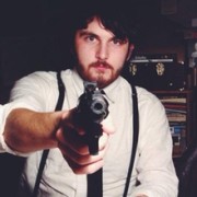
Ok Magic Hate ball, for the first one, I love the angle and the choice to use one subject as the focus of the picture, but I have one issue, and it is that the black and red (its the mercury/sodium lamps so it can't be helped), lamps that are lighting the subject's face seem well, blurry, like, if it is intended to be a borderline "children of the corn" image it is very scary, and projects the image of a rural/suburban fear. The second image I feel well, I like the color choice and spectrum, but I have one issue with it, and that is well, I can't find a focus point to use with it. I mean, there is no central object, and if that is the intent I don't mind it, but that's the biggest issue I have with it The third image feels like the picture perfect image of a forest or a nature reserve, with the feel of wilds, a solid balance of color, and the nice image of a path showing just the vague hint that humans have tread these areas before. I am confused about the shadow of the tree in the foreground though, otherwise it is a honestly amazing image!
|
|
#
?
May 9, 2015 16:29
|
|

|
Magic Hate Ball posted:
A couple thoughts.
|
|
#
?
May 9, 2015 16:47
|
|

|
bencreateddisco posted:
Why'd you choose that particular angle? It's not the most flattering and I don't see a compulsion to shoot from there. bencreateddisco posted:
I'm a sucker for these so thumbs up in my book. I'd love to see this bumped up a little bit and with slightly more contrast/sat. Mido posted:
I like this as is, love the grain.  , three takes on one image. , three takes on one image.Lauren BW Lauren Color Lauren Color Stripe
|
|
#
?
May 9, 2015 17:25
|
|


|
Really love the (natural?) light on the hair but would be curious to see what some fill light on her face would have done for the image. My eye is drawn to her pale rear as it's the brightest part of the image but I guess that's part and parcel with the overall style of the shot. I would love a similar shot from the hips up that showcases the matching colors of the hair/tattoo and lipstick/tattoo.
|
|
#
?
May 9, 2015 17:54
|
|
|
I don't think the color stripe works too well for this one. It just feels like it's a little too showy for a portrait. The portrait itself is okay, I feel she gets a little lost in the background. Did a few fashion shoots for a client I found on craigslist. Some of them turned out okay.   
|
|
#
?
May 10, 2015 19:42
|
|

|
Johnny Reb posted:I don't think the color stripe works too well for this one. It just feels like it's a little too showy for a portrait. The portrait itself is okay, I feel she gets a little lost in the background. that loving shirt holy poo poo
|
|
#
?
May 10, 2015 20:02
|
|
|
Johnny Reb posted:I don't think the color stripe works too well for this one. It just feels like it's a little too showy for a portrait. The portrait itself is okay, I feel she gets a little lost in the background. Is she sneezing smoke?
|
|
#
?
May 10, 2015 23:40
|
|
|
Johnny Reb posted:I don't think the color stripe works too well for this one. It just feels like it's a little too showy for a portrait. The portrait itself is okay, I feel she gets a little lost in the background. In both of these photos I have issues with the contrasting light. In the first, I don't feel like it helps narrow the eye's focus on the subject. In the second, you lose a lot of contrast between the subject and the wall. I'm not sure, but I get the feeling these were a lot more blown out before being processed? The end result is a little flat/dingy.  Meryl by Benjamin Patey, on Flickr Meryl by Benjamin Patey, on Flickr Ecosystem by Benjamin Patey, on Flickr Ecosystem by Benjamin Patey, on Flickr springtime by Benjamin Patey, on Flickr springtime by Benjamin Patey, on Flickr
|
|
#
?
May 11, 2015 17:00
|
|
|
bencreateddisco posted:In both of these photos I have issues with the contrasting light. In the first, I don't feel like it helps narrow the eye's focus on the subject. In the second, you lose a lot of contrast between the subject and the wall. I'm not sure, but I get the feeling these were a lot more blown out before being processed? The end result is a little flat/dingy. Nah, they were all exposed pretty well, I think, until I bumped up the luminance with my processing. So hopefully that means it's fixable. Although, the client's already satisfied, so I shouldn't care about going back to fix them, but I do.
|
|
#
?
May 11, 2015 17:53
|
|
|
It's a style I've seen before and a lot of people are into it. I just don't love it, personally. Still well-executed photos.
|
|
#
?
May 11, 2015 17:59
|
|
|
bencreateddisco posted:
There are a few things I like here. The framing is great, and I like the subject manner. I also like the contrast between the title and the content, springtime usually conveys newness, brightness, and something uplifting while the photo shows wilting, drooping petals (although depending on how you look at it I can also see them as blooming, which is what I think is going on). One thing that I don't understand is the color and saturation choice. It dulls the content without, for me, adding another dimension to it. I went to the Sackler and Freer Galleries in DC today and got these: 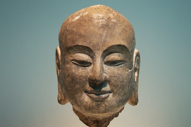 ananda by Tian He Ma, on Flickr ananda by Tian He Ma, on Flickr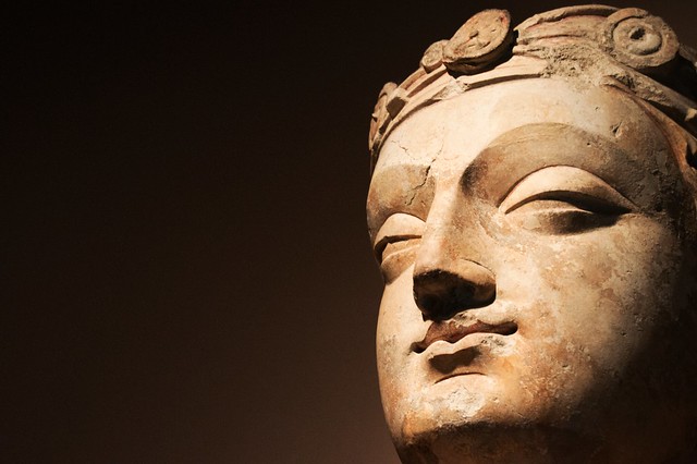 bodhisattva by Tian He Ma, on Flickr bodhisattva by Tian He Ma, on Flickr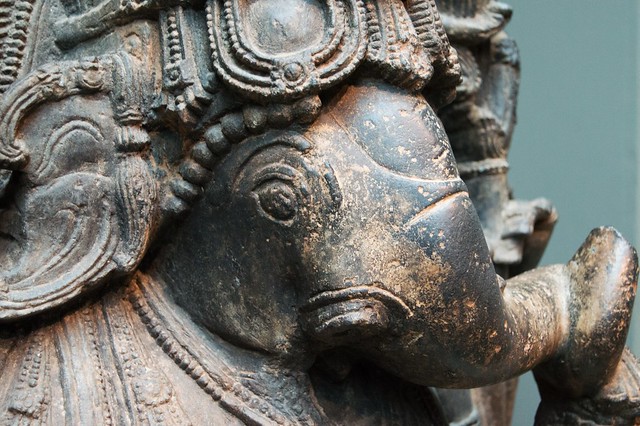 hindudeity by Tian He Ma, on Flickr hindudeity by Tian He Ma, on Flickr
|
|
#
?
May 14, 2015 03:30
|
|
|
Thirteen Orphans posted:I went to the Sackler and Freer Galleries in DC today and got these: The first one is way too much just "this is an art someone did", whereas your next 2 go into composition and isolating parts of the art and are much more interesting as a result. The textures in the 3rd one are great, and the composition in the second one is appealing. It's always tricky taking photos of art, or at least getting something unique from it. Ideally you want to show what moved you to take the photo, and the last 2 definitely accomplish that. Good work. I've been in a rut this year, with the one bright bright spot being another trip to Tokyo, which is really kind of cheating since it's such a naturally photogenic city. 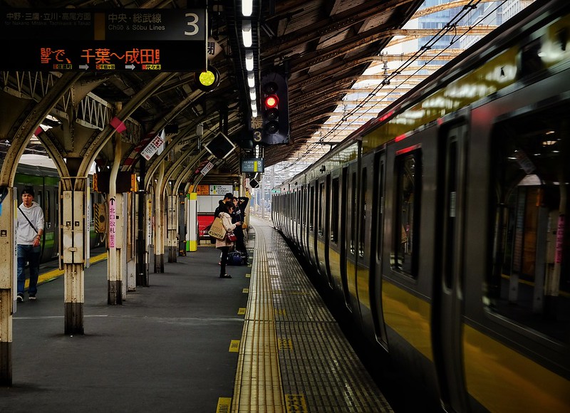 Chuo Local Line by Bill Baker, on Flickr Chuo Local Line by Bill Baker, on Flickr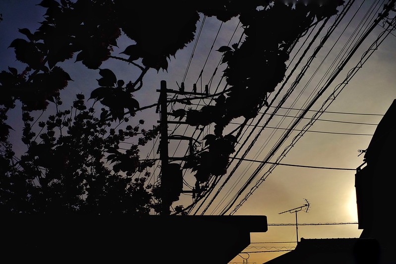 silhouette at sunset by Bill Baker, on Flickr silhouette at sunset by Bill Baker, on Flickr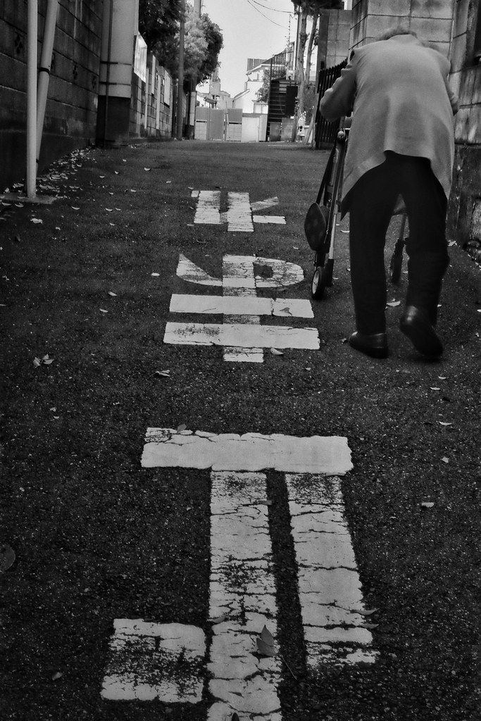 ascending by Bill Baker, on Flickr ascending by Bill Baker, on Flickr
|
|
#
?
May 15, 2015 02:34
|
|
|
krackmonkey posted:
Absolutely love this one, especially the colors. The sunset one I'm not a huge fan of, it seems to be just another sunset picture. The third one is pretty good, especially with the subject being an elder. Gives off a kind of spiritual feeling, almost, like it'd be the last picture in a life in pictures montage. Here's another one from the fashion shoot: 
|
|
#
?
May 15, 2015 19:22
|
|
|
Johnny Reb posted:Absolutely love this one, especially the colors. The sunset one I'm not a huge fan of, it seems to be just another sunset picture. The third one is pretty good, especially with the subject being an elder. Gives off a kind of spiritual feeling, almost, like it'd be the last picture in a life in pictures montage. I think I'd like this better if the focus was not on just the bottle, but on her face/the clothes that a fashion shoot is usually about. Did you miss focus or place it on the bottle on purpose? I like the other pictures from the shoot, though - they are nice! A picture I took earlier this year. I was kind of happy with it, but it seems Flickr has over sharpened it A LOT:  DSCF5123-Edit-Edit by Andreas Jakobsen, on Flickr DSCF5123-Edit-Edit by Andreas Jakobsen, on Flickr
|
|
#
?
May 16, 2015 07:27
|
|

|
FistLips posted:I think I'd like this better if the focus was not on just the bottle, but on her face/the clothes that a fashion shoot is usually about. Did you miss focus or place it on the bottle on purpose? I like the other pictures from the shoot, though - they are nice! this is a great photo, i would love to see it without that granular/oversharpened texture
|
|
#
?
May 16, 2015 08:03
|
|
|
VelociBacon posted:Really love the (natural?) light on the hair but would be curious to see what some fill light on her face would have done for the image. Johnny Reb posted:I don't think the color stripe works too well for this one. It just feels like it's a little too showy for a portrait. The portrait itself is okay, I feel she gets a little lost in the background. bencreateddisco posted:
FistLips posted:I think I'd like this better if the focus was not on just the bottle, but on her face/the clothes that a fashion shoot is usually about. Did you miss focus or place it on the bottle on purpose? I like the other pictures from the shoot, though - they are nice! More NY (more in my previous posts, feel free to critique):  _MG_4599.jpg by Axel, on Flickr _MG_4599.jpg by Axel, on Flickr _MG_4777-Edit.jpg by Axel, on Flickr _MG_4777-Edit.jpg by Axel, on Flickr _MG_4576.jpg by Axel, on Flickr _MG_4576.jpg by Axel, on Flickr
|
|
#
?
May 16, 2015 19:00
|
|

|
Mido posted:1 & 2 feel a bit claustrophobic for the kind of landscape that i feel like you are trying to go for. if you were further back or these were a wider angle it would sell me a lot more on the serene wooded road feel, also the bottom right on these is pretty unattractive space. Nthing approval for the grain. Maybe it's just the relative novelty of real film grain, but I like it. hi liter posted:
Interesting subject, especially for a candid street shot. It could just be my monitor, but so many of the monochrome digital photos that I see (and produce) seem to have a very, very slight bluish cast. This one is no exception. Does anyone else see it? One from me:  alcove-03724 by S M, on Flickr alcove-03724 by S M, on Flickr
SMERSH Mouth fucked around with this message at 03:12 on May 17, 2015 |
|
#
?
May 17, 2015 03:09
|
|


|
This is kind of neat. Overall though, I find the lack of contrast makes the photo kind of flat? I do enjoy the geometry of the shot though.  Self Portrait #5 by Benjamin Patey, on Flickr Self Portrait #5 by Benjamin Patey, on Flickr
|
|
#
?
May 17, 2015 03:44
|
|
|
SMERSH Mouth posted:but so many of the monochrome digital photos that I see (and produce) seem to have a very, very slight bluish cast. This one is no exception. Does anyone else see it? Now that you mention it, yeah I do. Looks like the colour of blu-tac.
|
|
#
?
May 17, 2015 03:56
|
|


|
Do the people seeing blue calibrate their monitors or have them set to a color temp that favors blue? Screens tend to favor a certain cast so you have to be careful about trusting what they display. Try viewing on anything different (even your phone) and see if it seems to have a different cast.
|
|
#
?
May 17, 2015 04:04
|
|

|
Edmond Dantes posted:Quoting these two because I completely agree. I'm not sure the pano crop is helping these photos. I think it works pretty well for the first, but in the second one the tips of some buildings are cropped off in a way that looks little haphazard.  img639 img639 img628 img628
|
|
#
?
May 17, 2015 17:37
|
|
|
mulls posted:I'm not sure the pano crop is helping these photos. I think it works pretty well for the first, but in the second one the tips of some buildings are cropped off in a way that looks little haphazard. This was my original take on it:  _MG_4777.jpg by Axel, on Flickr _MG_4777.jpg by Axel, on FlickrI like the first one, it's nicely eerie. The second one seems a bit off-centre to me, between the pillars at the bottom and the trees on both sides, looks like if you cropped a bit from the right you could have a nice symmetry going broken only by the crane arm.
|
|
#
?
May 17, 2015 20:05
|
|
|
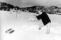
Edmond Dantes posted:You're right; I had it framed differently and changed it on a whim, not entirely sure why. Hmmm, I totally see what you're saying. Some symmetry would improve that photo. On yours, I actually think a crop that leaves off the buildings and just shows a lone figure in the snow would be nice.
|
|
#
?
May 17, 2015 22:18
|
|
|
xzzy posted:Do the people seeing blue calibrate their monitors or have them set to a color temp that favors blue? For me though it's just that one photo. I forget if I calibrated this monitor or not, but if it were my monitor, wouldn't I notice it in more photos? e: Same shot looks blueish on my phone too. Wafflecopper fucked around with this message at 00:16 on May 18, 2015 |
|
#
?
May 18, 2015 00:13
|
|
|
Do we not post photos any more? Is that not a thing? I'm really quite thinking this first one is pretty fun. There's a little bit of a weird-desolation vibe. If it were me, I'd want to push the baby carriage backwards a bit, to make it a bit more isolated. The second shot just seems flat to me, I'm not getting much out of it. The shape of the digger is cool, though. Here, have some glorified snapshots.  Untitled by Jason, on Flickr  Untitled by Jason, on Flickr  Untitled by Jason, on Flickr
|
|
#
?
May 22, 2015 16:36
|
|

|
thetzar posted:Do we not post photos any more? Is that not a thing? Only the first of those comes off like a snapshot. I love the second one. The straight-down angle and composition are great.
|
|
#
?
May 22, 2015 23:28
|
|
|
Untitled by Jason, on Flickr i really like the almost fibonacci spiral here  Underground Recreation by Benjamin Patey, on Flickr Underground Recreation by Benjamin Patey, on Flickr
|
|
#
?
May 24, 2015 15:16
|
|
|
This one is quite unsettling, in a good way. Really well framed! quote:
This one, I feel is a bit unfocused. I wonder if maybe just a little more pulled back would bring out the 'Man/Machine tearing a hole through nature' sort of theme, or if that's even what you were going for. I've been shooting with an X100 (now X100t), for about a year now. Mostly vacation stuff, wondering what people think London on the street  From a Halloween party  Novia Scotia 
|
|
#
?
May 24, 2015 23:58
|
|


|
toadee posted:
Great moment, the woman's expression is pretty delightful. The shot itself is a little busy, and the crop is a little irksome. Lotta' tangents and lost lines with the legs of our three protagonists. I'd suggest playing with a tighter crop? Maybe dump the handbag on the right, and bring the bottom of the frame up so the crop on the legs is a little more decisive. Also, if you can, screw around with some dodging+burning or shadow adjustments to bring the jackets of the two girls out from the background a little more, it'd really help keep the eye on the subjects and not get lost in the jumbled background. quote:From a Halloween party I like this photo quite a bit. Again, you captured a really nice human energy here. The skin tones look like they're leaning just a little too far pink/magenta. Also, I'm honestly not sure how I feel about the kinda' oblique angle on the arch... it does help balance the frame a little, but the square (or almost square) aspect ratio might have been served better with a more straight on, geometric composition in the background. Here's a shot I've been playing with for a while of a dust storm 'round the Lake Ndutu area in Tanzania. 
|
|
#
?
May 26, 2015 07:08
|
|
|
thetzar posted:
drat, this is really good.
|
|
#
?
May 26, 2015 07:28
|
|

|
bencreateddisco posted:
I'm really in love with this shot, but maybe the colors closer to the light source could have been a little more muted to go with the shadows in the rest of the picture. Here are a few from the Exotics car show at a nearby winery on Sunday:  IMG_8312 by Mazda Life Photography, on Flickr  IMG_8304 by Mazda Life Photography, on Flickr  IMG_8257 by Mazda Life Photography, on Flickr
|
|
#
?
May 26, 2015 14:37
|
|

|
thetzar posted:Do we not post photos any more? Is that not a thing? I know that Pete's is a tough place to take photos in, but it's also a super cool space that I wish you had gotten more of. Also, the stage feels a little cut off, like you're not close enough or not far enough. Colors look great tho.
|
|
#
?
May 26, 2015 16:50
|
|
|
Shiruan posted:Great moment, the woman's expression is pretty delightful. The shot itself is a little busy, and the crop is a little irksome. Lotta' tangents and lost lines with the legs of our three protagonists. I'd suggest playing with a tighter crop? Maybe dump the handbag on the right, and bring the bottom of the frame up so the crop on the legs is a little more decisive. Also, if you can, screw around with some dodging+burning or shadow adjustments to bring the jackets of the two girls out from the background a little more, it'd really help keep the eye on the subjects and not get lost in the jumbled background. Thanks, this is really helpful advice. That image is straight from the camera, and I will definitely give those suggestions a shot.
|
|
#
?
May 26, 2015 21:16
|
|
|
Awkward Davies posted:I know that Pete's is a tough place to take photos in, but it's also a super cool space that I wish you had gotten more of. Thanks. And yeah, I would have given a lot at that moment to have had a wider lens. I agree, being a little further away/wider would have really helped that shot. I got a few other things while there of my friend's band, but they're more close-up, band-photoy. Haven't decided which to put on my Flickr stream yet, but here's a sampling:   
|
|
#
?
May 27, 2015 04:14
|
|
|
thetzar posted:Thanks. And yeah, I would have given a lot at that moment to have had a wider lens. I agree, being a little further away/wider would have really helped that shot. I got a few other things while there of my friend's band, but they're more close-up, band-photoy. Haven't decided which to put on my Flickr stream yet, but here's a sampling: I really like all of these! I've never been good at band photography, but these are great. It feels more intimate when you do close ups like this, and I really like the little bit of grainy look to them. I snapped this one the other day during a shoot with my friend and fell in love with it.  IMG_9522 by Mazda Life Photography, on Flickr Here's a couple more from that shoot: 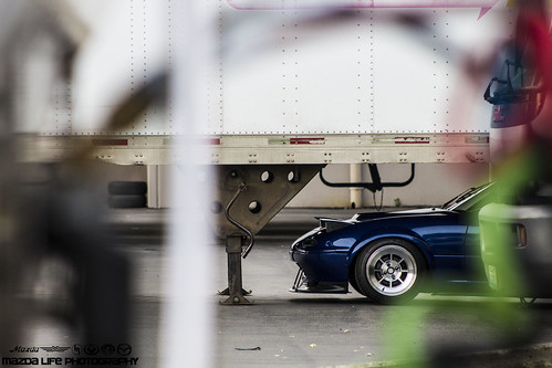 IMG_9726 by Mazda Life Photography, on Flickr 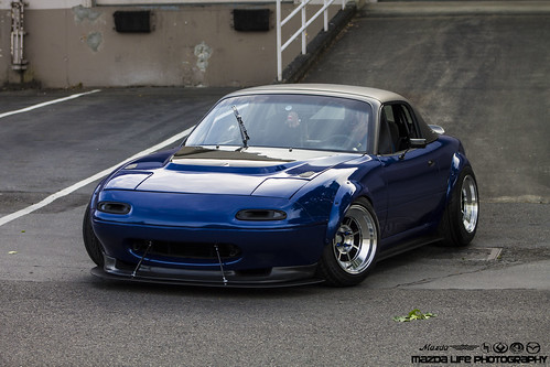 IMG_9558 by Mazda Life Photography, on Flickr
|
|
#
?
Jun 2, 2015 14:34
|
|
|
Totally amateur posting here, and first time poking my head into the subforum. I've recently gotten re-interested in photography and figured I'd post some of my older "good" photos for some feedback on composition and whatnot. These are from several years ago and were all taken on point and shoots. I have rarely received non-friend feedback on my photos so I figured this would be a good place to start now that I'm picking up my wife's DSLR and jumping in again. I have not touched any of these in editing software so any suggestions on where to start with processing would be great too: DSCN2654 by LogisticEarth, on Flickr Simple and to the point, but I'm bothered by small issues like the unlevel roof line and being off-center in regards to framing the door through the window. Would better symmetry improve this?  DSCN2669 by LogisticEarth, on Flickr This one could probably have benefited from having the hikers being a bit closer, and something about the ridge line bothers me. Would more sky be a good idea?  DSCN1012 by LogisticEarth, on Flickr I feel like this one seems a bit flat but not really sure where to start on improving it. Again, not sure if the sky/land ratio is quite right. LogisticEarth fucked around with this message at 17:56 on Jun 3, 2015 |
|
#
?
Jun 3, 2015 17:52
|
|
|

|
| # ? Jun 7, 2024 00:29 |
|
|
LogisticEarth posted:
First of all, the colors are amazing considering this is unedited. However, while I like the idea of the photo, I'm not a big a fan of how it turned out. Framing the busted window in the center works well, as that is the subject so to speak. The framing around it, though, feels claustrophobic to me. I'm not sure if it would have been a better to have gotten more of the building, but I wonder what it would have looked like if we could see more of that nice blue sky in contrast to the earthy sandy house in the frame.
|
|
#
?
Jun 3, 2015 23:06
|
|