


|
LogisticEarth posted:
These are all pretty ok, but I wish they weren't so weirdly sharp. Generally speaking, a good photo shouldn't be ruined by a slightly off-kilter roof, and these photos all have something to them that's appealing and overcomes whatever technical flaws you're panicking about. Don't turn photography into math homework or everything you shoot will be really rigid and you'll never be happy with it - focus on the atmosphere, not the angles. Not that angles and grids aren't worth considering but they're probably not why people are looking at your photo. The atmosphere in your photos is nice, and good, so keep it up.
|
 #
?
Jun 4, 2015 00:22
#
?
Jun 4, 2015 00:22
|
|


|

|
| # ? Jun 10, 2024 12:18 |
|
|
Thirteen Orphans posted:First of all, the colors are amazing considering this is unedited. However, while I like the idea of the photo, I'm not a big a fan of how it turned out. Framing the busted window in the center works well, as that is the subject so to speak. The framing around it, though, feels claustrophobic to me. I'm not sure if it would have been a better to have gotten more of the building, but I wonder what it would have looked like if we could see more of that nice blue sky in contrast to the earthy sandy house in the frame. Agreed. I'd also be really interested to see how it looks from a slightly lower angle, so that we get more of the sky visible in the window opposite, making the view out of that window a kind of microcosm of the whole photo with a similar blue sky/brown(roof/mountains)/yellow(wood/grass) dynamic.
|
|
#
?
Jun 4, 2015 02:42
|
|


|
I don't know that the lack of the sky is necessarily a problem. A lower angle that gets more into the frame would would also be an interesting shot, but he's also got some nice framing of the mountains in the background through the window that you'd miss out on from a lower angle. I do agree that he should do a little extra effort to make sure that his horizon lines are entirely horizontal, this is a very geometric composition that's weakened slightly by the slight tilt.
|
|
#
?
Jun 4, 2015 06:43
|
|


|
Thanks for all the excellent feedback. As I said I'm shooting more recently with the DSLR, since no other photos have been posted I'll do a few more self critiques. Again, I have no ventured into post processing so in addition to general info, any critiques or feedback on how post could improve these would be good: IMG_8649 - Copy by LogisticEarth, on Flickr I kinda like this one but I'm not sure all the white space improves the photo or detracts from it. It also feels a bit flat due to the lighting/underexposure? I like the softness of the shadows but the contrast seems a bit too low and overall it feels darker than it should be.  IMG_8717 by LogisticEarth, on Flickr Shot this one this morning. I unfortunately got a bit of the fire hydrant in the upper left hand corner. I'm also no sure if the hydrant's shadow is adding to the photo or detracting from it. Possible to improve this one by cropping out the hydrant in the frame, and/or shooting at a different time of day so the shadow up top falls out of the frame?  IMG_8696 by LogisticEarth, on Flickr I really like this deli's storefront due to the neon and the pig, so I'll probably revisit this one. After the fact it looks like I was more concerned with getting the pig vertical, which led to the window frame being a little skewed and off center. I was also debating about either taking the shot with either 1) the full neon window frame (it's out of frame on the left in this one), or 2)Bringing it in closer and cutting out the right window frame, leaving only the neon on the top and bottom. The issue with #1 was that the guy has a lot of junk stored on the left of the window and it might have cluttered up the shot. Also, I was just kind of winging the exposure and seeing what worked. I feel like the high ISO worked well as the neon and grain give it a bit of a seedy vibe.
|
|
#
?
Jun 7, 2015 16:15
|
|
|
LogisticEarth, didn't you used to play Men of War? Good to see you around here too. The first pic of the owls is underexposed - unless you purposely want the image to be dark. I usually check the histogram after shooting each picture to determine if it fits with the look I am trying to achieve. The second one may be interesting if you make a closer crop. Not sure what I am supposed to focus on here. The third one is really good. I think the rectangle of the neon being skewed is fine, it's a more interesting shape that way. I just got back from a trip where I tried a few experimental shots. Wondering what you all think of these  IMG_9252.jpg by Kevin Gao, on Flickr IMG_9252.jpg by Kevin Gao, on Flickr Curves by Kevin Gao, on Flickr Curves by Kevin Gao, on Flickr IMG_9528.jpg by Kevin Gao, on Flickr IMG_9528.jpg by Kevin Gao, on Flickr
|
|
#
?
Jun 7, 2015 20:59
|
|
|
lollybo posted:LogisticEarth, didn't you used to play Men of War? Good to see you around here too. I did indeed used to play Men of War! I remember playing a bunch of games with you. For the second photo I was going after the decomposing tennis ball. Just happened on it as I was walking on the street, thought it looked interesting no only due to the decomposition of a familiar object, but also as it had fallen on the border between the two different types of concrete. Tighter crop may have been better. lollybo posted:
I like the first two shots, I'm a sucker for western landscapes. Something is off about this one though. I'm not really sure what the subject is, the hikers or the rock face? Although both hikers are facing each other, the dude is significantly taller than the woman, which kinda dominates the pair as a subject, and he's looking off frame. I was going to say that the tree in the middle was also distracting. However, I'm thinking that the tree's silhouette by itself, sans hikers, may have been more interesting shot if composed a bit differently. vvvv Can you tell me what specifically since it's just a random study/practice shot and I have like zero formal training? LogisticEarth fucked around with this message at 16:26 on Jun 8, 2015 |
|
#
?
Jun 8, 2015 11:37
|
|
|
LogisticEarth posted:
That's just bad dude
|
|
#
?
Jun 8, 2015 16:24
|
|

|
From a technical standpoint, the main thing that's bad about the first picture is that it's underexposed. You can do cool things with a slightly dark or low key images provided you have strong enough lighting to draw out the forms of the object, but in this case you're shooting in fairly low, diffuse light so it just ends up muddy and unattractive. It doesn't read like something you did deliberately for effect but rather something you did accidentally because your flash didn't fire. Beyond that, the subject and composition are just sort of blah. There's not really a strong focal point here �my eye hits the owl because it's the biggest object in the scene, flips along the door frame to the antler, then registers that there are two indistinct forms in between those objects, and then I'm done. There's no tension to build interest or keep me looking at it, it's just mundane objects floating in a beige void. I'm not sure what you could have done composition-wise to make this more interesting, but it doesn't really seem like you've done anything at all. Your choices here aren't coming through; I don't know what YOU think I should be looking at. Why did you take this picture? What grabbed you about this and made you want to capture it? What were you trying to evoke? If it was a good picture, these are some questions that I as a viewer should have at least some inkling of, but I don't. For the second picture, things are better. The subject is clearer and more inherently interesting, and you've done some interesting things in how you isolated it and contrasted it to the shapes in the shadows. Weakening it I think is how close the ball is in color to the surrounding pavement, it kind of blends together and in a composition that relies on strong shapes that's not good. I think you should have experimented with a few different angles to find the one that separates the ball from its surroundings the most. The last picture is the best. It is a slightly underexposed image, but because of the contrasty lighting it works really well here. You've got three strong focal points (the main sign, the smaller background sign, and the pig) and strong diagonals leading between them, which creates a sense of dynamic tension that keeps you looking at the picture as your eye goes between him. The contrast of the vivid reds with the very deep blacks is also very satisfying. Good job!
|
|
#
?
Jun 8, 2015 19:21
|
|
|
thetzar posted:
thetzar posted:
mrlego fucked around with this message at 08:53 on Jun 15, 2015 |
|
#
?
Jun 12, 2015 17:28
|
|


|
lollybo posted:
Super evocative - love the black and white for this shot, works great with the alternating light/dark contrast of the sediment rings (?). Almost looks like a wave made of stone. Sorry I don't have anything constructive to offer about it. LogisticEarth posted:
I'm not sure how popular my feedback will be for this one but I would have just moved the subject (I consider that unraveled baseball to be the subject) a couple feet over so the framing is exactly the same but without the fire hydrant and it's shadow. At the end of the day the people looking at the photo aren't going to know any better and it'd make a lot better shot. Some photographers would feel like this is cheating but it's not like you're baiting eagles or bringing friends for faked spontaneity street photos. Wouldn't have hurt to have gotten closer to the subject to fill the frame a bit more but you've placed it well for rule of thirds - as well you've avoided the common fault of using a strong bisecting center line to split the image. I like it along the lower third as you've framed it. Took this while walking around Vancouver today. I was surprised to find that a square crop was the strongest (I can't frame any wider on the wall and wanted the geometric detail at the top).  Stairs by Trevor Zuliani, on Flickr Stairs by Trevor Zuliani, on Flickr
|
|
#
?
Jun 14, 2015 01:48
|
|

|
mrlego posted:What lens/body/ISO/f-stop were you shooting? Thank you so much. This is probably the most thorough crit I've gotten since school. And I didn't even realize how closed-eyes my subjects were as a whole. I shot all of these on a Fuji X-E2 pushing grain at iso 3200. All were with the 35mm wide open at �1.4.
|
|
#
?
Jun 15, 2015 03:28
|
|

|
 quote:For me, this is my first attempt at taking an image of a large thing in profile, I had a lot of natural light, so I wanted to take a picture of my car, since the bridge I was going to take pictures of had its scenic overlook closed for construction work This is a good Craig's list photo to have, or for insurance purposes. The car is sharp with no shadows. In fact, everything is sharp, even the truck 200 feet away, that apartment building, guard rail etc,. A good thing to think about is what do you want to see in your photo? Background elements can add or take away from your subject. It's important to look at your composition and decide if this is totally what you had envisioned. For variety, there are a few things you can do at this location: If you have a zoom or a few different primes, shoot photos at every focal length possible (wide, medium tele, long). Use the shallowest depth-of-field, move around your car, sit on the ground, go prone. If you have the time, take photos in the morning or evening and dusk. Stretch your ISO and shoot after the sun has set. Stand directly in front of the car and zoom in. A telephoto lens can help isolate your subject from the background and put the focus on your subject. (This also works for people). Every car is very unique in shape and maybe a front tele shot may look more "car like" or accentuate some detail that is interesting. I'm not familiar with your car but it looks like it would have a cool front grill/headlight thing going on. If taking a night photo, maybe turn on the headlights and/or the interior lights. Use a tripod and take a 30 second exposure at night. Even sodium vapor street lights can make a very interesting photo happen if you pay attention to focus and light/car placement. Take some chances. Did you have a time of day you'd like to shoot for? When outside, time of day and weather can be the biggest factors in shooting anything. I'd be interested to see this bridge that was part of your original plan. Will you be going back to the bridge to try again? mrlego fucked around with this message at 18:58 on Jun 15, 2015 |
|
#
?
Jun 15, 2015 18:44
|
|
|
LogisticEarth posted:Thanks for all the excellent feedback. As I said I'm shooting more recently with the DSLR, since no other photos have been posted I'll do a few more self critiques. Again, I have no ventured into post processing so in addition to general info, any critiques or feedback on how post could improve these would be good: I don't like this one. It's too dark and there is not really anything to catch the eye. Get more light and get closer, and maybe you'll have something? LogisticEarth posted:
Now THIS I like! I'd maybe move the ball a bit so the shadow is no longer there. Even if that might cause some idiot to call it "fake" LogisticEarth posted:
This is nice too. I get a 50s kind of vibe from it. Very pleasing. Ok, I've replaced my last pic I shared here with a version that's hopefully less eye wateringly sharpened:  DSCF5123-Edit-Edit by Andreas Jakobsen, on Flickr DSCF5123-Edit-Edit by Andreas Jakobsen, on FlickrI also found another one from two days before that I think I like:  DSCF5106-Edit by Andreas Jakobsen, on Flickr DSCF5106-Edit by Andreas Jakobsen, on Flickr
|
|
#
?
Jun 16, 2015 19:41
|
|

|
FistLips posted:Ok, I've replaced my last pic I shared here with a version that's hopefully less eye wateringly sharpened: Maybe it's just because I like the barn, but I think that first shot is the bee's knees. Between the wood, the trees, the grass, and the snow, there's just texture on texture on texture. I dig. The second shot has some nice color and light, and the diagonal of the powerlines is nice but... I don't know. I'm not sold on there being a there there. What was it that grabbed you about this scene?  La Paz Waterfall Gardens by Jason, on Flickr  Turismo by Jason, on Flickr  Untitled by Jason, on Flickr thetzar fucked around with this message at 04:10 on Jun 18, 2015 |
|
#
?
Jun 18, 2015 03:40
|
|
|
thetzar posted:Maybe it's just because I like the barn, but I think that first shot is the bee's knees. Between the wood, the trees, the grass, and the snow, there's just texture on texture on texture. I dig. These are fantastic, especially the first and second. Makes me wish I could travel more. I will say however that the middle one loses some definition on the person's head. Just an unfortunate placement given the shadow of the rocks on the hillside. LogisticEarth posted:
Going to have to go with the others in this thread who are calling this a bad photo. It just is. Subject, framing, exposure; they're all 'off'. But Don't let that discourage you. (It hasn't discouraged me. I have way, way too many bad, boring photos in my Lightroom catalog, and a few more on my flickr feed  ) And the neon pig pic is cool. I'd say though, that if you really wanted to revisit this place and make a better-looking image of this boring subject, you should try to either shoot it head-on, so that the horizontal line of the shelf is parallel to the upper and lower frames of the image, or shoot more decidedly from the side, to give the row of items some depth. ) And the neon pig pic is cool. I'd say though, that if you really wanted to revisit this place and make a better-looking image of this boring subject, you should try to either shoot it head-on, so that the horizontal line of the shelf is parallel to the upper and lower frames of the image, or shoot more decidedly from the side, to give the row of items some depth. I wanted to single your this photo because it brings up something that I've been contending with lately in my own photography: straight lines & perspective. For example:  ADM-7977 by S M, on Flickr ADM-7977 by S M, on FlickrThis was shot with a 35mm lens. I wanted the composition to be wide enough to capture both the truck and the train, while also keeping the tower in-frame. But the result is that the tower appears to lean to the right. ...I guess my question is, is this acceptable? I don't have much formal training in artistic photography. I know about the rule of thirds, and I look at a lot of other people's photos. Obviously, tastes vary and there are different stylistic movements and schools of thought, but if you were just trying to be as 'objective' as possible, would you say that the distortion of the tower's angle - taken as a single element - detracts significantly from the photo as a whole? What else about this picture is bad? I like taking photos of towers, trees, and buildings, but often end up with skewed lines that I'd wanted to be perfectly horizontal or vertical. Besides just trying to be more anal-retentive about how horizontally-blanced my camera is, are there some general rules of thumb for getting lines as straight as possible? SMERSH Mouth fucked around with this message at 05:02 on Jun 20, 2015 |
|
#
?
Jun 20, 2015 04:59
|
|

|
thetzar posted:
Honestly, I just like the place and thought the powerlines made a nice leading line. Not much to the picture, I admit, just some pleasing visuals ")
|
|
#
?
Jun 20, 2015 16:20
|
|
|
SMERSH Mouth posted:For example: I could see this composition working if there were more happening in the sky. As is, there is a lot of blank slightly blue sky not really doing anything and that space is more prominent than any of the other more interesting elements (railroad car and trailer). The tower is visually interesting, but it is so small in the frame that I don't know how much it adds to break up the symmetry of the frame. If you were to choose what the subject is (the trailer, tower, train) it should be bigger in the frame compared to other elements. As is, everything is equal, thus nothing is really the subject. So the eye does not have a element in the frame to "enter the photo", it just gets stuck in the middle. The power lines are cool leading lines, but they also lead right into the center of the frame, which the train does also. The center of the frame is kind of like a vortex where no eye can escape it's pull. I really like the highlights on the trees to the right. It looks very 3 dimensional. Also the train car has very interesting shapes, textures, and values. Like this:  The sky is still a little too big but I feel this is more pleasing to the eye. A little photoshop to bring out the shapes to the clouds and sky would do wonders, but I am not good at that so I won't try. mrlego fucked around with this message at 17:43 on Jun 21, 2015 |
|
#
?
Jun 21, 2015 17:26
|
|
|
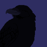
thetzar posted:Untitled by Jason, on Flickr I actually have to say that I like this one the most of the three. The other two have that specific film tone that lots of people love so I totally get why most people might like them, they're good shots but the third is one that retains my interest for a lot longer. SMERSH Mouth posted:For example: I had actually written a longer thing about this shot earlier in the week but it didn't post when the forums were down for those hours and I forgot about it. Basically have to agree that to my eye there isn't anything super interesting here. The distance from possible subjects is so great that there isn't any detail to them and the inclusion of so much uninteresting sky makes it look more like a photo you would take to show some rear end in a top hat how they parked their trailer/train in the wrong spot. On the topic of the perspective issue with the pole leaning in - you won't be able to get rid of this without a tiltshift lens which is heinously expensive and mostly used for taking pictures of architecture or similar where strong geometrical shapes are present. This is a shot I can't decide if it's too corny or what and would like some feedback especially if it makes you roll your eyes. I aimed to keep some detail in the branch as opposed to making this into a sliders-to-art shot. Is this over-processed?  Crowbranch by Trevor Zuliani, on Flickr Crowbranch by Trevor Zuliani, on Flickr
|
|
#
?
Jun 23, 2015 02:43
|
|
|
Yeah with regard to the responses to my photo, I could have ameliorated both problems (composition and perspective) by framing the horizon closer to the center. I'd have to go back and retake the shot to do this, but yeah, probably not enough there to really warrant it. I like the interplay between built and natural environments, but with that one it's just like, 'here's some manmade things, and some natural things. They continue into the distance, forwards and upwards." And the crow pic would look better if it was cropped so that all of the limbs are in sharp focus. Kind of hard to judge on the default forums background. Need to go to Flickr.
|
|
#
?
Jun 23, 2015 03:38
|
|
|
VelociBacon posted:This is a shot I can't decide if it's too corny or what and would like some feedback especially if it makes you roll your eyes. I aimed to keep some detail in the branch as opposed to making this into a sliders-to-art shot. Is this over-processed? I like the processing and the concept which gives a cool creepy vibe. However, I'm not thrilled with the composition. I'd prefer the angle to be straight on with the bird instead of looking up and either have the bird larger in the frame or more birds. Like I said, it's a cool concept, I just think it needs more. I know that's kind of a tall order but maybe this one of those concepts you want to try to explore more. Like maybe you can find a similar tree with a hill near by that you can shoot straight on or use a longer lens. It's been a long time since I've posted anything but here is one from me:  Mt. Rainier at Reflection Lake by Ryan Tamm, on Flickr Mt. Rainier at Reflection Lake by Ryan Tamm, on Flickr
|
|
#
?
Jun 23, 2015 05:42
|
|

|
La Paz Waterfall Gardens by Jason, on Flickr This is quite pleasing and mysterious. It reminds me of the jungle in Predator and Apocalypto. The dark tree trunk really makes the photo sing. The vignetting looks natural and blends well with the dark foreground edges. Use of a very wide DOF/focal length combo is nice to see in what looks like a semi low light/overcast situation. Very nice. Turismo by Jason, on Flickr I'm not sure what is going on here with the woman, the bus and the nature. They all feel out of place or disconnected. The woman is just kind of there, not really doing anything. The bus feels especially distracting, though I like the reflections of the skyline in the windows and the highlights/shadows of those funky weird seats. Beautiful location but, the aqua color buzzes in my brain when contrasted with the rest of the earthly greens, faded gray and browns that dominate the frame. Different color palettes clashing.  Untitled by Jason, on Flickr Really nice combination of weather, time of day, exposure and composition. The trees fading into the fog with the soft horizon angling down from right to left is very cool. I do wish the foreground tree/fence/grass area were a bit sharper. It looks like the tallest tree in the left third of the frame is the focal point, which is an interesting choice, but I think you could have sacrificed some of that 1/2000th shutter speed for more DOF and gotten more of the foreground in focus while retaining the sharp background elements. I guess it is really a preference thing. mrlego fucked around with this message at 09:38 on Jun 23, 2015 |
|
#
?
Jun 23, 2015 09:33
|
|
|
I've been doing a lot of night shooting lately and have liked some of what's came out of it, but I'm running into problems editing them. Portra4182 by Brett Schlough, on Flickr Portra4182 by Brett Schlough, on FlickrWith this one I like the area, but could maybe to with getting less of the billboard in frame, maybe have of the space on the left, try to get more of the main building in frame. Color wise this one also seems very blue and I've been having a lot of trouble correcting for that while editing.  Portra4180 by Brett Schlough, on Flickr Portra4180 by Brett Schlough, on FlickrWith this one I had to crop a lot tighter than I would like, mostly because there was some weird reflections going on the right side. I also think this one tends a little towards yellow color wise, but not as bad as the blue in the first picture.
|
|
#
?
Jun 24, 2015 01:12
|
|
|
I prefer the original. The bus gives the shot context, I figure the woman has been driving around the countryside in the bus and has pulled up at a rest stop to stretch her legs. Without the bus it's just a woman standing on the side of the road. The original is definitely the weakest of the three he posted, but I don't think removing the bus improves it at all. Wafflecopper fucked around with this message at 11:49 on Jun 24, 2015 |
|
#
?
Jun 24, 2015 11:47
|
|
|
Wafflecopper posted:I prefer the original. The bus gives the shot context, I figure the woman has been driving around the countryside in the bus and has pulled up at a rest stop to stretch her legs. Without the bus it's just a woman standing on the side of the road. The original is definitely the weakest of the three he posted, but I don't think removing the bus improves it at all. Agreed. The crop was more to show what it would look like without the crazy green of the bus.
|
|
#
?
Jun 25, 2015 07:58
|
|
|
VelociBacon posted:This is a shot I can't decide if it's too corny or what and would like some feedback especially if it makes you roll your eyes. I aimed to keep some detail in the branch as opposed to making this into a sliders-to-art shot. Is this over-processed? I don't think it's too over-processed, but the composition doesn't sit right as-is. The off-centre bird and negative space in the top-right and bottom looks like it's a shot for a book or album cover composed to give room for a title & author. Did the best I could with an iPhone camera, but I get the nagging feeling that something I don't know I could have done would've made it better. 
|
|
#
?
Jun 25, 2015 14:47
|
|


|
DigitalRaven posted:I don't think it's too over-processed, but the composition doesn't sit right as-is. The off-centre bird and negative space in the top-right and bottom looks like it's a shot for a book or album cover composed to give room for a title & author. If you had shielded the camera from above you might have avoided the lens flare.  Elizabeth by Benjamin Patey, on Flickr Elizabeth by Benjamin Patey, on Flickr
|
|
#
?
Jun 25, 2015 22:29
|
|
|
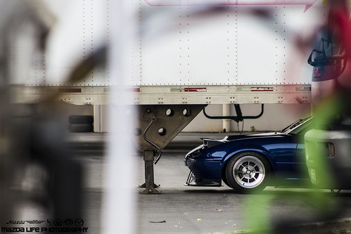
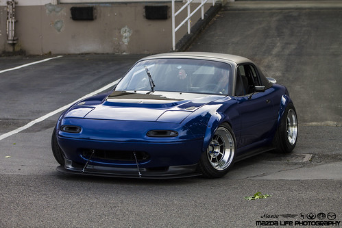
youareoffthehook posted:I really like all of these! I've never been good at band photography, but these are great. It feels more intimate when you do close ups like this, and I really like the little bit of grainy look to them. I'm not especially familiar with car photography so maybe there is some stylistic purpose behind it, but the background here is killing these shots. The bright whites of the structure are pulling the eye away from the car, and in all of them it looks really static. To me, if I'm trying to show off a fast car, I want the image to convey some sort of speed or movement or just direction, all I see here is a nicely colored car parked behind a warehouse. I took some people pictures for the first time in a long time.   
TsarAleksi fucked around with this message at 20:58 on Jun 28, 2015 |
|
#
?
Jun 28, 2015 20:51
|
|


|
TsarAleksi posted:I'm not especially familiar with car photography so maybe there is some stylistic purpose behind it, but the background here is killing these shots. The bright whites of the structure are pulling the eye away from the car, and in all of them it looks really static. To me, if I'm trying to show off a fast car, I want the image to convey some sort of speed or movement or just direction, all I see here is a nicely colored car parked behind a warehouse. For number one I love the shared moment you've captured. It's so genuine and exciting. I also love the composition and how you've included the curve of the shore, and put in a good bit of the pretty sky in. It seems like it was the perfect time of day to shoot there. You did great using natural light, however, this really needs a fill flash or possibly a reflector. If you're going to shoot portraits I think you really need to be able to take control of the light some how. This could be as simple as scrims and reflectors, strobes and soft boxes, or a combination of both. For number two I'm not a big fan. There is a lot of clutter (especially on the right side of the frame) and I couldn't really figure out what was going on until the 5th time I looked at it. At first I thought the chick in the middle was dancing in that thing but I see that they're trying to control their set up. My only suggestion would be to simplify the picture, focus just on the woman with her arms up, and keep shooting until you caught the moment. Number 3 I like the composition of the beach with the triangle shaped water, rule of thirds sky, and placement of the couple in the frame. The posing is good except that the bride should be looking at the camera instead of down at the ground. The lighting on the couple is too patchy, especially on the groom's face. As with number one, this is a situation where you really need to control the light. ________ Went on a photowalk the other day, here are 3 from me:  IMG_5823.jpg by Ryan Tamm, on Flickr IMG_5823.jpg by Ryan Tamm, on Flickr Blueman by Ryan Tamm, on Flickr Blueman by Ryan Tamm, on Flickr Dick's Entertainment by Ryan Tamm, on Flickr Dick's Entertainment by Ryan Tamm, on Flickr
Haggins fucked around with this message at 08:01 on Jun 29, 2015 |
|
#
?
Jun 29, 2015 07:56
|
|
|
Haggins posted:
I hope you at least gave him money after you bought your gross hamburger.
|
|
#
?
Jun 30, 2015 06:53
|
|
|
I was way too sober to eat there
|
|
#
?
Jun 30, 2015 07:17
|
|
|
Haggins posted:It's been a long time since I've posted anything but here is one from me: The main thing I wish I had here was more breathing room. You're so tightly focused on the reflection, on the mirror image and symmetry that it feels cramped, especially with that big, dense, black mass of trees in the middle. I want to look up at the mountains, and then at the sky, but the photo ends there, which is atmospherically frustrating (literally).  IMG_8590 by difficult listening, on Flickr  IMG_8662 by difficult listening, on Flickr  IMG_8651 by difficult listening, on Flickr
|
|
#
?
Jul 2, 2015 04:21
|
|
|
Thanks so much for all the feedback, everyone. Sorry for the delay.mrlego posted:Really nice combination of weather, time of day, exposure and composition. The trees fading into the fog with the soft horizon angling down from right to left is very cool. I do wish the foreground tree/fence/grass area were a bit sharper. It looks like the tallest tree in the left third of the frame is the focal point, which is an interesting choice, but I think you could have sacrificed some of that 1/2000th shutter speed for more DOF and gotten more of the foreground in focus while retaining the sharp background elements. I guess it is really a preference thing. I actually shot this through the window of a moving van. Hence the need for a rapid shutter speed and some blur in the foreground making it through anyway. Wafflecopper posted:I prefer the original. The bus gives the shot context, I figure the woman has been driving around the countryside in the bus and has pulled up at a rest stop to stretch her legs. Without the bus it's just a woman standing on the side of the road. The original is definitely the weakest of the three he posted, but I don't think removing the bus improves it at all. I like having the bus in both for context, and that great pop of color around the 'Turismo' sign. I also liked how the perspective of the bus and the landscape are angled against each other. keyboard vomit posted:I've been doing a lot of night shooting lately and have liked some of what's came out of it, but I'm running into problems editing them. I don't mind the blue on the first one at all! I just love the color painting up the windows of the shack. You're right about the billboard, though � I'd rather see more or none of it. Overall, though, I'd say that first shot is very successful. You're right about the second shot; very yellow. But that's not a bad thing,t he yellow light and green shadows give it an unearthly feel. I think what you're running into here with color balance is the fact that the lights being used really are very blue and very yellow, respectively. Daylight-balanced film is just going to show that, unless you really gently caress with it in post. Film being film, you don't get all the fancy color balance correction available in digital cameras � nor would it really be required for this kind of shooting. I like to see the weirdness of articicial light when I get the chance, as long as you're not trying to be accurate with reproducing skin tones or something. I traveled again recently. These are the first three photos I managed to get through Lightroom. Once again, my crippling fear of approaching strangers (especially in other countries) to take their pictures leaves me shooting inanimates, animals, and from afar.  Untitled by Jason, on Flickr  Untitled by Jason, on Flickr  Down and Through 1 by Jason, on Flickr
|
|
#
?
Jul 6, 2015 22:09
|
|
|
thetzar posted:Thanks so much for all the feedback, everyone. Sorry for the delay. I don't care one bit that you cant approach people, I LOVE this one. It makes me feel uneasy .. and I like it. Much mystery ..
|
|
#
?
Jul 8, 2015 20:27
|
|
|
thetzar posted:
The first one I'm finding interesting. It's capturing the feeling of how I would perceive the scene if I was walking through the area, I would notice and focus on the statue for a short while before even noticing that there was a cat sleeping underneath. Its nice how the cat isn't the main focus of the shot. One thing that is bothering me though is how the left side behind the statue isn't connecting in my mind that its the same area as the right side. Feels like two different backgrounds. The second one I absolutely love. I think it came out perfectly. Great job on that one. And since I haven't submitted anything for critique in a while. Been trying more long exposures  boat by cha_reckoning, on Flickr  camper by cha_reckoning, on Flickr Edit: deleted crap -CHA fucked around with this message at 16:43 on Jul 9, 2015 |
|
#
?
Jul 9, 2015 13:28
|
|

|
-CHA posted:The first one I'm finding interesting. It's capturing the feeling of how I would perceive the scene if I was walking through the area, I would notice and focus on the statue for a short while before even noticing that there was a cat sleeping underneath. Its nice how the cat isn't the main focus of the shot. The first one is a lovely photo of a (your?) pet that I am totes reporting you for, nobody wants to see that poo poo in the crit thread. The second one sets a nice mood and I think the comp and exposure are fine, but I think it'd be a stronger photo capable of saying something or telling a story if you included something more contextual in an engrossing manner. I can see someone's leg and foot inside the door there, but that really isn't enough to make me think anything besides "they didn't notice they could see that person's foot there." You could have had someone standing inside the window doing something, that might have been cool. I don't really want to get into listing all the different ways you could have placed a subject to make it more engrossing, figure that out yourself, but I think it could have been a lot more interesting with a very small change.
|
|
#
?
Jul 9, 2015 15:39
|
|


|
RangerScum posted:The first one is a lovely photo of a (your?) pet that I am totes reporting you for, nobody wants to see that poo poo in the crit thread.  Yeah I totally deserved that. I should have re-read the rules before posting. I should just replace the image so as to not crap up this thread if thats ok to do. Yeah I totally deserved that. I should have re-read the rules before posting. I should just replace the image so as to not crap up this thread if thats ok to do.
|
|
#
?
Jul 9, 2015 16:31
|
|
|
Magic Hate Ball posted:
You did manage to put some interest in what is a pretty mundane subject. I like the mood that is created by the overall darkness of the foreground and the setting sun in the background. The depth of field/composition is pretty obvious, but works well. I think I may have a liked a closer crop so that the main subject took up more space since right now there is mostly "nothing" in the whole picture. thetzar posted:
I really love the contrast and mood of this one. I'm a sucker for pictures with fog in them and I'm not disapointed. The foreground could be sharper, but that's hard to avoid with fog. It's contrasty enough to give it some feeling of sharpness so it still works for me. -- I haven't been taking pictures in something like 2 years and I'm trying to get back into it.   
|
|
#
?
Jul 13, 2015 15:16
|
|

|
KingColliwog posted:I haven't been taking pictures in something like 2 years and I'm trying to get back into it. Is watermarking still a thing? The bird pictures are bird pictures, I'll leave them be. On this one, there might be something interesting here, but the sky just kills it. The composition is alright, but the light just isn't interesting. This same location a dawn or dusk might render something more. With the sky blown out to white, which I'm going to guess you did to try to glassify the water (didn't quite get it though), it just looks like a mis-metered snapshot. A graduated filter would help knock down the sky if you really wanted to shoot at midday, but the shot would be better if you didn't. Some of these have been in other threads. Now they're here.  Untitled by Jason, on Flickr Untitled by Jason, on Flickr Untitled by Jason, on Flickr Untitled by Jason, on Flickr Untitled by Jason, on Flickr Untitled by Jason, on Flickr
|
|
#
?
Jul 13, 2015 16:02
|
|
|
Did you shoot those from a helicopter? They're impressive. It's hard to get a photo out of an aircraft that doesn't just look like a snapshot in my experience.
|
|
#
?
Jul 13, 2015 18:39
|
|
|

|
| # ? Jun 10, 2024 12:18 |
|
|
Baby Babbeh posted:Did you shoot those from a helicopter? They're impressive. It's hard to get a photo out of an aircraft that doesn't just look like a snapshot in my experience. The top and bottom ones were shot out of the window of my flight into Hong Kong. They involved a lot of cupping of the lens and draping of the window to eliminate glare and reflections.
|
|
#
?
Jul 14, 2015 15:39
|
|