|
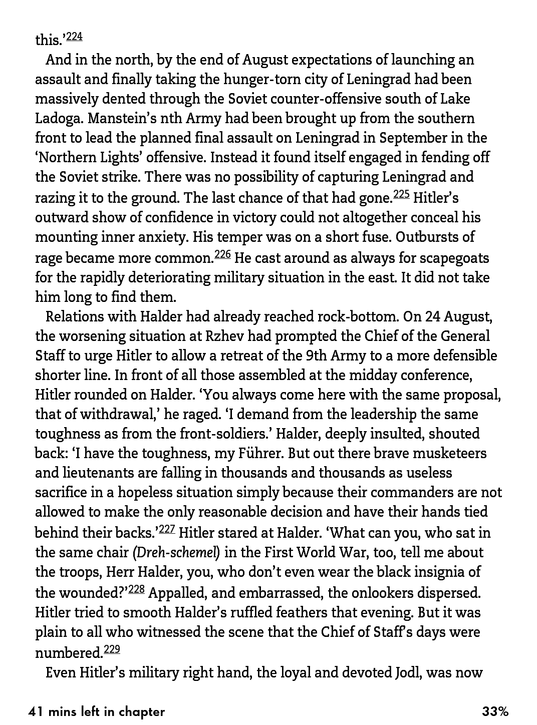
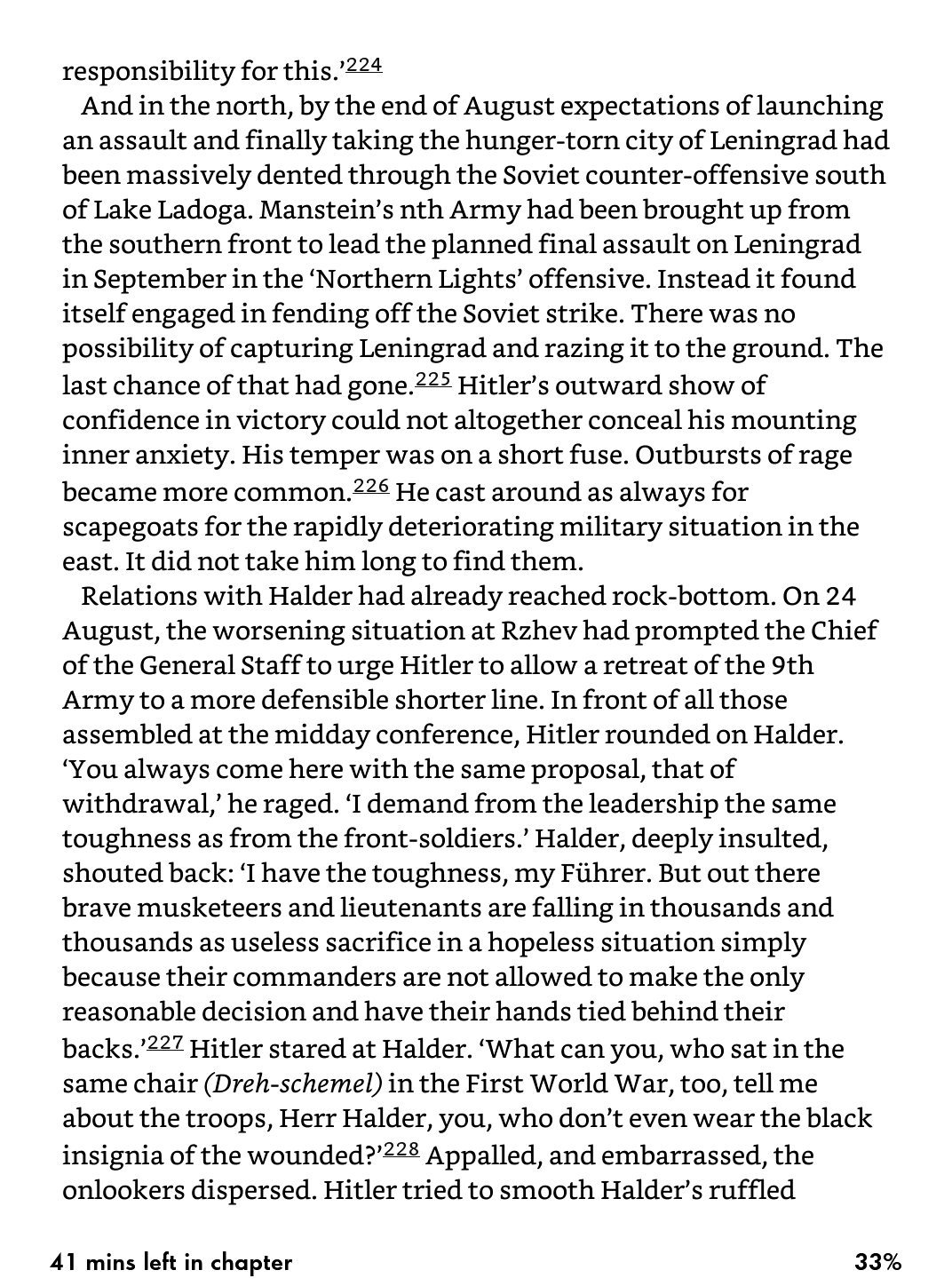
Bookerly is too thin and leads to fewer words per page than Caecilia. I'm incredibly disappointed.
|
|
|
|
|

|
| # ? May 17, 2024 23:02 |
|
I wish there was a way to add custom fonts to a non-jailbroken Kindle. I don't love any of the default options, including Bookerly, and incorporating my own custom font into each file is time-consuming and annoying.
|
|
|
|
Some of the books with 'enhanced typesetting' don't have all the good stuff it's supposed to have upon re-downloading: hyphenation, etc. Others do. That can probably be chalked up to lazy publishers, but man if it isn't bothersome. The font is fine. Chelb fucked around with this message at 23:42 on Aug 12, 2015 |
|
|
|
How does word density matter on an e-reader? Bookerly is fantastic. Caecillia looks like baby's first attempt at block-printing.
|
|
|
|
Gotta love being able to drag and drop fonts into a Kobo. FF Franziska for life
|
|
|
|
smr posted:How does word density matter on an e-reader? Bookerly is fantastic. Caecillia looks like baby's first attempt at block-printing. Some of us don't like to have 5 words on a page like we're Grandma Mindy
|
|
|
|
Is there any way to get Bookerly onto a first gen Paperwhite?
|
|
|
|
Is there a reason why some kindle version books have terrible translation into electronic form? I'm trying to read Heinleins "Stranger in a Strange Land" and it has typos galore. Im wondering if its the same in the store kindle version or the janky version I have.
|
|
|
|
Bob A Feet posted:Is there a reason why some kindle version books have terrible translation into electronic form? I'm trying to read Heinleins "Stranger in a Strange Land" and it has typos galore. Im wondering if its the same in the store kindle version or the janky version I have. If you're saying you pirated it then yeah the dude who did it probably just did a quick OCR job on it with only minor skimming for major errors. Go get a different version, it'll probably be better.
|
|
|
|
Nintendo Kid posted:Some of us don't like to have 5 words on a page like we're Grandma Mindy I use the second-smallest font size on both my Voyager and the Kindle app on my iPad Air and I think Bookerly looks significantly better on both. Both fonts provide tons of words per page at that size. Is his REALLY a problem for some people? Sheesh.
|
|
|
|
Yes, it is a big issue to many people because half the reason we got ereaders is so we could have books customized to our font/line density/margin/etc preferences.
|
|
|
|
Indeed, the hyperbole is strong with these goons..
|
|
|
|
Nintendo Kid posted:Yes, it is a big issue to many people because half the reason we got ereaders is so we could have books customized to our font/line density/margin/etc preferences. So a font that literally shows four less words out of four hundred on a "screen" than a different font that looks much more terrible otherwise is an actual issue to you? If so, you probably never should have bought a kindle in the first place then because they never promised infinite adjustability.
|
|
|
|
smr posted:So a font that literally shows four less words out of four hundred on a "screen" than a different font that looks much more terrible otherwise is an actual issue to you? It's an issue in that I'm disappointed the font looks kinda decent but I can't really use it. You'd consider it an issue if you hosed up cooking dinner wouldn't you? And it's way more than just 4 words a page on my settings.
|
|
|
|
Should this update be available in the UK yet?
|
|
|
|
Odette posted:Is there any way to get Bookerly onto a first gen Paperwhite? The new update might go to the Pw1 but there seems to be no official word either way. Currently, you can use Calibre and set the publisher / embed font as Bookerly. Google around for the font ZIP, it's not hard to find but is maybe You need the 4 font files. I've done this with the last 20-30 books I've sideloaded and it works very well; you just set your font to be the publisher font. The font itself looks a little pointless if you stare at it, but try reading with it and it feels a lot smoother, like your eyes do less work to follow the words.
|
|
|
|
Nintendo Kid posted:It's an issue in that I'm disappointed the font looks kinda decent but I can't really use it. You'd consider it an issue if you hosed up cooking dinner wouldn't you? And it's way more than just 4 words a page on my settings. I'm just not seeing the huge disparity in words-per-page at the second-smallest font setting on either Kindle App or Kindle Voyager. What settings are you using? Are you using Caecillia or Caecillia Narrow?
|
|
|
|
smr posted:I'm just not seeing the huge disparity in words-per-page at the second-smallest font setting on either Kindle App or Kindle Voyager. What settings are you using? Are you using Caecillia or Caecillia Narrow? That's nice for you, here's how it is for me:   There ends up being 2 sentences missing a page, between Bookerly and Cacellia Condensed.
|
|
|
|
This can't really be a thing people care about.
|
|
|
|
You are arguing with Fishmech. Stop engaging Fishmech.
|
|
|
|
bull3964 posted:You are arguing with Fishmech. Quit your whining. noirstronaut posted:This can't really be a thing people care about. Why would people not care what their books look like? It's one of the points of the Kindle that you can customize it 50 different ways.
|
|
|
|
Nintendo Kid posted:That's nice for you, here's how it is for me: I hope you find the 2 missing sentences soon
|
|
|
|
The two missing sentences can be found at the top of the following page.
|
|
|
|
To be fair some people do get overly excited about what Hitler did with his right hand.
|
|
|
|
Bookerly really is much easier on the eyes, so thanks for proving that. Is the font only available on mobile and Voyager (without Calibri, that is)?
|
|
|
|
Nintendo Kid posted:That's nice for you, here's how it is for me: Comparing it to a condensed font is a bit disingenuous though, as most people find reading such a font to be a strain. Your top example exceeds 70 characters per line and readability studies suggest 50-60 being of significant benefit. You may have adapted to this, but to the majority of people they will find the second much easier on the eyes. This is a definite perceptual difference to most people - I severely doubt many would perceive having to make 33 page turns to get to the chapter end instead of 31. Bookerly is a lovely font if you're not a weirdo.
|
|
|
|
If anything, Caecelia condensed is an even uglier version of an already ugly font, but the point is people should be able to use it if they want. Taking away customization options for a device that's marketed as letting you read the way you want to read is stupid.
|
|
|
|
saphron posted:Bookerly really is much easier on the eyes, so thanks for proving that. Nah. I upgraded my newest get paperwhite and it's on there.
|
|
|
|
Nintendo Kid posted:That's nice for you, here's how it is for me: My bad, you're correct, I'll go burn my Voyager right now. Aside: man, Cacellia Condensed looks like hosed rear end next to Bookerly.
|
|
|
|
bull3964 posted:You are arguing with Fishmech. Ahhhhh gently caress. This explains much.
|
|
|
|
Bookerly owns objectively.
|
|
|
|
Is the Voyage refresh expected to land later this year? My Kindle Touch from 2011 (amazing that it's lasted this long tbh) is still trucking along, and the only scratches are on the case, but I'd like something newer with a backlight. I was debating between a Paperwhite 2015 (with the updated resolution) and Voyage, but I can hold out if there's something else coming, my current eReader isn't going anywhere soon.
|
|
|
|
I honestly can't see where there's much to refresh on the voyage at this time. I don't think a higher DPI eInk screen has been released yet. I would expect the product cycle to stretch longer with this iteration. The only reaason why the Paperwhite was refreshed this year was to use the screen in the Voyage The book I'm currently reading must have fixed fonts because I can't change to Bookerly to try it out.
|
|
|
|
epub support
|
|
|
|
Dominoes posted:epub support Sure. And off-device collection management, and sideloaded fonts. Are we making a list of features that will never be added to the Kindle?
|
|
|
|
EPUB support wouldn't require a hardware refresh in the least, seeing as how AZW3 is just a modified EPUB format.
|
|
|
|
Stupid_Sexy_Flander posted:Nah. I upgraded my newest get paperwhite and it's on there. Oh snap, will have to check tonight then, thanks!
|
|
|
|
Nintendo Kid posted:EPUB support wouldn't require a hardware refresh in the least, seeing as how AZW3 is just a modified EPUB format. It _would_, however, require Amazon to be a completely different company than it has been since it was founded.
|
|
|
|
I want a higher contrast screen, I want blacks as deep as the darkest hole.
|
|
|
|

|
| # ? May 17, 2024 23:02 |
|
Khablam posted:The new update might go to the Pw1 but there seems to be no official word either way. How does one embed fonts like that?
|
|
|


