


|
Read op!
|
 #
?
Oct 31, 2015 15:37
#
?
Oct 31, 2015 15:37
|
|


|

|
| # ? May 10, 2024 06:05 |
|
|
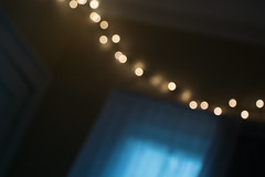
playground tough posted:I am pretty new to photography. I've always loved taking pictures and art/design but I could never justify purchasing a decent camera until I bought one before a big trip at the end of summer. I have a Nikon 1 with an adapter that I mainly use for old nikkor lenses i've gotten off ebay. So far I've really enjoyed shooting manually and what comes with it. These aren't necessarily the best shots i've taken, but i'd love any criticism. As VelociBacon said, read the OP. If you don't critique others photos, at least say something about your own. All three of these are kinda "meh" so having a jumping off point of why you liked them or what you think is good/bad about them helps. The first picture is just a picture of a cat. (Again, read the OP). You lost some detail in the cat's face, so not sure if you exposed for the cat or the background, something to watch out for. You're shooting a dark subject and he's backlit, so it's tricky and you have to control for that with exposing for the subject, fill lighting, post processing, etc. The bushes in the second picture have a neat color, which I'm guessing is what you were going for. The background is a bit cluttered and the canopy clashes with the illuminated line of the top of the bushes, and a wider aperture may have helped there. Really though, I think a different angle or perspective may have helped, because shooting them head on with a cluttered background like that just gives it a "here's a picture of some bushes" vibe. The third one I kinda like, but can't really say why. Although nothing is in focus, the light bursts are kinda sharp and give you a bit of a focal point. Ultimately there's not enough going on to hold my attention. As for myself, I whipped together a triptych after going through Lightroom when it was raining the other day. I really have no experience with putting photos together like this, but I noticed a pattern in a few of my shots since I find myself drawn towards subjects that have interesting textures. How does this work overall? Would flipping the center shot left to right make the composition flow better? Right now I feel it has a repeating curve in each shot, but flipping the center might give it a sinusoidal flow across all three pieces. 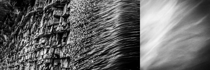 Land Sea & Air by Nate P, on Flickr
|
|
#
?
Oct 31, 2015 17:23
|
|
|
thetzar posted:
YEA i'm exceptionally down for this LogisticEarth posted:As for myself, I whipped together a triptych after going through Lightroom when it was raining the other day. I really have no experience with putting photos together like this, but I noticed a pattern in a few of my shots since I find myself drawn towards subjects that have interesting textures. How does this work overall? Would flipping the center shot left to right make the composition flow better? Right now I feel it has a repeating curve in each shot, but flipping the center might give it a sinusoidal flow across all three pieces. This is nice but I wish there was a little more structure to it as a triptych. Right now my eyes are drawn immediately to the sky photo on the right, which is probably the best part. It's nicely toned, the grain texture is amazing, and it's just the right balance between abstract and structured that I'm not bored in either direction. Mostly I wish there was a little bit more of a shape and separation to them. 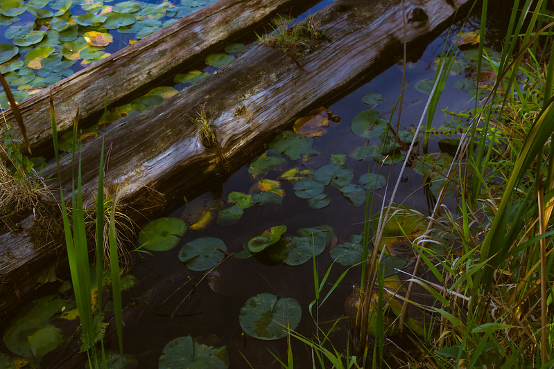 IMG_1987-2 by difficult listening, on Flickr  IMG_8261 by difficult listening, on Flickr 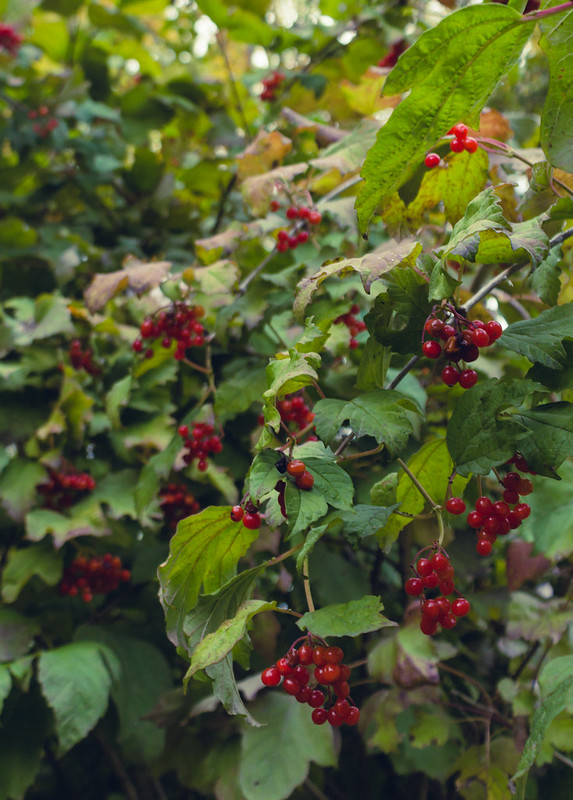 IMG_2141-2 by difficult listening, on Flickr
|
|
#
?
Oct 31, 2015 17:57
|
|


|
I kinda think that the left 2 photos work together well, and I like the clear yet not conflicting border between them. I think it would be improved if you flipped the third photo or got another sky picture with a dark left border. The sky photos also too different from the other two, they have this really cool texture going, and the lines from the ground photo continue along the water. The sky is just completely different, but I have no idea how you'd get a similar texture without getting very lucky with a funky cloud formation
|
|
#
?
Nov 1, 2015 08:26
|
|

|
LogisticEarth posted:As for myself, I whipped together a triptych after going through Lightroom when it was raining the other day. I really have no experience with putting photos together like this, but I noticed a pattern in a few of my shots since I find myself drawn towards subjects that have interesting textures. How does this work overall? Would flipping the center shot left to right make the composition flow better? Right now I feel it has a repeating curve in each shot, but flipping the center might give it a sinusoidal flow across all three pieces. I think these three shots do go together well, similar tonality and 'shape'. The only thing that bugs me is that the center shot has more selective focus, whereas the other two are more perfectly crisp (the rocks drop from focus on the very left, but I didn't notice that until I looked for it). Breaks things a little bit for me. Still a very good triptych, though. More mountains from me.  Untitled by Jason, on Flickr
|
|
#
?
Nov 1, 2015 15:28
|
|

|
thetzar posted:
God drat that's good. Love the contrast between the foreground and the mountain, which is well highlighted. The clouds focus the eye on the mountain well too. Really good stuff. Magic Hate Ball posted:
I really like the light in the first one, but it feels oversaturated in the yellows and greens. It's definitely my favorite, and the detail in the logs is nice. I dig the second too - the grain works. The third really doesn't do much for me though beyond hey those are berries. 
|
|
#
?
Nov 2, 2015 05:12
|
|

|
Soopafly posted:God drat that's good. Love the contrast between the foreground and the mountain, which is well highlighted. The clouds focus the eye on the mountain well too. Really good stuff. This may just be personal preference, but I love this shot. It suggests a number of questions, I like the colors, overall very nice work. 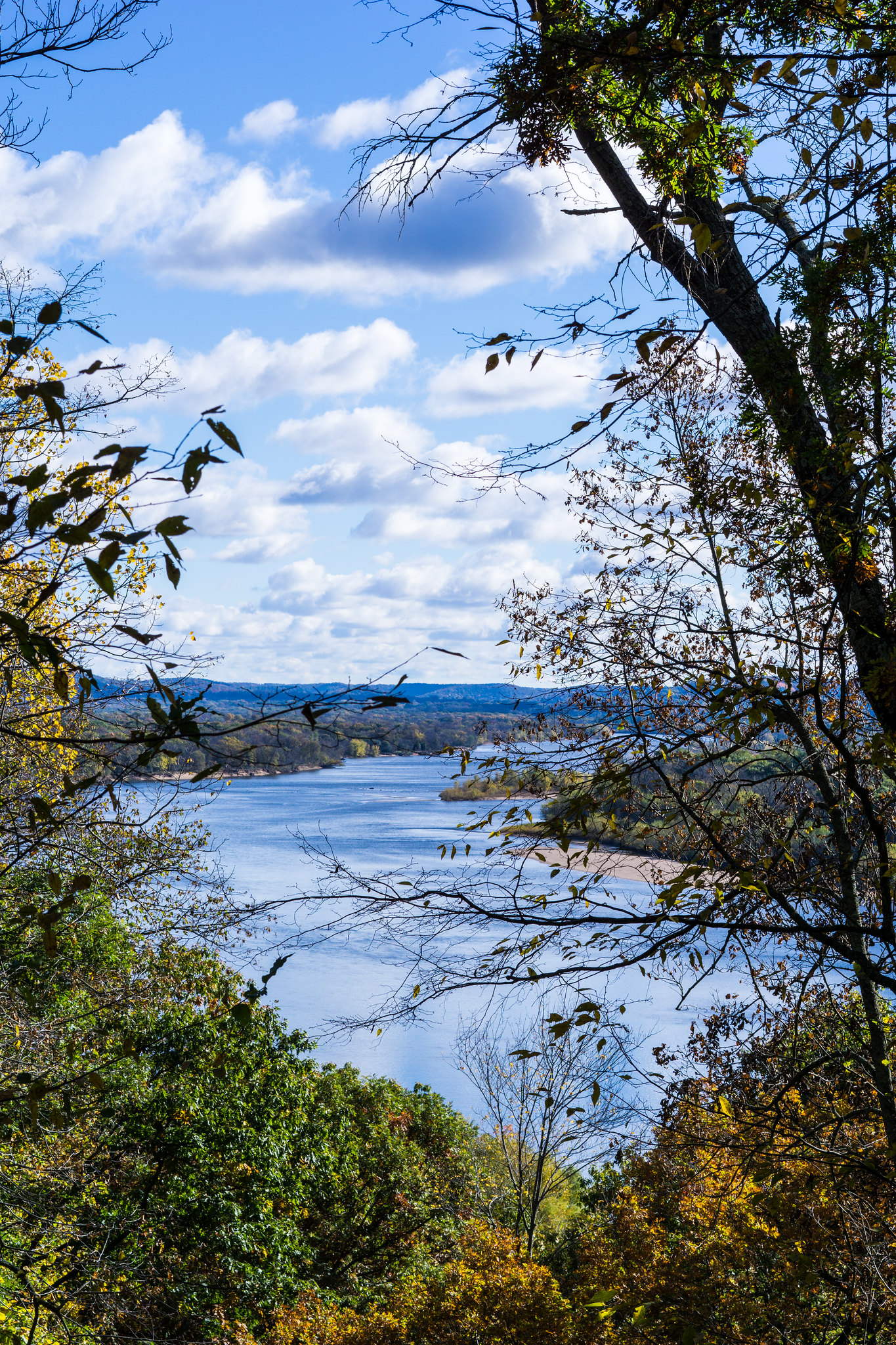 Wisconsin River by Viper_X83, on Flickr Wisconsin River by Viper_X83, on Flickr Vegas with Meghan-53 by Viper_X83, on Flickr Vegas with Meghan-53 by Viper_X83, on Flickr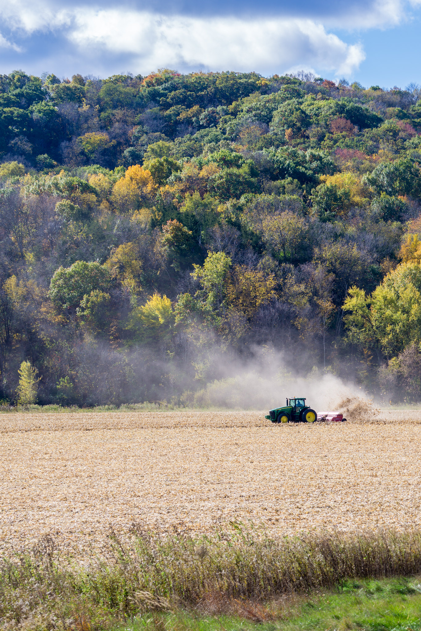 Harvest season by Viper_X83, on Flickr Harvest season by Viper_X83, on Flickr
|
|
#
?
Nov 2, 2015 05:42
|
|

|
It's really, really hard for me to come up with an explanation for why I like this picture so much. There's nothing that really stands out about it, but the overall composition just seems ... surreal I guess? It's almost a little unsettling because of the contrast of textures, every element is so disjointed and different from the next and there's no subject to define what "normal" is supposed to be. I love the striking effect it creates. JohnClark posted:
The second is by far my favorite from your three. It has much more depth than the other two. The first I think is a bit busy and I'd like a clear view of the river instead of being caught up in a dark branch. I've been trying to take my photos to the next level this month. I've started shooting in raw, every picture goes through post processing (where I had never done any before), and I'm working with flash. It's been a very difficult but exciting month.   
|
|
#
?
Nov 2, 2015 21:48
|
|
|
A Saucy Bratwurst posted:I kinda think that the left 2 photos work together well, and I like the clear yet not conflicting border between them. I think it would be improved if you flipped the third photo or got another sky picture with a dark left border. The sky photos also too different from the other two, they have this really cool texture going, and the lines from the ground photo continue along the water. The sky is just completely different, but I have no idea how you'd get a similar texture without getting very lucky with a funky cloud formation Is it cheating if I use this to post these? 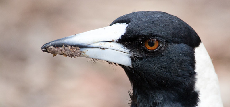 Magpie headshot by Me, on Flickr Magpie headshot by Me, on Flickr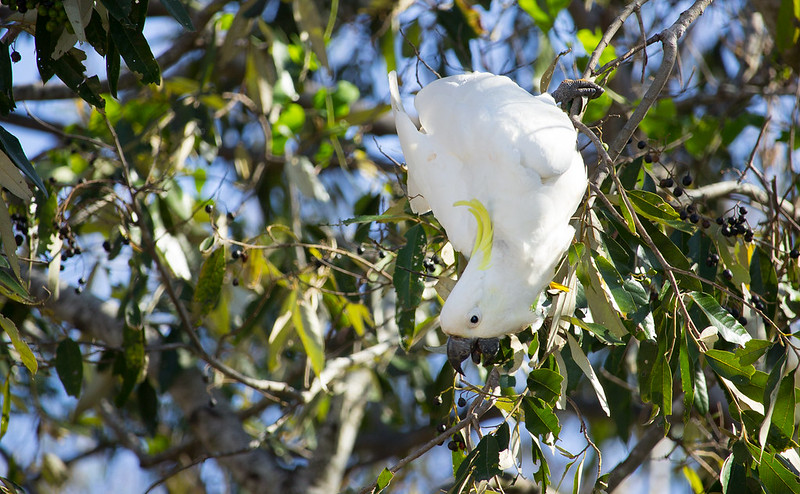 Food by Me, on Flickr Food by Me, on Flickr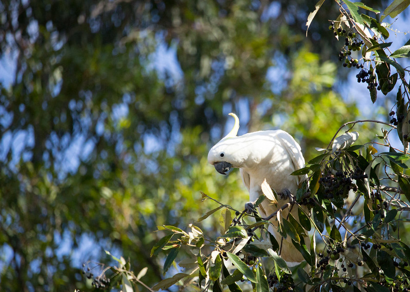 Curious by Me, on Flickr Curious by Me, on FlickrI have 2 more of those cockatoo photos that i think are better, but it's of them taking flight, and honestly I think those are more reliant on luck than these, which depend a lot more on skill. I'm pretty happy with all of these except the last one, his crest is supposed to be a bright yellow yet it's blown out to hell. Is there anyway to recover that in post (it's proper blown out, lightroom exposure all the way down is still white), or better still, something in my technique I can do differently that still gets me a good exposure of the rest of the scene? I think the magpie shot works better as a large photo, you see a lot more detail, but then you see that his beak angles out of the plane of focus, which I both like and dislike. E: I did 0 editing of the sky in that last one as well, so my exposure was short enough to keep the blue at ~3:30pm on a rebel. underage at the vape shop fucked around with this message at 16:40 on Nov 3, 2015 |
|
#
?
Nov 3, 2015 12:52
|
|
|
Judge Schnoopy posted:It's really, really hard for me to come up with an explanation for why I like this picture so much. There's nothing that really stands out about it, but the overall composition just seems ... surreal I guess? It's almost a little unsettling because of the contrast of textures, every element is so disjointed and different from the next and there's no subject to define what "normal" is supposed to be. I love the striking effect it creates. The first one feels under saturated and the last 2 (specially the 2nd) feel over saturated. I think the 2nd is the strongest as I feel the others are lacking an interesting subject. ----- 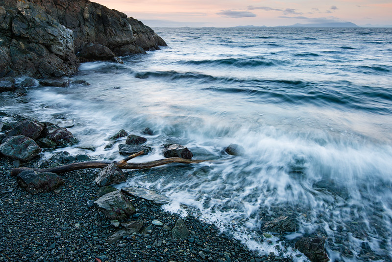 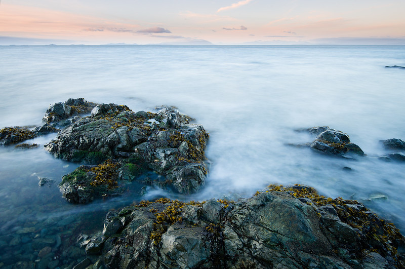
|
|
#
?
Nov 4, 2015 06:53
|
|

|
These are strictly nice, but they lack the atmosphere and direction of your other photos. The pinks in the sky are really pretty, though, I wish there was a little more of that throughout, or more detail on the water and the pebbles. What's going on on the rocks in the second photo? Let's see that sexy maritime plantlife. 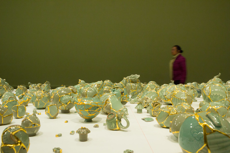 IMG_2306 by difficult listening, on Flickr 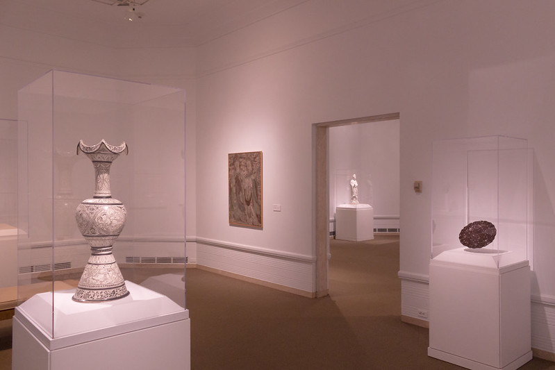 IMG_2347 by difficult listening, on Flickr 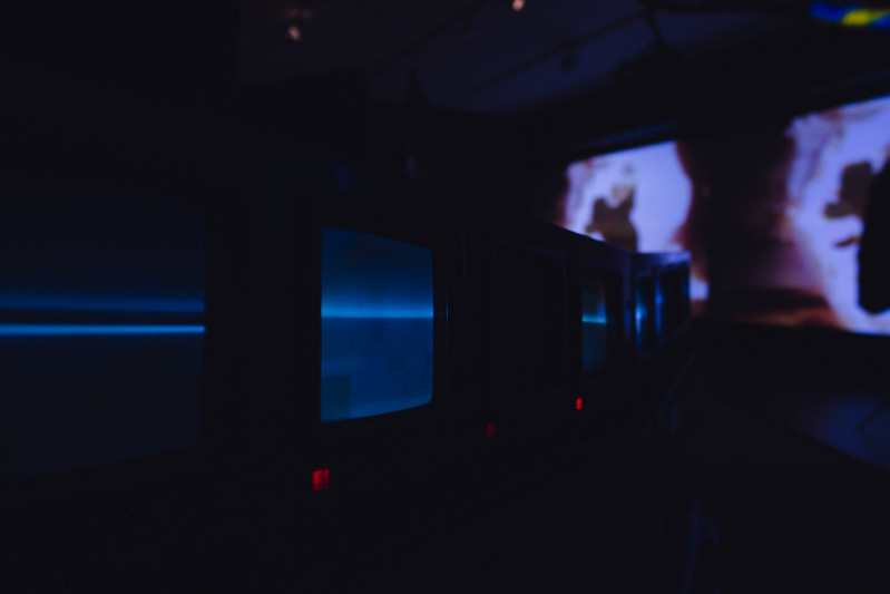 IMG_2373 by Difficult Listening, on Flickr Magic Hate Ball fucked around with this message at 09:12 on Nov 6, 2015 |
|
#
?
Nov 6, 2015 07:44
|
|
|
First time poster, beginner here. Please take everything with a grain of salt.Magic Hate Ball posted:These are strictly nice, but they lack the atmosphere and direction of your other photos. The pinks in the sky are really pretty, though, I wish there was a little more of that throughout, or more detail on the water and the pebbles. What's going on on the rocks in the second photo? Let's see that sexy maritime plantlife. I like the concept of the first photo. I think it would be better though if DOF was deeper and everything was sharp, including the person in the background. The person could be brightened / dodged, to play on the contrast of his clothes with the shards on the table. Unfortunately I don't really understand the second photo - what is supposed to be the subject here? My eyes lead me nowhere (except for the half cutoff lamp on the ceiling on the left). I think I like the third photo the most, even with the blurry splotches and the bright out of focus screen on the right that I'm sure someone would call distracting. I find the CRTs and their color lovely. Here's some of mine:   
|
|
#
?
Nov 6, 2015 14:04
|
|

|
Dread Head posted:The first one feels under saturated and the last 2 (specially the 2nd) feel over saturated. I think the 2nd is the strongest as I feel the others are lacking an interesting subject. I really enjoy the first of these, I can see the motion in the water, and the color is great. The second one gives me 'meh' feelings; the water isn't glassy enough for it to be a thing and there isn't enough atmosphere or subject to hold me otherwise. k-zed posted:Here's some of mine: I really dig the first one. I was going to ask why it was 16:9, until I noticed the perfect diagonal. Neat. The second shot makes me wonder what hack architect didn't have the glass banister center with the glass wall supports. As the balcony actually curved out a little? Got nothing to say about the last one. It's just... fine. For myself, more shots from my trip:  Sk�gafoss by Jason, on Flickr  Untitled by Jason, on Flickr  Untitled by Jason, on Flickr
|
|
#
?
Nov 7, 2015 18:13
|
|
|
thetzar posted:
My first impression from this one is that you did a selective saturation on the cabin, but it's actually just the photo has so little color in it. Have you tried playing with it in black and white? Maybe working the levels and contrast could preserve the cabin as the focal point.
|
|
#
?
Nov 7, 2015 18:25
|
|

|
k-zed posted:First time poster, beginner here. Please take everything with a grain of salt. Really dig this one. It might use some more contrast...but maybe not. I also can't really tell if it would be "better" without the prominent cloud in the lower left, or not (i.e. the shot as is but have a uniform cirrus-cloud look). Not that you can really change that, I'm just trying to think through about what I like about the image. And one for me: 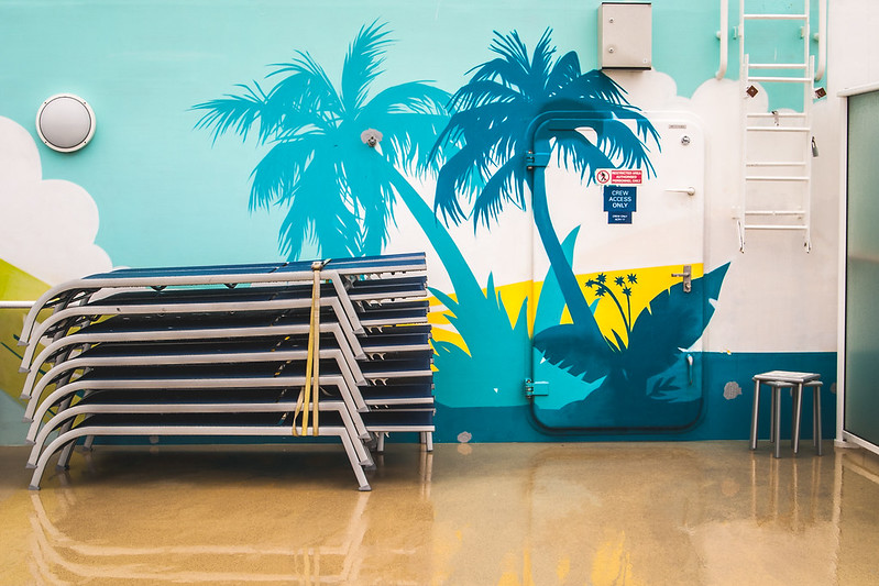 Wonderful View by Nate P, on Flickr Last week I was out on a cruise with family, and kept noticing all these little tropical "murals" they had painted over the walls around the ship's infrastructure to obscure. I liked the kind of "cruise-ship banality" they embodied so I played around with shooting a couple of the areas. I really liked the idea of this shot when I took it, but ultimately I think I failed. I liked the sort of stage-like setting, but ultimately I think I'm lacking a strong subject here. What I REALLY wanted to get was a nice pot-bellied sunbather in the lower left, instead of the stacked deck chairs. Unfortunately that opportunity really never presented itself, and I didn't feel like harassing people on vacation to go out of their way to be the grotesque centerpiece to my boring photo. 
|
|
#
?
Nov 11, 2015 15:56
|
|
|
Get rid of that bit of privacy glass on the right side and I'd like it a lot more. I think you had the right idea and the scene is fine, it's just one of those things where the execution of the details matters. It's almost like those deadpan photos that are super popular in the landscape thread these days, but not quite.
|
|
#
?
Nov 11, 2015 16:02
|
|

|
xzzy posted:Get rid of that bit of privacy glass on the right side and I'd like it a lot more. I will say that after I had taken the first few shots of that, it did occur to me that I was aping something from the landscape thread here, ha. I might try a different aspect ratio and get rid of the glass on the side. I tried a few different compositions, but there was clutter to either side and up and down so that was the best I could do with the native ratio. Anyway, I committed a sin yesterday and experimented with dutch angle:  Crayola Experience by Nate Pritchard, on Flickr I'm not ecstatic with the way this turned out, but I think it worked. I'm wondering if the best angle to shoot this from would be about 10 feet closer and with a wider angle lens. Couldn't experiment with that as 1) stepping forward would put me into a busy street, and 2) I don't have a wider angle lens. I'm also worried the yellow is overdone. I kicked up the vibrance, but not saturation. Obviously color is key to the subject so I wanted the colors to pop and not be too dull.
|
|
#
?
Nov 14, 2015 13:21
|
|
|
LogisticEarth posted:Anyway, I committed a sin yesterday and experimented with dutch angle: The colors are fine, and the dutch angle isn't a sin, but you're taking an inert, okay photo of an inert, commercial subject that's having the same effect on me as if I were to see it in real life, which is almost none. In a way that's an achievement (you could put this photo in a brochure about the Crayola factory, probably), but as a photograph it's not grabbing me. The only thing I can think to have done might have been zoom in, if possible, on the falling crayons and abstract them as straight figures against the clouds. 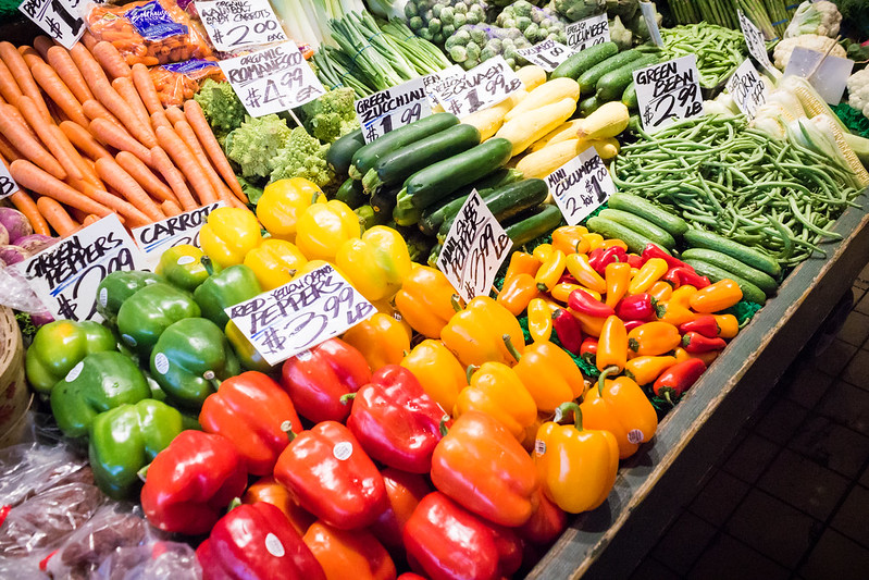 IMG_2441 by difficult listening, on Flickr 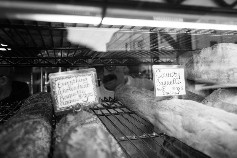 IMG_2389 by difficult listening, on Flickr 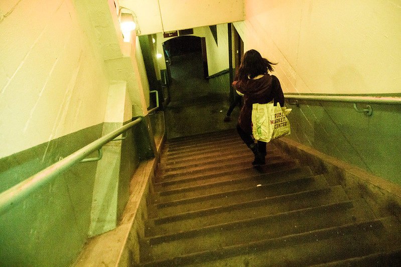 IMG_2451-2 by difficult listening, on Flickr
|
|
#
?
Nov 14, 2015 18:17
|
|
|
Magic Hate Ball posted:
I like the texture here and even the "shot through glass" look with the reflection. It gives it a very genuine look as if I'm standing there seeing the same thing. That said, the text on the left being slightly out of focus drives me nuts. My mind wants to read it like the text on the right. I have to really focus on it to read those words, and it distracts from everything else that's great. Same thing with the vegetables picture above it. There's text all over but only half of it is easily legible, so the other half is a distraction. I know there's a whole lot less you could do there with the signs facing different directions and catching various amounts of light. This is one that I've been looking at for a while but I can't decide if what I've done is any better than the original. I have a hard time deciding when to stop in post production. 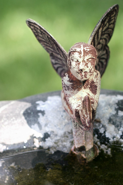 Fairy by the Water Fairy by the Water
|
|
#
?
Nov 16, 2015 18:15
|
|
|
its no big deal posted:My first impression from this one is that you did a selective saturation on the cabin, but it's actually just the photo has so little color in it. Have you tried playing with it in black and white? Maybe working the levels and contrast could preserve the cabin as the focal point. I hadn't looked at it, but thanks for the tip, might do more on that. Magic Hate Ball posted:
The first shot is vegetables. I have nothing to say past that. The second shot is interesting; I actually had to look at it three times (the third wasn't until Schnoopy quoted it) before I realized there was a dude in the background � I wish there was more of him, or less of him. Could be a cool, creepy presence to change the mood of the photo, keeping it from just being about bread. The last show is close to being unnerving, but isn't quite there yet. Maybe if it was wider, or higher, stretching the stairs out? Maybe if the light was dimmer... it's just missing something. Myself, I'm still spamming up the landscape threat with vacation photos.  Untitled by Jason, on Flickr  Glaciers wait for no man by Jason, on Flickr  The Witch's Tower by Jason, on Flickr
|
|
#
?
Nov 16, 2015 21:01
|
|
|
thetzar posted:The second shot is interesting; I actually had to look at it three times (the third wasn't until Schnoopy quoted it) before I realized there was a dude in the background � I wish there was more of him, or less of him. Could be a cool, creepy presence to change the mood of the photo, keeping it from just being about bread. I've actually got two other photos of him, but I'm not sure what I think of them, so here they are:  IMG_2445 by difficult listening/url], on Flickr [url=https://flic.kr/p/zR8DgL] 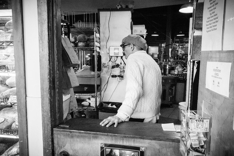 IMG_2446 by difficult listening, on Flickr thetzar posted:Myself, I'm still spamming up the landscape threat with vacation photos. I think I like this one the most here, it looks like a shot from Interstellar (go figure). I wish the clouds were just a little softer, more marshmallowy, but sunsets aren't totally forgiving. Still, the sense of isolation is terrific - this is a poster photo.
|
|
#
?
Nov 17, 2015 01:15
|
|
|
Magic Hate Ball posted:I've actually got two other photos of him, but I'm not sure what I think of them, so here they are: I prefer the second one, it's better framed and makes you think "what he lookin' at?" whereas the first one seems just like a snapshot you took while he was walking by. Which it probably is? I'm a bit stuck on this one. I like the original perspective (left) looking up at the tree, then I ran it through the Lightroom auto-align so it looks a bit more "correct" but I'm not sure what I prefer, or how much to boost the red capes on the girls. Or maybe I could go easier on the processing? Help!!  
|
|
#
?
Nov 17, 2015 09:50
|
|


|
Magic Hate Ball posted:The colors are fine, and the dutch angle isn't a sin, but you're taking an inert, okay photo of an inert, commercial subject that's having the same effect on me as if I were to see it in real life, which is almost none. In a way that's an achievement (you could put this photo in a brochure about the Crayola factory, probably), but as a photograph it's not grabbing me. The only thing I can think to have done might have been zoom in, if possible, on the falling crayons and abstract them as straight figures against the clouds. Yeah, the shot was more of a study shot rather than an attempt at making anything soul-moving, so I'll take brochure-quality as a success. I live in the same town as the factory so I walk past this pretty often and can easily play around with it more. Bummer is that I don't have a telephoto lens and my camera is only 6mp so cropping from wider shots drops the quality, very quickly. Cacator posted:I'm a bit stuck on this one. I like the original perspective (left) looking up at the tree, then I ran it through the Lightroom auto-align so it looks a bit more "correct" but I'm not sure what I prefer, or how much to boost the red capes on the girls. Or maybe I could go easier on the processing? Help!! I think the corrected perspective works, as you didn't overdo it too much. The tree seems a bit more "grand", and luckily the people are all at the bottom of the image so they're not getting distorted. The one thing that you do lose is the near edge of the shuttered shop on the lower left, which partially decreases the strength of the leading lines it creates, but that's pretty minor. Color-wise, it's definitely on the stylized side of things, I definitely wouldn't take it further. It also looks like you've got the clarity kicked up pretty good, maybe try backing off on that, bring up the shadows, and see how it looks.
|
|
#
?
Nov 17, 2015 12:57
|
|
|
Judge Schnoopy posted:This is one that I've been looking at for a while but I can't decide if what I've done is any better than the original. I have a hard time deciding when to stop in post production. what would there even be to say about this photo? it's a context-less detail photo that presents the subject in a very straightforward way Cacator posted:I prefer the second one, it's better framed and makes you think "what he lookin' at?" whereas the first one seems just like a snapshot you took while he was walking by. Which it probably is? the one with the corrected perspective is good
|
|
#
?
Nov 17, 2015 13:53
|
|

|
Magic Hate Ball posted:I've actually got two other photos of him, but I'm not sure what I think of them, so here they are: I personally enjoy the first one a little more because he looks completely disinterested in you standing there with your camera. I personally would have liked to see what these look like with a little color because the white in his sweater almost bleeds away into the background in the first and second picture. Here are two still life photos I took the other night that I wanted a bit of feedback on: 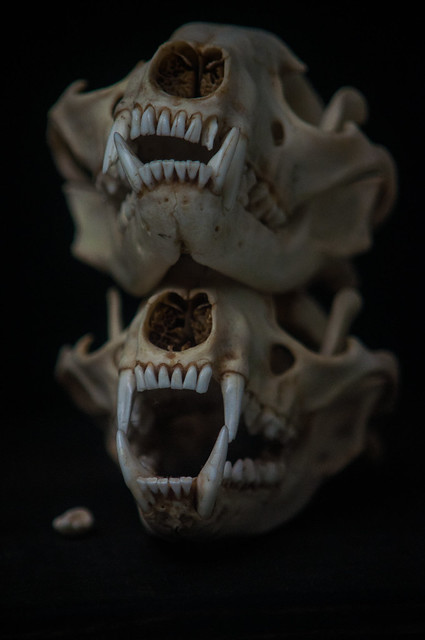 Skull on Skull 2 by Matt Blackmon, on Flickr 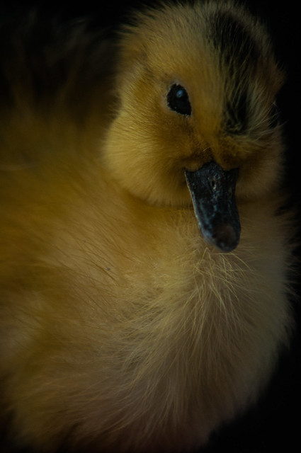 Duckling Dead Eye by Matt Blackmon, on Flickr
|
|
#
?
Nov 18, 2015 17:43
|
|

|
Cacator posted:I prefer the second one, it's better framed and makes you think "what he lookin' at?" whereas the first one seems just like a snapshot you took while he was walking by. Which it probably is? I think the color is fine where it is; I certainly wouldn't boost it any more. The perspective throws me back and forth, but I think I like the more-corrected one better, as the tree takes a bit more prominence. Nice shot. I think this'll be my last shot here from Iceland.  The Local by Jason, on Flickr
|
|
#
?
Nov 18, 2015 17:43
|
|
|
drat, that duckling is out for some blood. Gonna stab a fucker.
|
|
#
?
Nov 18, 2015 18:25
|
|
|
Struggled with a bunch of sunset shots yesterday, I know the sun and reflection are blown out, but not sure if it generally works despite that. I haven't done any HDR composites, and my tripod was too bulky to haul up the mountain so I didn't bother to bring it and take multiple exposures stable enough to be stitched together. Cairns at Sunset by Nate Pritchard, on Flickr
|
|
#
?
Nov 18, 2015 23:20
|
|
|
As an avid lovely sunset photographer, you should make the effort to bring your tripod, shoot before and after, and try to look around in all directions - don't always shoot into the sun. If you are going to shoot the sun, it should be blown out imo.
|
|
#
?
Nov 19, 2015 01:08
|
|
|
Minkee posted:Here are two still life photos I took the other night that I wanted a bit of feedback on: the darkness
|
|
#
?
Nov 19, 2015 19:55
|
|
|
Magic Hate Ball posted:
I really like this shot. For me, what's important about the photograph is the subject, this fellow. And what's important about him is how he has chosen to appear to us. His face just oozes character, and then you have his dress which just adds more layers. By getting a shot where we can appreciate both, but without being a straight on "portrait shot" I think is fantastic. This is the kind of shot I would point to when talking about taking "character portraits" outside the context of close up shots on faces.
|
|
#
?
Nov 19, 2015 21:08
|
|
|
Add me to the list of "kids who just bought a camera and think they're a photographer."Magic Hate Ball posted:
They're both really good, but I prefer the first. The outfit is a significant part of what gives this guy so much character in my eyes and you get a better look at it in the first shot. With this one I just thought the lamppost had a lot of character. There's an ugly vomit looking green on the wall in the bottom right that's kind of distracting.  DSC_0177 by Michael Broadway, on Flickr The brick seemed to be positioned in a deliberate fashion, which I thought was interesting. In hindsight maybe it actually was positioned like that on purpose by someone else coming by to take photos or something which kind of kills the charm I guess. Maybe a shallower DOF would have been good for this, there's really no reason for any of the stuff in the background to be that visible.  DSC_0128 by Michael Broadway, on Flickr The chair reminded me of the outdoor furniture we had at our beach house when I was a kid and I thought it was interesting to see it in this sort of environment. I don't really think I did a great job of capturing the spirit, but I kind of like the creamy white of the walls in the foreground so that's something I guess. 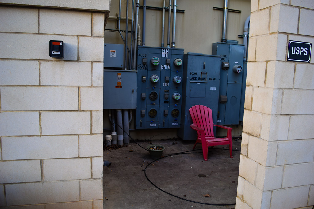 DSC_0094 by Michael Broadway, on Flickr
|
|
#
?
Nov 23, 2015 19:58
|
|

|
Carmant posted:Add me to the list of "kids who just bought a camera and think they're a photographer." The first two are pretty uninteresting, sorry. The subjects just don't do anything for me. The third is definitely the strongest. I like the juxtaposition of the bright pink chair that looks nice to relax in with the muted colours of the drab and not-so-relaxing surroundings. The ashtray helps the photo tell more of a story too, that the chair is where some janitor or someone comes and sits on their break for a ciggy. The shadow in the bottom-left corner is really distracting though, along with whatever that bit of black in the bottom-right is.
|
|
#
?
Nov 24, 2015 03:43
|
|


|
Carmant posted:With this one I just thought the lamppost had a lot of character. There's an ugly vomit looking green on the wall in the bottom right that's kind of distracting. I could kinda see where you were going with the lampost in the first one, but it's just not hitting right. It looks like you kinda tried to force rule-of-thirds where it didn't quite work. The trees muddle up the shot, and overall it seems too dark without the benefit of being moody. A different angle, different time of day, and/or longer exposure under darker conditions might have helped. The third photo with the pink chair has a really neat subject, good job picking out that scene. I think it could be improved by positioning yourself a bit better, so as to get less of the brick walls and more of what's inside the room. Again, it feels like you forced rule-of-thirds with the walls and it threw off your composition. Also, work on getting your vertical straight. And three for me, since the thread has been a bit slow. Took a walk today and experimented with shooting a few bridges. 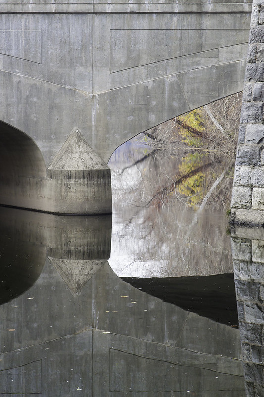 Lehigh Reflection 1 by Nate Pritchard, on Flickr 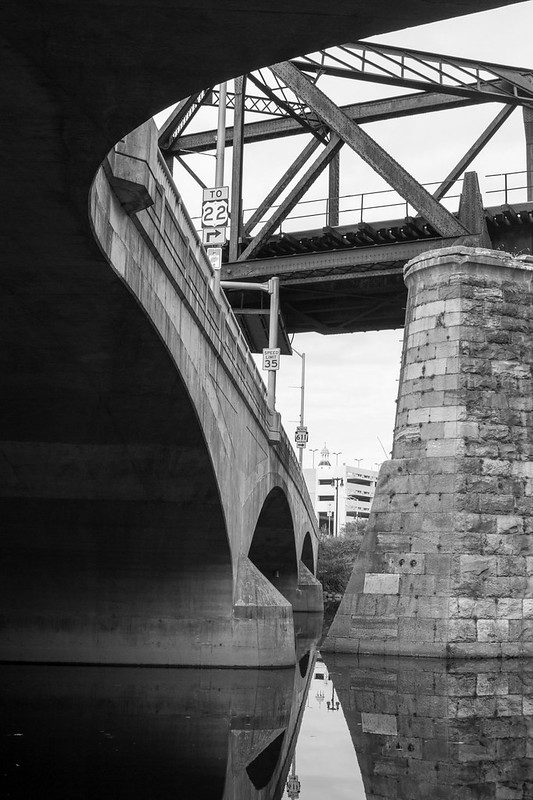 Lehigh Reflection 2 by Nate Pritchard, on Flickr 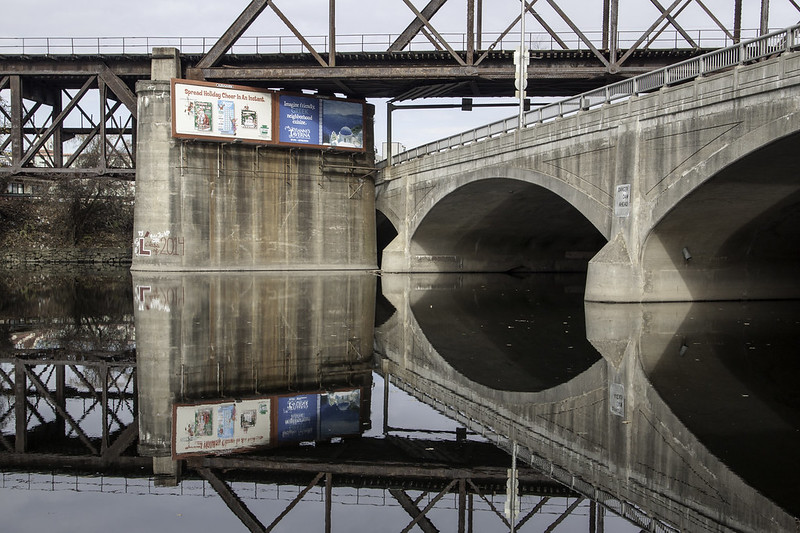 Lehigh Reflection 3 by Nate Pritchard, on Flickr Generally, I liked the way the bridges seemed to give me the feeling of hanging/floating structures. The second shot is more about the way the sweeping arch frames the rail bridge beyond, with the reflection just giving it a bit more interest in the bottom.
|
|
#
?
Nov 24, 2015 22:15
|
|
|
LogisticEarth posted:And three for me, since the thread has been a bit slow. Took a walk today and experimented with shooting a few bridges. In my opinion, whenever a reflection picture makes me want to turn my head upside down its a winner, and the first and third nailed that for me. I really like the second image, but for some reason my gut is really wanting to see some color in it, even though I'm guessing it was overcast so there wasn't much to be gained anyway. Here are a few from about a year ago that I have been holding on to because I've never fancied myself a photographer. I don't exactly have any formal training, but for some reason these all jump out at me. An explanation of what's good and bad in each would be greatly appreciated.   
Kwilty fucked around with this message at 01:48 on Nov 25, 2015 |
|
#
?
Nov 25, 2015 01:44
|
|

|
Kwilty posted:Here are a few from about a year ago that I have been holding on to because I've never fancied myself a photographer. I don't exactly have any formal training, but for some reason these all jump out at me. An explanation of what's good and bad in each would be greatly appreciated. Well, since nobody else jumped on these and it's been over a week (where'd everyone go?) I'll chime in. The first one, of the kid, looks a little dark, but otherwise is technically good. However, overall it's not doing much for me, and I'm assuming it might have more impact if there was some personal connection. His hair's messed up, snot on his nose, and skin looks a little blotchy, all of which could work if there were some larger context to the photo. But as a stand-alone image, it's just a messy kid staring at the camera. The second one has some potential in the lanterns there, but the background is really busy and off-center. It looks like you rule-o-thirded the building in the back, but the lanterns are really the subject here so that weakens it a bit. I would have tried to capture maybe fewer lanterns against a more simple (or blurred, if possible) background. Like that clear blue sky maybe, I'm drawn most to the the uppermost lantern (the one unfortunately clipped off, because it doesn't have the background cluttering it up. The third is by far the strongest, with a lot of character and questions around it. Cheap beer, funny line in an interesting script on the can, good blurred background. I'm betting this wasn't posed and just a snapshot on the table, however the Diet Coke can kinda waters the image down a bit. If you were posing a shot like this, might want to move such a recognizable and common logo out of the background and replace it with something else, or leave it vacant.
|
|
#
?
Dec 6, 2015 00:18
|
|
|
Going to put myself up on the chopping block here. I feel like I'm just a bit off on my focus (manual mode). ISO 2000 1/350 F5.6 16-50mm  ISO 2500 1/125 F/6.7 16-50mm Things I found bothersome very quickly was I almost always had a light pointed at me, just beside their head. And the shadow from the mic putting a nice black strip down their chin.
|
|
#
?
Dec 6, 2015 22:01
|
|
|
LogisticEarth posted:the kid, looks a little dark, You loving racist.
|
|
#
?
Dec 8, 2015 16:01
|
|
|
Your WB might be off here. I'm only saying that because when I take pictures in mah house, I get the same warm orangey tone until I fiddle with the WB a bit. LogisticEarth posted:
The first one is my favourite out of the three, and I think you posted a couple more in the landscape thread which I liked as well. I enjoy the lines and arches in these two, and it's noticeable that you've given thought to where they're placed in the frame. I think i like the first one more because of the forested bank and how you can see more of it (particularly the hint of red) in the water than land. Great use of reflections there, IMO.  DSCF0302.jpg by badmountain, on Flickr DSCF0302.jpg by badmountain, on FlickrThis is darker than it was in LR, ugh. I dislike the lighter tone of the mist against the foreground in the bottom right, I want to brush it away. I find I'm pretty liberal with my post-processing, feel a little guilty sometimes and I probably push it too far sometimes. Thoughts? edit: way darker, jesus.
|
|
#
?
Dec 14, 2015 18:41
|
|
|

|
| # ? May 10, 2024 06:05 |
|
|
Skizzzer posted:Your WB might be off here. I'm only saying that because when I take pictures in mah house, I get the same warm orangey tone until I fiddle with the WB a bit. Yeah, i played around with it and much preferred it lightened up. The bottom left doesn't bother me, but i would dodge everything else a little - don't worry about being "too liberal" with processing. I sometimes do "too dark" stuff so i wanted to do do something lighter. Is it lighter or just plain boring? 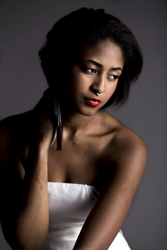 Ares by Kyle Sonnenberg, on Flickr Ares by Kyle Sonnenberg, on Flickr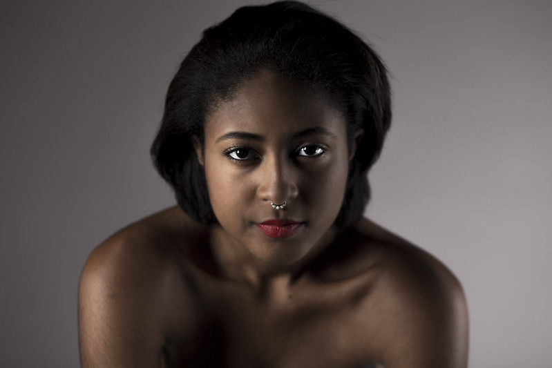 Ares by Kyle Sonnenberg, on Flickr Ares by Kyle Sonnenberg, on Flickr ares bw jpg by Kyle Sonnenberg, on Flickr ares bw jpg by Kyle Sonnenberg, on Flickr
Erostratus fucked around with this message at 21:58 on Dec 14, 2015 |
|
#
?
Dec 14, 2015 21:43
|
|