|
rotinaj posted:I don't know what your problem is with the Hulk's color pattern, but I'm going to have to ask you politely, but firmly, to leave. The problem was he was supposed to be gray but printing technology at the time was unable to reproduce a consistent color so Stan Lee just said "gently caress it, make him green".
|
 #
?
Oct 20, 2015 14:33
#
?
Oct 20, 2015 14:33
|
|


|

|
| # ? May 31, 2024 06:00 |
|
|
Ghostlight posted:You can see it fairly commonly, but the primary thing is that it's only kind of half true. There is a cute little digression about this in Matt Fraction's FF. One child was explaining the whole, good guys are blue and red and bad guys are green and purple, to another child while using classic Marvel heroes and villains to make his point. This is all accompanied by gorgeous Allred artwork, I wish I could find it and post it here but 
|
|
#
?
Oct 20, 2015 16:01
|
|

|
Wasn't Dragon Man sitting in on that conversation as well? (A big purple ex-villian.) FF was so good.
|
|
#
?
Oct 20, 2015 16:52
|
|

|
There's also a dude litterly called Purple Man created sometime in the 60s?
|
|
#
?
Oct 20, 2015 16:57
|
|


|
Norns posted:There's also a dude litterly called Purple Man created sometime in the 60s? Coming to a Netflix station near you really soon!
|
|
#
?
Oct 20, 2015 17:26
|
|

|
Reset Smith posted:There is a cute little digression about this in Matt Fraction's FF. One child was explaining the whole, good guys are blue and red and bad guys are green and purple, to another child while using classic Marvel heroes and villains to make his point. This is all accompanied by gorgeous Allred artwork, I wish I could find it and post it here but I totally forgot about that bit, it's great.   Dragon Man isn't in that scene but it does then cut to him and She-Hulk helping out with other things, which is a fun counterpoint.
|
|
#
?
Oct 25, 2015 03:59
|
|


|
I'm pretty sure that bit was just an excuse to get Mike Allred to draw a bunch of classic Marvel character. And that's totally okay.
|
|
#
?
Oct 25, 2015 22:51
|
|


|
I like that Kang is just chilling on his invisible energy bean bag chair with his techno vape.
|
|
#
?
Nov 2, 2015 23:44
|
|
|
Chance II posted:I like that Kang is just chilling on his invisible energy bean bag chair with his techno vape. On that note, I adore Kang's classic Kirby design. Big roomy poncho, flying chaise-lounge, the puffiest sleeves on earth-- and then extraordinarily uncomfortable-looking glamour boots and that bizarre head/chest-piece that makes it look like he can't nod or turn his head. It's such an off-putting and discordant look that really jibes with the oddness of his core concept-- yeah, he's here to conquer, and he's history's mightiest warrior or whatever, but having him constantly jaunt back to the 20th century gives him this incredible sense of being some sort of leisure-loving evil time-tourist. He has such a lush, decadent look compared to other big Kirby bad-guys (although Darkseid's mod miniskirt and go-go boots get close). And his first appearance nails this-- he's so casual in his initial fight with the Avengers, and his explicit motivation is ennui. Unfortunately, three months later he's fuming and obsessing and building Spider-Man robots, so the tonal inconsistency is sort of built in from the start. I love him. I'm always astonished that nobody has pushed that kind of camp/glam angle with him a la Gillen's Mr. Sinister. How Wonderful! fucked around with this message at 00:45 on Nov 4, 2015 |
|
#
?
Nov 4, 2015 00:37
|
|

|
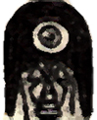
Martian Manhunter's new look in this week's issue.
|
|
#
?
Nov 19, 2015 22:36
|
|

|
Hmm I thought Deodato was drawing for Marvel right now. Who is that though, Allison Borges? zoux fucked around with this message at 22:50 on Nov 19, 2015 |
|
#
?
Nov 19, 2015 22:40
|
|

|
That looks really goofy and bad.
|
|
|
#
?
Nov 19, 2015 23:15
|
|


|
My true form is Piccolo with inconsistent cheekbones.
|
|
#
?
Nov 19, 2015 23:22
|
|


|
It wont last. MM is one of those chracters whose only going to appeal to long time readers (who id say prefer the beetle brow look). Shoulda just kept him in the Post Infinite Crisis costume as the Young Justice cartoon so wisely did.
|
|
#
?
Nov 19, 2015 23:37
|
|

|
Knives Amilli posted:It wont last. MM is one of those chracters whose only going to appeal to long time readers (who id say prefer the beetle brow look). His Superhero form hasn't even been in the series for most of this run. His Martian look 'till now has been a deformed elephant man with a paper bag over his head. It's a really interesting comic. e: Martian Manhunter is also an old man in a domino mask with a blanket for a cape in this thing. Teenage Fansub fucked around with this message at 23:55 on Nov 19, 2015 |
|
#
?
Nov 19, 2015 23:49
|
|
|
Extremis Armor is personally my favorite of all time. Its the best designed armor as far as conveying ARMOR with modern streamlining. It was such a well designed armor that it was the most Iconic Iron Man armor before the movie design took off (ive always felt that the movie armor took cues from Extremis since Adi Granov helped design both)..As far as comic armors, id place it as #3 behind model 4 and the Modular Armor as definitive Iron Man Armors.  Second favorite armor? War Machine armor. Inspired by such a simple concept ("iron man with a shitton of mounted guns") it remains to me one of the more enduring designs in all of comics because of its simple practicality. While the design has changed from the original iteration, most of the changes have been mostly cosmetic at best. The central design of "typical iron man suit, gray with two shoulder mounted guns" has mostly been the common denominator.  Genis-Vell. Never had a bad costume. His OG Captain Marvel duds have always been my favorite for taking the classic costume (one of the best Super Hero costumes ever imo) and throwing a starfield on it to really emphasize the Cosmic aspect.  Speaking of Marvells kids, Phyla Vells Quasar costume was so underrated. I remember reading Alex Ross's notes for Earth X and he made a comment saying that his Earth X Cosmic Marvel characters would have a almost royal design. That always stuck with me and the "space joan of arc" thing she had going on really sold a "royal warrior" look. 
|
|
#
?
Nov 20, 2015 00:13
|
|
|
Knives Amilli posted:Genis-Vell. Never had a bad costume. His OG Captain Marvel duds have always been my favorite for taking the classic costume (one of the best Super Hero costumes ever imo) and throwing a starfield on it to really emphasize the Cosmic aspect. What about his Legacy costume? 
|
|
#
?
Nov 20, 2015 00:58
|
|


|
Lightning Lord posted:What about his Legacy costume? we dont talk about that time 
|
|
#
?
Nov 20, 2015 01:53
|
|
|
Speaking of iron man armors, does anyone else find the film suits somehow really feminine looking (in a way that is probably not intentional)? I don't know if it's the wide hip area (which, yes, might be necessary in real metal armor, human bodies move in all kinds of odd ways!), the weak chest, or the very narrow looking arms, but the whole thing just looks less than traditionally "strong" or masculine in terms of silhouette or proportion. There's no intimidation factor to me. I could be totally off the mark though.
|
|
#
?
Nov 20, 2015 04:38
|
|
|
Toadstrieb posted:Speaking of iron man armors, does anyone else find the film suits somehow really feminine looking (in a way that is probably not intentional)? Not so much feminine but I do agree about the lack of intimidation. It has a lot more of a rounded feel (which as you stated Is probably to accommodate for an actual human).
|
|
#
?
Nov 20, 2015 04:45
|
|
|
Toadstrieb posted:Speaking of iron man armors, does anyone else find the film suits somehow really feminine looking (in a way that is probably not intentional)? Naw, I'm getting that vibe off that pic, too. I'm getting it from the leg length. From both my poorly remembered art classes and anecdata, women have a much longer leg to torso ratio than guys. Eg., I have to put our car's driver seat back two notches after my bf's driven it because my legs are much longer, even though we're both 5'8". That suit seems really high-waist-ed, which gives it a womanly figure. And yeah, those arms look skinny under the shoulder armor, giving him a poofy princess look. Edit: and upon further consideration, the coloring isn't helping. Going from the bottom up, the red boots to gold accents to silver thighs really kinda make me think of my old clubbing wardrobe of wearing knee high boots and thigh high stockings with some itty-bitty booty shorts/skirt. So yeah, now I can't unsee 90's Goth Girl Iron Man. JacquelineDempsey fucked around with this message at 05:03 on Nov 20, 2015 |
|
#
?
Nov 20, 2015 04:55
|
|


|
Knives Amilli posted:Extremis Armor is personally my favorite of all time. Its the best designed armor as far as conveying ARMOR with modern streamlining. It was such a well designed armor that it was the most Iconic Iron Man armor before the movie design took off (ive always felt that the movie armor took cues from Extremis since Adi Granov helped design both)..As far as comic armors, id place it as #3 behind model 4 and the Modular Armor as definitive Iron Man Armors.   (i don't know if that's from an actual thing or what)
|
|
#
?
Nov 20, 2015 06:01
|
|


|
JacquelineDempsey posted:Naw, I'm getting that vibe off that pic, too. I'm getting it from the leg length. From both my poorly remembered art classes and anecdata, women have a much longer leg to torso ratio than guys. Eg., I have to put our car's driver seat back two notches after my bf's driven it because my legs are much longer, even though we're both 5'8". That suit seems really high-waist-ed, which gives it a womanly figure. All of this, yes. I think Robert downy Jr. has a bit of an hourglass figure, too (may just be skinny-fat) and he does atleast from time to time have to fit into these suits for the films. Maybe that's an odd thing to notice, but as a somewhat high wasted man myself I'm like Jesus dude if you can hide that poo poo with your billion dollar walking tank uniform, do it, lol. Edit: This got me thinking that all of the movie costumes, atleast for the avengers films, kind of suck. Thor's in particular really gets to me:  What a hot mess of lines and panels. The torso section is dark and narrow, with that odd metal(?) V that really doesn't look like it'd be much use as armor, and then we have a 3 part loin cloth hanging out down there. The floating, off the shoulders cape looks pretty absurd, too--Hemsworth is a big guy, but it shrinks him. Also, bare hands, why? If Cap's duds can be Ultimates-influenced, why not Thor's? Always thought that costume was crazy clean looking and perfect for a modern take on the character.  Ah well. Toadstrieb fucked around with this message at 23:00 on Nov 20, 2015 |
|
#
?
Nov 20, 2015 07:01
|
|
|
Toadstrieb posted:All of this, yes. I think Robert downy Jr. has a bit of an hourglass figure, too (may just be skinny-fat) and he does atleast from time to time have to fit into these suits for the films. Maybe that's an odd thing to notice, but as a somewhat high wasted man myself I'm like Jesus dude if you can hide that poo poo with your billion dollar walking tank uniform, do it, lol. It looks like a straight translation of a Kirby design into live action to me. Now granted, it's not one of the relatively more grounded designs he did for the early Silver Age Marvel heroes, but the really ornate poo poo he was churning out for Eternals and parts of the Fourth World. That costume looks like a pretty good attempt at putting the latter aesthetic on screen. I guess that since the MCU portrayal of the Aesir builds heavily on the whole Clarkean Space Gods concept, they'd give them an aesthetic on the more extreme end of the Kirby spectrum than what they have in the comics.
|
|
#
?
Nov 21, 2015 01:40
|
|
|
Well, and the arm plating is straight out of Coipel's art on the JMS run.
|
|
#
?
Nov 21, 2015 03:28
|
|
|
I was always really impressed with Thor's duds in the MCU  Teenage Fansub posted:Martian Manhunter's new look in this week's issue. There's a lot I actually like about this, but this is so very much one of those designs that is going to look awful under certain artists. The face shape is ultimately what's going to do it, it's too Cumberbatch. Granted it's supposed to look alien, but under other artists he's going to look like a chipmunk. Hell he looks halfway to a chipmunk already.
|
|
#
?
Nov 21, 2015 04:51
|
|


|
Toadstrieb posted:Edit: This got me thinking that all of the movie costumes, atleast for the avengers films, kind of suck. Thor's in particular really gets to me: Pretty sure you're alone on this one. That costume owns.
|
|
#
?
Nov 21, 2015 05:16
|
|
|
Teenage Fansub posted:Martian Manhunter's new look in this week's issue. His head is shaped like a goomba. http://i.imgur.com/Ihgude9.png
|
|
#
?
Nov 21, 2015 06:17
|
|


|
That's.. uh.... yeah ok Goomba let's go with that. "Mushroom" was also acceptable.... yeah...
|
|
#
?
Nov 21, 2015 06:21
|
|
|
His head is shaped like a dick
|
|
#
?
Nov 21, 2015 06:29
|
|

|
nooooo
|
|
#
?
Nov 21, 2015 06:31
|
|
|
Calaveron posted:His head is shaped like a dick mind the walrus posted:nooooo The way the neck is drawn doesn't help.
|
|
#
?
Nov 21, 2015 06:35
|
|

|
Kirby owns but his designs don't translate to live action very well. The first Thor movie had everyone dressed in loving plastic.
|
|
#
?
Nov 21, 2015 13:41
|
|

|
I agree that the costume makes Hemsworth look a lot smaller than he actually is.
|
|
#
?
Nov 21, 2015 14:02
|
|

|
The best looking movie Thor costumes were the ones without the arm armor
|
|
#
?
Nov 21, 2015 14:44
|
|
|
Dacap posted:The best looking movie Thor costumes were the ones without the arm armor I like his old man costume with the destroyer arm.
|
|
#
?
Nov 21, 2015 14:52
|
|
|
Happy Hippo posted:Kirby owns but his designs don't translate to live action very well. The first Thor movie had everyone dressed in loving plastic. This is my problem with the Thor movie suits, the designs are great but the execution feels very cheap. It doesn't really feel like otherworldly, cosmic god/alien armor as everything is very obviously molded rubber. They can obviously manage to make Iron Man look like actual metal so I dont know why they go with this look.
|
|
#
?
Nov 21, 2015 16:21
|
|


|
Happy Hippo posted:Kirby owns but his designs don't translate to live action very well. The first Thor movie had everyone dressed in loving plastic. Well....
|
|
#
?
Nov 21, 2015 16:38
|
|
|
These own. Kirby owns.
|
|
#
?
Nov 21, 2015 17:06
|
|

|
|
| # ? May 31, 2024 06:00 |
|
|
 
|
|
#
?
Nov 21, 2015 17:20
|
|