


|
I like that Harley Davidson is on there twice.
|
 #
?
Nov 23, 2015 19:50
#
?
Nov 23, 2015 19:50
|
|


|

|
| # ? May 13, 2024 07:49 |
|
|

|
|
#
?
Nov 23, 2015 20:28
|
|


|

|
|
#
?
Nov 23, 2015 20:41
|
|


|
Vladimir Poutine posted:I think the bolide one conveys the info it intends to relatively clearly though What the gently caress is this poo poo right here
|
|
#
?
Nov 23, 2015 20:47
|
|


|
The article in question made sense until this
|
|
#
?
Nov 24, 2015 03:42
|
|

|
canyoneer posted:I like that Harley Davidson is on there twice. Along with my favourite company, Dilbert
|
|
#
?
Nov 24, 2015 06:21
|
|

|
This came up in class today. I have literally no idea what any of these numbers mean. I tracked down the original article, McCright and Dunlap 2011 (pdf link), and I guess what happened is that professor copied the numbers from Fig 1 into Excel and then made a scaled bar chart, somehow picking one of the worst possible ways to represent that data.
|
|
#
?
Nov 25, 2015 02:52
|
|

|
That doesn't seem so bad to me, but I do have to wonder why literally every answer is "global warming is probably bullshit".
|
|
#
?
Nov 25, 2015 07:32
|
|

|
cmndstab posted:That doesn't seem so bad to me, but I do have to wonder why literally every answer is "global warming is probably bullshit". Presumably there were other statements in the original survey that weren't included in the chart because they weren't relevant to the professor's point.
|
|
#
?
Nov 25, 2015 07:42
|
|

|
cmndstab posted:That doesn't seem so bad to me, but I do have to wonder why literally every answer is "global warming is probably bullshit". But those totals don't add up to anything consistent and the point he wanted to make would gave been better served by having 3 bars/question instead of stacking and scaling them which suggests the total of the 3 fractions adds up to a consistent value.
|
|
#
?
Nov 25, 2015 09:38
|
|

|
Also the dumb typos that are just about everywhere. If I'd handed that in I would have been chewed out something awful.
|
|
#
?
Nov 25, 2015 13:05
|
|
|
Drowning In Terror posted:Also the dumb typos that are just about everywhere. If I'd handed that in I would have been chewed out something awful. If you had handed it in, you would have been chewed out on Something Awful.
|
|
#
?
Nov 25, 2015 15:38
|
|

|
|
|
#
?
Nov 25, 2015 16:10
|
|


|
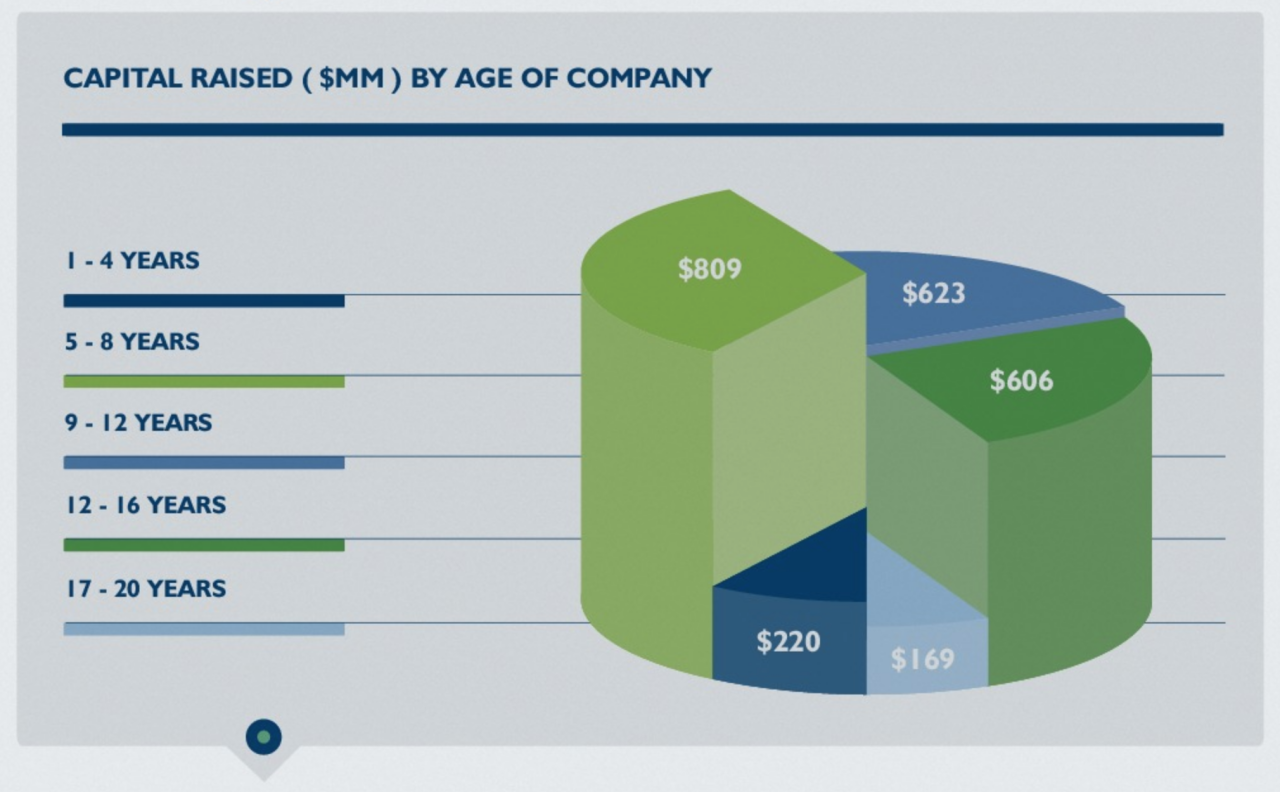
Wow is that a pie *and* bar chart at once?
|
|
#
?
Nov 25, 2015 16:14
|
|
|
That makes it twice as informative.
|
|
#
?
Nov 25, 2015 19:53
|
|
|

|
|
#
?
Nov 25, 2015 23:21
|
|
|
42 Others
|
|
#
?
Nov 25, 2015 23:45
|
|

|
QUACKTASTIC posted:42 
|
|
#
?
Nov 26, 2015 00:42
|
|


|
QUACKTASTIC posted:42 
|
|
#
?
Nov 26, 2015 00:56
|
|


|
I have literally been otherised by that graph. :tumblr:
|
|
#
?
Nov 26, 2015 03:18
|
|


|
 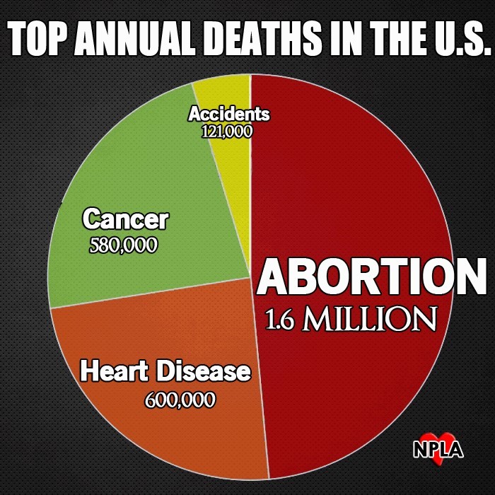 ABORTION
|
|
#
?
Nov 26, 2015 03:35
|
|
|
Well poo poo, nobody dies of old age / natural causes in the US? Or any other diseases. Golly, maybe you yanks are onto something.
|
|
#
?
Nov 26, 2015 07:40
|
|


|
Or murder, suicide, deaths by other diseases... gently caress, if abortions are what make this semi-utopia possible, then open the blood wombs!
|
|
|
#
?
Nov 26, 2015 08:30
|
|


|
Also. The three non abortion causes of death total 1,301,000 deaths, but take up more area than the 1,600,000 abortions. The graph sucks on every level.
|
|
#
?
Nov 26, 2015 09:25
|
|


|
The graph is misrepresenting the relative sizes, but not in favor of the point they're trying to make. Good job.
|
|
#
?
Nov 26, 2015 09:40
|
|

|

|
|
#
?
Nov 27, 2015 03:27
|
|
|
Regalingualius posted:Or murder, suicide, deaths by other diseases... Well technically suicide can be considered as a really late stage abortion, And well you never plan to get murdered so it could be ruled accidental on your part. For that matter, you don't plan on dying from disease so that might be ruled accidental too. Graph makes prefect sense.
|
|
#
?
Nov 27, 2015 03:49
|
|
|
 Oh no Hillary, don't tell me the corruption charges are true! Oh no Hillary, don't tell me the corruption charges are true!
|
|
#
?
Nov 27, 2015 05:31
|
|
|
Biffmotron posted:This came up in class today. I have literally no idea what any of these numbers mean. I'm the misspelling of 'occurring'
|
|
#
?
Nov 27, 2015 06:16
|
|


|
 from https://en.wikipedia.org/wiki/Kirkwood_gap What are units? What is the x-axis? What is this?
|
|
#
?
Dec 4, 2015 09:23
|
|


|
I dunno about the X-axis, but it says AU right on there. That's a unit.
|
|
#
?
Dec 4, 2015 10:06
|
|
|
Yeah, looks like both distance and resonance is in AU, but only one is marked and there are two Y axes for some reason, even though it's the same scale? X could be gap number or something, I think it's just supposed to show them in order. It's a pretty awful graph allright.quote:Source: Own work :wikipedia:
|
|
#
?
Dec 4, 2015 10:32
|
|

|
There's only one Y-axis; it's the same numbers on either side. That's pretty standard. I'm not saying it's a good graph (it's not), but it's at least somewhat legible.
|
|
#
?
Dec 4, 2015 10:38
|
|
|
But... Doesn't that legend imply that one axis is distance route sun in kirkwood gaps and the other axis is jovian resonance? This is not at all what the graph is. I don't even know what the y is on there. He might have wanted to show how resonance decreases as distance increases but ooh boy did he fail if that's what he wanted to do.
|
|
#
?
Dec 4, 2015 11:28
|
|
|
Fathis Munk posted:He might have wanted to show how resonance decreases as distance increases but ooh boy did he fail if that's what he wanted to do. I study that stuff professionally, and I have no idea what that plot is trying to say.
|
|
#
?
Dec 4, 2015 13:10
|
|
|
Letmebefrank posted:
The blue line is the distance from the sun, axis on the right The red line is which orbital resonance it is, axis on the left Example: The third pair of dots occurs with the red dot at 3,5 and the blue dot is around 2,3. Thus, a 3,5:1 orbital resonance with Jupiter (or a 7:2 orbital resonance) is around 2,3 AU These really should have plotted in XY, but it is saying something legible.
|
|
#
?
Dec 4, 2015 15:28
|
|

|
Iron Chef Nex posted:I study that stuff professionally, and I have no idea what that plot is trying to say.
|
|
#
?
Dec 4, 2015 15:48
|
|
|
It's me. I'm the AU
|
|
#
?
Dec 4, 2015 15:57
|
|
|
ducttape posted:The blue line is the distance from the sun, axis on the right What loving way of plotting things is that? You'd think someone with that background in science should know he should have used a loving xy graph. Like the simplest graph in the book.
|
|
#
?
Dec 4, 2015 16:19
|
|
|

|
| # ? May 13, 2024 07:49 |
|
|
Give me double y axes or give me death.
|
|
#
?
Dec 4, 2015 17:59
|
|
