


|
nescience posted:just got a DSLR, not sure on what I'm doing. Including reading the OP!
|
 #
?
Jan 10, 2016 05:52
#
?
Jan 10, 2016 05:52
|
|

|

|
| # ? Jun 1, 2024 10:01 |
|
|
Thirteen Orphans posted:Including reading the OP! Apologies; I edited my post to add a critique (I don't even know if that's a critique?). Tbh I'm not sure what I'm supposed to do, I read the OP but it seems a bit daunting. Did I break any other rules? I read the height limit rule but I figured [timg] tags would suffice. Also is there an even noobier thread? I didn't see any in the first page of Dorkroom.
|
|
#
?
Jan 10, 2016 06:04
|
|

|
nescience posted:Apologies; I edited my post to add a critique (I don't even know if that's a critique?). Tbh I'm not sure what I'm supposed to do, I read the OP but it seems a bit daunting. Did I break any other rules? I read the height limit rule but I figured [timg] tags would suffice. Also is there an even noobier thread? I didn't see any in the first page of Dorkroom. That's a critique, mostly. And no worries, I was just bustin' your chops ") . . My main problem with this photo is the framing. You have the contrasting lights, from the earth and from the sky, but the lower left corner doesn't fit in there nicely. Also, yeah the height is weird, at least on my tablet. It makes it hard to see the photo as a cohesive unit, as you have to look distinctly in two places, and the photo isn't composed to do that like a diptych. Also, newbies are welcome, but try to read through to learn about what critique is, and what we look for. I'm a novice, and some of the pros here are really good and helped me learn more.
|
|
#
?
Jan 10, 2016 06:40
|
|
|
nescience posted:
I'd tend to join Thirteen Orphans' opinion the height makes appreciating the photo as a whole hard. More travel photography since that's all I have:  statue by Arthur Nagui--Leclerc, on Flickr statue by Arthur Nagui--Leclerc, on Flickr telefon by Arthur Nagui--Leclerc, on Flickr telefon by Arthur Nagui--Leclerc, on Flickr blueprint by Arthur Nagui--Leclerc, on Flickr blueprint by Arthur Nagui--Leclerc, on FlickrPS: Concerning my previous posts I was mistakenly using the wrong files thus making the scans look mediocre.
|
|
#
?
Jan 10, 2016 17:54
|
|


|
Decever posted:More travel photography since that's all I have: I like the composition of the top one but the very shallow depth of field means there's nothing else to look at but the back of the statue and that's not interesting enough to hold attention. The middle one has some nice, desaturated colours and an old war-movie kind of feel but I think it would have been better if you had taken a couple of steps to the right to put the telephone box on the left third and avoid having the utility pole sticking up almost in line with the spike on top of the box. Obviously I don't know what was going on out of frame on the right of your photo though, maybe that wasn't an option. The bottom one is great. Here's what the Dnipro looks like in Kyiv when it's -19� and snowing hard 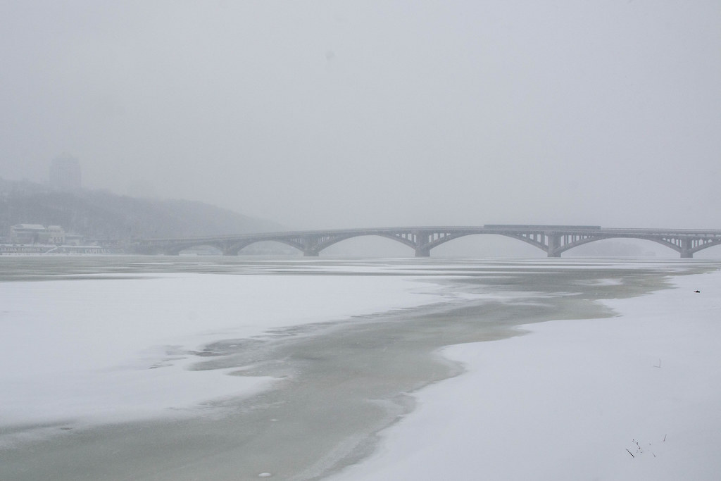 Frozen Dnipro 3 by Iain Compton, on Flickr And here's a Soviet-era beach resort in the middle of winter. 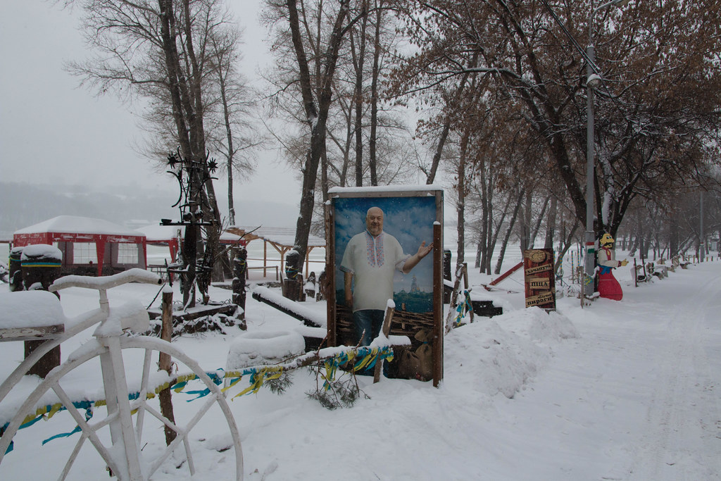 Beach Bar 2 by Iain Compton, on Flickr St. Sophia's Cathedral  Bogdan Khmelnitsky and St Sophia by Iain Compton, on Flickr
|
|
#
?
Jan 10, 2016 18:57
|
|
|
Helen Highwater posted:I like the composition of the top one but the very shallow depth of field means there's nothing else to look at but the back of the statue and that's not interesting enough to hold attention. I can't help but feel like these are really lacking a focus point, with the possible exception of the last image. There is no where to really grab the eye and hold attention, I think. For the bridge, the flow of the ice looks like it's starting to accomplish this, but it's not really completed due to the composition leaving so much gray sky and the flat color palate. I understand the idea here but the execution is lacking. The sign shot needs to be framed tighter or otherwise create more interest, just having a funny sign isn't enough to make it. The last one works pretty well, but the two points are equal in brightness and wind up competing for attention, a composition that differentiated them would have been stronger. ...  
TsarAleksi fucked around with this message at 17:22 on Jan 11, 2016 |
|
#
?
Jan 11, 2016 17:11
|
|

|
The first one is interesting in a way that I want to know what's going on. It seems like they've cleared a space for some kind of procession, but how did the stroller and those individuals get in the middle of the space? I like the portrait of the girl, but her right hand seems distracting to me. Maybe it's the contrast of color between her hand and arm and the shadows. Love the pop of her dress against that backdrop, though.  Light by ryantss, on Flickr
|
|
#
?
Jan 11, 2016 22:26
|
|

|
The first shot seems very dark in the shadows. The main subject is striking a cool pose, must the sharp contrast of the picture across the frame keeps this photo feeling kind of cluttered to me. The leading lines to the corner almost start to form up some nice shapes, but they're very broken up. To me, the first shot just isn't hitting. The second, however, I very much like. She's god a good look, tight isolation, and the vignetting isn't distracting. The hand is a bit paw-like, but not by much. Just a hint of fingernail would be nice. Great colors.  Megaliths of Pennsylvania by Jason, on Flickr 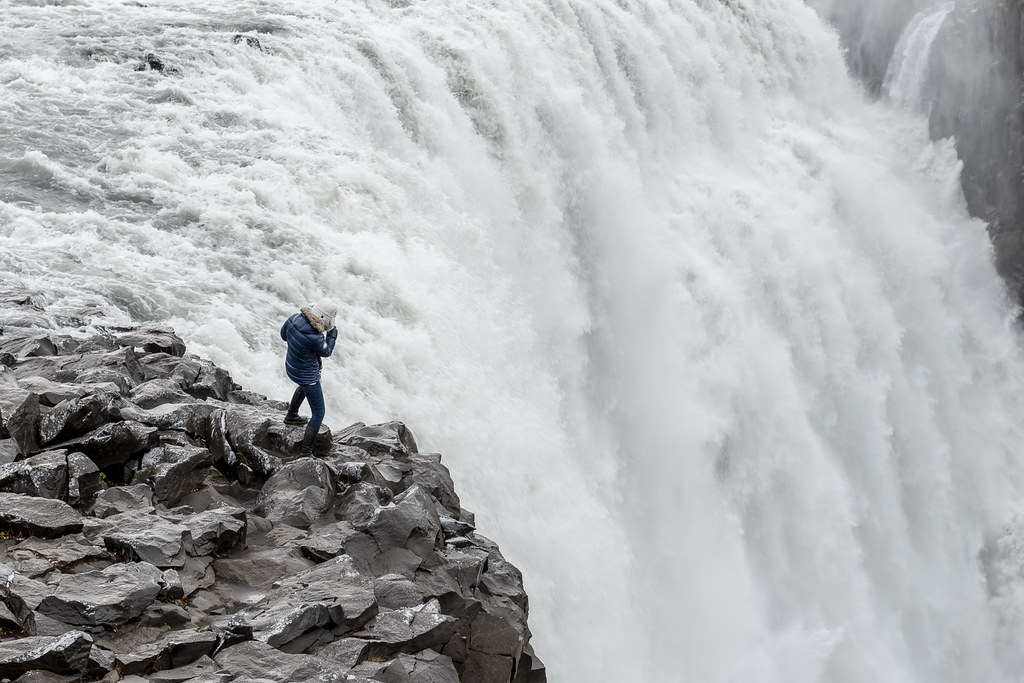 Untitled by Jason, on Flickr  Untitled by Jason, on Flickr
|
|
#
?
Jan 12, 2016 17:25
|
|

|
Trying something new, don't be gentle thetzar posted:
I don't really know what to say about the second image since I have no clue about shooting shots like this, but wanted to mention that there is a slightly less black part in the background that is very noticeable on my screen starting at roughly the right elbow. The right hand really jumped out at me as well. I have nothing else to criticise about this image though, I like it.
|
|
#
?
Jan 12, 2016 18:07
|
|

|
thetzar posted:
In what ways do you think that not centering the megalith adds to the photo?
|
|
#
?
Jan 12, 2016 19:37
|
|

|
InternetJunky posted:Trying something new, don't be gentle Your masking, especially around the ears, looks like poo poo.
|
|
#
?
Jan 12, 2016 19:38
|
|
|
RangerScum posted:Your masking, especially around the ears, looks like poo poo. 
InternetJunky fucked around with this message at 23:16 on Jan 12, 2016 |
|
#
?
Jan 12, 2016 22:56
|
|
|
I can clearly see the brush strokes around the subject. It's very noticeable on the MacBook Air that I am currently on.
|
|
#
?
Jan 12, 2016 23:19
|
|

|
InternetJunky posted:Any better? It's a real problem especially around the one ear tip as it has a very bright highlight on it. I'm sorry but I don't think this is an improvement- it still looks like a bad mask job.
|
|
#
?
Jan 12, 2016 23:20
|
|
|
I'll keep at it. I don't see brush strokes on my screen but if I import it and push the levels I see them easily.
|
|
#
?
Jan 12, 2016 23:31
|
|
|
The edges are too soft and I wouldn't necessarily say I can see brush strokes, but it's obvious to anyone who has ever had to mask out a fuzzy subject from a complicated background. The tip of the left ear and the top of the head in particular are extremely obvious. I don't know if working on it any more will magically improve it. Sometimes you gotta just face reality that it's not gonna work.
|
|
#
?
Jan 13, 2016 00:57
|
|
|
InternetJunky posted:I'll keep at it. I don't see brush strokes on my screen but if I import it and push the levels I see them easily. I'm going to second a lot of what's been said here. I actually really dig what you're going for here, and you mostly achieve it; but that masking job on the ears is bad, and it's going to be VERY HARD to improve. There's some specialized software out there for masking hair and fur. If you feel like spending a lot of money on a try. RangerScum posted:In what ways do you think that not centering the megalith adds to the photo? I just like how it feels slightly less formal that way. Though I suppose it may look more accidental than anything.
|
|
#
?
Jan 13, 2016 05:26
|
|
|
Carmant posted:
I think you need more compelling subjects, particularly in the first two shots. Your last one, I like the idea of the side lighting on the dolls face with his eyes in shadow - adds to the creepiness of these dolls. When I was a teenager I once delivered pizza to a house full of these with all of the lights off, creepy as poo poo. The problem I have is that one half of the of the photo is in darkness and imo doesn't add anything to the effect. I would play around with the composition there. nescience posted:
You could make two exposures, one for the sky and one for the ground. Keep in mind that you're not going to see much stars with all that light pollution though.  IMG_2273.jpg by badmountain, on Flickr IMG_2273.jpg by badmountain, on Flickr DSCF0619.jpg by badmountain, on Flickr DSCF0619.jpg by badmountain, on FlickrFor this one, I'm unsure about the crop + processing:  DSCF0632.jpg by badmountain, on Flickr DSCF0632.jpg by badmountain, on Flickr DSCF0632.jpg by badmountain, on Flickr DSCF0632.jpg by badmountain, on FlickrI like the grain even though it's artificial, but it feels like I'm compensating, and I've been playing around more with b+w... I dunno, any tips would be appreciated. Skizzzer fucked around with this message at 20:11 on Jan 17, 2016 |
|
#
?
Jan 17, 2016 20:08
|
|


|
tau posted:
I don't know the purpose of this shot. Not that I don't know what I'm supposed to be looking at. I've taken plenty of these shots myself. Nice distraction of the lights, the rows and angled umbrellas. But I don't know the purpose of it. I don't know what's significant about it. I don't know why this little enclave somewhere is somehow worthy of a shot. It's not desolate, it's obviously set up to host people, but there's no sense of it being unwantedly abandoned. There's plenty of reason to be there, it's inviting, to a degree but it's wet. Is that the point? Today is wet? thetzar posted:The first shot seems very dark in the shadows. The main subject is striking a cool pose, must the sharp contrast of the picture across the frame keeps this photo feeling kind of cluttered to me. The leading lines to the corner almost start to form up some nice shapes, but they're very broken up. To me, the first shot just isn't hitting. First one. I don't think there's enough contrast between the building in the background and the branches/twigs in the front. It's just blurring into disorganised noise without being a commentary on the chaos of a forest. You're framing the building with twigs, and it seems too smart, like your pointing us there but for no reason. Second one. I like this. It wouldn't be something I hang on my wall. It's an almost contrived situation of someone who could fall. I don't like pointed photography unless it has a purpose behind it and this doesn't really. Someone close to the edge of waterfall, it looks good, it's a nice shot. You should be pleased. Good composition, great processing and something I would be proud of. It doesn't tell me anything though. It raises no questions. Third one. Not a fan. His coat is contrasting the background in a weird way. His coat is too bright, as is his face. It's like a technical exercise in lighting. Show someone and don't expose for the background, except his coat is dark as well but well lit, and his face is too bright. I'm also not a fan of the subtle shadow on the right hand side of his face. This really seems like a test shot for lighting rather than a photograph that conveys anything of the subject. InternetJunky posted:Trying something new, don't be gentle It looks like a photorealistic pencil drawing of a cat by a guy who has no artistic sensibility but fully believes lions are superior to wolves. He often argues this point with his taller, lankier friend who has greasy black hair and always plays the Drow in their D&D games.  Psychiatric Hospital Grounds by Niamh O'Donovan, on Flickr
|
|
#
?
Jan 17, 2016 21:22
|
|

|
For the first photo, you should probably expose for the highlights and bring up the shadows in post, but it's not a very compelling photo at that angle either way. The colour version of the church is the best one in terms of the composition, the streetlight is not adding much to the photos and you end up with a lot of uninteresting empty space and unappealing elements like the speed limit sign. The colour version could do with some tweaking in the white balance though. The grain is overdone and kind of distracting.
|
|
#
?
Jan 18, 2016 20:04
|
|

|
Geektox posted:For the first photo, you should probably expose for the highlights and bring up the shadows in post, but it's not a very compelling photo at that angle either way. Thank you.
|
|
#
?
Jan 19, 2016 23:33
|
|
|
With effects like that grain I think the way to go is to not use them unless you have a specific reason for doing so (ie not just "hey this looks cool"), and use a light hand if you do decide to add them. I'm prone to going a little overboard on vignetting myself.
|
|
#
?
Jan 20, 2016 15:49
|
|


|
Mrenda posted:I don't know the purpose of this shot. Not that I don't know what I'm supposed to be looking at. I've taken plenty of these shots myself. Nice distraction of the lights, the rows and angled umbrellas. But I don't know the purpose of it. I don't know what's significant about it. I don't know why this little enclave somewhere is somehow worthy of a shot. It's not desolate, it's obviously set up to host people, but there's no sense of it being unwantedly abandoned. There's plenty of reason to be there, it's inviting, to a degree but it's wet. Is that the point? Today is wet? Thank you for this. You've confirmed my thoughts exactly. I really wanted to get a subject in there, sitting at one of the tables or something of the like, but it was about 10 degrees and around 7:30am on a Saturday morning. My only potential subject told me to go gently caress myself and pulled the covers back up. It's definitely an inviting shot to take, but I couldn't nail down a purpose for it on that day other than "Pretty colors and lights." There's snow out there now, so if I can get my rear end up early again tomorrow, I'll see what I can produce then.
|
|
#
?
Jan 23, 2016 03:44
|
|
|
So I took this on my Note5 yesterday on a whim. I stopped by a small town called Ludington in west Michigan. We saw the lighthouse and decided to make the half mile ice-covered trek out to it and I snapped this picture on the way back to the car. This is with stock everything and now I wish I had taken my D50. I wish I had centered the lighthouse over the sunset, as I believe the sunset is a bit too distracting as I wanted the lighthouse to be the focal point of the picture. Also if I had my D50 I would have been able to zoom in and get a better picture of the lighthouse as well. What do you guys think?  I like this, however the monolith could have been centered and the branches in the foreground of the monolith are a bit too distracting for me FlapYoJacks fucked around with this message at 01:56 on Jan 25, 2016 |
|
#
?
Jan 25, 2016 01:48
|
|

|
ratbert90 posted:I like this, however the monolith could have been centered and the branches in the foreground of the monolith are a bit too distracting for me I have to disagree with a few people here who suggest the pier should have been centered. I like the way the "face" of the structure is leading you to the right side of the photo, and how the two prominent branches frame it and mirror the shape. The biggest negative I have with the image is the density of branches, but there wasn't much to do about that. For some reason, I feel like an 4x5 ratio crop, rather than the native 4x6 would be better. The clutter of branches on either side doesn't add anything to the photo that isn't already there.
|
|
#
?
Jan 25, 2016 02:19
|
|
|
I agree, I like the placement of the monolith. (I'm assuming "pier" was a weird auto-correct mistake?) It feels like it's looking out over the area on the right of the photo, where people might gather in front of it or something. Although I like the photo in general, something I can't quite put my finger on keeps it in "good" rather than "great" territory. Maybe the lighting being a bit flat? I do like the moody feeling though so I dunno. This is probably not much help, sorry.
|
|
#
?
Jan 25, 2016 02:27
|
|
|
ratbert90 posted:So I took this on my Note5 yesterday on a whim. I stopped by a small town called Ludington in west Michigan. We saw the lighthouse and decided to make the half mile ice-covered trek out to it and I snapped this picture on the way back to the car. This is with stock everything and now I wish I had taken my D50. Didn't see the lighthouse at all to be honest until I looked a lot more closely. It's a cool picture of sky and water/ice. The blue-orange is a very striking contrast and I like the way that the ice on the right leads you into the photo. All of that stops at the sun though and the lighthouse is practically invisible.
|
|
#
?
Jan 25, 2016 12:06
|
|
|
Skizzzer posted:I think you need more compelling subjects, particularly in the first two shots. Your last one, I like the idea of the side lighting on the dolls face with his eyes in shadow - adds to the creepiness of these dolls. When I was a teenager I once delivered pizza to a house full of these with all of the lights off, creepy as poo poo. The problem I have is that one half of the of the photo is in darkness and imo doesn't add anything to the effect. I would play around with the composition there. Speaking of things that might call for HDR, each of these has either very blown whites or crushed blacks. In the first shot, the effect could be used in an interesting/creepy/attractive way for the TV, but then my eye is pulled right to that Pepsi refrigerator. It also seems to be noisy as all get-out. For the Jesus Lives photos, I don't think any of them are really calling to me (no pun intended). I like the crop on the first one the best, the close attraction of it works well. But there doesn't seem to be any life to the photo; it's just a picture of a sign. I'm actually wracking my brain to figure out why this falls flat for me when there are people making millions of internet point dollars in the Landscape thread taking great pictures of neon signs in windows at night. There's more tonality and range in them, the skies usually have some glow. And there's more color (neon, natch). But as far as what actually makes them sing more than this... there's a sense of life, or absent life there that I miss here. Your pulled-out crops provide more context, but they're missing... SOMETHING. Sorry, I'm failing and figuring out WHAT. Thanks to everyone for the feedback on the monolith shot (and others!). I took more photos.  Into the Woods by Jason, on Flickr  Into the Woods by Jason, on Flickr  A Walk in the Park by Jason, on Flickr  Untitled by Jason, on Flickr thetzar fucked around with this message at 05:56 on Feb 10, 2016 |
|
#
?
Jan 26, 2016 00:20
|
|
|
I really like the first forest picture, it's cool. I think both the forest photos, but especially the second, would be better with a more focused light source. It's pretty good as is in the first one, but the second one has the light spilling all around her. The composition on the second one feels a bit uninteresting too. I think putting her on a side, like the first photo, or as is with a lot less light would help it a lot. The park photo isn't really my thing, to me though it feels a little generic. I don't know where it actually is but it feels like that one walkway in New Yorks central park that you see everywhere in photos. It's always the same composition, and your photo is different, it just reminds me too much of That One Path people photograph as well as that bridge that also gets photographed a lot. The last one is really cool too, although I think the greys could be a bit darker. It feels a bit too washed out to me but that might have been what you were going for. I feel like I'm being too harsh cause they are all good photos, but I guess thats the point. My turn:  Mt Gravatt by ASB, on Flickr Mt Gravatt by ASB, on Flickr Mt Gravatt by ASB, on Flickr Mt Gravatt by ASB, on Flickr Mt Gravatt by ASB, on Flickr Mt Gravatt by ASB, on Flickrplease poo poo meaningfully on my photos
|
|
#
?
Jan 28, 2016 07:14
|
|

|
thetzar posted:Speaking of things that might call for HDR, each of these has either very blown whites or crushed blacks. In the first shot, the effect could be used in an interesting/creepy/attractive way for the TV, but then my eye is pulled right to that Pepsi refrigerator. It also seems to be noisy as all get-out. No worries man, I felt like I should like that photo too but I didn't really so I posted that here. The first one was taken with my iphone 4 - but i get what you're saying. I like your first over your second because the light feels more natural and I can see his eyes. Your 3rd and 4th are cool. I wonder if you could've pulled back on your 4th and given more sky, because i like how i can barely see the far, towering buildings and i want to see more of them.
|
|
#
?
Jan 29, 2016 04:36
|
|
|
A Saucy Bratwurst posted:My turn: I like the bottom one the most of all of these. The perspective so that the rail and the treaders of the steps are flat really gives it a kind of Rothko vibe. Even though It's clear what the subject of the photo is, it also works as an abstract. I like the very flat palette in the top one too. I'm not really sold on the middle one, it's a bit too busy and doesn't have the same economy of line as the others. Here are a couple from my trip to the aviation museum on Sunday that aren't just 'here's a picture of an aeroplane'. 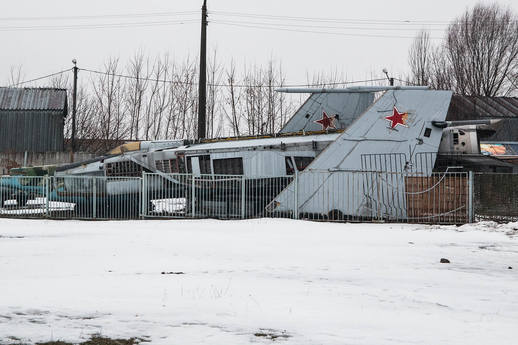 Disassembled MiG-25 by Iain Compton, on Flickr  Buried MiG-21U by Iain Compton, on Flickr
|
|
#
?
Feb 2, 2016 15:09
|
|
|
My first instinct on those two pictures are that there's probably something interesting there, but the composition doesn't do anything for me. They're screaming to get in closer and find the detail, there's too much going on right now that it's hard to see exactly what the subject is.
|
|
#
?
Feb 2, 2016 15:39
|
|


|
A Saucy Bratwurst posted:please poo poo meaningfully on my photos Mt Gravatt by ASB, on FlickrOk, has the best composition of the three, well balanced. Mt Gravatt by ASB, on FlickrBad, not well composed, too busy, no subject, little geometric interest. Colours don't work. Feels like it's leaning to the right. Mt Gravatt by ASB, on FlickrGood, but weighted to the left. Should have panned the camera right a little.
|
|
#
?
Feb 5, 2016 23:43
|
|

|
for fucks sake posted:
The first one works really well for exactly the same reasons the other two don't: line and subject. In the first photo, the subject is clear, we know what we're supposed to be looking at, and it's interesting. It's partially interesting because those sharp lines intersect each other in an aesthetically pleasing way. But you seem to have gathered most of that from your self critique. I would want to see the first photo punched up a bit, play with the levels or contrast or something to suss out some more hues. It's fine the way it is, I just wonder what else it can look like.
|
|
#
?
Feb 6, 2016 00:03
|
|
|
They are my photos that hes critiquing but thanks. I agree that the containers are the weakest shot of the 3 but I really liked the colours on the day. The sun came out of the clouds and everything was so vibrant in a neighbourhood with colours like the other 2. A shame I wasnt good enough to capture it well, there was a green forklift and skip that I wanted to include too but I couldnt get the framing right. The parking shot, Ill play with it when I dont feel so sick but I was trying to make it look as it did in real life.
|
|
#
?
Feb 6, 2016 00:48
|
|
|
A Saucy Bratwurst posted:They are my photos that hes critiquing but thanks. My bad, I thought he was quoting your asking for harsh critique because you put it so well. And I forgot you posted those. That wasn't cool, I apologize.
|
|
#
?
Feb 6, 2016 00:58
|
|
|
I'm looking for advice on what I could have done to make this photo more successful. I wanted to capture the closed in feel of the woods, but I feel it lacks sharpness and something to really bring the eye in. Maybe different post processing would bring a bit of moodiness in. I had my girlfriend along, so could have had her stand down the path, but she was adorned in neon hiking clothes and I wasn't sure if that would have worked. Probably should have tried it to properly compare. Right now it feels boring to me, but I want to make it better. Thoughts, goons? 
|
|
#
?
Feb 6, 2016 06:01
|
|
|
its no big deal posted:I'm looking for advice on what I could have done to make this photo more successful. I wanted to capture the closed in feel of the woods, but I feel it lacks sharpness and something to really bring the eye in. Maybe different post processing would bring a bit of moodiness in. I want to say this without sounding snarky. But I'm not. If you want to make your photo feel like the woods are closing in on you, take a picture where the woods are close. There are no trees within ten feet of you here, and I can barely see those clipping the frame. That's a wide path, with a fork in the distance. You focused close. All that's close are the twigs and little trees at the sides. The distant trees are out of focus, which further makes them feel far away. The only other thing in focus is the ground. Which does not feel like it is closing in on me. Though, gosh, there's a lot of it. You set the horizon right through the center of the frame, which is generally a no-no (looks boring), and makes the ground a, no, THE major subject in your composition.
|
|
#
?
Feb 6, 2016 06:17
|
|
|
thetzar posted:I want to say this without sounding snarky. But I'm not. I don't really see that as snarky at all. Thanks for the advice. I've been trying to make myself not just put the horizon on a third cause I felt my photos were stagnating a bit in terms of composition. Didn't nail it this time. I'll be doing a similar hike before too long and will take a bit more time to try for the feel I missed in this one.
|
|
#
?
Feb 6, 2016 06:36
|
|
|
|
| # ? Jun 1, 2024 10:01 |
|
|
The image needs better light too.. it's just one big grey curtain. With no highlights and no shadows there's nothing there to create mood. Clear skies is the proper way to do it, but you might be able to pull some dynamics out of an overcast image in post. If you want to bring in the trees, there's two options: get close to the trees and shoot wide. This expands the field of view and brings in more.. you'll get some overhead branches, the trail will look narrower, and it might get what you're after. But again you gotta be close to some trees.. like a few feet away because shooting wide makes stuff smaller. The other option is to use the longest zoom you got (like 200mm+), find a really long straight patch of trail, and max the focal length. This narrows the field of view, but "sucks" the background in, making what's there look bigger. If you have a subject, like someone walking the trail, this might get the closed in look you want. Also aim up, not down. No one cares enough about the trail for it to take 50% of the image, it's just the poo poo you stand on. If you've seen the Revenant movie, think back to all the sequences they had with the camera moving through a forest.. in all those shots, they were pointed towards the sky and it produced a much more powerful image. In your case you still probably want the trail because it creates lines that the eye follows, so think about getting down on your knees and tilting the camera up.
|
|
#
?
Feb 6, 2016 07:56
|
|
