


|
 Untitled-40 by Harvard J Nasty, on Flickr Untitled-40 by Harvard J Nasty, on FlickrNot quite sure what happened to the focus here but I think it looks cool. Fuji 400H
|
 #
?
Feb 12, 2016 09:16
#
?
Feb 12, 2016 09:16
|
|


|

|
| # ? Jun 6, 2024 09:43 |
|
|
HNasty posted:
The top third of the photo is just dead, boring space. The green arrow doesn't add anything, either.
|
|
#
?
Feb 12, 2016 20:09
|
|
|
HNasty posted:
Yeah, I feel like a crop or retake of the bottom right section of this would make for a more interesting photo. I photographed some stairs:  I like the geometric shapes in this one but I'm not sure if there is too much visual clutter around the railings.  I'm not sure whether or not I like the graffiti on the bottom right of this one. I've done a square crop with a little clone stamping to see how it would be framed without it. 
|
|
#
?
Feb 14, 2016 18:25
|
|
|
all 3 of those are just plain grey blobs that kinda merge together, theres no contrast or anything to give it interest. Is that digital black and white?
|
|
#
?
Feb 15, 2016 03:27
|
|

|
No, it's film. I'll give editing the scans another go tonight and be a little more aggressive with the levels, I'm always a little nervous of pushing that stuff too far and ending up with something that looks over-processed. crap nerd fucked around with this message at 08:06 on Feb 15, 2016 |
|
#
?
Feb 15, 2016 07:41
|
|
|
ok, attempt two with the black and white points set a little more aggressively I think the visual clutter at the bottom right of the railings unfortunately is a bit more noticeable on this one now:  Found a crop I was a more happy with for this one:  Would appreciate some feedback, especially on framing/composition.
|
|
#
?
Feb 15, 2016 20:48
|
|
|
crap nerd posted:I think the visual clutter at the bottom right of the railings unfortunately is a bit more noticeable on this one now: I think you need a little more space on the left - the big, relatively dark box shapes of the doors are what really catch my eye but they're wedged right against the edge of the frame. You have a nice border along the bottom and right edges, if you could get an even space along the left edge I think it would feel more balanced. The second one I think would also benefit from more space around the bottom of the stairs on the left. There's not much interest on the right hand side, so I think you could have panned or stepped to the left a bit to achieve this without losing much. The second one feels crooked but it might just be all the lines playing tricks on my eyes. Wafflecopper fucked around with this message at 14:39 on Feb 17, 2016 |
|
#
?
Feb 17, 2016 14:36
|
|


|
Thanks, yeah I see what you mean they seem a bit wedged in compared to the right side.
|
|
#
?
Feb 17, 2016 21:31
|
|
|
The world needs more crit.HNasty posted:
I'm going to disagree with most of the feedback here and say that I like having the top of the photograph here. That hit of blue provides a nice contrast to the warmth of the light in the tunnel. I think this succeeds quite nicely. crap nerd posted:ok, attempt two with the black and white points set a little more aggressively I think that both of these, especially the second one, are still aggressively grey. But leaving exposure aside for a moment, I do think that these both would benefit from cropping in or out. Right now the content ends right along the edge of the frame. The first shot is far more of the sinner on this front. The second still makes me uncomfortable, though. Something about the composition just makes me itchy. The diagonals are very nice, but if we were closer they'd fill the frame and become geometric -- further back and they'd be environmental.  Untitled by Jason, on Flickr  Untitled by Jason, on Flickr  Black Signs by Jason, on Flickr  Untitled by Jason, on Flickr
|
|
#
?
Feb 18, 2016 22:20
|
|

|
I'm still an amateur and hardly know what I'm talking about (and especially about technical stuff), but I'll give critiquing a shot. thetzar posted:
I like this shot, but I feel like there's too much grey floor taking up the bottom. It does a good job of showing her distance from the viewer, but just feels a little overwhelming. If you cropped the bottom I think you'd get a similar effect without that issue. I also wish there was more contrast in the lighting between her and the rest of the room, just to make her stand out little more. thetzar posted:
I really, really enjoy this. Honestly the only critique that comes to mind is that I wish he was a little clearer. It's difficult to tell what he's holding unless you really look, and at first I thought he was a chef or something because of his hat and white coat. I pulled my camera out of the closet after it sat there for a couple years and have made it my goal to get back into photography this year. I'm mostly winging things at this point, but I'm starting to understand aperture and shutter speed and exposure and all that better. I decided to do a photography challenge with one theme a week. This week is self-portraits.  IMG_6488 by Alysia Spencer, on Flickr  IMG_6481 by Alysia Spencer, on Flickr On this one I really wish the camera had been angled lower because I feel my head looks a little awkward cut off at the bottom of the frame, but I like it overall.
|
|
#
?
Feb 27, 2016 06:28
|
|
|
They look a bit underexposed to me. The first one is definitely stronger, in the second it looks like you've been decapitated. Avoid putting the subject of a photo right on the edge of the frame.
|
|
#
?
Feb 28, 2016 23:19
|
|
|
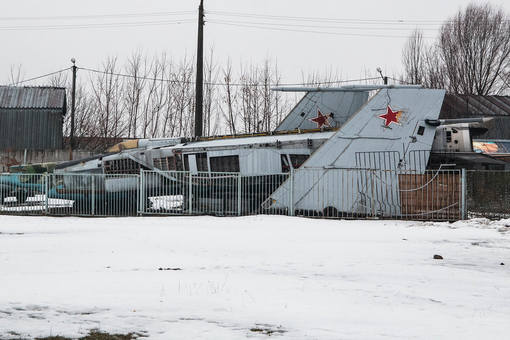
Helen Highwater posted:Here are a couple from my trip to the aviation museum on Sunday that aren't just 'here's a picture of an aeroplane'. Not really sure what the subject of the bottom one is. I just don't know what I'm supposed to be trying to concentrate on. Top one feel like there is a lot of deadspace in the foreground snow. Maybe try moving up closer to your subject? Below is a photo I took at a glass blowing exhibition/class today. Sony a6000 with Sony 35mm/1.8 prime.
|
|
#
?
Feb 28, 2016 23:38
|
|

|
ahleeshaa posted:I pulled my camera out of the closet after it sat there for a couple years and have made it my goal to get back into photography this year. I'm mostly winging things at this point, but I'm starting to understand aperture and shutter speed and exposure and all that better. I decided to do a photography challenge with one theme a week. This week is self-portraits. Thanks for the crit. Those were great points, and well taken. I agree with the other commenter on these that they appear underexposed. Not that I mind the dark seas in the frame; they work quite well. But even the smoke, which my brain feels should read as white(er) feels like a fairly dim grey. That said, the first shot is wonderfully framed and crisp, and I really like the hint of motion on the blown smoke. The second shot does feel offcenter, though. I'd want to see even only an extra inch of neck to make it feel more focused and less strained. Howard Phillips posted:Not really sure what the subject of the bottom one is. I just don't know what I'm supposed to be trying to concentrate on. I hate to say it, but I'm not really seeing a focus on subject in your shot either. Between the neon sign in the back, the torches, the ladies, and the instructor, I don't see a single place my eye is drawn. And there's so much dead space on the left that I feel like you could crop 40% of it off and have a stronger frame. Did you get any closeups? Seems like a great opportunity for macro. Asbestos lenses recommended. I got inspired by dinner and the Irving Penn show in NY right now.  Kalethulhu by Jason, on Flickr  Kalethulhu by Jason, on Flickr  Kalethulhu by Jason, on Flickr  Kalethulhu by Jason, on Flickr
|
|
#
?
Feb 29, 2016 00:48
|
|
|
Howard Phillips posted:Not really sure what the subject of the bottom one is. I just don't know what I'm supposed to be trying to concentrate on. For the top one, I wanted to get the whole aircraft inthe frame. A MiG-25 is a long aeroplane so dead space was inevitable without using a weird image ratio. Due to surrounding security fences, it wasn't possible to get a shot at an angle to shorten it either, although I did get some close ups of partial fuselage. The bottom one is about the MiG-21 jetfighter, buried in a pile of trash. Regarding yours, I would echo the previous comments. Crop out the entire left of the image and have a portrait crop of the people with torches. That neon sign is super-distracting. The strong reflections on the plate (window?) at the end aren't helping either and I don't think you can get rid of those no matter how you crop it. The reflected glow on the metal table is nice and would have been a much more interesting backdrop for a shot. thetzar posted:
I like these. The monochrome works well as it's all about the contrast. Here's a shot of the Maidan anniversary memorial  Maidan Memorial by Iain Compton, on Flickr
|
|
#
?
Feb 29, 2016 13:18
|
|
|
I like these two together, it's as if the ice is obeying the sign. I was struggling a little bit with exposure on these two shots. Maybe shooting ice on a lake wasn't the best choice for a first outing with the camera. I thought about using a closer crop around the sign, but I love the background too much.  DSC00503 by bull3964, on Flickr Similar comments about exposure here. I thought about pulling a little more detail out of the darker areas in Capture One, but I didn't really like the results. I do love transition between the ice and the water though. The light was just in the right place to put a shadow on the edge to enhance the separation. Looking at it now, it may have benefited from a longer shutter to blur the water flow a bit. I'm also not sure if I'm better off cropping the top sliver of water above the spillway or leaving it as is. The shadow line from the spillway is oddly sharp as well.  DSC00505 by bull3964, on Flickr
|
|
#
?
Mar 2, 2016 06:02
|
|

|
For the first one I'd boost shadows a bit, the sign is underexposed. I can't tell what I'm looking at in the second. e: Actually I got it now. Took a while to figure it out though, the geometry is weird and confusing. Including more of the surroundings might help with that. Wafflecopper fucked around with this message at 07:13 on Mar 2, 2016 |
|
#
?
Mar 2, 2016 07:10
|
|
|
Helen Highwater posted:Here's a shot of the Maidan anniversary memorial I'm not entirely convinced there's a there there. It's a meaningful place and in interesting installation, but I'm not getting an emotion from the shot. It's just kind of a photo of some art. If anything what I'm struck by is how little of an impact it's making on the surroundings... but I'm not struck by it much. bull3964 posted:I like these two together, it's as if the ice is obeying the sign. The photo of the sign is just a photo of a sign. I don't see the spillway, and I can't see that the ice is staying off of it. I can't even really read it as ice. Could be reflecting water, or oil, or anything bright. I also had to look at the second photo for a while before understanding what I was seeing � this need not be a bad thing. But I would suggest if you want to go abstract, cropping in on the left and bottom slightly, so we just get that whale-like shape isolated and high-contrast. A pretty diverse grab-bag from me.  Some of the Toys by Jason, on Flickr  In Flight by Jason, on Flickr 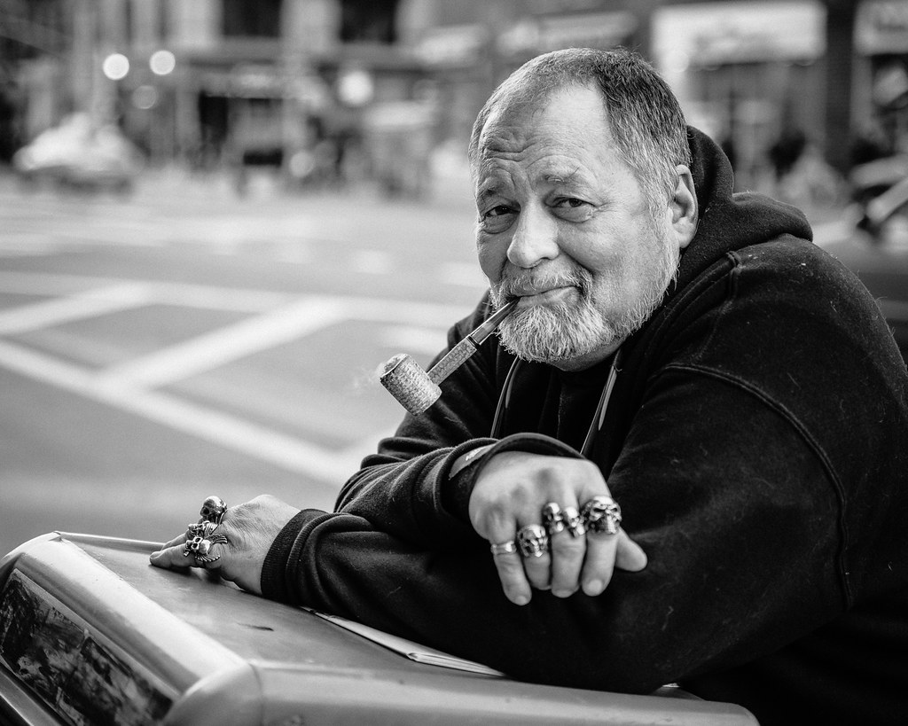 Untitled by Jason, on Flickr
|
|
#
?
Mar 2, 2016 23:45
|
|
|
thetzar posted:
I don't know a lot (anything) about product photography but this looks the part to me. I like the pastel-shaded backgrounds, although the blue one is a little intense compared to the rest and stands out a bit. thetzar posted:
I really dig this, the way the poles both mirror the jet's path across the frame and the sense of forward movement, along with the building suggesting height. It all fits together very nicely. thetzar posted:
This dude has an interesting face and character, but I wish the rings on his right hand were in focus. Maybe it was deliberate so as not to distract from his face, but to me they are an interesting part of his character and add an additional point of interest to the photo, and as such I feel they should be in focus.
|
|
#
?
Mar 3, 2016 12:14
|
|
|
thetzar posted:
I saw this on over in the landscape thread, I think, and while I really, really like the idea of it, I think there's too much negative space on the right. Not sure there's much you could do about that, as I'm sure this was a quick shot given the moving plane. Maybe if it was rotated such that the "wing" on the bottom is canted up a little more towards the upper right, without going so far as to make the Freedom Tower totally vertical?
|
|
#
?
Mar 3, 2016 13:57
|
|
|
LogisticEarth posted:I saw this on over in the landscape thread, I think, and while I really, really like the idea of it, I think there's too much negative space on the right. Not sure there's much you could do about that, as I'm sure this was a quick shot given the moving plane. Maybe if it was rotated such that the "wing" on the bottom is canted up a little more towards the upper right, without going so far as to make the Freedom Tower totally vertical? Can't agree with this. Part of the strength of the shot comes from the almost perfect alignment between the top of the 'wing' and the jet contrails. If they weren't as parallel, the shot would be a lot weaker and less interesting. The negative space works fine for me, the jet is moving into it and it lets you focus on the lovely harmony of lines to the left.
|
|
#
?
Mar 3, 2016 14:45
|
|
|
Helen Highwater posted:Can't agree with this. Part of the strength of the shot comes from the almost perfect alignment between the top of the 'wing' and the jet contrails. If they weren't as parallel, the shot would be a lot weaker and less interesting. The negative space works fine for me, the jet is moving into it and it lets you focus on the lovely harmony of lines to the left. I wasn't really saying to realign anything, as I agree that the parallel lines are key. Rather, i think it could benefit from reframing or something. The lines all lead my eye to the right, but it's just too much of a blue void to keep my interest. LogisticEarth fucked around with this message at 16:53 on Mar 3, 2016 |
|
#
?
Mar 3, 2016 16:41
|
|
|
Howard Phillips posted:Not really sure what the subject of the bottom one is. I just don't know what I'm supposed to be trying to concentrate on. Where is the tension? Sorry, but this is pretty terrible.
|
|
#
?
Mar 5, 2016 05:33
|
|
|
 Lots of color and movement at the Crawfish Palace. I like the light and the industrial feel. I also think there's something nice about quadrant layout. Really wish I got a crisper shot of the neon sign in the upper right. Here's a different crop that might work better. The Mantis fucked around with this message at 04:31 on Mar 20, 2016 |
|
#
?
Mar 20, 2016 04:10
|
|
|
The Mantis posted:
While I don't love-love it, I think I like it for the reasons you stated - neat colours, and I dig the balance between the two sides. The fan and basket kind of feel like a tic-tac-toe pair to me for some reason despite the basket not being truly circular. thetzar posted:
Goddamnit tzar, I hate that you post things across lots of different styles and I end up loving pretty much all of it. You've managed to take a photo of photographic gear without me rolling my eyes (which 90% of the ones on Flickr will make me do). I really dig the pastel background, the choice of equipment, the consistent angle.. it's really cool. ---  Went out to do a bit of candid work while the sun set yesterday and got a few I liked, this probably being my favourite. Still nothing spectacular but I'm seeing progression in the quality of my work (it's cropped from 3x2 to 8x10, but I'm happy enough with the original framing too) which pleases me. Original colour is faded blue hour light, but fancied taking this one into B&W rather than retain the original cast.
|
|
#
?
Mar 24, 2016 04:33
|
|


|
thetzar posted:
fucq off The Mantis posted:
This is a promising subject but I wish you were closer to the subject. The neon sign doesn't register in all the visual activity - I'm seeing steam, fan, metal, and hands, which is all that matters here. EL BROMANCE posted:
This isn't bad! Just kind of inert. I'd like to see what else you shot that evening, somehow I feel like I'm not getting an entire story with this picture.  IMG_4688 by difficult listening, on Flickr  IMG_4566 by difficult listening, on Flickr  IMG_4433 by difficult listening, on Flickr
|
|
#
?
Mar 25, 2016 19:23
|
|

|
EL BROMANCE posted:While I don't love-love it, I think I like it for the reasons you stated - neat colours, and I dig the balance between the two sides. The fan and basket kind of feel like a tic-tac-toe pair to me for some reason despite the basket not being truly circular. The longer I look at this photo, the more I like it. I think it's the beer next to him(?) that really makes it for me. Is the bike a bit out of focus? Hard to tell on my current monitor. Did you do the B&W in post? Would be interested to see the color version. I imagine I'd end up agreeing with you. Here's another crop question for me. I love the expressions, but I can't figure out how to frame them in the bus. I erred on the side of removing space and focusing on her.  Here's the full shot in case you think a different crop looks better. Both are straight from the camera with nothing in post.
|
|
#
?
Mar 25, 2016 20:06
|
|
|
Magic Hate Ball posted:This isn't bad! Just kind of inert. I'd like to see what else you shot that evening, somehow I feel like I'm not getting an entire story with this picture. The Mantis posted:The longer I look at this photo, the more I like it. I think it's the beer next to him(?) that really makes it for me. Is the bike a bit out of focus? Hard to tell on my current monitor. Did you do the B&W in post? Would be interested to see the color version. I imagine I'd end up agreeing with you. Thanks for the feedback! Yeah I think it's a beer in a coozy. You're probably right about it being a bit OOF, I checked the rough distances against my DOF calc and there was only about 15cm back to front and I focussed on the person. Here's TIMGs of the rest of the shots I took of him SOOC (the last definitely needs an exposure bump, but I didn't like the angle so much so wouldn't use it anyway). I liked the more close up framing personally, not sure if the wider view sells the story a bit more?        And just two other shots that I quite liked from the evening. For some reason I get a kick out of getting other people taking photos in my shots, especially when I can see their screens.   --- Magic Hate Ball posted:
I think this is my favourite of the 3, I think because of my aforementioned love of getting people taking photos and making that the subject with the disdain of the ladies face about it all. quote:Here's another crop question for me. I love the expressions, but I can't figure out how to frame them in the bus. I erred on the side of removing space and focusing on her. I think I prefer your crop to the full image too.. the subject feels a little awkward where it is in the full version and the other parts of the image aren't really needed so much.
|
|
#
?
Mar 26, 2016 02:11
|
|
|
 at the bar by Sean Beck, on Flickr at the bar by Sean Beck, on Flickrfirst post in here. took this a few weeks ago and I'm happy with how it came out. Maybe slightly underexposed, but I was sort of going for that look. I was hoping for maybe a little more detail in his face, but I could go either way. the green lights at the top definitely look a little strange to me, but not in a bad way.
|
|
#
?
Mar 31, 2016 21:50
|
|
|
Karl Barks posted:
Nice light and tone, good grain, I like the precise slice of focus along the middle, I feel like it catches everything it needs to and leaves out just enough to feel ethereal. I wish there were more to the right, though, it feels a little too squeezed-in and claustrophobic. Also, read the OP like a smart person, and please post again because your flickr is terrific.  IMG_4679 by difficult listening, on Flickr  IMG_4336 by difficult listening, on Flickr  IMG_4165 by difficult listening, on Flickr
|
|
#
?
Mar 31, 2016 23:44
|
|
|
Karl Barks posted:
In terms of how I understand and like framing, you've got that right. There aren't extraneous elements being distracting, except maybe maybe the green lights. You've also included enough in the scene to leave it focused but with room for imagination. I want to see more photos of this scene and that to me is a sign of a picture driving interest and curiosity with it's framing.  Photowalks-0904.jpg by Connor Wallace, on Flickr Photowalks-0904.jpg by Connor Wallace, on Flickr Photowalks-0923.jpg by Connor Wallace, on Flickr Photowalks-0923.jpg by Connor Wallace, on Flickr Photowalks-0925.jpg by Connor Wallace, on Flickr Photowalks-0925.jpg by Connor Wallace, on FlickrI took some photos somewhere other than just my neighborhood yesterday. I think I like the building ones, but then I wonder if it's just because they're different from my normal shooting lately. I didn't realize how similarly I framed them until later, which makes me wish I'd found a third building for a little three photo series. I can't pull the highlights back on the second anymore, unfortunately. I'm on a kick of shooting doors but then alway sit afterwards thinking it's a boring picture of a door, but I still like it.
|
|
#
?
Apr 1, 2016 16:32
|
|

|
its no big deal posted:In terms of how I understand and like framing, you've got that right. There aren't extraneous elements being distracting, except maybe maybe the green lights. You've also included enough in the scene to leave it focused but with room for imagination. I want to see more photos of this scene and that to me is a sign of a picture driving interest and curiosity with it's framing. The first two are good (the second is cooler) and sleek, but i have seen them before. I really like the third though, i have a thing for tri-colored weird objects. I like the classiness of the other two and don't mind the blown highlights. You could probably clone in some gray if you really cared though.  Relax by Kyle Sonnenberg, on Flickr Relax by Kyle Sonnenberg, on Flickr Daytona Beach, FL by Kyle Sonnenberg, on Flickr Daytona Beach, FL by Kyle Sonnenberg, on Flickr Daytona Beach Night by Kyle Sonnenberg, on Flickr Daytona Beach Night by Kyle Sonnenberg, on Flickr
|
|
#
?
Apr 1, 2016 21:15
|
|
|
Erostratus posted:
This is fantastic and awesome. But the extreme OCD part of me really, really wants to see that handlebar (specifically the brake lever) get cut out of the frame. All of the other extremities on the subjects are cut off. It's not like you could ask the guy to slouch down a little more on his motorcycle so you could make his hat even with the invisible line that goes through the end of the handlebar, though. Could you have shifted your own perspective? Probably not without some other part of the frame coming out of whack. But still. HNasty posted:
More OCD stuff: Think about cropping out the top 20% and right ~5% of this photo. The missed focus doesn't serve a somewhat technical photo like this very well, but it's not egregious. Colors look good. Subject is good. Here's mine:  IMG_6210 by S M, on Flickr IMG_6210 by S M, on FlickrIt's from a roll I shot last summer just testing out a new MF camera. The composition is minimally adherent to the rule of thirds but pretty mundane and the perspective doesn't work as well as I imagined it would when I was shooting it. But. Someone says that the 'dynamic range doesn't do it for [them]' - can anyone extrapolate on this critique? I pulled the highlights a little bit in PS... may have pushed the shadows by like 2 or 3. Would more contrast help this photo? Surely they don't mean it needs more apparent DR... i.e. higher DR? Right? Or am I making some fundamental mistake when it comes to B&W tonality? I'm a complete novice when it comes to B&W film photography. So forget about the composition for a minute. Tell me how the tonality of this image could be improved.
|
|
#
?
Apr 2, 2016 04:16
|
|

|
It needs those highlights back. The shadows look okay to me but even the brightest part of the photo are still really dull and grey. The rule of thumb that gets bandied around for B&W is to always have at least a little pure black and a little pure white. The black is there but there's no pure white.Erostratus posted:
Those three are all fantastic, especially the third. For this one however I have the opposite opinion to SMERSH, I think it's cropped/shot a bit too tight. I'd like to see the guy's feet, the top of his hat, and the rest of the front wheel of the bike in the shoot.
|
|
#
?
Apr 2, 2016 08:28
|
|
|
SMERSH Mouth posted:This is fantastic and awesome. But the extreme OCD part of me really, really wants to see that handlebar (specifically the brake lever) get cut out of the frame. All of the other extremities on the subjects are cut off. It's not like you could ask the guy to slouch down a little more on his motorcycle so you could make his hat even with the invisible line that goes through the end of the handlebar, though. Could you have shifted your own perspective? Probably not without some other part of the frame coming out of whack. But still. Why don't you just ask Putrid Grin what he meant, that guy is extremely comfortable working with B&W, and could actually give you good pointers. I really don't think he meant anything weird or malicious with his comment.
|
|
#
?
Apr 2, 2016 11:27
|
|

|
SMERSH Mouth posted:
Everything looks very dull on this picture, like an overcast day shortly before a massive shower. Unless that's your intention, you should definitely add more light to it. In a digital workflow, I'd simply raise the gamma curve, though perhaps have it flatten somewhat near the dark tones again. That's effectively increasing exposure and contrast. In an analog workflow (making a print on multigrade paper) I would use a stronger contrast grade and more exposure, to get the same effect. You don't necessarily lose much range by doing that kind of processing. Rather, you compress the available tonal information into the ends of the spectrum. A potential goal is to make a file/print where you get a clear picture but get the sensation of being blinded by the highlights, despite them being no brighter than the available ambient light in the viewing room/the backlight of the display. Here's a very quick and tonally bad example of how it might look with gamma and contrast increased. To me this looks more like the sun is breaking out after a shower, rather than a thick cloud cover before one.  Similar adjustments on an original raw/scan can probably give much better tones than mine, and feel less crushed in the shadows. (By the way looking at the histogram of your file, it looks like it was already modified in 8 bit color mode, there's some clear holes in it. Try to do as much editing as possible with higher bit depth.)
|
|
#
?
Apr 2, 2016 11:47
|
|


|
Sorry to add to the poo poo on you but to be blunt, imo the base photo just isnt that good. Especially when compared to some of your own photos. I think thisd be a much more productive conversation with another image.
|
|
#
?
Apr 2, 2016 14:34
|
|
|
SMERSH Mouth posted:This is fantastic and awesome. But the extreme OCD part of me really, really wants to see that handlebar (specifically the brake lever) get cut out of the frame. All of the other extremities on the subjects are cut off. It's not like you could ask the guy to slouch down a little more on his motorcycle so you could make his hat even with the invisible line that goes through the end of the handlebar, though. Could you have shifted your own perspective? Probably not without some other part of the frame coming out of whack. But still. Wafflecopper posted:Those three are all fantastic, especially the third. For this one however I have the opposite opinion to SMERSH, I think it's cropped/shot a bit too tight. I'd like to see the guy's feet, the top of his hat, and the rest of the front wheel of the bike in the shoot. Thanks guys, i didn't consider any of that really. I do have one of him with the full bike, but the noise is more apparent (black and white disguises it well though).  6 by Kyle Sonnenberg, on Flickr 6 by Kyle Sonnenberg, on Flickr
|
|
#
?
Apr 2, 2016 15:51
|
|
|
 UW Husky Stadium Link Station by difficult listening, on Flickr  UW Husky Stadium Light Rail Station Escalator by difficult listening, on Flickr  UW Husky Stadium Light Rail by difficult listening, on Flickr SMERSH Mouth posted:Here's mine: It's a dull, subjectless photo, that's the real problem here. What are you trying to convey? Tell me the story you had in your head when you took this picture. Erostratus posted:Thanks guys, i didn't consider any of that really. I do have one of him with the full bike, but the noise is more apparent (black and white disguises it well though). This is nice, even with the grain. I wish there was just a little more breathing room around the edge of the frame but I like that light from the side.
|
|
#
?
Apr 2, 2016 16:55
|
|
|
Godnabbit, people, we need more crit!Magic Hate Ball posted:
1: Nothing doing. Dark, subjectless, back of head. 2: Same. 3: Now we're talking! Bold, geometric shapes shatter the frame. The inky black field on the left defines the space of the subjects in the distance behind it. The architecture abstracts itself almost completely, with just some small human faces to provide a subject. Nice shot! Erostratus posted:
I'm digging all three of these. I agree with the other commenters that I want more buffer around the guy on the bike even in the second version you posted. If you were going to crop in, I'd still leave more headroom on the guy, even if that meant more leg-cutting. It kinda looks like you wanted a picture of the bike and the guy got in the way, but he's SUCH an interesting looking guy. Nice colors on the other two. Of the yellow wall, it looks like there's some receding or distortion in the right-hand corners. I'd correct for those, but you don't have to be me. I've been out of this thread a bit. Here are things.  Untitled by Jason, on Flickr  Untitled by Jason, on Flickr  Untitled by Jason, on Flickr  Katie by Jason, on Flickr
|
|
#
?
Apr 18, 2016 16:32
|
|
|

|
| # ? Jun 6, 2024 09:43 |
|
|
thetzar posted:
Sorry this isn't really crit but as someone trying to improve my own portrait photography, I see the shadows from the offaxis light up and to the subject's right but did you also use a fill light nearly on-axis with the camera?
|
|
#
?
Apr 18, 2016 17:08
|
|
