

|
You are the wind beneath my wings.
|
 #
?
Mar 2, 2016 00:34
#
?
Mar 2, 2016 00:34
|
|


|

|
| # ? May 28, 2024 15:29 |
|
|
strangemusic posted:You are the dickbutt beneath my arms. ftfy
|
|
#
?
Mar 2, 2016 01:50
|
|

|
speshl guy posted:ftfy You are the dick beneath my butt.
|
|
#
?
Mar 2, 2016 02:00
|
|


|
Davoren posted:You are the butt beneath my dick. ftfy
|
|
#
?
Mar 2, 2016 11:03
|
|

|
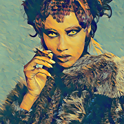
DavidAlltheTime posted:What is she covering with that white cloth in both shots? You'll never guess but it's another bad tattoo!  Side question: I was thinking this was a realistic version of a traditional tattoo design but can't think of the name. Am I totally wrong about that?
|
|
#
?
Mar 2, 2016 15:37
|
|

|
lol how long are those fuckin fingers
|
|
#
?
Mar 2, 2016 15:42
|
|

|
ICHIBAHN posted:lol how long are those fuckin fingers hey man finger dislocation is a real problem that affects tons of people
|
|
#
?
Mar 2, 2016 15:54
|
|
|

|
|
#
?
Mar 8, 2016 10:07
|
|
|
Haha holy poo poo the coloring on the K in King. Also the rest of it. In before "his queer".
|
|
#
?
Mar 9, 2016 03:40
|
|

|
his ween
|
|
#
?
Mar 9, 2016 07:09
|
|


|
I dunno, they're not the worst tattoos I've ever seen done in the moshpit at an ICP concert
|
|
#
?
Mar 9, 2016 16:46
|
|

|
They both for perfectly with the 20$ kitchen tattoo themes both of them seem to have going on. Do yourself a favor and Google bad boy tattoo. It's a wonderland.
|
|
#
?
Mar 9, 2016 17:17
|
|
|
 Endless Mike posted:Yeah, it looks like an awful coverup of an awful tattoo. I just don't understand why they didn't just turn it into an owl or literally anything but a giant black blob.
|
|
#
?
Mar 9, 2016 21:57
|
|


|
fullroundaction posted:Haha holy poo poo the coloring on the K in King. Her ring
|
|
#
?
Mar 10, 2016 02:36
|
|
|
 From this season of Survivor.
|
|
#
?
Mar 10, 2016 02:46
|
|
|
Met posted:
That guy is the definition of an rear end in a top hat so it works.
|
|
#
?
Mar 10, 2016 03:15
|
|
|
NO gently caress YOU DAD  http://m.imgur.com/vhVY24N.jpg http://m.imgur.com/vhVY24N.jpg
|
|
#
?
Mar 11, 2016 07:34
|
|

|
Optimist with doubt posted:I just don't understand why they didn't just turn it into an owl or literally anything but a giant black blob. I don't get why it was covered in the first place, was it a white power thing or is the "SS" accidental?
|
|
#
?
Mar 11, 2016 08:46
|
|
|
shame on an IGA posted:NO gently caress YOU DAD drat. It's drawn well enough. It's just...just... ...why? I predict a lot of long sleeves in this woman's future.
|
|
#
?
Mar 11, 2016 21:54
|
|
|
e_angst posted:drat. It's drawn well enough. It's just...just... Was gonna be like "no way that's on a woman, you're wrong it's def a creepy Bronie dude" but there are bra straps in this picture. So. Still a creepy Bronie to stay far, far, far away from.
|
|
#
?
Mar 12, 2016 00:23
|
|

|
 pretty good coverup imho.
|
|
#
?
Mar 12, 2016 00:24
|
|
|
Covering up that owl is a crime against humanity.
|
|
#
?
Mar 12, 2016 01:06
|
|
|
Sorbus posted:
WHY.
|
|
#
?
Mar 12, 2016 02:54
|
|
|
Sorbus posted:
That owl's expresssion is amazing, bahaha. So sad it got covered up.
|
|
#
?
Mar 12, 2016 03:08
|
|


|
Sorbus posted:
Technically that's a blastover rather than a coverup and it's a stylistic choice for some people to get heavy black designs over existing tattoos. Idk if this is necessarily what this person consciously chose to do but at least there is precedent for it.
|
|
#
?
Mar 12, 2016 03:52
|
|

|

|
|
#
?
Mar 12, 2016 04:03
|
|
|
Sorbus posted:
This is beautiful. This is art. Seriously though, this is exactly the kind of poo poo I think of when I think "Slayer fan", it's thematically perfect.
|
|
#
?
Mar 12, 2016 06:53
|
|

|
The best kind of mermaid.
|
|
#
?
Mar 12, 2016 07:36
|
|
|
Sorbus posted:
It sort looks like the SLAYER isn't actually a tattoo. God I hope it's not
|
|
#
?
Mar 12, 2016 13:26
|
|

|
Scratch Monkey posted:It sort looks like the SLAYER isn't actually a tattoo. God I hope it's not I wondered about that, it looks like it's made out of stick-on velcro (the fuzzy loop part) or somesuch. ed: Actually, that's a great idea: you could make a velcro snack holder, put a hotdog in it, stick it to your arm, and have a bite to eat while moshing madly. Pigsfeet on Rye has a new favorite as of 13:59 on Mar 12, 2016 |
|
#
?
Mar 12, 2016 13:56
|
|
|
this is actually good  
|
|
#
?
Mar 12, 2016 14:49
|
|
|
I can't hate that one. I've seen so many awful Texas ones that this looks nicely done and understated.
|
|
#
?
Mar 12, 2016 16:15
|
|

|
It got better once I realized the left border not being straight was text, and not simply incompetence.
|
|
#
?
Mar 12, 2016 16:45
|
|


|
It's worse in that case. It's a poor idea badly executed.
|
|
#
?
Mar 12, 2016 17:04
|
|
|
'home' is a nice touch.
|
|
#
?
Mar 12, 2016 18:39
|
|
|
http://i.imgur.com/JSkMNL6.jpg
|
|
#
?
Mar 12, 2016 19:04
|
|

|
rydiafan posted:It got better once I realized the left border not being straight was text, and not simply incompetence. Judging from the heart, that' s either Akron or Kent. It could be the world's best tattoo, and I'd still feel sorry for her.
|
|
#
?
Mar 12, 2016 19:12
|
|
|
Domus posted:Judging from the heart, that' s either Akron or Kent. It could be the world's best tattoo, and I'd still feel sorry for her. Someone getting a tattoo memorializing their love of Akron might be the saddest thing I've ever seen.
|
|
#
?
Mar 12, 2016 21:51
|
|


|
Sorbus posted:
I loving love this. The wreck me pony gets posted in this thread like once every three months though.
|
|
#
?
Mar 12, 2016 23:14
|
|

|

|
| # ? May 28, 2024 15:29 |
|
|
Paging SA poster Reverse Centaur
|
|
#
?
Mar 12, 2016 23:58
|
|