

|
Schwack posted:Nike is particularly bad about this. You're likely out of luck unless you go with a reseller or B&M store that has them sitting out. I bought my Super Bowl hoodie the day of the game. A friend of mine wanted the same one, but it never came back in stock online. peekaboo gangster posted:Also, 3 DONG HORSE, as a weirdo collector of jerseys, usually the Superbowl ones go on sale again later, closer to the start of preseason methinks - I ended up getting a Ray Lewis XLVII jersey for like $50. To be fair, he also retired after that game, and it was a the purple home jersey instead of the actual white one, but hey! It has the patch on it! I couldn't wait any longer so I bought one on eBay. It was 70 but the dude has a return-for-any-reason policy so I can send it back if it's lovely.
|
 #
?
Mar 23, 2016 01:54
#
?
Mar 23, 2016 01:54
|
|


|

|
| # ? May 24, 2024 22:06 |
|
|
3 DONG HORSE posted:I couldn't wait any longer so I bought one on eBay. It was 70 but the dude has a return-for-any-reason policy so I can send it back if it's lovely. My god..it's full of stars! 
|
|
#
?
Mar 27, 2016 01:49
|
|
|
maybe it's just the picture but that superbowl patch looks crooked as gently caress
|
|
#
?
Mar 27, 2016 07:49
|
|

|
I think it's the picture. I took a look again and flattened it out and it seemed fine. That freaked me out for a bit though! e: I guess I'll compare it to some pics online later this week. I have 14 days to return anyway so I might as well nitpick! 3 DONG HORSE fucked around with this message at 10:48 on Mar 27, 2016 |
|
#
?
Mar 27, 2016 10:43
|
|
|
https://twitter.com/michael31thomas/status/734864556636262401 https://twitter.com/jordancameron/status/734872465265037313 Also, throwbacks will be worn twice next year 
|
|
#
?
May 23, 2016 23:41
|
|

|
Ehud posted:https://twitter.com/michael31thomas/status/734864556636262401 Those throwbacks are a thing of beauty.
|
|
#
?
May 24, 2016 15:19
|
|
|
Almost every throwback is better than what replaced it.
|
|
#
?
May 24, 2016 20:08
|
|

|
NC-17 posted:Almost every throwback is better than what replaced it. I tend to agree in football most of the time. But if we think of other sports this happened once: 
|
|
#
?
May 24, 2016 20:11
|
|

|
My Polamalu jersey should be arriving tomorrow 
|
|
#
?
May 24, 2016 21:39
|
|


|
The Hershey-squirt Broncos and bumblebee Steelers throwbacks are NOT better than what they were replaced with.
|
|
#
?
May 24, 2016 21:46
|
|

|
Kevyn posted:The Hershey-squirt Broncos and bumblebee Steelers throwbacks are NOT better than what they were replaced with. Ditto original Bengals unis.
|
|
#
?
May 24, 2016 21:50
|
|
|
Grittybeard posted:I tend to agree in football most of the time. But if we think of other sports this happened once: That photo looks incredibly.... European 
|
|
#
?
May 24, 2016 22:56
|
|
|
Eifert Posting posted:Ditto original Bengals unis. The original Bengals uniforms with "BENGALS" on the helmet that look like clones of the Browns are kinda bland. The Boomer Esiason-era ones when they added the stripes are awesome, though, and really better than the current ones with all the white accents.
|
|
#
?
May 25, 2016 00:50
|
|


|
I prefer flash-forward jerseys over throwbacks.
|
|
#
?
May 25, 2016 00:50
|
|


|
fartknocker posted:The original Bengals uniforms with "BENGALS" on the helmet that look like clones of the Browns are kinda bland. The Boomer Esiason-era ones when they added the stripes are awesome, though, and really better than the current ones with all the white accents. I go back and forth on 90s unis vs Marv unis. Generally I prefer the 90s Blacks, but the modern Orange unis and Whites.
|
|
#
?
May 25, 2016 00:54
|
|
|
design in general just kind of took a large poo poo in the mid-90s through early 2000s and every sport suffered for it. nobody shows that better than the Washington Capitals imo 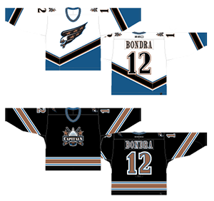
|
|
#
?
May 25, 2016 01:31
|
|
|
Chichevache posted:That photo looks incredibly.... European Man who spoke passionately about the joys of multiple penises in porn makes gay joke
|
|
#
?
May 25, 2016 02:58
|
|
|
Hockles posted:I prefer flash-forward jerseys over throwbacks.
|
|
#
?
May 25, 2016 03:01
|
|

|
japtor posted:I would be amused if they did this for the Raiders and just replaced all the Oakland with Las Vegas
|
|
#
?
May 25, 2016 03:01
|
|
|
v2vian man posted:design in general just kind of took a large poo poo in the mid-90s through early 2000s and every sport suffered for it. nobody shows that better than the Washington Capitals imo Rebranding the bullets and the caps redesign was a pretty rough one two
|
|
#
?
May 25, 2016 03:08
|
|

|
That wasn't even the worst re-design. The New York Islanders went from this  to this....  They changed back after a few years
|
|
#
?
May 25, 2016 03:51
|
|
|
I always felt this was the epitome of bad 90's design: But tbf, Houston has never had a good logo and the one this replaced looked like a tennis ball.
|
|
#
?
May 25, 2016 04:00
|
|
|
It's hilarious how many teams had to throw away those X-TREME ultra "in yo face with ATTITUDE" 90's redesigns and go back to a variation of the logos they had in the 70s and 80s. Like half the NBA has done it recently.
|
|
#
?
May 25, 2016 04:16
|
|
|
Kevyn posted:It's hilarious how many teams had to throw away those X-TREME ultra "in yo face with ATTITUDE" 90's redesigns and go back to a variation of the logos they had in the 70s and 80s. Like half the NBA has done it recently. i can think of like 10 NFL teams presently suffering from this. buccaneers, titans (ok they never had an older logo but they should make one up) patriots, seahawks, rams, broncos, ravens (see titans), eagles putting angry eyes on your mascot is always bad
|
|
#
?
May 25, 2016 04:21
|
|
|
Like someone once thought this would be a good logo for a professional team
|
|
#
?
May 25, 2016 04:33
|
|
|
somebody thought this was a good idea too fun side note about actual football: joe thomas, on roster / armonty bryant, felony arrests / barkevious mingo, likely cut / donte whitner, cut / christian kirksey, on roster / karlos dansby, cut / taylor gabriel, on roster / dwayne bowe, cut / brian hartline, cut
|
|
#
?
May 25, 2016 04:40
|
|
|
v2vian man posted:i can think of like 10 NFL teams presently suffering from this. buccaneers, titans (ok they never had an older logo but they should make one up) patriots, seahawks, rams, broncos, ravens (see titans), eagles I like the Bucs flag redesign although I think it's too big on the helmet but I loathe the overall uniforms. There was nothing wrong with the previous ones.
|
|
#
?
May 25, 2016 04:43
|
|

|

|
|
#
?
May 25, 2016 05:25
|
|

|
trigger warning
|
|
#
?
May 25, 2016 05:50
|
|

|
The new Browns unis just make me sad. Can't we all just agree to bury them and bring back the old ones? We can burn all the pictures.
|
|
#
?
May 25, 2016 06:01
|
|
|
CubanMissile posted:I always felt this was the epitome of bad 90's design: The 90s did make some cool-rear end stuff IMO  I want one of these with Dikembe on it so bad
|
|
#
?
May 25, 2016 10:31
|
|

|
You're all forgetting the king of bad 90s sports logos. The Buffaslug. 
|
|
#
?
May 25, 2016 11:18
|
|
|
Kevyn posted:Like someone once thought this would be a good logo for a professional team That logo was fine. It's the uniform that was bad. Also the Buffaslug was 2000s. The Sabres looked like this in the 90s: 
|
|
#
?
May 25, 2016 14:12
|
|
|
Every time someone talks logos I end up wasting at least an hour on sportslogos.net Bring back the USFL by the way.
|
|
#
?
May 25, 2016 14:29
|
|
|
There's no way, with that logo, the Oakland Invaders weren't a front for a neo-nazi organization.
|
|
#
?
May 25, 2016 14:37
|
|
|
Grittybeard posted:Every time someone talks logos I end up wasting at least an hour on sportslogos.net every time i see the San Antonio Gunslingers logo I just hear a super loud Goofy-style "GYU-HYUCK" in my head
|
|
#
?
May 25, 2016 14:45
|
|
|
Henchman of Santa posted:That logo was fine. It's the uniform that was bad.
|
|
#
?
May 26, 2016 01:23
|
|
|
I just picture some upper management dude standing over the designer yelling "more chrome! More! Make the horse chrome too! And make him on fire! Teal is a hot color, add some teal!"
|
|
#
?
May 26, 2016 02:06
|
|
|
Kevyn posted:I just picture some upper management dude standing over the designer yelling "more chrome! More! Make the horse chrome too! And make him on fire! Teal is a hot color, add some teal!" If the 90s had a color that color was teal
|
|
#
?
May 26, 2016 02:07
|
|
|

|
| # ? May 24, 2024 22:06 |
|
|
Mel Mudkiper posted:If the 90s had a color that color was teal Always paired with royal purple though, like a boss.
|
|
#
?
May 26, 2016 02:11
|
|