|
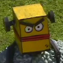
Been working on this this evening, almost happy with it.  Ideally want to keep the colours low and simple to make it easier to change the markings with masking on the fly and to keep it readable at smaller sizes, think it works well enough without the shading?
|
 #
?
May 15, 2016 22:04
#
?
May 15, 2016 22:04
|
|


|

|
| # ? May 10, 2024 17:33 |
|
|
I think it works with or without shading. If you are planning more animations I would recommend going with shading but remove the outlines. Animating outlines consumes a ton of time. I made a piece to acknowledge 400 twitter followers. Apparently they don't mind me mostly retweeting @dril with the occasional chunk of my own art posted so they deserve credit.
|
|
#
?
May 16, 2016 02:06
|
|

|
Scut posted:I think it works with or without shading. If you are planning more animations I would recommend going with shading but remove the outlines. Animating outlines consumes a ton of time. Dang, that's a shiny, rad looking 400!
|
|
#
?
May 16, 2016 21:02
|
|
|
Scut posted:I made a piece to acknowledge 400 twitter followers. Apparently they don't mind me mostly retweeting @dril with the occasional chunk of my own art posted so they deserve credit. Woo! What's your twitter, if you don't mind posting it here?
|
|
#
?
May 16, 2016 22:52
|
|

|
@scutanddestroy Summer gets busy and people don't want to sit in front of screens pushing pixels all evening, what have y'all got unfinished right now? How about a round of scratchpad pixel art posts?
|
|
#
?
May 17, 2016 00:46
|
|
|
Well ok   Came to the realization that the legs need to be... well leg sized instead of teeny stumps
|
|
#
?
May 17, 2016 08:32
|
|

|
alright This is done, just doing the app store business stuff now.  This is taking forever.  This needs to get done this week.  This needs to go somewhere next week.  This is for later.
|
|
#
?
May 17, 2016 10:55
|
|

|
the chaos engine posted:alright Which one is the secret one you mentioned the other day?
|
|
#
?
May 17, 2016 12:35
|
|
|
That's secret
|
|
#
?
May 17, 2016 12:37
|
|
|
Scratchpad? allright  
|
|
#
?
May 17, 2016 14:31
|
|

|
PREPARE FOR TROUBLE AND MAKE IT DOUBLE
|
|
#
?
May 17, 2016 15:17
|
|
|
Old Man Mozz posted:Scratchpad? allright I think this is Link but for some reason it really reminds me of Solstice. Also these are lovely colours!
|
|
#
?
May 17, 2016 16:19
|
|
|
Pixel'd and animated up this sweet tech lab for Starbound: https://gfycat.com/FlatSecondaryDikdik
|
|
#
?
May 17, 2016 17:45
|
|
|
Supernorn posted:Pixel'd and animated up this sweet tech lab for Starbound: Get outta here with your big city pixel art, professional pixelman guy!  Looks great! Shoehead fucked around with this message at 18:41 on May 17, 2016 |
|
#
?
May 17, 2016 17:53
|
|
|
Ooo yea baby. Scratchpad content posting is what I like. 
|
|
#
?
May 17, 2016 19:04
|
|
|
Here's something i guess: Tried to make the calves look more distinct, but struggling with that. I'm hoping my drawing is paying off, not sure if it's any better than previous attempts.
|
|
#
?
May 23, 2016 00:03
|
|

|
 just finished these up for the next print run deadline (magic token cards)
|
|
#
?
May 23, 2016 23:49
|
|
|
Hello everyone. This is my first post in the CC sub-forum, and I�d be very grateful to draw on your expertise. Up front, I'm not here to beg anyone to do any work for me. I'd just like to show what I have and get a general reaction, and maybe see if anyone has any advice or ideas. Feel free to respond to as little or as much of this as you like. Right now, my friend and I are hard at work on fan-translating two large Falcom RPGs for the PC Engine CD: The Legend of Xanadu and The Legend of Xanadu II. We've gotten them both essentially playable in English already, but included among the odds and ends left to do is creating English title screens. Here's the original title screen from the second game:  We aim to change the main Japanese graphic you see here, which is 240x32 and composed of sprites. Sadly, there is no way to expand its size. There is simply no room in the memory, plus the game does some fancy effects with it that just don't work if it's in larger dimensions. Essentially, whatever we make needs to rely on the same color scheme, too - dark blue-green with a light blue outline and possibly some black shading. Changing the palette might be an option, but again, because of the stuff the game engine does with the graphic, it would be much better to use the original color scheme or something very close to it. The first game uses a nearly identical graphic minus the Roman-numeral 2. Here�s the latest English version we have:  Before I explain anything else, I�d be curious to know what your reaction to it is at first glance. Neither my friend or I are artists, so we had to ask an acquaintance to make this for us. The first thing he gave us said just "Legend of Xanadu II", but we decided it needed to have "The" at the beginning because that's the full official English title that Falcom gave it. The guy then re-worked his original graphic into this, shrinking his original "of" and tacking "The" on the side. On one hand, I know that the size and color limits are pretty harsh, and this does a good job of maintaining the style of the original. On the other, though, I worry about the �The� and �of� being just a little too tiny, as well as the �II� looking almost like a weird H hanging around the end there. What do you guys think? Does it look good to you? Do whatever flaws it has seem like reasonable compromises given the limitations? Or do you think we ought to try and do better? Falcom put �The Legend of Xanadu� on the cover of both games in a big, fancy, golden-cursive font:  I wonder if it would be possible to take a cue from that and go for something thinner and curvier for the title screens. I�m no pixel-artist, though. Does that seem too far-fetched? Generally speaking, if anyone has any suggestions for fonts to experiment with, things to try with the palette and shading, or other similar graphics to look to for inspiration, I would be very interested to know them. Stylistically, this game is set in your typical 90s anime pseudo-medieval world, with a light and adventure-focused story. Finally, you might notice that the Japanese itself doesn't translate directly to The Legend of Xanadu, but rather to Legend of the Wind - Xanadu. You'd have to ask Falcom about that one. We've decided that if we were to go with a translation of the Japanese title, then probably Xanadu - Legend of the Wind is the way to put it (long story). Does that seem completely impossible to have look good given our limitations, though? That's all. Thank you very much!
|
|
#
?
May 26, 2016 10:05
|
|
I'm not really mentally alert enough to comment much, but I do have to say as a huge Nihon Falcom fan, you're doing the lord's work 
|
|
|
#
?
May 26, 2016 13:30
|
|

|
Thanks! Like I said, I am not and artist, and literally haven't tried to draw with a computer in nearly 20 years. However, I did download GIMP and manage to crank this out just as a really rough concept.  This is only 232x32. While it doesn't have the same impact as the other one, I think it at least shows that the "The" and the "of" can fit in there at the same size as the other letters. With a prettier font and and little touching up/shading by hand, I think this kind of thing could look better. Then again, I know that I don't really know what I'm talking about when it comes to this stuff.
|
|
#
?
May 26, 2016 14:01
|
|
|
I really like your second one, but for the sake of readability, I personally think you need to consider something from the original logo. In the original logo they've got a minimum of 2 pixels of space between the white lines so they can fit the drop shadow effect that helps it to pop from the background. I do realize that it's just a mock up so you probably intend to put it in there still, but there's a lot of places on that font that gets a little too tight to fit it effectively, so it may cut down on the readability. I'd consider going with either a slightly less fancy font, or considering small caps like the old English Final Fantasy logos.
|
|
#
?
May 26, 2016 18:36
|
|


|
https://twitter.com/cardamajigs/status/735858644365934592 it moves!
|
|
#
?
May 26, 2016 18:57
|
|
|
Finally finished work on the water level... https://www.youtube.com/watch?v=qHi96XJzSRg
|
|
#
?
May 26, 2016 23:39
|
|
|
Baron Snow posted:I really like your second one, but for the sake of readability, I personally think you need to consider something from the original logo. Thanks for the advice! Here's another mock-up I made:  This is Aramis Italic with bolding, with the II slightly enlarged and with a nightcap-like taper on the d's and the h clumsily edited off by yours truly. I think the T and the L could also stand to rise another pixel or two. Anyway, with this one, I always had enough room to put in shading, which I did. After many failed experiments with many other fonts and methods, this is the only mock-up that maybe beats the one I put in my previous post. For space-efficiency reasons, it would be nice to stick with lowercase. Now, I'm on the lookout for a font that has the same proportional advantages as this one, but is a little straighter without being too boring. Any ideas on that would be very welcome. Maybe I should post in the font thread? Of course, any ideas in general are very welcome, too. Like I said, I'm really not an artist. I don't know if I'll ever be able to come up with anything truly useable on my own, but I would at least like to try, and learn a few things along the way. Thanks again! EDIT - Latest version:  - Increased size of T, L, and X. - Tweaked tips of d and h (maybe made them worse, though) - Merged II - Moved things a little closer together Samuelthebold fucked around with this message at 16:10 on May 28, 2016 |
|
#
?
May 28, 2016 00:50
|
|
|
Can anyone give me some recommendations on where to commission paid sprite art? I just need about 60 frames of animated character sprites for a short 2D game demo, but I need them done well in a very specific style
|
|
#
?
May 29, 2016 00:31
|
|


|
Samuelthebold posted:Thanks for the advice! My typical suggestion for trying to get a fresh set of eyes is to run it through waifu2x. Generally it makes wonky things wonkier and good things go through fine.  Looks pretty good, I might recommend a drop shadow just for the 'e' in 'the' and 'a' in 'Xanadu' to stand out a bit more, but I understand if you don't want to do that.
|
|
#
?
May 29, 2016 03:08
|
|

|
Exclamation Marx posted:I made a couple of fonts  looks great, thanks
|
|
#
?
May 29, 2016 20:56
|
|


|
Tunicate posted:My typical suggestion for trying to get a fresh set of eyes is to run it through waifu2x. Generally it makes wonky things wonkier and good things go through fine. Thanks! That was certainly interesting to mess around with. My graphic has been through a lot of revision over the past couple of days. Here is the latest one. - T and X reshaped completely - d and h touched up to reduce roundness - Spacings between characters modified - External drop-shadow added - Blue outline now in three shades, in horizontal bands. (I didn't know the palette accommodated that, but it was in the original graphic all along.) I'd love to know what anyone thinks of this. ----------------------- Another fellow, someone knows what he's doing, posted this.  It's certainly nice that he got something so close to the packaging materials (see above). However, and I know I'm biased towards mine, I see two problems: 1. It relies heavily on anti-aliasing, which is going to be hard to do on real hardware and might come out looking bad. At least it turns out that there are some empty palette spaces to try it with, though. 2. It's a bit on the gaudy side. The golden cursive that this is based on is more like a decorative graphic than a proper title screen, and I'm afraid that this is a bit too extreme and out of sync with the tone of the games. How does it strike you at a glance? Samuelthebold fucked around with this message at 13:16 on May 30, 2016 |
|
#
?
May 30, 2016 12:11
|
|
|
Reply is not edit. Sorry!
|
|
#
?
May 30, 2016 13:15
|
|
|
Ziggy Starfucker posted:Can anyone give me some recommendations on where to commission paid sprite art? I just need about 60 frames of animated character sprites for a short 2D game demo, but I need them done well in a very specific style Style-matching can be tough. Not sure if my style would work for you at all but I'm booked up until autumn anyway. I would recommend you go to the TIGSource Forums and browse the portfolios of pixel artists there. Find someone you like and contact them.
|
|
#
?
May 30, 2016 20:42
|
|
|
 More super unfinished work. I have a lot of downtime in work atm so I'm animating between clients with a terrible mouse 
|
|
#
?
Jun 2, 2016 10:54
|
|
|
I'm looking for an artist to do some work on a game I'm developing for a hobby project. I was going to make a thread in SA Mart, but most of the work in this thread is jaw-dropping, so thought I might put this up here before. This involves quite a bit of work (sprites and gui/interface design mostly - no animations). Not sure what would be a fair payment, but the budget I have for these art assets is around $400. Would anyone be interested in having a go at it? Send me a pm with info and your website/portfolio and we can discuss further.
|
|
#
?
Jun 4, 2016 19:38
|
|
|
A friend and I are trying our hand at making games for fun, I'm the art half of the team and our first project is a simple platformer. I'm learning all kinds of annoying things about how to handle sprite sheets for games, but the most intimidating part is definitely making and animating pixel art. I have a painting and illustration background so I'm not completely hopeless, but I have extremely little experience with pixel art and no experience with animation at all, everything is an exciting new challenge when it comes to making things move.  This is Jumpman, our player character. This is actually his second incarnation because the first version had a 3-frame walk cycle and it was so horrendously lovely I could not let it continue to exist, so this is technically my second attempt at a proper walk/run cycle ever. He came out a lot better than I expected but I know there must be things that are wrong and I could use some criticism on both the pixel and animation aspects. One thing I've noticed after getting him into the game and running around is that as the arms pump the left and right sort of occupy the same space and have similar shape/palette that can cause a little bit of confusion about what's in front of what. Similar thing with the legs too I guess. Not sure what the solution is exactly, I might try an even darker color for the rear limbs to push them further back in space. I think the contrast in general could stand a little push perhaps. I'm also a little unsure about the quasi-toolbelt thing that I designed him with, it looked alright in the idle stance but I wonder if it's just confusing the read on his body in the run cycle. I'm planning on building a 3-frame jump animation to round out the movement set and I'll probably make some final tweaks to the whole thing then. Scoss fucked around with this message at 10:10 on Jun 6, 2016 |
|
#
?
Jun 6, 2016 10:06
|
|
I did this today: I think I actually will use this one for a small game idea I have. I'm not sure though.
|
|
|
#
?
Jun 6, 2016 20:11
|
|
|
Scoss posted:A friend and I are trying our hand at making games for fun, I'm the art half of the team and our first project is a simple platformer. I'm learning all kinds of annoying things about how to handle sprite sheets for games, but the most intimidating part is definitely making and animating pixel art. I have a painting and illustration background so I'm not completely hopeless, but I have extremely little experience with pixel art and no experience with animation at all, everything is an exciting new challenge when it comes to making things move. yeah first thing I noticed was the arms too and switching up the colours a bit would probably help, looks pretty nice otherwise!
|
|
#
?
Jun 6, 2016 22:16
|
|
|
Samuelthebold posted:Hello everyone. This is my first post in the CC sub-forum, and I�d be very grateful to draw on your expertise. This is a really cool project. Fonts are going to gently caress you up here IMO. They're made for making large chunks of text readable, not for impactful titles. If I was doing this i'd hew as close as possible to the elements that make up the Japanese characters and try to sort of redeploy them into English letterforms. The way those big swooping slashes play off the thick, slightly angled crossbars (or whatever you'd call em in japanese) looks so so good, I would not be quick to lose that. Also look at how the original busts out the roman numerals from the words with a dramatic jump in height and line weight; you've been downplaying that so far and I would tend towards the opposite, especially since the words are now in the same alphabet as the numbers. Good luck!
|
|
#
?
Jun 9, 2016 04:29
|
|
|
swamp waste posted:Fonts are going to gently caress you up here IMO. They're made for making large chunks of text readable, not for impactful titles. That is an untrue statement. Some fonts are absolutely, specifically made for impactful titles.
|
|
#
?
Jun 9, 2016 08:27
|
|
|
Our simple platformer also calls for an enemy that shoots bullets, but it's all super barebones and minimal as we learn how to make things. Originally I had only made a really sloppy 3 frame sprite sheet with two shooting frames and one death frame, but the temptation to go nuts and try something a bit more ambitious and metal-sluggy with a big gout of blood was too great to resist. I couldn't quite get the sense of weight I wanted as he collapsed and some of the foreshortening is a bit wonky, but it's so much better now and I think it will be fun to shoot him. Scoss fucked around with this message at 09:32 on Jun 10, 2016 |
|
#
?
Jun 10, 2016 09:29
|
|
|
I think the "collapsing to ground" portion of the animation could have fewer frames. It feels like he's falling too slowly, and there's a lack of dynamic motion as a consequence.
|
|
#
?
Jun 10, 2016 15:11
|
|

|

|
| # ? May 10, 2024 17:33 |
|
|
I think the biggest issue is that the dude's feet are sliding around from frame to frame instead of being planted to one spot, which is distracting and negates any feeling of weight to the body. If you don't feel like redrawing all those frames you might be able to get away with just translating the frames right as he falls so that the rightmost foot more or less lines up for every frame. I agree that the timing could use to finessing too. You have a good grasp on drawing readable poses, but your timing between key frames (standing, reeling backward, on knees, slumped over) is very even. Don't be afraid to experiment adding or removing inbetweens or to hold a pose for more than one frame. Just as a general tip: if you're not already, you should get your keys figured out first, then duplicate those frames to adjust your timing before you replace the duplicates with inbetweens (so four frames of pose A followed by 3 frames of B becomes A, three inbetweens, B, two inbetweens, C). If you're drawing every frame in sequence or doing inbetweens before you get the keys and timing down, you're probably going to end up making more work for yourself. Hardcordion fucked around with this message at 18:45 on Jun 10, 2016 |
|
#
?
Jun 10, 2016 18:34
|
|