


|
VelociBacon posted:Sorry this isn't really crit but as someone trying to improve my own portrait photography, I see the shadows from the offaxis light up and to the subject's right but did you also use a fill light nearly on-axis with the camera? So this whole thing is actually lit with a literal barn door. The subject is standing a couple feet inside of a barn door which is opened about 3 feet. I'm standing just outside the barn door, shooting in. The backdrop is the dark interior. The sun was high, but not directly on the subject, so the sky and grown was basically acting light a giant graduated softbox (sky bright, ground bright but less so). That accounts for the mostly-flat-solid light on the subject, with the slight strength above giving the glasses the slight shadow on the underside. I've gotten similar effects in the past by standing between two vertical stripboxes, or in front of a huge softbox or bounce wall. The ringflash look is a variation on this, but less soft.
|
 #
?
Apr 18, 2016 17:50
#
?
Apr 18, 2016 17:50
|
|


|

|
| # ? Jun 1, 2024 07:55 |
|
|
I'm an utter dilettante. Here's my crit I like this, but I think I'd like it more as a pure landscape. I get what the function of the person is, compositionally, but (and don't take this the wrong way) I think including a person is a sort of cop-out. Even if it would be boring without the person. As for the arch, I've seen it posted before, and it kicks rear end. It's awesome in its simplicity, and I love how it has two perpendicular gradients. My stuff:  
|
|
#
?
Apr 22, 2016 17:48
|
|


|
k-zed posted:I'm an utter dilettante. Here's my crit Ok first time critiquing someone else's photo. I think the contrast is a little low in the first one, nothing really pops out to me. I didn't notice the shack until I searched the photo. The second one I like, good composition, the shadow on the statue are nice. The statue might be a little soft, but I dunno what you shot that with. Looking to get opinions on some my more artsy~~~ shots. I'm interested in https://en.wikipedia.org/wiki/Chiaroscuro.   Harvard Bus Station by Sean Beck, on Flickr Harvard Bus Station by Sean Beck, on Flickr Peephole by Sean Beck, on Flickr Peephole by Sean Beck, on FlickrI think there might not be enough going on in the last one, but I love the colors. Karl Barks fucked around with this message at 17:16 on Sep 25, 2016 |
|
#
?
Apr 23, 2016 00:34
|
|

|
Karl Barks posted:Ok first time critiquing someone else's photo. I think the contrast is a little low in the first one, nothing really pops out to me. I didn't notice the shack until I searched the photo. The second one I like, good composition, the shadow on the statue are nice. The statue might be a little soft, but I dunno what you shot that with. I want to really improve my photography, so I'm posting in here to boost that pipe dream. I hate critiquing someone's work but here goes. I dig the first one. It's mysterious and makes me instantly think of Uncle Acid and the Deadbeats - Night Creeper album. Chick could be being stalked and about to be murdered. The second one doesn't really do anything for me. Maybe it's the huge amount of grain/noise, or that it's just a bus coming out of a tunnel. I kind of agree with you on the third one. The colors are fantastic, but there is so much dark space, I really don't know what I am looking through and distracts from the focus point. There, I did it, I'm sorry! Here are two from me today. Rip me a new rear end in a top hat. I initially had these in black and white, but changed my mind.  Tranquility by Eli Misel, on Flickr  Free Pizza! by Eli Misel, on Flickr Choicecut fucked around with this message at 01:55 on Apr 23, 2016 |
|
#
?
Apr 23, 2016 01:52
|
|

|
after talking myself out of ponying up the money for a few rolls of 35mm film, I decided to compromise and instead test my composition skills by purchasing a Fujifilm disposable camera. I haven't touched one of those things since I was a lot younger and figured it would be an easy way for me to really focus on arranging things. here are two of my favorite photos from the roll of 27:  For the first one, I was particularly interested in the weird perception of tilted axis due to the half-fallen tree behind the junction box. (This was taken next to a rarely used commuter rail station.) I think that the quality is fairly impressive for a disposable camera with what I imagine to be shoddy plastic innards for $10.99 a pop. The graffiti on the junction box itself is eye-catching and it looks like a Photoshopped image in and of itself - yet it isn't. As for the second, I am only slightly disappointed in how the print came out. I sort of like the gritty, early 90s bodega aesthetic however. The lighting ended up being really conducive to grain as you can tell and I wish it had just a little more clarity to it, but I'm satisfied with the result nonetheless.
|
|
#
?
May 8, 2016 05:11
|
|

|
Choicecut posted:I want to really improve my photography, so I'm posting in here to boost that pipe dream. I hate critiquing someone's work but here goes. I think the "free pizza" thing is a nice capturing of the moment and a faith in humanity type of thing - but your other one is hands down stronger. I think the muted tones go really well with the muted stranger. He seems "tranquil" as you nicely put it. Good capturing of an interesting pose. Good composition all around. Erostratus fucked around with this message at 09:31 on May 10, 2016 |
|
#
?
May 10, 2016 09:28
|
|

|
Karl Barks posted:
I love the first picture. It's got a nice inside frame going on and the bright colors and the tunnel's interior elements work really well with the silhouette. Although me personally, I don't know if I wouldn't have edited out the car on the left. I'm sure you left it in on purpose because it helps you establish that we're looking at an exit of some sort. But at the same time I feel like it almost looks like a mistake because everything else is pitch-black and the car is cut-off somewhere by the edge. The second picture's got some nice gritty vibe going on with the colors and the grain. I like it a bit more than the other guy but yeah, it's all a bit muted and distorted and then it's just a bus driving at the camera. Cool mood but as a whole it's not as good as the picture above. I absolutely agree with everyone on the third. Too much black and the shape of the colored bit is too undefined. Choicecut posted:
I like the first one. The subject is interesting and the picture as a whole is nicely composed. However, the texture on the grass hurts my eyes. Kinda looks like you ran it through a sharpen filter. Also I feel like the guy on the bench doesn't stand out from the background enough. I think it's because the contrast as a whole is so high. The second picture's got some nice colors but again too much sharpen and contrast for my taste, especially the shadow on the dude is a bit distracting. It also does less for me as a whole than the picture above. That one has a real serene quality to it whereas this picture seems less cohesive. Might have to do with the protagonist (the dude with the sign) being so far away and getting lost in the busy background. Finally decided to get back to my big ol' picture stash and get some more stuff online. Here's the first bunch:   
|
|
#
?
May 21, 2016 18:47
|
|

|
Karl Barks posted:Ok first time critiquing someone else's photo. I think the contrast is a little low in the first one, nothing really pops out to me. I didn't notice the shack until I searched the photo. The second one I like, good composition, the shadow on the statue are nice. The statue might be a little soft, but I dunno what you shot that with. yes!!! yes!!!!!!!!!! These are gorgeous. I do wish there was a little more visible in the last one (curtains?) but the colors are terrific. Awesome grain in the bus photo, and the flare on the lights in the first one is just stunning. I wish I could eat these photos.  IMG_3548 by difficult listening, on Flickr  IMG_4963 by difficult listening, on Flickr  IMG_5068 by difficult listening, on Flickr
|
|
#
?
May 21, 2016 19:11
|
|

|
Entenzahn posted:
I'm still honing in the post processing stuff, so I really appreciate this. I've been resisting the urge to over sharpen images I have taken since those ones. Thanks for the critique!
|
|
#
?
May 24, 2016 22:50
|
|
|
Mum gave me her camera after she gave up her newest hobby after 2 months. I'm gonna refrain from critiquing others for the time being seeing that my knowledge consists of reading couple of OPs for the time being. So following the thread, I'll try to say what I think i messed up on in these photos. Lucky for me, my first week with an SLR camera there happened to be a car show. 1. Not sure about the composition on this one, i really just tried to capture all the brown colors in the cockpit  2. I wanted to get more of the car in focus as well as the kid (depth of field thing I've read?). The kid was really cute so I regret not getting a better angle when he was facing me, but I'm still really shy taking pictures of strangers without asking.  3. I read about the "rule of thirds" so I tried to get the Maserati badge on one of those axis and make it the main focus.I think I messed up on the left side of the badge, there's too much texturing due to post processing. Definitely didn't notice it in LR but its more evident after i put it on flickr.  I think I have a bad habit of overdooing it during post-processing. I'm having issues identifying how much is "too much" in regards to editing a picture. But I had tons of fun and I'm already looking forward to other events.
|
|
#
?
Jun 21, 2016 04:22
|
|

|
SuperSix posted:Mum gave me her camera after she gave up her newest hobby after 2 months. I'm gonna refrain from critiquing others for the time being seeing that my knowledge consists of reading couple of OPs for the time being. So following the thread, I'll try to say what I think i messed up on in these photos. Don't take pictures of other people's kids without asking, if that's what you mean. First picture the first 1/6ish is weirdly dark, and so the picture is framed jarringly from that. Also I thought the colors were too muted inside the cab, and had to look at what brown you were trying to show case. Number two I just don't like, there's no action, just the back of two people's heads and a car that's weirdly framed. From the photo the car has no movement and so the photo falls flat. The color on this shoot is very nice. 3 I don't "get." It almost looks like you were going for a "commercial" shot, but the dark blacks obscure parts of the picture. I have been negative BUT I think this is actually a good start, your sense of framing isn't bad at all and I think with some input you'll get better at what to look for in post.
|
|
#
?
Jun 21, 2016 05:22
|
|
|
 IMG_5041 by difficult listening, on Flickr 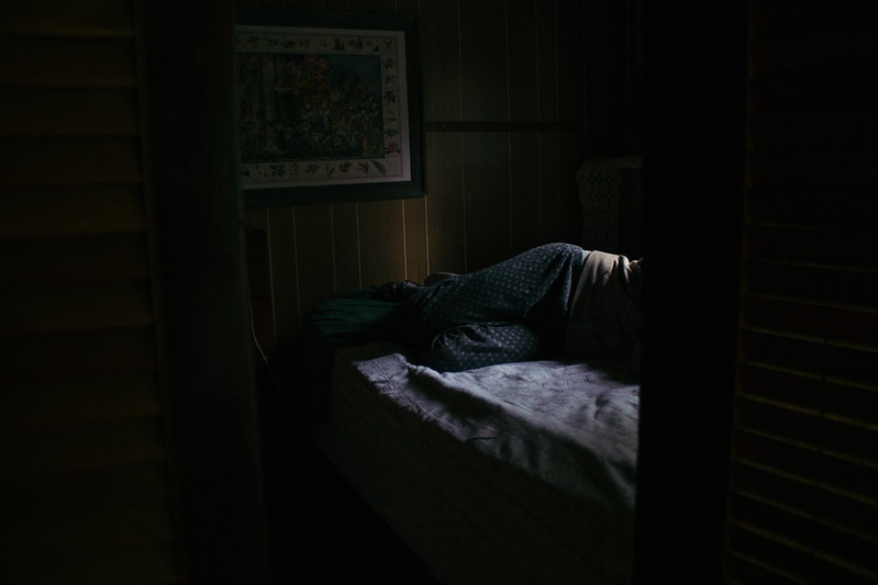 IMG_5242 by difficult listening, on Flickr  IMG_5584 by difficult listening, on Flickr SuperSix posted:Mum gave me her camera after she gave up her newest hobby after 2 months. I'm gonna refrain from critiquing others for the time being seeing that my knowledge consists of reading couple of OPs for the time being. So following the thread, I'll try to say what I think i messed up on in these photos. First off, definitely feel free to critique! It doesn't matter what you know or don't know, just say whatever comes to mind when looking at previous photos. Anyways, photos 1 and 3 feel very magaziney. 3 is far better than 1, because 1 excels purely based on the subject, which is just an object, which makes it boring. You've shot it from a ways off, so I don't feel very involved, and everything's cropped kinda boringly - the main point of interest here is the terrific dried-blood red color of the car, which is independent of you, and can be captured by anyone. 3 is sort of interesting in a photographic way - you're close up, the lines are threatening, the focus is shallow, which makes it feel breathless. The middle one is okay. The framing isn't telling me much, but what really kills it for me is the super aggressive contrast, the super blown out red shirt, the grimy blacks in the kid's denim, etc.
|
|
#
?
Jun 21, 2016 07:36
|
|
|
Magic Hate Ball posted:
Thirteen Orphans posted:Don't take pictures of other people's kids without asking, if that's what you mean. Thanks a bunch guys! I really appreciate everything you've said and I'll take everything to heart, it's really given me some perspective on what to look for. I need to work on discerning what makes different shots "photographically" interesting compared to just using a subject if that makes sense. That's what I have most trouble in, sometimes I take a look at popular shots and while it looks very good I have trouble identifying the elements that make it so. For example, just to leave some feedback, looking at your pictures (MHB), they all impart me a type of "mood" if you will, or provoke a feeling, but I have no idea why it does so. SuperSix fucked around with this message at 06:02 on Jun 23, 2016 |
|
#
?
Jun 23, 2016 05:55
|
|
|
SuperSix posted:Thanks a bunch guys! I really appreciate everything you've said and I'll take everything to heart, it's really given me some perspective on what to look for. I need to work on discerning what makes different shots "photographically" interesting compared to just using a subject if that makes sense. That's what I have most trouble in, sometimes I take a look at popular shots and while it looks very good I have trouble identifying the elements that make it so. It's partially a visual language (compare different styles of photography to see what's being emphasized) and partially just personal taste. Think about what, when you're in a moment and taking a photo, do you want to convey to the viewer? Like, for me, this photo is much, much better than your second photo up there because it's telling a similar story in a more interesting way. The shallow focus on the kid makes them feel much more like the subject than in the photo you posted, and the fact that the car is already speeding away (leaving that great haze) makes it feel almost cinematic. There's a "frozen in time" aspect that I get from this one that I don't get from the other because of all these bits that add up to make it feel ethereal. SuperSix posted:For example, just to leave some feedback, looking at your pictures (MHB), they all impart me a type of "mood" if you will, or provoke a feeling, but I have no idea why it does so. Thanks! That's probably because I cheat on my tone curves and force a false sense of mystery, rather than actually taking good photos.
|
|
#
?
Jun 23, 2016 06:16
|
|
|
Magic Hate Ball posted:
They work in a series, but on their own the first and the last aren�t too interesting to me even though I like the processing. I'm a fan of the second one though. I�m not sure what I�m looking at: A man? A woman? What is he/she doing? Wouldn�t think it would be reading judging by the way the person�s lying and usually people are covered by something if they�re sleeping. Whatever it is, I like the way it looks and the processing fits perfectly. 
Xabi fucked around with this message at 22:41 on Jul 14, 2016 |
|
#
?
Jul 14, 2016 12:32
|
|
|
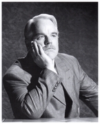
OK, let's do this. I've been out of this thread for a while, but this seems to be the place for criticism around here. I like crit. I desire crit. I can handle crit. Back into it we go. Oh, come ON. The first post in this thread in weeks, and you didn't read the rules. I dig the photo, though I am a fan of the dead-on perspective. I do wish there was a bit more visual contract between the subject and the field though. I mean, what I get out of this is 'this thing is all square and human and grey, but it's surrounded by green, lush, natural shapes and wildness.' And I like that. But the grey, cloudy sky muddles that, as does the other house/shed off to the left. Magic Hate Ball posted:
These things build a wonder, cinematic feeling together. Are you certain you're not a stealth social media campaign for the new Twin Peaks? 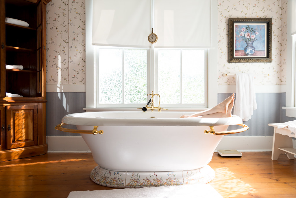 Just Relax by Jason Martin, on Flickr 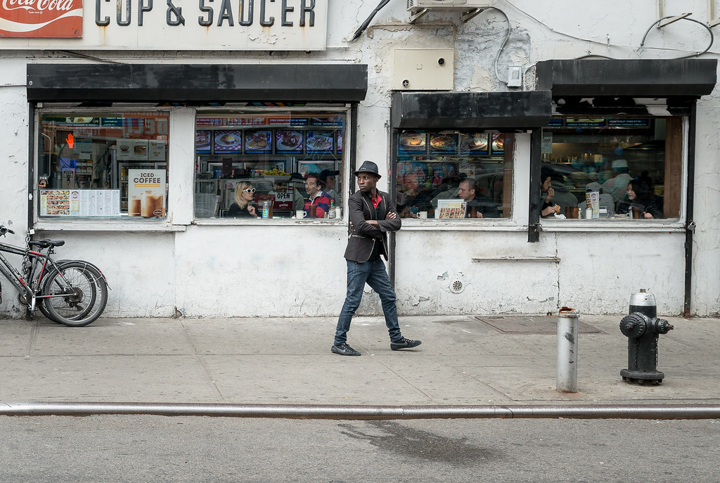 Untitled by Jason Martin, on Flickr  Untitled by Jason Martin, on Flickr
|
|
#
?
Jul 14, 2016 22:23
|
|
|
Really love that second one. It's cool that the colors in his outfit are kind of mirrored in the environment and it's nice placement � it's nearly symmetrical, but him being midstep gives it a kind of precariousness that keeps the effect from being too static.
|
|
#
?
Jul 15, 2016 00:55
|
|


|
thetzar posted:
 Untitled by Alysia Spencer, on Flickr This is mine. It wasn't super intentional so I was pleasantly surprised by it when I was scrolling through my pictures for the day. I'm still working on my post-processing and it's a little too grainy for my tastes, but I like the overall mood and composition of it. ahleeshaa fucked around with this message at 05:19 on Jul 19, 2016 |
|
#
?
Jul 19, 2016 05:17
|
|
|
The first one isn't really my style. I'm not sure why it's interesting, is it the tags? You tried to go for symmetry, but the rails aren't the same on both sides. The second one is my favorite of the three. The composition is nice and classic and the colors are good. It's a simple shot but it looks like some thought was put into it. The third one looks like the hornet is not quite in focus or may be it's the colors/contrast on it that are not strong enough�. The composition isn't working for me and there is way too much empty space. The color and detail of the flower is nice. --- So I'm posting a picture of a baby. Sorry. But really I think the shot is interesting and it's more than just a boring baby shot. I'm really bad at post, especially with portraits so I'd be extra happy for tips/critique on that aspect. 
|
|
#
?
Jul 27, 2016 00:59
|
|

|
KingColliwog posted:So I'm posting a picture of a baby. Sorry. It's ok. It's not mindblowing, but you've got action, intent, and framing, so there's something to look at. It is, however, very grey, which I know is not really under your control (cloudy day, asphalt background) but the baby looks a little ashen. ahleeshaa posted:
GREAT tones here, really lovely shadows (I hate inky blacks - these have a nice velvety feel), nice milky colors. The inclusion of the rider feels a little accidental, and the framing doesn't totally grab me, but the overall atmosphere is bewitching. This looks like a frame from Inherent Vice (ps don't worry about the grain it's fine). thetzar posted:
Really nice bright, air feel here. Took me a few looks to notice the legs, though. As much as I love the room (very Martha Stewart), it'd be nice to get closer up on them.  IMG_6009 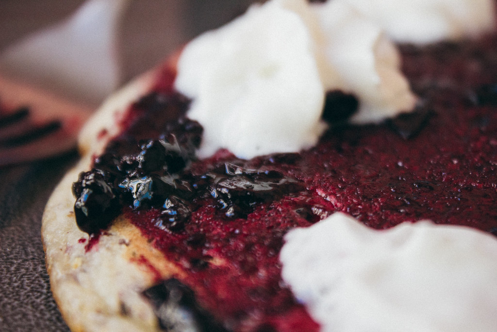 IMG_6071-3  IMG_6110-2
|
|
#
?
Jul 29, 2016 06:09
|
|
|
Magic Hate Ball posted:It's ok. It's not mindblowing, but you've got action, intent, and framing, so there's something to look at. It is, however, very grey, which I know is not really under your control (cloudy day, asphalt background) but the baby looks a little ashen. I had the habit of overworking my photos so I tried to go with a very light touch. Do you think the picture would benefit from boosting the colors some more so the baby looks less grey-ish. On my screen it's fine bordering on being too grey.
|
|
#
?
Jul 29, 2016 20:28
|
|
|
KingColliwog posted:I had the habit of overworking my photos so I tried to go with a very light touch. Do you think the picture would benefit from boosting the colors some more so the baby looks less grey-ish. On my screen it's fine bordering on being too grey. I think so? But I think it's also just the nature of the day you were shooting on. It also feels a little oversharpened, which gives it a kind of harsh texture.
|
|
#
?
Jul 29, 2016 20:50
|
|
|
KingColliwog posted:I had the habit of overworking my photos so I tried to go with a very light touch. Do you think the picture would benefit from boosting the colors some more so the baby looks less grey-ish. On my screen it's fine bordering on being too grey. Just upping the color temperature to something a bit warmer would probably be plenty, rather than increasing contrast or saturation.
|
|
#
?
Jul 29, 2016 20:50
|
|


|
Magic Hate Ball posted:
disagree, legs were the first thing i noticed and i personally like the framing. does feel slanted to the right, and i wish the tub was centered (slightly off to the right it looks like).
|
|
#
?
Jul 29, 2016 20:57
|
|
|
KingColliwog posted:So I'm posting a picture of a baby. Sorry. This is my first time posting in this thread. Looking at this I feel like if you were down a little lower instead of the camera pointing down at them it could have turned out a little better. I think that could have helped with the grey back ground. I think if there was a little more light you could pull off a faster shutter speed and possibly remove some of the blur from the water drops. I bought my first DSLR a couple of years ago mostly for portraits of my kids as they get older. Both have birthdays this month so I thought it appropriate to go out and take photos. My critique of my photo of my son:  Perhaps a different colored shirt would have lended better to the contrast of the photo. I think that the lighting at that time of day was a little harsh which makes me think that his hair was a little over exposed. If I could have waited out the timing longer for golden hour to set in I think I could have remedied the over exposure better. This being a two year old and a location kind of far from home meant that I could really only get the photo done in the time allotted before bed time.  What I like about this photo is the framing and how she is actually in the air and not touching the ground. I liked that the focal point was open enough for her and some of ground to be in focus and lend to some nice bokeh. The thing I am not crazy about in this photo is that I wish her hair wasn't covering that part of her eye. I am still not sure how I feel about the shadow overcasting her hair. I would have liked the lighting to be uniform.
|
|
#
?
Jul 29, 2016 22:20
|
|


|
Somewhat Heroic posted:
Are we looking at the same picture that girls foot is planted on the ground.
|
|
#
?
Jul 29, 2016 22:56
|
|
|
No it's not, the foot has no visible shadow. If her heel was down there would be one.
|
|
#
?
Jul 29, 2016 23:12
|
|

|
xzzy posted:No it's not, the foot has no visible shadow. If her heel was down there would be one. Now that you mention shadow, I see both, but you're right she's off the ground.
|
|
#
?
Jul 29, 2016 23:19
|
|
|
Thirteen Orphans posted:Are we looking at the same picture that girls foot is planted on the ground. It might not be as visible on this photo with the pixels at 1024, in the full resolution on  MY 5K iMac it is more apparent. MY 5K iMac it is more apparent.E: for clarity and e-penis measuring. Somewhat Heroic fucked around with this message at 23:58 on Jul 29, 2016 |
|
#
?
Jul 29, 2016 23:39
|
|
|
Somewhat Heroic posted:my 5K iMac oh god i'm nutting tell me more
|
|
#
?
Jul 29, 2016 23:44
|
|
|

|
|
#
?
Jul 29, 2016 23:48
|
|


|
I don't really dig this one. The contrast between the blown out(?) sun and darker leaves doesn't really add much to the photo. The whole left side of the photo, especially the blurry leaf that dominates the upper left, is kind of a waste. I'm left wishing you had panned a bit to the right so you'd have a sense of distance/depth behind the berries or whatever. Depth of field seems too shallow here and I don't really feel like it has a solid subject. The cream/cheese or whatever would have been a bit more appetizing focal point. The sharp focus on the jam makes it look just messy on it's own. The lighting is generally good but maybe could have been a bit brighter (or boost the highlights), as the jam looks more "gelatinous" than...fresh and tasty I guess. I like the colors going on here, although it's a bit oversaturated. A second lighting source might have helped to highlight the edges of the pipe. Although, in general, the general feeling I get from this is "oh, it's a bong", and not much else. I feel like panning up to omit the brass bowl and maybe working in something else to make it more interesting than "two stripes of color" might be worth trying. A good action shot. The angle is a bit too much. A fill flash might have helped as well to light her up and compensate for the bright light in the background. I'm also not sure how I feel about the fact that she's mid air. It's a neat novelty, but the way her shadow falls (or rather, doesn't fall) kinda makes it look like a incomplete photoshop. EDIT: What the heck, I haven't posted a while in here. Here's two black and white shots I took recently. Both were kind of off the cuff. The first was after a meeting at a county office I traveled two, and the second was from a hike. For the House-on-the-hill shot, I definitely want to go back during sunrise/sunset, but will take some planning as the vantage point was a couple miles downtrail from the parking lot.  Untitled by Nate Pritchard, on Flickr  House on the Hill B&W by Nate Pritchard, on Flickr LogisticEarth fucked around with this message at 20:03 on Jul 30, 2016 |
|
#
?
Jul 30, 2016 19:57
|
|
|
LogisticEarth posted:
I'm on board with reflection shots, but this doesn't do it for me. The cow is the most interesting thing in the frame, but there isn't enough of it and it's just kind of sitting there. Feels like a B+W picture of the sky in a reflection. I would have passed on this one. The second one is better, but I think you would have been better served with a longer focal length. The house is the clear subject of the shot but it's tiny and far away. You might have lost the context of the hill though... perhaps a landscape instead of portrait view was more appropriate here? I'm hoping to get some critique of some of my street shots. street photography is new to me, and I'm trying to get a feel for what makes a good photo. thanks!   
Karl Barks fucked around with this message at 14:19 on Aug 5, 2016 |
|
#
?
Aug 4, 2016 19:43
|
|
|
Karl Barks posted:I'm hoping to get some critique of some of my street shots. street photography is new to me, and I'm trying to get a feel for what makes a good photo. thanks! dust your loving negs
|
|
#
?
Aug 5, 2016 05:51
|
|

|
ahhh, yes 
|
|
#
?
Aug 5, 2016 15:34
|
|
|
Karl Barks posted:I'm hoping to get some critique of some of my street shots. street photography is new to me, and I'm trying to get a feel for what makes a good photo. thanks! Robert Capa is frequently quested as giving the old chestnut, "If your pictures aren't good enough, you're not close enough." This is far from universally true. But the more I try to do stuff with street photography myself, the more I'm finding it being true, for me, in that genre. I'd give that advice to you� get closer. The first shot does nothing for me. I'm sure that in life the light looked awesome, but here I'm just seeing a guy talk in a food cart. Same thoughts with the last -- nothing doing. The second shot is interesting (and also your closest). Three dudes in suits with different personalities, with Mr Flip-flops in the back. I can infer a much more interesting story here than I can with the others. Today from me: posed stuff. Centered stuff.  Untitled by Jason Martin, on Flickr  Summer Fridays by Jason Martin, on Flickr  Untitled by Jason Martin, on Flickr
|
|
#
?
Aug 6, 2016 04:21
|
|
|
In an effort to not dump tons of money into a nice camera only for vacation photos I'm actually starting to shoot a bit more here and there. With the fireman shot I'm not sure if it would have been better to crop out much of the background since there's no damage/action to look at or if the lines that intersect to his head help provide something interesting.  Not sure how I feel about the colors I settled on here, I feel I have a tendency to ramp things up too much. 
|
|
#
?
Aug 19, 2016 20:58
|
|
|
An all around great shot. Maybe would have been improved by opening up a tad and capturing the whole front of the truck on the right, while keeping the good framing of the truck on the left and nice symmetrical bisection of the tire. Perhaps a wider shot, or maybe taking a step or two to the left and framing accordingly. Highlights may be a bit blown out. Either way, very nice. This one isn't so hot. Oversaturated colors (as you suspected, I guess). The sky is blown out, the foreground/mid-ground too dark, etc. A tricky exposure but in this case I would have gone for a fill flash/reflector on the girl, and exposed a bit more for the sky. Looks pretty Instagram-ey. Comments from a while ago: Karl Barks posted:I'm on board with reflection shots, but this doesn't do it for me. The cow is the most interesting thing in the frame, but there isn't enough of it and it's just kind of sitting there. Feels like a B+W picture of the sky in a reflection. I would have passed on this one. Thanks, the "cow reflection" was basically a quickie shot after leaving a meeting at work. I was wondering if it worked in any way or not, either way I can see how it's a bit of a throwaway. For the house photo, after looking at it, It could perhaps benefit from being tightened up a it. I was hiking and stuck with a 18-55mm kit lens, and that was shot at the max focal length, so I couldn't do any better for that one. I think my next big purchase will probably be a 70-200mm to fill that gap. I'm finding I wish I had a longer focal length quite often.
|
|
#
?
Aug 20, 2016 00:10
|
|
|
LogisticEarth posted:This one isn't so hot. Oversaturated colors (as you suspected, I guess). The sky is blown out, the foreground/mid-ground too dark, etc. A tricky exposure but in this case I would have gone for a fill flash/reflector on the girl, and exposed a bit more for the sky. Looks pretty Instagram-ey. Something more like this? This just from a trip to Wisconsin with ~my girlfriend~, I haven't done much as far as flash/lighting work. Bouncing between the two and seeing some other older edits I have I really need to dial the color ramping back. 
|
|
#
?
Aug 20, 2016 19:53
|
|
|

|
| # ? Jun 1, 2024 07:55 |
|
|
Howdy y'all. Haven't posted in this thread in years. This one is the strong one, he's framed nicely in that wall, lots of perpendicular geometry, it feels like a thought out frame and the man was accepting of your presence. This is really nicely done. Quiet light. I think this is the most interesting of the bunch you shared. The light is interesting & moody & works with the center weighted composition. I like the framing, the colors are pleasing & the shallow DOF works for me in this shot. Here is some of my work:  DSC03152 by Benjamin Boshart  Casting Shadows by Benjamin Boshart  20160316-DSC01494-2 by Benjamin Boshart
|
|
#
?
Aug 26, 2016 05:28
|
|