


|
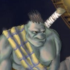
Mugaaz posted:Working on my first warlock, anything you guys recommend before I base and seal him? My brother is not a fan of the scrolls, says I should make the scrolls different tones and different types of metal for the caps, but I feel like that will make it too busy. Any advice on that or anything else you notice would be appreciated. Thanks. My advice is to seal that guy right now, he looks gorgeous. Agree on not doing different scrolls.
|
 #
?
Jul 13, 2016 05:16
#
?
Jul 13, 2016 05:16
|
|


|

|
| # ? May 9, 2024 17:28 |
|
|
WIP posting- Decided to paint up a bigass dragon for my dad. It's going to be deep grey/black for skin and wings, and gold scales. I want to take the below scale pattern and give it some oomph without loving it up too bad. Right now I'm thinking all I really gotta do is sepia wash the platinum inner part of each scale, leaving the gold alone, and then go back over the edges with a brighter gold. Any ideas on this?
|
|
#
?
Jul 13, 2016 09:23
|
|

|
BULBASAUR posted:
Nah man, if I did that you would see through my web of lies, that these models are really not that special. This one has a horrible mold line I left on the face, for example. 
|
|
#
?
Jul 13, 2016 13:10
|
|
|
CommissarRed posted:So I ended up getting a Hadross starter set for Wrath of Kings. I also picked up the Orsund Cavalier model, which is really awesome but I have no idea how to base him. I had a tough time finding any reference images ocean bases as well. CMON might have used broken plaster to make the rocky effects on their bases. The good thing about plaster is that it is pretty easy to shape and work with. I used cork for mine, to try to get a rocky shoreline look, and added water effects in the recesses (though apparently I didn't take photos of the finished product.) They're alright, but I'm not super happy with the results. I don't think the water effects really added anything to the look of the bases.  EDIT: And if you're looking for any of the Hadross character boxes, let me know - I've got some I'm looking to get rid of.
|
|
#
?
Jul 13, 2016 13:24
|
|

|
My biggest problem at the moment is fixing mistakes. Especially when Im airbrushing and uhh managed to give the top of my Imperial Knight a sparkle coat.    I hated putting the model together but painting it has been ace.
|
|
#
?
Jul 13, 2016 13:56
|
|

|
berzerkmonkey posted:I had a tough time finding any reference images ocean bases as well. CMON might have used broken plaster to make the rocky effects on their bases. The good thing about plaster is that it is pretty easy to shape and work with. Yeah, i figured they used some sort of shaping material, as I couldn't find anything online that comes premade like that. The closest thing I could find was Woodland Scenics rock outcroppings. I'll probably just end up going with cork. Those look pretty cool, by the way!
|
|
#
?
Jul 13, 2016 15:20
|
|
|
CommissarRed posted:Yeah, i figured they used some sort of shaping material, as I couldn't find anything online that comes premade like that. The closest thing I could find was Woodland Scenics rock outcroppings. I'll probably just end up going with cork. Thanks! You might try looking at the mulch that landscapers use - there is a type that is large chunks (of pine?) that some people use:  Unfortunately, I have been unable to find anything large in my area - it's either shredded or small nuggets.
|
|
#
?
Jul 13, 2016 15:26
|
|
|
Lethemonster posted:My biggest problem at the moment is fixing mistakes. Especially when Im airbrushing and uhh managed to give the top of my Imperial Knight a sparkle coat. Wow that is so smooth. Looks like a fondant cake. How is spray area of the brush just really small? How do you paint the blue or gold without getting them on each other
|
|
#
?
Jul 13, 2016 17:00
|
|
|
Ok, my heat gun worked (it actually arrived Monday), and I'm still alive, so it was a great success. I had to go up to 400°F to get the bend to "stick" for more than a few hours. Here's the result: For people who need to do something like this too, my recommendations are: use fairly high heat (it took 400°F for the left wing, but the one on the right was easy to bend in boiling water), get heat-resistant gloves (I used ones for barbecuing), make sure you have a good work surface (I made one out of foamboard and reflective insulation tape), and hold the piece in position for a few minutes after heating so it sets correctly. I'd also wait on painting for a few days to make sure your piece doesn't relax back into its original shape. And here's a bonus picture of some badass four-eyed space crocodiles I bought and haven't put together yet: 
Avenging Dentist fucked around with this message at 19:09 on Jul 13, 2016 |
|
#
?
Jul 13, 2016 19:05
|
|

|
goodness posted:Wow that is so smooth. Looks like a fondant cake. I used low tack masking tape for when I want sharp edges or to protect a colour. I was too lazy this time and didnt tape up enough of the blue and ended up with gold oversprayed onto the blue. Going to have to either go full in on having fabulous glitter armour or repaint the top  If you want to hit small areas with an airbrush you want low pressure, thin paint, and getting in close. Smaller nozzle/needle sizes means more precise. Crown caps are used to get in close without spidering paint everywhere. I just keep reels of masking tape to wrap stuff in though.
|
|
#
?
Jul 13, 2016 19:23
|
|
|
Yeah, that coat is so smooth, it actually does look soft and eatable. What's your trick?
|
|
#
?
Jul 13, 2016 20:37
|
|


|
WIP of my Berserkers: It's really frustrating how many hours I've spent on these little fuckers and yet in photographs they look pants. I'd appreciate any specific thoughts or advice, I know there's a good deal of clean-up and another layer of highlighting on pretty much all but the hair (and possibly a red/brown wash on the hair to tie it together? The guy flipping the bird had that but his hair looks dull AF) Cheers,
|
|
#
?
Jul 13, 2016 20:54
|
|

|
I'd add a tattoo on one or more beserkers and some blood to the orc heads
|
|
#
?
Jul 13, 2016 21:08
|
|


|
BULBASAUR posted:Yeah, that coat is so smooth, it actually does look soft and eatable. What's your trick? Layers are: Royal Blue and Royal Purple 1:1 mix Royal Blue Royal Blue: Andrea Blue 1:2 mix Andrea Blue:Ivory 2:1 mix All diluted with vallejo airbrush thinner until they are thin enough that drops readily plop out of a loaded brush. Airbrush with an iwata neo at max of 18 PSI. Coats go on thin enough that it only takes a few moments to dry. Use lots of angling to make sure I only hit raised areas/over edges to get the blends right. Then a few layers of satin varnish diluted 1:1 with airbrush thinner. Its actually really fast; despite being very thin and many layers. I think the build up of layers and varnish are what's making it look so fondaty, as theres levels for the light to penetrate through. I used to find blue really boring to paint but the royal blue vallejo colour paint has completely turned that around. Edit: I had to start doing a soft varnishing because I found if I got water or paint on the layers I was lifting it up again and reblending the surface. I think its because of how light the layers were - similar to the problem I had with my screamers. The satin coat stops that being an issue at all and doesnt affect details/detail depth. Lethemonster fucked around with this message at 21:29 on Jul 13, 2016 |
|
#
?
Jul 13, 2016 21:26
|
|
|
Southern Heel posted:WIP of my Berserkers: For a tabletop-ready unit they don't look bad. A bit basic perhaps, but not awful. Thoughts:
|
|
#
?
Jul 14, 2016 15:13
|
|
|
Got home last night and painted up the first of my Hadross force. I'm just going for a table top standard, nothing exceptional. I'm pretty pleased with how the model turned out, and I think the color choices really helped to capture the ocean feel I was going for. That being said, I want to add a little more on the base. I was thinking of doing still water, then water effects for some foam (directly in front of him where the rock separates). Should I maybe add some dark sand behind him as well and hit it with a gloss? Also, this is the first time I've actually managed to pull of NMM Gold. It's not perfect, but it's believable from a distance.   
|
|
#
?
Jul 14, 2016 15:22
|
|
|
Slimnoid posted:For a tabletop-ready unit they don't look bad. A bit basic perhaps, but not awful. Is there a generally accepted definition of tabletop painting? Because I'd stick those guys firmly in nice tabletop. I do agree he can do some more with the standard. It's such a huge center piece. I'm not a huge fan of blood effects on units but these are Berserkers so it makes sense. I agree the orc head would look cool if you bloodied it up a bit.
|
|
#
?
Jul 14, 2016 15:32
|
|


|
GoodBee posted:Is there a generally accepted definition of tabletop painting? Because I'd stick those guys firmly in nice tabletop. Tabletop quality painting: Looks great at 6' away sitting on a table top. Looks much less great when seen 6" away in your hand (or photographed). The 6' distance really blurs the edges and makes stuff this is only ok look well done.
|
|
#
?
Jul 14, 2016 15:35
|
|

|
GoodBee posted:Is there a generally accepted definition of tabletop painting? Broadly speaking, tabletop quality/tabletop ready is clean basecoat, a wash, and maybe a highlight. The base should have something on it, even as simple as 90's-era goblin green sand, and the rim of the base should have a solid color all around. That's the absolute basic necessities to making a model look 'ready,' and I've found it's generally accepted across most places. Anything added after the fact is just gravy. Southern Heel's berserkers are what I'd hold up as a good example of tabletop ready, with a bit extra to it (the grass in particular). It's the sort of paint job that, if carried across an entire army, would look nice on the table all spread out in an army-wide photo. SH could easily leave them as-is and they'd be fine, but there's room for improvement and refinement with just a little bit more effort.
|
|
#
?
Jul 14, 2016 15:51
|
|
|
That sounds like I'm on the same page. Cool.
|
|
#
?
Jul 14, 2016 16:08
|
|
|
Finished up two Malifaux commissions.  
|
|
#
?
Jul 14, 2016 22:15
|
|
|
 I kinda feel like this is boring but I'm not sure what it needs? Maybe some weathering?
|
|
#
?
Jul 16, 2016 08:03
|
|

|
Finished my demon prince! X-post from the 30k thread.Lord Twisted posted:Finished The Colchisian Reaper - need to base him, but I'm starting that project tomorrow to base all these suckers at once. Only thing I'm a bit 'eh' about is the chest armour, but I'll live with it.
|
|
#
?
Jul 16, 2016 11:10
|
|


|
Nichol posted:
Some weathering on the grates and stairs wouldn't be amiss, but what strikes me the most is the center symbol. I think if you paint it up in the same orange and blue (or heck, just white) it'd go a long way towards making it a better piece.
|
|
#
?
Jul 16, 2016 13:41
|
|
|
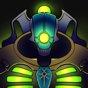
Finished my first warcaster, Doomshaper. Thoughts? 
|
|
#
?
Jul 16, 2016 22:35
|
|


|
Lord Twisted posted:Finished my demon prince! X-post from the 30k thread. I really like the metal on this. How did you paint that warm brass color?
|
|
#
?
Jul 16, 2016 22:53
|
|
|
Dwarf bronze - auric gold - 3 washes of seraphim sepia. Quite easy!
|
|
#
?
Jul 16, 2016 23:10
|
|
|
I'm painting some armored dwarfs and gone with black undercoat, heavy drybrush with boltgun metal then light with mithril silver followed by multiple paint glazes (blue, purple, dark green) and another light drybrush: the metal looks great but i'm coming to realise 90% of the model is like this. Is there anything I can do other than using a more diverse colour palette elsewhere to stop this being a sea of metal? Thanks,
|
|
#
?
Jul 17, 2016 00:42
|
|
|
Southern Heel posted:I'm painting some armored dwarfs and gone with black undercoat, heavy drybrush with boltgun metal then light with mithril silver followed by multiple paint glazes (blue, purple, dark green) and another light drybrush: the metal looks great but i'm coming to realise 90% of the model is like this. Is there anything I can do other than using a more diverse colour palette elsewhere to stop this being a sea of metal? Need picture to say.
|
|
#
?
Jul 17, 2016 00:48
|
|
|
Slimnoid posted:
Weirdo posted:I'd add a tattoo on one or more beserkers and some blood to the orc heads I took your advice, and this is what I've got so far. I don't want to make much more work for myself, but if there are any specifics you can think of for a final flourish I would greatly appreciate it:  Mugaaz posted:Need picture to say.  Obviously very WIP. Southern Heel fucked around with this message at 19:45 on Jul 17, 2016 |
|
#
?
Jul 17, 2016 16:10
|
|
|
I received some paints and brushes for Christmas and I'm finally trying this out for my Imperial Assault figures using Sorastro's great beginner's tutorials. I'm finding that I don't really understand when paint is properly thinned. I feel like sometimes I'm putting it on too thick and sometimes it's a bit too runny and takes multiple coats. I've done a bit of research but having a hard time getting this down. If you guys have any quick tips that would be awesome. I have both citadel and Reaper HD paints. Edit: Missed the link in the OP here, but it doesn't seem to be loading for me currently. Radioactive Toy fucked around with this message at 18:57 on Jul 17, 2016 |
|
#
?
Jul 17, 2016 18:48
|
|

|
About the consistency of skim milk is what you should be going for. How many coats a particular color can take depends on a few factors like what sort of base color it is going on over and how pigment dense it is. Multiple thinner coats will be better at preserving details than globbing it in to color in one pass.
|
|
#
?
Jul 17, 2016 19:36
|
|
|
Southern Heel posted:I took your advice, and this is what I've got so far. I don't want to make much more work for myself, but if there are any specifics you can think of for a final flourish I would greatly appreciate it: I am really digging the multi based berserkers, I know they look fiddly to assemble, but my KoW dwarves and abyssal dwarves could use some more berserker troops  Also for the ironclad I would suggest a brassy or golden colour on some metal accents, like the stars, to help break up the iron a bit. The purple hammerheads would look nice alongside a few warmer gold details.
|
|
#
?
Jul 17, 2016 20:30
|
|
|
Radioactive Toy posted:I received some paints and brushes for Christmas and I'm finally trying this out for my Imperial Assault figures using Sorastro's great beginner's tutorials. I'm finding that I don't really understand when paint is properly thinned. I feel like sometimes I'm putting it on too thick and sometimes it's a bit too runny and takes multiple coats. I've done a bit of research but having a hard time getting this down. If you guys have any quick tips that would be awesome. I have both citadel and Reaper HD paints. I've used some of his tutorials for the IA dudes, and know that some of those colors are notoriously difficult to paint. Namely, the stormtroopers and the royal guard. I'm also not sure I like the stormtrooper tutorial, but it works well enough, I guess. I also haven't found a better way yet, so take that as you will.
|
|
#
?
Jul 17, 2016 20:58
|
|

|
Dimo ArKacho posted:I've used some of his tutorials for the IA dudes, and know that some of those colors are notoriously difficult to paint. Namely, the stormtroopers and the royal guard. I'm also not sure I like the stormtrooper tutorial, but it works well enough, I guess. I also haven't found a better way yet, so take that as you will. Yeah, I felt like starting with a Stormtrooper would be good as a first dip in to the hobby since they are really only two colors but they don't seem super easy to work with so far. Oh well, things are turning out OK as a first try besides my primer disaster this morning where some of the troopers' faces ended up as blobs of nothingness. They are currently sitting in some Simple Green so I can try again tomorrow. Has anyone painted these guys and done anything neat for denoting the different squads? I figure instead of using the numbered stickers I can probably paint one of the shoulder pads with a matching color.
|
|
#
?
Jul 17, 2016 22:56
|
|
|
Finished Kingdom Death Survivor in Dragon Armour, with Chakram and Gloom Sword.   
|
|
#
?
Jul 18, 2016 01:19
|
|

|
Radioactive Toy posted:Yeah, I felt like starting with a Stormtrooper would be good as a first dip in to the hobby since they are really only two colors but they don't seem super easy to work with so far. Oh well, things are turning out OK as a first try besides my primer disaster this morning where some of the troopers' faces ended up as blobs of nothingness. They are currently sitting in some Simple Green so I can try again tomorrow. How much to you care about them being canon? In SW shoulder pad color usually denotes rank.
|
|
#
?
Jul 18, 2016 01:25
|
|

|
El Estrago Bonito posted:How much to you care about them being canon? In SW shoulder pad color usually denotes rank. Oh I did not realize this. I don't really care about them being canon, mostly just interested in making them look cool but also distinguishable on the board. I'll post a picture later if I can get a decent shot. They are looking alright, but the face and eye area is a bit rough. Even with a super tiny brush I was getting the dark gray all over the place and it was tough to fix it with the white. I'll just have to continue practicing. Radioactive Toy fucked around with this message at 02:37 on Jul 18, 2016 |
|
#
?
Jul 18, 2016 02:11
|
|
|
Southern Heel posted:I took your advice, and this is what I've got so far. I don't want to make much more work for myself, but if there are any specifics you can think of for a final flourish I would greatly appreciate it: Doing a great job on the beards is where you can distinguish them, wildly different colored beards would help too. Can also pick out the ornamentation on the shoulder armor separately.
|
|
#
?
Jul 18, 2016 02:43
|
|
|

|
| # ? May 9, 2024 17:28 |
|
|
So last night I put on a matte varnish on my game board and maybe didn't put it on thin enough. In some of the areas it could pool it has left a chalky glue type coat. Did I just mess up my board or will it eventually dry clear? If it matters it was Liquitex professional matte varnish.
|
|
#
?
Jul 18, 2016 16:44
|
|
