


|
This is a bipedal model for a rigging class. I don't like being another dude with a naked woman but I need the motivation. So yeah, we were given a choice of any bipedal and I picked one of the most hyper sexualized video game characters I could think of. For now I'm just getting the proportions right. I'll need to go back through and fix the topology. I don't know how geometry will deform yet and I really should get around to learning basic topology techniques.  She has a set of arms with wings that come from her head. I'm really looking forward to rigging that, and animating it. Texturing, too. This is going to be a lot of fun. poo poo.     subdividing once to get rid of the jaggies, and smoothing the mesh will look good at this level. I also don't know how to subdivide the face and will need to look at a model by someone who knows what they're doing. I'd really prefer to avoid the aborted alien fetus eye look that is so prevalent.  
Anagram of GINGER fucked around with this message at 20:55 on Sep 11, 2016 |
 #
?
Sep 8, 2016 11:50
#
?
Sep 8, 2016 11:50
|
|


|

|
| # ? May 10, 2024 15:23 |
|
|
Finally got around to downloading drivers for the intuos 4 my friend gave me months ago. Playing around with it, it seems really nice and the scroll wheel is super cool. Pretty new to digital art/illustration with Photoshop and it seems a little counter intuitive. Didn't delve too much into brushes and such back in college a few years back. I was using CS6 back then and have CC now, so likely some things have changed. I understand the basics like work with layers and build the image up from that, but it still feels counter intuitive. Like with emulating a pencil it seems like there's not really any easy to adjust opacity/darkness based on pen pressure, based off my initial loving around with it right now. Is this totally off base? I guess I'm looking for some tutorials on how to do illustration within Photoshop that are concise and informative. Edit: I guess I'm confused about how to get digital art to emulate traditional media. Is it possible, or should I not be looking to use Photoshop in this manner? dog nougat fucked around with this message at 22:16 on Sep 9, 2016 |
|
#
?
Sep 9, 2016 22:11
|
|
|
dog nougat posted:I guess I'm confused about how to get digital art to emulate traditional media. Is it possible, or should I not be looking to use Photoshop in this manner? Here are the settings I use for making brushes act more like pencil. I rarely work with solid lines, and prefer placing somewhat transparent strokes. I tend to keep Shape Dynamics off, but I use lines with wispy ends on occasion. It's good to know it's there. 
|
|
#
?
Sep 9, 2016 22:35
|
|
|
Alright, cool. Just watched some really dry annoying voiced tutorial that basically said the same thing. But didn't really do into any details. Guess I just really have to sit down and play around with it to get it to work for me and build up a collection of brushes and presets that I like.
|
|
#
?
Sep 9, 2016 22:46
|
|
|
 I feel like this was a bit of a failure, despite liking how I worked the colors on the knight. I'll try this again tomorrow, see what I can do.
|
|
#
?
Sep 17, 2016 01:07
|
|
|
Colon Semicolon posted:
His legs look a little off to me, but otherwise I actually really like this.
|
|
#
?
Sep 17, 2016 04:16
|
|
|
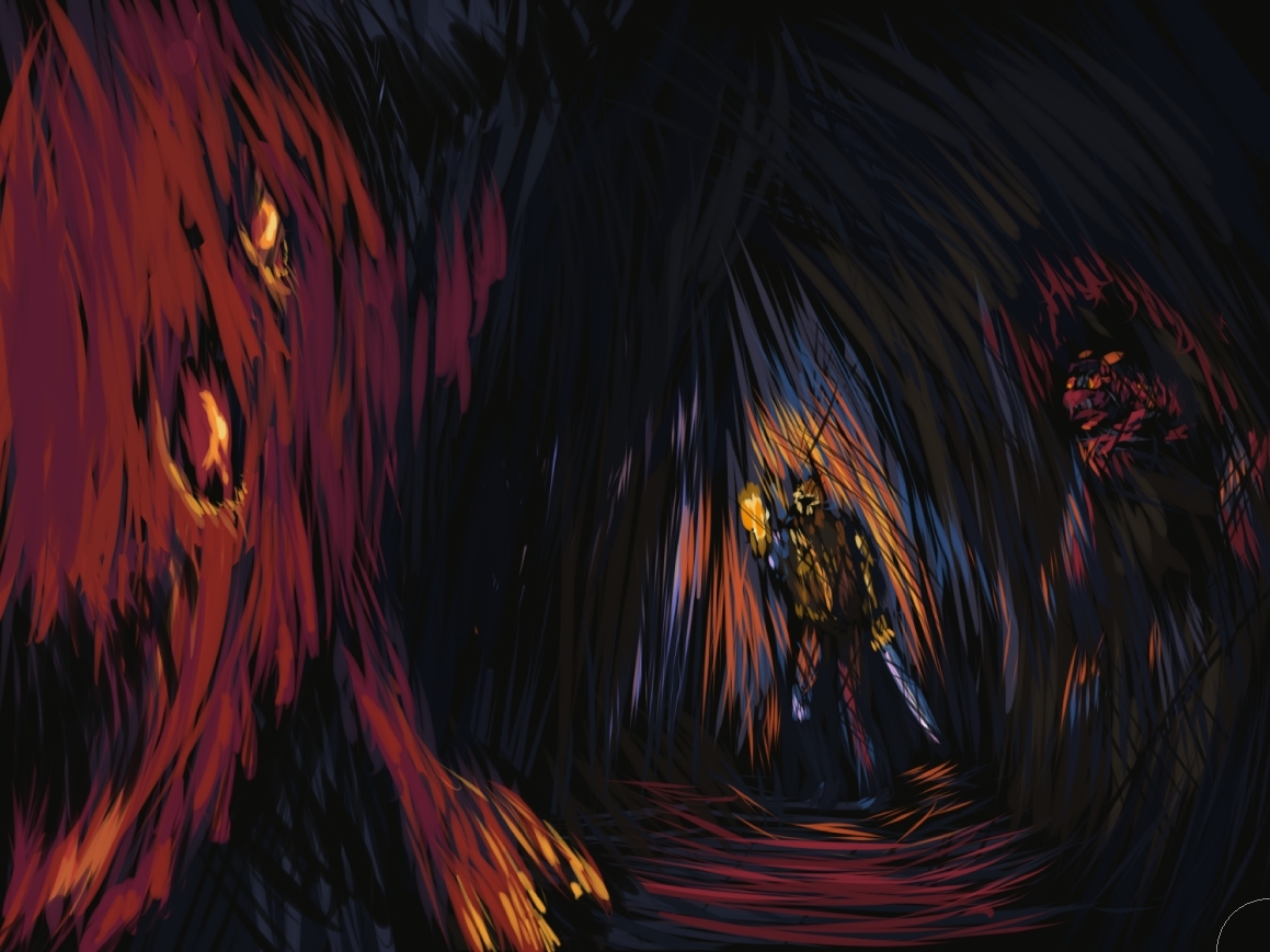
 I'm redoing the whole thing today with a different angle and focus. Even though it's not done yet, I'm enjoying this version MUCH better. Maybe later I'll revisit the cave focus for another piece. I guess I'm creating some sort of theme with these scribbly pieces though. What a fun little fantasy setting.
|
|
#
?
Sep 17, 2016 19:56
|
|
|
 Hate to double post but I finished this thing. I guess maybe I should actually push this style and try to do it more often than once a year. ...It's too easy though. I feel like i'm not challenged at all when I do this. This took maybe 4-5 hours tops.
|
|
#
?
Sep 18, 2016 21:30
|
|
|
Colon Semicolon posted:
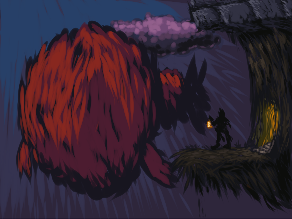
I like the texture you get with this technique but I think you could definitely work on the overall values a lot more. All of it is a bit too dark and samey and the knight in particular is hard to see cause he's too close to the background value wise. I think you can push the overall contrast of the piece and that would help it read a little better. Did a quick paint over to show you what I mean. 
|
|
#
?
Sep 19, 2016 01:33
|
|
|
Impartial judge here. I definitely like that touch up. Immediately jumped out at me more than the previous, whereas I liked it a lot already.
|
|
#
?
Sep 19, 2016 07:20
|
|

|
bold move making darkest part the part closest to the light source
|
|
#
?
Sep 19, 2016 18:04
|
|


|
just add little highlights to the thing and assume the left side is lit by something more substantial than a lamp nice unironic post and av combo
|
|
#
?
Sep 19, 2016 18:33
|
|
|
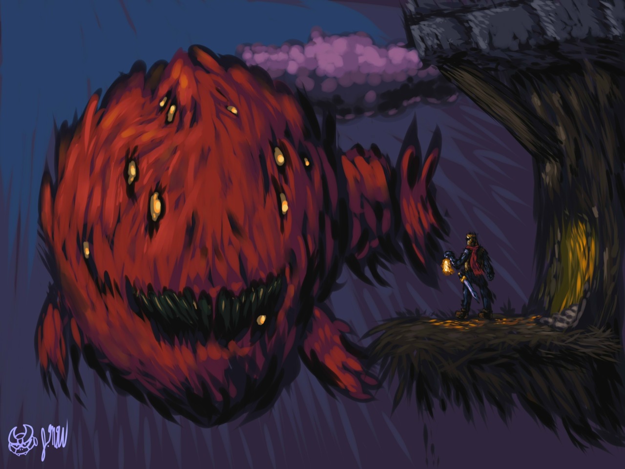
I was trying to make sure that the fish was actually seen properly. it's a place in permanent night with only a moon so the moon is kinda the acting light source. It's the same place as this piece: (I don't know why people like this piece so much I even sold the drat thing in a big frame) I do like the contrast change but it's a bit TOO bold for the scene. Only thing i DON'T like about the edit is that the knight's scarf is totally obscured and it's like my favorite little thing about him. I guess i could maybe pull it outfrom his body, but there's not really an intention of wind here. I'll see what I can do though. I think maybe I can try and light the fish a bit more using the lamp's light source. it wouldn't be super hard. Diabetes Forecast fucked around with this message at 18:52 on Sep 19, 2016 |
|
#
?
Sep 19, 2016 18:42
|
|
|
I love the painting style and the fish meatball too.
|
|
#
?
Sep 19, 2016 19:40
|
|
|
Relearning Illustrator. Forgot how tedious it can get, but I'm super pleased with how this turned out. Gonna Be printing Rat Pope on some shirts.
|
|
#
?
Sep 19, 2016 20:43
|
|
|
well gosh guys, thanks! I think this might be the final version of it? i dunno, it seems like I got it about right now. E: Jesus christ, I had never thought about this: This poo poo's very clearly inspired by all the Stephen Gammell illustrations I saw as a kid. It took talking with my girlfriend a moment ago to realize that! Diabetes Forecast fucked around with this message at 21:46 on Sep 19, 2016 |
|
#
?
Sep 19, 2016 21:16
|
|
|
Colon Semicolon posted:well gosh guys, thanks! Yeah the contrast is much better than before, and it's good that you got some more lighting from the lamp in there. Also I wasn't trying to say you had to light it from the left or something like that, I chose that direction cause it looked like it was getting more light from there then the lantern in the original so I went with it. I just think the piece needed some more contrast somewhere. You could also do it by darkening the left side of the fish instead and downplaying the moonlight. Then you'd have it so that most of the light you are seeing is from the lantern. You'd lose detail on the fish but that might help preserve the night time feel more. There's probably some good reference out there that would help with figuring out the best way to handle that problem. Though if you are done with the piece it could just be something to look for in the next one. Also I agree, the scarf is quite nice.
|
|
#
?
Sep 19, 2016 22:57
|
|
|
messing around with a picture from the cosplay thread  
|
|
#
?
Sep 20, 2016 05:05
|
|
|
You might like what happens when you turn off the density on the brushes you use, approaching a piece like that. It's been my experience that density settings really mess you around.
|
|
#
?
Sep 20, 2016 12:43
|
|
|
hmm? Oh, no I was going for that solid form of the hair, and then just some green just because. I wanted her face to be framed in solid black. I turned spacing all the way down (to full) and kept flow / opacity all the way up What do you mean by density? I'm unfamiliar with that setting.
|
|
#
?
Sep 20, 2016 14:23
|
|
|
I think the issue is there's not a whole lot of flow control going on, IE the strands are ultra thick looking where they could stand to be thinner/less opaque/both in areas. E: some of the highlight lines suffer the same issue too. JuniperCake posted:Yeah the contrast is much better than before, and it's good that you got some more lighting from the lamp in there. I'll proooobably do another touch-up, but at the moment I've really gotta keep at my portfolio stuff. You bring up a good point that I could probably just mess with the darker side to get the same basic effect. Diabetes Forecast fucked around with this message at 19:14 on Sep 20, 2016 |
|
#
?
Sep 20, 2016 18:53
|
|
|
it was a two minute thing that ended up whatever it was going to be, so there's no issue. I just wanted to see something on the canvas this time. It is impossible for something to be wrong when there were no standards or goals to start with.
|
|
#
?
Sep 20, 2016 19:25
|
|
|
Elsa posted:it was a two minute thing that ended up whatever it was going to be, so there's no issue. I just wanted to see something on the canvas this time. It is impossible for something to be wrong when there were no standards or goals to start with. hm...no
|
|
#
?
Sep 20, 2016 20:13
|
|

|
you can dislike it. but if you start trying to say it's objectively wrong when it wasn't meant to be anything in particular, that is kind of pointless. This is why people put paint up their rear end and poo poo onto a canvas, because people don't understand the concept of subjective versus objective art.
|
|
#
?
Sep 20, 2016 20:52
|
|
|
okay actually people shitpaint for more reasons than just to make a statement maybe.
|
|
#
?
Sep 20, 2016 21:43
|
|
|
Elsa posted:
After a few video courses on New Master's academy and working through the likes of Vilppu and Bargue drawings, some knowledge of fundamentals have really helped me look back on all my stuff. After I get done drawing boxes and forms 1000+ times maybe I'll start something.
|
|
#
?
Sep 20, 2016 21:46
|
|
|
Elsa posted:you can dislike it. but if you start trying to say it's objectively wrong when it wasn't meant to be anything in particular, that is kind of pointless. the point is, it's bad. you can say it's not bad because really what is bad but as far as rendering goes it's bad and people were trying to help you make it less bad
|
|
#
?
Sep 20, 2016 22:28
|
|
|
Troposphere posted:the point is, it's bad. you can say it's not bad because really what is bad but as far as rendering goes it's bad and people were trying to help you make it less bad obviously. however. if people can't recognize the difference between a purposeful render and a two minute thing with a default brush and eraser then 
|
|
#
?
Sep 20, 2016 23:57
|
|
|
Truth be told my spooky paintings are majority pencil and eraser but I actually put serious effort in so there you go.
|
|
#
?
Sep 21, 2016 00:04
|
|
|
If you uploaded a thing to show people it's a bit rich to claim then that you don't care what people think of it.
|
|
#
?
Sep 21, 2016 00:48
|
|


|
I actually uploaded it for the sake of this thread and its activity. Thinking someone will read it is a bit of a stretch.
|
|
#
?
Sep 21, 2016 00:52
|
|
|
Messing around with sketchbook pro. It's pretty good. Unlike Elsa's opinions.
|
|
#
?
Sep 21, 2016 02:13
|
|

|
Maybe if you're just making art for art's sake with the direction that you have no direction then maybe don't get weirdly defensive and explainy when people respond to it honestly? That's some fine artist academia "you just don't get it, man" bullshit, is what I'm saying.
|
|
#
?
Sep 21, 2016 02:54
|
|


|
As long as people are judging me and not a 2-min thread bump scribble this is an improvement.
|
|
#
?
Sep 21, 2016 05:21
|
|
|
i think it took longer than two minutes
|
|
#
?
Sep 21, 2016 06:19
|
|
|
Who cares, god Post art stop acting like children
|
|
#
?
Sep 21, 2016 06:27
|
|
|
sorry, here's something i did in a minute and 59 seconds
|
|
#
?
Sep 21, 2016 06:46
|
|
|
Fine, here's a stupid loving drawing of some moron candy:
https://instagram.com/mutatedjellyfish/
|
|
#
?
Sep 21, 2016 07:07
|
|
|
That's good. Let's keep that sort of thing going.Colon Semicolon posted:Who cares, god
|
|
#
?
Sep 21, 2016 07:14
|
|
|

|
| # ? May 10, 2024 15:23 |
|
|
This is a stussy S that joined the Hitler Youth and wishes it was born a swastika plus dickbutt. looking for critique I think it might be my brush settings Anagram of GINGER fucked around with this message at 07:27 on Sep 21, 2016 |
|
#
?
Sep 21, 2016 07:20
|
|