


|
There's a lot of cool stuff on Here's my usual crosspost from the oath thread, which may or may not lower the coolness, I can't say myself. Electric Hobo posted:Oath complete! Electric Hobo fucked around with this message at 08:20 on Oct 1, 2016 |
 #
?
Sep 30, 2016 10:47
#
?
Sep 30, 2016 10:47
|
|


|

|
| # ? May 9, 2024 22:58 |
|
|
moths posted:I think it's actually a light pastel green, which world great for base coating WW2 US Army uniforms but will look strange on tanks. Thanks for this, I have some infantrymen to paint too so it looks like I'll be grabbing both of those sprays.
|
|
#
?
Sep 30, 2016 13:22
|
|


|
Hey goons, bit lost on a paint job and unsure how to tackle it further. I painted up my first mini and was pretty happy with the outcome. But I decided to work on a second to see if I could come up with an alternate scheme I preferred and fancied giving orange a go, but something with it isn't quite coming out right:  The greys are a little bit different in each ship, the top uses more of a blue grey and the bottom ship is a bit darker in real life, my lamp has really lit the thing up. I wanted to add some contrasting light grey panels on the second one to offset the orange, but I'm not really sure where to place it, it just isn't quite working yet as a colour theme? any suggestions? and which do you guys/gals think looks better? The first model is finished and sealed, the second still has a bit to go but I'm a bit lost on it.
|
|
#
?
Oct 1, 2016 01:08
|
|

|
I'm leaving for ReaperCon in about two-and-a-half weeks. Any recommendations for transporting paints, brushes, and other painting supplies?
|
|
#
?
Oct 1, 2016 01:09
|
|

|
Flying, driving or other?
|
|
#
?
Oct 1, 2016 02:23
|
|


|
Dark Age Brood stuff I have been working on. I REALLY like this game.     
|
|
#
?
Oct 1, 2016 02:41
|
|
|
Flipswitch posted:Hey goons, bit lost on a paint job and unsure how to tackle it further. I'd probably do something like this:  EDIT: Probably lighter grey, in retrospect it should obviously be the same color as your first ship.
|
|
#
?
Oct 1, 2016 03:07
|
|
|
PaintVagrant posted:Dark Age Brood stuff I have been working on. I REALLY like this game. Nice, I saw those on the Facebook group! Always good to see more Dark Age poo poo.
|
|
#
?
Oct 1, 2016 03:09
|
|

|
GoodBee posted:Flying, driving or other? Flying. I'm military, so I get extra baggage on airlines, and gently caress driving through the entirety of west Texas.
|
|
#
?
Oct 1, 2016 04:26
|
|
|
SRM posted:That's loving gorgeous dude. I wish they're range was more of that and less titty rapemonsters. dr_ether posted:The vast majority of the models are not "titty rapemonsters". The models that fall into that category are the Wet Nurse (which I own and have painted), and perhaps the Lion God. Given I have the game, and a good number of the expansions, there is indeed body horror, but rape monsters, nay. Apologies if this is stirring up some long-resolved TG drama or whatever, but I really liked the miniature and was concerned from these posts so I decided to look up some other miniatures and do a little reading, and I was just curious if the "rapemonsters" thing was just silly hyperbole, or if this is something more represented in the game than the art? I didn't catch much about the Lion God (besides being a warped former ruler of a grand kingdom, also having a cool design), but from what I could find it seemed like the worst was just some naked lady miniatures with the Lion Knight (which is apparently supposed to have more levity than the other monsters/expacs) which are entirely optional, and a pinup line that's intentionally vestigial from the actual line/game. (Also, do they have any future kickstarters planned ala Reaper Miniatures? I really like a lot of these designs and would be into getting kickstarter value instead of $40-60/expac)
|
|
#
?
Oct 1, 2016 04:35
|
|
|
PaintVagrant posted:Dark Age Brood stuff I have been working on. I REALLY like this game. These are all awesome. Love that Job on the yellow
|
|
#
?
Oct 1, 2016 05:50
|
|


|
Cross post from the oath threadArson Fire posted:Oath Complete!
|
|
#
?
Oct 1, 2016 06:08
|
|


|
I am not satisfied with my freehand gremlin signs. Why don't I like them? Is the text too big? Does it just take you out-of-scale to have any handwritten text at all? Or is it that it draws the eye more than its in-game worth would dictate?   Does anyone have any ideas? I don't know what else I would do with the signs, as I never really got any better ideas than "arrow" and "no smoking". Maybe I should get rid of the sign behind pere entirely?
|
|
#
?
Oct 1, 2016 20:57
|
|

|
I think the writing is too messy for the sign, or the sign is too clean for the writing. I get that they're gremlins with crappy handwriting, but I think you want to really weather up the sign to match. Peeling off paint, mud, grime, the whole shebang.
|
|
#
?
Oct 1, 2016 21:51
|
|


|
No pie
|
|
#
?
Oct 1, 2016 21:52
|
|

|
Gareth Gobulcoque posted:I think the writing is too messy for the sign, or the sign is too clean for the writing. I get that they're gremlins with crappy handwriting, but I think you want to really weather up the sign to match. Peeling off paint, mud, grime, the whole shebang. I was considering hitting the signs with a brown wash, but the ground is so muddy that I'm worried if I muddy up the boards too it's all going to end up extremely... muddy. Currently doing some tests with acrylic pouring medium, which I think is the water solution I've been looking for. Once I know how that looks I guess I'll have a better idea of whether or not I want to wash the boards too. Another idea was just removing the big sign entirely and putting some more rocks/shrubs where it used to be. I thought it would be cute, but I'm not sure it's adding anything. I kind of liked it compositionally when it was empty, but what would it even be at that point? A fence?
|
|
#
?
Oct 1, 2016 22:23
|
|
|
Try some thinned dark green on the bottom half of the signs to imply moss or grass stains. You'll break up that big patch of clean brown, it'll look a lot more natural, and it should pop a little more than brown on brown.
|
|
#
?
Oct 1, 2016 23:30
|
|
|
I'm going to start painting my first minis soon and I'd like some advice. I plan on having a lot of white on my figures. What color primer should I use? I've heard arguments for white and grey.
|
|
#
?
Oct 2, 2016 03:41
|
|


|
I prime pretty much everything grey, I find it so much more forgiving than white.
|
|
#
?
Oct 2, 2016 04:46
|
|


|
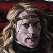
Was wondering if I could get some feedback on what would improve my painting. A problem I seem to have is any shading I do comes out looking blotchy, especially with skin tones.   
|
|
#
?
Oct 2, 2016 06:11
|
|
|
Dazerbeams posted:I'm going to start painting my first minis soon and I'd like some advice. I plan on having a lot of white on my figures. What color primer should I use? I've heard arguments for white and grey. Black is the most forgiving. The hard-to-reach spots are going to be shadow spots anyway, so it doesn't look so bad if you miss painting a little nook or cranny. However, it tends to mute the colors over it. It makes red and yellow even more difficult to paint than normal. Not, like, horrible and impossible, but if you're thinning your paints properly, you're going to need a few more layers to get it to look right, especially if you want them to look bright. White is really great for getting those bright colors. However, if you miss a spot, it's going to show pretty obviously, meaning you have to go over the mini more carefully when you get your basecoats on. Grey is in-between. It doesn't look quite as obvious as white if you miss a spot, but it lets you get okay bright colors, if not quite as vibrant as white. If you use spray primers, you can also do what's called zenithal priming. That's where you prime the mini black, then spray a light dusting of grey at about 45 degrees, and then white almost directly overhead, which preshades minis pretty well. EDIT: If the minis are mostly white, then you might start with grey for zenithal and then just spray the white at 45 degrees.
|
|
#
?
Oct 2, 2016 06:19
|
|
|
JackMann posted:EDIT: If the minis are mostly white, then you might start with grey for zenithal and then just spray the white at 45 degrees. I wouldn't bother tbh, the contrast isn't going to be noticeable. Here is a question; cool white or warm white? If you're going for a cool or bright white, use a light grey. If you're going for a warm white/very light beige, use a bone color.
|
|
#
?
Oct 2, 2016 06:43
|
|

|
I'm going for a bright white. I'm really looking for a stark and clean look, so the white primer giving vibrant colors sounds appealing. I've read about putting a wash coat directly over the white primer coat to help with the nooks and crannies. Is that an option or just a bad idea?
|
|
#
?
Oct 2, 2016 07:40
|
|
|
Dazerbeams posted:I'm going for a bright white. I'm really looking for a stark and clean look, so the white primer giving vibrant colors sounds appealing. I've read about putting a wash coat directly over the white primer coat to help with the nooks and crannies. Is that an option or just a bad idea? I used it for the last few guys I painted, and I found it a lot easier than painting over a flat white base. Not only is it more forgiving for bits you can't reach, but it gives the miniature instant definition, picking out smaller details that are easy to miss when everything is a bright white. Just try to get an even coverage and avoid pooling on larger areas. Edit: I was going for a darker finish so applied the wash quite heavily here, if you're going bright just thin it a bit, or apply it more carefully. 
Gravitas Shortfall fucked around with this message at 21:01 on Oct 2, 2016 |
|
#
?
Oct 2, 2016 19:41
|
|
|
Knuckle Sammich posted:Was wondering if I could get some feedback on what would improve my painting. A problem I seem to have is any shading I do comes out looking blotchy, especially with skin tones. Thinner paint, finer brushes - the face looks like you need something much smaller to get finer control. And possibly an exercise to learn more about blending - find a model with lots of flowing cloaks/clothing (some wizard, basically) and go to town on the blending, just really focus on it for a model. Ignite Memories posted:I am not satisfied with my freehand gremlin signs. Why don't I like them? Is the text too big? Does it just take you out-of-scale to have any handwritten text at all? Or is it that it draws the eye more than its in-game worth would dictate? The issue at the moment as I see it is that it looks like the writing is pristine on the pristine signs. As other suggested, weathering on the signs, but if you can work out how to apply weathering I think that would make it pop more, it's a bit flat. I'm not sure here, maybe very fine cutting in from the outside of the letters with the wood colour. Or horizontal very fine cuts in to go with the grain of where the wood on the sign would be.
|
|
#
?
Oct 3, 2016 00:53
|
|

|
Neurolimal posted:Apologies if this is stirring up some long-resolved TG drama or whatever, but I really liked the miniature and was concerned from these posts so I decided to look up some other miniatures and do a little reading, and I was just curious if the "rapemonsters" thing was just silly hyperbole, or if this is something more represented in the game than the art? The main offenders are the Wet Nurse (not a model in the game), the Lion God (has a phallus like head/whip that emerges from a vagina like orifice at the neck), and the naked women with the Lion Knight. Within the game art, nudity is common, but for all genders, and any talk about sex is often in the context of consenting couples of survivors being picked to have children (the game has cards and events centred on survivors forming partnerships, having family bloodlines, etc etc there is no mention of rape anywhere in the book, nor any mechanics that represent it, in fact there are random game events, like the "Manhood Stealers" that can only affect male survivors). So yes, there is some cheesecake in some of the game models, and one or two monsters that walk the line, most are not like that, and male and female survivors are created as equals in the game, and are provided in equal numbers on the armour kits for making your custom survivor models. As for KS, on Black Friday will be the new one that will be to fund production (development is all done) so the game can be made in numbers so that it can be supplied to shops. What level of discount backers will get is unknown, but it won't be as good as it was for initial backers.
|
|
#
?
Oct 3, 2016 02:23
|
|

|
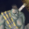
Wazzu posted:Thinner paint, finer brushes - the face looks like you need something much smaller to get finer control. And possibly an exercise to learn more about blending - find a model with lots of flowing cloaks/clothing (some wizard, basically) and go to town on the blending, just really focus on it for a model. Thank you for the advice. I'm already using really fine brushes but I'm only thinning my paint the bare minimum to avoid clumps due to my impatience of wanting to see an immediate change when adding a new layer. Next on my list is these two guys which will give me a chance to play around and hopefully break some bad habits.  (edit) fixed image
|
|
#
?
Oct 3, 2016 03:38
|
|
|
I can relate to that impatience, but you really do get a better result with milk/water consistency paints and small loads on the brush. Just try to make your painting environment one that you'd be OK chilling out in between drying layers. It also helps to have multiple separated areas to paint with the current color you have thinned; if you take your time with each one then the first should be dry enough for a new light layer by the time you finish the last one.
|
|
#
?
Oct 3, 2016 14:27
|
|
|
Neurolimal posted:Apologies if this is stirring up some long-resolved TG drama or whatever, but I really liked the miniature and was concerned from these posts so I decided to look up some other miniatures and do a little reading, and I was just curious if the "rapemonsters" thing was just silly hyperbole, or if this is something more represented in the game than the art? The Kickstarter campaign they had, while very successful in making money, took foreeeeeeever to fulfil. I think it started August 2012, with games being sent out around July last year. Then we had to wait for expansions after that  But I ended up selling the core game for a lot more than I paid for everything I got from the Kickstarter, so I can't really complain. If they do another one, I hope they keep a strict timetable and not add/change too many things along the way. That dang box weighed a ton, I tell you what!
|
|
#
?
Oct 3, 2016 14:34
|
|


|
As far as I know the KS will be to fund a production run (all of the game is designed and molds done, so it is just to pay for production time and resources - nothing new will be going in) and of course new expansions. So the turn around should be much much quicker if you just back to get the boxed game.
|
|
#
?
Oct 3, 2016 15:46
|
|
|
Finished some more painting today. All of these are reaper figures, but I'm going to use them for the Lord of the Rings Strategy Battle Game.  Gandalf! (Yeah, I know the staff+sword figure is better for Gandalf, but I saw this one in the shop). The parchment is actually Vallejo Dark Skin mixed down with white, which i think came out as a nice color for it.  A Squadron of Moria Goblins. I don't know if I like this skin tone (Army Painter Demonic Yellow). I don't have a lot of good options without mixing, and I try to avoid mixing when possible. Foolster41 fucked around with this message at 23:51 on Oct 3, 2016 |
|
#
?
Oct 3, 2016 23:47
|
|
|
I made a grody test base for my Bloodbound. Probably won't have time to work on them for a while, but the test base turned out well. I'm obsessed with water FX. It adds such great contrast to miniatures. GreenMarine fucked around with this message at 06:42 on Oct 4, 2016 |
|
#
?
Oct 4, 2016 06:38
|
|
|
Finished this Rask recently. It never quite came together the way I wanted to, but it's not bad for a side army project.   
|
|
#
?
Oct 5, 2016 18:25
|
|
|
That's a cool looking murloc. I like the muted colors.
|
|
#
?
Oct 5, 2016 18:32
|
|
|
Ooh, fishpeople. Warmahordes I take it, with that base? Didn't know it has fishpeople.
|
|
#
?
Oct 5, 2016 19:39
|
|

|
Attestant posted:Ooh, fishpeople. Warmahordes I take it, with that base? Didn't know it has fishpeople. Yeah they have these guys, called Bog Trogs, and then Croaks, which are frog people, and of course Gatormen. I have an army of Gatormen and a couple of other things in there. I need to get some Bog Trogs though and Rask. dr_ether fucked around with this message at 19:58 on Oct 5, 2016 |
|
#
?
Oct 5, 2016 19:54
|
|
|
Foolster41 posted:I try to avoid mixing when possible. Any particular quality reason a novice painter like me should know, or is it just so you dont need to write down mix ratios and save time on preparing things for touch-ups?
|
|
#
?
Oct 5, 2016 19:58
|
|
|
Neurolimal posted:Any particular quality reason a novice painter like me should know, or is it just so you dont need to write down mix ratios and save time on preparing things for touch-ups? From listening to a bunch of other folks it's an issue of doing exact mix ratios and making your color consistent across your army if you add dudes. If you're willing to track that and are confident in your measurements it should be fine.
|
|
#
?
Oct 5, 2016 20:09
|
|

|
dr_ether posted:Yeah they have these guys, called Bog Trogs, and then Croaks, which are frog people, and of course Gatormen. I have an army of Gatormen and a couple of other things in there. I need to get some Bog Trogs though and Rask. Thanks, might want to pick up some of that stuff just to paint. I just like fishpeople.
|
|
#
?
Oct 5, 2016 20:12
|
|
|

|
| # ? May 9, 2024 22:58 |
|
|
Do any lines have a good "barbarian with a whip" or "roast turkey" models?
|
|
#
?
Oct 5, 2016 20:27
|
|