


|
Every browser shares a bug-that-has-become-a-feature, where if a gif's delay is set to 0 or 10ms, it displays at 100ms delay instead. That's why a lot of .gifs you download turn insane if you view them in irfanview or whatever; whoever made the gif left the delay at 0ms and only ever viewed it in a browser, so it looked ok there. If you want higher frame rate, the lowest delay you can safely use is 20ms.
|
 #
?
Oct 31, 2016 00:19
#
?
Oct 31, 2016 00:19
|
|


|

|
| # ? May 25, 2024 14:10 |
|
|
Scut posted:Why aren't there more Cabal-like games? Are you going to expand on this? It looks ripe for it. I think so - we're thinking of multiple levels, enemies, etc. then porting to iOS. Also: 
|
|
#
?
Oct 31, 2016 00:44
|
|
|
Has anyone found a good app for tablets/phones for doing pixel art? I have a Samsung tablet and I've been looking for something that I can use with the stylus.
|
|
#
?
Oct 31, 2016 01:05
|
|

|
Tendales posted:Every browser shares a bug-that-has-become-a-feature, where if a gif's delay is set to 0 or 10ms, it displays at 100ms delay instead. That's why a lot of .gifs you download turn insane if you view them in irfanview or whatever; whoever made the gif left the delay at 0ms and only ever viewed it in a browser, so it looked ok there. Why has nobody been able to explain this until now? 10 years and I finally have an answer!
|
|
#
?
Oct 31, 2016 10:47
|
|
|
MikeJF posted:Never use no delay or 0, behaviour on that is inconsistent between browsers. Tendales posted:Every browser shares a bug-that-has-become-a-feature, where if a gif's delay is set to 0 or 10ms, it displays at 100ms delay instead. That's why a lot of .gifs you download turn insane if you view them in irfanview or whatever; whoever made the gif left the delay at 0ms and only ever viewed it in a browser, so it looked ok there. Oh my god, it's like you guys just taught me a magic spell.  I was very unaware of this, despite non-zero efforts to google what was up. Thanks so much! Edit: also here are some small critters burrowing to safety:  
rinski fucked around with this message at 21:57 on Nov 1, 2016 |
|
#
?
Nov 1, 2016 06:50
|
|
|
No animations done yet, but I was kinda happy with this doodle session. I was going to make a surreal-geometric-biology level anyway, but now I have an enemy type for it that scales up to a boss encounter. Probably going to redo the big one to make it read more like a boss, but I like the overall look of these guys.  
rinski fucked around with this message at 02:44 on Nov 4, 2016 |
|
#
?
Nov 4, 2016 01:00
|
|
|
I'd feel shy too if I just had my transdimensional dong hanging out.
|
|
#
?
Nov 4, 2016 11:42
|
|

|
big ol' square dick
|
|
#
?
Nov 4, 2016 12:13
|
|
|
Yeah, I should probably redo that so it doesn't look like he's got a big square dick. That is good feedback.
|
|
#
?
Nov 4, 2016 15:52
|
|
|
rinski posted:Yeah, I should probably redo that so it doesn't look like he's got a big square dick. That is good feedback. disagree. it's all a part of the charm. honest-talk I love this style a whole bunch and I really want to see more
|
|
#
?
Nov 4, 2016 17:25
|
|

|
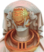
 Small piece of a large piece I'm unable to ever finish. But skulls = cool.
|
|
#
?
Nov 4, 2016 17:45
|
|

|
BurritoEclair posted:
Man, your palette is insane. I have trouble with color theory and getting my palettes to look good, which is why I'm trying to focus on four-color grayscale stuff first. Did you build out your palette over time and just kind of tweak as you went, or did you just pick something and stick with it? Either way, that skull mountain seems like a cool place. Edit: Old Man Mozz posted:disagree. it's all a part of the charm. Oh cool, thanks! Square dicks all around!  
rinski fucked around with this message at 00:15 on Nov 6, 2016 |
|
#
?
Nov 4, 2016 18:30
|
|
|
This is very cool. Have you kept older versions? It would make a great timelapse gif.
|
|
#
?
Nov 4, 2016 19:48
|
|

|
Scut posted:This is very cool. Have you kept older versions? It would make a great timelapse gif. Don't tell anyone else, but I made this just for you.  rinski posted:Man, your palette is insane. I have trouble with color theory and getting my palettes to look good, which is why I'm trying to focus on four-color grayscale stuff first. Did you build out your palette over time and just kind of tweak as you went, or did you just pick something and stick with it? Either way, that skull mountain seems like a cool place. Don't tell Scut I showed you. But in that PowerPoint presentation you can see how far everything has come from the start. Started with some really vibrant colors, thought the enviroment's colors were too pretty and higher contrast. Didn't want the Wolf Maiden and Wolf to look so flat. Flipped things around. Shifted things around. Made ruins popping out of the ground, got their approval. Did pixel art studies of pretty statues, got rid of statues, brought back statues. Changed the wolf to a cute dog using my dog as reference. Made that dog fluffier so my dog wouldn't sue me. Just poop down some colors and adjust. Up until the skull mountain I was drawing everything on 1 or 2 layers. Latest mess: 
|
|
#
?
Nov 5, 2016 15:10
|
|
|
Wow, that's really cool. I'm still learning, so seeing other peoples' processes is super helpful and interesting. I like how the seasons suddenly change and the spooky tree is reduced to a normal stump. Such is life near skull mountain.
|
|
#
?
Nov 5, 2016 21:35
|
|
|
 Guess who is excited about Sombra?
|
|
#
?
Nov 6, 2016 15:25
|
|

|
rinski posted:Wow, that's really cool. I'm still learning, so seeing other peoples' processes is super helpful and interesting. I like how the seasons suddenly change and the spooky tree is reduced to a normal stump. Such is life near skull mountain. The constant changes have less to do with my processes and a little more to do with me not planning this out at all. Originally this was based off a painting i was doing, thought that was boring so I made the tree pumpkin face then everything else happened. I think I started with only 8 colors and I'm probably somewhere closer to 24 now. Best thing you can do is just make stuff. Do pixel _dailies and doodle in your spare time.  NES palette sketch. NES palette sketch.
|
|
#
?
Nov 6, 2016 15:35
|
|
|
Shoehead posted:
This is great. I like the double-outline style and how your take on her looks punk as heck. It's cool how much character you fit into that tiny pixel portrait. BurritoEclair posted:
See, dithering on that image looks like it belongs. I never quite know when to implement dithering, because it seems like this interesting intersection between shading, texture, and a stylistic choice. I have one sprite currently where I tried using dithering and it's mostly for texture.  Also here are some more guys sprouting out of shapes. I tried creating different morphologies depending on their shape preference, but I think the smart order of operations would be to worldbuild first, figure out what meaning the shapes have (within these guys' culture), then draw stuff informed by that metaphor. My process is probably not the most efficient process.  
rinski fucked around with this message at 23:26 on Nov 14, 2016 |
|
#
?
Nov 8, 2016 03:14
|
|
|
rinski posted:See, dithering on that image looks like it belongs. I never quite know when to implement dithering, because it seems like this interesting intersection between shading, texture, and a stylistic choice. I have one sprite currently where I tried using dithering and it's mostly for texture. It's easy to notice dithering when the two colors are higher contrast. I'm blending reds that are fairly close to one another. There's also something about how you transition from a dither to a solid and back out again. But texture comes from the pattern and the contrast more than anything. I guess. I keep losing my hit keys in graphic gale, might switch to Aseperite soon.
|
|
#
?
Nov 8, 2016 06:16
|
|
|
rinski posted:This is great. I like the double-outline style and how your take on her looks punk as heck. I like how much character you fit into that tiny pixel portrait. Your stuff reminds me of Mortis Ghosts' OFF a lot and that's an extremely good thing. (If you somehow haven't played, drop everything and download it, it's free)
|
|
#
?
Nov 8, 2016 13:43
|
|

|
Jewel posted:Your stuff reminds me of Mortis Ghosts' OFF a lot and that's an extremely good thing. (If you somehow haven't played, drop everything and download it, it's free) Yeah, once I started drawing these guys I noticed the similarity and kind of got magnetized to that style for these guys. Off's style is creepy and endearing, which fits for what I wanted these guys to be. 
|
|
#
?
Nov 9, 2016 01:07
|
|
|
 Small wip part of a commissioned piece. NES palette only.. I think?
|
|
#
?
Nov 9, 2016 01:52
|
|
|
random late night sprite!
|
|
#
?
Nov 9, 2016 07:40
|
|
|
  A friend of mine is doing a DnD lite game for some of his students, so he reworked the classes into more 'real world' relevant stuff. Pictured is the Ranger, Fighter, Bard, and Wizard for his game. He sent me pictures of the kids so the sprites are modelled after them. McKilligan fucked around with this message at 00:53 on Nov 11, 2016 |
|
#
?
Nov 10, 2016 11:32
|
|

|
    Some portraits from Hellweek 2016
|
|
#
?
Nov 13, 2016 14:43
|
|
|
Getting faster at animating. I remember when animating something like 10 frames in a way that parsed as "good enough" would take me an actual day or longer. This spawn/death animation cycle is 55 frames and only took me a few hours, and the running tentacle cat took significantly less. I'm glad I decided to rework my sprites to make them simpler, because animating my old sprites took... well, longer than is feasible for the scope of this project. I can see how something meticulous like Owlboy took nine years.   What do you use to draw this? I like how sketch-y it looks. Shoehead posted:Some portraits from Hellweek 2016 Not sure if I'm just latching onto a few details (huge smile, tall eyes, fancy headwear), but that third portrait kinda reminded me of that guy from Totally Rad. 
rinski fucked around with this message at 23:42 on Nov 14, 2016 |
|
#
?
Nov 14, 2016 23:29
|
|
|
rinski posted:Getting faster at animating. I remember when animating something like 10 frames in a way that parsed as "good enough" would take me an actual day or longer. This spawn/death animation cycle is 55 frames and only took me a few hours, and the running tentacle cat took significantly less. these are really good and full of a strange life. the dog(?) is particularly good 
|
|
#
?
Nov 15, 2016 17:36
|
|
|
rinski posted:
I use the Pen tool in GIMP with my wacom tablet, but I'll usually only use the pressure/size dynamic option, and I turn dynamics off for detail work. I'll usually just use black to sketch out a silhouette that I like, then I'll come in and tweak it with colors/shading, etc.
|
|
#
?
Nov 16, 2016 06:59
|
|
|
Cloud Strife in black and white. Still deciding what mood I want the colors to have.
|
|
#
?
Nov 18, 2016 18:11
|
|
|
 old   new someone asked me about that original for use in some indie game on one of the tandy PCs of all things, so I just decided to make them a much better one.
|
|
#
?
Nov 22, 2016 06:58
|
|
|
Diabetes Forecast posted:
This is taking me back to the first time I played R-Type in the best of ways. So I have a question for you and for all the spaceship-posting people itt from a neophyte: do you mostly use math to figure out how the animation should look? Or do you just kinda sculpt the pixels until they look right? Because you guys seem to understand light and form in a way that's currently beyond me. I feel like I get how to pixel biological organisms, because there's a bit of inherent roughness and/or stylization that lends itself to organic objects. Creatures don't move 100% perfectly and some jerky motions actually make the sprites look more lifelike rather than less. But when I look at this ship, or stuff in FTL, or sprites from early SHMUPs (my go-to example is Nemesis/Gradius for Gameboy), it all looks so... meticulous. Like I get that your neutral to L/R tilt is just two frames, but there's an internal consistency between those two frames there that I don't 100% understand. As for a general query to the thread at large: when I doodle/sketch, it's pretty freeform, so when it comes time to animate sprites, I sometimes have "end panel" sprites and sometimes I build sprites from the ground up. I have had significantly more success with the latter than the former. This was a (reposted) sprite, which I built frame by frame during the animation process: Here's an example where I started with a "finished" sprite and tried to work backwards. First is a screencap of my workspace where I was trying to figure out animation frames, but barely anything is saved from that process, because none of it read well at all. I highlighted the kinda jarring transition where "let's work from the ground up" awkwardly bumped into "let's try to work backwards":  I ultimately ended up just changing that "finished" sprite slightly, so the rooting would look a bit more natural, but even now I look at the animation and am like, "good enough, but the way the roots and their shadows grow into the cone, from frame to frame, still looks unnatural."  My question: How do you guys build your sprite animations? Do you start from the first frame and build on it organically? Or do you figure out the end frame first, then work backwards? If you do work backwards, do you have any advice for me, someone who seems brain-wired to intuitively understands the former instance, but not the latter?
|
|
#
?
Nov 22, 2016 11:05
|
|
|
rinski posted:My question: How do you guys build your sprite animations? Do you start from the first frame and build on it organically? Or do you figure out the end frame first, then work backwards? Well, the most logical way to go about it would be keyframing. Technically you can make keyframes in any order, maybe even start from the middle. If you treat it like an actual drawn animation the thought process might suddenly click. All I'm talking about here is just creating the key frames of action, so, say, when it's smallest, in the middle, and when it's full; and then drawing the in-betweens when you feel you've got the visuals of the key points down. That's where all the timing and fun stuff happens that gives it weight and snappiness too.
|
|
#
?
Nov 22, 2016 12:13
|
|
|
rinski posted:This is taking me back to the first time I played R-Type in the best of ways. So I have a question for you and for all the spaceship-posting people itt from a neophyte: do you mostly use math to figure out how the animation should look? Or do you just kinda sculpt the pixels until they look right? Because you guys seem to understand light and form in a way that's currently beyond me. I feel like I get how to pixel biological organisms, because there's a bit of inherent roughness and/or stylization that lends itself to organic objects. Creatures don't move 100% perfectly and some jerky motions actually make the sprites look more lifelike rather than less. But when I look at this ship, or stuff in FTL, or sprites from early SHMUPs (my go-to example is Nemesis/Gradius for Gameboy), it all looks so... meticulous. Like I get that your neutral to L/R tilt is just two frames, but there's an internal consistency between those two frames there that I don't 100% understand. the thing that's important to understand is you're not really moving pixels around very much. you're changing color blocks to give the illusion of movement and making very minor changes to the overall structure. it's effectively static for the most part. if you'll notice, I don't actually change the arms shape or edges at all, I just move them over a pixel and bring in brighter/darker colors to give the illusion of them going higher/lower. the light acts as a depth control rather than a straight up light source in this method. That ship in particular is 4 blue shades, white, and 3 gray shades totaling to 8, so I had to be very careful to give the lighting a good sense of movement.  Also I did some minor fixes to the colors. it felt a little off before.
|
|
#
?
Nov 22, 2016 20:54
|
|
|
Been working on animations for training vignettes in my new game: (semiauto pistol)  (revolver)  Here it is the Semiautomatic Pistol animation on its intended background (dressed up a little and intended to play in a small window over the main game screen) 
|
|
|
#
?
Nov 25, 2016 19:05
|
|

|
Noyemi K posted:Been working on animations for training vignettes in my new game: I feel the bullet has to travel a little faster, the recoil a little snappier, and the bullet fall with a faster descent; everything feels just slightly floaty because of the combo of all 3, though fixing just one or two might help. It's a really nice animation, it's just all timing from here I think!
|
|
#
?
Nov 25, 2016 21:32
|
|
|
The actual projectile trajectory (the long thin yellow line) is just a mockup for promotional material�in-game I will not have the shot trajectory traced because in real life you can't really see that sort of thing unless tracers are loaded. Could have effects like sparks from the projectile jacket or skimmed surfaces getting sheared, but overall it is not terribly important because I have so many things I need to do already that adding in an effect with no gameplay purpose is pretty low on the list. In later vignette mockups you'll probably see some improvements though, especially as rifles just have sharper recoil in general and that is a set of sprites I need to do next.
|
|
|
#
?
Nov 25, 2016 22:52
|
|
|
The corridor doors feel like they're sticking out of the wall, is that the intended effect?
|
|
#
?
Nov 26, 2016 02:27
|
|
|
Those are range dividers, so yes.
|
|
#
?
Nov 26, 2016 04:09
|
|

|
I could probably stand to reduce the saturation on the wall element behind the lane dividers and add some dirt to the back walls like I did with the dividers themselves for visual interest.
|
|
|
#
?
Nov 26, 2016 06:58
|
|
|

|
| # ? May 25, 2024 14:10 |
|
|
Jewel posted:Well, the most logical way to go about it would be keyframing. Technically you can make keyframes in any order, maybe even start from the middle. If you treat it like an actual drawn animation the thought process might suddenly click. All I'm talking about here is just creating the key frames of action, so, say, when it's smallest, in the middle, and when it's full; and then drawing the in-betweens when you feel you've got the visuals of the key points down. That's where all the timing and fun stuff happens that gives it weight and snappiness too. I'll look into keyframing a bit more. I can kind of envision how that might work best, but it seems like it might require a deeper understanding of light and form than I currently have. I actually tried to use keyframing on that cone monster animation, but I really stumbled while building the in-between frames: I kept under/overestimating how much movement was necessary and it resulted in jerky motion that I had to go back over a few times to smooth out. I could see how, once I develop a better sense of form and movement, keyframing could really help streamline my process. Diabetes Forecast posted:the thing that's important to understand is you're not really moving pixels around very much. you're changing color blocks to give the illusion of movement and making very minor changes to the overall structure. it's effectively static for the most part. if you'll notice, I don't actually change the arms shape or edges at all, I just move them over a pixel and bring in brighter/darker colors to give the illusion of them going higher/lower. the light acts as a depth control rather than a straight up light source in this method. Color blocks are something I've read about before in a tutorial, and it seems like something I need to look into more. When I first started trying to get more serious about pixeling, I checked out Color and Light by Gurney, but I still have trouble wrapping my head around some of the finer points. I do get what you mean, though, regarding using light as an indicator of depth. I think this might be a case where you aren't doing anything outright magical, just being careful and using your palette efficiently, but your technology was sufficiently advanced to appear like magic to me. Thanks for the help you guys! Here's a semi-finished version of an animation I was beating my head against the wall for a while on. Based on my Google image searches, it seems like anyone who's taken an art class has drawn thousands of shaded spheres, but, well, that's not me (yet). While I'm generally happy with how this animation turned out (despite how long it took to create), the shading is... questionable. Also, I'll have to fix the sudden black outline on the head during the last stretch.  One problem I'm grappling with is the sense of what's "good enough." For example, when I look at this animation, I can tell the shading is a bit off, but I don't find it jarring. But because my perspective is one of relative ignorance, I'm unsure how many people view this similarly, how many people would balk at the shading and think it really detracts from the animation, and how many people might sense something seems off but aren't quite sure what. I think my best bet is to aim for the latter space, partially because I enjoy that aesthetic and partially out of rationalization: I'd like to finish this project and the road to competent pixel art is long and blocky. rinski fucked around with this message at 01:09 on Nov 29, 2016 |
|
#
?
Nov 29, 2016 01:05
|
|