

|
Black gold silver and.......red???
|
 #
?
Nov 23, 2016 03:31
#
?
Nov 23, 2016 03:31
|
|


|

|
| # ? May 13, 2024 10:36 |
|
|
have the LV golden knights bent the knee and sworn fealty to the LA kings yet?
|
|
#
?
Nov 23, 2016 03:32
|
|

|
a logo even lamer than the sens guy
|
|
#
?
Nov 23, 2016 03:32
|
|


|
Teemu Pokemon posted:Black gold silver and.......red??? https://twitter.com/Sean_Leahy/status/801250202032238592 
|
|
#
?
Nov 23, 2016 03:34
|
|

|
So, it's not "LAS Vegas Golden Knights," but just "Vegas Golden Knights"?
|
|
#
?
Nov 23, 2016 03:35
|
|

|
Yeah but don't they get that is going to look like poo poo if it's just straight up #ff0000 and not like a dark brick red or something
|
|
#
?
Nov 23, 2016 03:37
|
|
|
Nissin Cup Nudist posted:haha Bettman can be cool sometimes https://www.nhl.com/flyers/news/on-this-day-franchise-adopts-flyers-as-team-name/c-890534 lol at this quote:Although the name was already picked, management needed to find a good way to publicize it. The solution: A �name the team� contest open to the public, with a grand prize to the winner. The contest winners were chosen among entrants who suggested Flyers or Fliers.
|
|
#
?
Nov 23, 2016 03:38
|
|


|
St. Dogbert posted:So, it's not "LAS Vegas Golden Knights," but just "Vegas Golden Knights"? The gift that keeps on giving
|
|
#
?
Nov 23, 2016 03:38
|
|
|
St. Dogbert posted:So, it's not "LAS Vegas Golden Knights," but just "Vegas Golden Knights"? This is good, four words is too many. Except the word that's cut should be Golden. Congrats on ten years of Golden Shower jokes Vegas, until he sells the team to someone who wises up and renames them he Nevada Knights or Nevada Scorpions.
|
|
#
?
Nov 23, 2016 03:38
|
|

|
Nail Rat posted:This is good, four words is too many. Apparently, this is the third choice. "Black Knights" was the first, but Army wouldn't let them use it. Just "Knights" was the second, but the London Knights kiboshed that too.
|
|
#
?
Nov 23, 2016 03:39
|
|
|
I still don't get how a professional sports franchise couldn't strong arm or pay off a loving junior league team
|
|
#
?
Nov 23, 2016 03:41
|
|
|
The Something Awful Forums > Discussion > Sports Argument Stadium > NHL V Expansion: The Blessings of the Creator are Upon Us
|
|
#
?
Nov 23, 2016 03:42
|
|
|
Should have gone with Golden Hordes.
|
|
#
?
Nov 23, 2016 03:42
|
|

|
What conference do they play in? Pac 12? Mountain West? I look forward to seeing this FBS team in action!
|
|
#
?
Nov 23, 2016 03:42
|
|


|
Haha holy poo poo, their abbreviation is probably going to be VEG or VGS and both of those are terrible and hilariousCBJSprague24 posted:What conference do they play in? Pac 12? Mountain West? I look forward to seeing this FBS team in action! That seriously does look like a old PS2 Madden create-a-team logo or one of the generic logos they used for one of the directional 1-AA teams in NCAA Football
|
|
#
?
Nov 23, 2016 03:43
|
|
|
St. Dogbert posted:Apparently, this is the third choice. "Black Knights" was the first, but Army wouldn't let them use it. Just "Knights" was the second, but the London Knights kiboshed that too. And a billionaire couldn't say "come at me bro" to a loving Ontario hockey league team?
|
|
#
?
Nov 23, 2016 03:44
|
|
|
MononcQc posted:have the LV golden knights bent the knee and sworn fealty to the LA kings yet? Hate the kings but love this post.
|
|
#
?
Nov 23, 2016 03:44
|
|

|
CBJSprague24 posted:What conference do they play in? Pac 12? Mountain West? I look forward to seeing this FBS team in action!
|
|
#
?
Nov 23, 2016 03:44
|
|


|
I look forward to watching the Vegas Golden Knights compete with the Angeles Kings and the Jose Sharks. Perhaps some day they will win the Cup by defeating the York Rangers.
|
|
#
?
Nov 23, 2016 03:44
|
|

|
Teemu Pokemon posted:Haha holy poo poo, their abbreviation is probably going to be VEG or VGS and both of those are terrible and hilarious The VAG Golden Showers. Edit: Oh God, this is going to stick if Vegas gets a rival isn't it?
|
|
#
?
Nov 23, 2016 03:45
|
|


|
God drat the colors and logo are just soooooooooo bland and boring and uninspiring... It's exactly how almost everyone in this expected! 
|
|
#
?
Nov 23, 2016 03:45
|
|
|
Harlock posted:Obviously the Sun Belt I was going to suggest Fun Belt but didn't realize they had teams out West (though with all the realignment...). e- Kevyn posted:I look forward to watching the Vegas Golden Knights compete with the Angeles Kings and the Jose Sharks. Perhaps some day they will win the Cup by defeating the York Rangers. Or the New Islanders.
|
|
#
?
Nov 23, 2016 03:47
|
|
|
This poo poo is like a starter wordpress template, clipart included.
|
|
#
?
Nov 23, 2016 03:49
|
|


|
Kevyn posted:Jose Sharks There sure as gently caress better be a roller hockey / beer league team in the bay area called this... 
|
|
#
?
Nov 23, 2016 03:52
|
|
|
They should have had like three crossed swords or something.
|
|
#
?
Nov 23, 2016 03:52
|
|
|
St. Dogbert posted:but I guess "simple" logos are in. They absolutely are - that's the way design trends have been headed / are "in fashion" for the last few years. See also: Islanders 3rds, Brooklyn Nets rebranding, Oklahoma City
|
|
#
?
Nov 23, 2016 03:54
|
|
|
It could be worse
|
|
#
?
Nov 23, 2016 03:54
|
|

|
grack posted:It could be worse How
|
|
#
?
Nov 23, 2016 03:55
|
|
|
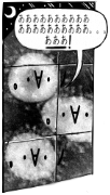
It's not the worst thing I've ever seen, but I do wish they had gone with Desert Knights. The negative space on the helmet spelling a V is pretty nice.
|
|
#
?
Nov 23, 2016 03:56
|
|

|
Stretch Marx posted:They should have had like three crossed swords or something. Hell why not keep the military theme THE CREATOR is super  for and add another sword: for and add another sword:
|
|
#
?
Nov 23, 2016 03:56
|
|
|
wow you don't pick a name that is subservient to another team in your own goddamn division
|
|
#
?
Nov 23, 2016 03:56
|
|
|
Scorpions would have been alright but the real fault lies with the NHL for shooting anything gambling related down immediately, because of course the Vegas name is gonna be lame as poo poo if you can't use the one thing people know Vegas for.
|
|
#
?
Nov 23, 2016 03:58
|
|
|
Nail Rat posted:How 
|
|
#
?
Nov 23, 2016 03:58
|
|

|
The negative space V is not creative in the slightest.
|
|
#
?
Nov 23, 2016 03:59
|
|

|
Dale Ouise posted:The negative space V is not creative in the slightest. I don't think its as atrocious a logo as others. It's not spectacular, no.
|
|
#
?
Nov 23, 2016 04:01
|
|
|
At first I thought this was for a team called the Gradiuses or something.
|
|
#
?
Nov 23, 2016 04:02
|
|
|
i will fully admit i liked this logo as a secondary
|
|
#
?
Nov 23, 2016 04:06
|
|


|
this is all really loving stupid and the nhl is stupid for putting a hockey team in loving las vegas gently caress you bettman
|
|
#
?
Nov 23, 2016 04:05
|
|


|
See also: Buffaslug, Captain Highliner, Mooterus
|
|
#
?
Nov 23, 2016 04:06
|
|
|

|
| # ? May 13, 2024 10:36 |
|
|
Yaya posted:Scorpions Too AHL / Minor League'ey. grack posted:See also: Buffaslug, Mooterus drat you, was gonna post both of those.
|
|
#
?
Nov 23, 2016 04:09
|
|