

|
Someone post that LA Burger Kings logo
|
 #
?
Nov 23, 2016 04:11
#
?
Nov 23, 2016 04:11
|
|

|

|
| # ? May 13, 2024 11:25 |
|
|
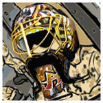
Yaya posted:I don't think its as atrocious a logo as others. It's not spectacular, no. If you're gonna be bad, be spectacularly bad. This helmet logo is just 
|
|
#
?
Nov 23, 2016 04:12
|
|
|
f u, unironically bring back the Spawn jersey.
|
|
#
?
Nov 23, 2016 04:14
|
|


|
oh well
|
|
#
?
Nov 23, 2016 04:22
|
|
|
I was like the one person on earth who thought this was a good logo. Carry on.
|
|
#
?
Nov 23, 2016 04:26
|
|

|
Martytoof posted:I was like the one person on earth who thought this was a good logo. I liked it too!  
|
|
#
?
Nov 23, 2016 04:26
|
|

|
I always knew the nhl was the real no fun league
|
|
#
?
Nov 23, 2016 04:28
|
|
|
I really don't understand why they dropped the Las.
|
|
#
?
Nov 23, 2016 04:29
|
|
|
Teemu Pokemon posted:oh well  e: this joke actually works on a couple levels. Duke Chin fucked around with this message at 04:37 on Nov 23, 2016 |
|
#
?
Nov 23, 2016 04:34
|
|

|
Martytoof posted:I was like the one person on earth who thought this was a good logo. I think it's a cool patch/secondary logo but there should be a little bit of Orange accent in there somewhere imo
|
|
#
?
Nov 23, 2016 04:37
|
|
|
Came away spending less than I thought I would. Got a hat for my brother and I and a shirt. Good to go until the jerseys. I couldn't hear the speeches because of the helicopters, but I did arrive late and was at the back. Lol at the video loving up tho
|
|
#
?
Nov 23, 2016 04:52
|
|

|
Wow that was a loving gong show eh?
|
|
#
?
Nov 23, 2016 04:53
|
|


|
I'm not sure how I feel about Martytoof posted:I was like the one person on earth who thought this was a good logo. 
|
|
#
?
Nov 23, 2016 04:55
|
|
|
Spring Break My Heart posted:I really don't understand why they dropped the Las.
|
|
#
?
Nov 23, 2016 04:56
|
|

|
Golden Showers it is
|
|
#
?
Nov 23, 2016 04:58
|
|


|
The G'Nights
|
|
#
?
Nov 23, 2016 04:59
|
|

|
Nice NHL 17 stock logo
|
|
#
?
Nov 23, 2016 04:59
|
|
|
The logo is OK. The team name is bad.
|
|
#
?
Nov 23, 2016 05:00
|
|

|
shyduck posted:Nice NHL 17 stock logo They just today released a batch of new custom logos that are way better than this logo.
|
|
#
?
Nov 23, 2016 05:02
|
|


|
Hockles posted:They just today released a batch of new custom logos that are way better than this logo. For EASHL only or for the create-a-whatever modes as well?
|
|
#
?
Nov 23, 2016 05:12
|
|
|
Duke Chin posted:For EASHL only or for the create-a-whatever modes as well? *shrug* Probably both since it uses the same pool of logos
|
|
#
?
Nov 23, 2016 05:14
|
|
|
Hockles posted:*shrug* Probably both since it uses the same pool of logos I mean, it's EA we're talking about here... 
|
|
#
?
Nov 23, 2016 05:21
|
|
|
Lessail posted:Came away spending less than I thought I would. Got a hat for my brother and I and a shirt. Good to go until the jerseys. I got a hoodie! They were sold out of hats by the time I got into the store :/
|
|
#
?
Nov 23, 2016 05:43
|
|

|
Teemu Pokemon posted:oh well I didn't realize this was a real logo until I looked at the screenshot of the team site with the cross logo. This one's actually kind of cool. It's still "stock Madden Create-A-Team", but it's not bad.
|
|
#
?
Nov 23, 2016 05:53
|
|


|
well the good news for the Vegas Golden Knights is that the division they are being placed in is a complete poo poo show where Edmonton has a legit argument of being the best team So yeah.. there's no reason Vegas couldn't be in the playoffs and competing for a Cup very quickly. Basically just add a decent goaltender and a couple of high talent forward draft selections and they are there..
|
|
#
?
Nov 23, 2016 06:00
|
|

|
pizza valentine posted:I got a hoodie! They were sold out of hats by the time I got into the store :/ Which one did you go to? I got mine from the outside tent.
|
|
#
?
Nov 23, 2016 06:10
|
|
|
Starsfan posted:well the good news for the Vegas Golden Knights is that the division they are being placed in is a complete poo poo show where Edmonton has a legit argument of being the best team they are going to suck for half a decade at least
|
|
#
?
Nov 23, 2016 06:12
|
|


|
Porrima posted:I was a defenseman once, but then I took a puck to the knee.
|
|
#
?
Nov 23, 2016 06:16
|
|
|
Lessail posted:Which one did you go to? I got mine from the outside tent. The Black Clover store. They had a bunch of re-branded black clover hats with the logo on the side that I thought was kind of weird. I got in line maybe 15 minutes after they said everything was open.
|
|
#
?
Nov 23, 2016 06:17
|
|
|
That's not even a loving knight's helmet, it's like a viking one.
|
|
#
?
Nov 23, 2016 07:20
|
|

|
i think the logo is pretty good, the double meaning thing is done in a reasonably subtle yet well-integrated sort of way, the color scheme is fine the team name is dogshit
|
|
#
?
Nov 23, 2016 07:26
|
|

|
this is a worse team name than blue jackets
|
|
#
?
Nov 23, 2016 07:27
|
|
|
Vincent Van Goat posted:That's not even a loving knight's helmet, it's like a viking one. Well yeah what did you think the V in the helmet even stood for duuuuuuuuuuh
|
|
#
?
Nov 23, 2016 07:43
|
|
|
NHL V Expansion: Golden Showers of the Creator are Upon Us
|
|
#
?
Nov 23, 2016 07:44
|
|

|
Now to await the day when I can follow the team in the espn app 
|
|
#
?
Nov 23, 2016 08:33
|
|
|
Lessail posted:Now to await the day when I can follow the team in the espn app Ahhh, The Creator didn't hire you even after all that SinBin fanfic? Jokes aside I'll be there the first time the Bruins play em. :bookem:
|
|
#
?
Nov 23, 2016 11:23
|
|
|
quote:The story also noted that Foley decided the �Las� in Las Vegas wouldn�t be included in the name because, �In talking to locals, everyone seems to call it �Vegas.� Funny. quote:According to ESPN.com, the final versions of both the logos and the jerseys weren�t decided until 2 � weeks ago. The story said Foley needed the NHL to sign off on the name. He also required approval from Clarkson College and the University of Central Florida, which are both nicknamed the Golden Knights. Overall the NHL seemed happy with both the logo and name. Also funny. quote:Foley settled on the name late summer, but took his time to try to figure out the perfect logo and color scheme for the organization. quote:Thumbing through a book that displays the jersey color schemes for home and away, Foley pointed out the changes that had been undertaken even since September, including a band of red on both the jerseys and socks that was initially white. That was the brainchild of McPhee. So funny. Contract VGK.
|
|
#
?
Nov 23, 2016 14:08
|
|

|
Vincent Van Goat posted:That's not even a loving knight's helmet, it's like a viking one. This. Also hilarious is the big ado about the "chivalry" and such of the knight, protectors of the downtrodden, when in fact they were just high-rolling mercs who probably couldn't give less of a poo poo about protecting anyone or doing much of anything that wasn't bashing skulls (be they enemy soldier or unruly peasant)
|
|
#
?
Nov 23, 2016 14:32
|
|

|
Underwhelming. I don't hate the helmet logo, but it's kind of boring. They should have gone with 'Las Vegas Nights' or 'Vegas Nights' for some sweet, sweet double entendre. And the last thing the league/world needs is more black jerseys. Someone in the thread suggested a deep brick red as a home color and that would have been awesome. Anything but more black.
|
|
#
?
Nov 23, 2016 14:35
|
|

|

|
| # ? May 13, 2024 11:25 |
|
|
i am the bird posted:Funny. I'm not sure what's funny about the first part. He's right in that everyone just says Vegas.
|
|
#
?
Nov 23, 2016 15:30
|
|