


|
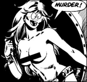
JordanKai posted:I actually don't mind the Sandman recolours that much (possibly because I haven't read it yet), but good lord: Well, that is just murder. And such a slap in the face for the original colorist.
|
 #
?
Jan 10, 2017 15:37
#
?
Jan 10, 2017 15:37
|
|


|

|
| # ? May 22, 2024 14:59 |
|
|
JordanKai posted:I actually don't mind the Sandman recolours that much (possibly because I haven't read it yet), but good lord: I think I need everyone's talk(Or more likely scorn). The original is very blue and yellow, the new one is very grey. While the blue is 'nice', I cannot recognise what is so 'glorious' in the original to the redo that it is seen as 'murder' that it was changed. Can someone explain it to me step-by-step, that I can understand? Like, it's been brought up multiple times as an example of 'the worst'. And I don't get it, but want to.
|
|
#
?
Jan 10, 2017 16:37
|
|

|
Bloodly posted:I think I need everyone's talk(Or more likely scorn). While the first one has intricate line work, the color scheme helps simplify the image as a whole by drawing the eye from the darker blue of the upper deck and the main figure to that white area the hero is presumably falling towards, implying motion through the use of color. The new version, besides the use of gradients being subjectively uglier, loses that unified color scheme in favor of a mix of browns and greys that doesn't lighten towards the bottom so much as they've placed a little white gradient burst where he's supposed to be falling towards. Those greys and browns are dark enough that they don't contrast with the line work as much as the pale blues and yellows, so the entire image aside from the main figure becomes muddy and harder to comprehend.
|
|
#
?
Jan 10, 2017 16:56
|
|


|
They completely flattened and dulled out the page. The contrasting colors fading into the background give a really good sense of light and shadow and also a really good sense of the depth of the scene, and also lead the eye effectively through the page. You lose a ton of that sense of depth and organization with the new ones; look at the little thumbnail images and see how much easier it is to make out the gist of what's happening in the old vs the new. The old is also using two main colors throughout that are complimentary which while it's not a shortcut to having a good looking page and can be abused in things like AAA action movie posters, give it much more style and boldness than the mess of grey blobs in the new one. There is a way to find a middle ground between these two and have something more real/gritty looking that still uses effective color theory but they did not accomplish it at all.
|
|
#
?
Jan 10, 2017 16:57
|
|

|
The colour in the first one enhances the depth and sense of motion. Also, just forget about colour theory and all that. The simple fact that the colours needed to be changed to something "realistic" is sad enough on its own. It's a fantasy setting. Why would you see a bunch of nice blues and yellows and say nah, gimme more grey and brown please.
|
|
#
?
Jan 10, 2017 17:08
|
|


|
Yeah but they really put a lot more detail in the butt region and I personally applaud that effort.
|
|
#
?
Jan 10, 2017 17:13
|
|

|
Load_Gradient_Body_Buttocks_v043
|
|
#
?
Jan 10, 2017 17:14
|
|
|
Is this where I get to complain that the Flex Mentallo recoloring 100% killed my enthusiasm for finally being able to buy a copy? Still don't own it!
|
|
#
?
Jan 10, 2017 18:00
|
|

|
I dislike the Miracleman recolor and I hate the Killing Joke recolor.
|
|
|
#
?
Jan 10, 2017 18:17
|
|


|
Bloodly posted:I think I need everyone's talk(Or more likely scorn). I'm no colour expert, but let yourself look at each page, and see where your eye is naturally drawn to. If you're anything like me, the shift from deep colours at the top to white at the bottom pulls your eyes to the bottom of the page, and gives a real sense of movement. On the re-colour, your eye gets stuck on the biggest splotch of colour (the guy) and you don't get the same sense of movement.
|
|
#
?
Jan 10, 2017 18:33
|
|

|
Lobok posted:The colour in the first one enhances the depth and sense of motion. This is the biggest criticism for me, the brighter center naturally leads the eye to the bottom of the space in the direction the character is falling. The recolored version feels a lot more static like the character is just hovering upside down.
|
|
#
?
Jan 10, 2017 20:35
|
|

|
BROCK LESBIAN posted:Yeah but they really put a lot more detail in the butt region and I personally applaud that effort. I can't argue with this though
|
|
#
?
Jan 10, 2017 20:37
|
|
|
This is what the two pages look like in black and white; the recolour has much stronger contrast, but it's spread all over the place, which is why there's no direction to it. I don't actually like 80s colours that much and the original is pretty washed out, but keeping the two-colour theme of the background, even if they still changed the blue to grey, and enhancing the original's contrasts instead of redoing it all, would have been a much better way of updating it.
|
|
#
?
Jan 10, 2017 22:21
|
|


|
Lurdiak posted:I dislike the Miracleman recolor and I hate the Killing Joke recolor. the killing joke recolor makes me wanna loving kill myself lol.
|
|
#
?
Jan 11, 2017 00:05
|
|

|
The Killing Joke recolour is a sin. What really gets me is that Joker is just coloured to his model sheet all the time, regardless of lighting, what the mood of the scene is, what the other colours in the panel are, he's just always Purple with a White face and Green hair because that is Canon. It's the most unimaginative and dead-feeling colour work you could imagine.
|
|
#
?
Jan 11, 2017 00:11
|
|

|
I kinda like the Killing Joke recolour. I feel like it gives the comic a more sombre, grim tone. The original is cool because the colouring gives it the tone of a wild, manic nightmare; a gaudy circus horror. I don't think you can go wrong with either, really, but the colours do change the tone. Also I really love how the flashback scenes look. I love how the reds in them get brighter with every one. I feel like The Incal recolour looks better when you look at the pieces, but it doesn't work as a whole like the original. Is there a trade that uses the original colours, or is the recolour the only one? I've been wanting to read it for a while.
|
|
#
?
Jan 11, 2017 01:13
|
|
|
The flashbacks having muted greyish colors is the laziest poo poo ever.
|
|
|
#
?
Jan 11, 2017 01:52
|
|
|
Wasn't it Killing Joke where somebody from the original team came out and said that the recolor was closer to the original vision?
|
|
#
?
Jan 11, 2017 01:54
|
|


Internet Wizard posted:Wasn't it Killing Joke where somebody from the original team came out and said that the recolor was closer to the original vision? George Lucas.
|
|
|
#
?
Jan 11, 2017 01:58
|
|
|
Internet Wizard posted:Wasn't it Killing Joke where somebody from the original team came out and said that the recolor was closer to the original vision? Well then their original vision was bad, and thank god for the color printing limitations of the time.
|
|
#
?
Jan 11, 2017 02:04
|
|


|
catlord posted:I kinda like the Killing Joke recolour. I feel like it gives the comic a more sombre, grim tone. The original is cool because the colouring gives it the tone of a wild, manic nightmare; a gaudy circus horror. I don't think you can go wrong with either, really, but the colours do change the tone. Also I really love how the flashback scenes look. I love how the reds in them get brighter with every one. The Humanoids release hardcover is the original colors, and it's beautiful.
|
|
#
?
Jan 11, 2017 02:29
|
|
|
Internet Wizard posted:Wasn't it Killing Joke where somebody from the original team came out and said that the recolor was closer to the original vision? The opposite of this was year one as the artist said that the coloring ruined it. The Neal Adams Bateman recolors were also poo poo, but he might like them as he is currently out of his mind.
|
|
#
?
Jan 11, 2017 02:51
|
|
|
From trying to find the process on youtube I gather most comics coloring these days is digital, but what did they use in the olden days?
|
|
#
?
Jan 11, 2017 03:17
|
|

|
Internet Wizard posted:Wasn't it Killing Joke where somebody from the original team came out and said that the recolor was closer to the original vision? Hell, it was recoloured by Bolland himself. I don't know if the rest of the creative team agrees it's an improvement though; I'm sure John Higgins doesn't. It is one of the more interesting recolours, in that it gives this version a bit of a "director's cut" impression, though in my own opinion it just makes me grateful Bolland's Judge Dredd work is in black & white (the series would not be improved by grim and gritty Marx Brothers homages or sombre looking Dark Judges, frankly). Fantastic artist in pretty much all other respects though, of course. bobkatt013 posted:The opposite of this was year one as the artist said that the coloring ruined it. The Neal Adams Bateman recolors were also poo poo, but he might like them as he is currently out of his mind. Not just the colouring! For an interesting look at how the belief that glossy paper=high class actually ruins older work, Mazzucchelli's opinion of that particularly poor reprint are worth reading. gus rules ok fucked around with this message at 03:25 on Jan 11, 2017 |
|
#
?
Jan 11, 2017 03:23
|
|

|
zoux posted:From trying to find the process on youtube I gather most comics coloring these days is digital, but what did they use in the olden days? Watercolor dye. (Be sure to read the comments -- some interesting stuff there too.) Selachian fucked around with this message at 06:40 on Jan 11, 2017 |
|
#
?
Jan 11, 2017 05:50
|
|
|
It's the same story with Sandman- everyone on the original production team quoted in the linked articles is on record saying the original color job was basically them not having enough time to do it right.
|
|
#
?
Jan 11, 2017 06:31
|
|
|
catlord posted:I kinda like the Killing Joke recolour. I feel like it gives the comic a more sombre, grim tone. The original is cool because the colouring gives it the tone of a wild, manic nightmare; a gaudy circus horror. I don't think you can go wrong with either, really, but the colours do change the tone. Also I really love how the flashback scenes look. I love how the reds in them get brighter with every one. I have to say, I do quite like what they did with the flashbacks in the Killing Joke recolour, so that's one thing it has going for it. I think it would have worked a lot better if the muted colours were contrasting with lurid colours in the present day, though. Here's one panel comparison that I just find generally egregious.  The image is pretty small, but look at how the blue lighting in the original scene is used to convey depth and a sense of position. Thanks to the fact that Batman and the Joker are both lit in blue, but to different degrees, we can tell intuitively exactly how far the Joker is standing behind Batman and we're aware that he's going to have to lunge forward with that knife. Then, with the pink lighting covering his entire back in the fifth panel, we see that Joker's getting doubled over so hard that he's now completely in the light he previously had his back to. This gives a sense of motion and dynamism. The clever use of high contrast colour to convey light and depth really adds to the energy and readability of the scene. In the recoloured scene, you sadly don't get any of that. Joker is purple, white, and green, Batman is blue-black, and any variations in light source are expressed by flat shading and a bit of airbrush blending on the light and dark edges of their figures. The vivid lighting that was previously used to express motion and depth is gone entirely. It's not an awful series of panels, and the colouring is basically competent, but it loses so much of what made the original page great and gains, I think, nothing by it.
|
|
#
?
Jan 11, 2017 10:15
|
|
|
But look at that sweet gradient background bro
|
|
#
?
Jan 11, 2017 10:35
|
|
|
They both have gradients in the backgrounds.
|
|
#
?
Jan 11, 2017 11:07
|
|

|
It was a joke. They're not all good
|
|
#
?
Jan 11, 2017 11:18
|
|
|
Are there any re-colors that most people can agree are an improvement? Also, is there such a thing as a colorized b/w comic that doesn't look completely awful? I would think you would have to remove a ton of the existing shading to make it work remotely well.
|
|
#
?
Jan 11, 2017 16:55
|
|


|
I'd be totally down with a version of The Killing Joke that cooled it on the psychedelic colours, and I don't think the recolour looks outright awful, but there are so many details it loses in its devotion to a more "standard" palette that do have a real effect on how effectively the visual information on the page is being displayed. Like, you could convey the same strong sense of position and movement in those panels with much more subdued colours than the very bright ones the original work uses, but it's something the recolour decides against. In the original, the lighting is so intricate and characters are lit up by various tones not just to convey depth and motion, but also to communicate theme - there's a scene early on where Batman is pictured doused in the yellow light given off by Joker's appearance on the Batcomputer's screen, then in a purple that's closer to his natural palette as Alfred approaches him from behind to take off his cape, for instance. We see him being consumed in this work and changed by this rivalry, then calmed by Alfred, who's his rock and a bastion of normality, and all this is expressed through the light. In the recolour, Joker's image on the screen isn't giving off any light, and rather than being yellow, it's just his standard palette set against computer screen tone. To get away from strict technical colouring stuff from a moment and into "cultural" colour theory, both purple and yellow are associated with fear, but yellow is also associated with cowardice and madness while purple is regal and opulent, so the use of colour in the scene is pitting these two strange creatures of the night against each other and showing how one threatens to consume the other. There's a lot of levels on which the original page works while the recoloured page just punches in and goes home, so to speak. Found the scene in question:  You can see that the colour here is so stark and high contrast that it's actually overwhelming at times. I think it would be totally fine and perhaps even better to cut that down and move the contrasts into powerful, distinct highlights, for instance, while keeping to the model sheet specification for the main areas of colour. You'd still retain a lot of the power and thematic interest. But the recolour just cuts it all out entirely and takes a strict literal approach: Batman is here, the Joker is here, Batman is looking at the Joker on a screen.
|
|
#
?
Jan 11, 2017 17:02
|
|
|
david_a posted:Are there any re-colors that most people can agree are an improvement? david_a posted:Also, is there such a thing as a colorized b/w comic that doesn't look completely awful? I would think you would have to remove a ton of the existing shading to make it work remotely well.
|
|
#
?
Jan 11, 2017 17:30
|
|
|
Android Blues posted:
I think part of what's happening here is that the old one is representing the computer monitor light of the era, which tended to be fairly limited in terms of palette.
|
|
#
?
Jan 11, 2017 17:43
|
|
|
Weird that they were so intent on removing the yellow that they also changed the symbol on Batman's chest.
|
|
#
?
Jan 11, 2017 18:19
|
|
|
I think that was maybe to fit in with his character design in the modern stories at the time. Which is endemic of a lot of colouring decisions in the story, really, just sticking to the character's strict on-model colours and appearance above all else.
|
|
#
?
Jan 11, 2017 18:26
|
|
|
Android Blues posted:But the recolour just cuts it all out entirely and takes a strict literal approach: Batman is here, the Joker is here, Batman is looking at the Joker on a screen. But it doesn't do that. It's specifically only highlighting the characters, the tea service, and the Joker on the screens.
|
|
#
?
Jan 11, 2017 22:10
|
|
|
 I really liked this page from JLA: Vixen: Rebirth: Reloaded 2
|
|
#
?
Jan 12, 2017 03:27
|
|

|

|
|
#
?
Jan 12, 2017 03:29
|
|
|
|
| # ? May 22, 2024 14:59 |
|
|
Couple more really nice paces  I'd really like a full solo series for Vixen that's drawn like this.
|
|
#
?
Jan 12, 2017 03:31
|
|