


|
underage at the vape shop posted:
Magic 8 ball, looking at the first photo, I think it's a snowy landscape from a plane window? It's hard to tell, it took me looking at it to figure out what it was so I could say something because it's not immediately obvious. Which is fine when you do it on purpose, but there's nothing of interest to draw you into the photo and make you want to look at it. If that was your intent, it falls flat because there's nothing to grab your attention, if it wasn't, then I think you need to consider what you are trying to do with the photo when you take it. Of the other 2, I like the second one better. Sorry to be blunt but the blurry train post is really generic and done to death. The second one is a little generic (stormy city at night) but it doesn't look like I've seen the photo 1000x before.
|
 #
?
Jan 10, 2017 07:28
#
?
Jan 10, 2017 07:28
|
|


|

|
| # ? May 21, 2024 15:14 |
|
|
 TerrorMissu1 by Jon Mil, on Flickr TerrorMissu1 by Jon Mil, on FlickrTook a few shots at a local comic convention last weekend. I'm reasonably happy with how they turned out, but I know they could all be improved. Just not sure in what way exactly. What I like: The angle was good, lighting decent, reasonably straight, cropped fairly well, and I think I color corrected it right. What I don't like: the focus needed to be moved further back about 6-8", her face was going out of focus. The background is rather busy and distracting. I need to pay attention to whats behind more. Such as using the garden wall as a background. use a lower ISO than 3200 to reduce noise. I feel like I should have gotten more light around her eyes and face.
|
|
#
?
Jan 16, 2017 20:16
|
|
|
Hello! I've been a hobbiest on and off for about 15 years, but I want to get more serious about learning better techniques and how to use a camera properly. I've never had anyone who knows anything about photography look at my work and tell me whether it was any good or not, so I'll take all the critique I can get. On the same note, my critique of the work of others is bound to be quite amateurish. First, on someone else's images: mattdev posted:Got a couple of shots from a recent trip to Thailand. I really like the colors in the first image, as well as the expression on the guy's face. The person in the background, over his left shoulder, is kinda distracting. Also, the part of the boat behind the subject that is sticking out above his head is bothering me. I maybe would have shot from a little lower, in order to avoid seeing that at all. The monks are definitely my favorite part about the second image. I would crop out the entire right 1/4 of the picture, getting rid of the back of the person's head there. It's a shame, because I feel like the dark background behind the head works really well for the overall image. I don't like the tiny bit of car in the very bottom left, but as it is, I don't think you'd want to crop out any more of the left side. Over all, it's interesting to look at and I like it. Here are a few of mine. I've always really liked this one. iirc, I did some minor color adjustments in Lightroom.  sculpture by B, on Flickr It's a flower. Does anyone care about seeing a flower photo? I assume the answer is no but I really like how the colors came out on this one.  magenta flower by B, on Flickr I never really go for B&W but I feel like it works well for this image. The color version has a pretty washed out sky and the bridge is only like, two colors.  bridge slant by B, on Flickr
|
|
#
?
Jan 17, 2017 14:07
|
|


|
Golluk posted:
Yeah it's hard to tell where her prop gun ends and the background begins. I know your P&S isn't going to allow for very wide apertures so I'd try to find a cleaner background for your subject, and maybe a fairly light one so she stands out against it. She and her outfit are blending into that background sheet on the right.
|
|
#
?
Jan 17, 2017 15:02
|
|


|
DJExile posted:Yeah it's hard to tell where her prop gun ends and the background begins. I know your P&S isn't going to allow for very wide apertures so I'd try to find a cleaner background for your subject, and maybe a fairly light one so she stands out against it. She and her outfit are blending into that background sheet on the right. Another con, another crack at taking decent pictures. I paid far more attention to what was in my backgrounds this time. I also dropped down to iso 2000, and played a bit with some additional lighting from a jogging light. Really like the make up on this character from Undertale. Not entirely sure I color corrected this right. The hallways were very warm and yellowish. I think the poses were fairly good, though the legs of the left person should have been split slightly, to reduce how wide their hips look.  _staar_dust_2 by Jon Mil, on Flickr _staar_dust_2 by Jon Mil, on FlickrA nicely done head! Looking at it on this screen, I definitely set the blues a bit high. I think a bit warmer, and brighter would improve things. Also have a slight belly roll going, otherwise I like the pose. Might have rotated a bit more to the right to separate the legs again.  acekitten2 by Jon Mil, on Flickr acekitten2 by Jon Mil, on FlickrEver popular Diva outfit. The spot was surprisingly dark, so made use of the light. I think it could have been posed a bit better. More to the right, to cut out that window. Slightly rotate the front hip more in front, and the face a bit more to the left to sharpen, elongate the chin.  amaleighcp1 by Jon Mil, on Flickr amaleighcp1 by Jon Mil, on FlickrI think I finally found out why I haven't been happy with the clarity/sharpness of some of these. I've mostly been shooting at F4-4.5 to deal with low lighting. It seems at the focal length I'm at (20-30mm), the lens is sharpest between F5.6-8.0. It's made me tempted to get a 33mm prime that will be sharp at F2.8-4.
|
|
#
?
Jan 25, 2017 20:30
|
|
|
I'm not really sure what to say about those shots. They aren't really something more than 'I was at a thing and here are some costumes people were wearing'. It's like how someone will take pictures of their car before selling it, there isn't really any artistic intent to the photo so it doesn't seem reasonable to critique the photo as such. Technically, the lighting is uninteresting, the photo image quality is very poor from I guess the camera straining to properly expose. All of the photos are underexposed to my eye. the rear person in the first shot is out of focus.
|
|
#
?
Jan 25, 2017 21:01
|
|

|
VelociBacon posted:I'm not really sure what to say about those shots. They aren't really something more than 'I was at a thing and here are some costumes people were wearing'. It's like how someone will take pictures of their car before selling it, there isn't really any artistic intent to the photo so it doesn't seem reasonable to critique the photo as such. Technically, the lighting is uninteresting, the photo image quality is very poor from I guess the camera straining to properly expose. All of the photos are underexposed to my eye. the rear person in the first shot is out of focus. Valid points! Thinking back, that did end up being roughly what happened. Try to get a picture of all the costumes there. I suppose that's part of the difference between "hallway" shots, and going off for 10-15 minutes for a mini shoot. I guess next attempt will be trying to improve focus, clarity, and exposure. I should probably work out my more technical shortcomings before trying to tackle the artistic ones.
|
|
#
?
Jan 25, 2017 21:27
|
|
|
Yeah I think your biggest problem is the setting in general. There's only so much creative control possible in a convention center and all your photos look like generic smartphone snapshots. I mean you got what looks like people standing in a hallway on the way to a public washroom. The lighting is horrible and the colors are muddy (likely fluorescents), no matter how much correction you attempt. All of them look under exposed. Are there any con photos that you've seen that you consider to be absolutely stunning? I'd start by analyzing what makes those successful and trying to imitate.
|
|
#
?
Jan 25, 2017 21:30
|
|
|
I don't know if I've ever seen a con photo that had any visual interest beyond "look at this costume". You're taking pictures of deliberate, mismatched artifice in a setting designed to be as vague and invisible as possible. I think you probably just have to seek out things like "groups of spidermen" to create a more broad, abstract effect than "here is person dressed as character".
|
|
#
?
Jan 25, 2017 22:10
|
|

|
Looking at your Flickr stream, it seems like all of your shots are event shots - either cons or concerts. I'm not going to tell you what you should be shooting but I'll say that you are making life harder for yourself. You're dealing with erratic light, little or no control over the subject and whatever background happens to be at the venue. It's hard even for people with a lot of experience and high-end gear to produce really great photos under those conditions. If you're posting in this thread, I can only assume that you want to improve. My advice is to take some different photos where you do have control over the composition, lighting and ambience, try taking some landscape or urban shots, try closeups of detail in nature or architecture, maybe borrow a photogenic friend and try setting up a slightly more elaborate portrait shoot. Get feedback on those and try to apply what you learn to your event shots.
|
|
#
?
Jan 26, 2017 14:52
|
|
|
Yeah, there's definite wisdom there. I know that my candid or unplanned shots have consistently improved based on practicing through planned or controlled shots - the experience lends itself to better technique.
|
|
#
?
Jan 26, 2017 17:49
|
|
|
Krakkles posted:Yeah, there's definite wisdom there. I know that my candid or unplanned shots have consistently improved based on practicing through planned or controlled shots - the experience lends itself to better technique. i.e. once you understand what conditions lead to better photos, you'll be able to better position/look for/whathaveyou those conditions "in the wild". Some great advice from Krakkles and Helen Highwater.
|
|
#
?
Jan 26, 2017 18:11
|
|
|
totalnewbie posted:i.e. once you understand what conditions lead to better photos, you'll be able to better position/look for/whathaveyou those conditions "in the wild". And with any luck, I'll be able to put it into practice! Appreciate the advice and feedback.
|
|
#
?
Jan 27, 2017 20:03
|
|
|
DarkEuphoria posted:
Is there anything to salvage from this shot of a lion? The timing was good but I was not able to crop or process it in a way that I felt made it a keeper.  IMGP0114.jpg by Kernodle, on Flickr
|
|
#
?
Jan 27, 2017 20:54
|
|


|
Syrinxx posted:I find this unsettling but in a good way, it makes me feel unbalanced and have a bit of vertigo. Definitely worked for me. Did you already crop it and have some more room to work with? Not cutting off the platform would work, showing more of the surrounds to give context since getting closer won't really work with that big pole going through the lion's body. I am thinking something that would center the lions mouth or part of the lion around the bottom right intersection of the rule of thirds grid. Right now the center composition isn't doing much for you. That would mean extending the scene up and to the left, showing more clearance above the poles and the rest of the platform to the left. rio fucked around with this message at 21:56 on Jan 27, 2017 |
|
#
?
Jan 27, 2017 21:54
|
|

|
Syrinxx posted:Is there anything to salvage from this shot of a lion? The timing was good but I was not able to crop or process it in a way that I felt made it a keeper. The pole cutting the lion in half is really unfortunate and there's not much you can do now about it. A lot of people who do zoo shots try to minimise the appearance of the actual enclosure in the photo, which is something to focus on next time maybe. It's hard without a good telephoto lens however.
|
|
#
?
Jan 28, 2017 00:07
|
|

|
VelociBacon posted:I'm not really sure what to say about those shots. They aren't really something more than 'I was at a thing and here are some costumes people were wearing'. It's like how someone will take pictures of their car before selling it, there isn't really any artistic intent to the photo so it doesn't seem reasonable to critique the photo as such. Technically, the lighting is uninteresting, the photo image quality is very poor from I guess the camera straining to properly expose. All of the photos are underexposed to my eye. the rear person in the first shot is out of focus. To add on to this, if you want real critique, your photos will need to have a lot more intent beyond just a photo of something. Otherwise all you're gonna get is technical advice (which is fine if that's what you really wanted) - but that's not critique. A photo of a cosplayer is usually just that - but did you have any intent behind taking it beyond showing us you were taking photos at the event? Is there a deeper motive or message or story? And that's probably how a series or project begins too.
|
|
#
?
Jan 28, 2017 02:48
|
|

|
rio posted:Did you already crop it and have some more room to work with? Not cutting off the platform would work, showing more of the surrounds to give context since getting closer won't really work with that big pole going through the lion's body. I am thinking something that would center the lions mouth or part of the lion around the bottom right intersection of the rule of thirds grid. Right now the center composition isn't doing much for you. That would mean extending the scene up and to the left, showing more clearance above the poles and the rest of the platform to the left.  IMGP0114-nocrop by Kernodle, on Flickr
|
|
#
?
Jan 28, 2017 03:15
|
|
|
Magic Hate Ball posted:I don't know if I've ever seen a con photo that had any visual interest beyond "look at this costume". You're taking pictures of deliberate, mismatched artifice in a setting designed to be as vague and invisible as possible. I think you probably just have to seek out things like "groups of spidermen" to create a more broad, abstract effect than "here is person dressed as character". http://richardmanphoto.com/PICS/TransformationsCosplay-Portfolio/
|
|
#
?
Jan 28, 2017 03:23
|
|


|
My DUDE how did you manage to make a 4x5 negative into a LifeTouch yearbook photo from 1995?
|
|
#
?
Jan 29, 2017 04:36
|
|
|
I took some shots of some animals at the Detroit Zoo a few months ago and edited/posted them for social media cred. Look at me, I'm so cool. It just occurred to me that I might be able to get some feedback on both the original shots and the edited versions. As-shot:  Edited:  One of the things I was having trouble with is that the background is kind of dark and the arctic fox is really white/bright. The surrounding foliage in the original kind of looked, I don't know how to describe it, bland? Washed-out? So I wanted to see if I could bring it out a bit. I like that the log in the background kind of gives the picture a little more balance, but I'm 50/50 on whether or not it's distracting. It's not that easy to get shots of them, though, because of the way the enclosure is set up so I don't know if I could have framed it better. I think overall the after-editing one definitely feels a little bit like the colors were played around with, which makes me think I would have been better off with a lighter touch. I think the crop itself was okay though, but would also love feedback there.
|
|
#
?
Jan 30, 2017 05:30
|
|
|
I think the rock is distracting because it is a weird looking rock. It looks more like a petrified roosting bird than a rock. Weirdness aside, I do notice that my eyes tend to focus on it, probably because the fox's body is creating a curve that leads the eye towards the rock and the shape of the rock itself causes the eye to continue to look right. If possible, I would blur it out some. The crop and composition seems fine otherwise. The whiteness of the fox can probably pop a bit more, but I dunno how much it's on the edge of being blown out.
|
|
#
?
Jan 30, 2017 07:23
|
|

|
The way you framed it makes it look like the poop shaped rock is important. It actually looks more important than the cute fox where you have it in the frame at worst, and at best you are featuring it as a subject along with the fox. We don't want to look st the poop shaped rock. I just threw the original on a phone app to crop a portrait and landscape because it is late and easier to do that than type a bunch of words. Are you familiar with the rule of thirds? I took a very lazy way to edit both so that the rock isn't as meaningful - you can take the inside box of the rule of thirds grid and line up the eyes or head (depending on the subject) in the upper left or upper right corner of the middle box of the rule of thirds grid. If this doesn't make sense I can draw the grid over the photo tomorrow to show you what I'm talking about so let me know. The rule of thirds is great because you can be pretty lazy and just plug in some formulas about where to put poo poo and it is usually better than just guessing. Eventually you don't have to follow this rule but it is important to have a firm understanding of it and be able to know all about what you can do with the grid to make your pictures look like you are deliberately showing the view where to look. So instead of a prominently placed poop rock now we are looking at the wolf that I very much want to play with and give rubs. I don't know if you have the megapickles to crop on this far but even doing less of a crop you can use the same idea. Also I kept it 3x2 rather than square because I am just generally not into square crops unless it is instant film or medium format or something that god intended to be a square, but that is just me. There are definitely better ways to do it than this but, again, just throwing it in an app to crop it framing the eyes (in the landscape crop) and the head (in the portrait crop) with the top corner of the center of the rule of thirds grid.   rio fucked around with this message at 09:25 on Jan 30, 2017 |
|
#
?
Jan 30, 2017 09:21
|
|
|
Golluk posted:Another con, another crack at taking decent pictures. Ok, this poo poo is my bread and butter so apologies for jumping in far after everyone else. It can't be repeated enough times that you have to be incredibly selective about your backgrounds and lighting. Convention centers and hotels are the absolute worst when it comes to this and it pays to take a walk around and find all of the weird, interesting, and hidden areas. Don't be afraid to ask the cosplayers to move to a different location. Have a few picked out that provide favorable lighting conditions and smaller crowds. Next to windows, stairwells, parking garages, elevator lobbies, the elevators themselves (provided no one is in them) are all good. Go outside. Check the hotel lobby. Get a reasonable flash. If you can't get away from the crowd, and you can't find a good background, try to take a good tight portrait instead. Yeah, you're going to miss some costume detail but a well done portrait is going to look better than a poorly done body shot. For the love of gently caress, keep your god drat angles straight. Don't be yet another shitqueen cosplay photographer who makes up for having no loving composition skills by tilting the camera at a forty-five degree angle then fellating themselves for being edgy and pro. For the love of gently caress, keep your god drat aperture at a sensible size for the lighting. Don't be yet another shitqueen cosplay photographer who thinks that gaping wide apertures are the end-all and be-all of good photography. Bokeh should be a consideration, not the end goal. Don't do that stupid thing where you have the cosplayer point at you or hold some prop out at you then you focus on the prop and then let the bokeh poo poo on everything else. That looks loving terrible but its another gold standard of poo poo con photographers. Be very aware of fabrics and how they react in strong light. D.va costumes and pretty much anything that's spandex or stretch material becomes see-through if you're using direct flash. Also, if you want to talk more about this loving nerd poo poo, PM me.
|
|
#
?
Jan 30, 2017 17:46
|
|
|
This would be my choice for a crop as well.
|
|
#
?
Jan 30, 2017 18:22
|
|
|
squidflakes posted:if you're using direct flash. Which should be never. Ever.
|
|
#
?
Jan 31, 2017 02:31
|
|
|
DarkEuphoria posted:Here are a few of mine. These are okayish. Your main problem is lack of focus. What are you trying to convey about these subjects? The first photo has beautiful tone, but it's essentially a picture of nothing. The photo of the flower is awkwardly framed, I find my eye drawn towards the big white area in the middle, which is essentially featureless. The potential point of interest, the tip of the blossom, is shoved way up towards the top. The bridge photo is kind of a dead picture. It's a collection of lines and a clutter of architectural structure. Bridges are tricky - like most public art, they're usually designed to look blandly nice, so a photo of a bridge usually just looks blandly nice, at best. Take more photos! 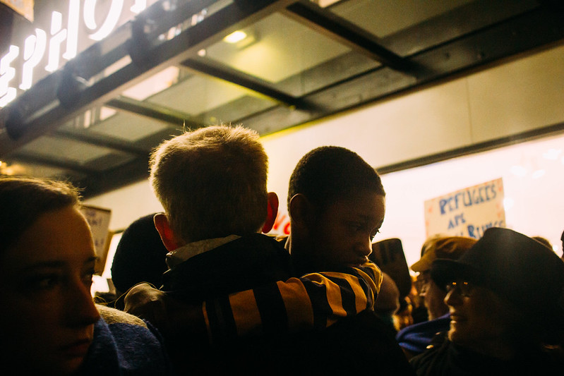 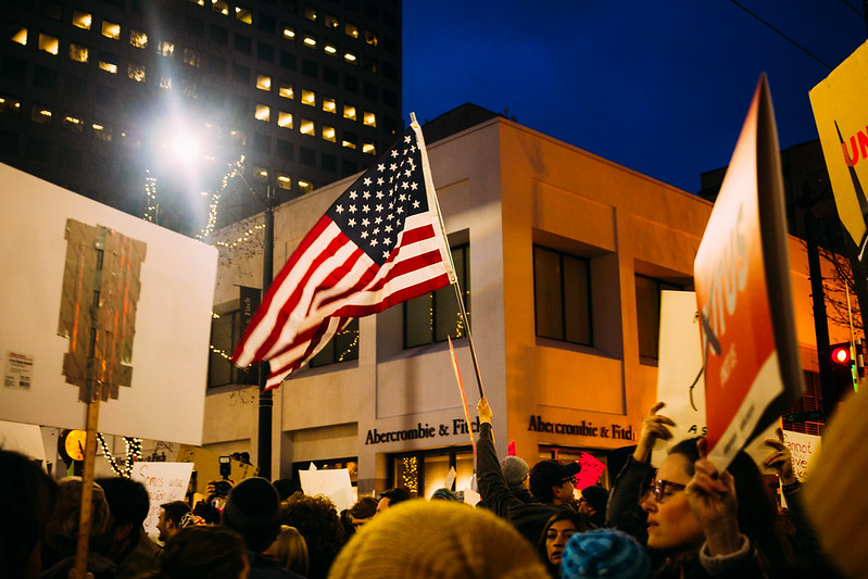 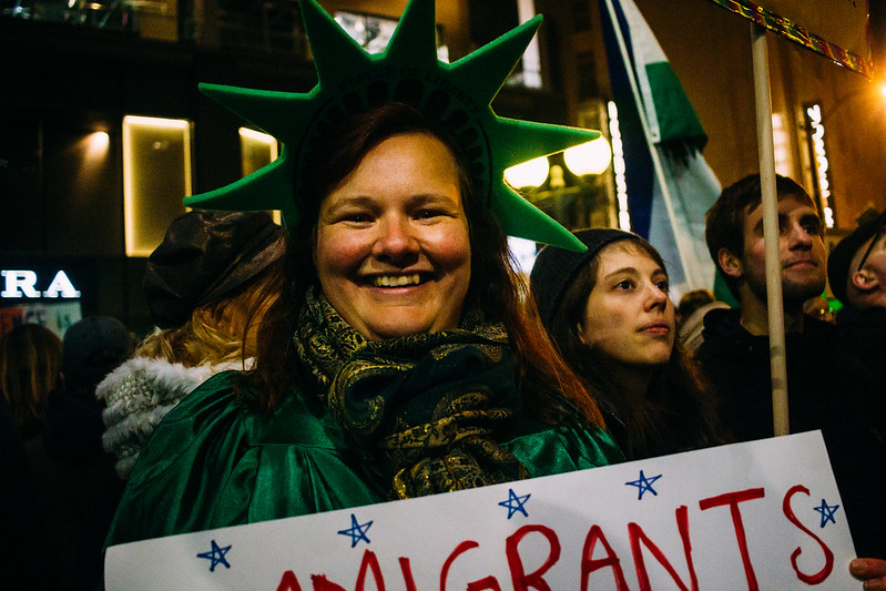
|
|
#
?
Jan 31, 2017 06:40
|
|
|
Magic Hate Ball posted:These are okayish. Your main problem is lack of focus. What are you trying to convey about these subjects? The first photo has beautiful tone, but it's essentially a picture of nothing. The photo of the flower is awkwardly framed, I find my eye drawn towards the big white area in the middle, which is essentially featureless. The potential point of interest, the tip of the blossom, is shoved way up towards the top. The bridge photo is kind of a dead picture. It's a collection of lines and a clutter of architectural structure. Bridges are tricky - like most public art, they're usually designed to look blandly nice, so a photo of a bridge usually just looks blandly nice, at best. The third, I like it, but the framing would be better if a bit more of the sign was visible - the entire word, for example. The second. Man. That's a great shot. The flag, the people, the sign that's just barely legible - you think you know what it says, but you can't really read it. The only thing that I would like better would be if the sign on the left were more interesting - the taped together, white back looks basic and mechanical, and not in an interesting way. Your shots make me think of Santa Monica. 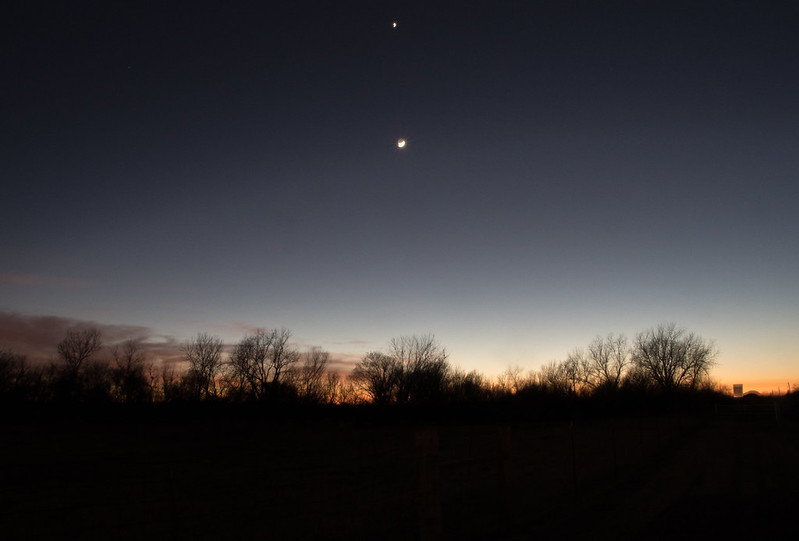 The Moon over the Plains by Nate H, on Flickr
|
|
#
?
Jan 31, 2017 08:22
|
|
|
rio posted:The way you framed it makes it look like the poop shaped rock is important. It actually looks more important than the cute fox where you have it in the frame at worst, and at best you are featuring it as a subject along with the fox. We don't want to look st the poop shaped rock. InternetJunky posted:This would be my choice for a crop as well. GrandpaPants posted:I think the rock is distracting because it is a weird looking rock. It looks more like a petrified roosting bird than a rock. Weirdness aside, I do notice that my eyes tend to focus on it, probably because the fox's body is creating a curve that leads the eye towards the rock and the shape of the rock itself causes the eye to continue to look right. If possible, I would blur it out some. That is some quality advice. Seeing the closer crops really turns my 50/50 into 100% yeah, it's distracting. Does color also make it more difficult for the fox to stand out? i.e. I wonder if the colors were reversed (light log / dark fox) if the fox would stand out more? And because there was no comment on the color, was it okay? TIA!
|
|
#
?
Jan 31, 2017 16:10
|
|
|
totalnewbie posted:That is some quality advice. Seeing the closer crops really turns my 50/50 into 100% yeah, it's distracting. Does color also make it more difficult for the fox to stand out? i.e. I wonder if the colors were reversed (light log / dark fox) if the fox would stand out more? In general, the lightest parts of a picture will grab attention first. if there are equally sized light bits and dark parts of a photo in roughly the same photo-space (i.e. both equally close to the centre), then the lighter area will be the most dominant part. The colours on your fox photo seemed fine to me, maybe a bit muted but not way out of scale.
|
|
#
?
Jan 31, 2017 16:53
|
|
|
Krakkles posted:The first, I feel a desire to see the people just a little bit better, a little brighter - it's a bit too dark there. Why f/32 on this one?
|
|
#
?
Feb 1, 2017 14:07
|
|
|
murk posted:Why f/32 on this one? Would a larger aperture have been better?
|
|
#
?
Feb 1, 2017 17:18
|
|
|
Krakkles posted:I was hoping for depth of field, but especially now that you say that, that was perhaps excessive. Yes, you get diffraction issues at those high stops, everything would have been in focus anyways at f/11 or so. E: probably even f/8, remember how distance from sensor relates to DoF. You can use the extra light to lower the ISO (not that the shot looks noisy). VelociBacon fucked around with this message at 17:29 on Feb 1, 2017 |
|
#
?
Feb 1, 2017 17:27
|
|
|
VelociBacon posted:Yes, you get diffraction issues at those high stops, everything would have been in focus anyways at f/11 or so. It probably would have also concealed the dust on the lens, which I'm now wanting to clean. Sigh.
|
|
#
?
Feb 1, 2017 17:47
|
|
|
Krakkles posted:
This is okay. The colors seem a little muted, and I wish the darkness below the trees was a proper black because there's just the shades of some stuff down there that's distracting my eye. 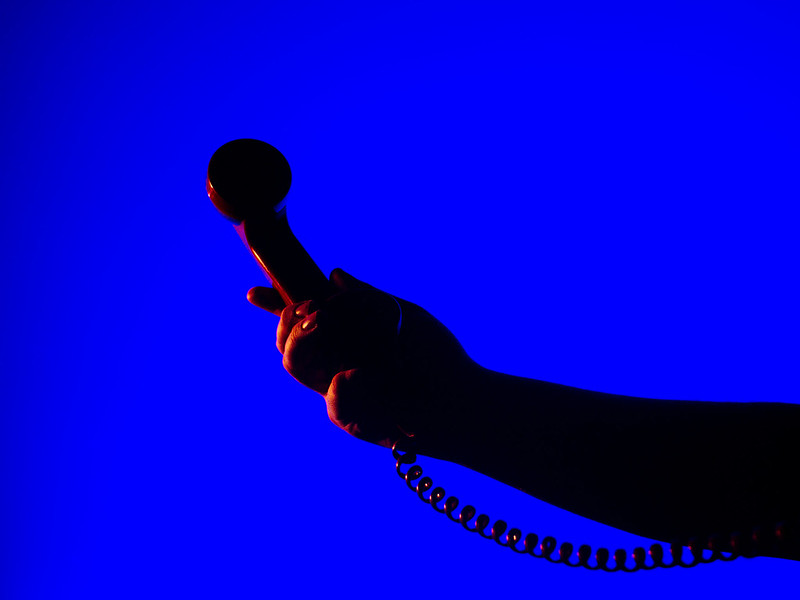  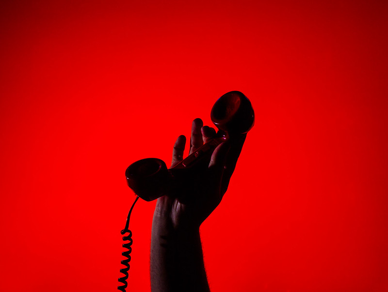
|
|
#
?
Feb 2, 2017 01:02
|
|
|
Magic Hate Ball posted:This is okay. The colors seem a little muted, and I wish the darkness below the trees was a proper black because there's just the shades of some stuff down there that's distracting my eye. 1 and 3 are amazing. The second one has a little too much negative space - the shadows on the hand and phone blend a little too much.
|
|
#
?
Feb 2, 2017 03:34
|
|
|
Krakkles posted:Follow up question: I used Lightroom on my MBPr to edit this, and had the brightness on the screen all the way up. It looked black. My desktop PC shows what you're describing. Is there a way to adjust the MBPr to show correctly, or can I just not edit photos on there? Get a screen calibrator. It is the only way to know that what you are seeing is accurate unless you are intimately knowledgeable about your histograms.
|
|
#
?
Feb 2, 2017 04:56
|
|
|
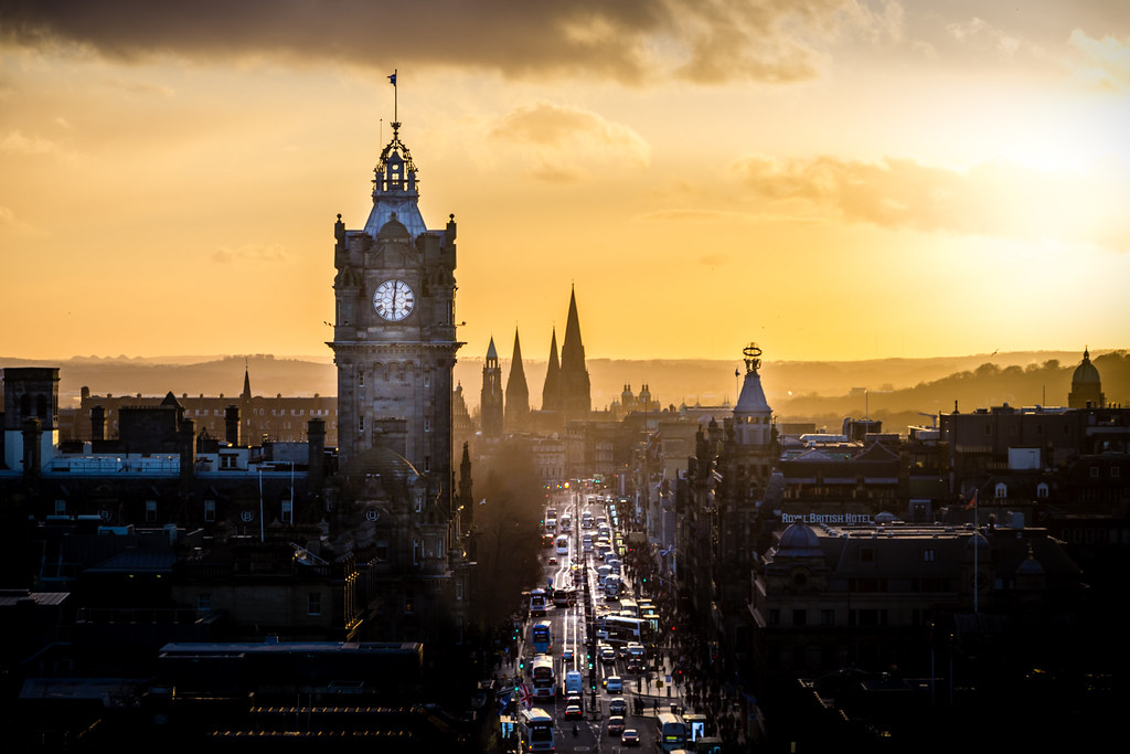 Street Sight by Nathan Nixon, on Flickr Street Sight by Nathan Nixon, on Flickr Monuments Sunset by Nathan Nixon, on Flickr Monuments Sunset by Nathan Nixon, on Flickr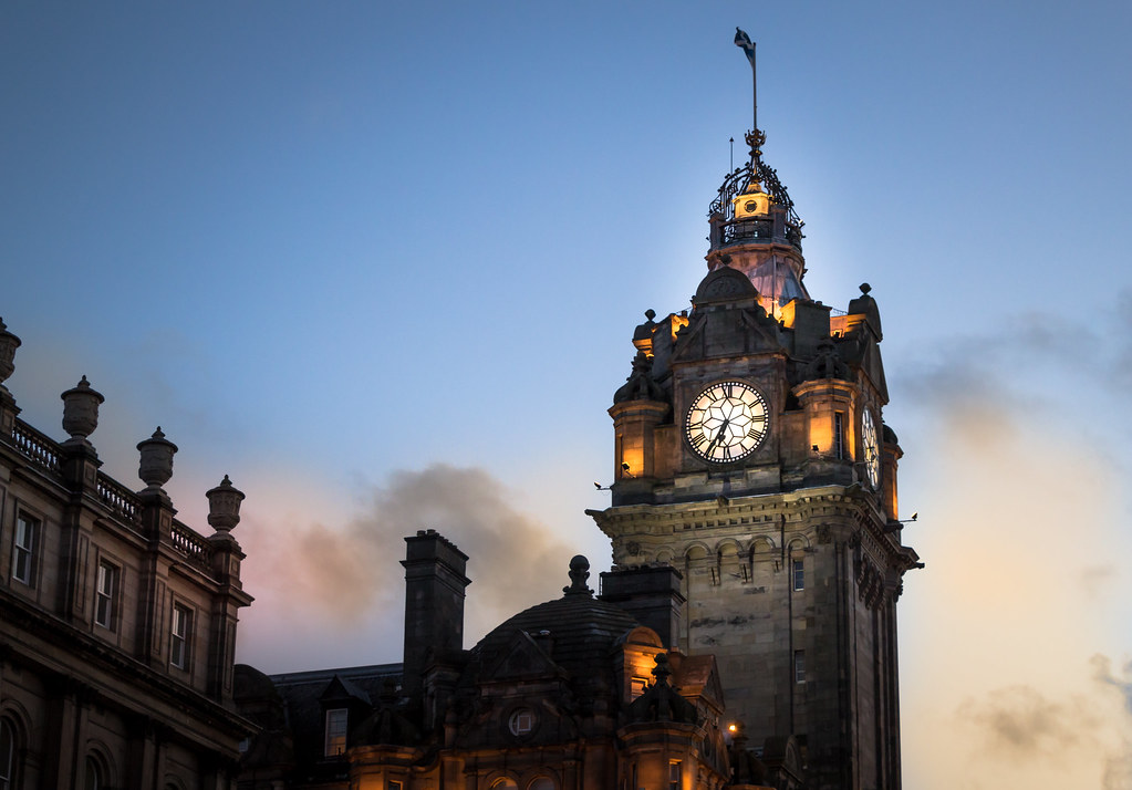 Balmoral Clock by Nathan Nixon, on Flickr Balmoral Clock by Nathan Nixon, on FlickrI just bought a secondhand Canon EOS 60D so I could start seriously making photography a hobby and this is one of my first shots using it (I've been using a phone camera for the past 2 years). The lighting was great that evening and it's all natural color in the background sky. However, I don't have a tripod yet and I think I'm shaking too much and ruining the photograph by losing sharpness. Also, I don't think I got a large enough depth of field in the picture but again I think I need to get a tripod so I can have a smaller aperture and longer shutter. I'm still trying to get used to the settings on the camera so I'm hoping to go out again next week to try to get some more sunset pictures and improve. I welcome criticism on my post-processing (Lightroom) as well as that feels hit or miss for me at the moment. I think I did okay on this photo but others have told me that it's too obvious where I have used the brush tool to highlight areas of the photo i.e. the clocktower.
|
|
#
?
Mar 19, 2017 00:48
|
|
|
I think it's a fairly standard trap to fall into when you're new to over-process and you seem to have done this in those shots. To be fair if you post that kind of style on facebook or similar that's what they prefer.
|
|
#
?
Mar 19, 2017 01:28
|
|
|

|
| # ? May 21, 2024 15:14 |
|
|
Fix those nasty halos (the parts of the sky you turned white) around the areas where you dodged, they'd look better. With processing, less is best.
|
|
#
?
Mar 19, 2017 06:52
|
|
