|
YggdrasilTM posted:I mean, I'm sure that when they printed Elesh Norn in loving phyrexian people complained that the card was unreadable, right? The difference is that the Judge Elesh Norn looks loving baller and these look like complete poo poo. Also people know what Elesh Norn does in constructed. Good luck parsing all the card elements to whoever gets introduced to Chain/Chair Lightning by opening one of these at prerelease. Also the P/T being stacked vertically is colossally stupid. Literally the only benefit to these existing is that they fulfill my wish of WotC printing tournament-playable cards for people who don't care about the way cards in their deck look.
|
 #
?
Mar 29, 2017 01:09
#
?
Mar 29, 2017 01:09
|
|


|

|
| # ? Jun 4, 2024 12:15 |
|
|
Finally, the Virbicate reprint we've all been waiting for.
|
|
#
?
Mar 29, 2017 01:12
|
|


|
Rinkles posted:Uhh 
|
|
#
?
Mar 29, 2017 01:16
|
|


|
https://twitter.com/TrickMTG/status/846850855626145792 WOTC and Trick are getting worked right now on twitter.
|
|
#
?
Mar 29, 2017 01:26
|
|
|
https://twitter.com/maro254/status/846879106574663680
|
|
#
?
Mar 29, 2017 01:26
|
|

|
TheChirurgeon posted:Ha, that's pretty cool. You will ruin your opponents day with Mind Twist at prerelease.
|
|
#
?
Mar 29, 2017 01:27
|
|

|
Angry Grimace posted:You will ruin your opponents day with Mind Twist at prerelease. oh yeah and it'll be rad as gently caress to watch him mutter about how bad the new invocations look as he scoops
|
|
#
?
Mar 29, 2017 01:28
|
|

|
it seems to be a very love it or hate it thing, it's closer then i thought it would be
|
|
#
?
Mar 29, 2017 01:29
|
|
|
Angry Grimace posted:You will ruin your opponents day with Mind Twist at prerelease. You will ruin their Magic playing experience for the rest of their lives. That's what Mind Twist does, maaaan.
|
|
#
?
Mar 29, 2017 01:32
|
|

|
They should make lotto ticket cards with that tapestry generator
|
|
#
?
Mar 29, 2017 01:33
|
|
|
It could have been worse. They could have used Papyrus font for the rules text.
|
|
#
?
Mar 29, 2017 01:32
|
|

|
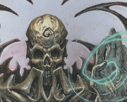
I refuse to believe these are real. This is the ultimate April Fools joke by Wizards Also, I agree that Patrick Rothfuss sucks and the books he writes are poo poo
|
|
#
?
Mar 29, 2017 01:33
|
|

|
Well gently caress me sideways, I need to get me a bunch of these.
|
|
#
?
Mar 29, 2017 01:33
|
|

|
lol I actually kind of like this one, it's so ridiculous. Reminds me of Asterix comics or something.
|
|
#
?
Mar 29, 2017 01:33
|
|
|
*Designer, in George Lucas voice* "I may have gone too far in a few places"
|
|
#
?
Mar 29, 2017 01:34
|
|
|
mandatory lesbian posted:it seems to be a very love it or hate it thing, it's closer then i thought it would be I don't remember anything close to as much negativity on the first two. People had complaints about Expeditions, the main one being that they wished they were more transparent to show off the cool full-frame art, but generally people liked them, and I don't recall anyone having anything bad to say about the frame style of Inventions. Inventions look amazing. At most, some people disliked some of the specific artworks on some of them. Looking on Twitter I'm seeing about 75-25 people hating Invocations viciously and in-depth vs. generic "looks cool!" comments.
|
|
#
?
Mar 29, 2017 01:37
|
|
|
i was expecting 90-10, so yeah, closer then i thought
|
|
#
?
Mar 29, 2017 01:42
|
|
|
mandatory lesbian posted:i was expecting 90-10, so yeah, closer then i thought You know that 5 geek social fallacies webpage? Basically the way every interaction with WotC goes is a big blinking "Ostracizers/Criticizers are Evil". These POSs are a prime example.
|
|
#
?
Mar 29, 2017 01:44
|
|
|
Dark Ritual is a Masterpiece too
|
|
#
?
Mar 29, 2017 01:44
|
|


|
mandatory lesbian posted:i was expecting 90-10, so yeah, closer then i thought They have to be taking notice and not just dismissing it as "people always hate change", right? Was there any negative reaction to Inventions?
|
|
#
?
Mar 29, 2017 01:45
|
|
|
That is some horrendous loving art. Why does the cat god look like that?
|
|
#
?
Mar 29, 2017 01:45
|
|


|
Entropic posted:They have to be taking notice and not just dismissing it as "people always hate change", right? Was there any negative reaction to Inventions? They looked a little gaudy in the previews but turned out pretty good when on actual foiled cards. These are fundamentally flawed and no foiling is going to make them not look bad.
|
|
#
?
Mar 29, 2017 01:49
|
|
|
new ReBoot shaping up to be a monster
|
|
#
?
Mar 29, 2017 01:50
|
|


|
I legit couldn't even read Vindicate's name until I looked down and checked the rules text. These are the worst tcg cards I've ever seen.
|
|
#
?
Mar 29, 2017 01:49
|
|


|
Elyv posted:Dark Ritual is a Masterpiece too 
|
|
#
?
Mar 29, 2017 01:49
|
|

|
Rap Record Hoarder posted:That is some horrendous loving art. Why does the cat god look like that? 3D foil effect will make it looks more like normal art
|
|
#
?
Mar 29, 2017 01:49
|
|

|
That BarkActual art looks cool, I hate the frame
|
|
#
?
Mar 29, 2017 01:50
|
|
|
Holy gently caress this is unbelievable and hilarious that someone conceived of this and someone signed off on this.
|
|
#
?
Mar 29, 2017 01:51
|
|
|
Not that many real money cards yet, are there?
|
|
#
?
Mar 29, 2017 01:52
|
|
|
gently caress this would have been nice
|
|
#
?
Mar 29, 2017 01:53
|
|

|
Entropic posted:They have to be taking notice and not just dismissing it as "people always hate change", right? Was there any negative reaction to Inventions? They're going to say some poo poo about how they knew this would be controversial, but they were really pleased by how it was received in the microdemographic they were targeting or something.
|
|
#
?
Mar 29, 2017 01:55
|
|
|
Elyv posted:Dark Ritual is a Masterpiece too BARKACTUAL
|
|
#
?
Mar 29, 2017 01:55
|
|
|
clamiam45 posted:Holy gently caress this is unbelievable and hilarious that someone conceived of this and someone signed off on this. Imagine someone pulling off the mythic task of pulling a Dark Ritual and a Mind Twist in his prerelease pool. Imagine turn 2 Dark ritual into Mind Twist. It's possible, in 2017.
|
|
#
?
Mar 29, 2017 01:56
|
|
|
Snacksmaniac posted:BARKACTUAL Now read the type line. You've gotta have a degree in cryptography to read the type line.
|
|
#
?
Mar 29, 2017 01:57
|
|
|
Just wow. These cards look like poo poo. It's like they saw this: 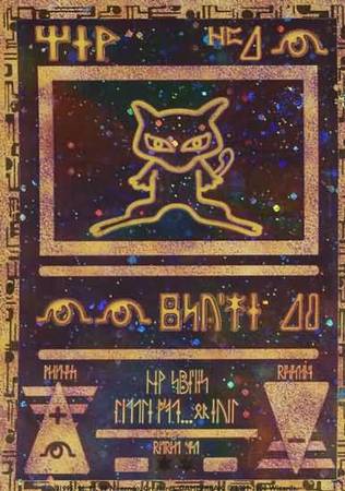 And asked themselves how they could make it look even worse and ended up with something that looks like an unreadable version of this: 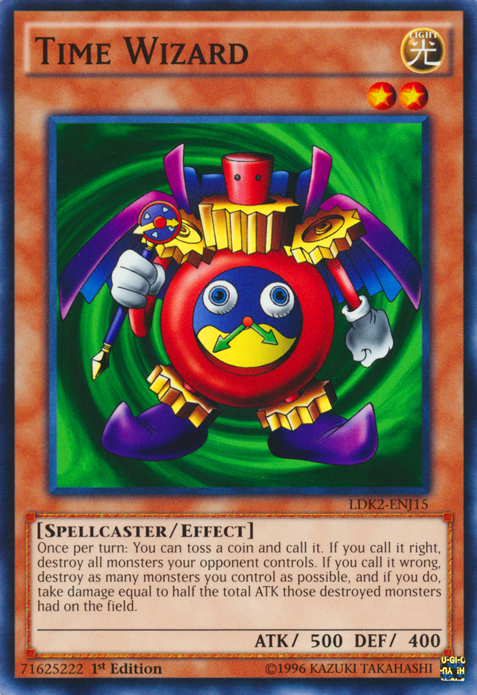
|
|
#
?
Mar 29, 2017 01:57
|
|

|
This one actually looks pretty good. The art fits well with the frame and so the card forms one congruent whole. The symmetry in particular really helps. If they all looked like this it wouldn't be so bad. I'm not sure what the art has to do with producing extra mana though. If you renamed it to City of Brass it would be much better.
|
|
#
?
Mar 29, 2017 01:59
|
|

|
clamiam45 posted:Now read the type line. You've gotta have a degree in cryptography to read the type line. Pretend I edited that numbers gif so it ends with the guy seeing "instant." Jabor posted:
It's fine. It's like "Yo, Bolas shrine, gimme some mana. TIA." On par with the other rituals minus the spell caster.
|
|
#
?
Mar 29, 2017 01:59
|
|
|
Jabor posted:This one actually looks pretty good. The art fits well with the frame and so the card forms one congruent whole. The symmetry in particular really helps. If they all looked like this it wouldn't be so bad. Totally agree.
|
|
#
?
Mar 29, 2017 02:02
|
|
|
Do you think they spent actual money to get some experts on hieroglyphics to concoct this nonsense, or did they just run the cardnames through wingdings and call it a day?
|
|
#
?
Mar 29, 2017 02:02
|
|
|

|
| # ? Jun 4, 2024 12:15 |
|
|
Jabor posted:This one actually looks pretty good. The art fits well with the frame and so the card forms one congruent whole. The symmetry in particular really helps. If they all looked like this it wouldn't be so bad. This is the best looking one. This still looks terrible. I'm pretty sure it's people marching to a sacrifice altar or something. It's hard to see with 4 pixels of the card being devoted to actual art.
|
|
#
?
Mar 29, 2017 02:02
|
|