|
JerryLee posted:I suspect (I hope) he meant "more printings of existing QH artwork" I really find the CGI-style art that wotc is forcing on mtg artists these days to be incredibly boring and bland. I understand the need to standardize it a bit, so it's all recognizable as mtg art, but allowing more stylized pieces, like those that QH did, would be a big step forward.
|
 #
?
Apr 21, 2017 21:03
#
?
Apr 21, 2017 21:03
|
|


|

|
| # ? May 15, 2024 20:09 |
|
|
You do know why a lot of illustrators work digitally, right?
|
|
#
?
Apr 21, 2017 21:15
|
|
|
Star Man posted:You do know why a lot of illustrators work digitally, right? You can work digitally without it looking like a still shot of CGI from B horror movie.
|
|
#
?
Apr 21, 2017 21:19
|
|
|
Maybe you should pick some of your unfavourites because I keep looking at cards and thinking "ooh pretty".
|
|
#
?
Apr 21, 2017 21:21
|
|


|
CompeAnansi posted:I really find the CGI-style art that wotc is forcing on mtg artists these days to be incredibly boring and bland. I understand the need to standardize it a bit, so it's all recognizable as mtg art, but allowing more stylized pieces, like those that QH did, would be a big step forward. It depends on the artist, like with everything else. Guys like Daarken and Chippy do great work and theirs is all digital. Likewise, there's lots of garbage art on the older cards. That said, I'd love to see some new Anson Maddocks and Mark Tedin art TheChirurgeon fucked around with this message at 21:32 on Apr 21, 2017 |
|
#
?
Apr 21, 2017 21:23
|
|

|
CompeAnansi posted:You can work digitally without it looking like a still shot of CGI from B horror movie. I'm going to ask you again. Star Man posted:You do know why a lot of illustrators work digitally, right?
|
|
#
?
Apr 21, 2017 21:25
|
|
|
Also, picking anything by Chase "Literally a 3D Model Artist" Stone is cheating.
|
|
#
?
Apr 21, 2017 21:28
|
|
|
Mark Tedin is a cool guy, he shows up to most big events in the northwest. I asked him why he hasn't been featured on more cards recently and apparently Wizards just stopped calling 
|
|
#
?
Apr 21, 2017 21:29
|
|


|
TheChirurgeon posted:It depends on the artist, like with everything else. Guys like Daarken and Chippy do great work and theirs is all digital. Likewise, there's lots of garbage art on the older cards. Agreed. I have nothing against people working digitally. That, in itself, isn't particularly relevant. I'm sure someone could paint a scene that looked like CGI crap if they really wanted to. I'm talking about the art style, regardless of the way it's created. It probably would help to have some examples. These are just the first ones I found in the Amonkhet spoiler. Looks like CGI and would have (IMO) looked better in a different style: 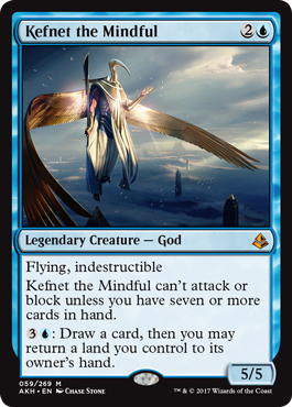 Actually looks a bit different than the new norm: 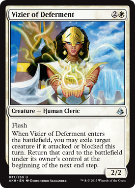 EDIT: Hah! I was pre-empted by Siivola. I find it funny that the first objectional piece I come across is from the person they mentioned.
|
|
#
?
Apr 21, 2017 21:35
|
|
|
i want them to use a style guide that allows for stasis to be reprinted with its original art
|
|
#
?
Apr 21, 2017 21:36
|
|
|
Cactrot posted:Mark Tedin is a cool guy, he shows up to most big events in the northwest. I asked him why he hasn't been featured on more cards recently and apparently Wizards just stopped calling Part of it is probably the change in Art Directors; newer guys have their favorites that they prefer to go to. It's a shame though, because I always loved Tedin's work. His and Maddocks' stuff would have been amazing in Shadows over Innistrad/Eldritch Moon. I also feel like we could use more Richard Kane-Ferguson art
|
|
#
?
Apr 21, 2017 21:37
|
|
|
the "children's coloring book" aesthetic
|
|
#
?
Apr 21, 2017 21:38
|
|
|
mandatory lesbian posted:the "children's coloring book" aesthetic A lot of Amy Weber's stuff (e.g., Celestial Prism) from the first few sets fits in with this aesthetic. That said, she has some good stuff too, like Time Walk and High Tide.
|
|
#
?
Apr 21, 2017 21:41
|
|
|
mandatory lesbian posted:i want them to use a style guide that allows for stasis to be reprinted with its original art I never hated the Stasis art, it just felt really out of place in the game, which was my only problem with it. That said, I liked the simplicity of a lot of the earlier cards. Stuff like the original Shatter, Mana Short, Disenchant, and Dark Ritual had iconic art that was really eye-catching without being overdone. My biggest problem with a lot of the modern cards is that too many of them try to cram too much into a small box and it ends up being busy. I don't love the frames, but I like the art on most of the new Invocations because a lot of it is relatively simple and evocative (e.g. the new Dark Ritual). e: Ironically, most of this simplicity came from having no time to complete the set, so guys ended up rushing to get a bunch of cards done. Maddocks did an interview a while back where he mentioned doing something like 65 cards for Alpha because they needed someone to fill in gaps, and taking about 2-3 hours to do each card On a set basis, it may be the second-weakest set of all time, but I love almost everything about The Dark, the only set designed by a Magic Art Director. It's such a visually evocative set with so many cool things going on TheChirurgeon fucked around with this message at 21:47 on Apr 21, 2017 |
|
#
?
Apr 21, 2017 21:44
|
|
|
CompeAnansi posted:A lot of Amy Weber's stuff (e.g., Celestial Prism) from the first few sets fits in with this aesthetic. That said, she has some good stuff too, like Time Walk and High Tide. i'm not actually knocking it, i love the stasis art
|
|
#
?
Apr 21, 2017 21:45
|
|
|
Yeah somewhere along the way the art direction seems to have gone from getting art that looks good at 1"x2" versus art designed to look cool as a desktop wallpaper.
|
|
#
?
Apr 21, 2017 21:46
|
|


|
I would kill for a printmaker to do some illustrations for Magic. But that's not exactly an easy process of making art.
|
|
#
?
Apr 21, 2017 21:48
|
|
|
CompeAnansi posted:EDIT: Hah! I was pre-empted by Siivola. I find it funny that the first objectional piece I come across is from the person they mentioned. 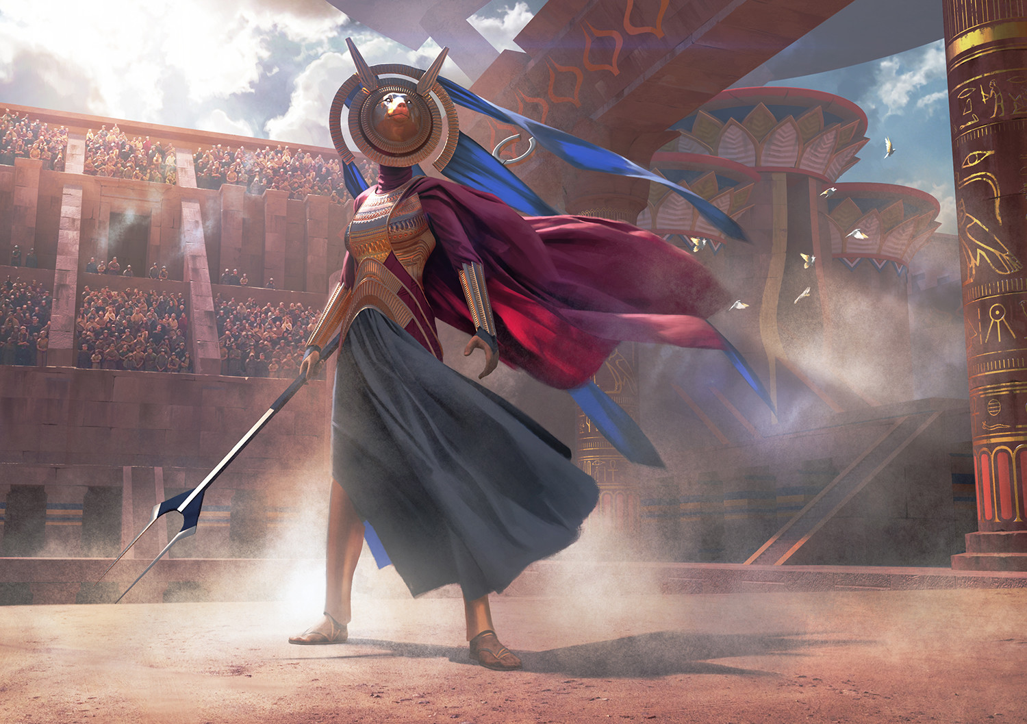 The joke here is, both Stone and Meehan literally work with 3D models. That's why the lighting is so stark and the shadows so sharp. This isn't the art director pushing a lame style, that's just how these people work. In this same set you'll find literal oil paintings by artists like Howard Lyon and Volkan Baga and hey, those look like oil paintings.
|
|
#
?
Apr 21, 2017 21:48
|
|
|
Siivola posted:Here's another you'll probably dislike: That looks straight out of a 90's Black Isle Studios game's intro video.
|
|
#
?
Apr 21, 2017 21:50
|
|
|
TheChirurgeon posted:I never hated the Stasis art, it just felt really out of place in the game, which was my only problem with it. Jesper Myrfors told a funny anecdote about Richard Garfield telling him he needed art for CoP black ASAP or else it wouldn't be in the set because they were going to print soon. How soon? 2-3 hours. Myrfors obviously couldn't do it, CoP black was missing from alpha, and the eventual art was made lazily anyway, with some photoshop filters.
|
|
#
?
Apr 21, 2017 21:53
|
|
|
whydirt posted:Yeah somewhere along the way the art direction seems to have gone from getting art that looks good at 1"x2" versus art designed to look cool as a desktop wallpaper. Yeah, that's actually a nice way of summarizing my discontent. It feels like some of the newer art is trying to pack too many details into a very small space. I guess I'm just old fashioned and like stuff that looks like this better: 
|
|
#
?
Apr 21, 2017 21:55
|
|
|
whydirt posted:Yeah somewhere along the way the art direction seems to have gone from getting art that looks good at 1"x2" versus art designed to look cool as a desktop wallpaper. Yeah I'd say that's one of the big issues. The overall level of competency has increased substantially over time, but it does seem like the art in the cards is a little too cluttered. Some of that is due to the need to do story stuff, definitely. Otherwise, the stronger art direction is a double-edged sword; it helps the game's aesthetic overall, but kills a bit of that individuality that we'd normally see if artists had more freedom to just do whatever. But the flip side is we get fewer true stinkers with poo poo like Reverse Damage e: The big shame is that we're unlikely to see any of the old art show up in Iconic Masters because of the royalty fee structure for older Magic art TheChirurgeon fucked around with this message at 22:00 on Apr 21, 2017 |
|
#
?
Apr 21, 2017 21:57
|
|
|
Star Man posted:You do know why a lot of illustrators work digitally, right? What are you getting at?
|
|
#
?
Apr 21, 2017 22:49
|
|

|
Christopher Moeller will be missed (he's retiring from Magic). https://www.youtube.com/watch?v=WLccZ5Cu3w8 His artworks were always standouts (okay, usually) especially in modern sets.
|
|
#
?
Apr 21, 2017 23:07
|
|
|
Why don't they just pay Terese Nielson to make 250 compositions of whatever the hell she wants, and then they design cards around them E: call it "Terese Nielson Masters" and instead of expeditions they put in signed cards Nebalebadingdong fucked around with this message at 23:15 on Apr 21, 2017 |
|
#
?
Apr 21, 2017 23:13
|
|

|
Rinkles posted:Christopher Moeller will be missed (he's retiring from Magic). His art includes as high of points as Zealous Persecution and Isamaru, Hound of Konda, and as low of points as Strength of the Tarjuru and Vampire's Bite, encompassing the best and worst of Magic art.
|
|
#
?
Apr 21, 2017 23:16
|
|

|
Orange Fluffy Sheep posted:His art includes as high of points as Zealous Persecution and Isamaru, Hound of Konda, and as low of points as Strength of the Tarjuru and Vampire's Bite, encompassing the best and worst of Magic art. I'll amend that:His artworks were standouts when they stood out enough for me to notice it was him (which is plenty). Still, he painted a lot of my favorites.
|
|
#
?
Apr 21, 2017 23:19
|
|
|
Rinkles posted:What are you getting at? With traditional media, you have to document the commissioned artwork. The original size for a lot of Magic artwork is around 11x14, which is too big for most scanners. There are scanners available that can scan images larger than letter size, but that's a method that really only works with artwork done with pen and ink or watercolor. The other way that artwork gets documented is by mounting it on a wall and having a light setup so that even, reflected light is shining on the artwork and you photograph it. There are also mounts you can get for cameras where the camera is facing down and you place artwork underneath it. But you can't photograph artwork in a room where the walls are bright orange because that orange is going to get reflected on the artwork. And you can't photograph artwork with a cheap camera, you need good and expensive equipment if you want print-quality reproduction. It's easier to do copy work now because digital cameras let you see how your photography went and you can adjust it pretty easily on the computer, but imagine seeing your copy work turning out like crap in 1995. You gotta do it all over again. The other problem with traditional media is that it's more difficult to make adjustments to the artwork if the art director wants changes. It's easier to do that if your work is a painting, but pen and ink and watercolor are not very easy to make adjustments with because once you put something down, you can't undo it. And, there's the issue of space, having to replace materials, and ventilation if your materials require it. If you illustrate with oil paints, you can't just dump your spent turpenoid down the drain in your kitchen because it will gently caress up the drain and the chemicals from the pigments in the paints and vehicles need good ventilation. And it can take up a bit of space at home if where you live is tiny. You gotta store that equipment and artwork somewhere. A lot of illustrators moved on to digital work because it's an easier workflow. All you need is the software of your choice and a means to input that artwork and a desk. You don't have to photograph artwork and changes requested by the client are easier to implement. You then just send the work to your client in an email or upload it to a server. That doesn't make digital art the superior way to do art, but for a lot of freelance illustrators, it makes their workflow a lot simpler to just do that. The foundations and principles of design don't magically change just because the work is on a computer instead of a mounted canvas.
|
|
#
?
Apr 21, 2017 23:22
|
|
|
If that was what you were trying to get at, why were you addressing it to me? My complaint was about the style, not the medium.
|
|
#
?
Apr 21, 2017 23:25
|
|
|
CompeAnansi posted:If that was what you were trying to get at, why were you addressing it to me? My complaint was about the style, not the medium. Because instead of stuffing a loaded weapon into mouth and pulling the trigger, I'm spending my time misreading posts on the internet.
|
|
#
?
Apr 21, 2017 23:27
|
|
|
Star Man posted:With traditional media, you have to document the commissioned artwork. The original size for a lot of Magic artwork is around 11x14, which is too big for most scanners. There are scanners available that can scan images larger than letter size, but that's a method that really only works with artwork done with pen and ink or watercolor. The other way that artwork gets documented is by mounting it on a wall and having a light setup so that even, reflected light is shining on the artwork and you photograph it. There are also mounts you can get for cameras where the camera is facing down and you place artwork underneath it. But you can't photograph artwork in a room where the walls are bright orange because that orange is going to get reflected on the artwork. And you can't photograph artwork with a cheap camera, you need good and expensive equipment if you want print-quality reproduction. It's easier to do copy work now because digital cameras let you see how your photography went and you can adjust it pretty easily on the computer, but imagine seeing your copy work turning out like crap in 1995. You gotta do it all over again. Thanks for the write up -- I know most of what you said, but you pointed out some interesting details.
|
|
#
?
Apr 21, 2017 23:28
|
|
|
bring back ron spencer art
|
|
#
?
Apr 21, 2017 23:35
|
|

|
Star Man posted:Because instead of stuffing a loaded weapon into mouth and pulling the trigger, I'm spending my time misreading posts on the internet. Fair enough
|
|
#
?
Apr 21, 2017 23:37
|
|
|
its me glenda posted:bring back ron spencer art I did not like most of his stuff
|
|
#
?
Apr 21, 2017 23:37
|
|
|
Star Man posted:Because instead of stuffing a loaded weapon into mouth and pulling the trigger, I'm spending my time misreading posts on the internet. You should play a fun game like Magic: The Gathering.
|
|
#
?
Apr 21, 2017 23:37
|
|
|
Orange Fluffy Sheep posted:You should play a fun game like Magic: The Gathering. Magic was fun until I discovered this thread in 2009. Now it's a part of my own personal hell.
|
|
#
?
Apr 21, 2017 23:39
|
|
|
whydirt posted:Yeah somewhere along the way the art direction seems to have gone from getting art that looks good at 1"x2" versus art designed to look cool as a desktop wallpaper. This looks really good  This wastes it  And that's with a piece of art that doesn't try to force detail into something the size of a pinky finger. The problem, to me, is that Wizards commissions all this huge, excellent artwork that looks good in a large format, and then prints it on a tiny piece of cardboard where it loses a ton in shrinking. I wish they would do this for some of their big promo pieces, the art they use on boxes and on web promos, but then dial down and recognize that most of their art is only ever going to be seen in a tiny format, and allow artists to create things specifically to look good in that format.
|
|
#
?
Apr 21, 2017 23:44
|
|


|
Amonkhet has some pretty good pieces of art but a lot of them are on weak commons that will rarely be in play, like the 4 mana frost breath and the land ramp aura
|
|
#
?
Apr 21, 2017 23:47
|
|

|
Any tips on the prerelease tonight? 2HG at my LGS and I haven't studied the spoilers.
|
|
#
?
Apr 21, 2017 23:48
|
|

|
|
| # ? May 15, 2024 20:09 |
|
|
Balon posted:Any tips on the prerelease tonight? 2HG at my LGS and I haven't studied the spoilers. https://www.channelfireball.com/articles/the-amonkhet-prerelease-primer/ And would not hurt to look at LSV limited reviews. Green links to all of them: https://www.channelfireball.com/articles/amonkhet-limited-set-review-green/ (gold, land artifacts hasnt been posted yet)
|
|
#
?
Apr 21, 2017 23:54
|
|