


|
Who's HCB?
|
 #
?
May 25, 2017 04:54
#
?
May 25, 2017 04:54
|
|


|

|
| # ? May 10, 2024 00:40 |
|
|
Magic Hate Ball posted:Who's HCB? Henri Cartier-Bresson
|
|
#
?
May 25, 2017 05:07
|
|

|
A critique at that stage is useful because 1) it will still help people with the basics of composition and 2) they will not go beyond "see something cool and take photo" unless they are taught not to.
|
|
#
?
May 25, 2017 05:29
|
|

|
First off, please treat me like I've been doing this for a short amount of time as I basically have. I've had this 60D and 50mm 1.8 combo (upgraded to the STM this year) for about 8 years or so but I never took it as seriously as I should. This year I've decided that since I've always loved photography why not actually put my stuff out there and try to further enhance my ability to capture interesting things and compose interesting photos. Even the simple act of forcing myself through the anxiety and indecision of editing + uploading photos was a wonderful experience that taught me a lot about my strengths, weaknesses, and style that I never noticed before. Here's to getting better. Any criticism would be appreciated. I like nature a lot. When I was a kid I could sit around outside and spend forever just looking at the grain on trees, lizards sunbathing, interesting plant textures, bugs crawling around. Not much has changed. Photography allows me to harness those natural interests and spend time getting closer to what's going on and really experiment with bringing out what catches my eye and fascinates me and hopefully anyone viewing. It's difficult but if I was trying to describe what I usually go for with nature shots, it's a calm but direct meditation on the details. Nothing else exists, only myself and a subject that often gets ignored as day to day life goes by. 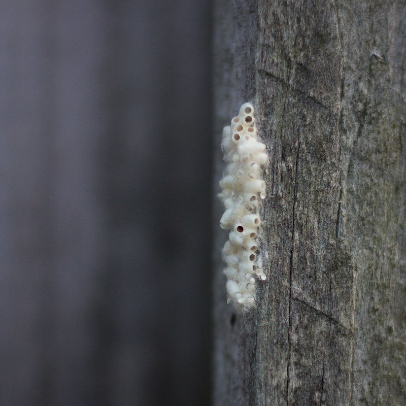 IMG_8772.jpg IMG_8772.jpg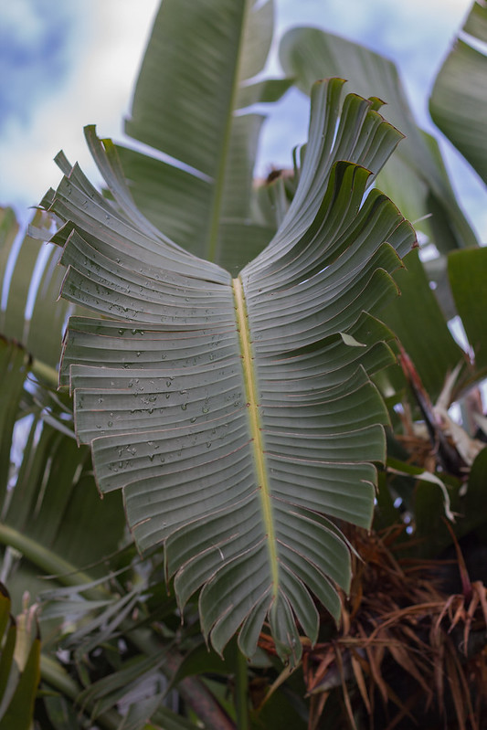 IMG_8594.jpg IMG_8594.jpg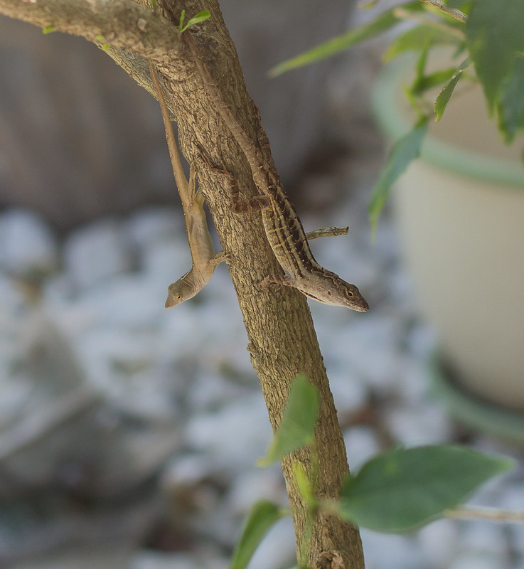 IMG_7912.jpg IMG_7912.jpg IMG_7860.jpg IMG_7860.jpg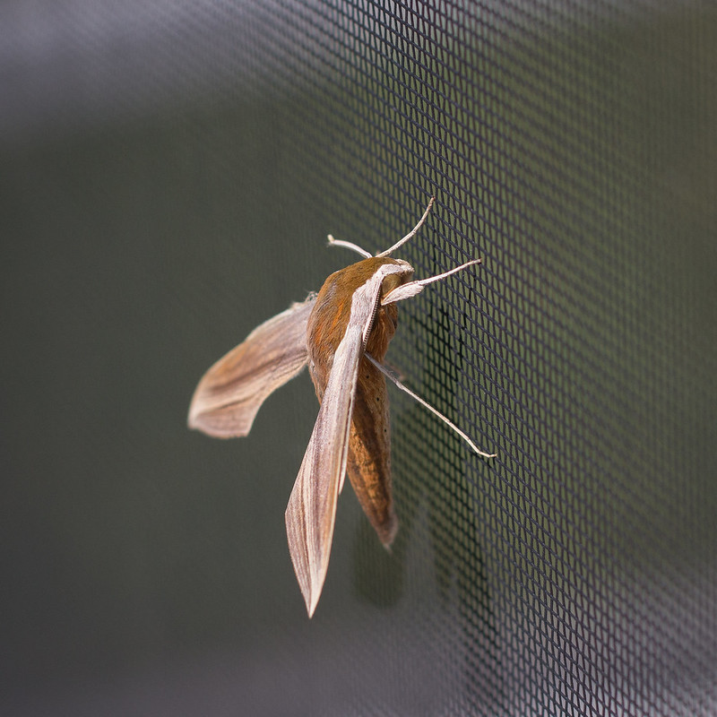 IMG_5731.jpg IMG_5731.jpgClouds. How often do I get the chance to hang out with million pound flying objects? I enjoy trying to find the unique shapes, patterns, and flowing channels throughout them. Cloud photos can instantly bring me right into their mood and atmosphere. They easy to photograph but not always easy to get a unique interesting final product out of them. Mainly using my 50mm. The challenge is half of the fun though. The first two are not heavily edited, the only drastic change was a slight white balance adjustment to bring them from orange/red to purple.  IMG_6501.jpg IMG_6501.jpg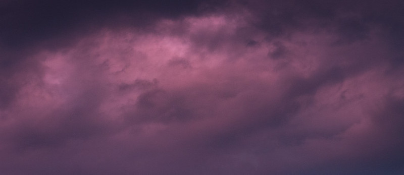 IMG_6498.jpg IMG_6498.jpg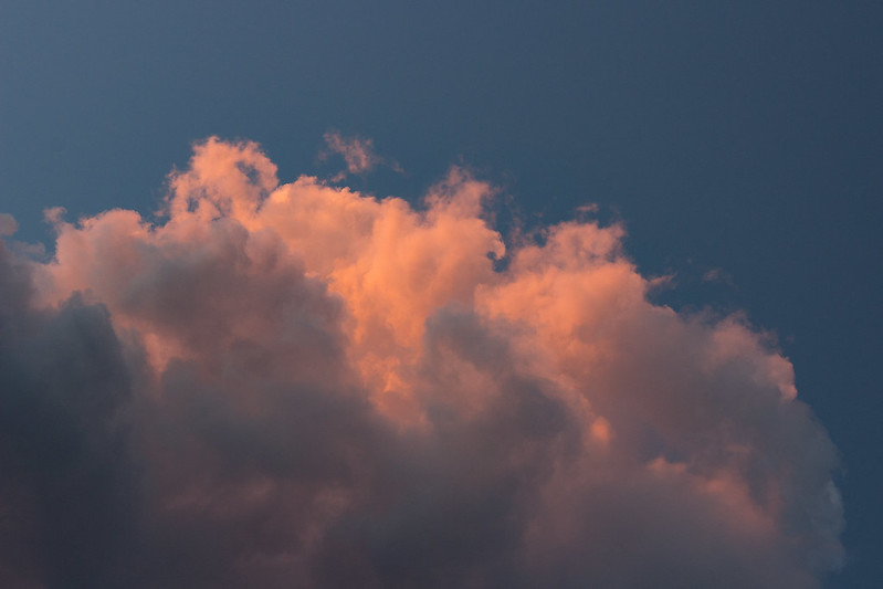 IMG_6152.jpg IMG_6152.jpgThis one was tricky. It was a photo I liked a lot but couldn't seem to get anything from. I used it as an opportunity to experiment with cropping and found a scene I absolutely love and was very glad I didn't ditch it. 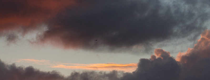 IMG_6189.jpg IMG_6189.jpgThese next two I've got back and forth on. The first I've liked for a while now, even though I think I could have cropped it better. More space for the roof instead of having it cut right into the bottom right corner. The second I took at Niagara Falls in horrible conditions with weak knowledge of what I was doing. Similar to the cloud photos though I enjoy the feel of it. It's gloomy and has a nice sense of scale. 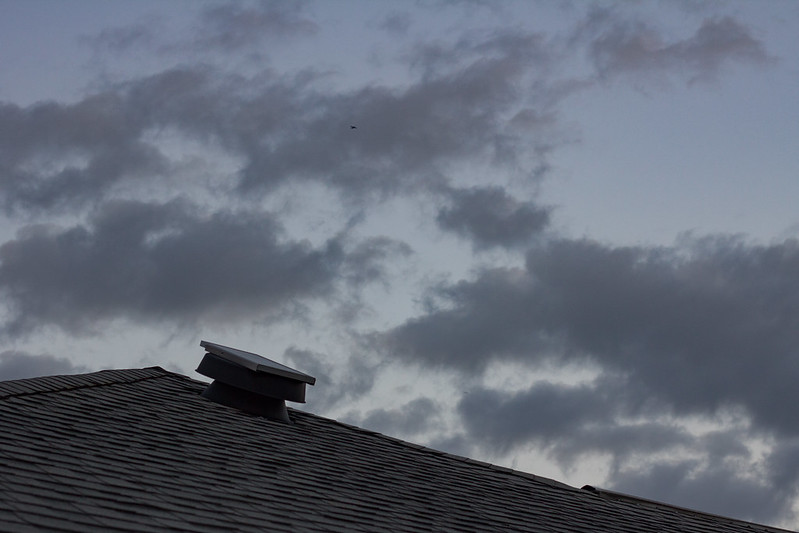 IMG_6869.jpg IMG_6869.jpg IMG_6077.jpg IMG_6077.jpgThanks and sorry in advance for the big ol' page killing dump! I had a handful of others on my Flickr but didn't want to post pretty much everything, take a look if you'd like to share any criticism on those.
|
|
#
?
May 25, 2017 06:31
|
|


|
ansel autisms posted:thanks for the feedback. one note - i'm not really going for the "wandering into the scene" thing like i described before, that was just trying to give some context into how i came about taking all of these. i'm not really sure what my intent is, which is why i'm asking for feedback in an attempt to wring something out of the crevices of my mind. Its comforting to know people far more experienced and skilled than I am still get this problem.
|
|
#
?
May 25, 2017 06:32
|
|

|
underage at the vape shop posted:Its comforting to know people far more experienced and skilled than I am still get this problem. We are always facing this problem. It never stops!
|
|
#
?
May 25, 2017 06:58
|
|

|
Kilometers Davis posted:I like nature a lot. When I was a kid I could sit around outside and spend forever just looking at the grain on trees, lizards sunbathing, interesting plant textures, bugs crawling around. Not much has changed. Photography allows me to harness those natural interests and spend time getting closer to what's going on and really experiment with bringing out what catches my eye and fascinates me and hopefully anyone viewing. It's difficult but if I was trying to describe what I usually go for with nature shots, it's a calm but direct meditation on the details. Nothing else exists, only myself and a subject that often gets ignored as day to day life goes by. My feeling is that, for the nature shots anyhow, you haven't really done this. The first few nature pictures don't really focus on textures or details, but rather on the whole object. Most of those images would be more interesting if they were actually closer studies of textures and details. There's nothing technically wrong with them, they just aren't interesting enough to make me want to look closer if I'm scrolling through a feed of photos. The cloud images show an attempt to explore something more abstract, but there's nothing to pull me in, no interesting contrasts or details to explore. Generally cloud photos work better if there is something to contrast the abstractness of the clouds against - a tower, a plane, a tree, whatever. Silhouettes and clouds or clouds and reflections can create some very compelling images.Clouds by themselves, not so much. The last one is an example of a picture that would have been 100% more interesting with a good cloudscape going on behind it. As it is, it just feels like a shot taken on the way past, there's no energy or drama to the picture, the sky is almost flat and the light is bad. It would have been a good golden hour photo or night photo. There's also some weirdness going on along the bottom of the frame, it looks like haze but it could be part of a fountain. Either way it's distracting.
|
|
#
?
May 25, 2017 12:52
|
|
|
This is such a great shot, I'm sure the window of opportunity was short, and you really nailed focus and perspective. This is one of the pictures that speak to why relatively simple camera gear (60d and a nifty fifty) can do so much more for a casual shot than the mobile phones people are using to capture everyday life these days. It's an interesting capture that could never be conveyed with an iphone. Basically, I wish more people walked around with a decent camera.
|
|
#
?
May 26, 2017 21:02
|
|
|
Linux Nazi posted:This is such a great shot, I'm sure the window of opportunity was short, and you really nailed focus and perspective. This is one of the pictures that speak to why relatively simple camera gear (60d and a nifty fifty) can do so much more for a casual shot than the mobile phones people are using to capture everyday life these days. It's an interesting capture that could never be conveyed with an iphone. photography isn't about gear my dude
|
|
#
?
May 29, 2017 19:22
|
|

|
I wish people cared about composition and not taking snapshots more than them having a nice camera tbh
|
|
#
?
May 29, 2017 19:31
|
|
|
Linux Nazi posted:This is such a great shot, I'm sure the window of opportunity was short, and you really nailed focus and perspective. This is one of the pictures that speak to why relatively simple camera gear (60d and a nifty fifty) can do so much more for a casual shot than the mobile phones people are using to capture everyday life these days. It's an interesting capture that could never be conveyed with an iphone. Using a 60D for a casual shot doesn't make that shot any better ithan being captured on an iPhone. I've seen tons of iPhone shots that are way better than shots from a Canon 5D3.
|
|
#
?
May 30, 2017 00:12
|
|
|
Let's not get into a debate about whether it's the camera or the photographer. In the end, it's both that are important. Your camera gear is an ENABLER. It enables you to take better photos than if people don't have the gear. However, you also have to have the ability to make use of the camera in the first place. If you don't have the skills then you're not going to be getting a great picture, iPhone or 5D3.
|
|
#
?
May 30, 2017 01:58
|
|

|
That depends entirely on context. Given the same ability level, or let's say the exact same person, they won't take the same picture with the phone or the nice camera because they know the limitations of the phone so they, ideally, will make a good picture with what they are using if they are a good photographer. The gear will let you have more options, like controlling depth of field and focal length but two people with the same ability, one has the latest iPhone or whatever and the other has a 5D doesn't mean that the 5D person will take a better photo. The person with the phone will just have less options.
|
|
#
?
May 30, 2017 05:33
|
|
|
Good god. Yes, composition is important, but you are reading way too much into what I was saying. All I was saying is that the moth looks neat, moreso than it would if it was shot with some mobile phone. That wasn't a picture that was trying to convey more than "look at this cool bug on this screen". The gear better brought out the detail, which was what I liked about it. I'm not saying it's "Decisive Moment", I'm just saying a positive thing about a picture I thought was pretty. Blame Pyrrhus fucked around with this message at 08:04 on May 30, 2017 |
|
#
?
May 30, 2017 08:02
|
|
|
With photographs, and images in general, there's a natural progression in the viewer's reaction to them. First, the viewer must establish what it is that they are seeing. Without this critical first step, there can be no understanding of the photograph, and that seriously limits the viewer's capability to have an emotional response. Once the viewer has established what it is they are looking at, they move on to the next step: interpretation. When simplified, interpretation has two sub-steps: 1. Application of the viewer's own opinions and biases about the subject, and 2. The viewer's perception of intent behind the author's decision to make and exhibit the image. Aka, the voice of the creator. *. It's important to note that many viewers will completely skip step 2. However, step 1 is impossible to skip due to how our brains function. I think it's important to keep in mind that the process of establishment doesn't have to be instantaneous, and that the speed / ease at which the viewer recognizes the subject will have an impact on their feelings about the image. If the subject is instantly recognizable, then they move immediately to interpretation. On the other hand, if the recognition of the image is too slow a process, there's the chance that the viewer will not engage with the image (whether this is a shortcoming of the viewer or the creator is subjective and varies case by case). Some people want instant recognition and instant interpretation. Others want instant recognition and moderate/slow interpretation. Others still will enjoy slow recognition, and slow interpretation. Sometimes people can vary between all of these, depending on their mood! We're humans, not statues. If recognition and interpretation are both extremely short processes, then the image comes across as being both uncomplicated and shallow. These images are fitting for a good portion of our society today, but for serious enthusiasts of creative expression, they are utterly boring wastes of time. I'm not saying that shallow images can't look "cool," rather that after a certain point, looking cool isn't an interesting enough mechanic for me, or some others, to seriously engage with. Not everybody enjoys photography and other creative mediums for the same reasons, and that's fine, but I think it's objectively correct when calling the images shallow. Whether or not that's boring to you just depends on what type of person you are. Here are some examples of shallow images: "Hey look at this bug I found." "Hey look at this expensive sports car." "Hey look at this photo of a popular tourist attraction." "Hey look at this attractive human being." The subjects of each of these pictures are entirely capable of being a bit more stimulating when presented in a certain way: 1. A photograph of a single living moth among a multitude of spider webs containing dead moths would be more interesting. 2. An expensive sports car parked in a neighborhood destroyed by war would be more interesting. 3. A popular tourist attraction can be made more interesting when focusing on its visitors, or the way in which society treats it as a form of profit generation. 4. Physical beauty is insanely boring and inherently shallow so good luck trying to make that interesting unless you're dissecting the manner in which we place such undue importance on it. Important note: I feel this applies to physical beauty both in humans and in nature. A quick explanation on why I find these to be more interesting- 1&2 would both be examples of extreme contrasts, which pique the viewer's attention and can lead to deeper analysis. They would be further enhanced if paired with complimentary images to reinforce their meaning. 3 is an example of using photography as a form of social commentary, which has always been a vital segment of artistic expression. There are exceptions to the above points- most obviously in the area of documentary and news reporting imagery- but that is because those images fit into, and build upon, an already established context in our minds. Another interesting thing to keep in mind is that almost everyone is susceptible to aesthetic preferences, and this greatly impacts their likelihood to enjoy your picture. Someone who generally prefers thinking about pictures in addition to looking at them, will throw all of this poo poo right out the window if a photo resides in their preferred aesthetic plane. I believe this is because we usually ascribe meanings to areas of aesthetics, and these meanings are automatically applied to photos regardless of the intent of the creator. It's a flaw in our analytical process that can also be used as a shortcut to generating deeper feelings in a viewer, but this only works when they ascribe the "correct" values to the aesthetic. The overall takeaway is that you shouldn�t be offended when most people find your photo to be boring poo poo. It�s not their fault that you are presenting an image of a subject that they have no interest in without first building some context to draw them in. Another thing that should always be remembered in the critique thread is that harsh critiques can be the most helpful, and lead to the biggest changes in ways of thinking. Don't get so wrapped up in your ego that if someone attacks your photographic intent that you end up shutting them out completely. Being harshly criticized stings for everyone, and everyone handing them out has probably received plenty of them in the past. There's already such a coddle culture built up on other photo platforms that you should deeply deeply appreciate someone's willingness to be an honest rear end in a top hat to you here. Keep an open mind, and keep asking questions- both in here, and to yourself when you're about to press that shutter button. "Why am I taking this picture?" RangerScum fucked around with this message at 11:50 on May 30, 2017 |
|
#
?
May 30, 2017 11:35
|
|

|
Linux Nazi posted:Good god. Yes, composition is important, but you are reading way too much into what I was saying. All I was saying is that the moth looks neat, moreso than it would if it was shot with some mobile phone. That wasn't a picture that was trying to convey more than "look at this cool bug on this screen". The gear better brought out the detail, which was what I liked about it. Yes I know what you meant and you're not wrong. But that's not critique, that's just saying the photo is what it is, which isn't supposed to be in a critique thread. To be fair, there is nothing else much you could have said anyway. Which reinforces RangerScum's point - most of the photos in this thread can't be critiqued because they're shallow. The fastest way to improve at this stage is not to ask for critique but to look at good photos and photobooks first. Photobooks are often filled with mundane boring photos placed at the right moment of a sequence, and they work because of the context. alkanphel fucked around with this message at 13:09 on May 30, 2017 |
|
#
?
May 30, 2017 11:59
|
|
|
Subjects of interest (content) can do well to function as catalyst in seeking photographic form but are unlikely representative of "good photography" if merely used to describe. A greater context or tension needs to be established either within or externally to the photograph.
|
|
#
?
May 30, 2017 12:47
|
|

|
alkanphel posted:Yes I know what you meant and you're not wrong. But that's not critique, that's just saying the photo is what it is, which isn't supposed to be in a critique thread. Fair point. I was just looking to offer some positive criticism.
|
|
#
?
May 30, 2017 16:48
|
|
|
I can see why this thread remains dead for long periods of time. As someone who is relatively new to photography it really helps to get very basic advice about composition or technical suggestions. I get where comments that boil down to "beautiful pictures are shallow and boring, and you should have more of a message/story" come from, but I feel like some of that comes after one has mastered the technical ability to take a beautiful photo. What I'm getting from this discussion is that people in my situation should look elsewhere for advice, and come back here if/when we're ready to explore the deeper artistic side of things. If this thread is at the point where I should be expected to recognize famous photographers by their initials, I don't belong here yet (if ever).
|
|
#
?
May 30, 2017 18:03
|
|

|
I think it's just goons being goons and you should keep posting pictures for critique. Technical ability and artistic ability can and are developed simultaneously. I think most people who post in this thread have got the technical ability down okay, but it's also the easier part of photography to "do okay in" (there's always room for improvement). But artistic ability is best improved by interacting with something outside of your own head, whether it's professional photographers' photos, others' critiques of your photos, your critiques of their photos, etc.
|
|
#
?
May 30, 2017 18:09
|
|
|
totalnewbie posted:Technical ability and artistic ability can and are developed simultaneously. This. If you want to develop both at the same time, write out your intentions with each pic you post so people can give you more than just a technical critique. But also, it was literally posted a few posts above: quote:The fastest way to improve at this stage is not to ask for critique but to look at good photos and photobooks first. Don't do it to copy them; look at the pics and work on figuring out why the compositions work. DeadlyMuffin posted:I can see why this thread remains dead for long periods of time. As someone who is relatively new to photography it really helps to get very basic advice about composition or technical suggestions. I dunno, if it were me, and I was trying to get into an artistic hobby and I had a place where people who had been doing it for way longer than me were willing to challenge me with their opinions, I'd see that as a valuable resource. Actually that was me, about 9 years ago. RangerScum fucked around with this message at 18:39 on May 30, 2017 |
|
#
?
May 30, 2017 18:14
|
|
|
Learning how to identify what "works" for you in a piece of art is an essential part of making expressive art - if you can't talk about it, it doesn't exist.
|
|
#
?
May 30, 2017 18:44
|
|
|
Back to critiques... I am not a fan of the composition of this shot. The bokeh blur is half of the photo and doesn't add that much. I probably would have shifted the line of eggs to be on the left 1/3 line reduce the bokeh burred area. I also might have used a slightly tighter aperture maybe f 3.2 to reduce the bokeh on the eggs -- only one of the holes appears sharp. In the photo below, I wanted to try an capture the trees faded in the clouds/fog. I like the diagonal gradient and the changes in texture and contrast across the photo. The upper right corner doesn't quite fit, but I didn't notice that as I was processing on my phone in the train. 
|
|
#
?
May 30, 2017 18:57
|
|

|
accipter posted:Back to critiques... If you're going for a mysterious fog shot I think you should have shot it a bit wider. There isn't really enough in the frame imo.
|
|
#
?
May 30, 2017 19:54
|
|
|
I think the effect works a lot better when there's more structure to the fading. For example, if it's a line of trees fading away. Here, especially when expanded, it just looks like you have some close trees on the right, some frosted trees on the left, and some trees in the background. It could be that the trees are fading (getting further from you) right to left, but the taller trees in the background ruins that effect, to me. Also, wider as the previous poster said. Finally, and I just noticed this but there's a speck of a close branch on the top right and it's really distracting now that I've seen it. But maybe that's what you meant when you said it didn't fit.
|
|
#
?
May 30, 2017 20:04
|
|
|
orb games  accipter posted:In the photo below, I wanted to try an capture the trees faded in the clouds/fog. I like the diagonal gradient and the changes in texture and contrast across the photo. The upper right corner doesn't quite fit, but I didn't notice that as I was processing on my phone in the train. It's kinda dull. The rising line of trees yanks my eyeballs right off the edge of the photo. There's not enough texture to grab me, and not enough overall shape to be abstractly pleasing.
|
|
#
?
May 31, 2017 00:21
|
|
|
Magic Hate Ball posted:orb games I think a series about a bowling alley could be pretty interesting. I like the style of the first one, but the editing in #2 is a bit too "vsco-y" for my taste. I think blowing out your blacks like that is usually a bad stylistic choice, but that's just my opinion. You shot it with a phone, so I get it.
|
|
#
?
May 31, 2017 09:43
|
|
|
Ok, I'll dive in here. The recent few pages have been interesting and helpful.Kilometers Davis posted:Lizards, bugs, clouds, etc. So all of these lack something for me. They seem to be taking photos for the sake of taking photos, and thus lack an overall sense of purpose. The cloud ones are visually pretty, but you mention a couple times that you liked a photo and you couldn't get something from it, or that you go back a forth on one. Usually, that's an indicator that it's destined for the garbage pile. You should be able to describe what it is you like about the photo, and what emotions you were trying to bring out. Not every photo has to have a deep emotional meaning, but there should be at the very least a point and a goal, and then reflection should center on how the photo hit or missed the mark. In your own critique, think less about technical things like post processing and more about "how could I have gotten this feeling across more fluently?". What brought about the gloom in the last couple photos that you liked? How could you have enhanced that? The clouds are million-pound flying objects - why do your photos feel like a weird watercolor? Were you trying to imply awe and scale, or an abstract? FWIW they're all exposed well and I like elements of most of them, but when presented as a set that's my main reaction. 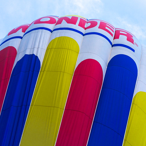 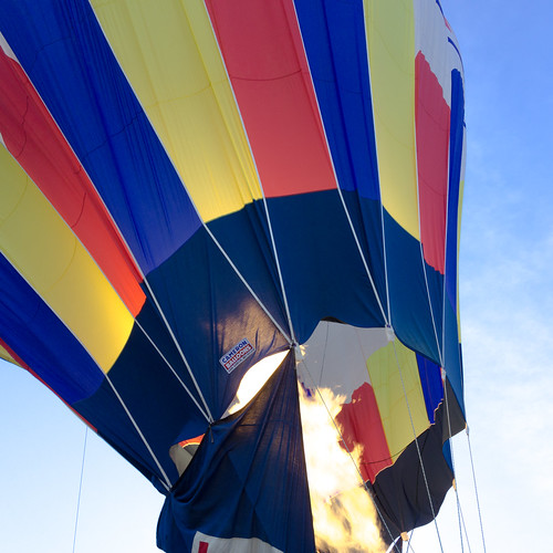 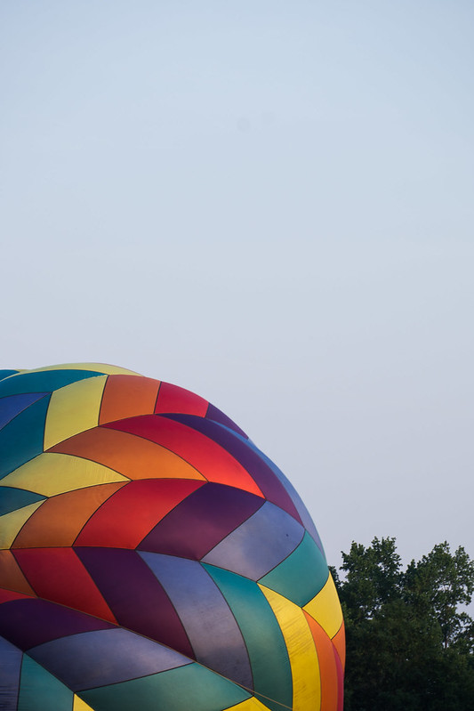 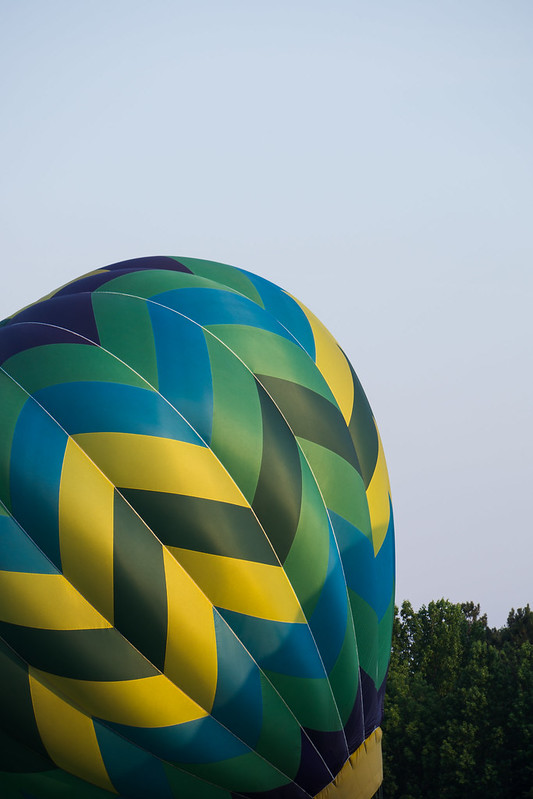 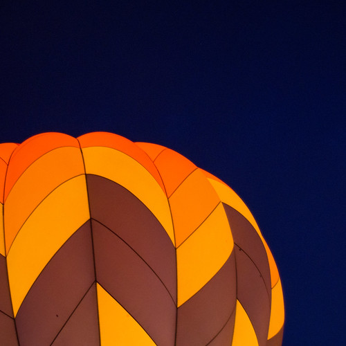 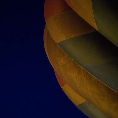
|
|
#
?
Jun 1, 2017 14:10
|
|

|
Soopafly posted:In your own critique, think less about technical things like post processing and more about "how could I have gotten this feeling across more fluently?". What brought about the gloom in the last couple photos that you liked? How could you have enhanced that? The clouds are million-pound flying objects - why do your photos feel like a weird watercolor? Were you trying to imply awe and scale, or an abstract? So... what are you trying to express in your pictures? This is the only one that really stands out to me. The others seem like bad crops of snapshots. You might photoshop out some of the specks, especially that one in the brown panel; it sticks out a lot and is distracting to me. The reason this works (though I'm not entirely sold on the crop) for me is the contrast of light vs. dark and color vs. "monochrome" (though it has some slight variation). Looks very close to being a textbook cover. edit: if it's about the sequence of events of a hot air balloon going up in the sky, I think it really lacks coherence (not the same balloon, very little context (e.g. first shot showing it on the ground, last shot clearly showing it in the air), etc.) totalnewbie fucked around with this message at 14:40 on Jun 1, 2017 |
|
#
?
Jun 1, 2017 14:37
|
|
|
I don't see any thing to any of these to be honest. The composition on the daylight shots seems to be more or less random and I don't really understand why you'd keep them. For me (and I am hardly the most discerning photog on here), these would have been cut. The second would have been a better shot as a close up of the flame jet with the rim of the ballon opening providing context and a frame around it, but as it is, it just seems to be a missed shot where you were panning too fast and the subject got left behind in the frame. The last two are more interesting, mostly as an abstract of contrast from light to dark although the very last one is too dark for a good contrast and the penultimate one is, again, weirdly cropped. The daylight ones just strike me as strange composition choices with nothing remarkable otherwise. There's way too much dead space and the rest of the frame isn't providing anything to offset that. Here are some more form me. I did some night photography in the streets around my apartment. It goes from touristy historical centre to rough back streets very fast. 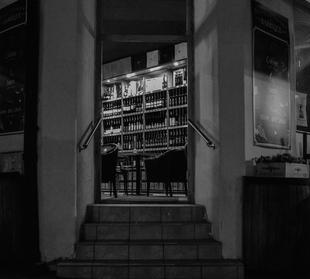 Arax012.jpg by Iain Compton, on Flickr 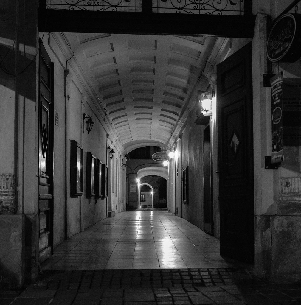 Arax010.jpg by Iain Compton, on Flickr 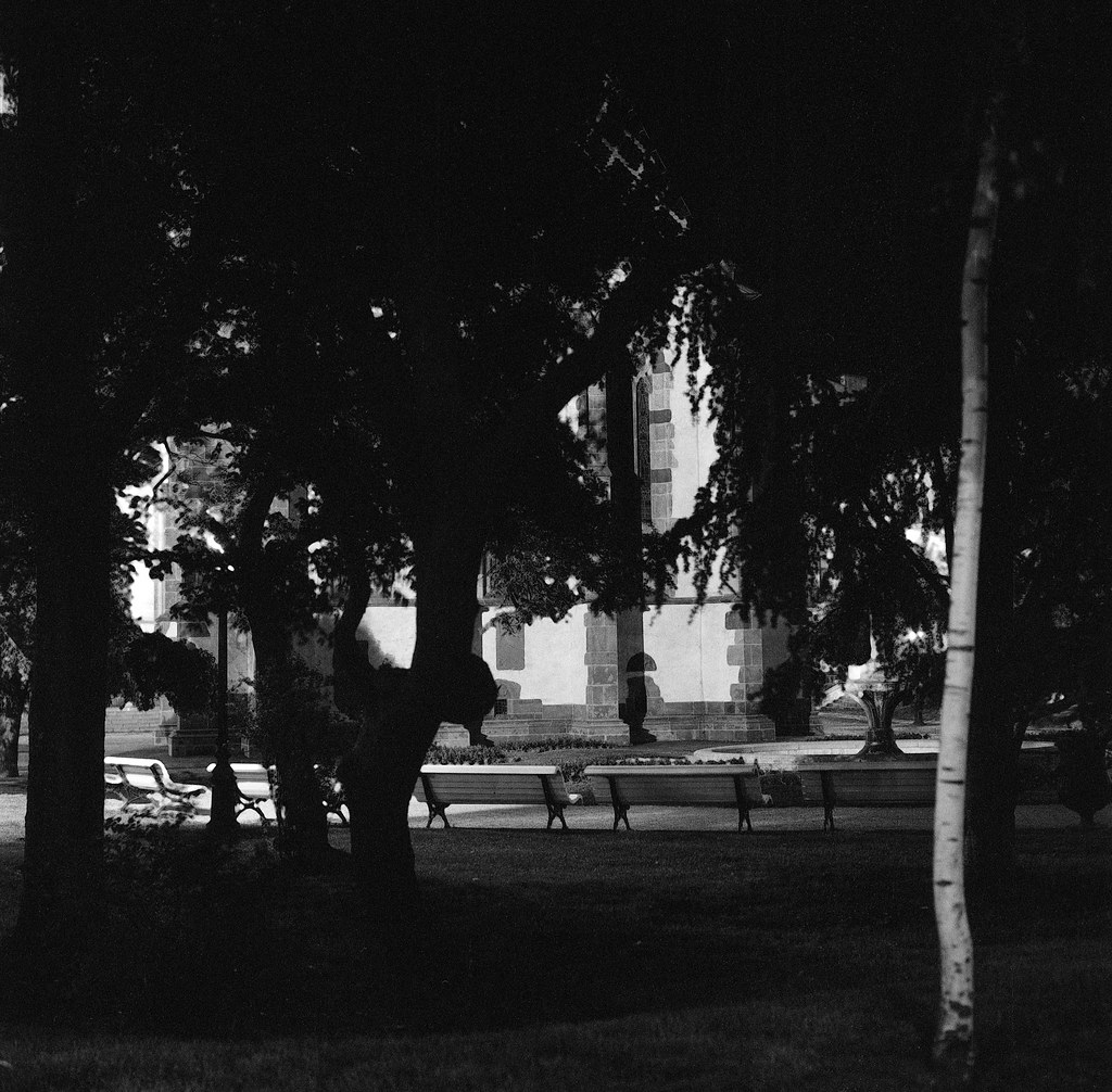 Arax001.jpg by Iain Compton, on Flickr  Arax004.jpg by Iain Compton, on Flickr  IMG_6294.jpg by Iain Compton, on Flickr
|
|
#
?
Jun 1, 2017 15:38
|
|
|
the wonderbread balloon gave me a nice chuckle
|
|
#
?
Jun 1, 2017 15:52
|
|
|
Helen Highwater posted:Here are some more form me. I did some night photography in the streets around my apartment. It goes from touristy historical centre to rough back streets very fast. You have highlights in these photos that are blown to white, but then processed to not be white anymore. It's not a good look.
|
|
#
?
Jun 1, 2017 16:17
|
|

|
totalnewbie posted:So... what are you trying to express in your pictures? This is the only one that really stands out to me. The others seem like bad crops of snapshots. You might photoshop out some of the specks, especially that one in the brown panel; it sticks out a lot and is distracting to me. Helen Highwater posted:I don't see any thing to any of these to be honest. The composition on the daylight shots seems to be more or less random and I don't really understand why you'd keep them. For me (and I am hardly the most discerning photog on here), these would have been cut. The second would have been a better shot as a close up of the flame jet with the rim of the ballon opening providing context and a frame around it, but as it is, it just seems to be a missed shot where you were panning too fast and the subject got left behind in the frame. These are both helpful critiques - thanks! The goal of the set was to show a timeline of a balloon - not necessarily a rising one, just a deflated-to-inflated - and create an ambiguity of scale. I also tried to display a passage of time, but I can see that it comes across in a very clunky way. The composition was intended to create an ambiguity of scale, with some balloon shots taking up the whole frame and others including elements like the trees and fire to show disparate scales. In retrospect, this could have worked better using drastically different framing than I did to get that point across, because there's little context besides the balloons themselves. I was trying awful hard to make them have stylistic similarities but not hard enough to make them have a cohesive point. I think that's the thing I've found the hardest, is in the moment recognizing the potential for a coherent story, and designing a set of photos to be on-message.
|
|
#
?
Jun 1, 2017 16:44
|
|
|
Soopafly posted:These are both helpful critiques - thanks! The goal of the set was to show a timeline of a balloon - not necessarily a rising one, just a deflated-to-inflated - and create an ambiguity of scale. I also tried to display a passage of time, but I can see that it comes across in a very clunky way. The composition was intended to create an ambiguity of scale, with some balloon shots taking up the whole frame and others including elements like the trees and fire to show disparate scales. In retrospect, this could have worked better using drastically different framing than I did to get that point across, because there's little context besides the balloons themselves. I was trying awful hard to make them have stylistic similarities but not hard enough to make them have a cohesive point. I think all three on the right hand side follow a nice theme, and it's well finished by the third. Each of them has a contrast in light, the first has the illumination of the flame set against the opacity of the material, the second has the shadow being cast across the balloon, and the third has the duller material against the depth of the night/morning sky, and it's an appropriate bookend as the warming tone shows a progression in time. For me the question would be whether to go with the image in the middle right, or the middle left. The middle right seems a better overall photo, but that comes down to crop as it is. The one on the left could be made into a square form which would work with the other two and keep the shape/dominance of the balloon coherent through all images. I think there could be more to how you present them with canvas flipping and how they're hung. And I appreciate how they're both sweet (they're of balloons) and melancholy (progressing into a night and its semiotics, and also the danger of people going up in them at night.) It makes it very different from what I would see as a normal dawn to daylight balloon ride.
|
|
#
?
Jun 1, 2017 17:30
|
|
|
 Here's some self-crit. - Yes it looks cool but does it do anything more than that? I think I'm drawn to it only because I know the building (The Barbican in London). - I took the shot on a beautiful sunny day and the contrast between the grey building and the blue sky was amazing. Did I ruin it with the B&W conversion? Possibly. - Would this photo be better if it had the context of the ground / bottom of the building? Maybe but I have no idea how to get that shot due to the scale of the building. - The angle that the building is leaning at feels wrong but I couldn't find a good way to correct it in post. I rotated the shot but I think I need to learn how to do perspective correction in PS.
|
|
#
?
Jun 3, 2017 11:16
|
|
|
I'm a big fan of brutalism and the Barbican is a fantastic building that's hard to get wrong IMO. I quite like the B&W conversion even though it looks a bit too blue for my taste. I like the gradient on the tower from very dark at the bottom to lighter at the top and the way that it contrasts with the opposite sky gadient. The extra context of the ground isn't required here I don't think, the part of the tower that's in the frame speaks for itself. I find the aspect ratio a bit odd, it looks narrower than the usual 4:3, is it a custom crop? If so, then I'd be tempted to make it a vertical panorama crop and have the building fill almost the whole base of the photo with no dead space at the bottom left. If it's a crop and you have some more of the top available I'd probably give it a bit more room up there as well.
|
|
#
?
Jun 3, 2017 13:36
|
|
|
I've got three different framings of this that I can't decide on. I'm also not sure if the colours are oversaturated (it's the default Astia profile though so I haven't touched anything). I'm leaning towards the first image due to its intimacy but there's a bit of a flare from the light above stuck in there.   Nigel Tufnel posted:
Could you maybe recentre the building so that the base of the building fills the bottom of the photo? I feel like there's too much empty space on the left side. I'd get more of an impression that the edges of the buildings are converging at the top.
|
|
#
?
Jun 3, 2017 16:14
|
|


|
^ I like the third one. It frames the couple well and gives the best context of their surroundings while still drawing attention to them.
|
|
#
?
Jun 3, 2017 16:24
|
|
|
Cacator posted:Could you maybe recentre the building so that the base of the building fills the bottom of the photo? I feel like there's too much empty space on the left side. I'd get more of an impression that the edges of the buildings are converging at the top. Helen Highwater posted:I find the aspect ratio a bit odd, it looks narrower than the usual 4:3, is it a custom crop? If so, then I'd be tempted to make it a vertical panorama crop and have the building fill almost the whole base of the photo with no dead space at the bottom left. If it's a crop and you have some more of the top available I'd probably give it a bit more room up there as well. I recropped in 4:3 and I do like it more. Thanks for the suggestions!  rio posted:I like the third one. It frames the couple well and gives the best context of their surroundings while still drawing attention to them. Agreed. It seems the most interesting and the road draws the eye nicely.
|
|
#
?
Jun 4, 2017 19:00
|
|
|

|
| # ? May 10, 2024 00:40 |
|
|
Nigel Tufnel posted:I recropped in 4:3 and I do like it more. Thanks for the suggestions! Yeah that's something I hadn't considered when taking the photo (I was totally creeping on those people) but the road framing is the best in that one for sure.
|
|
#
?
Jun 4, 2017 19:38
|
|