|
Helen Highwater posted:
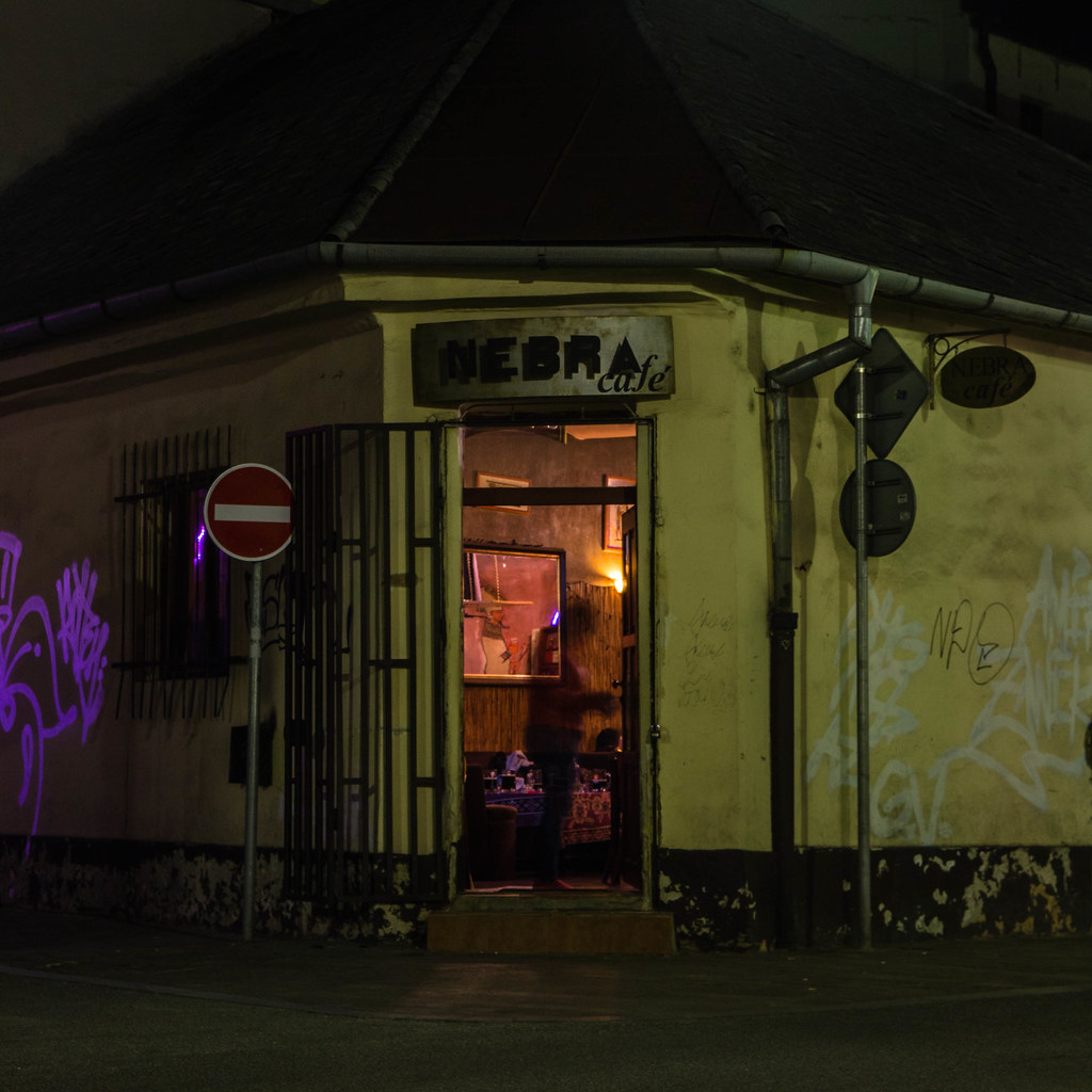
The black & white images don't really do much for me. There doesn't seem to be enough tonal contrast to make them work in B&W and I feel they are lacking subject. Someone else mentioned it too, but the whites look oddly blasted out on them, yet muffled. The color photo pulls my interest in more. I'm wondering if we are in a bad part of town with all the graffiti on the walls of a dimly lit cafe'. Trying to make out the inside of the cafe' through the mirror hanging on the wall, I noticed the body ghost in the doorway. The purple neon/black light on the left lighting up the graffiti is cool. I don't know if I really like the photo, but it has interesting aspects. I have yet to do night photos with film cause I'm a giant wuss, so I respect what you are doing! I feel completely lost in photography right now (I still love it though!), so maybe a good poo poo on will give me some direction. For a whole week I set out with a 99 cent Chinon Genesis IV and some Fuji superia to try and force myself to really think about what I'm shooting and that my gear doesn't matter. I have some pretty nice cameras, a Pentax 67, Mamiya C330, Nikon FA, Fuji XT1, but I feel like all I do is churn out poo poo photos unless I'm taking portraits of family (MF is fantastic for this!!). I felt like this experiment would be a good exercise, until I started seeing the results after developing them, ha! My goal was to try and do a series of photos that displayed optimism vs. conservatism (I'm a politics junky and our democracy is in the shitter), so I sought out colors of blue and yellow to try and portray this in a semi-industrial setting. I was also looking for scenes with interesting shadows cause I just think they are cool. Getting likes on flickr are useless, and I really like the harsh loving criticism you guys churn out here with no bullshit. It sounds completely loving stupid typing out my intentions and most likely they are, but gently caress it, here are a few of them:    
Choicecut fucked around with this message at 02:49 on Jun 9, 2017 |
 #
?
Jun 9, 2017 02:44
#
?
Jun 9, 2017 02:44
|
|

|

|
| # ? Jun 6, 2024 22:53 |
|
|
All I can say is that you seem to know what you're doing but at this point you're more like copying existing styles and shooting scenes that match those styles. Which isn't a bad thing, it trains the eye and that's where we all begin from. The next thing you have to do to 'evolve' is to shoot more and inject some intent that is original to you. And by shooting more, I mean a few hundred, not just 10 or 20. From there you might be able to pick out organic trends in your photos that were created by your subconscious - those might be the photos that you can truly call yours. Also as you figure out what you like to shoot, look at more good photobooks in those genres - they will influence you but you will be able to add your own layer and make it something new.
|
|
#
?
Jun 9, 2017 03:00
|
|

|
Man! You just described exactly what I'm feeling. Photos just feel like a copy of a copy, so then I start questioning what my vision is, do I even have a vision, WILL I ever have vision, etc. I think I also have hesitation in finding that subconscious vision for fear it will completely suck. Sounds like I just need to keep on doing what I'm doing, more photobooks, more shooting, suck less and be patient. Thanks dude!
|
|
#
?
Jun 9, 2017 03:35
|
|
|
I think part of it is that you're going for a sterile, industrial look, which is visually oppressive and can become oppressive for oppressive's sake. You've got nice tones and overall geometry, but I'd like to see some kind of intrusion or commentary. The flat, antiseptic location style is inherently political, so what are you trying to say? The closest you get to success here is the second one, with the tree at the bottom and the cluster of ugly shrubs, which has an element of Tati-esque humor, and the first one is nice too - industry stamping out nature. Without commentary or strong mood you just get a video game screencap. nightout 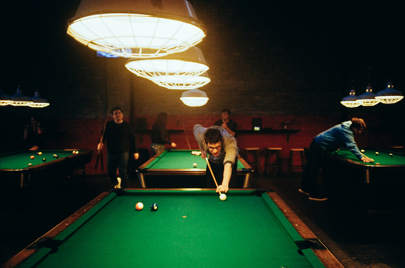 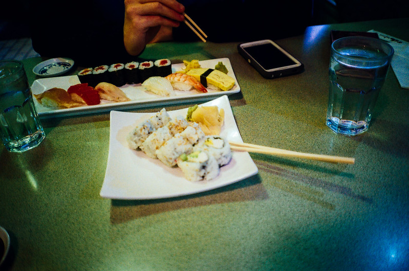 
|
|
#
?
Jun 9, 2017 03:47
|
|

|
I don't really see how this is anything more than an Instagram dinner pic with a faux-artsy filter. This looks like it was taken with one of those instant cameras they have now-a-days. If the blur were just the person in movement it might have worked. Otherwise I don't think the bowling hall should also lack focus.
|
|
#
?
Jun 9, 2017 04:38
|
|
|
Thirteen Orphans posted:I don't really see how this is anything more than an Instagram dinner pic with a faux-artsy filter. First roll of film with a camera (Nikon L35AF) I bought at the thrift store.
|
|
#
?
Jun 9, 2017 04:45
|
|
|
Choicecut posted:Man! You just described exactly what I'm feeling. Photos just feel like a copy of a copy, so then I start questioning what my vision is, do I even have a vision, WILL I ever have vision, etc. I think I also have hesitation in finding that subconscious vision for fear it will completely suck. Sounds like I just need to keep on doing what I'm doing, more photobooks, more shooting, suck less and be patient. Thanks dude! I think you're still too early to be doing the questioning. Shoot more first, more than you think is normal. For example, shoot 100 photos without even looking at them. Then review and identify photos you like - but don't force yourself to shoot those, just keep it in the back of your head. Then go out, shoot another 100. Rinse and repeat. In between, look at good photobooks. Maybe by the time you've shot 1000 photos, I'm pretty sure something should emerge. You'll probably know when it's right when you feel the photos contain some element that maybe only you understand. If someone sees your photo and says "Hey that's a Stephen Shore photo", you're probably not there yet. If he says "Hey that looks like a Shore photo but it's quite 'choicecut'", then I think you're on your way. But of course, YMMV - this process can take years (if you read the interviews of masters, they even say decades).
|
|
#
?
Jun 9, 2017 05:36
|
|
|
Art in general is learned by copying and there is nothing wrong with that so keep copying what you like and it will eventually turn into a more individual style.
|
|
#
?
Jun 9, 2017 07:10
|
|

|
Just wanted to say that I really like this shot. The contrast between the struggling growth of the bare bush and the oppressive, giant vent looming above it really works for me.
|
|
#
?
Jun 9, 2017 12:25
|
|
|
The shadow and the texture change in the shadow is what does it for me. "gently caress you tree, no sun for you"
|
|
#
?
Jun 9, 2017 14:47
|
|

|
Thanks dudes. Appreciate all the input and direction, poo poo helps.xzzy posted:The shadow and the texture change in the shadow is what does it for me. Me too. I waited at that spot for awhile until the shadow was just where I wanted it. I liked how the shadow fell right on the dead looking little shrubs at the bottom, and the ones in the sun are alive and growing. I was hoping that it would represent conservatism (blue at top/vent) casting its shadow across the vast political landscape and the continued gap between political parties, killing off the yellow optimism. Without me actually saying that's what I was going for, I doubt anyone would know though. "art" 
|
|
#
?
Jun 11, 2017 16:56
|
|
|
I didn't even notice the dead shrubs, because I am a simpleton.
|
|
#
?
Jun 12, 2017 00:24
|
|
|
rio posted:Art in general is learned by copying and there is nothing wrong with that so keep copying what you like and it will eventually turn into a more individual style. �You start out imitating your heroes, and the way you gently caress up becomes your style.� That's Elvis Costello and SO true. Here's one for the thread. I was assigned with doing some stuff that supposed to be completely focused on what was defined to me as "colour blotches/splashes" (goddamn contemporary artists and curators) rather than subjects, composition or whatever, AND they have to be square (GAH!), the kind of stuff really get's me out of my confort zone. That's part of the reason I took the assignment in the first place to be completely honest, but now I find that any metrics I have to evaluate my shots just don't work with this kind of material. Honestly I have no idea if these are any decent at all. They all look so banal and useless and bleh to me, in lack of a better word. Some comments on them just under each. Inputs very very welcome ") (hope this count as self critique as per thread rules) (hope this count as self critique as per thread rules) I... Don't know? I kinda like it thought. Maybe it's the track going up and a definable ground/base, plus the leaf is at least some sort of focal point. Thought maybe I'm running away from the assignment?  The balance in this composition makes me quite unconfortable, as if it's just not right and that was the plan, so sucess?  I do like how this looks like looking into a tissue sample back in the lab days (it's a large wood board, no macro). Primo Itch fucked around with this message at 22:11 on Jun 12, 2017 |
|
#
?
Jun 12, 2017 22:07
|
|
|
Primo Itch posted:Here's one for the thread. I was assigned with doing some stuff that supposed to be completely focused on what was defined to me as "colour blotches/splashes" (goddamn contemporary artists and curators) rather than subjects, composition or whatever, AND they have to be square (GAH!), the kind of stuff really get's me out of my confort zone. That's part of the reason I took the assignment in the first place to be completely honest, but now I find that any metrics I have to evaluate my shots just don't work with this kind of material. I think you hit the nail on the head--those aren't doing much for me. Have you looked for any other photographers working in this kind of space? I think a lot of what is posted here fits the parameters of the assignment and is far more interesting than what you've shown. Maybe a little deconstruction of other artists images might help you find what makes the shot "work".
|
|
#
?
Jun 13, 2017 01:27
|
|
|
beachday   Primo Itch posted:�You start out imitating your heroes, and the way you gently caress up becomes your style.� This stuff is tough because to make it work you have to have either an overwhelming aesthetic, crystal clarity, or a total perfection of line and weight, and preferably all three. You're looking for abstractions and simplifications. The minimalzine instagram has a lot of good examples of what this entails, notice that most of the pictures there could easily be paintings or collage images. The first one works the most for me, but the leaf fucks it up. I like the gentle grey hues, the deep green, and the way the intruding cement crack is arranged. The other two don't work for me at all - the second is too grimy and grotty (harsh, crunchy contrast) and isn't level, and the third is too vibrant and lacks arrangement.
|
|
#
?
Jun 13, 2017 02:07
|
|
|
Primo Itch posted:�You start out imitating your heroes, and the way you gently caress up becomes your style.� I think these are mechanically/technically good, but lack any sort of depth. What is the subject of these photos? What is the context? The 3rd picture might be interesting if it were submitted to the right place because it does kind of look like a tissue sample, but to the trained eye, which would probably be the case if you were submitting it to a specific biology photo contest, for example, it probably doesn't enough. So now I think you have to say to yourself, "Okay, if I can't come up with a bullshit reason for this photograph to be artistic, then maybe it's not." Like, take a look at what you've shot and try to write up a short description as if you were trying to hang it up in a museum. "This piece shows the contrast of modern urbanization and the resilience of nature to find ways to survive despite all attempts by humanity to cover it over with concrete." I mean, that is the bare minimum, is for YOU to be able to bullshit it into being "art", so to speak.
|
|
#
?
Jun 13, 2017 02:18
|
|

|
Magic Hate Ball posted:beachday wow great photos! 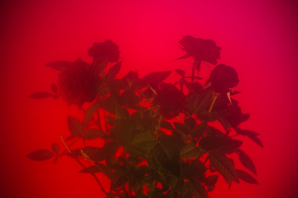 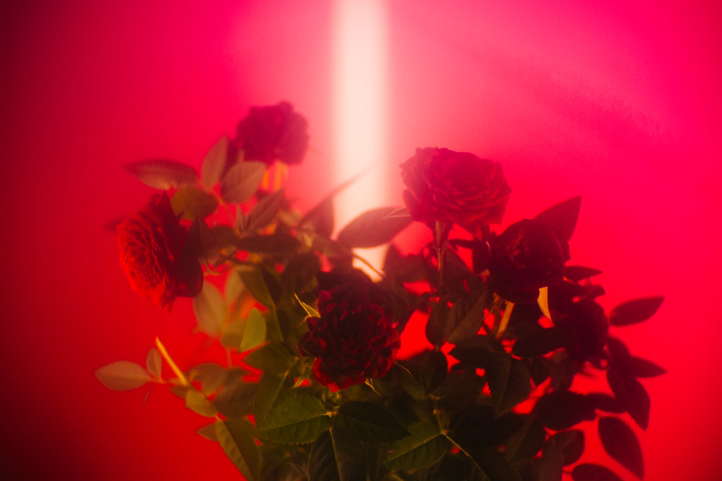 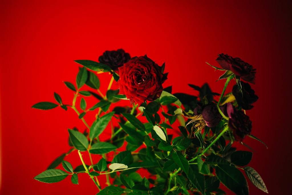
|
|
#
?
Jun 24, 2017 17:27
|
|
|
Edit:lol im a dope
Thirteen Orphans fucked around with this message at 17:45 on Jun 24, 2017 |
|
#
?
Jun 24, 2017 17:42
|
|
|
Thirteen Orphans posted:"Wow great photos" isn't a critique. Use your big beautiful eyeballs to really look carefully at what's happening here edit: lol everyone post more, god!!
|
|
#
?
Jun 24, 2017 17:46
|
|
|
Magic Hate Ball posted:Use your big beautiful eyeballs to really look carefully at what's happening here I do have beautiful eyes, thank you for the critique. :bigtran:
|
|
#
?
Jun 24, 2017 17:51
|
|
|
Magic Hate Ball posted:wow great photos! I like the idea of shooting red roses on a red background (especially with the green plant contrast)but I don't think the plant itself its working out for you. It's pretty chaotic and without purpose. i think the photo could work if it was either isolated to a bud or two or shaped in some graphic type way. For example, on the third one, I like the way you lit the center bud but the rest of the plant does nothing for the picture. I don't care much for the lack of clarity (haze) in the first two. Basically I think you got a good idea for a concept, it's just not there yet. ______________ Kinda of a cross post from the street thread, but here are my three for today. I've been slack rear end as a photographer for the past couple years, I blame it on getting my masters. Hoping to get back into the full swing of things again.  L1000536.jpg by Ryan Tamm, on Flickr L1000536.jpg by Ryan Tamm, on Flickr L1000517.jpg by Ryan Tamm, on Flickr L1000517.jpg by Ryan Tamm, on Flickr L1000520.jpg by Ryan Tamm, on Flickr L1000520.jpg by Ryan Tamm, on Flickr
|
|
#
?
Jun 29, 2017 05:39
|
|

|
Hey, that's Flip Flip Ding Ding! I love that place.
|
|
#
?
Jun 29, 2017 05:54
|
|
|
Yeah! I went to Georgetown after work last week. Such a cool place for a photowalk.
|
|
#
?
Jun 29, 2017 06:03
|
|
|
I haven't been down in a while but when I was really pinball-obsessed I used to go two or three times a week. Have you been to Maruta's around the corner? At 5:30 all their sushi goes half-off and it owns.
|
|
#
?
Jun 29, 2017 06:05
|
|
|
Magic Hate Ball posted:I haven't been down in a while but when I was really pinball-obsessed I used to go two or three times a week. Have you been to Maruta's around the corner? At 5:30 all their sushi goes half-off and it owns. Sweet, I'll have to check it out. I've been living in Tacoma and working in Auburn for the past year but now work has me up in SoDo 3 days a week so I'm starting to do more Seattle things after work.
|
|
#
?
Jun 29, 2017 06:17
|
|
|
Magic Hate Ball posted:wow great photos! that third one is so good it just detracts from the first 2. I could stand to see an entire series shot in the style and clarity of the third on, but the other 2 just don't have enough going for them in texture or detail to merit the same consideration. that third one is great, however, and you should revisit what led you to that shot and see if there's more to mine from that perspective. there's an album cover in there as well. felt a real Stephen Shore pang when I saw this scene, didn't do the man any justice whatsoever, but still had those feels when I clicked the clicky bit  Americana by Bill Baker, on Flickr Americana by Bill Baker, on Flickr
|
|
#
?
Jul 8, 2017 06:57
|
|
|
krackmonkey posted:felt a real Stephen Shore pang when I saw this scene, didn't do the man any justice whatsoever, but still had those feels when I clicked the clicky bit There is definitely some interesting stuff going on at the car wash, but I think you've got too much going on in the frame. I think everything above the roof of the carwash is wasted space. The interesting part is the people and their cars. For example if you could do this again, I'd get up close and shoot the girl texting on the phone with a wash bay in the background, or maybe get a diptych-y looking photo of two bays together. As far as the concept, I think it's a cool idea and you should try it again. Next time when you go out, instead of trying to capture the whole scene in a single photo, start by picking shooting small details/areas and work your way up to adding more elements.
|
|
#
?
Jul 10, 2017 16:43
|
|
|
Yeah, there's a lot of wasted space that does nothing but distract. It might work with a panorama crop, bring the sides in to the walls around the central three bays and bring the top of the frame down to just above that tree to the left of the roof gable. Then I think you have an interesting image. Fake edit: Like this  The perspective isn't great, Ideally you'd be centred with the middle bay to get the symmetry that would make it work better.
|
|
#
?
Jul 10, 2017 18:54
|
|
|
Exposure in the shadows needs to be brought up as well. Image feels too dark overall.
|
|
#
?
Jul 10, 2017 19:30
|
|

|
Here's a new edit of an older shot.  krackmonkey posted:
I guess I need to go look up Stephen Shore now.
|
|
#
?
Jul 18, 2017 20:56
|
|

|
Hi thread! I just picked up my first DSLR a few days ago and have been trying to figure out this "photography" business. I really like it a lot so far, even though so far my main goal has been to figure out the Manual mode. I don't really feel comfortable criticizing other people's work here, or the few things I could say have already been said. Hopefully in the coming weeks I'll feel more confident both in my photo taking and my commenting. So here's three photos I've taken that I feel are kinda presentable. Please keep in mind that these are all unedited, as I don't have access to any photo editing software, so I'm just basically trying to do the best I can with what my camera can provide.  2nd snaps 055 by Pooper Trooper, on Flickr I actually quite like this one, but I feel the colours would need to pop a little bit more. It was way sunnier than it seems to be, and things were more vibrant. Not really sure about placement either, but I feel that overall it sets a nice mood.  2nd snaps 066 by Pooper Trooper, on Flickr Another one I feel is *almost* there. Ideally there would be no people on the beach. Could probably use some more sharpness, or some extended exposure. I'll have to get back to that place and shoot some more.  first few snaps 030 by Pooper Trooper, on Flickr This one was my first (and last!) attempt at shooting the night sky with a tripod from my girlfriend's balcony. I really really like it, and I actually also like how the buildings pop up. Night sky photography is one of my favourite themes, and any and all advice when it comes to shooting photos of that will be more than welcome! Looking forward to what you guys have to say. I feel like I'm learning a lot from reading all the useful critiques to all these great photos here.
|
|
#
?
Aug 3, 2017 16:56
|
|

|
Pooper Trooper posted:Looking forward to what you guys have to say. I feel like I'm learning a lot from reading all the useful critiques to all these great photos here. I have to say that you're going to need some kind of photo editing software or you're never going to be able to get photos that have the pop you're looking for. Other than that, remember to always level your horizons - especially with a water/land/sky transition in the shot.
|
|
#
?
Aug 3, 2017 17:02
|
|

|
VelociBacon posted:I have to say that you're going to need some kind of photo editing software or you're never going to be able to get photos that have the pop you're looking for. Other than that, remember to always level your horizons - especially with a water/land/sky transition in the shot. Oh I know. It's just that I'm already over budget for now, not to mention overwhelmed with all the new information I'm trying to take in. Buying the software is one thing, learning how to use it is another. It'll happen sooner or later though. Thanks for the tip on leveling, I actually tried my best but you're right, it seems they're kinda slanted to the right, especially in the second photo 
|
|
#
?
Aug 3, 2017 17:39
|
|
|
Pooper Trooper posted:Oh I know. It's just that I'm already over budget for now, not to mention overwhelmed with all the new information I'm trying to take in. Just FYI, Adobe Lightroom/Photoshop combo is available for a 30 day free trial, and is $10.99/month after that if you go the subscription route.
|
|
#
?
Aug 3, 2017 17:54
|
|
|
It's hard to give proper critique on the photos because there's a lot of elementary things that are wrong with them even (some of which you've pointed out yourself). Firstly absolutely edit your photos before publishing them. Most folks use Lightroom which is available on a subscription basis for about $11 a month and cheaper if you can qualify for the academic discount. You also get Photoshop with that which you probably won't use a lot at first but will be glad that you have it later. Secondly the pictures you've shown don't really display any kind of composition. This is more important than getting the technical stuff right. if your photo is kind of a mess, no-one will care that it's perfectly exposed. In the first one, I feel like the little marina with the small boats in it is the interesting part of the image, but there's a whole lot of distracting poo poo around it. Maybe you needed to be a bit lower down so that the middle of the picture gets blocked out and we just see the marina with those boats in the background? Maybe a different angle towards the open sea would make for a more interesting frame? The third one is mostly dead space. That can be interesting if it's highlighting the subject but you have two elements on opposite sides of the frame and they are at a strange angle to boot. I'm not sure what to look at or where the subject is. If you wanted the night sky to be the main point, then don't confuse the issue with multiple elements. Have a lot of sky with either a foreground object or something low in the frame to set it off. The clich� tree on a hill against the milky way shot might be overdone but, it illustrates how you compose when your subject is the background. The second one again would be more interesting from a lower angle. It's also overexposed by about a stop. If you don't want people in your shots, you have two options. Either go super early in the morning before people get there or use an ND filter and a long exposure so that moving people don't show up in your frame. You'll probably still need to clone out some ghosts in that last case and it won't help when people stay in place for the whole length of your exposure (like the sunbathers), but it's easier than trying to clone literally everyone out of a normal exposure.
|
|
#
?
Aug 3, 2017 19:13
|
|
|
The first photo is the best of the bunch, there's an interesting subject in the foreground and everyone love glassy water reflections. But it still needs adjustments.. take a couple steps left and angle the lifeguard tower out, give us more of the water horizon. The colors are fine, you won't get much better around midday. If you want more pop come during sunrise or sunset. The second one is pretty chaotic in terms of layers. The water+skyline is a photo, the beach is a photo, and the building is a photo. Put them all in frame together and there's no flow to the composition. Granted, some people do chaos intentionally and make some really kickass pictures with it but I think new photographers should focus on sticking to the easy rules and building a foundation. Google for "storytelling landcape" to pick up on the concept of using scene elements to draw the viewer's eye to a subject. Without knowing the location, stepping down on to the pathway that leads to the building may have done more for you. The building itself is pretty cool too and there's probably a good picture in there, lurk the landscape thread and study photos of people who do closeups of buildings. The night scene is almost an abstract photo, but not really. The sky shouldn't be purple either. At the very least you need to crop off the building on the right, it's doing nothing. Buildings crawling into the sky is a valid composition, but consider getting down to street level and actually framing an image around them. If you want to photograph stars, there generally needs to be a subject.. like a constellation, or the milky way, or the moon. Star fields can be cool but your exposure wasn't anywhere near long enough to get one (and you couldn't do it in a city anyways, as city glow will interfere with photographing stars).
|
|
#
?
Aug 3, 2017 19:32
|
|
|
I disagree about taking out the lifeguard tower. The beach is what I like about it since it contrasts the boats with their big apparent size vs. the tiny little beach people and if he cut out the tower he would lose too much of the beach to make it relevant. That beach shot is actually a very nice go for just starting out with photography - keep looking for interesting things like that and study composition so you can know how to exploit them and present them in interesting ways to look at. 2nd photo and 3rd didn't fare as well. There are no subjects and just a lot of nothing in the third one and the second doesn't have an interesting subject the way you present it. Also, as it was said above, you have to keep your horizon straight. Just do that 100% of the time from now on - once you get used to it you wont be able to unsee crooked horizons and you can laugh at the professional wedding photographers who do it on purpose all the time. Contrary to some opinions, I don't think you actually always have to have a subject, at least in a concrete sort of way, but it is a lot harder to make that successful and at the beginning it is incredibly helpful to try to learn the most traditional ways of creating successful images which is rule of 3rds and subject placement. After you are strong with that then you might be able to make a night sky picture work, but if that is unfamiliar to you then you end up with just nothing there to make anyone want to look at the photo. And yes, you will need to post process to get things to pop like you want them to. Good news is that you can just shoot jpg while you work on your composition and other basics. But, and big but here, you will have to move to raw and post processing eventually. There is just no way around it for the majority of photography, and the cases where you might want or need to shoot jpg are not situations you will be dealing with right now. Shooting raw will also make you more critical because you wont want to process every lovely picture of the sky or whatever (no offense, I did the same thing) and will want to only focus on processing the keepers. Keep working on it - good start and everyone can do it if they work hard at it and develop a critical eye.
|
|
#
?
Aug 4, 2017 03:03
|
|
|
As a general point, remember, you're responsible for every piece of "real estate" in your images. The more stuff you have in the image, the harder it is coordinate things into a nice composition. I know it's a mistake I made early one, I tried to capture everything in one frame. Next time, try focusing in on small details and working your way out. Like with the boats, try getting some of the texture of the wood, then backing out and getting part of the boat, then the whole boat, then a couple boats, etc.. Work your way out until it starts to fall apart. Also, echoing what everyone else is say, you should make getting LR or something like it a priority. Digital file management and editing is an important part of modern photography. Haggins fucked around with this message at 16:40 on Aug 4, 2017 |
|
#
?
Aug 4, 2017 16:35
|
|
|
Pooper Trooper posted:Oh I know. It's just that I'm already over budget for now, not to mention overwhelmed with all the new information I'm trying to take in. Buying the software is one thing, learning how to use it is another. It'll happen sooner or later though. Thanks for the tip on leveling, I actually tried my best but you're right, it seems they're kinda slanted to the right, especially in the second photo
|
|
#
?
Aug 4, 2017 16:54
|
|

|

|
| # ? Jun 6, 2024 22:53 |
|
|
I am a rookie, take a million pictures and hope some come out kind of dad. My kids rarely want to be posed. Can anyone point me to a resource for me?
|
|
#
?
Aug 18, 2017 20:44
|
|