


|
Ron Jeremy posted:I am a rookie, take a million pictures and hope some come out kind of dad. My kids rarely want to be posed. Can anyone point me to a resource for me? You can't pose kids sometimes, if at all, and a lot of the time you will get better pictures not posing them. What you can do it trick them into facing good light and wait for a moment to happen. Get down on their level too or point your articulating screen up and lower the camera. Your picture is a good example - I will take pictures of my daughter like that because it is my daughter and I don't care if I am taking great photos 100% of the time and just want the picture to remember the moment. Like if it were an event or paying work I would not even take the picture. As a dad it different though. So when I want the moment AND for an acceptable picture I will try to trick my daughter somehow into moving into the light how I want her to. If you have to deal with other peoples kids with paid work then it gets easier because you will come up with ways to make it work as a job rather than settling on something subpar artistically because it is your kid. And I don't mean that in a harsh way - it is just something I noticed about my own shooting. The light is sometimes the only thing you can try to control with kids to get a good picture.
|
 #
?
Aug 18, 2017 23:48
#
?
Aug 18, 2017 23:48
|
|


|

|
| # ? May 30, 2024 22:17 |
|
|
Yeah kid candids are some of the most challenging situations to nail, but the most rewarding when you do. They're always moving so you need to be fast, but it also gives you a lot of opportunities for different poses and angles because they're always moving. Just be mindful of your framing - you have a bunch of empty space above her head and you cut off her feet.
|
|
#
?
Aug 18, 2017 23:55
|
|

|
Easiest way to avoid that is pull back on the zoom a little bit and fire away. Then fix it with a crop in post. I don't claim to be an expert but in my experience max zoom on a moving subject is a great way to get a mountain of duds.
|
|
#
?
Aug 19, 2017 00:18
|
|

|
I was way into learning photography about 8 years ago and recently have rekindled the interest. Waiting on some upgraded gear, but in the meantime, here are a few old favorites of mine from my Rebel XTi. A Mosaic-lined staircase in San Francisco. This is sort of me taking a picture of somebody else's art, but I like how it ceases to be a staircase and becomes a painting the more you look up the staircase.  Granville Market in Vancouver. I like the mix of color, but feel I didn't quite get the white balance right.  Just a bowl of pasta. Contrast of opposing colors with the bowl and all that. I don't like the black border I added to my photos back then. Don't know why I did that.
|
|
#
?
Aug 23, 2017 20:59
|
|

|
Books On Tape posted:
This feels very underexposed to me, because you have a bunch of bright colors but everything is very dark.
|
|
#
?
Aug 24, 2017 18:42
|
|

|
I'm going to critique my own photos. I liked the combo of her look along with all the dirt/dust on her arms & hands. Critiques- the very top of the helmet is cut off. With how close the photo is and the lower 75% her body being cutoff, it almost looks like someone else's hands are messing with the goggles. Not a whole lot I could do about it, I guess, considering I was in the passenger seat and already leaning back.  Just wanted to get a photo of the cat chilling in the grass. Was happy that I got one of the pictures in focus- the manual focus on my camera isn't great, and the auto-focus was having trouble with all the grass. My biggest gripe is the big, blurry leaf on the right side. Wish I'd gotten more cat in the photo, but I was afraid of scaring it off by trying to get closer. Could probably stand to tone down the whites a bit, too.  Purpose was to get any sort of shot of the dolphins swimming around the boat, which was also moving. The line is clearly in the way and my biggest issue. Part of the dolphin's tail is cutoff. Wake getting kicked up from the boat. Their placement feels a bit off. If I managed to get the picture with them more centered, I feel like there would be less wasted space.
|
|
#
?
Aug 30, 2017 09:05
|
|


|
its all nice on rice posted:I'm going to critique my own photos. An important lesson that a lot of photographers learn quite late and some never learn at all, is that things aren't interesting. Scenes are interesting. With your dolphin photo, imagine that the line doesn't exist (or that you had cloned it out) and the dolphin is about two metres farther out so you get all of it in the frame without the wake of the boat. Do you have an interesting photo? You don't. You have a photo of a mostly submerged dolphin, shot from above, not doing anything more interesting than just swimming along. That's cool if you just want a 'hey I saw a dolphin!' photo for Facebook, but it's not a good photo. Look at this photo by Internet Junky from the birds thread by way of example.  That is an amazing photo of a penguin. Not just because it has a penguin in it and the photo is properly exposed, in focus and well lit, but because the whole composition supports the subject and enhances it. The penguin is the main point of the photo, but we can see the mountains behind that are framing it, the scrubby vegetation in the foreground that acts as a contrast and breaks up the bleak whiteness of the snow, and then we have the penguin to hold our attention even though it's only a very small part of the entire frame. We aren't looking at a photo of a penguin, we are looking at a scene that has a penguin in it. Your other photos are like this as well. There's no story, no drama, no scene to them. We have a closeup of a woman wearing a helmet and she seems to be in some kind of open vehicle. It's too close to get any sense of what's going on around her and she's not doing anything inherently interesting to be a good subject with that framing. I can't see the dirt and dust that you are talking about, it just looks like she's adjusting her goggles for some reason. The cat is a technically rough photo with very blown out highlights that distract from the subject and make it hard to look closely enough to even see what the photo is about. Why is the cat in the grass? Is it stalking a bird? That would be a more interesting scene to capture.
|
|
#
?
Aug 30, 2017 18:08
|
|
|
It's funny that you mention Facebook because that's where all my stuff ends up. That's not to say I'm complacent with my pictures, though. You hit it with the dolphin photo- we were on a boat out to a snorkeling spot and they showed up. Friends and family eat it up on social media, but the three pictures I got of them were ultimately lacking. Two of dolphins underwater and one of a mother and baby jumping together. With the former, it's cool that the water is clear enough to see them, but other than their distorted bodies, there's nothing but blue ocean. With the latter, they're so far away that 95% of the picture is blue water and blue sky. When I'm going through my photos, I feel like I'm too close or too far away in a lot of them. I also have trouble doing too much "people I know will find this interesting/cool/whatever" and not actually considering everything that's going on outside or around the frame, or I have trouble deciding what should(n't) be in the shot.
|
|
#
?
Aug 30, 2017 21:56
|
|
|
I'm not trying to put down Facebook as a platform for sharing. If your friends are there, then by all means use it. I'm more trying to draw a distinction between documentary photography and creative photography. Documentary photography simply records that something happened - in this case 'I was in a boat and there were dolphins.' Think about all the times you've seen people taking selfies in front of tourist attractions, it's the same thing. 'I saw this statue/famous location/whatever'. There's no intent beyond it other than that. If you're trying to create an intent, then you need to do more. As a dude who doesn't know you, I don't care that you saw a dolphin, people see dolphins all the time. I know what a dolphin looks like so a random photo of a dolphin doesn't interest me too much. What would interest me is a picture of a dolphin doing something interesting, a picture that tells a story about the dolphin at that moment in time, a picture that puts the dolphin in some kind of context or something that is a studied portrait using perspective, framing and lighting to show an interesting view of a dolphin. There's nothing wrong with documentary photography, not everything needs to be approached like you are shooting a NatGeo cover, but those photos are only going to be of interest to people who have some kind of personal connection to you.
|
|
#
?
Aug 30, 2017 22:38
|
|
|
I see what you're saying. I went back through a few of my albums and it's mainly "here is a place we went or thing we saw" along with with photos of random stuff or candid shots. It's really only interesting to the people who were there or know us. There are some here or there that I think fit outside that bubble, but it's few and far between.
|
|
#
?
Aug 30, 2017 23:56
|
|
|
Here's a great example of a photo that tells a story. It's another one by Internet Junky, this time from the wildlife thread. It's not just a picture of some water buffalo hanging around, there's a thing happening. There's drama. The choice to make it monochrome means that we aren't distracted by colours. The big bright area in the centre attracts our attention and spotlights the buffalo, then our eye gets drawn upwards to where they are coming from and we see the rest of the herd amongst the bushes at the top. Why are the buffalo trying to get down that steep cliff? It looks pretty dangerous so maybe they are getting away from something worse. It's a moment frozen in time that makes us think more deeply than 'oh that's a cool photo of an animal'. It's the kind of photo that people would pay to put on their wall, not just a thing that says 'I saw some animals'.
|
|
#
?
Aug 31, 2017 01:24
|
|
|
I have no idea what I'm doing - I started shooting a month ago for fun, and have been slowly reading and teaching myself as I've gone so far. Learning post is on my laundry list of things to learn, but I've been enjoying myself so far.  DSCF3875 by WBD, on Flickr  DSCF4200 by WBD, on Flickr  DSCF5326 by WBD, on Flickr quote:quote:quote:
|
|
#
?
Aug 31, 2017 03:39
|
|

|
 This was an experiment in merging dozens (100+) of images together in an effort to remove all the people on a busy street. It wasn't as successful as I'd hoped but the whispy ghost crowd effect is sort of neat in its own way I think. I'm not sure if the effect I was going for would really be possible with the density of people from that angle without going into each photo individually and removing as many people as I could manually. Got a lot of dirty looks and one oul fella who told me it was "illegal to take pictures of people in public". Did feel a bit odd sitting there reading my book while the camera snapped away to be honest. Sorry if this is in the wrong thread.
|
|
#
?
Sep 4, 2017 00:01
|
|

|
joedevola posted:Got a lot of dirty looks and one oul fella who told me it was "illegal to take pictures of people in public". Hope you told him to gently caress off. There's some weird poo poo going on around all the edges due to the blend, so you need to at least crop it in to get rid of those artifacts.
|
|
#
?
Sep 4, 2017 01:18
|
|


|
joedevola posted:
In that situation tell him to "smile for the camera because it is going on the internet".
|
|
#
?
Sep 4, 2017 01:21
|
|
|
joedevola posted:
Not really a critique, but I did see another photographer who took long exposure photography of crowded areas using a 10-stop ND filter or something. If this is something you want to play with, maybe give that method a shot. Not quite as labor intensive as merging hundreds of photos.
|
|
#
?
Sep 4, 2017 01:24
|
|
|
Shot with a 10 stop filter of a busy main street at 3pm on a Saturday afternoon. There are some ghosts around the edge and a bit farther out where they aren't moving across the frame as fast but there are probably more than a thousand people in that shot. If I'd taken 3-4 shots and averaged them like joedevola, I'd probably have got rid of all of them. IMG_4631.jpg by Iain Compton, on Flickr
|
|
#
?
Sep 4, 2017 12:43
|
|
|
Helen Highwater posted:Shot with a 10 stop filter of a busy main street at 3pm on a Saturday afternoon. There are some ghosts around the edge and a bit farther out where they aren't moving across the frame as fast but there are probably more than a thousand people in that shot. If I'd taken 3-4 shots and averaged them like joedevola, I'd probably have got rid of all of them. Wow, this is exactly the sort of ghost town effect I was going for. That is excellently eerie. Using the method you'd definitely get rid of the people at the edges. EL BROMANCE posted:Hope you told him to gently caress off. I asked him to walk around the corner to the City Hall and inform all the tourists that they were breaking the law. joedevola fucked around with this message at 16:38 on Sep 4, 2017 |
|
#
?
Sep 4, 2017 16:25
|
|
|
Any advice on which of these two photos are better? And if neither are good, or faults are in them, what should I do better next time? Untitled by John Girgis, on Flickr  Untitled by John Girgis, on Flickr
|
|
#
?
Sep 4, 2017 23:02
|
|

|
The bottom one is the better one in my opinion. The top one would be a really great study of the feathers and colours except that the crop slices off bits of the bird in bad places. Losing the feet isn't a problem but the missing tail and top of the head ruin what would otherwise be a really nice photo. The bottom one doesn't have the same extreme close-up detail, but the negative space frames the bird really nicely and provides context. Maybe I'd clone out the patch of grass in the bottom left corner though.
|
|
#
?
Sep 4, 2017 23:11
|
|
|
Helen Highwater posted:The bottom one is the better one in my opinion. The top one would be a really great study of the feathers and colours except that the crop slices off bits of the bird in bad places. Losing the feet isn't a problem but the missing tail and top of the head ruin what would otherwise be a really nice photo. Thanks for the advice. ") I agree with everything you said. I just wanted to self-affirm a little. As soon as I snapped the top one I regretted the cut off parts. Because the bird is such a big one I wanted to give it a sense of barely fitting in the frame, but I was handheld and two tiny bits of movement between my hand and the bird's standing straighter gave me the cutoffs. I didn't retake the pic because I wanted to take as many shots before the bird flew off so I have like eighteen other angles, but regret losing out on that one. But I really like how much detail I can see in it. The bottom one I actually had your advice of taking in 'scenes' not 'things' in pictures while I was snapping it. I do agree that it's the better shot and as I was walking away from the bird it's the shot that I was sure would be the one I kept. I will stamp out that patch of green.
|
|
#
?
Sep 5, 2017 13:11
|
|
|
Ernie. posted:Any advice on which of these two photos are better? And if neither are good, or faults are in them, what should I do better next time? The bottom one is a more complete "photo" but neither one is really yelling anything vital at me. It's a bird in a pond, and your photos make me feel like I'm standing a ways away looking at it. What separates this photo from thousands of other photos of birds in ponds? What information am I meant to be receiving besides "here's a bird"? The second one is "here's a bird by itself", which is some slight amount of information, but my eye is immediately drawn to the headache-inducing ripples at the top, descending on the photo like a bruise. If you're taking a photo of a bird, the photo has to be saying something besides "bird", and the subject has to be highly clarified.   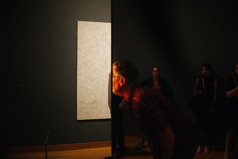
|
|
#
?
Sep 8, 2017 08:51
|
|

|
I like this picture but two things stand out as perhaps imperfect. Firstly, the tree to the right-side. I'm not sure if it detracts from the image or acts as a frame to the bridge further away to add a homely feeling when looking at the scene. Secondly, the flower in the foreground may just be a distraction and should've been removed from the frame. Any thoughts? 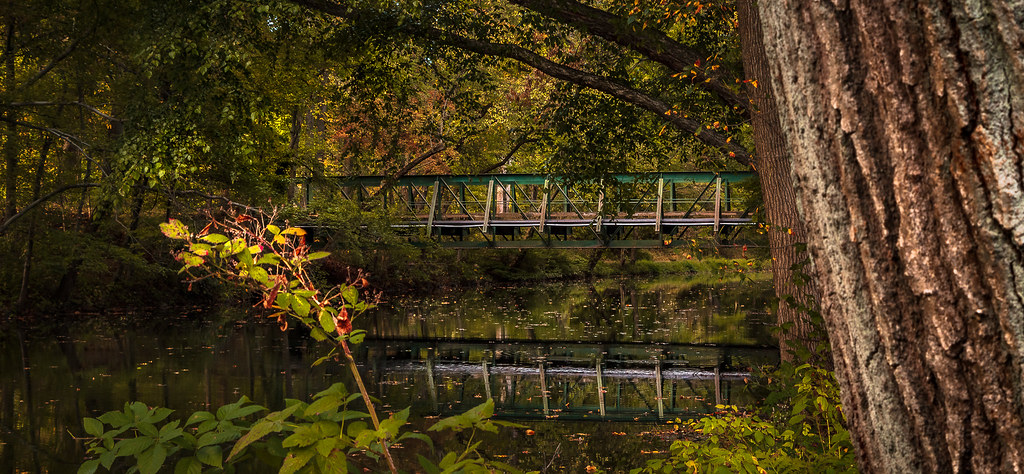 River Crossing by Nathan Nixon, on Flickr River Crossing by Nathan Nixon, on Flickr
Thom12255 fucked around with this message at 19:17 on Oct 10, 2017 |
|
#
?
Sep 27, 2017 00:38
|
|
|
Yeah, that flower really kills the simple architecture of the bridge, it's really distracting.
|
|
#
?
Sep 27, 2017 01:56
|
|
|
 Kalmthout by roland luijken, on Flickr Kalmthout by roland luijken, on FlickrI am in to photography now for a couple of months. I live nearby a natural resort and usual now go there several times a week. It's amazing that each time the photo's come out different in colors. This picture was taken with a D3400 and Tamron 70-300mm at sunset.
|
|
#
?
Oct 16, 2017 15:50
|
|

|
You have to crit your own photo or another photo in the thread when you post. It�s ok if you�re new just go over your own photo with as much crit as you can identify.
|
|
#
?
Oct 16, 2017 15:59
|
|

|
Orions Lord posted:
Two minor complaints -- first, the tree line in back is not quite in focus. I would perhaps try stopping down to a much narrower aperture and using a tripod if that makes the shutter speed too long to shoot handhold. Secondly, this isn't quite level, the left side of the frame's horizon is slightly higher than the right. With this composition having that level be 100% straight is crucial. That said, taking a bunch of photos of the same spots at different times of day (and eventually, different times of the year, etc) sounds like a good fun long term project!
|
|
#
?
Oct 16, 2017 16:03
|
|


|
toadee posted:Two minor complaints -- first, the tree line in back is not quite in focus. I would perhaps try stopping down to a much narrower aperture and using a tripod if that makes the shutter speed too long to shoot handhold. Secondly, this isn't quite level, the left side of the frame's horizon is slightly higher than the right. With this composition having that level be 100% straight is crucial. Thanks, I will level it out next time. Also the aperture is a good one I switch a lot from close to far etc. and forget to change the settings.
|
|
#
?
Oct 16, 2017 18:02
|
|
|
Orions Lord posted:
I like the overall effect�that glass-smooth water is really neat�but I almost feel like you�re trying to get too many subjects into the frame, if that makes sense. Have you tried capturing just the tree on the left-hand side? You could still take advantage of the water reflection but the viewer would have a more distinct subject to focus on, and by zooming in on one tree you might be able to capture a lot more detail. (Disclaimer: I�m very new at photography, so my critique is definitely coming from a layperson�s POV.)
|
|
#
?
Oct 20, 2017 18:53
|
|


|
This photo makes me think of happy times with friends and loved ones. It's a great capture of two people enjoying each other's company and also enjoying art. I can imagine what the rest of the woman's is like. I also think she adores how the man explains things. It's cute and a honest photo. Right off the bat I liked the tones and post processing. I would try bumping highlights a bit and cooling off things just a touch and seeing how that looks. Secondly, the hand blur is a bit distracting though it does come into play with the story I imagine viewing the photograph. Vignette is a little strong for me and gives me the illusion of the need for profile lens correction or line straightening. I am however, a huge fan of the last photo you posted and really dig the shadows, crops, and lighting on the people: Keep up the good work and thanks for sharing!! I'm organizing my portfolio and would love some feedback.  link link
|
|
#
?
Oct 21, 2017 02:41
|
|

|
Orions Lord posted:
I agree with the other comments - the reflection on the water is nice but it feels a little crowded. I feel like the sky is also blown out and would be better to capture the color of the sky or at least make it darker so that it isn't so harsh. It's neat that the color of the sky matches the color of the sky in the water but I think it is too harsh against the trees and grass. I'm not sure if that is a processing issue or something that would have to be fixed when you take the picture. Keep experimenting, I like the idea!
|
|
#
?
Oct 31, 2017 18:45
|
|


|
I'm new at critiquing so for what it's worth: I think this is well done and I am drawn in by the way her arms are covering her head. The texture of the stockings and being able to capture that is also a nice touch. I appreciate the use of white space but would like to see a little more of the subject in the frame, or consider lowering the exposure on the wall to give it a little more texture. The lightest part above the pillow is bothering me for some reason. Without knowing how this fits in with the rest of your portfolio, I think you could do more to reduce the negative space in the frame and give more weight to the subject.
|
|
#
?
Oct 31, 2017 19:05
|
|
|
Sleepytime posted:I agree with the other comments - the reflection on the water is nice but it feels a little crowded. I feel like the sky is also blown out and would be better to capture the color of the sky or at least make it darker so that it isn't so harsh. It's neat that the color of the sky matches the color of the sky in the water but I think it is too harsh against the trees and grass. Thanks I will try to keep the whole picture in my mind also the sky. I've learned how to edit the sky now but I rather do it right the first time.
|
|
#
?
Nov 9, 2017 14:21
|
|
|
toadee posted:Two minor complaints -- first, the tree line in back is not quite in focus. I would perhaps try stopping down to a much narrower aperture and using a tripod if that makes the shutter speed too long to shoot handhold. Secondly, this isn't quite level, the left side of the frame's horizon is slightly higher than the right. With this composition having that level be 100% straight is crucial. Yes, rotating the picture is now also on my to do list. And a tripod is also on the list (specially when I do infrared). Now I just put the camera on whatever I can find. Thanks.
|
|
#
?
Nov 9, 2017 14:24
|
|
|
Thom12255 posted:I like this picture but two things stand out as perhaps imperfect. Firstly, the tree to the right-side. I'm not sure if it detracts from the image or acts as a frame to the bridge further away to add a homely feeling when looking at the scene. Secondly, the flower in the foreground may just be a distraction and should've been removed from the frame. You should think about what the subject of the photo is, what is adding interest, and what is interfering with that interest. In this case, you wanted to take a photo of the bridge. The bridge is in a darker part of the photo (relative), and far away. In the forground, you have that tree and the flower. The tree has a very prominent pattern with a lot of contrast, and is in focus enough to draw some attention. The flower is really big, bright, and right on the rule of thirds, and that makes it the first thing you see when you look at the photo. The relatively dark bridge just becomes a background. It kinda looks to me like you wanted to take a photo of the bridge, because you found it pretty from that spot, got it in frame, then tried to apply your knowledge of composition to everything else too. It's not just the flower, I think that without it, you'd probably be annoyed by that dark branch on the right side too. 
|
|
#
?
Nov 17, 2017 07:16
|
|

|
I really like this one! The water is fantastic, my biggest complaint is that the rocks lose their definition as they get darker. Perhaps brighten the rock formation and keep the water as is? Edit: To clarify, I meant trying to brighten only the very dark portion of the rock formation. Thirteen Orphans fucked around with this message at 11:22 on Nov 17, 2017 |
|
#
?
Nov 17, 2017 07:34
|
|
|
Thirteen Orphans posted:I really like this one! The water is fantastic, my biggest complaint is that the rocks lose their definition as they get darker. Perhaps brighten the rock formation and keep the water as is? I'm seeing plenty of definition on my screen in the dark areas.
|
|
#
?
Nov 17, 2017 19:05
|
|
|
underage at the vape shop posted:You should think about what the subject of the photo is, what is adding interest, and what is interfering with that interest. In this case, you wanted to take a photo of the bridge. The bridge is in a darker part of the photo (relative), and far away. In the forground, you have that tree and the flower. The tree has a very prominent pattern with a lot of contrast, and is in focus enough to draw some attention. The flower is really big, bright, and right on the rule of thirds, and that makes it the first thing you see when you look at the photo. The relatively dark bridge just becomes a background. It kinda looks to me like you wanted to take a photo of the bridge, because you found it pretty from that spot, got it in frame, then tried to apply your knowledge of composition to everything else too. I revisited the place a few weeks later and took this and I think it's better compositionally (the editing sucks as I forgot flux was one when I did it and wasn't too interested in doing it again.) 
|
|
#
?
Nov 17, 2017 20:36
|
|
|
I like this but I think the bottom portion doesn't add much and could be cropped out.
|
|
#
?
Nov 17, 2017 20:38
|
|
|

|
| # ? May 30, 2024 22:17 |
|
|
Thom12255 posted:I like this but I think the bottom portion doesn't add much and could be cropped out. I thought this too but when I did a finger crop on my monitor it didn't make the picture better, it just made it feel closed in because of everything you have to throw away to keep the square.
|
|
#
?
Nov 17, 2017 21:04
|
|