


|
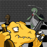
Here's some card art I made for someone's digital TCG, using their 16-color palette. Since I usually do 5-color monochrome stuff, I was a bit intimidated at first (figuring out how to make shading gradients with limited colors was... not particularly intuitive for me), but I think it helped me better understand this whole "color blocks" concept I've been hearing about.   
|
 #
?
Oct 4, 2017 01:27
#
?
Oct 4, 2017 01:27
|
|


|

|
| # ? May 10, 2024 16:52 |
|
|
I wanted to draw something for halloween, so I did a style imitation of Francis Coulombe (Frankiesmileshow)'s big RPG monsters for his forthcoming RPG using his palette. He really is inimitable but it was a lot of fun and I learned quite a bit from it.
|
|
#
?
Oct 13, 2017 08:25
|
|

|
More October monsters ITT thanks!
|
|
#
?
Oct 13, 2017 13:39
|
|

|
I decided to try my hand at this. never done any pixel art before, I saw a lot of people recommending to start with the GB palette for simplicity's sake, so that's why it's greenscale. let me know what I should improve on!
|
|
#
?
Oct 16, 2017 05:57
|
|

|
noether posted:I decided to try my hand at this. never done any pixel art before, I saw a lot of people recommending to start with the GB palette for simplicity's sake, so that's why it's greenscale. let me know what I should improve on! It's a really good start! My critique would be that the neck is too thin, her eyes seem a tad big even with the anime style, same With the mouth but I honestly wouldn't be too worried. If you're thinking of using more colours I would recommend dawnbringers 16 and 32 bit palette and take/change colours that you like from it. More colours don't necessarily mean more complexity, but self imposed limits are cool.
|
|
#
?
Oct 17, 2017 00:17
|
|

|
Ash Crimson posted:It's a really good start! My critique would be that the neck is too thin, her eyes seem a tad big even with the anime style, same With the mouth but I honestly wouldn't be too worried. thanks  I wend back and fiddled with it some more. I scaled down her eyes and mouth a bit and widened her neck, and I messed with the palette a bit so it's less eye-searing. the right iris kind of butts up against the outline of the eye, but I think that's probably inevitable, so whatever. it definitely looks better like this regardless.  I checked out the palette and it looks really good in the sample images they made for it. I'll definitely try using it later!
|
|
#
?
Oct 17, 2017 07:00
|
|
|
noether posted:thanks These are good changes! I don't necessarily think the previous colours were wrong or eye-searing, but that they mainly lacked contrast, or at least the two lightest colours did. I made an edit, but take my changes with a grain of salt, they're what i would have done but i'm not good at faces or bodies at this size, nor am i good at the anime-style that you've done:  I went a tad overboard with the anti-aliasing, but with a limited palette i feel it's a necessary evil, although that's my personal preference. I look forward to seeing more of your stuff and i highly recommend you check out Pixelation.com's forum and Pixeljoint's WIP forum as well as it's gallery!
|
|
#
?
Oct 17, 2017 11:04
|
|
|
4 colour mushrooms 
|
|
#
?
Oct 31, 2017 10:12
|
|

|
I have a babby question. I decided to fire up Aesprite and play with some of the concepts in the images SystemLogoff posted. So I made myself a circle with the circle tool. That doesn't follow the stepwise rule though, even if it does look lovely and even. Is that okay, or is this circle somehow no good? Or have I misunderstood the rule? I know this is a beginner thing to be asking about, but gdi I'm going to get these fundamentals down.
|
|
#
?
Oct 31, 2017 16:32
|
|

|
It's ugly but technically correct. You could use it as an opportunity to practice making smoother curves, though.
|
|
#
?
Oct 31, 2017 19:20
|
|

|
The method of making the segments be in descending order of pixel count (e.g. that circle would be 4-3-2-1-1-1-2-3-4) creates a less jagged appearance but is mathematically further from a perfect circle than what the circle tool creates. I would recommend to defaulting to the more aesthetically pleasing one, because neither is a perfect circle and they're both close enough that the difference doesn't matter in most cases.
|
|
#
?
Nov 7, 2017 08:41
|
|

|
You will likely be antialiasing it as well, which will push it back towards the ideal in appearance on those pixels.
|
|
#
?
Nov 7, 2017 10:24
|
|
|
Scarodactyl posted:You will likely be antialiasing it as well HISSSSSS
|
|
#
?
Nov 8, 2017 15:25
|
|


|
MikeJF posted:HISSSSSS
|
|
#
?
Nov 8, 2017 16:42
|
|
|
This is the pixel art thread, not the anti-alias your stuff so its super fuzzy and nasty but technically mathematically correct thread.
|
|
#
?
Nov 10, 2017 00:30
|
|


|
Polio Vax Scene posted:This is the pixel art thread, not the anti-alias your stuff so its super fuzzy and nasty but technically mathematically correct thread. It's only fuzzy and nasty if you do it wrong.
|
|
#
?
Nov 10, 2017 01:28
|
|

|
Polio Vax Scene posted:This is the pixel art thread, not the anti-alias your stuff so its super fuzzy and nasty but technically mathematically correct thread. Just look at those gorgeous mushrooms by exmarx Even with a 4-color palette he's done a lot of antialiasing:  You can end up with a blurry mess if you do it wrong of course. But saying you don't like aa at all is like saying you don't like clean lines or shading.
|
|
#
?
Nov 10, 2017 02:23
|
|
|
Oh, right, manual antialiasing is fine, I was thinking of automatic antialiasing.
|
|
#
?
Nov 11, 2017 14:02
|
|
|
Wouldn't automatic anti-aaing count as non-pixel art technically? Anyways, trying to do a walk animation, but i think the perspective might be an issue, as well as the walk itself: 
|
|
#
?
Nov 14, 2017 16:28
|
|
|
Adding some motion to the upper half will help with that a lot.
|
|
#
?
Nov 15, 2017 21:53
|
|
|
I'd say you've got the knees bending too much before the swing forward. It looks like he's kick-walking.
|
|
#
?
Nov 16, 2017 02:51
|
|
|
Polio Vax Scene posted:Adding some motion to the upper half will help with that a lot. Will do so! Specifically the arms or the body itself moving up and down? Hardcordion posted:I'd say you've got the knees bending too much before the swing forward. It looks like he's kick-walking. Tried to fix that in this update (still working on upper body sorry)  Hopefully it looks less kick-walkish.
|
|
#
?
Nov 19, 2017 20:15
|
|
|
Ash Crimson posted:Will do so! Specifically the arms or the body itself moving up and down? I think the main thing now is on the last frame of the kick back, the flat of his foot is perpendicular to the ground. If that was angled somewhat I think it would look pretty natural.
|
|
#
?
Nov 19, 2017 20:32
|
|

|
Booyah- posted:I think the main thing now is on the last frame of the kick back, the flat of his foot is perpendicular to the ground. If that was angled somewhat I think it would look pretty natural. Like this?  Arms are pretty bad i confess. So i'm not spamming, here's some stuff: Cyangmou, a pixel-art with some serious skill, has been working on his game which was just released on steam recently; Tower 57. http://tower57game.com/ Check it out, the pixel art is really great! Some of his other stuff can be seen here: http://pixeljoint.com/p/32234.htm Another pixeller called Skeddles (http://pixeljoint.com/p/8024.htm) has a website, Lospec, with some tools and resources that might be helpful to newer (and older!) artists, as well as a list of some of the more popular and historical palettes. If you're feeling generous and want to help grow the community and his website, he's currently got a patreon (https://www.patreon.com/lospec). And finally Michafrar, who has worked on some of the pixel adventure time games, has a series of tutorials hes' been creating that are available on gumroad, with a free preview if you're interested and more plus future tutorials! I found his tutorials really helpful, would recommend if you're looking for more indepth tutorials. Site here: http://pixellogicbook.com/ Apologies for the shilling!
|
|
#
?
Nov 19, 2017 23:49
|
|
|
Ash Crimson posted:Like this? No, this is perfect, I've been looking for this post exactly. I've been wanting to get into pixel art, but really didn't know where to start.
|
|
#
?
Nov 20, 2017 03:21
|
|
|
So interest of learning of how to shade a pixelized sphere (just realized the topic was already 2 months old after made this  ), here's some useful tips I've picked up over time: ), here's some useful tips I've picked up over time:First, understand the shape of a sphere. A sphere is essentially a shape in which every point on its surface is the same distance away from the same center point. This means that its silhouette will always show up as a circle, so we can start by just drawing a flat circle like this:  To understand how to shade this circle to appear as a sphere, think about how light from a single point reflects off the surface of a sphere. Light shining directly onto a surface (i.e. the surface is perpendicular to the ray of light) will appear the brightest, whereas the more angled the surface becomes (i.e. as the surface becomes more parallel with the ray of light) less light will be reflected and the resulting color will be dimmer. In terms of a sphere, color will appear the brightest at the point closest to the light source, and will dim more the further away you go from this point. To imagine this in our drawing, try drawing concentric circles or lines of latitude on your sphere where your poles are the at points nearest to and farthest from your light source. For example, try to aim for something that looks like this:  Take note in this example that the spacing in these latitudes seem wider in the center of the sphere and narrower near the edges of the sphere in order to maintain a sense of perspective for the viewer. Being able to see a sphere like this is key in order to understand to shade it correctly, beause once you have this down, you can pretty much start shading based on areas separated by the latitudes like so:  In this case we simply shade the area furthest away from the light with dark gray, the area closest to the light with white, and the rest of the sphere with light gray. In terms of lighting, our dark gray area is our rim lighting, or rim shading, which nicely accentuates the depth of our sphere by contrasting the lit part versus the unlit. Our white area, on the other hand, is our specular lighting which is essentially a reflection of our light source on the sphere. Since it's a reflection of our light source, we can pretty much change the shape of our specular area to whatever we want as long as we still respect the curvature of the sphere.  We can even play with adjusting our areas by changing the bounds of our latitude. For example, we can increase our rim lighting to the next latitude like so:  However, this looks kind of funky due to the fact that we're only using 3 colors in this example: one indicating total brightness, one indicating somewhat bright, and one indicating not very bright at all. Even though the dark-gray colored portion of our sphere seems to correctly occupy what should be the unlit part of our sphere, it still looks weird because 1) we're only using 3 discrete colors, so there's a harsh drop-off from our somewhat lit color to our unlit color, and 2) in the real world, our light would reflect off other surfaces in our environment back to the underside of the sphere, so some parts of the underside of the sphere should still be lit to some extent, especially at points midway up our sphere. Both of these issues can be resolved through the use of dithering. In this case, a good dither would use a lot of noise in order to escape issues of banding. The end result would be a more matte look, kind of like looking at the surface of a moon or a planet.  This can still be improved upon by using more colors and/or less contrasting colors, but at this point you have something that actually looks like a sphere.
|
|
#
?
Nov 20, 2017 10:37
|
|


|
I'm making a super tiny dungeon man for a super tiny dungeon adventure. He fits handily in a 16x16 square! Reducto would be proud, I think. actual size    x2 zoom   
|
|
#
?
Nov 28, 2017 00:20
|
|
|
Cicadas! posted:I'm making a super tiny dungeon man for a super tiny dungeon adventure. He fits handily in a 16x16 square! Reducto would be proud, I think. The walk animation reminds me of Lemmings so much.
|
|
#
?
Nov 29, 2017 22:26
|
|


|
 Messing with Aseprite, it's pretty neat. Might start an RPGMAKER or C++\SDL project. How do I cat? Anything I do makes it either look like it's convulsing or making biscuits on the down\up walk cycle. SSH IT ZOMBIE fucked around with this message at 23:39 on Dec 8, 2017 |
|
#
?
Dec 8, 2017 23:21
|
|
|
I'm not qualified to give any tips but for what it's worth the front facing cat looks like it's at an angle while the sideways one doesn't, and that's kind of strange e: what I mean is that if you lower his butt a bit it should look better, and make his tail longer in the front facing one as well Highblood fucked around with this message at 21:07 on Dec 9, 2017 |
|
#
?
Dec 9, 2017 20:43
|
|

|
Highblood posted:I'm not qualified to give any tips but for what it's worth the front facing cat looks like it's at an angle while the sideways one doesn't, and that's kind of strange  Nah, you're right. There was a perspective issue. I think it's fixed, thanks.
|
|
#
?
Dec 10, 2017 02:08
|
|
|
Looks great, I guess I'm not so dumb after all
|
|
#
?
Dec 10, 2017 17:00
|
|
|
The 8-Bit Guy released a new RTS for the Commodore 64 called Planet X2. In his video he talked about working on a DOS port next. I made a mockup for him to see if I could get the gig. EGA palette, 16x16 pixels. If you want to throw your hat in the ring you can find him on facebook. EGA is frankly a garbage palette but he's making a game that could actually run on that 286 your dad still keeps in the garage. Here's a making-of video 8-Bit Guy did about the C64 port. Pretty interesting to see someone make an authentic release for such an old platform. https://www.youtube.com/watch?v=NB_VBl7ut9Y
|
|
#
?
Dec 14, 2017 22:49
|
|
|

|
|
#
?
Dec 21, 2017 08:32
|
|

|
 deco
|
|
#
?
Dec 26, 2017 10:02
|
|
|
That looks excellent!
|
|
#
?
Dec 28, 2017 14:39
|
|
|
exmarx posted:
Did another lot of these  Scut posted:That looks excellent! Thanks!
|
|
#
?
Jan 1, 2018 14:57
|
|

|
exmarx posted:Did another lot of these Is second from the right FKA Twigs?
|
|
#
?
Jan 2, 2018 16:36
|
|
|
L-R: M.I.A in MSPaint, James Turrell in NES, FKA twigs in Amstrad CPC, John Berger in Pico-8 Amstrad CPC is probs the most garbage palette of its size I've ever worked with, there's nothing to bridge the pale pink and the bright yellow/green/cyan
|
|
#
?
Jan 3, 2018 00:46
|
|
|

|
| # ? May 10, 2024 16:52 |
|
|
My first attempt at working from digitized screen captures as well as my first wide pixel piece.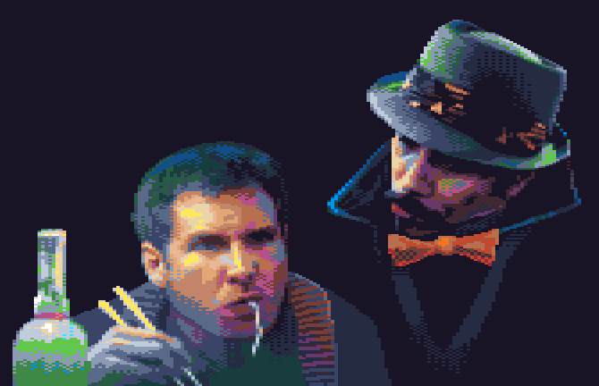
|
|
#
?
Jan 5, 2018 21:08
|
|