


|
Checking that I'm using Imgur correctly...(great, only took 4 attempts) 
spinderella fucked around with this message at 07:32 on Jan 22, 2018 |
 #
?
Jan 22, 2018 06:39
#
?
Jan 22, 2018 06:39
|
|


|

|
| # ? May 11, 2024 16:07 |
|
|
 
|
|
#
?
Jan 22, 2018 19:08
|
|
|
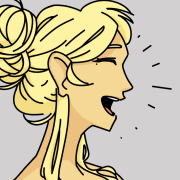
a hole-y ghost posted:awesome! Oh hey funny story, remember back when you were drawing this? a hole-y ghost posted:Drawing update: think I'm done with this one. I thought there was something fucky with the face back then, but couldn't quite articulate it, so I took a reference shot of my own face with the webcam, trying to match the angle and the expression to figure out wtf. I absolutely failed at forming proper descriptive sentences for the ever-so-slight changes and gave up, deciding that also maybe I don't wanna doxx myself yet by posting the pic, either. Anyway that ended up being the reference pic I used for that. I've got this feeling of dread creeping down my neck, just looking at this pic. There's no need to make the 'Murican president look that flattering, it's ok, we all know he's way fatter than that. I drew Apple from Animal Crossing Pocket Camp because they are THE CUTEST oh my god I love them so much  Look at that chubby fuzzy face it brings me so much joy.
|
|
#
?
Jan 23, 2018 00:42
|
|


|
Sharpest Crayon posted:Oh hey funny story, remember back when you were drawing this? 
a hole-y ghost fucked around with this message at 16:29 on Jan 23, 2018 |
|
#
?
Jan 23, 2018 01:59
|
|

|
e: didn't attach whoops
|
|
#
?
Jan 23, 2018 06:33
|
|
|
e: I think attachments are not working. sorry for the triple post e: Sharpest Crayon posted:I've got this feeling of dread creeping down my neck, just looking at this pic. 
a hole-y ghost fucked around with this message at 06:40 on Jan 23, 2018 |
|
#
?
Jan 23, 2018 06:34
|
|
|
alright gonna try atttachments again
|
|
#
?
Jan 23, 2018 16:24
|
|
|
Finally got the time (and inspiration) to draw something again. https://twitter.com/Shinmera/status/955828135936839681
|
|
#
?
Jan 23, 2018 16:43
|
|

|
Hey, I looked around and didn't find a better thread, but if there is just let me know. I'm trying to start drawing daily, but I haven't held a pencil in ~10 years so I don't really have an idea how to focus on the basics. I'm afraid that I'll start drawing and pick up real bad habits that I'm not aware of. I'm not worried about making masterpieces in the next three months or anything, I'm just looking for some guidance. Does anyone have good resources, links or books I should check?
|
|
#
?
Jan 23, 2018 16:45
|
|
|
Chakan posted:Hey, I looked around and didn't find a better thread, but if there is just let me know.
|
|
#
?
Jan 23, 2018 16:50
|
|
|
Chakan posted:Hey, I looked around and didn't find a better thread, but if there is just let me know. One very basic thing to do daily is simply training your motor control. If you're interested in anatomy, I can recommend Figure Drawing: Design and Invention.
|
|
#
?
Jan 23, 2018 16:58
|
|
|
Shinmera posted:If you're interested in anatomy, I can recommend Figure Drawing: Design and Invention.
|
|
#
?
Jan 23, 2018 17:09
|
|
|
Spinster posted:Checking that I'm using Imgur correctly...(great, This is supposed to be Aziz Ansari right? If you weren't going for the likeness ... well ... you sorta got it anyways. Also kind of funny. Was she really that much taller than him? The expression says it all.  This is what I get for asking my GF to pose. She turns around, takes off her pants, and shops for clothes on her phone. Don't worry ... I got consent to post ... but only to "the nerds on the forums".  I think she just likes to moon people by proxy. I think she just likes to moon people by proxy.
sigma 6 fucked around with this message at 18:25 on Jan 23, 2018 |
|
#
?
Jan 23, 2018 18:21
|
|


|
I posted this in the resources thread but Marc Leone's drawing channel has been invaluable to me. I could barely draw a straight line in July when my job announced that they'd be having a staff art display that year. On a whim I started drawing. This weekend, this was my hour-long study. It's not ground breaking but I'd never have imagined that I could do anything like it. 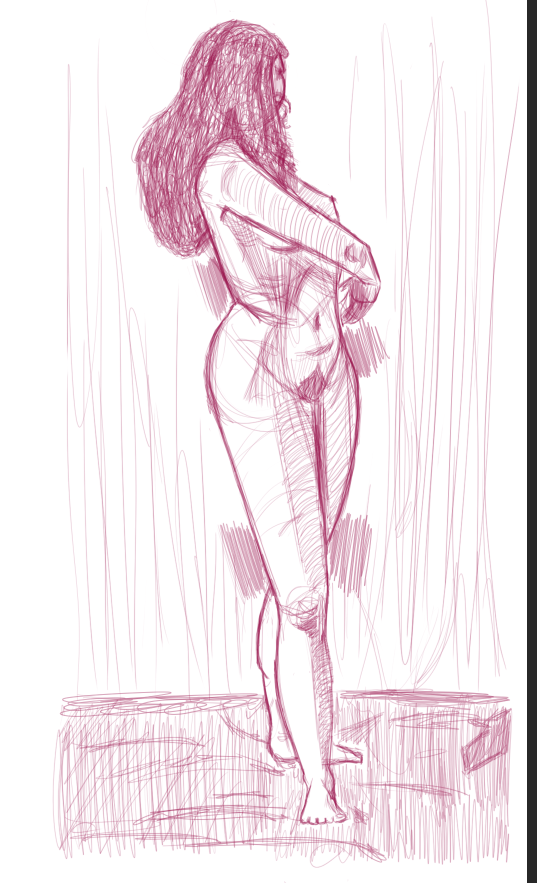
|
|
|
#
?
Jan 23, 2018 18:38
|
|
|
Started something today. 
|
|
#
?
Jan 23, 2018 19:06
|
|
|
sigma 6 posted:This is supposed to be Aziz Ansari right? If you weren't going for the likeness ... well ... you sorta got it anyways. Also kind of funny. Was she really that much taller than him? The expression says it all. Yes it's supposed to be Aziz and it's supposed to be funny. I'm doing a big effort thread and man I don't have to be good but its still taking me forever to draw these. Practice under time pressure, aargh. And she's that much taller now lol.
|
|
#
?
Jan 23, 2018 21:39
|
|
|
This is pretty embarrassing for me, but here goes anyway: I'd like to ask if anyone has some feedback about my style -- what you dislike and like about it, and if there's anything that confuses you or if you have any suggestions for improvements. I'm aware that style is something very personal, but I often get the feeling that I'm stuck in my own head too much, so I hope to get some new perspectives on things by hearing what others have to say about it. If you're interested in lending a hand, an easy way to browse through my stuff is here. Also of interest might be this, which is an overview of my style development over the past few years.
|
|
#
?
Jan 23, 2018 23:33
|
|
|
Shinmera posted:This is pretty embarrassing for me, but here goes anyway: I'd like to ask if anyone has some feedback about my style -- what you dislike and like about it, and if there's anything that confuses you or if you have any suggestions for improvements. I'm aware that style is something very personal, but I often get the feeling that I'm stuck in my own head too much, so I hope to get some new perspectives on things by hearing what others have to say about it. You might want to start a new thread for this-it'll be easier for you to keep track of the feedback/critiques, and to have a discussion on the comments you're getting, instead of sifting through updates to this thread. E: craypas and some boys  
Theokotos fucked around with this message at 00:18 on Jan 24, 2018 |
|
#
?
Jan 24, 2018 00:11
|
|

|
the chad squareboy vs the virgin roundboy
|
|
#
?
Jan 24, 2018 00:55
|
|

|
Shinmera posted:This is pretty embarrassing for me, but here goes anyway: I'd like to ask if anyone has some feedback about my style -- what you dislike and like about it, and if there's anything that confuses you or if you have any suggestions for improvements. I'm aware that style is something very personal, but I often get the feeling that I'm stuck in my own head too much, so I hope to get some new perspectives on things by hearing what others have to say about it. I�ll say the 2 biggest things I notice that I think you would benefit from are varying your line width more (like it doesn�t look like you change it at all throughout one drawing) and varying up the face and body shapes of the people you draw, there�s a lot of same face going on throughout your drawings and it seems especially noticeable since you don�t define a lot of makeup or color change within their faces. I won�t say that the more flat, simple colors are bad because it�s a legit stylistic choice and when done well can look very good but I would maybe try to use more nuanced color schemes, some of the colors you pick feel a little default color swatch-y, not like ms paint colors bad or anything but just feels like you could make slightly more interesting choices. Also that rainbow robot is cool
|
|
#
?
Jan 24, 2018 01:12
|
|

|
Shinmera posted:This is pretty embarrassing for me, but here goes anyway: I'd like to ask if anyone has some feedback about my style -- what you dislike and like about it, and if there's anything that confuses you or if you have any suggestions for improvements. I'm aware that style is something very personal, but I often get the feeling that I'm stuck in my own head too much, so I hope to get some new perspectives on things by hearing what others have to say about it.
|
|
#
?
Jan 24, 2018 03:10
|
|
|
Sharpest Crayon posted:You've got the main body of hair down pat, all you've gotta do is add a couple of sharp, errant strands that follow the curvature of hair, but stand out. Slightly more visible (thicker) than on the right eyebrow since , but that's what you'd want in the hair. Use a harder-edged brush so they don't come out too soft. Thanks for the advice. I'd already started drawing this next drawing I did before I read this comment but I'll be sure to try and follow this next time.  I really enjoy drawing "ugly" people I've found out. There's so much opportunity for brutal linework and harsh light changes, which I love. Also I don't always feel like I'm improving, so I decided to redraw the hulk. I tried drawing him when I'd been drawing for about 2 months last July and it turned out like this:  I'm still no were near my goal of where I want to be, but I do feel a little pride that even my own negative brain can recognise I've improved in six months. EDIT: What I would really like help with though is learning how to add texture to the things I'm drawing. I think I'm starting to really get the hand of using lighting, negative space and shading to define the shape of objects - but I'm at a bit of a lose of how to combine that with "texturising" the planes without disrupting the definition of the objects themselves? If that makes sense. d3c0y2 fucked around with this message at 04:29 on Jan 24, 2018 |
|
#
?
Jan 24, 2018 03:52
|
|
|
pretty tired today
|
|
#
?
Jan 24, 2018 04:16
|
|
|
Al! posted:pretty tired today This is really cool. I'm always in awe of pixel artist's ability to convey so much with such minimalist tools.
|
|
#
?
Jan 24, 2018 04:18
|
|
|
the trick is that im not a trained artist and working in low resolution with a limited number of brushes allows u to work in a very forgiving envrionment. of course as ive gotten better i spend a lot more time on it and the tools get a bit restrictive, but ive tried painting in photoshop and it just looks bad to me because i dont have as much knowledge of foundations, so the awe goes both ways. i dont really think of it as pixel art tbh, im not interested in the pixel-by-pixel precision that real pixel artists have, i just dont have the patience. what i do is more of a jumped up KidPix, or Mario Paint
|
|
#
?
Jan 24, 2018 05:25
|
|
|
Wowporn posted:Also that rainbow robot is cool e:aaand naturally I messed up one of the layers right before saving. anyways you get the idea
a hole-y ghost fucked around with this message at 06:40 on Jan 24, 2018 |
|
#
?
Jan 24, 2018 06:33
|
|
|
Wowporn posted:I’ll say the 2 biggest things I notice that I think you would benefit from are varying your line width more (like it doesn’t look like you change it at all throughout one drawing) and varying up the face and body shapes of the people you draw, there’s a lot of same face going on throughout your drawings and it seems especially noticeable since you don’t define a lot of makeup or color change within their faces. I won’t say that the more flat, simple colors are bad because it’s a legit stylistic choice and when done well can look very good but I would maybe try to use more nuanced color schemes, some of the colors you pick feel a little default color swatch-y, not like ms paint colors bad or anything but just feels like you could make slightly more interesting choices. I like having fixed-width strokes, but I should see how to incorporate several distinct widths into a drawing. I've been doing that every now and again, but haven't been able to figure out a good rule for when to use what kind of width yet. I'm definitely guilty as charged with the sameyness. I've been focusing on curves and edges for so long I kinda lost sight of varying body features. Colour is a thing I mostly have no idea about, to be frank. I just pick around on the colour triangle until I get something that looks vaguely Ok. I've been meaning to get into painting this year in an attempt to get me to deal with shading and colours in general more. Thanks for the feedback! a hole-y ghost posted:Well I guess what I'd ask you then is: where do you want your drawing skills to be? What do you want to be able to draw like, and where is your own art different from it? I ask because I remember you saying you're unsatisfied with your progression. I'm not entirely sure I can give a concrete answer to this, which I suppose is part of the problem. The best I can muster is that I'd like to draw things that I will also end up liking to look at. Every now and again I come across an artist whose works I really like. I then try to figure out what I like about it and how to change my own drawings to go more in that direction. So far it seems I have a fondness for precise and simple lines and shapes, with distinct curves and edges. In terms of influences, I guess the top contenders would be John Allison, Asahi, L5, and Dowman (possibly NSFW). Theokotos posted:You might want to start a new thread for this-it'll be easier for you to keep track of the feedback/critiques, and to have a discussion on the comments you're getting, instead of sifting through updates to this thread. I didn't want to make a big deal out of it, but I might consider doing that yet. If this is taking up too much room in the thread I'll readily move it to a separate one though. Hopefully I'll find the time to provide some actual content again soon.
|
|
#
?
Jan 24, 2018 23:28
|
|
|
Airdrop arts nyeeeeeeeooommmm awayyyyyy
|
|
#
?
Jan 25, 2018 00:25
|
|
|
I want to thank everyone who posted stuff for me to look over. It's a lot, but I've got time in spades so I appreciate your help!
|
|
#
?
Jan 25, 2018 04:01
|
|
|
wanted to try a weird perspective and some complicated animations
|
|
#
?
Jan 25, 2018 05:29
|
|
|
Shinmera posted:I like having fixed-width strokes, but I should see how to incorporate several distinct widths into a drawing. I've been doing that every now and again, but haven't been able to figure out a good rule for when to use what kind of width yet. I'm definitely guilty as charged with the sameyness. I've been focusing on curves and edges for so long I kinda lost sight of varying body features. Some of the best advice an artist once gave me is that as a beginner, you should never focus on developing any particular "style." Just learn how to draw from observation, keep practicing, and your own style will naturally develop. That isn't to say you should not try to imitate other artists, because you can definitely learn a lot that way too. But judging from your comments here, I think the reason you haven't developed much is precisely because you've just been concentrating on perfecting this kind of angular line art you've got going on. I actually like your 2013 stuff better, because it looks like you were trying to understand the form of the things you were drawing. That said, I really like this piece. The only thing is the person should stick out more, either with varying line width or color, like Wowporn suggested. Sharpest Crayon posted:Airdrop arts nyeeeeeeeooommmm Love the contour lines. Jake Snake posted:Started something today. Worked on this today.  Does anyone else think it looks like her left hand is detached from her body? Also I'm really worried about that smile coming across as creepy.
|
|
#
?
Jan 25, 2018 05:35
|
|
|
Jake Snake posted:
I think she looks quite cheerful, and the hand is good imo, maybe a bit hard to read because her sleeve is so loose it's hard to tell where the forearm begins.
|
|
#
?
Jan 25, 2018 06:47
|
|

|
Spinster posted:Checking that I'm using Imgur correctly  (Plz ignore what's wrong with this, I just had to see how it would post.) spinderella fucked around with this message at 07:16 on Jan 25, 2018 |
|
#
?
Jan 25, 2018 07:09
|
|
|
Jake Snake posted:
In reworking the face, you opened the eyes a bit more and flattened the cheekbones, which makes the smile look a bit fake. A genuine smile pulls the cheeks up and tends to make the eyes squint a bit, especially the lower lids usually pull up. The foreshortening on the arms would look more convincing if you added a wrinkle or two like the one you've got there on the left that would clearly show the division between "this is in front" and "this is behind", currently the left looks like it's just going sideways and the right like it's going down. I'd add a curve to the edge of the cloth on the left to show a bit more wrist and that there's a round tube-object under the cloth that the cloth would not lay flat on. Also I love your palettes, there's something very comforting about them.
|
|
#
?
Jan 25, 2018 12:56
|
|
|
need to do more body study stuff grumble grumble:
|
|
#
?
Jan 25, 2018 15:51
|
|
|
Good job, though. ^^^
|
|
#
?
Jan 25, 2018 16:10
|
|

|
^ thanks!Shinmera posted:I'm not entirely sure I can give a concrete answer to this, which I suppose is part of the problem. The best I can muster is that I'd like to draw things that I will also end up liking to look at. Every now and again I come across an artist whose works I really like. I then try to figure out what I like about it and how to change my own drawings to go more in that direction. Well, my initial impression is that a lot of the stuff you like has plenty of smooth, flowing lines and is rather action-oriented, but your drawings are getting more and more angular. I'm noticing that you're putting in sharp angles more and more. Please take note that these affect composition�a sharp angle with high contrast (especially ~45 degrees and smaller) which you're using for elbows, knees, chins, etc., draws attention, and tends to serve as a visual "kink" that sort of slows down/stops the eye. These are okay mostly towards the edges of a composition, since that will keep your viewer's eye inside the picture. However, it looks to me like you're starting to describe any junction in the body with these really sharp, high contrast angles (hip, chin, shoulder, elbow, nose, butt, malleolus of the foot, etc.) this way and I'm curious if there's a certain reason for that. Particularly confusing/conspicuous to me as a viewer are the pointy calves and forearms. Now I'm not saying "don't do it!!!  ," just make sure you pay attention to where it's leading/stopping the eye. ," just make sure you pay attention to where it's leading/stopping the eye.Otherwise I'd try to tone that down and reserve it for places that really contribute to the overall composition, and elsewhere shoot for more naturalistic shapes. Also try for poses that are more dynamic, with diagonal or s-curve shaped lines of action (hopefully someone else can explain line of action more, since it's a bit hard for me to articulate).
|
|
#
?
Jan 25, 2018 17:36
|
|
|
Jake Snake posted:Some of the best advice an artist once gave me is that as a beginner, you should never focus on developing any particular "style." Just learn how to draw from observation, keep practicing, and your own style will naturally develop. That isn't to say you should not try to imitate other artists, because you can definitely learn a lot that way too. But judging from your comments here, I think the reason you haven't developed much is precisely because you've just been concentrating on perfecting this kind of angular line art you've got going on. I actually like your 2013 stuff better, because it looks like you were trying to understand the form of the things you were drawing. Yeah, I followed that advice for many years until I fell down this cliff. The reason I even started on all this is because I got to a point where I vastly preferred some of my drawings over others for reasons beyond the usual objectively quantifiable ones like anatomy. So I tried to figure out what those reasons are; why I preferred some things over others and how I could push myself in that direction. My preferences being hard to grasp and rationalise hasn't made it easy though, and perhaps a return to basics is in order. Jake Snake posted:That said, I really like this piece. The only thing is the person should stick out more, either with varying line width or color, like Wowporn suggested. I'm glad to hear that! Makes the hours I put into it feel more worth it. As for making the person stick out more, I'm not so sure. The focus of the image (and the series it is a part of) is supposed to be much more on the scenery than the person walking on it. The kind of feeling I'm trying to convey is how imposing nature can be. I suppose making the person stick out more could work if the contrast otherwise was stronger still. a hole-y ghost posted:I asked you the question so I guess I ought to answer! The best reason I can muster is that I think it looks interesting. So far from the teensy amount of feedback I've gotten in the past year or so I seem to be in the minority with that though. I've definitely been getting edgier (hah) over time, and that's mostly a result of me trying to push that to its limit to see how far I could go with it. Again, perhaps a return to basics is in order, and I'll see what happens if I tone it down some more again. Maybe I'll find another way to make it interesting for me. I'm aware of the line of action and all that, and very painfully aware that I should focus on more dynamic poses. Being trapped in my own head for a very long time with close to no feedback, and coupled with other issues, has put me in a position where I would immediately get depressed if I couldn't get a pose down right, so I shrivelled back to not even trying to do anything more taxing or interesting. Part of my attempt at breaking out of that entire situation has been me starting to post in this thread. Hopefully with prolonged exposure I can fix this. Thanks again to all of you for your feedback, I really do appreciate it. This has been some of the most honest and insightful feedback I've gotten in a long time, and it's quite liberating. Shinmera fucked around with this message at 19:35 on Jan 25, 2018 |
|
#
?
Jan 25, 2018 19:31
|
|
|
TheMostFrench posted:I think she looks quite cheerful, and the hand is good imo, maybe a bit hard to read because her sleeve is so loose it's hard to tell where the forearm begins. Sharpest Crayon posted:In reworking the face, you opened the eyes a bit more and flattened the cheekbones, which makes the smile look a bit fake. A genuine smile pulls the cheeks up and tends to make the eyes squint a bit, especially the lower lids usually pull up. The foreshortening on the arms would look more convincing if you added a wrinkle or two like the one you've got there on the left that would clearly show the division between "this is in front" and "this is behind", currently the left looks like it's just going sideways and the right like it's going down. I'd add a curve to the edge of the cloth on the left to show a bit more wrist and that there's a round tube-object under the cloth that the cloth would not lay flat on. Thanks! Will definitely rework the left hand/arm. Also I see what you mean about the cheekbones and eyes. I'm having this issue where too many lines/shadows are making her look old. Glad you like the palette. I can't take too much credit though, since I mostly work from reference photos. Shinmera posted:Yeah, I followed that advice for many years until I fell down this cliff. The reason I even started on all this is because I got to a point where I vastly preferred some of my drawings over others for reasons beyond the usual objectively quantifiable ones like anatomy. So I tried to figure out what those reasons are; why I preferred some things over others and how I could push myself in that direction. My preferences being hard to grasp and rationalise hasn't made it easy though, and perhaps a return to basics is in order. When you get lost, it's always a good idea to return to the basics. No matter how skilled you are, you're never too good for that. Shinmera posted:I'm glad to hear that! Makes the hours I put into it feel more worth it. As for making the person stick out more, I'm not so sure. The focus of the image (and the series it is a part of) is supposed to be much more on the scenery than the person walking on it. The kind of feeling I'm trying to convey is how imposing nature can be. I suppose making the person stick out more could work if the contrast otherwise was stronger still. I see what you mean. I suppose due to her size or position in the picture, I thought there should've been more focus on her. Maybe take a cue from Chinese landscape painting, and make her a tiny speck on the page. a hole-y ghost posted:need to do more body study stuff grumble grumble: This is really awesome.
|
|
#
?
Jan 25, 2018 22:11
|
|
|

|
| # ? May 11, 2024 16:07 |
|
|
d3c0y2 posted:
Personally, I usually pick some parts of whatever I want the material to be, and add some definition by drawing texture here and there. When doing texture, it's important to keep in mind the shape of the thing you're doing it on so it doesn't "flatten" you picture or stand out too much. You can get away with texture brushes if you use them sparingly or make them semi-transparent, but they will never show perspective or wrap around your objects. Depending on your style, you may only need to hint at texture here and there instead of covering your entire piece with a detailed embroidery of detail. I highly recommend the exercise that Humboldt Squid undertook - they painted 100 material studies in the form of cubes, balls and this weird pestle shape. Just cubes upon cubes of fruit and bark and metals and stones. I swore I'd do the same when I saw it but uh. I'm getting around to it. In a decade or so.
|
|
#
?
Jan 26, 2018 00:59
|
|