


|
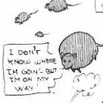
Kurieg posted:you'll have to make due with this.
|
 #
?
Feb 1, 2018 19:31
#
?
Feb 1, 2018 19:31
|
|

|

|
| # ? May 28, 2024 15:15 |
|
|
unseenlibrarian posted:And of course, if a vampire embraces a werewolf transformed via Iron Soul, they become that rarest of all monsters, the Carbomination. I just wanted to let you know that I saw this.
|
|
#
?
Feb 1, 2018 20:11
|
|
|
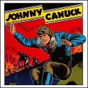
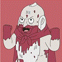
Kurieg posted:I sadly do not have a stencil font on this computer, so you'll have to make due with this. nice try, but ISSION and CCOMPLISHED are the same font
|
|
#
?
Feb 1, 2018 20:18
|
|

|
Xinder posted:nice try, but ISSION and CCOMPLISHED are the same font Oh I'm so sorry sir, I'll just fix that right up for you. 
|
|
#
?
Feb 1, 2018 20:30
|
|
|

|
|
#
?
Feb 1, 2018 20:40
|
|

|
Kurieg posted:Oh I'm so sorry sir, I'll just fix that right up for you. Swedish Dracula called, he's handing you his job.
|
|
#
?
Feb 1, 2018 20:46
|
|

|
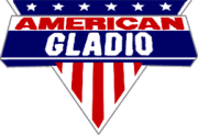
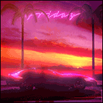
Kurieg posted:https://twitter.com/wwpublishing/status/959081102831955969
|
|
#
?
Feb 1, 2018 20:59
|
|


|
Kurieg posted:https://twitter.com/wwpublishing/status/959081102831955969 It looks like a promo for a wrestling event pre attitude era.
|
|
#
?
Feb 1, 2018 21:13
|
|
|
I guarantee that Swedish Dracula made at least 18 executive orders to change the logo to get it to look like that hell he probably designed the whole thing himself
|
|
#
?
Feb 1, 2018 21:13
|
|
|
Vitamin P posted:It looks like a promo for a wrestling event pre attitude era. Nah, that's exceedingly Attitude Era. Which is a pretty good description of the nuWW approach in general.
|
|
#
?
Feb 1, 2018 21:16
|
|
|
The W looks like it's made out of fangs and stakes. Like some dentist vampire hunter staked a vampire's fangs.
|
|
#
?
Feb 1, 2018 21:22
|
|

|
nofather posted:The W looks like it's made out of fangs and stakes. Like some dentist vampire hunter staked a vampire's fangs. The W is the W from the old Werewolf the Apocalypse Logo. It's supposed to be claw marks. 
|
|
#
?
Feb 1, 2018 21:25
|
|
|
RocknRollaAyatollah posted:White Wolf is getting back to the heart of its original fan base by being aggressively Deviant Art in its art design. Hey, that's not fair. Deviant's logo uses at most two fonts.
|
|
#
?
Feb 1, 2018 21:53
|
|
|
nofather posted:The W looks like it's made out of fangs and stakes. Like some dentist vampire hunter staked a vampire's fangs. Yeah, as someone who isn't the core demographic of "specifically like maybe half the people who played this game twenty years ago, maybe," that W looks like some vampire poo poo, not wolf poo poo. Also everything about this is hideous and hilarious. This is their big cool announcement. They have nothing except this, and it's terrible.
|
|
#
?
Feb 1, 2018 22:16
|
|

|
Remember their vampire logo that replaces the Q in Masquerade with an ankh?
|
|
#
?
Feb 1, 2018 22:25
|
|

|
So what do I get if they replace the "O" in acension with a pentacle?
|
|
#
?
Feb 1, 2018 22:27
|
|
|
Kurieg posted:It's supposed to be claw marks. I did figure that, with the whole 'Werewolf' part, it just looks like fangs. Maybe they had the same art people back then. Has much info about the video game been released?
|
|
#
?
Feb 1, 2018 22:43
|
|
|
nofather posted:I did figure that, with the whole 'Werewolf' part, it just looks like fangs. Maybe they had the same art people back then. It's literally the same letter from the old logo. quote:Inspiration for the new Werewolf logo has been drawn from protest signs, hardcore punk logos and a general vibe of violent resistance, combined with three classic Apocalypse images - the claw-mark, the savage �W� and the Garou glyph for �war�. nofather posted:Has much info about the video game been released? poo poo all!
|
|
#
?
Feb 1, 2018 22:46
|
|
|
Kurieg posted:So what do I get if they replace the "O" in acension with a pentacle? An increasing sense of melancholy?
|
|
#
?
Feb 1, 2018 22:49
|
|
|
Like, the game might not've even entered actual development yet for all we knew. They announced it before they had a single line of code.
|
|
#
?
Feb 1, 2018 22:50
|
|
|
ProfessorCirno posted:Like, the game might not've even entered actual development yet for all we knew. They announced it before they had a single line of code. Cyanide website claims 2018 release. http://www.cyanide-studio.com/werewolf So, you know.
|
|
#
?
Feb 1, 2018 22:58
|
|


|
ProfessorCirno posted:Like, the game might not've even entered actual development yet for all we knew. They announced it before they had a single line of code. Hey, that's S.O.P. for WoD games. If it's released in the next two years, I'd be surprised if it was any good. If it isn't, it's probably not coming. I'd be more interested in any of the oWoD or cWoD or whatever they're calling it if they were capable of not living in the 90s. Granted, the problem isn't that the theme is the 90s, it's that they've socially and politically never left it. I played a great (albeit short) game of requiem set in Miami in the 80s and it was awesome and a bit over the top. But it wasn't encumbered by game design principles or a focus on just being "a rebel". It was also self-aware, so these are all things that worked. It's like nuWW looks at all the things that work for game companies and then just do the opposite.
|
|
#
?
Feb 1, 2018 23:00
|
|
|
Kurieg posted:Oh I'm so sorry sir, I'll just fix that right up for you. it's beautiful
|
|
#
?
Feb 1, 2018 23:14
|
|
|
Kurieg posted:So what do I get if they replace the "O" in acension with a pentacle? Embarrassed?
|
|
#
?
Feb 1, 2018 23:25
|
|
|
Kurieg posted:It's literally the same letter from the old logo. Which I haven't spent twenty years fawning over, it's new to me. Is the W also the glyph for war?
|
|
#
?
Feb 1, 2018 23:28
|
|
|
nofather posted:Which I haven't spent twenty years fawning over, it's new to me. Is the W also the glyph for war? No, the "Swirly thing" replacing the O in Apocalypse is the glyph for the Beast of War, one of the heads of the Triatic Wyrm.
|
|
#
?
Feb 1, 2018 23:34
|
|
|
Vitamin P posted:It looks like a promo for a wrestling event pre attitude era. Wait a minute, this is the Stargazer's theme music! https://www.youtube.com/watch?v=DAZp_wbv0h4
|
|
#
?
Feb 2, 2018 00:13
|
|
|
I am reminded that one of the things I really liked in old Werewolf was that all the glyphs were drawn like they were made by claws. It's the good kind of 90s WW cheesy.Kurieg posted:So what do I get if they replace the "O" in acension with a pentacle? They won't do that, Brucato would be scared you'd turn the book upside down and become a Nephandus.
|
|
#
?
Feb 2, 2018 00:26
|
|

|
I dunno, that logo kind of gives me hope for the new line Mainly hope that when they release the new Gypsies, no one will know because its written in 73 different fonts.
|
|
#
?
Feb 2, 2018 02:02
|
|
|
And here's the Fianna wrestling entrance theme: https://www.youtube.com/watch?v=x-64CaD8GXw BAH GAWD, HE'S GOT A FAMILY!
|
|
#
?
Feb 2, 2018 02:27
|
|
|
Jesus christ. It's an eyesore, even more than the old logo was - and I hated the old one.
|
|
#
?
Feb 2, 2018 02:46
|
|
|
Desiden posted:I dunno, that logo kind of gives me hope for the new line I have good news for you  This computer does have the Stencil font. e: put up a better second attempt. Kurieg fucked around with this message at 03:15 on Feb 2, 2018 |
|
#
?
Feb 2, 2018 03:02
|
|
|
Kurieg posted:I have good news for you This is a joke right? Like I'm almost completely sure this is a joke, but with some of the recent...'decisions' made my NuWW recently I can't be completely certain.
|
|
#
?
Feb 2, 2018 04:00
|
|
|
hangedman1984 posted:This is a joke right? Like I'm almost completely sure this is a joke, but with some of the recent...'decisions' made my NuWW recently I can't be completely certain. This is completely 100% something that White Wolf made and they decided to reveal it here on our bad comedy forum. It's fake, I mean FFS I made the font out of smaller "Gypsy"s Kurieg fucked around with this message at 04:07 on Feb 2, 2018 |
|
#
?
Feb 2, 2018 04:05
|
|
|
It's no lie that SwedeDracula said he wants to redo the book and call it Opre Roma! though.
|
|
#
?
Feb 2, 2018 04:12
|
|
|
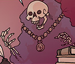
I spent way too long trying to figure out what letter the skull was meant to be.
|
|
#
?
Feb 2, 2018 04:29
|
|
|
A thought: Vampires should, rationally, (and we all know all vampires are super rational Ayn Randian supermen!) be extremely anti-Nuclear war. There is no reasonable estimate by which a nuclear conflict of any significant size does not extinguish between 50 and 95% of the human race, if not all life on earth, given the recent research on the firestorms (itself building on work in the 1980s) and the long term crop disruption that will result. No humans = no food. No food = cannibalism. A corrolary: the radicals of the Sabbat should, at all costs, attempt to trigger a nuclear war. Cannibalism is not taboo, and the extinction of advanced human society in no way conflicts ideologically with the party line and is in fact favourable to them on two grounds. It is much easier to control a malnourished and sickly population that can barely keep itself alive than an alert one with surplus energy; second, when the Antediluvians rise it is preferable that the available foodstocks for them be much diminished, and the mass cannibalistic frenzy will simultaneously strengthen the soldiers against them and limit their food supply when the megadeaths reawaken them. If it occurs during the two weeks to months of permanent night or so that will follow the war, so much the better. Torpor is not a desirable option in a situation in which food stock is extremely limited because of the excessive vulnerability of a torpid vampire to cannibal hunters; however, it may also be considered that the vast majority of known vampires reside either in Europe or North America, primarily in urban locales. While reasonably immune to radiation, the mass firestorms that will incinerate most urban targets pose an existential threat to cainites that far outweighs this immunity and will result in the death of the vast majority of known cainites. This further favours three groups of vampires: Sabbat radicals, the Giovanni, and the Gangrel and Ravnos lines. The first, if the war is instigated by them, will be prepared to weather the storms. The second, if they survive, will no longer lack the requisite souls for their great scheme. The third, by virtue of their comparatively decentralized population, will endure better and be better equipped to scavenge after the war on torpid survivors of other clans. Now, who's ready to make a game where nuclear disarmament is a crucial plinth for most elders jyhad plans and a core component of the Camarilla's kine agenda?
|
|
#
?
Feb 2, 2018 06:02
|
|
|
Kurieg you are absolutely friggin' killing it in this thread with those logos. A true hero to us all.
|
|
#
?
Feb 2, 2018 06:35
|
|

|
Lord_Hambrose posted:I had to really read the pledge levels to figure them out. Why did they have to make this so complicated it requires tagged Tiers and is still obtuse, what the hell
|
|
#
?
Feb 2, 2018 07:05
|
|

|

|
| # ? May 28, 2024 15:15 |
|
|
AmiYumi posted:I've read through it three times and I still can't figure it out. Does the "At-Cost PoD" mean that pledging the Hardcover tiers has a shipping cost but doesn't get you a physical book until you pay DriveThru RPG + another shipping cost? Or do you get a book sent to you, plus the ability to buy more books? They've done the at-cost PoD in previous Kickstarters, apparently because there is demand for it and they get requests, so somebody's interested in the at-cost PoD even if I don't perfectly follow why. If the tier you're looking at contains both a Core Book Hardcover and an At-Cost PoD, what that's saying is you're going to receive a traditionally printed hardcover using the Kickstarter shipping cost, and also you're given a coupon that shaves OPP's cut off the price of buying a print-on-demand hard copy from DrivethruRPG. I've gotten the hardcover tier before on other Kickstarters and just ignored the coupon and didn't bother with a PoD. The traditionally printed hardcover typically is of slightly higher quality than the PoD book, thicker pages, the cover might be silvered or textured or something, etc. The only strong ideas I have as to why you'd want the coupon are that a) the traditional printing arrangements are slower to make than uploading a PDF to Drivethru, so often there's a period where the PoD hard copy has been made available but the nice traditional-print hardcovers have not yet been shipped, and some people get impatient and have money to spare, and b) especially with the expensive deluxe editions in other Kickstarters besides this one, some people want a fancy collector's edition to keep intact on their shelf and a PoD hard copy they feel more comfortable wearing out, flipping through and using.
|
|
#
?
Feb 2, 2018 08:24
|
|