|
hope and vaseline posted:I'm seeing plenty of definition on my screen in the dark areas. Apologies, I guess my monitor sucks. 
|
|
|
|

|
| # ? May 30, 2024 15:26 |
|
Those areas are a little dark for me as well. The blue tones are great though.
|
|
|
|
It was on purpose that I left it like that, and why I didnt say anything. It was dark like that in real life, the rocks are black and behind a cliff, after sunset. I felt that brightening the rocks made the water look fake, but it was for real that colour. I'm planning on going back at sunrise one day, I'll try it again
|
|
|
|
joedevola posted:
The effect is like a procession of ghosts or demons, you could redo that effect in a war setting for potential brilliance, imo. Here's one I snapped today  Just a phone camera, never had money or training for better. Just would like a critique of my angle just a simple implication that even copying someone else's art can be distorted by our point of view, something like that. I was at the seattle art museum today and the Andrew Wyeth exhibit was pretty nice, I couldnt find a good thread to talk about it but it's worth seeing if you're in the area. 
got any sevens fucked around with this message at 02:52 on Nov 18, 2017 |
|
|
|
got any sevens posted:Here's one I snapped today Personally I would've tried to get the big white flash/light circle on the painting subject's face, because at least then it would be like The Thing's poster. It's centred and just has that "bad centered tourist vacation" vibe as a result. Maybe it would've been more effective for your message to take a picture of an interesting person taking a picture of the painting, ideally in an interesting way or with an interesting implement. A small child with a Fisher-Price camera comes to mind as a fun jab to make. Also not crazy how you got all the frame in the shot but clipped the lower left corner.
|
|
|
|
Thom12255 posted:I revisited the place a few weeks later and took this and I think it's better compositionally (the editing sucks as I forgot flux was one when I did it and wasn't too interested in doing it again.) Oh I think this turned out much better than the original. It really makes me want to be there to experience it. If it were my shot, I would have tried to keep the foreground tree on the right out of the shot but keep the one behind it in the photo to help frame.  Untitled by a a, on Flickr Untitled by a a, on FlickrWeird flea-market finds. I really wish I had tried this with a narrower aperture. Too much of the dress and her reaching hand are out of focus. I was fairly happy that I imagined what I think was a more interesting scene then a dead on document shot. This however has not been a hit with people that have seen it. My takeaway from that is that it needs more story. I remember seeing it in the view finder and getting a little rush. I think that is where some of my attachment to it comes from.
|
|
|
|
got any sevens posted:The effect is like a procession of ghosts or demons, you could redo that effect in a war setting for potential brilliance, imo. Pretty much agree with Kenny on this one, overall the composition doesn't seem deliberate enough - the lower left bit of the frame is clipped and you could probably crop a little bit of that empty space at the bottom, too. I do like the expression on the dude's face, though. It almost seems like he's reacting to it, but the angle's a bit off for that. murk posted:
The focus seems just a touch off here - it looks like her hair is the sharpest part and her features are a little soft, but it could just be a combination of the shine / material too, I can't quite tell. It is a little distracting having the farther part of the dress in really sharp focus (maybe even sharper than her hair?). I think for me the bigger issue is that you have a ton of lines leading the eye up and to the right - the corner of the box, the doll's hand, the direction of her eyes, and the intersection of the wall and ceiling behind it. It kinda guides my eye in that direction but obviously there's nothing there. Maybe some really light vignetting would help pull attention back to the center? I'm super new to this so that might be terrible advice. I like weird flea market stuff so the subject is totally fine to me. There isn't a ton of context to work with, though, that is true. The bits of dirt in the hair and the price tag are the only things that really help place it. Here's a couple shots I took at the Day of the Dead festival last month, pretty much the first pictures I've ever taken with an actual camera aside from some random objects in and around my home. I'm still learning how to edit in Lightroom too, so if anything sticks out as particularly egregious, please let me know.  
Grizzled Patriarch fucked around with this message at 19:45 on Nov 22, 2017 |
|
|
|
 Boat by dnalsid, on Flickr Boat by dnalsid, on FlickrWas at my buddies lake house and it has some old boats. The boats were interesting to look at in person but trying to take an interesting photo of them is harder. I also can't figure out proper white balancing. The boats are painted white so I sampled the paint and tweaked some sliders to get it to look good. Any critique on color would be useful, or suggestions for learning. Here the sun is shining on the trees to the left and the boat in the back which is a bit distracting to me but I'm not sure if that's the same for someone looking at the pic for the first time. I was also messing about with longer exposures here for the first time.
|
|
|
|
I think the problem here isn't white balance, but light. Your light is pretty flat in the scene, you don't have a lot of dynamic range and, while the boat is clearly the subject of the photo, the shed behind it has the stronger lighting. The scene itself is fine although I'd probably crop it in a little to lose that tree right up against the left border, but it would be a lot better if the light was highlighting the subject rather than random bits of background. There's probably a time of day in the very early morning or the late evening when the woods are fairly dark but you have some nice golden light coming through. If you can find a time/location that puts some of that light on the boat, then you will have a much better photo.
|
|
|
|
 Kids by roland luijken, on Flickr Kids by roland luijken, on FlickrI shot this picture on the birthday of my daughter. I use gimp as editing software. Any tips.
|
|
|
|
The lighting is nice. The first thing that I noticed was the lack of any space above the girl's head. It looks a bit too cramped on top. I don't know if you cropped it down or if that's the composition as shot but, if you can, I would definitely open it up a bit. The slightly off-centre composition might not be to everyone's taste but it mostly works I think. The boy is on the right hand line of thirds which tends to give him a bit more weight in the photo, but he has his back to us while the girl is a much more obvious subject. If there was a shot without the boy or if he was facing us on the other side of the horse, I think the composition would be stronger. The kids are yours so the photo has a lot more emotional power to you than it does to random internet strangers. As such, the thing that makes the picture really speak to me is a story or a narrative within the shot, and there isn't one. There's no interaction between the boy and the horse or the boy and the girl. A nicely lit picture of a child on a horse can tell its own story, but the boy's presence weakens that because I am automatically looking for a way that the elements of the photo inter-relate. It is a beautifully lit photo and I have no arguments with your editing choices apart from the crop, but it's basically a beautifully lit snapshot rather than a considered image.
|
|
|
|
Helen Highwater posted:The first thing that I noticed was the lack of any space above the girl's head.
|
|
|
|
It's a pretty good family photo wall picture. Would be better without the boy blocking off the horse's head. Desaturating his jacket might help. The tightness on the top isn't perfect but I don't think it's bad enough to sweat over.
|
|
|
|
If you look at it how you'd examine a painted portraiture from ~1500-1700 I think you'd find the subject being in the centre (Christ) places them in a powerful position in the piece while the other figure has their presence limited to a subjugated role due to the lack of face as well as being below the central subject. The five buttons on the subject's vest in cross form are classical of the early renaissance/late medieval period representations. The 6 horizontal stripes on the boys jacket hood represent one stripe for each paired apostle, further demonstrating the diminished grandeur of this secondary subject. A good photo.
|
|
|
|
VelociBacon posted:If you look at it how you'd examine a painted portraiture from ~1500-1700 I think you'd find the subject being in the centre (Christ) places them in a powerful position in the piece while the other figure has their presence limited to a subjugated role due to the lack of face as well as being below the central subject. The five buttons on the subject's vest in cross form are classical of the early renaissance/late medieval period representations. The 6 horizontal stripes on the boys jacket hood represent one stripe for each paired apostle, further demonstrating the diminished grandeur of this secondary subject. A good photo.
|
|
|
|
I will remember to add more space in the next set of pictures. Also desaturation the jacket I would never thought about that. And yes this is my daughter and the composition is made in a 'fathers look'. If my daughter is Christ in this picture I would be..... Thanks all for your remarks.
|
|
|
|
 Sunday afternoon at the dining room table by President Beep, on Flickr In general, I like this picture, especially since it's one of the first ones I took with my nifty fifty (practically my only prime). Two things that I think stand out though: As with the cool picture of the kids and the horse posted above (that lighting is indeed awesome), I think I should've left more space on top of the subject's head. Also, maybe it's just me, but it seems as though the highlights could stand to be turned down a bit and the shadows lifted. I shot this in JPEG, so I haven't done any tweaking in LR yet.
|
|
|
|
President Beep posted:
Top of the head doesn�t matter as much with a shoulders up portrait. This is because with the horse one there was a lot to look at and focusing on the head ends high in the frame as they shot it. With shoulders up often you are using the eyebrows at or above the top horizontal rule of thirds line and the top of the head is more to frame the face than something that needs to be considered in the composition. Those rules can all be broken of course. I was going to download the picture to crop to show what I am trying to say since it is easier to see than to two about but can�t with it on flickr so I hope that makes sense.
|
|
|
|
rio posted:Top of the head doesn�t matter as much with a shoulders up portrait. This is because with the horse one there was a lot to look at and focusing on the head ends high in the frame as they shot it. With shoulders up often you are using the eyebrows at or above the top horizontal rule of thirds line and the top of the head is more to frame the face than something that needs to be considered in the composition. Those rules can all be broken of course. I was going to download the picture to crop to show what I am trying to say since it is easier to see than to two about but can�t with it on flickr so I hope that makes sense. No worries. That definitely makes sense. Come to think of it, I do recall seeing a fair few portraits where the top of the head is actually cut off a bit, but the brow line is still well within frame. It�s kind one of those things that you notice a thousand times but it doesn�t really click until someone explicitly points it out. Thanks!
|
|
|
|
Never done anything resembling product photography, so after filtering through a dozen superficial and lovely tutorials I decided to just try it out and fish for feedback on what I'm doing wrong.  Benny's Monster Truck by xzzy77, on Flickr My concerns are: a) Rule of thumb regarding aperture. Is some softness a cool creative tool or do I want it all sharp? b) Lighting. I'm using some 60w bulbs and a couple clamp lamps I got at home depot. How far away from decently lit am I? c) Shadows. Most shots seem to eliminate shadows but I think I kind of like them. Again: what's the rule of thumb? d) Backdrop. The one I have has a slightly shiny side, and a felt side. Correct to assume this controls fuzzy/soft shadows? What's "best?" (also how the gently caress do I get wrinkles out of the drape) I don't really intend to turn this into a "thing" I do anywhere remotely close to professional, but it would be nice to have the basic technique sorted out. Also, I need better assistants: https://i.imgur.com/r2mjxEj.jpg
|
|
|
|
xzzy posted:Never done anything resembling product photography, so after filtering through a dozen superficial and lovely tutorials I decided to just try it out and fish for feedback on what I'm doing wrong. Regarding point c, I don't think the shadows detract much from the picture. In fact, I kind of like them. Since their edges are pretty soft are they're generally diffused, they don't seem to be competing for attention/obscuring the lines and shape of the subject. As a counterexample, I have seen pictures before with very sharp and uniformly dark shadows that totally ruined the subject by essentially changing its shape, if that makes sense.
|
|
|
|
You might enjoy this video about product photography if that's your thing. I think it scared me off ever trying, mind. https://www.youtube.com/watch?v=JHRaEzJd4iM
|
|
|
|
That dude owns, he's like the bob ross of photoshop. Instead of happy trees it's "getting rid of junk".
|
|
|
|
xzzy posted:a) Rule of thumb regarding aperture. Is some softness a cool creative tool or do I want it all sharp? A: Generally (and especially for small objects), most product photography has the whole item in focus. This might require focus stacking to achieve. B: Looks fine but maybe a bit of a low powered fill flash or ringlight to pull out the shadows a bit would help. C: On hard, angular objects like Lego, heavy shadows can change the shape of the item as pointed out above. Shadows can be cool if you are going for a darker 'sophisticated' look on a dark background. On white though they usually look like you hosed up the lighting. D: The fuzzy side will soak light, the shiny side will reflect it. If you're shooting against a white background, overexposing it will kill any detail and you therefore won't see wrinkles. I shoot the camera pictures on my blog against a folded white tablecloth draped over and around an armchair. There are creases and wrinkles everywhere but you can't see them because the background is blown out (the item is properly exposed though). Shine a light on the backdrop or cheese it in post with the white point.
|
|
|
|
I've been toying with this image for years now, every once in a while going back to try a different crop or adjustment. I think I'm finally happy with it, but I've also lost perspective and would appreciate any criticisms. President Beep posted:
xzzy posted:Never done anything resembling product photography, so after filtering through a dozen superficial and lovely tutorials I decided to just try it out and fish for feedback on what I'm doing wrong.
|
|
|
|
InternetJunky posted:
Good stuff. Thanks for the advice! e: Did a quick crop. I do kind of like it without the chair. 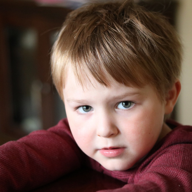 Sunday afternoon at the dining room table by President Beep, on Flickr President Beep fucked around with this message at 16:13 on Dec 26, 2017 |
|
|
|
 I�m having some trouble with this sunburst pic I took earlier today. Even after massaging in post, the sunlight still seems to be overwhelming stuff in the foreground. Any general adjustment recommendations for this scenario? The resolution has also suffered, but this is one hell of a crop, so I don�t think that can be helped. Poor lens selection/composition on my part. e: I should probably clarify. When I mentioned the sunlight issues, I meant aside from the sunburst. President Beep fucked around with this message at 01:48 on Jan 21, 2018 |
|
|
|
President Beep posted:
Unless you bracket I don�t think you have much of a choice regarding the balance between the sun and the foreground. You could raise the exposure of the foreground but it would probably start looking unnatural.
|
|
|
|
rio posted:Unless you bracket I dont think you have much of a choice regarding the balance between the sun and the foreground. You could raise the exposure of the foreground but it would probably start looking unnatural. I figured I'd pretty much put myself in a corner here. I did try fiddling with exposure, and yeah, it gets wonky(er).
|
|
|
|
xzzy posted:Never done anything resembling product photography, so after filtering through a dozen superficial and lovely tutorials I decided to just try it out and fish for feedback on what I'm doing wrong. I've done a fair bit of this myself in a studio setting, my best results were had with two 300w strobes, with softboxes, on either side of the product, if not slightly in front and angled toward the subject. For the background I used a high thread count white cotton sheet of fabric, held up behind the subject with a backdrop frame, then pinned at the rear edge of the product stand to create an infinite background. Underneath that I had a small 100w strobe angled up to kill any shadows (this was dialled back a hell of a lot). As for camera settings and lens, I shot at 70mm, f13, 1\125s. End result was sharp and evenly lit. For your current setup though, it is definitely usable. The only glaring issue I can see is the reflections from the glossy surfaces, and a circular polariser will fix that no troubles. Also try ironing the sheet that the product sits on so it lays perfectly flat on the stand.
|
|
|
|
   I'm too attached to these photos. I know everyone in these pictures, and people I know that see them love the shots for the same reason. Family will tell you a blurry piece of poo poo is beautiful because their kid is in it. There are things I wish were different- First photo: the snowflake on her lip and above her brow. I have a strong urge to edit that flake on her lip out, because i really love this picture. Second: I wish that the bottom of the sled was in focus. It's almost like he''s on top of a fruit roll-up. Third: That goddamn broom. It would, also, have been better if I was on an even plane with them. You can still tell I'm taking the picture from a higher angle. I think I went heavy on the clarity in post. I hit the vignette slider, too. Thoughts? its all nice on rice fucked around with this message at 10:10 on Feb 25, 2018 |
|
|
|
I think these are just family photos and the second is the best one. the other two don't do anything for me, as someone who doesn't know the subjects. they also all seem a bit dark but I am on my phone. the vignetting is too heavy IMO, which doesn't help.
|
|
|
|
Agreed about the vignetting - that was my first thought. There�s a fine line of what looks good and this is pretty far past that line. Basically if you can see the shape of the vignetting then it is too much. Of course heavy vignetting can work sometimes but anything can work if it is good and that is just a guideline. An image shouldn�t really need vignetting anyway. Regarding the shits themselves they look like snapshots and as if there isn�t much thought about composition or making an image or thinking about much, just snapping a shot (hence the name). Not trying to be discouraging though, keep doing it! And just because they are snapshots doesn�t diminish their worth to you and the people you know. Normal people don�t care about composition if their kids are in the photos and/or if they are in the photo and think they look good. Actually making a good image by thinking about composition, changing angles to actually choose your background and learning from experience (and critiques from people who don�t exist in hug boxes like Flickr) is something people might appreciate if they see that kind of image vs. someone who snapped a shot with their cellphone but really no one cares and you can see that in the photos of the �professional� family photographers who have their first dslr, the their friends that they are now professionals, call themselves �Precious Moments Photography� and get hired by all of their friends. But hey, more power to them if they are making money because the vast majority of good photographers aren�t since everyone is a photographer these days. I know this thread isn�t super active but if you want any more advise feel free to post away. I owe this thread a lot since it was active back when I started and a large part of how I shoot now was because of the critiques here so although I might not be here often I will always try to contribute with advice. Oh regarding the snowflakes I don�t think you need to edit them out in this case. If you were putting this up on a wall, printed large, or having someone pay you the yes I�d get all into that but spend your time shooting rather than working on that kind of post processing for now. Try to get it all right in camera too and set a burst of at least three images if you are in a situation like this so that if one shot has a passing snowflake in a spot you don�t like then you will have at least two others to choose from.
|
|
|
|
I'm real self conscious about my work and rarely post here but it's 3AM so gently caress it. I went down to the local protest march today (yesterday?) and snapped some photos. My first time doing what I guess could be considered street/documentary photography, so I didn't have high expectations but I feel like I got at least two good shots from it.  This is one of the first frames I took of the day. I feel I could've improved on it some if I moved in closer to her and gotten a bit lower in order to get more of the feeling of defiance I wanted to (and hopefully did, to some extent) portray in the picture. Also if possible I would have tried to hide the face of the woman in the lower right because I feel it's distracting.  I super enjoy the action in this one, but I wish I had added narrowed the aperture one or two clicks just to bring the second row of people into the focus plane, or swapped to a wider lens and gotten closer. Also on both, I've been experimenting a bit with split toning and the only real color I personally can find that works better than no split toning at all is that quasi-sepia. I dunno if that's just because it's pleasing to my eye or other colors are for moods I don't usually try to convey in my shots, so if anyone has any advice on that I'd appreciate it Spaced God fucked around with this message at 09:51 on Mar 25, 2018 |
|
|
|
What is the sepia tone adding to the photos? It's a weird choice for contemporary photos. If the colours are distracting from the image, why not simply convert to B&W? The composition in the first one is strong. It shouldn't be hard to clone out the lady in the bottom corner. The second one is a bit more generic and I'm not seeing why it's a keeper to be honest. Regarding split toning, the trick is to stay way the gently caress at the bottom of the colour picker. Unless you are correcting a heavy colour cast - like from stage lighting or something - you will want to stay within a few pixels of the bottom edge (assuming the use of the colour picker tool in Lr).
|
|
|
|
That was my first thought too - there�s not usually any good reason that sepia will be stronger than a good black and white conversion.
|
|
|
|
I really wouldn�t second guess the composition in the first one. I get what you were hoping to capture, but compared to how the shot actually turned out, a more dramatic, �defiant� angle may have come off as a little too on-the-nose. As captured the subject looks more human (and sad, and a little bit defiant) as opposed to monolithic and impersonal. I like it.
|
|
|
|
This is a great photo - the composition is structured well, and it's definitely a decisive moment. A trick I like to test out in lightroom when color can play a significant role in the effectiveness of a photo is to edit the tones in black and white & then switch back to color. It sometimes makes finding the color balance easier to correct as well if you've been playing with contrast. - Here is some work I was fortunate enough to get selected in a group show  
|
|
|
|
Helen Highwater posted:It shouldn't be hard to clone out the lady in the bottom corner. I wouldn't recommend editing the content of the image in documentary style photography
|
|
|
|
|
| # ? May 30, 2024 15:26 |
|
Fart Amplifier posted:I wouldn't recommend editing the content of the image in documentary style photography 
|
|
|


