


|
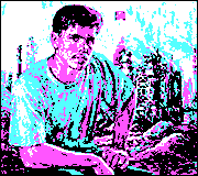
Was that photo edited? Wikipedia says the photographer got a lot of info about the family wrong, but nothing about the image itself being edited.
|
 #
?
Apr 12, 2018 14:29
#
?
Apr 12, 2018 14:29
|
|


|

|
| # ? May 31, 2024 02:40 |
|
|
Wafflecopper posted:Was that photo edited? Wikipedia says the photographer got a lot of info about the family wrong, but nothing about the image itself being edited. Look at the ghost thumb in the lower right.
|
|
#
?
Apr 12, 2018 15:51
|
|

|
xzzy posted:Look at the ghost thumb in the lower right. I�m sittin� down here in the computer light, Lookin� at the thumb of Tom Joad...
|
|
#
?
Apr 12, 2018 16:32
|
|


|
shoulders in focus instead of face 2/10
|
|
#
?
Apr 13, 2018 19:48
|
|

|
Magic Hate Ball posted:shoulders in focus instead of face 2/10 Two of the people aren�t even looking at the camera. What garbage. 
|
|
#
?
Apr 13, 2018 20:06
|
|
|
the missed focus on that shot always bothered me more than anything but if any photo gets a pass it would probably be that one.
|
|
#
?
Apr 13, 2018 20:08
|
|
|
Some of it is bad conversion, if you dig up the originals on the LOC website the sharpness is better. http://www.loc.gov/pictures/item/2017762891/ Photographer definitely missed focus, but if you pixel peep it got worse on prints made after THE THUMB was edited.
|
|
#
?
Apr 13, 2018 21:27
|
|
|
These are awesome, I love the composition on both. Did you try pure B&W before sepia? The difference really stands out when people are posting the Pea Pickers photo on the same page as yours. For whatever it's worth, I like the slightly shallower depth of field in the second image. I think it draws the eye to the woman in the front, and the rest of the protest follows. I haven't posted in this thread in ages, so here are a couple of mine:  For this one I liked the contrast between the gray and angular surroundings and the bright circular logo. I went to a really small aperture to try and keep some detail on the rain, and I'm pretty happy with how that worked.  This is an older picture of mine that I went back and played with a bit. I'm happy with the sky, but I feel like the foreground might be brightened a bit too much. I was really trying to avoid making it look like a HDR picture but it is an environment with a huge range. If anything I reduced the dynamic range in editing by darkening the background and brightening the foreground, but it still looks a little artificial. I like it, but I'm not quite happy with it yet. DeadlyMuffin fucked around with this message at 23:17 on Apr 13, 2018 |
|
#
?
Apr 13, 2018 23:14
|
|


|
I don't come to the dorkroom often and my camera was collecting dust after I was done traveling. I don't have much to say about anyone else's work yet so I'll critique what I'm posting today and go from there. I took pictures of flowers to get more acquainted with my camera and lenses. I want to isolate flowers from the background but I'm missing my focus a lot and my aperture might be too open. I noticed the wind was pushing the flowers around a lot, which made is pretty hard to nail anything with such a shallow DoF. If anyone has flower tips, please share them! I wanted to fill the whole frame with flowers here, but it comes off as a little too busy.  I like this one, I wanted to isolate the tulip from the green background and focus on it's shape.  Focus is all fuckered up and I should have composed it in a way to make the background more uniform. 
Elderbean fucked around with this message at 04:03 on Apr 27, 2018 |
|
#
?
Apr 27, 2018 04:01
|
|


|
Flowers are fun to practice with, but nobody is going to give a poo poo unless they�re groundbreaking.
|
|
#
?
Apr 27, 2018 06:51
|
|


|
You would be surprised at how many people loving love blossom and close ups of flowers or leaves with lots of pretty bokah swirls behind them. This was me simply documenting my first blossom in my new garden.  First cherry blossom by learnin curve, on Flickr First cherry blossom by learnin curve, on Flickr92.6 pulse on 500px at one point. elderbean With that second picture you should know that tulips are an absolute bitch to photograph well. if you search for tulip on Flickr you can see that the successful photographs use the sunlight first and foremost. Once you work out how light works and it�s relationship with aperture, shutter speed, iso, and depth of field then your photography will improve massively. This isn�t me being a dick but get hold of photography for dummies, it has simple practical tutorials in there that will teach you far quicker than the internet can.
|
|
#
?
Apr 27, 2018 18:12
|
|


|
One thing to keep in mind is that with mundane beautiful things like flower photos require good composition beyond almost everything else to be interesting. Otherwise they are just snapshots. And even with good composition someone has likely done it already and done it better. I don�t mean that to be discouraging because it is a nice challenge to try to take interesting photos of those mundane beautiful things to try to make them novel but the first priority is composition and treating the photo like almost an abstract photo.
|
|
#
?
Apr 27, 2018 18:22
|
|

|
The right lens is absolutely essential, I took that photo with a Nikon 85mm 1.8 which is a glorious fabulous and rather expensive lens and it�s no bloody good for flowers as the minimum focusing distance is too far away. You need a fast lens with a wide aperture that you can get in close with and does not weigh a ton. I like using a a light cheap Sony camera (have image stabilisation in the body) with old Minolta beercan lenses for my garden stuff. Disclaimer; I�m not claiming to be the best ever flower photographer but I�ve taken enough poo poo shots to know why they are poo poo. Minolta (Sony mount) 100-300mm F4.5-5.6 cost �40 and is far more suitable.  9401206395_c4f32c3d8d_o by learnin curve, on Flickr 9401206395_c4f32c3d8d_o by learnin curve, on Flickr
|
|
#
?
Apr 27, 2018 18:37
|
|
|
This photographer takes ordinary garden flowers and makes photographs of them super-stylized with a huge amount of bokeh and color. The photographer was featured on a BBC garden show the other day. https://www.leavesnbloom.com/portfolio   
Thom12255 fucked around with this message at 01:30 on Apr 28, 2018 |
|
#
?
Apr 27, 2018 19:16
|
|
|
Those look like fake pictures from The Sims.
|
|
#
?
Apr 27, 2018 21:39
|
|
|
Always wondered where those came from.
Thom12255 fucked around with this message at 01:12 on Apr 28, 2018 |
|
#
?
Apr 28, 2018 01:06
|
|
|
Yes but did he bait that ladybug?
|
|
#
?
Apr 28, 2018 04:54
|
|
|
Fake ladybug. Focus issues aside Clematis flowers are quite big so if it�s real then it�s the biggest ladybug I�ve ever seen.
|
|
#
?
Apr 28, 2018 08:45
|
|
|
learnincurve posted:Fake ladybug. It's probably an Australian ladybug. That eats crocodiles.
|
|
#
?
Apr 28, 2018 09:26
|
|
|
 Kalmthoutse heide by roland luijken, on Flickr Kalmthoutse heide by roland luijken, on FlickrI love old lenses. This one was shot with a Super-Takumar 1:1.8/55
|
|
#
?
Apr 30, 2018 10:26
|
|

|
I wish I knew what I was looking for with old lenses for my Nikon d7000. I'm pretty sure it'll take any AF lense.. I would want to add focus screen for anything that's manual.
tater_salad fucked around with this message at 18:03 on Apr 30, 2018 |
|
#
?
Apr 30, 2018 17:57
|
|


|
Orions Lord posted:
I thought the bokeh looked familiar even before I saw your text. I haven�t used mine for ages but when I was first getting into mirrorless like 6 years ago I used it - this is one of the only images I have online with it. The bokeh is so harsh but it�s kind of cool 
|
|
#
?
May 1, 2018 02:16
|
|
|
When I saw the photo's of this person https://www.flickr.com/people/120117087@N08/ I was sold on old lenses. Orions Lord fucked around with this message at 13:56 on May 1, 2018 |
|
#
?
May 1, 2018 13:54
|
|
|
 Fort van Ertbrand by roland luijken, on Flickr Fort van Ertbrand by roland luijken, on FlickrFort van Ertbrand in Kapellen. After god knows how many years the opened is for public just for one day.
|
|
#
?
May 20, 2018 18:45
|
|
|
 My friend let me run around in her store. I kept this one because it brought up memories of being in a store as a child, hiding out of boredom. I purposely cropped it tight so it would feel cramped like another shirt on the rack. All the clothes in the middle distance are not colorful or interesting, which is made worse by the plastic muting things to begin with. I am also still playing with it to try and make the plastic seem less blurry in general.  I was drawn to all the different geometry on display here. Combined with those two goofy spouts in the foreground, this photo is cartoon-ish, but in the real world. The pipes and rain gutters in the top of the center frame seem to hint at an elaborate system of connected tubes that continue into the distance. I am pleased with this photo.
|
|
#
?
May 23, 2018 21:21
|
|
|
You're right on the first picture. Having more in the clothes on the rack would help. The plastic and mix of clothes also breaks up any uniformity that could have made an interesting physical pattern / texture in the absence of interesting colors / prints. The leaves in the foreground on the second photo break up what makes that spot work as a subject. I'm not sure how close those are to the building but consider shooting around them to remove the distraction. The trees in the background are less distracting (and possibly harder to frame out) but try to eliminate anything from your shot that doesn't contribute to your vision for the photo.
|
|
#
?
May 24, 2018 14:33
|
|


|
Sleepytime posted:consider shooting around them to remove the distraction.
|
|
#
?
May 25, 2018 06:03
|
|
|
My first go at showing photos I took. All taken from a cell phone. I'm excited to have a better platform soon. Some of these are pretty cool, according to yours truly. https://imgur.com/a/VsFCOCW I'm looking for feedback, maybe on a different kind of focus. I throw it out there as a sample of the stuff I tend to appreciate, and thus the stuff I'll prob shoot going forward, so I might as well better understand how to approach that. Cannon_Fodder fucked around with this message at 19:25 on May 30, 2018 |
|
#
?
May 30, 2018 19:11
|
|

|
I'm extremely new to photography, so I'm not comfortable critiquing others' work yet. Next time I'll add my heavily qualified opinion on someone else's work, but I'm hoping to get some feedback on a couple of my own photos. Memorial Bridge with Boat by candowilldo, on Flickr Memorial Bridge with Boat by candowilldo, on FlickrFor this one, I really loved the arches of the bridge combined with the building on the hill. It reminded me of some landscape portraits that I've seen. I took some pictures, went out and took some different shots from the bridge, and then I came back to make sure I got it. While I did, that yellow-roofed boat came cruising up the river, and it struck me as a good way to populate the vacant right half of the picture. Even if it's not terribly photogenic, it adds life to the composition, and if it's not glamorous, it is at least authentic. Despite the centered river bank, I shot this with the rule of thirds in mind, which I think helps the composition. I will say that the photo is a little blurrier/hazier than I thought it would be, and I think it would be a better shot with different weather/sky. Sunrise, especially, could be good, since the shot is taken facing west.  Kayak Rental by candowilldo, on Flickr Kayak Rental by candowilldo, on FlickrYesterday was overcast and gray all day here, so when I stumbled across the bright colors and interesting texture of these kayaks, I jumped at the opportunity. I also like how the scene is generally posed; if I had to place the departing kayaks myself, I wouldn't have done it any differently. I liked the people on the dock, as well: three of them are having a conversation (safety briefing?), another is being helped into a kayak, and together with the departing kayakers, you have the whole sequence playing out. I'm not sure I noticed that at the time, but I was very pleased after the fact. One obvious error is that the shot is just a little bit too low, as evidenced by the decapitated woman in the top right and the chopped-off bow of the red kayak. Being mindful of the periphery is one thing (among many) I need to work on. If the shutter speed were a touch faster, I might have been able to get the tips of the paddles a little less blurry, too. I'm also not sure I got the color/exposure right in post-processing; the original is a little brighter and less saturated. The overall effect of the edited vs the original is more brown, less gray.
|
|
#
?
Jun 3, 2018 15:21
|
|


|
Cannon_Fodder posted:My first go at showing photos I took. Composition is king so you�ll want to start studying it. It�s not a rule you have to stick to in the long run but understanding and being able to implement the rule of thirds is important. The picture with the people cut off on the left side of the frame is a good example. Anything that is in the frame should be justifiable so when you have some element like that hanging off the side of the frame it automatically makes the photo a snapshot, like an afterthought rather than a thought out photo. You are basically creating an image as a photographer vs. hitting the shutter button at something you think looks cool - that is the distinction between snapshots, which is the majority of what you see nowadays since everyone has a cell phone and photographers who carefully consider what they are doing and study how to get better. This is not a knock by the way - just something to think about if you want to improve. Keeping a level horizon is also an important part of creating an image. Unless you have a distinct reason to tilt the frame (you usually won�t) then the horizon should be level and not crooked. A little more to the technical side, you�ll want to watch out for blown highlights. This is where bright spots appear bright white and is where the camera�s dynamic range runs out. You can see that prominently in the sky in one of your photos. You can recover those blown highlights in post processing sometimes, more so if you shoot raw, but learning to see and identify them is a good first step. Most of the can be accomplished with a cell phone. Often people think �when I get a better camera I will get better�. That might be true but only if you put in the time to study what you�re doing. A better camera will give you more options but will not inherently make your photos better. The good news is that if you like photography then learning about it is really fun! Wherever you show photos for critique expect some harsh criticism at first. Many people lose motivation when they are emotionally attached to an image and someone tears it down from a tech idea perspective so try not to get too attached to your shots. You might want to get the book �Understanding Exposure� as it is a good starting point. Good luck!
|
|
#
?
Jun 3, 2018 16:24
|
|
|
Warheart525 posted:
I'm also really new so take my critique with a grain of salt. I like how the yellow roof stands out in the first picture, but the bridge feels a little distracting to me. I like the colors on the second one, but the composition on it doesn't really gel with me. Not quite sure why? I think those trees on the right kinda take me out of it. I posted this in the contest thread but would like some critique on it. Was taken with my phone kind of on a whim. I thought it fit with the theme of the contest so I figured hey, why not post it. 
|
|
#
?
Jun 4, 2018 01:17
|
|


|
CodfishCartographer posted:I'm also really new so take my critique with a grain of salt. I like how the yellow roof stands out in the first picture, but the bridge feels a little distracting to me. I like the colors on the second one, but the composition on it doesn't really gel with me. Not quite sure why? I think those trees on the right kinda take me out of it. I like the composition (would prefer no plane) but what is up with these artifacts?    
|
|
#
?
Jun 4, 2018 04:45
|
|

|
It was actually taken through a window while I was at work, and those were some smudges on said window  I need to go get rid of them in photoshop, but figured I could still get some feedback on the shot despite them. (I know I should have done that before submitting to the monthly contest, but I took it on the last day and just didn't have time) I need to go get rid of them in photoshop, but figured I could still get some feedback on the shot despite them. (I know I should have done that before submitting to the monthly contest, but I took it on the last day and just didn't have time)
|
|
#
?
Jun 4, 2018 05:47
|
|
|
 Kalmthoutse heide by roland luijken, on Flickr Kalmthoutse heide by roland luijken, on FlickrI hate mosquitos maybe I should swap to urban photography...
|
|
#
?
Jun 4, 2018 10:40
|
|
|
rio posted:Composition is king so you�ll want to start studying it. It�s not a rule you have to stick to in the long run but understanding and being able to implement the rule of thirds is important. The picture with the people cut off on the left side of the frame is a good example. Anything that is in the frame should be justifiable so when you have some element like that hanging off the side of the frame it automatically makes the photo a snapshot, like an afterthought rather than a thought out photo. You are basically creating an image as a photographer vs. hitting the shutter button at something you think looks cool - that is the distinction between snapshots, which is the majority of what you see nowadays since everyone has a cell phone and photographers who carefully consider what they are doing and study how to get better. This is not a knock by the way - just something to think about if you want to improve. This is valuable, thank you very much. I'll keep clicking away.
|
|
#
?
Jun 4, 2018 14:14
|
|
|
It's kind of sad that this thread is so dead because it almost feels like this is the one place on the internet where people will actually give decent feedback on an image.Orions Lord posted:
I'd love to hear any critiques about this image in general, but especially about the processing. The original was shot into the wind on a very rainy day, so my lens was covered in water leading to a very washed out final image. Switching to B&W seemed to be the only way I could add some contrast back into the bear without making the colours ridiculous. 
|
|
#
?
Jun 25, 2018 15:31
|
|

|
InternetJunky posted:I'd love to hear any critiques about this image in general, but especially about the processing. The original was shot into the wind on a very rainy day, so my lens was covered in water leading to a very washed out final image. Switching to B&W seemed to be the only way I could add some contrast back into the bear without making the colours ridiculous. I�m not really sure how to suggest how to improve this image, but I will say I really love it. I like the detail on the bear, and the rain (snow?) falling. The dirt detail is great too! Maybe some of the stuff along the bottom of the frame along the ground is a little distracting? But there�s not much you can do about that. Anyways, to help give this thread more content, I posted these in other threads, but would like some critique on them:  IMG_20180615_210229 by Cody P, on Flickr IMG_20180615_210229 by Cody P, on Flickr IMG_20180617_162815_2 by Cody P, on Flickr IMG_20180617_162815_2 by Cody P, on Flickr IMG_20180607_162821 by Cody P, on Flickr IMG_20180607_162821 by Cody P, on Flickr
|
|
#
?
Jun 26, 2018 16:13
|
|
|
InternetJunky posted:It's kind of sad that this thread is so dead because it almost feels like this is the one place on the internet where people will actually give decent feedback on an image. Thanks for the feedback, I will do my best to get that kind of stuff out next time.
|
|
#
?
Jun 27, 2018 10:22
|
|
|
CodfishCartographer posted:
I realize a bit late, but it might be a good idea to critique my own stuff! 1: I was trying to get a feeling of something old and forgotten. Everything in that building looked like it was placed there in the 90s and then never moved, and I liked the light shining down in that area whereas the rest of the building was dark. I upped the contrast to try to really drive home that feeling of loneliness, like being the only person left in an empty office and wondering why you�re bothering. The image looks a bit crooked, but I can�t quite figure out a rotation that makes me happy with it - something always looks wrong 2: I really liked the textures with this, and kinda tried to go for something a bit abstract. When I first zoomed in this far, I couldn�t really tell what the letters were supposed to be. I liked the shadows and the contrast they provide, but a few parts feel a bit out of focus. 3: I took this one while sitting in traffic so it�s a teensy bit low-effort, but I liked the lines made by the buildings and the power cables. Since it was a bit of an impulse shot I�m not entirely sure what exactly I specifically liked about it at the time, it was more of a gut feeling. I also really like how the shadows between some of the buildings merge with the traffic lights, but that was a happy accident more than anything else.
|
|
#
?
Jun 27, 2018 17:07
|
|
|

|
| # ? May 31, 2024 02:40 |
|
|
I'm new here and to photography in general, but here's my hopefully non-terrible critiques and photos:CodfishCartographer posted:
This one's just kind of... boring? It's hard to make out much detail inside the building, so mostly it just looks like a closed, slightly run down office. The powerlines against the trees in the background are also pretty distracting once I noticed them. I think maybe a more straight-on shot would let you bring more focus to what you're trying to show, the kinda weird geometry and angles this shot has are more distracting than they are interesting. CodfishCartographer posted:
This one seems overly cropped or slightly out of focus - there's too much noise to really pick out the details of the texture. The uneven space to the left and right of the frame also bugs me a bit, it looks a bit off center and not intentionally. I like the overall idea though. CodfishCartographer posted:
I like how the more horizontal power line lines up with the line of the clouds, not sure if that's intentional or not but it looks nice. Composition wise, the tree and vertical striped building at the bottom are distracting to me - the streetlight on the left is also unfortunate.  DSC00491 by Ryan A\, on Flickr DSC00491 by Ryan A\, on FlickrI like the almost-symmetry in this one. I wish I had been able to capture the bottom of the door and steps since it feels a little truncated, but there was a parking meter in the way.  DSC00485 by Ryan A, on Flickr DSC00485 by Ryan A, on FlickrWhat grabbed my eye here was the difference between the brand new construction up top and the bare concrete/boarded up lower. I'm not sure the ratio between the two is right though. I tried cropping tighter but it wound up feeling really cramped.  DSC00427 by Ryan A, on Flickr DSC00427 by Ryan A, on FlickrI'm not quite sure why I like this one so much - the hull paint looks almost like an oil painting, so I think having the sharp TUG and perfect circle below it gives some nice contract. DarthRoblox fucked around with this message at 18:58 on Jul 1, 2018 |
|
#
?
Jul 1, 2018 18:56
|
|