|
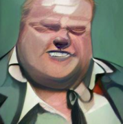
Ygolonac posted:Oh hey, I think I found Rob's model for that Captain America picture. I've always thought it was this iconic picture of Arnold, and he just screwed up the proportions badly. 
|
 #
?
Jun 22, 2018 02:05
#
?
Jun 22, 2018 02:05
|
|


|

|
| # ? May 27, 2024 21:28 |
|
|
Say Nothing posted:I've always thought it was this iconic picture of Arnold, and I know, low-hanging fruit, et cetera... Have some Tim Truman as penance. 
|
|
#
?
Jun 22, 2018 15:17
|
|

|
Paty Cockrum's art didn't really work on Amazing Spider-Man.
|
|
#
?
Jun 22, 2018 16:06
|
|

|
Push El Burrito posted:Paty Cockrum's art didn't really work on Amazing Spider-Man. Love the writing, though! The fat woman thinks she is not inferior to the handsome man. Hah, the nerve!
|
|
#
?
Jun 22, 2018 17:00
|
|

|
A few issues later he tells MJ he was reluctant at first meeting her because her aunt kept saying she had a "great personality". Pete was kind of a dick in the 80s.
|
|
#
?
Jun 22, 2018 17:45
|
|
|
Reminds me of the Ctrl+Alt+Del plotline where one of the characters goes on a date with a... Gasp... Fat girl! But it turns out she's super cool, and he's struggling with the fact that he might like a... Gasp... Fat girl! And he was all ready to tell her it's just not working out when she revealed that she was wearing a fat suit the entire date to make sure he's not shallow person, and they proceed to date because he can get it up now that he knows she is not really a disgusting fatty after all.
|
|
#
?
Jun 22, 2018 18:03
|
|
|
Push El Burrito posted:A few issues later he tells MJ he was reluctant at first meeting her because her aunt kept saying she had a "great personality". I think that's just an accurate recap of what he was doing in the 60s. MJ didn't appear out of the blue, there was the lead-up in prior issues where they would show her, but obscured, as Peter tried to avoid meeting her. That's part of the appeal of her famous "jackpot" line because before Peter opens the door he's basically like "oh god, here we gooooholy poo poo!"
|
|
#
?
Jun 22, 2018 19:51
|
|


|
X-men, webcomics edition!
|
|
#
?
Jun 22, 2018 19:55
|
|

|
Lobok posted:I think that's just an accurate recap of what he was doing in the 60s. MJ didn't appear out of the blue, there was the lead-up in prior issues where they would show her, but obscured, as Peter tried to avoid meeting her. That's part of the appeal of her famous "jackpot" line because before Peter opens the door he's basically like "oh god, here we gooooholy poo poo!" Plus, Pete was a dick in the '60s, too.
|
|
#
?
Jun 22, 2018 20:57
|
|
|
Senior Woodchuck posted:Plus, Pete was a dick in the '60s, too. Yeah, I wasn't clear but that's what I meant. He wasn't just a dick in the 80s, he was recalling how he was a dick in the 60s.
|
|
#
?
Jun 22, 2018 21:28
|
|
|
Peter was the usual "the world owes me everything" teen in the 60s. In the 80s he has gone full Reaganite.
|
|
#
?
Jun 22, 2018 21:45
|
|
|
Good? Bad? Whatever you decide, Frank Miller will sell you this original piece for $9,000.
|
|
#
?
Jun 27, 2018 01:37
|
|

|
Ferrule posted:Good? Bad? Whatever you decide, Frank Miller will sell you this original piece for $9,000. I�m glad to see Miller�s doing more coherent work again.
|
|
#
?
Jun 27, 2018 01:40
|
|


|

|
|
#
?
Jun 27, 2018 02:39
|
|
|
This Salad Fingers reboot is loving weird.
|
|
#
?
Jun 27, 2018 03:01
|
|
|
Here's a couple I've seen this month. This one is from Previews for an upcoming title in the continuing adventures of bizarre looking children:  And the award for the most awkward/wooden kiss goes to The Man of Steel himself on the main cover for #4:  What's amazing about it is that neither one of them looks to be kissing the other.
|
|
#
?
Jun 27, 2018 03:01
|
|

|
That's pretty standard, though. Like maybe their aim is a little off but on movie posters and book covers the characters are ever so close to kissing without actually kissing.
|
|
#
?
Jun 27, 2018 03:06
|
|
|
That FF cover is a throwback to 1999 or so when Valeria was a teenager from the future and Doom raised her or something.
|
|
#
?
Jun 27, 2018 03:19
|
|

|
What the gently caress is going on with Franklin's head
|
|
#
?
Jun 27, 2018 03:32
|
|


|
site posted:What the gently caress is going on with Franklin's head Sal Larocca has become an increasingly worse artist in the 20 years since he last drew that book.
|
|
#
?
Jun 27, 2018 03:36
|
|
|
site posted:What the gently caress is going on with Franklin's head Unstable Follicles�
|
|
#
?
Jun 27, 2018 04:14
|
|
|
site posted:What the gently caress is going on with Franklin's head Harelip. Lobok posted:That's pretty standard, though. Like maybe their aim is a little off but on movie posters and book covers the characters are ever so close to kissing without actually kissing. They look more like they are sleeping than kissing. Like two action figures being pressed together to make them kiss. Hobo Grandpa fucked around with this message at 09:01 on Jun 27, 2018 |
|
#
?
Jun 27, 2018 08:51
|
|
|
That makes it hotter 
|
|
#
?
Jun 27, 2018 13:37
|
|

|
No one can touch Del Mundo on covers these days. Winter Soldier #11 Reminds me of 70s sci fi book covers
|
|
#
?
Jun 27, 2018 15:31
|
|

|
ecavalli posted:I’m glad to see Miller’s doing more coherent work again. Ironically hiding his work with splattered ink is the most choerent thing Miller could do at this point
|
|
#
?
Jun 27, 2018 17:03
|
|
|
Rotten Red Rod posted:Ironically hiding his work with splattered ink is the most choerent thing Miller could do at this point That�s not spattered ink, it�s just blood the colorist hasn�t gotten to yet. �THIS...IS...SUBSTANDARD!� >Editor kicks Miller�s latest work down bottomless pit<
|
|
#
?
Jun 27, 2018 17:35
|
|


|
Honestly, putting aside the quality of Miller's art skill, I just don't get the splatter. If he wanted to add a little artistic flair to the image with an ink splatter, why go overboard like that? You can barely make out most of Superman's body, nullifying most of the work he did. Why do it at this stage, and not during color? And what thematic reason relating to Superman is there for that ink splatter, anyway? It really just looks like he hosed up and spilled ink on a drawing and now he's trying to cash in on it anyway.
|
|
#
?
Jun 27, 2018 18:17
|
|
|
zoux posted:No one can touch Del Mundo on covers these days. Winter Soldier #11 It is extremely Chris Foss/Peter Elson. Man, now I wanna haul out my book of 70's SF novel illustrations. And my other book of Roger Dean album covers.
|
|
#
?
Jun 27, 2018 18:48
|
|


|
Rotten Red Rod posted:Honestly, putting aside the quality of Miller's art skill, I just don't get the splatter. If he wanted to add a little artistic flair to the image with an ink splatter, why go overboard like that? You can barely make out most of Superman's body, nullifying most of the work he did. Why do it at this stage, and not during color? And what thematic reason relating to Superman is there for that ink splatter, anyway? Look man if you can make Campbell's soup cans into expensive art by showing them in different colors some rich white moron will buy a picture of sups with paint splatter on it at an outrageous price
|
|
#
?
Jun 27, 2018 19:20
|
|
|
zoux posted:No one can touch Del Mundo on covers these days. Winter Soldier #11 This is a homage of an actual book cover, isn't it? Because I'm sure I've got seen this exact cover on a Heinlein or Asimov book somewhere.
|
|
#
?
Jun 28, 2018 01:03
|
|
|
Rotten Red Rod posted:Honestly, putting aside the quality of Miller's art skill, I just don't get the splatter. If he wanted to add a little artistic flair to the image with an ink splatter, why go overboard like that? You can barely make out most of Superman's body, nullifying most of the work he did. Why do it at this stage, and not during color? And what thematic reason relating to Superman is there for that ink splatter, anyway? It's to distract you from that right arm/hand.
|
|
#
?
Jun 28, 2018 23:33
|
|
|
Rotten Red Rod posted:Honestly, putting aside the quality of Miller's art skill, I just don't get the splatter. If he wanted to add a little artistic flair to the image with an ink splatter, why go overboard like that? You can barely make out most of Superman's body, nullifying most of the work he did. Why do it at this stage, and not during color? And what thematic reason relating to Superman is there for that ink splatter, anyway? The answer to that question (and all questions regarding Miller's work over the prior two decades) is "9/11 broke his loving brain."
|
|
#
?
Jun 29, 2018 00:09
|
|
|
Apparently the Invisible Woman is a Liefield Jenny Mcarthy Clone. 
|
|
#
?
Jun 29, 2018 00:23
|
|
|
unruly posted:Apparently the Invisible Woman is a Liefield Jenny Mcarthy Clone. Behold....the uniboob.
|
|
#
?
Jun 29, 2018 00:36
|
|

|
Madkal posted:Behold....the uniboob.
|
|
#
?
Jun 29, 2018 00:52
|
|
|
Miller (rightfully) catches a ton of poo poo and was never the world's greatest draftsman but his work on Daredevil, Ronin, TDKR and Sin City really did transcend the medium and dragged it into another level of storytelling that hadn't been seen in a LONG while and was much needed. Klaus Janson and others did a ton of the heavy lifting for sure, but his story boarding for a while was about the bedfst I've ever seen and it just bums me out a little that one of the true revolutionaries of the medium is viewed as a tired joke these days. I mean, he IS, no question anymore but his contributions to the craft are pretty strong.
|
|
#
?
Jun 29, 2018 03:30
|
|

|
unruly posted:the "vaccine's cause autism" haircut Lmao
|
|
#
?
Jun 29, 2018 14:31
|
|

|
unruly posted:It's literally the size of her head. Without the "vaccine's cause autism" haircut, I'd say it's probably larger. Unrealistic art! We can�t even see her rear end at the same time as her boobs! I know Re3d�s the stretchy one, but this is possible for all female supers. I�ve seen it�s possible from a whole bunch of floppy covers from the late �90s! Seriously, have these artists even studied the human form, especially how female bits work in motion? There�s a reason sports bras are so popular. The �vaccines = autism� haircut is much better than my take, the �I�d like to speak to your manager� �do.
|
|
#
?
Jun 29, 2018 17:02
|
|
|
unruly posted:Apparently the Invisible Woman is a Liefield Jenny Mcarthy Clone. I think we've seen this one before - wasn't it the fault of a crappy colorist, and the original drawing looks fine? BiggerBoat posted:Miller (rightfully) catches a ton of poo poo and was never the world's greatest draftsman but his work on Daredevil, Ronin, TDKR and Sin City really did transcend the medium and dragged it into another level of storytelling that hadn't been seen in a LONG while and was much needed. Klaus Janson and others did a ton of the heavy lifting for sure, but his story boarding for a while was about the bedfst I've ever seen and it just bums me out a little that one of the true revolutionaries of the medium is viewed as a tired joke these days. I still love his older work, and I remember in context how important they were. But sadly, to me, anyway, his older work DOES suffer to some degree as a result of his recent work. I look at a lot of the bizarre, questionable stuff he's doing now, and when I look back, it's pretty much what he's always been doing, only now it's turned up to 11. Rotten Red Rod fucked around with this message at 17:44 on Jun 29, 2018 |
|
#
?
Jun 29, 2018 17:30
|
|
|

|
| # ? May 27, 2024 21:28 |
|
|
BiggerBoat posted:Miller (rightfully) catches a ton of poo poo and was never the world's greatest draftsman but his work on Daredevil, Ronin, TDKR and Sin City really did transcend the medium and dragged it into another level of storytelling that hadn't been seen in a LONG while and was much needed. Klaus Janson and others did a ton of the heavy lifting for sure, but his story boarding for a while was about the bedfst I've ever seen and it just bums me out a little that one of the true revolutionaries of the medium is viewed as a tired joke these days. I mean the ink splatters are bad but I really love how weird his art is these days. His solo backups in DK3 were pretty wild and awesome.
|
|
#
?
Jun 29, 2018 18:11
|
|