


|
Those outfits aren't really suitable for winter conditions.
|
 #
?
Jul 11, 2018 01:54
#
?
Jul 11, 2018 01:54
|
|


|

|
| # ? May 13, 2024 03:43 |
|
|
That's a standard Outlaw outfit, Diamondback (think that's her on the right) has most always been part of the skintight crowd, and there's a tendency for artists to give Dom a secondary mutation of "inflation". Also, I can't quite make it out, but is that a "Horn" signature in the bottom left? Because that would explain a lot.
|
|
#
?
Jul 11, 2018 02:03
|
|

|
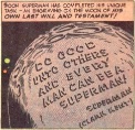
Ferrule posted:Didn't Kirby do that too, or am I mixing masters? Kirby had to fight tooth and nail to get his original art back. He knew it's value.
|
|
#
?
Jul 11, 2018 02:11
|
|

|
Couldn't possibly worse than Greg La-gently caress SAKE
|
|
#
?
Jul 11, 2018 02:33
|
|

|
goatface posted:Some classic one-handed art. At first I thought that was for an cheesecake indie publisher like Aspen Comics or something, until I saw the Marvel tag in the corner.
|
|
#
?
Jul 11, 2018 22:31
|
|

|
Alaois posted:Couldn't possibly worse than Greg La-gently caress SAKE Ban all Gregs from drawing comics imo. Or just ban all Gregs, I don't think I've met a cool Greg.
|
|
#
?
Jul 11, 2018 22:40
|
|

|
GrandpaPants posted:Ban all Gregs from drawing comics imo. Does this include Greg Evans from Luann?
|
|
#
?
Jul 11, 2018 22:52
|
|

|
GrandpaPants posted:Ban all Gregs from drawing comics imo. Also garys
|
|
#
?
Jul 11, 2018 23:02
|
|


|
site posted:Also garys Someone's a Rat Queens fan.
|
|
#
?
Jul 11, 2018 23:52
|
|

|
Capullo makes up for the other Gregs.
|
|
#
?
Jul 12, 2018 00:03
|
|

|
Ygolonac posted:Also, I can't quite make it out, but is that a "Horn" signature in the bottom left? Yeah it looks like a photo manip and not a drawing/painting, ie. exactly how Horn's poo poo looks e:  https://twitter.com/OliverSava/status/1016768389539393536
|
|
#
?
Jul 12, 2018 03:02
|
|

|
Flesh Forge posted:Yeah it looks like a photo manip and not a drawing/painting, ie. exactly how Horn's poo poo looks I mean why have a wank stash AND a comic cover when you can have both at once?
|
|
#
?
Jul 12, 2018 05:04
|
|


|
That poo poo really looks like the low quality poster poo poo you see at comic cons that weren't officially licensed
|
|
#
?
Jul 12, 2018 06:02
|
|
|
Flesh Forge posted:Yeah it looks like a photo manip and not a drawing/painting, ie. exactly how Horn's poo poo looks People don't actually buy this poo poo, right? This stuff goes straight to cancellation.... right?  I mean it's 2018. I imagine the teens of the 80s and 90s needed this for the under-the-bed stash, but contemporary teens have the god damned internet.
|
|
#
?
Jul 12, 2018 08:12
|
|
|
Pacra posted:People don't actually buy this poo poo, right? This stuff goes straight to cancellation.... right? The cover may suck, but the art in the book is good and more importantly so is the writing. It�s been a really fun book so far.
|
|
#
?
Jul 12, 2018 08:17
|
|


|
That hair placement is unfortunate.
|
|
#
?
Jul 12, 2018 08:44
|
|
|
X-O posted:The cover may suck, but the art in the book is good and more importantly so is the writing. It�s been a really fun book so far. I don't know how comic book companies work but given how Greg Land was the cover artist for the book before hand, as well as being the cover artist for Mystery in Madripoor (which is also good, btw) and now this, the entire thought process of the guy in charge of covers seems to be "That's the book with all the sexy ladies in it! Give it to the porno guys!"
|
|
#
?
Jul 12, 2018 09:03
|
|
|
Say Nothing posted:That hair placement is unfortunate. Diana might want to wax.
|
|
#
?
Jul 12, 2018 15:11
|
|
|
Say Nothing posted:That hair placement is unfortunate. Look man, she�s Greek. Cut her some slack. There�s only so much tweezing a person can do.
|
|
#
?
Jul 12, 2018 15:37
|
|


|
Did a Midwestern comedy club circa 1987 get loose in this thread all of a sudden or
|
|
#
?
Jul 12, 2018 15:48
|
|


|
Say Nothing posted:That hair placement is unfortunate. 
|
|
#
?
Jul 12, 2018 16:46
|
|

|
purple death ray posted:Did a Midwestern comedy club circa 1987 get loose in this thread all of a sudden or
|
|
#
?
Jul 12, 2018 17:22
|
|
|
I�ve been tearing through various European comics and some of the art is just awesome. The first three are from Atar Gull, which is a one-shot about an African chieftain who is captured by slave traders. The artist is named Br�no. I believe the writer is Nury. It�s awesome.    This second set of images is also by Br�no, in a series he did with Nury called Tyler Cross. I burned through the three volumes that are out. Reminds me so much of Parker by Cooke, from the art to the story itself. Absolutely fantastic, one of my favourite comics discoveries of the last few months.     If you read French and like gritty crime stories you need to check this series out.
|
|
#
?
Jul 12, 2018 20:04
|
|


|
good panel transition in exiles 5
|
|
#
?
Jul 12, 2018 20:59
|
|
|
GrandpaPants posted:Ban all Gregs from drawing comics imo. Grek Pak seems fine and as mentioned, Greg Capullo has done some great work. Also I should know better than to engage but its 2018, if your typing fingers are itchy to type out a joke that reduces to "lmfao what if a woman had pubes" please slam them in a car door.
|
|
#
?
Jul 12, 2018 21:12
|
|

|
purple death ray posted:Did a Midwestern comedy club circa 1987 get loose in this thread all of a sudden or I'm not sure what you mean. Now, if you'll excuse me, I have to smash this watermelon with an oversized mallet. Archyduke posted:Also I should know better than to engage but its 2018, if your typing fingers are itchy to type out a joke that reduces to "lmfao what if a woman had pubes" please slam them in a car door. I hate to defend Say Nothing, but the joke was the artist's inability to recognize where hair should end, lest it appear her pubes are peaking out of her costume. Not that women have pubic hair. ecavalli fucked around with this message at 21:30 on Jul 12, 2018 |
|
#
?
Jul 12, 2018 21:26
|
|
|
Jordan7hm posted:I�ve been tearing through various European comics and some of the art is just awesome. This is the kind of artwork I love; a refreshing absence of rubbery gradients. Very Mignola'ish.
|
|
#
?
Jul 12, 2018 23:07
|
|
|
 I love Ottley's splash pages, there are some incredible ones in Invincible. Also let's all welcome Brit to the Marvel Universe
|
|
#
?
Jul 13, 2018 15:51
|
|

|
zoux posted:
Is that anything like when they welcome someone to the X-Men? 
|
|
#
?
Jul 13, 2018 15:54
|
|
|
Mike Allred had a bunch of covers revealed the last couple of days, so here's a dump. Planet of the Apes variant covers mixing up the old and new of the movies.   Archie Meets Batman '66 #4  and the wraparound cover for his Silver Surfer omnibus. 
|
|
#
?
Jul 14, 2018 00:54
|
|
|
Teenage Fansub posted:Mike Allred had a bunch of covers revealed the last couple of days, so here's a dump. Oh my yes. Not sure why I'm surprised by how awesome this is. I really shouldn't be.
|
|
#
?
Jul 14, 2018 01:49
|
|
|
zoux posted:
I'm so glad he escaped from Kirkman's clutches.
|
|
#
?
Jul 14, 2018 02:35
|
|
|
Kilmers Elbow posted:This is the kind of artwork I love; a refreshing absence of rubbery gradients. Very Mignola'ish. It turns out that this has been translated by Europe Comics and is available in English! http://www.europecomics.com/serie/tyler-cross/ I highly, highly, highly recommend checking it out if you like the art.
|
|
#
?
Jul 14, 2018 11:33
|
|
|
https://www.comixology.com/Bruno/comics-creator/81965 yup there you go
|
|
#
?
Jul 14, 2018 11:44
|
|

|
zoux posted:
these are really good but I find myself tired of really "hot" coloring tendencies that most artists use. Every color is to the outer edge of the saturation level so with everything being super intense, it loses its impact. I'm not a fan of the "everything is brown and grey" approach either but a little variation would actually help the super bright saturated clors op more. Hope I'm explaining this right.
|
|
#
?
Jul 14, 2018 14:27
|
|

|
I wish I was clever about colouring - what's the best way to describe the differences between the colouring methods and styles we have now with those in the 70s or the 80s?
|
|
#
?
Jul 14, 2018 14:50
|
|
|
Wheat Loaf posted:I wish I was clever about colouring - what's the best way to describe the differences between the colouring methods and styles we have now with those in the 70s or the 80s? Here's then:  Here's now: 
|
|
#
?
Jul 14, 2018 15:23
|
|
|
People don't have to care about how the print quality will affect the colours any more.
|
|
#
?
Jul 14, 2018 15:26
|
|


|
Wheat Loaf posted:I wish I was clever about colouring - what's the best way to describe the differences between the colouring methods and styles we have now with those in the 70s or the 80s? Depends on style and medium. And I would believe also would depend a lot more on printing tech at the time. But for a general comparison, compare the 'House Style' of the companies from then and now.
|
|
#
?
Jul 14, 2018 15:31
|
|


|

|
| # ? May 13, 2024 03:43 |
|
|
That Allred art reminds me that I was reminded the other day that Allred did a Batman 66'/Legion of Super Heroes one shot, and it's real delightful. Even has a spot on Egghead.
|
|
#
?
Jul 14, 2018 15:44
|
|


