


|
DarthRoblox posted:
I get what you're doing but for that contrast, I would've cropped it more half and half to be honest, especially if you're trying to do a comparison. Additionally, I would recommend playing with the skew on this. Flattening it out will help a TON. I went to Hong Kong recently and took some pics.  
|
 #
?
Jul 11, 2018 02:08
#
?
Jul 11, 2018 02:08
|
|


|

|
| # ? Jun 6, 2024 15:13 |
|
|
mattdev posted:
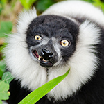
I like these a lot! The hard contrast works really well in black and white. In the second photo you have a ton of empty space but you used it really well. There is this really hard shadow that produces a clear border between the two halves in the image but you can still see details. Makes me want to know what's happening there. Then you see the person in the foreground. There's a lot going on in this image even though there isn't really anything happening. Here is a photo of a crowned lemur baby I took in May at the Apenheul park in the Netherlands:  Baby Crowned Lemur by Mathias Appel, auf Flickr Baby Crowned Lemur by Mathias Appel, auf Flickr
|
|
#
?
Jul 12, 2018 19:16
|
|
|
Mattis posted:I like these a lot! The hard contrast works really well in black and white. That lighting and profile are awesome.
|
|
#
?
Jul 12, 2018 19:18
|
|


|
 Veere Zeeland by roland luijken, on Flickr Veere Zeeland by roland luijken, on FlickrShooting holes
|
|
#
?
Jul 13, 2018 18:26
|
|

|
Mattis posted:Baby Crowned Lemur by Mathias Appel, auf Flickr that lighting is perfect and the subject is adorable  The plant in the foreground getting in the way of its neck and ear is really distracting. It probably would have meant missing the shot if you moved far enough to reframe it, though. Orions Lord posted:
I like the subject (staircase door) and the lighting a lot. The windows on the left being out of focus kind of takes away from the geometry, but focus stacking could fix that. Also maybe get the bottom of that first window in the frame. Something about the right side feels a little bit cramped but I can't put my finger on it.  Puntan Dos Amantes by CM Yee, on Flickr I know I screwed up with the observation platform shadow in the bottom left and I probably should have readjusted the polarizer for the right side of the pano.
|
|
#
?
Jul 14, 2018 14:04
|
|

|
Atlatl posted:that lighting is perfect and the subject is adorable Thanks a lot for the feedback.
|
|
#
?
Jul 14, 2018 21:38
|
|
|
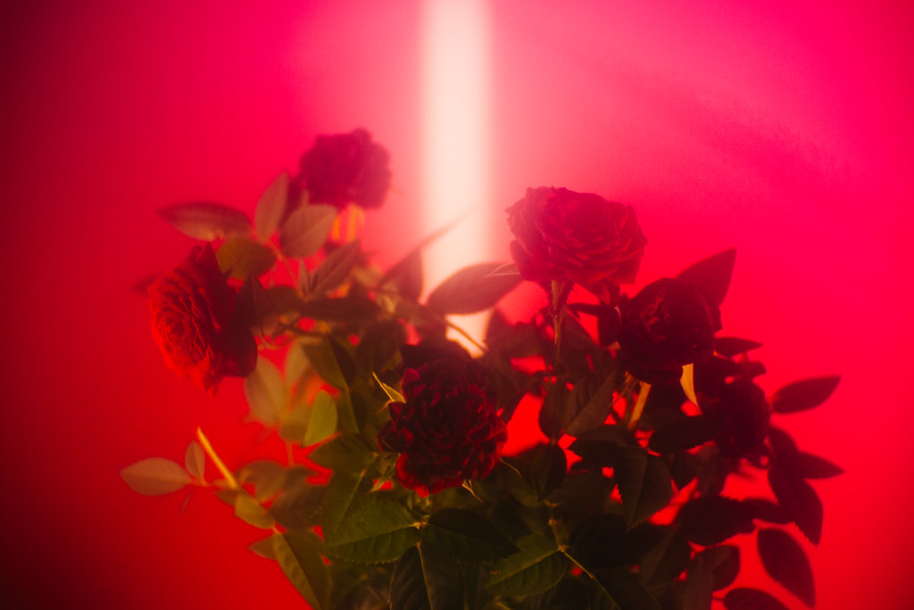
This one is good, I like the placement of the light in the background. I like that that the rose under red light is monochrome, that kind of stuff makes me like :3 Dark pic 
|
|
#
?
Jul 16, 2018 01:47
|
|

|
DarthRoblox posted:
It's a shame you couldn't capture the bottom, cus it definitely feels kinda cut off without it. I love the color pallet, though. the difference between the two shrubs also makes the image feel a little unbalanced. I feel like maybe an asymmetrical crop that's tighter on the left and wider on the right might help, but that would probably result in a completely different feel. DarthRoblox posted:
I agree with what was posted before, I wish this was a face-on shot, since this seems to be slightly off to the left. I also feel like some of the sidewalk / street would help this too. Alternatively, maybe go for a more abstract sort of feel, and crop off the top of the building? DarthRoblox posted:
This is my favorite of what you posted, I love the colors. The hole beneath the TUG marking looks almost painted on, which is cool. However, it seems slightly off-center? Maybe it's just me. I love the details in the subject's hair in this one. However, the woman on the left is kind of distracting to me, especially since she's out of focus. Maybe do a major crop to cut her out almost entirely? then it would give a good contrast of the man going one way, with "everyone else" going another. Might totally change the photo, though. I like this one a lot, but the shadowed area on the right is a little distracting with how dark it is. I assume this was done for contrast purposes, but it feels a little much to me. Maybe up the shadows a little? You could maybe also go the complete opposite direction, and go super duper contrast with it and make them even darker, but that might not work out great. I do really like how the shadow line naturally leads your eye to the person, but the ever so slight amount of darkened detail on the right keeps pulling my eye away from them. Mattis posted:
I really love the angle of this! I actually thought the little guy was clinging to a branch/log, it wasn't until I took a second look that I saw it was another lemur. While it was a cool discovery on my part, I'm not sure if that was what you intended or not. I like how the dark areas in the background lead your eye to the lemur, but I could maybe see a tighter crop on the left. I also wish the aperture was a few stops wider, the background seems just detailed enough to be distracting, but not a lot you can do about that now. Anyways, I finally got another roll of film back, here's what I've been shooting. All shot on Superia 1600, so I tried to do what I could with the grain. I'll spoiler my own thoughts on my images so hopefully they won't influence any feedback you guys have.  73530019 by Cody P, on Flickr 73530019 by Cody P, on FlickrFor this one I noticed how drab and grey and boring the parking garage felt, but this one orange marker stuck out. Yet, despite sticking it, it also felt drab and grey and boring, despite being such a vibrant color, so I tried to capture that feeling. I also felt like this was a good shot to capture the claustrophobia and confusion that many small, unfamiliar parking structures have, so I tried to get lots of signs and angles and hard edges. I feel like the bottom-right and center highlights are too blown-out, even after burning them. I also worry the burning I did is too noticeable, but maybe that's because I've been staring at it too long.  73530036 by Cody P, on Flickr 73530036 by Cody P, on FlickrDefinitely the grainiest of the bunch, but I intentionally didn't remove much in post. I was walking along a lake pier and noticed this kind of ugly valve with ugly stickers on it, and it sort of gave me the feeling of when it's a super nice day out, but you feel like poo poo. Even when it's bright and sunny out and you're at a nice relaxing beach and everyone is having fun, but gently caress you feel like garbage anyways. I thought the dark pallet and grain helped get that feeling. that being said, I do worry the grain is too heavy, and maybe I should have toned it down. I also worry the extra pier on the right is distracting being cut off, but I also kind of feel like it helps give a sense of place with the pier seen in the bottom. Maybe I'm just justifying not taking the effort to clone it out, though. The pipe also kinda looks like it's coming out of nowhere.  73530003 by Cody P, on Flickr 73530003 by Cody P, on FlickrSimilarly, I liked the unwelcoming and alienating look of this house, despite being in a sunny happy beach town. At first glance the house looks very bright and cute, but then the windows are shut tight and there's a weird board ruining the look of the place and there are words painted on to it basically telling people to gently caress off. And yet it's surrounded by colorful houses, and even has flowers out front! I'm sad I couldn't copy / heal brush the sign away along the fence, I tried hard but nothing looked natural. I also tried to salvage the super dark area on the left, but I couldn't get it any better than this. I do like how it ties in with the feelings I was going for with this, though - even if it was a happy accident. I'm not sure I like the shadows the house is casting on itself, but since we were just passing through on vacation I couldn't really come back for a better shot later on. I also did a little bit of cloning to remove some distracting branches and power lines, I hope it's not obvious. CodfishCartographer fucked around with this message at 04:59 on Jul 18, 2018 |
|
#
?
Jul 18, 2018 04:53
|
|


|
The XKCD Larper posted:Dark pic I like the idea here but I think the picture is too dark overall. She's almost completely obscured and blends into the sky. If you exposed it a bit longer or bracketed then stacked the exposures then adjusted it back in post you'd get better separation. CodfishCartographer posted:
I really like this, the texure in the dingy walls is great. CodfishCartographer posted:
This is nice as well, I like how you've lined up the top part of the valve with the tree line in the background. That being said, why are you shooting 1600 speed film if you're trying to avoid grain? Here's a trio I'd love feedback on.  Fuji Pro 400H on medium format. I was trying to capture the grunge of the bathroom, and bring about a disjointed feeling with the multiple reflections for an overall unsettling feeling. I love this shot, but I fear I may be huffing my own farts.  Fuji Superia X-tra 400, 35mm Trying to utilise the golden hues that Superia brings out to convey to bring out the dry, wind blasted feeling of this landscape with the path centred to draw the viewer in.  Fuji Superia X-tra 400, 35mm I was expecting the film to bring out the yellow in the roller doors more, this is the shot I'm unhappiest with in these three. Trying to capture the dilapidation of this industrial area.
|
|
#
?
Jul 21, 2018 13:11
|
|

|
Megabound posted:
I really like the grunge on the mirror here, and how it �censors� the subject. Especially works well since the bathroom looks kind of nice otherwise. Reminds me of a bathroom that was really nice and expensive forty or fifty years ago. I really like the placements of the showerheads, too. I think you succeeded fairly well in what you were trying to get, although I didn't quite get much of a disjointed feeling from it. Megabound posted:
I like the swoop on this one, and the color of the sky. I can�t tell if the greenery at the top of the plants is moving slightly due to a slower shutter speed, or if it just looks that soft, but it�s nice. Reminds me of a day at the beach that�s a bit too windy. I�m not sure how I feel about the path in the center, my eye keeps drifting between it and the plants themselves. It feels a little distracting, but the picture would probably feel too flat and boring without it, so I dunno maybe someone else can chime in about it. Megabound posted:
I really like the textures on the doors on this one. It feels ever so slightly crooked though, and the tree reflected in the window on the right keeps distracting me. Especially since you were trying to bring out the dilapidated feeling of it, the greenery reflected in the windows gives it more of a business park feeling, at least to me. Also, at first I didn�t really like the grey sky along the top, but it�s grown on me and now I think it works. Megabound posted:That being said, why are you shooting 1600 speed film if you're trying to avoid grain? Honestly, I just shot on it because I underestimated just how grainy it was  Still new to this and feeling out how various films feel and how different ISO films behave. Here's some more from that roll: Still new to this and feeling out how various films feel and how different ISO films behave. Here's some more from that roll: 73530020 by Cody P, on Flickr 73530020 by Cody P, on FlickrI really liked the orange light of sunset of this shot, but I also liked the texture of the sign and the building in general. I also liked the idea of the sunset signifying this old decaying building, with the shadow of a smokestack also giving it an abandoned industrial feel. The grain really works well here, I think. I also liked the repetition of the windows of this shot - I wanted to get a zoomed-in shot to flatted them out for something more abstract, but didn�t have a long enough lens on me. I tried making a crop of this shot to focus on this idea, but I dunno how well it worked.  73530021 by Cody P, on Flickr 73530021 by Cody P, on FlickrThe smokestack from the previous shot! I kind of went for something a little abstract, but I just liked the sunset behind the silhouette of an industrial town. Looking at the shot it feels a little crooked, but with the uneven and unclear horizon I�m not sure if it�s a trick of the eyes or not.  73530033-2 by Cody P, on Flickr 73530033-2 by Cody P, on FlickrThis was intended to show off the dark grunge I stumbled upon while walking along a beach trail. It stood out to me as so ugly in such a nice and scenic location. While I think I captured the ugliness of it, I realize I didn�t succeed in capturing the contrast of that ugliness against a scenic view. I tried to include some nature in the shot to give that sort of contrast, though.
|
|
#
?
Jul 26, 2018 16:43
|
|
|
The light and the building are cool, but the image as posted isn't doing much for me. I think the linked crop of the windows is a better idea but I'm not a fan of the angle. Like if you could hover 30 feet in the air to get the lines horizontal I think you got it. The second one is a little crooked, light poles are usually very straight, and the smoke stack is leaning the same direction so you could benefit from some straightening. But I like the image, the sky and silhouette feel balanced to me and I can dig it. I've never done B&W conversion before so I'm curious what people think about my efforts. I kinda like them as is, but lack the experience to know if I just have newbie blinders on. It's something I've been wanting to figure out, and this setting had some really harsh sun and neat textures so I figured it'd be worth a shot.    If they were bad pictures even before the conversion I can suck it up, but I'd like to know if my flailing around with lightroom sliders was effective. xzzy fucked around with this message at 04:01 on Aug 2, 2018 |
|
#
?
Aug 1, 2018 14:58
|
|

|
I think the first one is your best one compositionally, with the sky textures, the mysterious looking mass of land and the way the light hits the water and how it seems to radiate from it. The visual weight in the elements, the sky, the land and the water are harmonically pleasing together. That said you have a bit of dust in your sensor that you should clean at some point ") The other two are interesting, but don't do as much for me tbh. There's too much dynamic range in the second one and you're losing a lot of detail to both to the sky and the shadows.
|
|
#
?
Aug 1, 2018 15:11
|
|
|
xzzy posted:The light and the building are cool, but the image as posted isn't doing much for me. I think the linked crop of the windows is a better idea but I'm not a fan of the angle. Like if you could hover 30 feet in the air to get the lines horizontal I think you got it. If you like black and white textural stuff take a look at Aaron Siskind, he's the master
|
|
#
?
Aug 1, 2018 23:42
|
|

|
Black and white are real fun when you're trying to capture textures. Shame about the flare on the last photo. You can look up Sebasti�o Salgado if you want to see more high contrast B&W    I've been taking photos like this whenever I bring a camera to a punk show. Lots of slow shutters (like 1.3s, f16, and multiple flashes) and movement. I was tired of getting shots were someone is mid-movement and making a weird face. I'm kinda hoping i'm adding context by getting all that movement. I still have these files as DNGs, and these are all out of camera
|
|
#
?
Aug 2, 2018 03:04
|
|
|
High contrast is definitely what I was going for on two of the images, which is a simple task in LR, but when you start reading on the topic you see people blabbing about which colors are represented better in B&W film and whether to fuss over it when converting digital, or discussions about whether to leave detail in the shadows/highlights or ruthlessly clip them. It's a big topic. I was trying to apply some of what Michael Kenna does, I dig his landscapes. (agreed the one with the flare is the weakest of the three but it's very different from the other two so I was curious how people would see it)
|
|
#
?
Aug 2, 2018 04:19
|
|
|
Went out and shot some Blue Angels stuff today. I was on the SE corner of Boeing field shooting through fencing while the Blue Angels took off. They had a set of four take off first with the trailing two aircraft after to make a total of six. While shooting the take off I tried to get one of the last two but in the heat wake of the quartet and the heat made by the photo subject the AF system did its best and I ended up with this: 20180803-DSC_4023 by That Guy, on Flickr 20180803-DSC_4023 by That Guy, on FlickrLooks like some sorta painting. I need to get the spot on the top right-center cleaned up, I suspect it's on the sensor itself.
|
|
#
?
Aug 4, 2018 09:14
|
|

|
I'd appreciate any critiques people want to offer for these shots, but what I'm really looking for specifically are comments about the colour balance. I have a whole series of bear shots that I'm really struggling with where they are either coming out with a green tint or a magenta tint, and I just can't get it right. I think the first shot has a slight magenta tint to it and the second shot is way too green fwiw ... just wanting a second opinion.  xzzy posted:I've never done B&W conversion before so I'm curious what people think about my efforts. I kinda like them as is, but lack the experience to know if I just have newbie blinders on. It's something I've been wanting to figure out, and this setting had some really harsh sun and neat textures so I figured it'd be worth a shot. Fabulousity posted:Went out and shot some Blue Angels stuff today. I was on the SE corner of Boeing field shooting through fencing while the Blue Angels took off. They had a set of four take off first with the trailing two aircraft after to make a total of six. While shooting the take off I tried to get one of the last two but in the heat wake of the quartet and the heat made by the photo subject the AF system did its best and I ended up with this:
|
|
#
?
Aug 5, 2018 18:38
|
|

|
I like how the bear photos completely resemble family portrait sessions. It�s like they knew how to pose for you.
|
|
#
?
Aug 5, 2018 18:40
|
|


|
InternetJunky posted:I'd appreciate any critiques people want to offer for these shots, but what I'm really looking for specifically are comments about the colour balance. I have a whole series of bear shots that I'm really struggling with where they are either coming out with a green tint or a magenta tint, and I just can't get it right. I think the first shot has a slight magenta tint to it and the second shot is way too green fwiw ... just wanting a second opinion. I think the second might be tending towards green but I�m on my phone and would need to check on my monitor later to be sure. I shoot Fuji so I�m also dealing with that tending towards magenta and will have an easier time telling on the monitor I work on. Is the hue and tint the same in your settings between the two photos? If not, the first one looks good so maybe you just use your color balance from that one on the second since the lighting looks similar. I really like them - they are very cute family shots.
|
|
#
?
Aug 5, 2018 21:31
|
|

|
First one looks great to my eyes. Second one I wouldn't have noticed the tint if you never pointed it out, but now that you did it's all I can see.
|
|
#
?
Aug 5, 2018 21:51
|
|
|
Yeah, the first one looks very nice too me. Can see a green cast to the second though.
|
|
#
?
Aug 5, 2018 22:38
|
|
|
First looks great, my eyes do see the bears with a slight magenta tint but it's not bad.
|
|
#
?
Aug 5, 2018 22:42
|
|
|
On the second bear shot to my eyes it looks like the faces of the cubs and the nose of the mother have been over-clarified. If this is just how they looked ignore this post but if you did any editing to those areas I'd dial it back a bit. It looks like a painting.
|
|
#
?
Aug 6, 2018 05:36
|
|

|
First scan with the Epson V600. I am unsure if the colors look funky or not since I did all my editing on my iPhone at lunch. As for composition, I think I definitely would have preferred to use a wider lens I think it looks a bit tight, but that might be me overanalyzing it. img069 by Andrew Balch, on Flickr img069 by Andrew Balch, on Flickr
|
|
#
?
Sep 15, 2018 21:36
|
|

|
birds posted:First scan with the Epson V600. I am unsure if the colors look funky or not since I did all my editing on my iPhone at lunch. As for composition, I think I definitely would have preferred to use a wider lens I think it looks a bit tight, but that might be me overanalyzing it. When using Epson scan make sure you go into the histogram before it scans and widen it up a bit, setting your black point and rgb highlights after in Photoshop. Otherwise it really removes a lot of DR during the scan.
|
|
#
?
Sep 15, 2018 22:06
|
|
|
So I put photography to the side for the last couple of years due to my time being consumed by things involving my job. I am now trying to get back into it. I don't have to too much to add to the photos above so I will limit my commentary to my own. I don't really consider myself a bird photographer but there is a place that seabirds like to feed near me and I figured that would give me something to shoot. Generally I wish I had used a longer lens and/or I had remembered I could put my camera in crop mode. These three I like and decided would be keepers, but they also all feel off. The first one I like for capturing the bird's wing span and the impression of flight. However I vacillate between liking the crop and thinking I should give it a little bit more room to breath on top. I thought about adding more to the top and taking from the bottom to give a more central composition but I liked the action in the water, even though it is unrelated. Basically I think it is cropped the best way it can be, and half the time I look at it I like it but the other half I look at it strikes me as being balanced wrong in someway.  DSC_1161 by noonebutme2010, on Flickr DSC_1161 by noonebutme2010, on FlickrThe second one I generally like all around, but the bird is out of focus. The subject really turned into the water disturbance as the bird took off and (I think) conveys the moment of taking flight. I actually like the overall effect, but I don't know if I am just convincing myself it is good because it's mine or whether this is really working.  DSC_1117 by noonebutme2010, on Flickr DSC_1117 by noonebutme2010, on FlickrThis last one I like but the composition feels off. I actually rotated this from horizontal to vertical. The black background is water, but it came out as great contrast. Overall I like how it turns into a portrait of the bird. However as I said the composition just seems off in some way.  DSC_1095 by noonebutme2010, on Flickr DSC_1095 by noonebutme2010, on FlickrEdited for distracting grammar mistakes. iammeandsoareyou fucked around with this message at 16:39 on Sep 16, 2018 |
|
#
?
Sep 16, 2018 16:36
|
|
|
I really like the effect you got in the third shot. Almost looks like something done against a studio backdrop. I agree with you regarding the composition though. I don�t know if you did any cropping, but if you have room to rotate the image counter-clockwise�thus orienting the bird more upright as opposed to leaned back a bit�it might help.
|
|
#
?
Sep 16, 2018 18:41
|
|
|
iammeandsoareyou posted:So I put photography to the side for the last couple of years due to my time being consumed by things involving my job. I am now trying to get back into it. I don't have to too much to add to the photos above so I will limit my commentary to my own. Second image - you've captured the sense of movement well. I think the bird needs more room again in the direction it's going. Last image - love the contrast of white on black. If you did a tight vertical crop it would be fantastic imo.
|
|
#
?
Sep 17, 2018 15:24
|
|
|
I can sort of see the magenta cast you're talking about in this, but its not consistent across the image (compare the dark area in the trees directly above the center bear to the most frame-left dark area) and almost feels like some sort of extremely subtle flaring or other optical imperfection. If you hadn't specifically called it out I'd have assumed it was more to do with a difference in natural shade of the background foliage, honestly. I really like those shots, though. content: I've kind of fallen out of actually giving a poo poo for the last few years, but recently I've been trying to actually care about my work again, and actually tried to take some decent shots while I was in atlanta for DragonCon a couple weeks ago. Most of what I shot ended up feeling like the usual touristy poo poo one takes at these cons, but I feel like I might have gotten something decent with a few shots and was looking for some critique to help me get back into thinking about shooting.  
|
|
|
#
?
Sep 18, 2018 04:25
|
|

|
Megabound posted:
Don't post homegrown
|
|
#
?
Sep 22, 2018 04:39
|
|
|
 This is a random JPEG shot I took that I liked, I feel it turned out better than 99% of my "composed" shots up in the mountains. Figures, the week after I took this I found out what RAW is, I was just shooting in the x100f's ACROS profile at the time, so no possibility of a color option, sadly. I don't think there is enough contrast in this shot, I don't know much about filters, but from what little I've seen in Lightroom a blue filter or a red filter would give it a little more oomph. That being said I don't know what I'm talking about. Maybe "contrast" isn't even the right word. Any thoughts are appreciated. When compared to something like xzzy's pictures on this page, and Babysitter Super Sleuth's b&w, I feel like they have better contrast in their shots. xzzy's top photo has a big mass of black, though. I wish there was a little more texture there.
|
|
#
?
Oct 8, 2018 15:58
|
|

|
I think it depends on intent. I think the sorta-washed-out look is quite nice.. to me it has more of a snapshot feel, but not in a negative way. It's a cool B&W photo that documents a scene. With the picture of mine you quoted, I was more after the blinding sun and the water texture, so details in the rock weren't something I tried to preserve. If that was a bad decision, that's fine, but I got what I intended. I don't know what Babysitter's intent was but everything in that shot is set up to draw attention to the man that's in focus, and as presented it was pulled off well. Adjusting contrast is pretty easy in light room, even if you're not working on a raw file. You just can't push as hard on a non-raw, but in general, wiggle the lights and dark sliders until you get where you want. But to my eye your picture doesn't need much in the way of adjustment anyways.
|
|
#
?
Oct 8, 2018 16:17
|
|
|
Makes me think of something you'd see in an old issue of National Geographic. I like it.
|
|
#
?
Oct 8, 2018 17:28
|
|
|
I think it looks really good. I've never used the f model, but the X100 series film profiles always seem to be the exception to always shoot RAW. I don't know what photo editing software you have access to but there might be enough data in the jpeg to lower the exposure just a smidge which might make it pop a bit more. But really it looks pretty good as is. If the f will let you shoot dual RAW and film profile jpegs I would set it to Acros filter +RAW so you have a ready to go black and white image plus a color file you can do with as you wish. Honestly I think that particular shot looks better in black and white than color and it makes me want to keep an eye on the X100f used market. I have been shooting a bit a wildlife recently mainly because it's convenient where I live. This is one that I like but I go back and forth on whether I cropped in to tight on the subject.  untitled-13 by noonebutme2010, on Flickr untitled-13 by noonebutme2010, on Flickr
|
|
#
?
Oct 8, 2018 19:34
|
|
|
Smoove J posted:
It's hazy and washed out which is fine, but it sounds like you wanted a sharper look. You can fix it in Lr with the gradiated filter tool.  Select the tool and drag down and rightwards from the top left corner until the middle line is running along the diagonal mountain edge on the right of the frame. Decrease exposure Increase contrast Add a very small amount of dehaze (if you're using a later version of Lr). Increase clarity Decrease highlights You can gently caress about with the sliders to your tastes and that lets you have a reasonably seamless local adjustment to the problem area without affecting the darker, more contrasty right hand side of the frame. A red filter will make the sky more contrasty but won't affect the mountains that much.
|
|
#
?
Oct 9, 2018 05:00
|
|
|
iammeandsoareyou posted:I have been shooting a bit a wildlife recently mainly because it's convenient where I live. This is one that I like but I go back and forth on whether I cropped in to tight on the subject. I feel like a little bit of a wider crop would probably be good, depending on the rest of the shot. I could stand to see a little more room to the left of the bird, to give a little more weight to the direction it's flying in. I feel like since it doesn't have much detail on the bird itself, it doesn't benefit from being as close-up as you have it. Babysitter Super Sleuth posted:I've kind of fallen out of actually giving a poo poo for the last few years, but recently I've been trying to actually care about my work again, and actually tried to take some decent shots while I was in atlanta for DragonCon a couple weeks ago. Most of what I shot ended up feeling like the usual touristy poo poo one takes at these cons, but I feel like I might have gotten something decent with a few shots and was looking for some critique to help me get back into thinking about shooting. While my gut reaction is more in favor of the first, I think after sitting on these I prefer the second - the lighting works for the subject, I just wish that her arm wasn't cut off on the right. As for the first, I really love the tones and contrast you've got going on, and the ~bokeh~ is good, but it just doesn't really feel like it's telling me anything or doing anything for me. It just feels like you took a picture of some random folks standing in line. If the subject matter was more interesting or told a better story, I'd love this one. Sorry I don't have much more to provide to help you out with it, though. Fabulousity posted:Went out and shot some Blue Angels stuff today. I was on the SE corner of Boeing field shooting through fencing while the Blue Angels took off. They had a set of four take off first with the trailing two aircraft after to make a total of six. While shooting the take off I tried to get one of the last two but in the heat wake of the quartet and the heat made by the photo subject the AF system did its best and I ended up with this: I really dig the look of this, but for whatever reason I wish the plane itself were sharper. I doubt that's even possible, though. I also wish the shot were just a bit wider, although maybe then you'd lose the watery effect from the exhaust. funny you were so concerned with the smudge, I probably wouldn't have noticed it if you hadn't pointed it out. As for my own content, these are probably my three favorites from my most recently-developed roll of HP5+ 400, looking for whatever feedback people wanna provide! Spoilered my own thoughts on the pics, so they don't influence others (hopefully)  95420011 by Cody P, on Flickr 95420011 by Cody P, on FlickrI can't quite get this to feel level. Maybe it's just the nature of the subject, but it always feels slightly crooked. It also feels a little dark, maybe? But whenever I lighten it up, it suddenly feels TOO light.  95420017 by Cody P, on Flickr 95420017 by Cody P, on FlickrI wish I had used a smaller aperture with this to get more of the beams in focus. I was thinking having the depth of field would help the image feel more three dimensional, but it just makes it feel like I missed focus, I think.  95420024 by Cody P, on Flickr 95420024 by Cody P, on FlickrMy favorite of the bunch. the bottom corners being different levels bugs me, but I can't crop it to look natural and not also be crooked. CodfishCartographer fucked around with this message at 04:58 on Oct 13, 2018 |
|
#
?
Oct 13, 2018 04:54
|
|
|
 Wood Ave. #1
|
|
#
?
Oct 20, 2018 22:04
|
|
|
Father O'Blivion posted:
I like the composition, and his facial expression gives this piece a lot of character. Down on the bottom, though, is that someone�s head, or a finger? Either way it draws your eye away from the subject.
|
|
#
?
Oct 21, 2018 00:28
|
|
|
Atlatl posted:that lighting is perfect and the subject is adorable I visited Guam in May and recognized this immediately. I actually like this picture the way it is. Here's what it looks like looking down from that observation platform (where buying a drink is mandatory, but worth it).  My entry:  Taken with a Voiglander macro with the lens cap on. This is light leakage along the housing that extends when focusing and I like the pattern that it creates. ISO1600 noise was annoying.
|
|
#
?
Nov 10, 2018 22:36
|
|
|

|
| # ? Jun 6, 2024 15:13 |
|
|
Followed my own advice. Much happier with this version.
|
|
#
?
Nov 11, 2018 23:28
|
|