|
 Untitled by Daniel Fairley, on Flickr Untitled by Daniel Fairley, on FlickrJust started shooting a couple months ago but love the black and white date night candids I've been getting.
|
|
|
|
|
| # ? Jun 6, 2024 13:25 |
|
 Andrew Balch, on Flickr Andrew Balch, on FlickrDid what I could to salvage this. I shot this on Velvia so that may be why I'm having trouble bringing out some detail in the shadows. Might have even brought out too much. Overall, I'm quite happy but I think it would be better with some activity.
|
|
|
|
birds posted:
lol shadow detail on Velvia? Anyway, the dynamic range on Velvia is 5 stops or less, you're probably not going to get any shadow detail in a shot like that. You've got almost pure highlights and almost complete blacks. That might be even beyond 12 stops so yo uhave to meter properly or compensate in other ways. alkanphel fucked around with this message at 02:25 on Dec 3, 2018 |
|
|
|
poemdexter posted:
Good moment. Burn the top a little bit -- it pulls away from the subject. The sharpest and brightest point of a photo are what the eye latches onto first, and it's generally not good to have those spots compete if you can help it.
|
|
|
|
The Monk posted:Good moment. Thank you for that tip!
|
|
|
|
 Snowy Egret Cold by Daniel Rucker, on Flickr Snowy Egret Cold by Daniel Rucker, on FlickrI think this is the first actually good photo I've taken. I'm fairly happy with it, although I feel the balance between the land and the water is a little skewed. Ideally I would have gotten a equal amount of both, but the land was sloped. I'm completely new to photography and have no training outside of some youtube videos and a handy cheatsheet telling me what settings will produce what kind of photos. birds posted:
I really like this one. It's haunting, like you're visiting the scene of where something happened.
|
|
|
|
You dont HAVE to have a straight line on a third. Think of compositional rules like that as suggestions for ways to think about taking a good photo. The land being sloped there doesnt take away from the photo at all, the bird is your subject. The land is an important element but its not your main element. Keep taking photos and learning and having fun with it.
|
|
|
|
I'd love any feedback. poemdexter posted:
Zuul the Cat posted:
|
|
|
|
InternetJunky posted:I'd love any feedback. The setting and the subject(s) are very cool, but I feel like the composition is trying to do too much without settling on one theme. The bears are so small that to me they don�t do much more than distract from the greater landscape quality, and the mountains look too crowded at the top of the frame to take advantage of their presence in the image. I absolutely don�t think this is a �bad� picture, but I�m left unsure of what it�s trying to be.
|
|
|
|
President Beep posted:The setting and the subject(s) are very cool, but I feel like the composition is trying to do too much without settling on one theme. The bears are so small that to me they don�t do much more than distract from the greater landscape quality, and the mountains look too crowded at the top of the frame to take advantage of their presence in the image. I absolutely don�t think this is a �bad� picture, but I�m left unsure of what it�s trying to be.
|
|
|
|
Do you think you could do something like a 16x9 landscape crop keeping the bears towards the left side of the frame? They don�t take up much of the shot as-is, so I suppose the resolution might not hold up... e: Maybe use the upper bounds of the nearest tree line, plus some space on top, for the top of a recomposition.
|
|
|
|
birds posted:
I know you said you saved this, I assume it was way underexposed, but it would have been nice to retain more of the starbursts the lights or maybe use a different aperture to just let the lights be just glowing orbs. I'm not sure which one would be better. Compositionally, I think it would have been nice to frame this with more black around the building, to make it seem more desolate, since there isn't any activity in the scene. Otherwise I really like the colors, the green yellow walls of the building and the shadows on the ground, the various greens of the light posts, and the contrast of some of the blue lights. It's been a few years and I just caught up from the last time I lurked here in 2013. I haven't had much time for photography lately, so I decided to edit a few photos from a few years ago when I was in Barcelona to warm into it. Have at 'em.   
|
|
|
|
I don't know how to explain it, but this almost looks like a photoshopped picture that had a busy background replaced with the empty sky. For some reason, I actually like that. I'm having trouble putting my feelings into words, but I think this is really interesting to me because something about it makes me imagine a lot about the scene and the setting around it. I think a lot of surfing pictures all kind of look the same, but I like the horizontal and parallel line the wave makes with the horizon.
|
|
|
|
I really like the composition here, but I keep waffling back and forth on the color. Too saturated? I�ve found that it�s noticeably harder for me to accurately judge my own work... Open to any other feedback too. 
|
|
|
|
This is really visually pleasing, but my gut instinct is telling me you should crop the lowest section out of the photo so you have a third of boardwalk, a third of sand and a third of water.
|
|
|
|
President Beep posted:I really like the composition here, but I keep waffling back and forth on the color. Too saturated? I�ve found that it�s noticeably harder for me to accurately judge my own work... Yeah, it definitely seems a little over-saturated to me. I'd prefer more of a pastel set of colors, but maybe that's just me. Also, it feels slightly crooked?  AA009A_02 by Cody P, on Flickr AA009A_02 by Cody P, on FlickrJust got a roll back with this, I had to do a fair amount of keystone correction on it, how'd I do? Any other feedback?  AA007A by Cody P, on Flickr AA007A by Cody P, on FlickrThe keystone on this one keeps making me think it's crooked. Thoughts? Other feedback?
|
|
|
|
CodfishCartographer posted:Yeah, it definitely seems a little over-saturated to me. I'd prefer more of a pastel set of colors, but maybe that's just me. Also, it feels slightly crooked? Thanks for sharing your thoughts. When you say that the over saturation may �just be [you]�, that�s kind of what I struggle with. I get that saturated colors may not be everyone�s thing, but at what point is it �bad�. Developing a personal style is one thing, but I�m new enough at photography that I think what I should be gunning for at this point is photographs that most people (or at least those whose opinions I respect) would agree are technically sound. Once I get more experience then I�ll be more comfortable pushing stylistic boundaries. Sort of the old �you have to know and understand the rules before you can break them� adage. On the other hand, I might be way overthinking this. Regarding your shots, the straightness looks just fine to me. You�re the one who�s spent time and effort correcting the geometry though, so it makes sense that you�re also the one who continues to scrutinize them the most. President Beep fucked around with this message at 20:51 on Dec 21, 2018 |
|
|
|
The Monk posted:Good moment. I really dig that picture, and this is an awesome bit of advice.
|
|
|
|
President Beep posted:I really like the composition here, but I keep waffling back and forth on the color. Too saturated? I�ve found that it�s noticeably harder for me to accurately judge my own work... I feel like this should be a picture of the church and the path leading up to it, but right now it�s dominated visually by the grass in the foreground. I would try desaturating and cropping vertically until the path spans the corner.
|
|
|
|
tk posted:I feel like this should be a picture of the church and the path leading up to it, but right now it�s dominated visually by the grass in the foreground. I would try desaturating and cropping vertically until the path spans the corner. Thanks to you as well. I think you and Codfish were right about the saturation being too over the top. I had to go into the color mixer and kick the poo poo out of the greens until they behaved, but it does look more natural now. Good call on the path placement�the turf really was too prevalent. Luckily I had another, closer shot that lent itself better to the improved composition. 
|
|
|
|
President Beep posted:Thanks to you as well. I think you and Codfish were right about the saturation being too over the top. I had to go into the color mixer and kick the poo poo out of the greens until they behaved, but it does look more natural now. This is much better. Easier on the eyes, and the composition definitely is improved by being closer. I like the person (people?) more in this version as well! I posted this last page and I think it kinda got swept away. Since this thread seems fairly active at the moment, anyone wanna provide some critique? It was my favorite of the roll it was on, but I fknow there's ways I coulda improved it. CodfishCartographer posted:
|
|
|
|
President Beep posted:Thanks to you as well. I think you and Codfish were right about the saturation being too over the top. I had to go into the color mixer and kick the poo poo out of the greens until they behaved, but it does look more natural now. I think this one is a lot better than the previous. The colors seem more natural and work well with the church. CodfishCartographer posted:This is much better. Easier on the eyes, and the composition definitely is improved by being closer. I like the person (people?) more in this version as well! I would crop this in further. The brick wall and the chair are the subject. The other stuff is serving more of a distraction than a booster, I feel. Putting up a few more animal shots I got.  Snowy Egret Landing by Daniel Rucker, on Flickr Snowy Egret Landing by Daniel Rucker, on Flickr Cottontail Rabbit by Daniel Rucker, on Flickr Cottontail Rabbit by Daniel Rucker, on Flickr
Zuul the Cat fucked around with this message at 23:26 on Dec 21, 2018 |
|
|
|
President Beep posted:Thanks to you as well. I think you and Codfish were right about the saturation being too over the top. I had to go into the color mixer and kick the poo poo out of the greens until they behaved, but it does look more natural now. CodfishCartographer posted:This is much better. Easier on the eyes, and the composition definitely is improved by being closer. I like the person (people?) more in this version as well! Is there a way to make the lighting more drastic? Everything feels very flat. I assume there was another light fixture behind you? Maybe you could turn that one off or take out the fillaments. Maybe even remove one from the fixture above the chair? These may all be out of your control so maybe just increasing the contrast and/or burning in the left and right walls will help. Framing wise, it could be a good idea to get down to chair level, and take a photo as if you were sitting across the room, but aim at the same spot on the wall? This would bring more of the exposed joists into view to make the space feel more rough.
|
|
|
|
CodfishCartographer posted:
This is rad. I thought it was a pencil drawing at first. Really dig that shot.
|
|
|
|
CodfishCartographer posted:Yeah, it definitely seems a little over-saturated to me. I'd prefer more of a pastel set of colors, but maybe that's just me. Also, it feels slightly crooked? FWIW, I initially thought something about the first one looked off before reading your explanation. Felt like it was pulling down towards the left side of the image. I�ve been looking at the image for long enough to lose my initial impressions though and I don�t see it anymore. I like the second one though. Don�t see anything wrong with the geometry there.
|
|
|
|
Totally busting proper thread flow here, but missed this yesterday:President Beep posted:Thanks for sharing your thoughts. When you say that the over saturation may �just be [you]�, that�s kind of what I struggle with. I get that saturated colors may not be everyone�s thing, but at what point is it �bad�. Developing a personal style is one thing, but I�m new enough at photography that I think what I should be gunning for at this point is photographs that most people (or at least those whose opinions I respect) would agree are technically sound. Once I get more experience then I�ll be more comfortable pushing stylistic boundaries. Sort of the old �you have to know and understand the rules before you can break them� adage. The problem with the saturation in the church picture was mostly that it didn�t fit with the scene. You had this cold, dreary, colorless looking church as the focus of your image, but it had to fight against the bright and cheery fall colors. I wish I had good advice on how to avoid over-saturation (I know that I could use some), but the best I have is �adjust to what you think looks good the pull it back� and �let your pictures sit overnight, then do some final tweaks based on your initial-second-impression�. tk fucked around with this message at 16:42 on Dec 22, 2018 |
|
|
|
tk posted:I wish I had good advice on how to avoid over-saturation (I know that I could use some), but the best I have is �adjust to what you think looks good the pull it back� and �let your pictures sit overnight, then do some final tweaks based on your initial-second-impression�. That�s actually good advice. I tend to oversaturate, and I think it�s something like a subconscious impulse to make sure my pictures are attention-getting. This has all been a good exercise.
|
|
|
|
President Beep posted:Thanks to you as well. I think you and Codfish were right about the saturation being too over the top. I had to go into the color mixer and kick the poo poo out of the greens until they behaved, but it does look more natural now. There is something pretty strange going on in the processing on this image -- there is way too much grain for an ASA100 shot; did you dramatically underexpose and then push it in processing (like 4 stops?). The composition itself is good, it most decidedly abides the rule of thirds and the path makes a nice line for the eye to follow. Given the amount of color mashing and grain going on, I am wondering if it would be better served in black and white. Did you shoot this at dusk or straight into the sun? poemdexter posted:
I am torn here. On the one hand there is a nice moment captured here, but on the other the quality / focus is pretty distracting, especially all the big artifacts in the bokeh and the way the focus is kind of smeared across her hair. Did you do some kind of processing around her head? Also, there is something vouyeristic about this kind of image, not bad per se but the distance makes it feel more like a surveillance photo than I think you intended. Zuul the Cat posted:I think this one is a lot better than the previous. The colors seem more natural and work well with the church. I think these need some work on composition -- both have the animals smack dead in the middle of the frame and it's really hurting the images, a judicious crop is probably all it will take. I've been on a processing binge, which means I am finally working through a 10 year backlog (and posting here for the first time in... a while.)    edit: on my screen these are looking kind of fuzzy or badly re-rezed, is anyone else seeing this? TsarAleksi fucked around with this message at 23:04 on Jan 3, 2019 |
|
|
|
TsarAleksi posted:There is something pretty strange going on in the processing on this image -- there is way too much grain for an ASA100 shot; did you dramatically underexpose and then push it in processing (like 4 stops?). The composition itself is good, it most decidedly abides the rule of thirds and the path makes a nice line for the eye to follow. Given the amount of color mashing and grain going on, I am wondering if it would be better served in black and white. Did you shoot this at dusk or straight into the sun? Haven�t checked the raw file, but I recall the initial exposure being pretty normal�I was shooting in aperture priority and let the meter, set to evaluative, do it�s work. Off the top of my head, I can think of a few reasons why you might be perceiving some elevated noise: -It�s an older camera, so even low level ISO shots, I assume, don�t stack up to a more modern body(?) -In an attempt to make the church stand out a little more, I did place a filter over it wherein I monkeyed with contrast, dehazing, etc. Even at the time I was wondering if it was misguided. It was a hazy day, so I was concerned about that affecting the image. -Similar to above, I would�ve messed with dehazing/increasing contrast in the whole image. Noise introduced as a result? Thanks for offering your thoughts. A B&W conversion may indeed be a good treatment. Might start from square one and do some more gentle edits as well. Phoneposting, so I don�t think I can offer much in the way of useful feedback on sharpness. I do however really like the composition of this one. I�m a sucker for sub-framing, and this is a neat use of it. The tumbled, chaotic pile of stones framed by the orderly doorway is very cool. President Beep fucked around with this message at 23:56 on Jan 3, 2019 |
|
|
|
From memory it�s the dehaze slider that can bring in additional noise, yes.
|
|
|
|
President Beep posted:Haven�t checked the raw file, but I recall the initial exposure being pretty normal�I was shooting in aperture priority and let the meter, set to evaluative, do it�s work. Off the top of my head, I can think of a few reasons why you might be perceiving some elevated noise: I used a 20D and a 1DII for years and never saw noise like that at 100, your noise performance should not be that bad on a 70D. As El Bromance points out, it's almost certainly a result of the dehaze slider or over application of dodging. Can you post the unedited version?
|
|
|
|
My pleasure! This ought to work. It was uploaded as a raw, so I�m assuming it�ll download as the same. https://www.amazon.com/photos/shared/SgUGogIaQGWRIDjrN-G9dA.0J3bO3NJAZNqrPnxoiX_dp
|
|
|
|
President Beep posted:My pleasure! This ought to work. It was uploaded as a raw, so I�m assuming it�ll download as the same. Looking at the histogram, it's clear that the foreground is very underexposed. It was not a wrong decision, per se, because the sky is well exposed, but it has left you with very little latitude to adjust the foreground without getting a bunch of noise and ugliness because there just isn't that much detail there to begin with.
|
|
|
|
Oh, cool. That make sense. In hindsight, and this is something I have yet to try with a shot, perhaps exposure stacking would�ve been a good idea.
|
|
|
|
That�s what I use one of my User defined slots on the mode wheel for. Click to that, set camera to burst and 5 shots across a range of exposures are mine.
|
|
|
|
What sort of an EV spread do you like to use? As wide as possible?
|
|
|
|
TsarAleksi posted:
I really like this one. Nothing fuzzy about it. 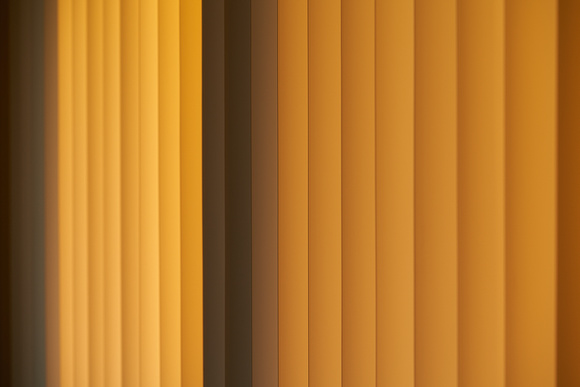 Is this too clich� of a subject? I will play with the depth of field a bit more in the future, but the window of opportunity was really short and I had to bail for work.
|
|
|
|
President Beep posted:What sort of an EV spread do you like to use? As wide as possible? I think I have it only set to -2 to +2, I should expand it really as it makes more sense to go further with a 5 burst and not a 3.
|
|
|
|
EL BROMANCE posted:I think I have it only set to -2 to +2, I should expand it really as it makes more sense to go further with a 5 burst and not a 3. I do two exposures, good enough if the only goal is limiting noise and saves having a bunch of huge stacks lingering around.
|
|
|
|

|
| # ? Jun 6, 2024 13:25 |
|
President Beep posted:My pleasure! This ought to work. It was uploaded as a raw, so I�m assuming it�ll download as the same. I actually really like this unedited. It has a moodiness to it, looks very natural compared to the edit and the light is great.
|
|
|


