


|
Samp wore a special kit yesterday to commemorate the 120th anniversary of one of the original clubs that would later become part of the modern Sampdoria, Sampierdarenese I wish they had gone sponsorless but it's nice regardless.
|
 #
?
Mar 11, 2019 16:05
#
?
Mar 11, 2019 16:05
|
|


|

|
| # ? Jun 9, 2024 18:10 |
|
|
https://twitter.com/USMNT/status/1105148831770075138?s=19 I don't hate it, which already makes it better than most of the recent designs.
|
|
#
?
Mar 11, 2019 18:08
|
|

|
Why even bother
|
|
#
?
Mar 11, 2019 18:21
|
|
|
brasstassels posted:https://twitter.com/USMNT/status/1105148831770075138?s=19 I don�t hate it, but I like the two previous kits significantly more. Firmly in meh territory for me.
|
|
#
?
Mar 11, 2019 18:48
|
|

|
tbf the American flag is basically a hate symbol at this point so any kit with elements of it is inherently bad
|
|
#
?
Mar 11, 2019 21:33
|
|
|
The USWNT just unveiled both new ones today: https://twitter.com/USWNT/status/1105143388607795201 If you actually go click into the article they have some neat detail shots with the back of the white jersey listing all 50 states in a light grey which is kind of neat. I like the stars down the side of the shorts as well. Still prefer the last two kits with the horizontal bars though.
|
|
#
?
Mar 12, 2019 00:06
|
|
|
Jovial Cow posted:The USWNT just unveiled both new ones today: The aways are great, are the men going to wear that too?
|
|
#
?
Mar 12, 2019 00:31
|
|
|
Gigi Galli posted:The aways are great, are the men going to wear that too? I don't know are they? brasstassels posted:https://twitter.com/USMNT/status/1105148831770075138?s=19
|
|
#
?
Mar 12, 2019 00:32
|
|


|
Shrapnig posted:I don't know are they? Oh I meant the other ones ffs.
|
|
#
?
Mar 12, 2019 01:01
|
|
|
gently caress both US teams
|
|
#
?
Mar 12, 2019 13:55
|
|
|
ElGroucho posted:gently caress both US teams
|
|
#
?
Mar 12, 2019 17:45
|
|


|

|
|
#
?
Mar 19, 2019 20:56
|
|

|
Now that's a collar.
|
|
#
?
Mar 19, 2019 21:16
|
|
|
Just imagine popping it.
|
|
#
?
Mar 19, 2019 21:35
|
|

|
big crush on Chad OMG posted:Just imagine popping it. 
|
|
#
?
Mar 19, 2019 22:00
|
|

|

|
|
#
?
Mar 19, 2019 22:53
|
|

Gigi Galli posted:Now that's a collar. 
|
|
|
#
?
Mar 20, 2019 09:37
|
|
|
nice Dortmund shirt
|
|
#
?
Mar 20, 2019 10:51
|
|


|
Sadly just a concept.
|
|
#
?
Mar 20, 2019 12:58
|
|


|
Since City are going to Puma for next season, Nike have made a sort of "best of" kit for, I don't know, making money off idiots I suppose.
|
|
#
?
Mar 25, 2019 18:40
|
|


|
pik_d posted:Since City are going to Puma for next season, Nike have made a sort of "best of" kit for, I don't know, making money off idiots I suppose. Jesus Christ
|
|
#
?
Mar 25, 2019 19:33
|
|
|
pik_d posted:Since City are going to Puma for next season, Nike have made a sort of "best of" kit for, I don't know, making money off idiots I suppose. 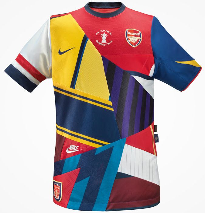
|
|
#
?
Mar 25, 2019 19:44
|
|


|
The strange bit is that the patterns are all askew. I'm not saying it looks good, it's still a mess. But at least make it look like a view of each shirt rather than an amalgamation of patterns
|
|
#
?
Mar 25, 2019 20:03
|
|

|
They are really good, Nike is good
|
|
#
?
Mar 25, 2019 20:46
|
|

|
pik_d posted:Since City are going to Puma for next season, Nike have made a sort of "best of" kit for, I don't know, making money off idiots I suppose. Microsoft really needs to retire Paint.
|
|
#
?
Mar 25, 2019 21:00
|
|

|
pik_d posted:Since City are going to Puma for next season, Nike have made a sort of "best of" kit for, I don't know, making money off idiots I suppose. Inter did this too  I think the City one is better because it's contrasting, this one just looks a mess.
|
|
#
?
Mar 25, 2019 21:01
|
|
|
those rule
|
|
#
?
Mar 25, 2019 21:02
|
|
|
Unironically awesome, every single one
|
|
#
?
Mar 25, 2019 22:19
|
|
|
I would take the city one over whatever skintight condom nonsense puma is going to come up with still miss umbro
|
|
#
?
Mar 25, 2019 22:43
|
|

|
Gigi Galli posted:Inter did this too I feel like on TV the Inter one would look better because you wouldn't see the detail as much as in a still image. The City one would still just be a mess of different colors. And at least the Inter one is obviously Inter kits, where the City one has the sky blue essentially marginalized as a sash and one (1) sleeve.
|
|
#
?
Mar 26, 2019 01:38
|
|
|
That Inter one looks fine to me. At least you can tell it�s a remix of the usual kit. It�s worse when they try to do something new altogether and you can barely tell what team the kit belongs to.
|
|
#
?
Mar 27, 2019 13:05
|
|

|
e: double post
|
|
#
?
Mar 27, 2019 13:05
|
|
|
Vegetable posted:That Inter one looks fine to me. At least you can tell it�s a remix of the usual kit. It�s worse when they try to do something new altogether and you can barely tell what team the kit belongs to. yeah because the patterns are all in-line with how they'd look on the shirt. The City one is all off-kilter
|
|
#
?
Mar 27, 2019 14:01
|
|
|
Well done Nike, sneaking two logos on one shirt. The Inter kit is quite good, the other two are shameful
|
|
#
?
Mar 28, 2019 08:14
|
|

|
jeebus bob posted:Well done Nike, sneaking two logos on one shirt. Welcome to five years ago op, when the logo trend started
|
|
#
?
Mar 28, 2019 08:47
|
|
|
 AFCON KIT ALERT AFCON KIT ALERT A solid look for Mali. This is what the next US shirt should be.  
|
|
#
?
Mar 28, 2019 14:54
|
|
|
Also a solid look for Brizzle with the new badge and a button collar. 
|
|
#
?
Mar 28, 2019 14:57
|
|
|
prefer the robin we had on our away shirts but it's ok
|
|
#
?
Mar 28, 2019 15:33
|
|

|
You'd think Championship clubs in with a shout at the playoffs would wait to announce sponsors.
|
|
#
?
Mar 28, 2019 15:49
|
|
|

|
| # ? Jun 9, 2024 18:10 |
|
|
Is the "Mifflin" on the back or what
|
|
#
?
Mar 28, 2019 16:23
|
|