


|
The moon, I think, needs a little more noise and blur to fit in. The font looks nice (I find this more readable than the last, but that's obviously not a huge factor in an album cover) but could use a little bit of distress/texture, something to make it look like it's either part of the print, or written on with a marker/brush. I don't think stars would really fit in as the sky doesn't seem dark enough to reveal stars. e: V V V I hope it doesn't run into an unfortunate accident involving onion torpedoes into a thermal duct a hole-y ghost fucked around with this message at 20:24 on Jul 2, 2019 |
 #
?
Jul 2, 2019 16:06
#
?
Jul 2, 2019 16:06
|
|


|

|
| # ? May 23, 2024 13:15 |
|
|
that's no moon..............
|
|
#
?
Jul 2, 2019 18:23
|
|

|

|
|
#
?
Jul 3, 2019 00:50
|
|


|
Al! posted:that's no moon.............. 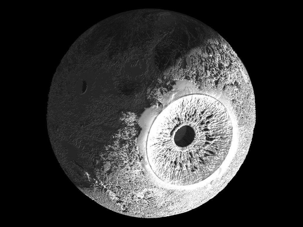 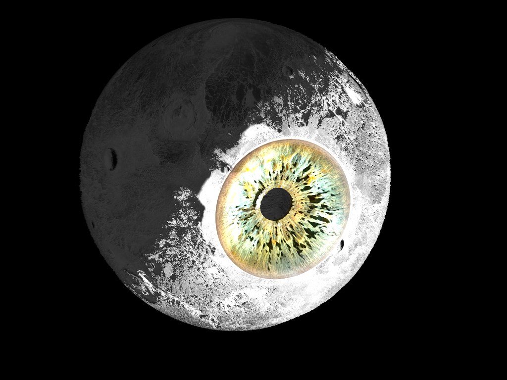 a hole-y ghost: Thank you for the input. I hate picking fonts. 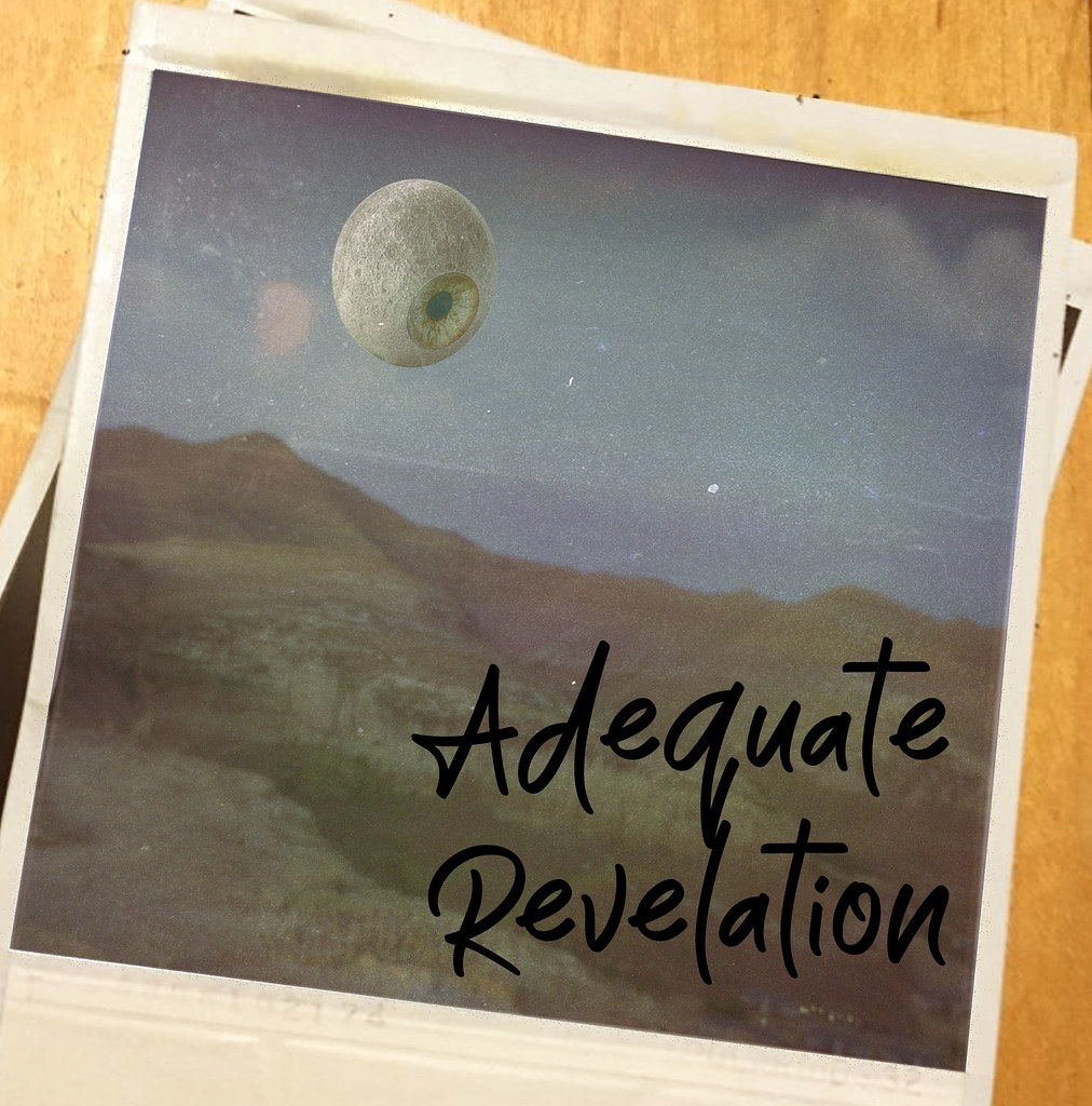 Black marker or white lettering? Time or date stamp? sigma 6 fucked around with this message at 07:26 on Jul 3, 2019 |
|
#
?
Jul 3, 2019 03:48
|
|

|
I think the white lettering pops more. as for time/date stamps, don't polaroids have those on the back of the picture? e: VVV yeah but I don't think any polaroids did the burned in stamps. none of the ones I used at least, maybe someone else knows a hole-y ghost fucked around with this message at 22:53 on Jul 3, 2019 |
|
#
?
Jul 3, 2019 14:07
|
|
|
I agree the white font pops more. Was thinking of time / date stamps like this. Interestingly the number you see on the bottom in the white is the number of the batch of the film manufactured.
|
|
#
?
Jul 3, 2019 16:36
|
|
|
|
|
#
?
Jul 3, 2019 21:01
|
|

|
I'm starting to feel like everything I color feels too oversaturated and I wanted to play more with lighter brighter colors for once. I also got the Frenden brush pack for Clip Studio and holy crap it's overwhelming. I tried the Frenden Inker Tilt Brush for this. The lines could be cleaner but overall I'm pretty happy with how this came out. If anyone else has the pack and has suggestions on which ones are good solid mainstays that'd be great.
|
|
#
?
Jul 3, 2019 22:05
|
|
|
 
|
|
#
?
Jul 4, 2019 19:17
|
|

|
I'm tabling at a convention in September for the first time in kind of a long time, I've got a square card reader thing for taking cards but I'm also wondering how much small change I should bring? It's a pretty small convention (like 2k people I think?) so I figure not a ton but am still afraid I'll underestimate. Does anyone in here do that sorta thing more often/can weigh in?
|
|
#
?
Jul 4, 2019 20:35
|
|

|
Never give up on dog's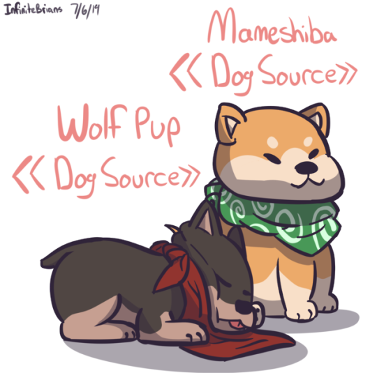
|
|
#
?
Jul 4, 2019 22:19
|
|
|
Wowporn posted:I'm tabling at a convention in September for the first time in kind of a long time, I've got a square card reader thing for taking cards but I'm also wondering how much small change I should bring? It's a pretty small convention (like 2k people I think?) so I figure not a ton but am still afraid I'll underestimate. Does anyone in here do that sorta thing more often/can weigh in? Consider the prices of your things first. Do you have a lot of small cheap items that would bring in loads of change? In this case, not a lot of change needed. Do all your prices require that change be given if people buy with notes? Coin up or prepare to drop your prices to the nearest note in your customer's purse. Honestly, the worst case scenarios here are that you have to ask the booth next to you if they'd do you a solid and change a note for ya, or that you'll go home jingling with your pockets full of unused change.
|
|
#
?
Jul 5, 2019 00:02
|
|

|
My stuff will mostly be small stuff, but my fear is I'll get a lot of "Oh cool a $2 pin all I have is a $20 bill" at the beginning of the day
|
|
#
?
Jul 5, 2019 02:32
|
|
|
Wowporn posted:My stuff will mostly be small stuff, but my fear is I'll get a lot of "Oh cool a $2 pin all I have is a $20 bill" at the beginning of the day "Sorry, I don't have the change for that right now, it is early in the day. Can I interest you in this print and let me sign it for you and give you a discount so it will come to $10, I can change that?"
|
|
#
?
Jul 5, 2019 05:25
|
|
|
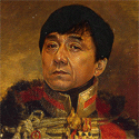
Here's Matt Berry as a dungeons and dragons character:
|
|
#
?
Jul 5, 2019 22:07
|
|


|
 Playing card sized.
|
|
#
?
Jul 6, 2019 01:06
|
|
|
Study from movie still.
|
|
#
?
Jul 6, 2019 14:13
|
|
|
^^^^^Nice work! Casino? sketchy as hell but the latest in my fight to push myself toward more effective use of line and even less realism. I love stuff like Creaturebox, but it's like pushing through a mental block trying to do something cartoony like that.
|
|
#
?
Jul 6, 2019 16:20
|
|
|
Thanks! Yep.
|
|
#
?
Jul 6, 2019 18:18
|
|
|
 Started trying to draw, can't figure out ladies or lady arms
|
|
#
?
Jul 7, 2019 11:18
|
|
|
lofi posted:
That's great. As a creature of low entertainment, I can only compare things to comics, so I'll say it gives me a kind of spooky P. Craig Russell vibe, which I assure you is a compliment. sammyv fucked around with this message at 14:39 on Jul 7, 2019 |
|
#
?
Jul 7, 2019 11:20
|
|

|
gmc9987 posted:"Garbage" is not how I'd describe it at all, the tiles looks pretty nice so far! As for colors, with this current version I think you may be thinking too literally in terms of colors - dirt = brown, snow = white, etc. The first game that sprang to my min as an example was Celeste. That game takes place almost entirely in a snowy alpine region, but most of the screenshots you can find on Google show a very "unnatural" palette of yellows, purples, and pinks. There are some blue areas to make a particular icy hazard stand out, but overall the palette is very limited and restricted. Have you tried picking out a palette of 5 or 6 colors that you like together, and limiting yourself to only those colors plus a couple shadow/highlight colors? Celeste has been my primary reference for this, yes. I just couldn't figure out how it manages to look as good as it does. sigma 6 posted:Use photo reference!! I imagine an icy tundra would not be near neon yellow. One is idea is to find a photo of an icy tundra that you like. Blur the crap out of it and then color pick 4 or 5 average colors from that as a color palette. Cool colors and less saturated color scheme would be my advice. The bright yellow and black scheme is like yellowjacket bees for the brain. Not pleasant and definitely not an icy tundra. That's what I did before and it just ended up looking brown and boring. Fish Noise posted:reflect sky color I'm sorry, I don't know what you mean. Invert the sky colour, or reflect it in the terrain, or? Sedgr posted:Where theres ice, theres snow. Go for a more desaturated blue grey color scheme and then make it pop with white snow for highlights. That does indeed look better, but it also looks a bit too dead to me. I was specifically wondering how to make the colours a bit quirky without it looking weird. a hole-y ghost posted:<detailed and very useful post> Thanks a lot for this! I was already looking at how other artwork to figure out how they did it, but couldn't get a feeling for it. I've since reworked it a bunch of times, trying to incorporate the feedback you guys gave me. This is what I have now:  Still not quite happy with it. I keep making changes but I can't put my finger on what I like better or worse. It's been very frustrating.
|
|
#
?
Jul 7, 2019 14:26
|
|


|
I also finally got off my butt and did another calendar picture. Here's June:
|
|
#
?
Jul 7, 2019 14:27
|
|
|
sammyv posted:That's great. As a creature of low entertainment, I can only compare things to comics, so I'll say it gives me a kind of spooky P. Craig Russell vibe, which I assure you is a compliment. Thanks, I take that entirely as a compliment! I'm super comics-influenced, so it makes sense! Shinmera posted:This is what I have now: Broken link! I wanna see!  You know you've made it as an artist when friends start bringing you all their random poo poo to use as art-fuel. "Oh, just had a tooth pulled and managed to keep hold of it - I bet Lofi would like that!"
|
|
#
?
Jul 7, 2019 17:55
|
|
|
That's weird, it shows up for me. Here's the containing tweet: https://twitter.com/Shinmera/status/1147858879683993601
|
|
#
?
Jul 7, 2019 18:03
|
|
|
I like the ice, it contrasts with the yellow sky nicely, but the stone looks a bit bland.
|
|
#
?
Jul 7, 2019 20:50
|
|
|
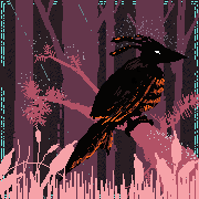
more bird
|
|
#
?
Jul 8, 2019 05:14
|
|
|
lofi posted:I like the ice, it contrasts with the yellow sky nicely, but the stone looks a bit bland. Yeah, I agree. I think the pattern is fine but the colouring is still not right. Another month for the calendar:
|
|
#
?
Jul 8, 2019 15:18
|
|
|
lofi posted:
Teach me all you know, you are so good at this. You diving stuff is so tranquil, I like it! I spend the weekend driving my Aprilia Sportsbike in the German mountains, also brought a small book and paints   Water is hard, in general this one is overworked.
|
|
#
?
Jul 8, 2019 15:49
|
|
|
Keetron posted:Teach me all you know, you are so good at this.  1) Ditch the pencil, draw straight in pen 2) Draw a thing 3) Textures are awesome, add more of them! 4) Add more black 5) Goto 2 Looking at yours, I'd suggest desaturating your colours some, especially on the trees. Things are rarely as brightly coloured as you think they are. lofi fucked around with this message at 16:36 on Jul 8, 2019 |
|
#
?
Jul 8, 2019 16:30
|
|
|
finally getting a handle on line art i think
|
|
#
?
Jul 8, 2019 19:58
|
|
|
Midsommar was fun.
|
|
#
?
Jul 8, 2019 22:11
|
|
|
ThePlague-Daemon posted:finally getting a handle on line art i think drat, that is some sweet angle-line-thing. Are they one stroke each, or thickened up after or what?
|
|
#
?
Jul 8, 2019 22:54
|
|
|
Didn't hit the stage of staring listlessly at a blank canvas until I had to colour it, but then it all worked out just fine!
|
|
#
?
Jul 8, 2019 23:15
|
|


|
lofi posted:drat, that is some sweet angle-line-thing. Are they one stroke each, or thickened up after or what? It's a combination of me thickening it up and erasing out parts.
|
|
#
?
Jul 8, 2019 23:33
|
|
|

|
|
#
?
Jul 9, 2019 02:40
|
|
|
another vanitas
|
|
#
?
Jul 9, 2019 03:27
|
|
|
woah double post, haven't seen that in a while
|
|
#
?
Jul 9, 2019 03:27
|
|
|
lofi posted:
1: will do. First the pen and then the paint or just both at kind of the same time? 2: can do that 3: wait, what is a texture, how do I get a texture? 4: is Payne's grey ok? 5: roger what is desaturating? But the sun was on the grass, it was like super green! (ok, not that green) In general, I drew very little the last few weeks. Still working on the Hufflepuff crest in cross stitch, which is WAAY more work than anticipated.
|
|
#
?
Jul 9, 2019 16:25
|
|
|

|
| # ? May 23, 2024 13:15 |
|
|
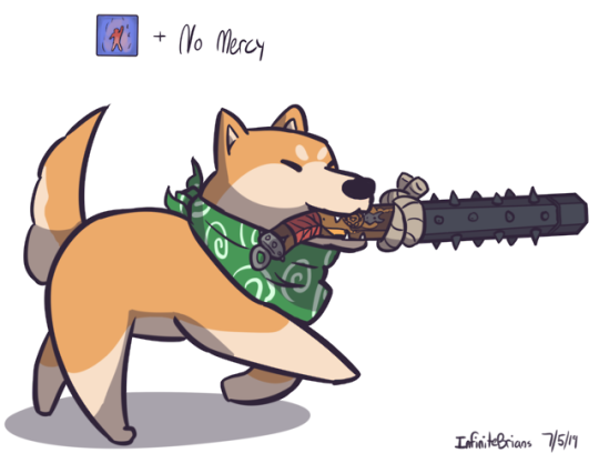
...................................................dogs...  
|
|
#
?
Jul 9, 2019 20:27
|
|