


|
I have a theory, call it crackpot if you want, for why 90s X-Men visual style endures in popularity despite being objectively kind-of terrible: 1. Make sure the characters' faces are stylized and take up huge portions of the frame. 2. Liberal use of the color Gold, with some Blue for contrast, especially on the key characters. Secondary characters can get any color. 3. Make sure Cyclops doesn't have the condom head.
|
 #
?
Oct 14, 2019 17:24
#
?
Oct 14, 2019 17:24
|
|


|

|
| # ? May 28, 2024 00:11 |
|
|
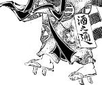
 Plastic Man #9 (1947), art by Jack Cole. I just love the way this page is laid out.
|
|
#
?
Oct 14, 2019 23:03
|
|


|
Darthemed posted:
God yes, I love golden-age stuff like this. There's a lot of comics from that era that were cranked out with rough art and writing that felt like a fever dream, but then there were gems like these by people with skill and wit willing to experiment, both writing and art-wise. Mad Magazine's first dozen or so issues are all like this and they're all still amazing today.
|
|
#
?
Oct 14, 2019 23:26
|
|

|
I'm glad I stopped buying comic books in the eighties.
|
|
#
?
Oct 14, 2019 23:44
|
|

|
Dick Trauma posted:I'm glad I stopped buying comic books in the eighties. I wish I had been that smart. 
|
|
#
?
Oct 14, 2019 23:46
|
|


|
Honestly I was too young for the comics, X-Men's continuity was nigh-impenetrable for an elementary age kid. But the cartoon, video games and action figures? Those were my poo poo.
|
|
#
?
Oct 14, 2019 23:49
|
|
|
Rotten Red Rod posted:Honestly I was too young for the comics, X-Men's continuity was nigh-impenetrable for an elementary age kid. But the cartoon, video games and action figures? Those were my poo poo.
|
|
#
?
Oct 14, 2019 23:51
|
|
|
I know. I was very penetrated.
|
|
#
?
Oct 15, 2019 20:34
|
|
|
For a while my favorite X-man was Maggott
|
|
#
?
Oct 16, 2019 18:54
|
|


|
A Bride's Tale has very fancy camels. 
|
|
#
?
Oct 16, 2019 22:55
|
|


|
I'm definitely a 90's X-man man. Even though so much of it is objectively terribad.
|
|
#
?
Oct 23, 2019 11:11
|
|

|
DarkCrawler posted:I'm definitely a 90's X-man man. Even though so much of it is objectively terribad. Specifically X-Man.
|
|
#
?
Oct 23, 2019 14:48
|
|

|
Great thread. https://twitter.com/DanSchkade/status/1179160242392842240
|
|
#
?
Oct 23, 2019 17:33
|
|

|
 Shadowman #5 (1999) Mat Broome (penciler)/Sal Regla (inker)
|
|
#
?
Oct 28, 2019 16:28
|
|
|
Darthemed posted:
DETECTIVE! YOU NEED TO SEE THIS! I CAN FIT MY WHOLE FIST IN MY MOUTH! AND MY OTHER FIST! AND MY FEET! AND THE SARGE'S FEET! AND
|
|
#
?
Oct 28, 2019 17:12
|
|

|
Darthemed posted:

|
|
#
?
Oct 28, 2019 17:59
|
|
|
that panel would probably look unironically good with a more stylized coloring style (especially if the rest of the comic had a similar level of stylization)
|
|
#
?
Oct 28, 2019 18:03
|
|

|
I dunno, it still looks like he's turning his face twenty degrees further than the rest of his head.
|
|
#
?
Oct 28, 2019 18:32
|
|

|
https://www.youtube.com/watch?v=sklqvDSGjCA
|
|
#
?
Oct 28, 2019 19:07
|
|


|
So I read this glowing write up of Immortal Hulk and they were gushing over the art and, while it's interesting in a sense, I'm gently caress all if I can figure out what's going on in any of it which is what good storytelling should do. https://www.avclub.com/immortal-hulk-smashes-the-universe-in-an-apocalyptic-mi-1839355874 I don't think it's that great 
|
|
#
?
Oct 29, 2019 01:31
|
|

|
Which page are you having a problem with? The weird looking alien people, or the one at the end with the intentionally abstract looking image? I haven�t read the actual issue yet either, I only flipped through it at the store because the owner said it was weird as gently caress. It�s more like something from Silver Surfer: Black than the usual hellish monsters from Immortal Hulk.
|
|
#
?
Oct 29, 2019 08:21
|
|


|
BiggerBoat posted:So I read this glowing write up of Immortal Hulk and they were gushing over the art and, while it's interesting in a sense, I'm gently caress all if I can figure out what's going on in any of it which is what good storytelling should do. I mean, it's fairly clear to me in the pages posted, but it isn't that great or anything. There's nothing to actually anchor yourself to visually aside from the letterboxes. I think it's the lack of faces on the aliens, they're drawn and posed as humanoids but my chimpanzee brain isn't attaching itself to any of them. That said, I've seen dozens, if not hundreds of pages where I've had the opposite problem-- too many generic faces and none of them exist as a proper focal point to contextualize the rest of the page--so don't think I'm saying "the aliens should have faces." There's nothing egregious about it though, it just looks like generic "trippy sci-fi dream sequence" notebook doodles. The kind of designs that will almost certainly never be used outside of this writer/artist's tenure on the book.
|
|
#
?
Oct 29, 2019 12:01
|
|
|
Darthemed posted:
This is the Good/Bad Art thread, not the loving Amazing Art Thread
|
|
#
?
Oct 29, 2019 18:22
|
|
|
Yeah I don't have a problem with that either, it's exaggerated but it looks fun and dynamic to me
|
|
#
?
Oct 29, 2019 23:28
|
|

|
What's not to love about a man who can fit his entire head into his own mouth.
|
|
#
?
Oct 30, 2019 00:16
|
|
|
Matt Broome was very nice when met him at WizWorld Chicago.
|
|
#
?
Oct 30, 2019 05:51
|
|
|
Lobok posted:DETECTIVE! YOU NEED TO SEE THIS! I CAN FIT MY WHOLE FIST IN MY MOUTH! MY TEETH HAVE TURNED INTO TWO WHITE BLOCKS WITHOUT ANY SPACES IN BETWEEN
|
|
#
?
Oct 30, 2019 10:01
|
|
|
Rotten Red Rod posted:Honestly I was too young for the comics, X-Men's continuity was nigh-impenetrable for an elementary age kid. But the cartoon, video games and action figures? Those were my poo poo. If you were a kid when it landed, it also felt like the 'mature' series in contrast to like the Marvel Action Hour.
|
|
#
?
Nov 2, 2019 18:20
|
|

|
Darthemed posted:

|
|
#
?
Nov 2, 2019 21:38
|
|

|
I would be very annoyed if i opened up that issue and the dialogue wasn't just "Guuuuuuhhhhh" "AAAAAAAAAA" "Oooooouughhh" "Huuuuuhhhhh" "Mmmmhhmhhh" "OooOoOOooOo~♪" "HUHHH!!" "HUURGH!!"
|
|
#
?
Nov 3, 2019 00:26
|
|

|
What it's like to bite into a York Peppermint Patty.
|
|
#
?
Nov 3, 2019 01:38
|
|

|
Punching down, but here are highlights from the Marvel Mangaverse. UDON Studio didn't put much effort in.  Nor did Chuck Austen.   Because most of it was Ben Dunn.  broken anatomy Irongirl broken anatomy Irongirl      
|
|
#
?
Nov 3, 2019 02:38
|
|
|
I hate that guy.
|
|
#
?
Nov 3, 2019 07:30
|
|
|
There was this really weird period in the 90s and early 00s where anime was just straight up referred to as Japanimation. Then Western artists tried to cash in on that specific look and it was the nightmare scenario you see above. Have some good art from Beastars to balance out the   
|
|
#
?
Nov 3, 2019 07:59
|
|


|
A cover full of o-faces
|
|
#
?
Nov 3, 2019 08:32
|
|


|
what did we do to deserve this
|
|
#
?
Nov 3, 2019 12:13
|
|


|
So did anyone actually die?
|
|
#
?
Nov 3, 2019 16:37
|
|

|
I don't think most of those characters have been seen outside of cameos in 20 straight years, so all of them?
|
|
#
?
Nov 3, 2019 16:47
|
|
|
The bigger question is, can you name a single character on that cover?
|
|
#
?
Nov 3, 2019 16:49
|
|
|

|
| # ? May 28, 2024 00:11 |
|
|
When I think of 2099 I'm like oh yeah, Spider-Man, Doom, Punisher... I honestly forgot there even was an X-Men 2099.
|
|
#
?
Nov 3, 2019 16:55
|
|