


|
TheAardvark posted:somewhere other than far left. your untenable position will be better served by other forums.
|
 #
?
Feb 20, 2020 19:06
#
?
Feb 20, 2020 19:06
|
|


|

|
| # ? May 12, 2024 07:01 |
|
|
Anne Frank Funk posted:your untenable position will be better served by other forums. au contraire, the names should be far left because the posters are 
|
|
#
?
Feb 20, 2020 19:20
|
|

|
TheAardvark posted:just want to say I'm frustrated by the quote text because every other forum you just scan the left side for the name and now I have to stop and focus to see who is being quoted. I like the idea of a custom one but not one that puts the name somewhere other than far left. you�re what�s wrong with this country!
|
|
#
?
Feb 20, 2020 20:17
|
|


|
Keep �sources close to� but make it black.
|
|
#
?
Feb 20, 2020 23:23
|
|

|
Platystemon posted:Keep �sources close to� but make it black. yeah that would be cool
|
|
#
?
Feb 21, 2020 00:14
|
|


|
red and black, surely
|
|
#
?
Feb 21, 2020 00:50
|
|

|
now, if you'll follow these guidelines, you'll arrive at a stylesheet in no time: what is black and white, yet re(a)d all over?
|
|
#
?
Feb 21, 2020 16:11
|
|


|
TheAardvark posted:just want to say I'm frustrated by the quote text because every other forum you just scan the left side for the name and now I have to stop and focus to see who is being quoted. I like the idea of a custom one but not one that puts the name somewhere other than far left. I like the joke, but yeah this is hard to get used to.
|
|
#
?
Feb 22, 2020 04:00
|
|
|
comedyblissoption posted:i like the gay space communism theme instead of this newspaper bullshit people seem to want Same. Newspaper theme is real lame. Cspam should be gaudy, colorful, and makes you feel like you're on an acid trip while browsing. That's the only way to summarize both american politics and cspam circa 5 AE (After escalator)
|
|
#
?
Feb 22, 2020 05:06
|
|
|
The newspaper is fun and you shouldn't do that other stuff.
|
|
#
?
Feb 22, 2020 12:31
|
|
|
*heroin addict voice* WHERE'S MY FUCKIN NEEDLE
|
|
#
?
Feb 22, 2020 13:38
|
|
|
really queer Christmas posted:Same. Newspaper theme is real lame. Cspam should be gaudy, colorful, and makes you feel like you're on an acid trip while browsing. That's the only way to summarize both american politics and cspam circa 5 AE (After escalator) Ur real lame
|
|
#
?
Feb 22, 2020 15:27
|
|


|
A long time ago Imp Zone had a gaudy, colorful stylesheet. You do not want this.
|
|
#
?
Feb 22, 2020 15:53
|
|

|
Bleh.
|
|
#
?
Feb 22, 2020 20:49
|
|
|
Just dicking around, always thought it was strange we never played up the guillotine thing with a forum like CSPAM 
|
|
#
?
Feb 22, 2020 21:04
|
|
|
the hyoid bone one is way better
|
|
#
?
Feb 23, 2020 00:19
|
|

|
I like the guillotines, they should linger on the banned image a bit longer, like maybe 2-4 seconds or so
|
|
#
?
Feb 23, 2020 03:51
|
|
|
Son of Thunderbeast posted:I like the guillotines, they should linger on the banned image a bit longer, like maybe 2-4 seconds or so like this?  
GonadTheBallbarian has issued a correction as of 04:36 on Feb 23, 2020 |
|
#
?
Feb 23, 2020 04:32
|
|
|
Perfect 
|
|
#
?
Feb 23, 2020 04:42
|
|
|
Platystemon posted:Keep �sources close to� but make it black. use only the username as the link 
|
|
#
?
Feb 23, 2020 11:02
|
|


|
Also get rid of the blues and make them reds this is cspam for christ's sake
|
|
#
?
Feb 23, 2020 11:54
|
|

|
Post blue no matter who
|
|
#
?
Feb 23, 2020 18:59
|
|
|
spckr posted:use only the username as the link Is there a way to do this with css alone?
|
|
#
?
Feb 23, 2020 22:46
|
|
|
TimWinter posted:Is there a way to do this with css alone? To get this:  Take this block:  and add this semicolon and line: 
|
|
#
?
Feb 24, 2020 02:14
|
|
|
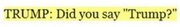
can you make it so that the trump thread's title's spelling of "trump" is automatically changed to the last one posted in the thread
|
|
#
?
Feb 24, 2020 05:10
|
|

|
Shear Modulus posted:can you make it so that the trump thread's title's spelling of "trump" is automatically changed to the last one posted in the thread you have ik buttons. you can make this happen if you just commit to it
|
|
#
?
Feb 24, 2020 05:31
|
|

|
what about when im asleep
|
|
#
?
Feb 24, 2020 05:33
|
|
|
that is now your sole purpose in life, congratualtions, shear modulus,,,
|
|
#
?
Feb 24, 2020 05:33
|
|

|
Shear Modulus posted:what about when im asleep just empty quote all spellings when you wake up, bonghitz style
|
|
#
?
Feb 24, 2020 05:35
|
|
|
Shear Modulus posted:what about when im asleep i said commit
|
|
#
?
Feb 24, 2020 05:35
|
|
|
please make the cspam background a nice aerial picture of central park TIA
|
|
#
?
Feb 24, 2020 05:38
|
|
|
Platystemon posted:To get this: Any idea how to get "posted" in black as well? I got this far too :/
|
|
#
?
Feb 24, 2020 05:55
|
|
|
TimWinter posted:Any idea how to get "posted" in black as well? I got this far too :/ It�s hacky, but here you go. code:The positioning could be wrong with different fonts or renderers, and notably it doesn�t switch to yellow when the quote is of your own post.  There may well be a better way to do it. Platystemon has issued a correction as of 08:52 on Feb 24, 2020 |
|
#
?
Feb 24, 2020 07:59
|
|
|
Oooh yeah that's the stuff. How does the .forum_269 stuff work? does everything in this forum have a class applied to it? I've been writing a stylesheet assuming it'll get loaded after forum.css
|
|
#
?
Feb 24, 2020 08:31
|
|
|
Whatever. However it's applied, it seems to work as expected. Not super happy with it yet, but it's a good starting point https://github.com/tim-win/269-css
|
|
#
?
Feb 24, 2020 08:38
|
|
|
so what's up, we are like halfway to a news-themed stylesheet
|
|
#
?
Feb 28, 2020 02:47
|
|
|
Not that I am going to do anything to help out, but I think the idea of a new york times stylesheet is boring and sucks rear end. It should look crazy and use :has pseudoclasses to make posts containing BERNIE fly around the screen and. Avatars should be saying the posts. Mods posts should be turned into 1px text in a collapsed box that you have to click a button to display. All of the branding and styling should be directly copied from AboveTopSecret
|
|
#
?
Mar 1, 2020 18:41
|
|

|
The Xkdc Larper posted:Not that I am going to do anything to help out, but I think the idea of a new york times stylesheet is boring and sucks rear end. It should look crazy and use :has pseudoclasses to make posts containing BERNIE fly around the screen and. Avatars should be saying the posts. Mods posts should be turned into 1px text in a collapsed box that you have to click a button to display. All of the branding and styling should be directly copied from AboveTopSecret
|
|
#
?
Mar 1, 2020 18:58
|
|


|
The Xkdc Larper posted:Not that I am going to do anything to help out, but I think the idea of a new york times stylesheet is boring and sucks rear end. It should look crazy and use :has pseudoclasses to make posts containing BERNIE fly around the screen and. Avatars should be saying the posts. Mods posts should be turned into 1px text in a collapsed box that you have to click a button to display. All of the branding and styling should be directly copied from AboveTopSecret
|
|
#
?
Mar 1, 2020 21:24
|
|
|

|
| # ? May 12, 2024 07:01 |
|
|
also OPs should still bear the blue checkmark of shame
|
|
#
?
Mar 1, 2020 21:24
|
|