|
Cat Face Joe posted:These are all good ideas, thanks. Maybe consider either having the white on the model be just off-white (like an incredibly light grey or a very bright ivory) or have your snow be patchy/falling on rocks (or logs or whatever) that are big enough to protrude through to give you some contrast? So like there is snow on the top of the rock, but the sides of the rock are too steep for the snow to lie on. Or depending on the model/pose maybe splatter some blood on the snow? I dont have a lot of experience with snowy bases (literally 8 models, ever) but I kind of feel that if you start bringing down the whiteness of the snow it wont read as snow any more unless you can do it incredibly subtly. I could easily be wrong though, as I say I'm hardly a snow base expert.
|
 #
?
Oct 12, 2020 23:50
#
?
Oct 12, 2020 23:50
|
|


|

|
| # ? May 9, 2024 21:50 |
|
|
Cat Face Joe posted:These are all good ideas, thanks. Yeah, I think your best bet would be to include some rocky outcropping and build up from blue to white - something like this:  If you do the rocks in grayscale it wouldn't even throw off the monochromatic look. Also worth noting that depending on what snow material you're using, you can wet your brush and sorta feather the edges out to get a wet "slush" look like it's starting to melt at the very edges. Lets a little of whatever you put it on top of show through and adds some texture / tonal contrast. I know you can do it with Valhallan Blizzard, not sure about others but I imagine they're mostly the same stuff. edit: some better pictures of those bases here: http://wappellious.blogspot.com/2013/09/chamber-of-secrets.html Grizzled Patriarch fucked around with this message at 01:37 on Oct 13, 2020 |
|
#
?
Oct 13, 2020 01:34
|
|


|
Cat Face Joe posted:These are all good ideas, thanks. Out of curiosity are you going to paint with black or mix various colors to achieve a look that reads as black? Marco explains better than I could: https://www.youtube.com/watch?v=kyXzfVO2Kdw
|
|
#
?
Oct 13, 2020 01:55
|
|


|
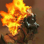
Finished up an ice elemental, some Crysmals, and a gross little imp. The Crysmals were printed in blue and green transparent resin. The three on the left are blue, the two on the right are green.
|
|
#
?
Oct 13, 2020 04:01
|
|


|
Der Shovel posted:I'd be extremely interested in seeing how that turns out as you start to do contrasts on it. For whatever reason I've never been able to make contrasts work on anything larger, but I'm not ready to give up yet. Late reply, but I did a whole process post about this guy in particular to show how I do it - here's a link to the post. (It also shows how contrasts make for a nice base for easy half-assed NMM.) The end result, though, is this, after maybe 2 or 3 hours sustained painting time per mini.  Also, for "contrasts on larger models," here's Japanese wunderkind mini painter Senasuke using Contrasts to paint a Gundam of all things (in Japanese, but YouTube's auto-translate subtitles aren't terrible so you can get the basic idea): https://www.youtube.com/watch?v=ExAZKKjF1as Of particular interest is the technique she's worked out for mitigating pooling, which starts at the 8:35 mark.
|
|
#
?
Oct 13, 2020 04:58
|
|
|
If you're glazing, using washes, or contrast paints to modulate large surfaces, you can mix gloss varnish into your paint mix. It will help a lot with pooling. Also if your underlayer is a gloss paint or if you take the time to hit it with gloss varnish the two comboed up will help even more. Also this is the first time Vallejo has let me down:  Right paint is the one I expected, left paint is the one I got 
|
|
#
?
Oct 13, 2020 07:29
|
|


|
Squigs are such a joy to paint. Basing these boys was a nightmare and I lost some fingerprints in the process but I'm pretty happy with the progress. I need to dry brush the edge of the feet more to blend it in but I love this mini.
|
|
#
?
Oct 13, 2020 13:58
|
|

|
Some of my friends made models in hero forge, I want to print and paint them. Are there "secret tips" for painting pink? Like how pink makes a great under coat for yellow or yellow under gold metallic. All the pinks i've painted have been like, strong Kirby pink. This was the first model volunteer and that shirt lands it right in a paint blind spot of mine.
|
|
#
?
Oct 13, 2020 14:15
|
|
|
I can't help you either way, but are you asking how to do a nice pastel pink like that shirt, or are you saying that's what you normally do but this time you want like a neon pink like those sun glasses?
|
|
#
?
Oct 13, 2020 14:28
|
|

|
The pastel pink of the shirt is what I don't know how to do. The strong purple / pink in the sunglasses is what I have done before.
|
|
#
?
Oct 13, 2020 14:59
|
|
|
Serenade posted:Some of my friends made models in hero forge, I want to print and paint them. Are there "secret tips" for painting pink? Like how pink makes a great under coat for yellow or yellow under gold metallic. All the pinks i've painted have been like, strong Kirby pink. I don't think pink is really a color you need "tricks" for like red or yellow. Pink paints tend to work just fine, and you can just mix in some white for highlighting and red or magenta or purple for shading.
|
|
#
?
Oct 13, 2020 15:00
|
|
|
Finished a couple of "final boss" necromancers.  The plan is to let the party kill one in a mimic dungeon, then the other in a zombie dungeon, then to have some weird mimic attacks in town that lead them to killing the first one again, then after some quiet/other quests, to fight them both together (after they've put each other back together).
|
|
#
?
Oct 13, 2020 18:54
|
|
|
Serenade posted:The pastel pink of the shirt is what I don't know how to do. The strong purple / pink in the sunglasses is what I have done before. If you're using GW colors, Fulgrim pink is pretty spot-on for that. If you want an even more desaturated pastel tone, you're gonna want to mix in a slightly green yellow - here's a mixing chart for reference - it's using oil paints but it will give you an idea of what I mean:  For highlighting, using white is going to give you a slightly chalky look - your best bet for smoother highlights is going towards a cream, edging into an almost slightly orange color, and it can be darker than you're probably thinking - a pale flesh tone can actually look really nice as a pink highlight, and your eye reads it as a brighter color even when they're very close in value.
|
|
#
?
Oct 13, 2020 21:06
|
|
|
Giant Ethicist posted:Also, for "contrasts on larger models," here's Japanese wunderkind mini painter Senasuke using Contrasts to paint a Gundam of all things (in Japanese, but YouTube's auto-translate subtitles aren't terrible so you can get the basic idea): Huh
|
|
#
?
Oct 13, 2020 21:19
|
|

|
I have never considered drybrushing with contrast paint.
|
|
#
?
Oct 13, 2020 21:39
|
|
|
Giant Ethicist posted:Also, for "contrasts on larger models," here's Japanese wunderkind mini painter Senasuke using Contrasts to paint a Gundam of all things (in Japanese, but YouTube's auto-translate subtitles aren't terrible so you can get the basic idea): This is wild, I love it e: lady proceeds to freehand panel lines on completely flat surfaces with no guidelines using only a brush Eej fucked around with this message at 22:22 on Oct 13, 2020 |
|
#
?
Oct 13, 2020 22:14
|
|

|
Eej posted:This is wild, I love it Senasuke is real good. Her channel is about 10% GW minis and 90% Gundams these days (Bandai's giving her a lot of money to make stuff on her channel, GW less so) but she has a real eye combined with a powerful "I'll paint however I want, gently caress conventional wisdom" energy. Here she is wet blending Contrasts right on the model, and when she paints with traditional acrylics she does stuff like this:    (She's on Twitter and Instagram, for the following-painters crowd.)
|
|
#
?
Oct 13, 2020 22:52
|
|
|
I don't know if I like it, but that is very interesting
|
|
#
?
Oct 14, 2020 03:50
|
|
|
x-post from the hams threadEej posted:Completed my first (half) unit of Necrons, I'm excited the skeles are back in town I'm not sure which base looks best so I probably will just randomly do both rocky/sandy and cracked earth textures for variety
|
|
#
?
Oct 14, 2020 04:10
|
|

|
Personally I like the middle and right bases
|
|
#
?
Oct 14, 2020 05:42
|
|
|
decided to get some age of sigmar hammer bros because I think they look cool and I wanted to try doing dark metal armor. I think they turned out pretty good  next I'll start learning how to do decent looking bases
|
|
#
?
Oct 14, 2020 08:26
|
|


|
He mini's painting people! Do you want a miniatures painting gang tag? Check out this new stickied thread: https://forums.somethingawful.com/showthread.php?threadid=3944018
|
|
#
?
Oct 14, 2020 18:54
|
|
|
Leperflesh posted:He mini's painting people! Do you want a miniatures painting gang tag? Check out this new stickied thread: https://forums.somethingawful.com/showthread.php?threadid=3944018 Hell yeah, count me in whenever someone designs something. A 40k tag would be neat too.
|
|
#
?
Oct 14, 2020 20:41
|
|

|
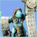
 I painted a lizardguy. First of many for a Seraphon army.
|
|
#
?
Oct 14, 2020 20:47
|
|

|
NUMBER 1 FULCI FAN posted:Hell yeah, count me in whenever someone designs something. A 40k tag would be neat too. Someone come up with some ideas, I can sorta do animated gifs.
|
|
#
?
Oct 14, 2020 21:21
|
|


|
Painted some mans, and touched up some others (still missing a head, arm and backpack - conversions in the works that got mixed up during a move). Just waiting on basing material in the mail to finish em off  
|
|
#
?
Oct 14, 2020 22:39
|
|

|
with a rebel yell she QQd posted:Someone come up with some ideas, I can sorta do animated gifs. Something that says two thin coats and then a big splash of paint.
|
|
#
?
Oct 14, 2020 22:43
|
|

|
Finished some Lumineth Wardens, C&C welcome.
|
|
#
?
Oct 15, 2020 00:10
|
|


|
Grizzled Patriarch posted:If you're using GW colors, Fulgrim pink is pretty spot-on for that. If you want an even more desaturated pastel tone, you're gonna want to mix in a slightly green yellow - here's a mixing chart for reference - it's using oil paints but it will give you an idea of what I mean: This helped a bunch, thanks. Playing with the colors, quinacridone red + titanium white works for the "base coat", switching to unbleached titanium + less quinacridone red for the highlights
|
|
#
?
Oct 15, 2020 00:33
|
|
|
Update on robo boi. My purple finally arrived: 
|
|
#
?
Oct 15, 2020 02:27
|
|

|
Mugaaz posted:Finished some Lumineth Wardens, C&C welcome. Those are some nice, silky looking duds.
|
|
#
?
Oct 15, 2020 11:00
|
|
|
I love that they look like they stepped out of WHFB but HD
|
|
#
?
Oct 15, 2020 12:45
|
|
|
Lovely Joe Stalin posted:Over a Wraithbone undercoat he did Skeleton Horde, then layered the suit with Wraithbone pot version, then highlighted with Matt White from the Army Painter. I wonder if this would work for all the white panels on my Horizon Zero Dawn robot miniatures...
|
|
#
?
Oct 15, 2020 15:49
|
|


|
   Not the best paintjob I've ever done, I'm really out of practice. But I love how much fun he's having.
|
|
#
?
Oct 15, 2020 16:38
|
|
|
chin up everything sucks posted:
If you want some CC: A wash would really help bring out the details! I'd use a brown wash on the bone/metals and a dark green wash on the skin.
|
|
#
?
Oct 15, 2020 16:43
|
|


|
chin up everything sucks posted:
o poo poo waddup
|
|
#
?
Oct 15, 2020 17:00
|
|


|
Mugaaz posted:Finished some Lumineth Wardens, C&C welcome. I gotta C&C for you  GOODAMN 
|
|
#
?
Oct 15, 2020 17:55
|
|


|
Mugaaz posted:Finished some Lumineth Wardens, C&C welcome. Fully aboard with your style here ") Ace work Ace workWhat you did with the bases really ties everything together too
|
|
#
?
Oct 15, 2020 22:30
|
|
|
Mugaaz posted:Finished some Lumineth Wardens, C&C welcome. Yellow trim on elf skirts is a pretty masochistic choice, take it from me. They look great, though!
|
|
#
?
Oct 15, 2020 22:45
|
|
|

|
| # ? May 9, 2024 21:50 |
|
|
humblewood miniatures are fantastic but i'm kinda pissed at whoever decided the rooster's staff should have 5 butterflies on it
|
|
#
?
Oct 15, 2020 23:50
|
|