


|
boop the snoot posted:I don�t mean offense by this, I just want to try to learn to get better at taking pictures. A lot of the time, photos like that are not solely good because of the technical aspects/standpoint but the feel of the photo. The technical stuff only helps to make the photo shine beyond the feel. But of course, the feel is the most subjective part about a photo. 
alkanphel fucked around with this message at 14:42 on Aug 15, 2021 |
 #
?
Aug 15, 2021 14:37
#
?
Aug 15, 2021 14:37
|
|


|

|
| # ? Jun 1, 2024 10:32 |
|
|

|
|
#
?
Aug 18, 2021 12:30
|
|

|
    
|
|
#
?
Aug 18, 2021 14:02
|
|

|
all good stuff on this page so far, especially these two
|
|
#
?
Aug 18, 2021 14:28
|
|

|
This is my favorite of the bunch, dreamy theater set vibes. I thought it was an interior until I processed the street sign.
|
|
#
?
Aug 18, 2021 15:07
|
|

|
Legit thought this was down the street from me and had to go google street view to make sure 
|
|
#
?
Aug 18, 2021 15:14
|
|

|

|
|
#
?
Aug 18, 2021 15:56
|
|
|
drat, really nice stuff eggs and Karl. That's a nice set, the flower in particular.
|
|
#
?
Aug 18, 2021 21:33
|
|
|

|
|
#
?
Aug 19, 2021 18:25
|
|


|
Congrats to all the previous posters in this page, great stuff.   
|
|
#
?
Aug 20, 2021 23:29
|
|


|
|
|
#
?
Aug 23, 2021 14:29
|
|
|

|
|
#
?
Aug 26, 2021 08:44
|
|


|

|
|
#
?
Aug 26, 2021 11:27
|
|
|
That rocks
|
|
#
?
Aug 27, 2021 03:35
|
|

|
  
|
|
#
?
Aug 27, 2021 05:28
|
|

|

|
|
#
?
Aug 31, 2021 01:46
|
|
|
 
|
|
#
?
Aug 31, 2021 07:27
|
|
|
I'm slowly teaching myself how to take pictures of things
|
|
#
?
Aug 31, 2021 13:54
|
|


|
NTRabbit posted:I'm slowly teaching myself how to take pictures of things Could use a dramatic sunset sky replacement
|
|
#
?
Aug 31, 2021 18:01
|
|
|
ic an play this game too
|
|
#
?
Sep 1, 2021 01:25
|
|
|
More like ground replacement filter.
|
|
#
?
Sep 1, 2021 01:48
|
|

|
  
|
|
#
?
Sep 3, 2021 07:27
|
|
|
These are great, I like 1 & 3 in particular...
|
|
#
?
Sep 3, 2021 23:49
|
|

|
 DSCF2716 by King Dugga, on Flickr DSCF2716 by King Dugga, on Flickr
|
|
#
?
Sep 7, 2021 01:00
|
|


|
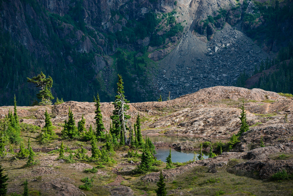
This page is severely lacking in mountains.   
Cacator fucked around with this message at 06:17 on Sep 8, 2021 |
|
#
?
Sep 8, 2021 05:54
|
|
|
Cacator posted:This page is severely lacking in mountains. Where is it?
|
|
#
?
Sep 8, 2021 06:34
|
|
|
More mountains. 
|
|
#
?
Sep 8, 2021 07:28
|
|
|
ImplicitAssembler posted:They're all nice, but this one really speaks to me. Thanks - this is from a hike along the Valley of the Ten Peaks in Alberta, Canada. Dread Head posted:More mountains. Slick
|
|
#
?
Sep 8, 2021 15:26
|
|
|
Cacator posted:Thanks - this is from a hike along the Valley of the Ten Peaks in Alberta, Canada. We're gonna have to take away your tourist privileges for not shooting moraine lake from the top of the rock pile.
|
|
#
?
Sep 8, 2021 15:42
|
|

|
xzzy posted:We're gonna have to take away your tourist privileges for not shooting moraine lake from the top of the rock pile. I brought two rolls of film and made sure to take my last shot of ektachrome from the rock pile! If only I could find someone to develop it for me...
|
|
#
?
Sep 8, 2021 15:47
|
|
|
Also here's a mountain I saw this summer. Mountains are nice. Very much not confident with my B&W conversions so if someone thinks I hosed it up I'd love to hear what I did wrong. There was a lot of slider wiggling so I'm worried I overcooked it and am blind to it.
|
|
#
?
Sep 8, 2021 16:01
|
|
|
xzzy posted:Also here's a mountain I saw this summer. Mountains are nice. I think this looks pretty good. The common mistake is to blow highlights and stuff like that (or crush blacks too much) and in general apply too much contrast. The highlights on the left mountainside look on the border of being blown out but it's not super distracting - only distracting to me because I'm looking at it wondering if any of it is actually blown out.
|
|
#
?
Sep 9, 2021 01:54
|
|
|
VelociBacon posted:The highlights on the left mountainside look on the border of being blown out but it's not super distracting - only distracting to me because I'm looking at it wondering if any of it is actually blown out. Caught my eye too. Between that and the patch of trees right below, the photo is weighted heavily to the left. I wonder if that'd be less noticeable in color. Regarding black levels, I'd say they're lifted a tad too much. seravid fucked around with this message at 02:04 on Sep 9, 2021 |
|
#
?
Sep 9, 2021 02:01
|
|
|
xzzy posted:Also here's a mountain I saw this summer. Mountains are nice. Was this a colour photo originally?
|
|
#
?
Sep 9, 2021 02:16
|
|
|
VelociBacon posted:The highlights on the left mountainside look on the border of being blown out but it's not super distracting - only distracting to me because I'm looking at it wondering if any of it is actually blown out. Yeah, I sweated over that for a bit in LR and there's even a radial filter over it to bring down the highlights. Nothing in the histogram is clipped though. But I couldn't wiggle sliders enough to get it to naturally blend in better.. anything more started to make ugly halos. I could fix it in photoshop but I also kind of wanted to see if anyone else commented on it. seravid posted:Caught my eye too. Between that and the patch of trees right below, the photo is weighted heavily to the left. I wonder if that'd be less noticeable in color. My issue with the color version is it's pretty low contrast. There was smoke haze, the greens were kinda dingy, and the mountains were pretty flat. I didn't feel color brought anything to the table. If you care to form an opinion on your own, here's an unedited export: https://i.imgur.com/3cyJ9cv.jpg I'll agree it's heavy on the left. Looking at the conversion next to the color maybe I pulled down the darks too much. ImplicitAssembler posted:Was this a colour photo originally? Yes it was!
|
|
#
?
Sep 9, 2021 03:02
|
|
|
xzzy posted:
imo trying to hide the haze is a mistake. other people have pointed out it looks a little crushed. personally i like the subtly shifting tones of the haze. i think it comes of even better in the colour version from the blue wood smoke on muted greens. nice picture in any case
|
|
#
?
Sep 9, 2021 04:35
|
|
|
|
|
#
?
Sep 9, 2021 05:36
|
|
|
xzzy posted:Yeah, I sweated over that for a bit in LR and there's even a radial filter over it to bring down the highlights. Nothing in the histogram is clipped though. But I couldn't wiggle sliders enough to get it to naturally blend in better.. anything more started to make ugly halos. I could fix it in photoshop but I also kind of wanted to see if anyone else commented on it. Tons of stuff work with. Normally hate when people do this, but this is shifting the levels within range and tweaking midpoint + a a tiny amount of color work. Probably even more so if you have the original 16bit version 
|
|
#
?
Sep 9, 2021 06:23
|
|
|
 
|
|
#
?
Sep 9, 2021 09:31
|
|
|

|
| # ? Jun 1, 2024 10:32 |
|
|
They�re all good but the first one is really fantastic I think. Cacator posted:This page is severely lacking in mountains. Same here and as others have said the second-to-last is the standout. I think it�s the very distinct foreground, midground, and background, with each looking good and the background especially has some really cool cloud stuff going on that ties it all together there with the round one in the upper left just sitting perfectly between those two peaks. Also the last one is cool. Looks like the setting for a 70s western.
|
|
#
?
Sep 9, 2021 16:11
|
|