|
https://twitter.com/markjburns88/status/1600158619927863296
|
 #
?
Dec 6, 2022 23:59
#
?
Dec 6, 2022 23:59
|
|


|

|
| # ? Jun 8, 2024 12:26 |
|
|
Glad I invested in MS Excel.
|
|
#
?
Dec 7, 2022 00:02
|
|


|
Meta? What? What sort of numbers-that-don�t-mean-what-they-seem nonsense is that?
|
|
#
?
Dec 7, 2022 00:29
|
|


|
Subjunctive posted:Meta? What? What sort of numbers-that-don’t-mean-what-they-seem nonsense is that? https://twitter.com/CaseyDeckerTV/status/1600247127464349697 
|
|
#
?
Dec 7, 2022 00:34
|
|


|
Ornamental Dingbat posted:Glad I invested in MS Excel. You fool! You're going to lose your sheet!
|
|
#
?
Dec 7, 2022 00:49
|
|


|
Incredible that someone chose to publish that when they had the alternative of destroying all evidence and moving to Ecuador under an assumed name.
|
|
#
?
Dec 7, 2022 01:43
|
|
|
market "research" is literally less scientific than, and probably not as accurate as, reading entrails
|
|
#
?
Dec 7, 2022 01:58
|
|

|
Subjunctive posted:Incredible that someone chose to publish that when they had the alternative of destroying all evidence and moving to Ecuador under an assumed name.
|
|
#
?
Dec 7, 2022 02:15
|
|

|
Gaylord Hotels called, they were asking about your founder�s discount.
|
|
#
?
Dec 7, 2022 03:32
|
|

|
It came from Facebook:
|
|
#
?
Dec 8, 2022 15:18
|
|

|
120-year-old practically unknown league is fastest growing brand, hmmm Walton Simons posted:It came from Facebook: How do some of these guys have goals while not playing a match? Is there some sort of statistical thing that doesn't count a match if you didn't start?
|
|
#
?
Dec 8, 2022 15:24
|
|

|
Nope, the author just doesn't seem to think information on who played in the World Cup in 1954 exists. You can look up the exact lineup of third division domestic games from the fifties so it's just absurd.
|
|
#
?
Dec 8, 2022 15:50
|
|
|
Walton Simons posted:It came from Facebook: Matches played vs goals scored might make for an interesting scatter plot. I wouldn't add those two very different numbers together though as they are doing with the stacked bars.
|
|
#
?
Dec 8, 2022 16:42
|
|
|
Horrible stacking choice, when the interesting part is the ratios. But I also like the wording about the German guy winning the tournament in 2014. It sounds like he did it all alone.
|
|
#
?
Dec 8, 2022 18:03
|
|
|
jjack229 posted:Matches played vs goals scored might make for an interesting scatter plot. I wouldn't add those two very different numbers together though as they are doing with the stacked bars. Yes, it's somewhat more interesting: 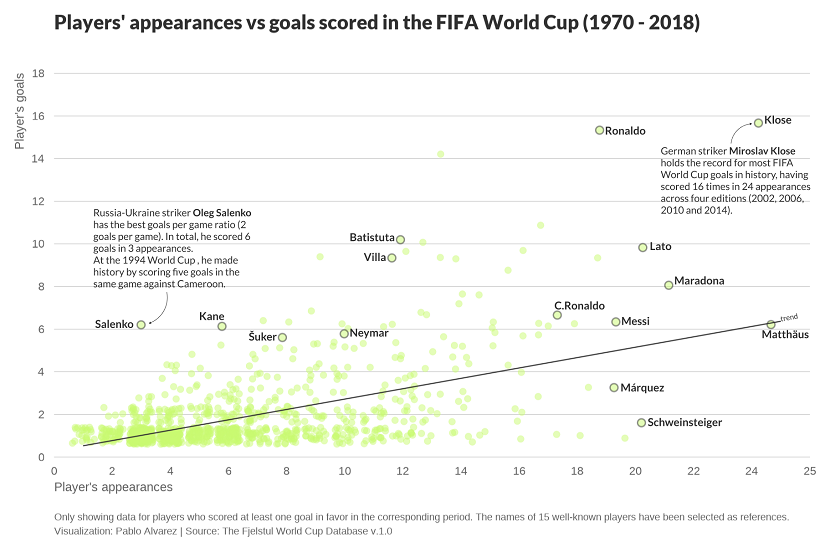 At least this one acknowledges that their data period starts in 1970 to avoid stupid things like 13 goals in 0 games. Edit: kind of weird though that they highlighted Marquez and Schweinsteiger who played plenty but didn't score much... And not Cubilas or Gerd Müller who were prolific goalscorers. Edit2: waaaaait... I guess they applied some sort of scattering to limit overlaps and make the scatterplot easier to read, but it feels wrong to see data points where there is no overlap but an offset is applied, as if Schweinsteiger really scored 1.8 goals... Shazback has a new favorite as of 18:29 on Dec 8, 2022 |
|
#
?
Dec 8, 2022 18:04
|
|

|
Shazback posted:Yes, it's somewhat more interesting: Why do they shift all the points so it looks like people scored 2.3 times in 4.7 appearances or whatever?
|
|
#
?
Dec 8, 2022 18:23
|
|


|
dublish posted:Why do they shift all the points so it looks like people scored 2.3 times in 4.7 appearances or whatever? Substitutes? No idea about the goal spreading
|
|
#
?
Dec 8, 2022 23:27
|
|


|
Serperoth posted:Substitutes? No idea about the goal spreading It's jitter. https://stackoverflow.com/questions/17547699/what-does-the-jitter-function-do-in-r
|
|
#
?
Dec 9, 2022 00:19
|
|
|
Shazback posted:It's jitter. Huh. Thanks!
|
|
#
?
Dec 9, 2022 01:40
|
|
|
Shazback posted:It's jitter. This totally makes sense for data that is rounded, but for data where the exact number is known and fractional goals are not possible? 
|
|
#
?
Dec 9, 2022 06:05
|
|
|
It's nice to see weights. I suspect that graph would look nicer if it had subtle grid markings at the integer values so you can see the explicit bins
|
|
|
#
?
Dec 9, 2022 06:27
|
|
|
drk posted:This totally makes sense for data that is rounded, but for data where the exact number is known and fractional goals are not possible? It's because otherwise a lot of the data points would be exactly on top of each other so you couldn't tell whether some circle represented a lot of players or just one
|
|
#
?
Dec 9, 2022 07:27
|
|

|
Qwertycoatl posted:It's because otherwise a lot of the data points would be exactly on top of each other so you couldn't tell whether some circle represented a lot of players or just one you could change its size or use a heatmap
|
|
#
?
Dec 9, 2022 08:33
|
|


|
Not really a chart, but enjoy this absolutely insane map of countries where a company distributes its product. 
|
|
#
?
Dec 11, 2022 03:52
|
|

|
Elviscat posted:Not really a chart, but enjoy this absolutely insane map of countries where a company distributes its product. New Zealand is on the map at least, even if the distance to Australia is distorted.
|
|
#
?
Dec 11, 2022 04:00
|
|

|
I like the implication that these countries are just launching the product straight into the ocean.
|
|
#
?
Dec 11, 2022 04:05
|
|
|
I can't decide if I like Cuba being labeled "Guam" or Taiwan being in the Atlantic Ocean off the coast of Brazil more.
|
|
#
?
Dec 11, 2022 04:17
|
|
|
For me it's the dot that's off the coast of Baja California connected to the dot that isn't even on the globe, and absolutely nothing else.
|
|
#
?
Dec 11, 2022 04:32
|
|


|
Elviscat posted:Not really a chart, but enjoy this absolutely insane map of countries where a company distributes its product. This image has fuckin layers of stupidity. At first, I was marveling at the seeming mapping of a Mercator projection of the entire globe onto a quarter-sphere, but the more you look at it the more insane it becomes. First of all, why are there lines all over the place that don't seem connected to either words or places? There's a giant "M" over the whole thing for no reason, connecting empty spaces to one another. The thicker lines at first seem to be labels connecting names to places, as they correctly identify Canada, United States, Mexico, and Chile. But then what's going on with Guam(?) pointing at Chad/Niger, or UK/Sweden(????) pointing at eastern Europe? Bahrain looks correct but the word Kuwait is randomly plastered over it. The line pointing to China seems to be labeled either Japan, Philippines, or Korea. And beyond all the lines, there's also random dots everywhere, but they don't seem to correspond with anything correctly. Which label is supposed to go with the dot on Ho Chi Minh City; Singapore??? Why does Panama seem to be on Hispaniola (or is THAT what "Guam" is)?? Is "Sweden" the dot on Finland? Is "UK" the dot on The Netherlands/Belgium area? Why are Taiwan and Malaysia hanging out near southern Africa? Also, each landmass appears to, entirely independently, have a circular gradient, as if to simulate a light source. So all of Eurasia and Africa has one shine centered around Afghanistan, but Australia has its own shine, as does Madagascar, Greenland, the Americas, etc. It looks really, really dumb on the small islands, especially in Indonesia. edit: i tried to reverse image search it; didn't find the source but did find another use of the same "projection" 
DontMockMySmock has a new favorite as of 04:41 on Dec 11, 2022 |
|
#
?
Dec 11, 2022 04:37
|
|

|
DontMockMySmock posted:another use of the same "projection" Not quite. Look at Alaska
|
|
#
?
Dec 11, 2022 04:59
|
|

|
DontMockMySmock posted:edit: i tried to reverse image search it; didn't find the source but did find another use of the same "projection" i kinda like it, tbh. it's not useful, but it is neat. and isn't that the most important characteristic of any map since time immemorial?
|
|
#
?
Dec 11, 2022 06:52
|
|

|
It has the look of an image that started its life with everything laid out properly with a bunch of well made layers all in the right place, that was then it was saved and sent to someone else who opened it in another bit of software that made an attempt to read the file but just couldn't quite figure out the layers properly ending up in a jumbled mess. That person just shrugged and published it anyway. Either that or someone just really sucks at making images and chucked it together in five minutes.
|
|
#
?
Dec 11, 2022 06:53
|
|

|
It's like when I take a bunch of photos to make a panorama but then hit the wrong buttons in the stitcher software
|
|
#
?
Dec 11, 2022 06:55
|
|
|
Ornamental Dingbat posted:I like the implication that these countries are just launching the product straight into the ocean. Also presumably space. And the back half of the earth is terra incognita.
|
|
#
?
Dec 11, 2022 10:37
|
|

|
redleader posted:i kinda like it, tbh. it's not useful, but it is neat. and isn't that the most important characteristic of any map since time immemorial? But where are the dragons??
|
|
#
?
Dec 11, 2022 17:49
|
|


|
|
|
#
?
Dec 12, 2022 13:20
|
|
|
https://vimeo.com/779765286
|
|
#
?
Dec 14, 2022 02:05
|
|
|
As an American I am proud to donate my precious blood, tears, and piss to the Ukrainian cause.
|
|
#
?
Dec 14, 2022 02:25
|
|


|
Pppbbbttthhhhhh Without any timeline this is just a graph I have to wait to fill up before I can visualize.
|
|
#
?
Dec 14, 2022 10:48
|
|
|

|
| # ? Jun 8, 2024 12:26 |
|
|
Might be the biggest Armenian flag in the world.
|
|
#
?
Dec 14, 2022 13:28
|
|