|
If it�s not already in a separate tube (like you�re carrying a palette or w/e) I�d bring it along in a separate tube, and when you mix use the SMALLEST touch of whatever color + blob of white. It�s important to remember gouache is semi-opaque watercolor, so your whitest white is the paper. Honestly I like using white acrylic at the end to push highlights/whites. Also titanium white is more opaque than zinc.
|
|
|
|

|
| # ? May 14, 2024 11:07 |
|
Crocobile posted:If it�s not already in a separate tube (like you�re carrying a palette or w/e) I�d bring it along in a separate tube, and when you mix use the SMALLEST touch of whatever color + blob of white. Yeah, already planning on carrying the tube, just seems that even the even mild brush contamination pushes it too far from white - though I'm more used to oil so maybe the habit of just moving to the next color without really cleaning the brush is culprit. I've ordered a tube of titanium white and will try keeping a brush on highlight duty. Keetron posted:You might want to consider watercolors when on the road. But that is just you know, my opinion, man.
|
|
|
|
oh gosh yeah, you gotta clean the brush between colours. Unless you don't mind muddiness.
|
|
|
|
I went and set up a portfolio site to organize my doodlings, as well as created a landing page for commissioned illustrations. This is all quite new to me and I'm quite entirely not sure what I'm doing. Is there anyone else in this thread that has done anything similar whom could provide any advice? https://jmreilly.myportfolio.com Edit: I found this dusty book in my library that seems to have some useful information for creative weirdos that have no idea about how to business. I'm open to suggestions on any other books or resources to help in a similar way. https://amzn.to/3XEXz6H IkeTurner fucked around with this message at 07:47 on Feb 18, 2023 |
|
|
|
Recommendation for a photoshop process? Trying to combine hues within a certain threshold into a solid huge. So far it seems like Filter Gallery > Cutout is the closest to what I'm looking for?
|
|
|
|
Ornery and Hornery posted:Recommendation for a photoshop process? I use combinations of Image->Adjustments->Posterize and Filter->Blur->Smart Blur to accomplish what I think you're asking about. Try them in different orders and amounts to compress images down into solid hues. Also, depending on the source image, sometimes making several duplicates of the original source, apply a different level of Image->Adjustments->Threshold to each, and color pick and apply a specific color to each threshold'd layer.
|
|
|
|
Instead of doing Posterize via the Image-Adjustments menu, make an adjustment layer. It�s non-destructive so you can mess with it along with the Smart Filters. Another thing you can do is convert the image from RGB to indexed color. https://helpx.adobe.com/photoshop/using/customizing-indexed-color-tables.html If you set up your color table just how you want and save it to a file, you can apply that table to other images either one-off or as a batch.
|
|
|
|
Does anyone have any recommendations for books on constructive anatomy for drawing from imagination? I'm at the point where I can draw a stick mannequin in proportion okay, but I have difficulty adding muscles and form to the basic stick figure, as well as adding clothes. I'm looking to draw more stylized figures in particular. Loomis's figure drawing for all it's worth is a good example, but something more modern would be helpful, maybe with a focus on construction tips (i.e. the outer part of the thigh muscle is generally higher than the inner portion, etc.) I'm thinking of a book that does something like: If you draw an elliptoid on this part of your stick drawing, it can represent your thigh muscles, and you can connect this way to the foot. Or The bicep is underneath the pectoral which is under the deltoid, so you can use these three lines to simulate where the upper arm connects to the torso. Some books I've considered are Figure Drawing: Design and Invention by Michael Hampton and Point Character Drawings by Taco.
|
|
|
|
Neon Noodle posted:Instead of doing Posterize via the Image-Adjustments menu, make an adjustment layer. It�s non-destructive so you can mess with it along with the Smart Filters. These are Pro Tips. Do as much in adjustment layers as possible so they're non-destructive and can be tweaked easily. The Customizing Index Color Tables to accomplish this is new info to me, and I've been using Photoshop for like decades now. Well done! This is excellent info.
|
|
|
|
Does anyone sell prints, and if so is there some good print to order service? I've gotten stuff printed w Shutterfly, Google photos, and some other service I can't recall but never used anything like redbubble and the like. Any recommendations?
|
|
|
|
|
Sup! I'm dipping my toes into watercolor and had a paper question. I'm shopping for 100% cotton paper for practice and I'm wondering if watercolor block paper is the same tooth on both sides? I'm specifically looking at the baohong academy blocks, and would like to make use of both sides if possible.
|
|
|
|
|
PokeJoe posted:Does anyone sell prints, and if so is there some good print to order service? I've gotten stuff printed w Shutterfly, Google photos, and some other service I can't recall but never used anything like redbubble and the like. Any recommendations? It depends on what you want. I print my own on an ancient Epson r2000. I buy print on demand prints as a part of my day job so I have seen some from different services. I wasn't impressed with Redbubble. Fine Art America is OK but their customer service can be iffy if you have a problem. Society 6 is pretty low quality paper. I hear Printful is good but have no personal experience with them. I have always liked anything we get from Smugmug but that is mostly photo prints. The thing I hear over and over from art fair artists I know is it's best to find a local print shop to do them for you if you don't do your own. They might be more expensive but then you can see the product and tweak things. If you have a local Blick, they often have sales on their printing services though I don't know how good a deal they are. They do have nice giclee printers.
|
|
|
|
Google Butt posted:Sup! I'm dipping my toes into watercolor and had a paper question. I'm shopping for 100% cotton paper for practice and I'm wondering if watercolor block paper is the same tooth on both sides? I'm specifically looking at the baohong academy blocks, and would like to make use of both sides if possible.
|
|
|
HungryMedusa posted:It depends on what you want. I print my own on an ancient Epson r2000. I buy print on demand prints as a part of my day job so I have seen some from different services. 🤯 I buy half my paints at a local blick idk why I didn't even think to check out their print services! Thanks for the advice 
|
|
|
|
|
Google Butt posted:Sup! I'm dipping my toes into watercolor and had a paper question. I'm shopping for 100% cotton paper for practice and I'm wondering if watercolor block paper is the same tooth on both sides? I'm specifically looking at the baohong academy blocks, and would like to make use of both sides if possible. I concur with the previous post. I've used a lot of brands and they're all just slightly different on both sides. strathmores in my experience are significantly different, canson and arches are pretty close. random super high end stuff varies. All can be useable on either side. experiment a little and figure out what you prefer. I used to have a huge issue where i wasnt using my art supplies to experiment enough because I was too precious about the costs and poo poo and its like nah. you gotta gently caress around to find out.
|
|
|
|
Thanks for the advice. I did a bunch of research and the most economical option I've found for decently reviewed 100% cotton paper is the baohong academy in 10 packs of 15x22" sheets @ $35 shipped. I ordered 2 packs with the plan to cut them up and paint on both sides. I'm hoping I can avoid feeling too precious about them at that price point, but we'll see..
Google Butt fucked around with this message at 01:07 on Mar 17, 2023 |
|
|
|
|
Does anyone have experience with scanning painted canvases? I'm trying to figure out whether buying a flatbed (scanning in sections) or having it scanned professionally is a good price / convenience. I'd need to scan widths up to 24".
|
|
|
|
Is the canvas on stretcher bars? Most works on canvas just don�t scan well at all. It�s better to invest the energy in a photography setup with appropriate lighting, tripod and DSLR.
|
|
|
|
Neon Noodle posted:Is the canvas on stretcher bars? Most works on canvas just don�t scan well at all. It�s better to invest the energy in a photography setup with appropriate lighting, tripod and DSLR. It's a 1.5 inch depth canvas. A photography setup might be the way to go anyway for sales listings. My computer touching ways have me wanting a "lossless" scan so that I can provide a print option.
|
|
|
|
A good photo with a proper lighting set up is the professional way to get art imaged, and is going to be better than any scan for all but the most flat and untextured image. A 24MP photo is good for a 13x20 inch print at 300dpi.
|
|
|
|
I've been curious about watercolour as a way to colourise sketches in my sketch book. I bought this today: https://www.officeworks.com.au/shop/officeworks/p/faber-castell-watercolour-pans-and-brush-18-pack-fa18010075 What is the best practice with a kit like this in terms of mixing colours? i.e. if I want to make a lighter shade of ultramarine, do I sample some of the ultramarine with a wet brush, deposit it on the white plastic palette piece, clean the brush, then repeat with some of the white and mix from there?
|
|
|
|
neurotech posted:I've been curious about watercolour as a way to colourise sketches in my sketch book. I bought this today: https://www.officeworks.com.au/shop/officeworks/p/faber-castell-watercolour-pans-and-brush-18-pack-fa18010075 If it's watercolor and not something like gouache, don't use the white. You just dilute the paint with water to get it lighter and you save the white of the paper as your highlights. A good way to go about it is to wet an area of the paper first, then just slowly add a little bit of pigment to gradually darken it up. And if you go too far you can wet a brush and lift it so long as the color is not very staining. For mixing, you can either mix colors together on the pallette then use them, or just layer them like you were glazing. You don't have to let it dry between adding colors but know that the paint will go wherever it's wet on the paper so controlling that will be good for keeping the edges where you want them. JuniperCake fucked around with this message at 10:14 on Mar 22, 2023 |
|
|
|
JuniperCake posted:If it's watercolor and not something like gouache, don't use the white. You just dilute the paint with water to get it lighter and you save the white of the paper as your highlights. A good way to go about it is to wet an area of the paper first, then just slowly add a little bit of pigment to gradually darken it up. And if you go too far you can wet a brush and lift it so long as the color is not very staining. Ahhh I see, I didn't think that diluting would lighten it. That makes sense. What about darkening?
|
|
|
|
neurotech posted:Ahhh I see, I didn't think that diluting would lighten it. That makes sense. What about darkening? You can add black to darken. Or complements or whatever you like.
|
|
|
|
JuniperCake posted:You can add black to darken. Or complements or whatever you like. Right, and would I use that method I suggested earlier (except with black of course)?
|
|
|
|
neurotech posted:Right, and would I use that method I suggested earlier (except with black of course)? Yeah you could. Or you could mix the black with the blue on the palette then add instead of adding black directly to the paper. You should experiment with different ways and see how you like to work with it.
|
|
|
|
JuniperCake posted:Yeah you could. Or you could mix the black with the blue on the palette then add instead of adding black directly to the paper. You should experiment with different ways and see how you like to work with it. That's what I was getting at, yep. I'm mainly asking because I was worried that I'd cross-contaminate the pans somehow.
|
|
|
|
You can also use less water to make the paint darker. Don't darken with black - darken with the complementary colour
|
|
|
|
Angrymog posted:
Eh that's more of a preference thing imo. I know plenty of skilled watercolorists who use black and their work is fine for it. Like I know using black in painting is a bit of a controversial subject that people have strong feelings about in general. But I think it's good to be careful about absolutes of always use x or never use y, since people can make a lot of stuff work you know? Even Sargent used black after all. JuniperCake fucked around with this message at 12:48 on Mar 22, 2023 |
|
|
|
If you darken with the complementary color, you will both darken and neutralize. Different black pigments have different temperatures. You might want to darken in a different hue direction, so choose your darkening color based on that. For instance, you can darken toward blue or purple with Ultramarine, or darken toward brown with Burnt Umber. edit: watch some veedios https://www.youtube.com/playlist?list=PL4GKIljwZeFto2DTYFyvfVbeoU0txHXcs
|
|
|
|
Just using a warm and cool color to paint is a lot of fun and you'd be surprised at the range you can get. Primary red and ultramarine is great, viridian and vermillion.
|
|
|
|
New stuff for a new year. I�m resolving to do small, low-production-count pieces to force myself to rely less on re-printing the same old stuff all the time  
|
|
|
|
love the second one in particular. I like the colour gradient in the background.
|
|
|
|
Google Butt posted:Thanks for the advice. I did a bunch of research and the most economical option I've found for decently reviewed 100% cotton paper is the baohong academy in 10 packs of 15x22" sheets @ $35 shipped. I ordered 2 packs with the plan to cut them up and paint on both sides. I'm hoping I can avoid feeling too precious about them at that price point, but we'll see.. Strathmore 400 is good, economical, and available drat near anywhere. I like it better than Fabriano, way better than Canson. E: Oh strathmore isn't 100% cotton, but if it's just for practice/funsies then why bother Flambeau fucked around with this message at 01:47 on Mar 27, 2023 |
|
|
|
Did another map, this one is Kansas surficial geology. 18x24, I've been working with larger paper and it's pretty rewarding. Forgive the poor lighting 
|
|
|
|
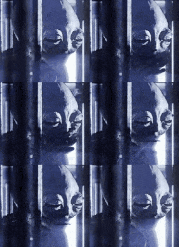
I've also been doing some experiments with setting wood on fire, then printing it  
|
|
|
|
Holy moly
|
|
|
|
dupersaurus posted:I've also been doing some experiments with setting wood on fire, then printing it These are really cool. The last one looks like an elephant�s snout.
|
|
|
|
dupersaurus posted:I've also been doing some experiments with setting wood on fire, then printing it Love these so much The bottom one reminds me of an owl. Flambeau posted:Did another map, this one is Kansas surficial geology. 18x24, I've been working with larger paper and it's pretty rewarding. This is a great idea and I love the execution.
|
|
|
|

|
| # ? May 14, 2024 11:07 |
|
smallmouth posted:These are really cool. The last one looks like an elephant’s snout. silicone thrills posted:Love these so much It's clearly ET with his head tilted to the side
|
|
|


