


|
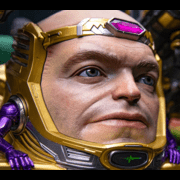
Joe Fisto posted:This has to be someone typing in "J Scott Campbell style Mary Jane, Black Cat and Gwen Stacy" into an AI. Was it J. Scott Campbell?
|
 #
?
May 2, 2023 02:09
#
?
May 2, 2023 02:09
|
|


|

|
| # ? May 27, 2024 07:53 |
|
|
Lobok posted:Was it J. Scott Campbell? It may have been. Is it ok for an artist to ask for an AI to make art in their style? Interesting.
|
|
#
?
May 2, 2023 02:10
|
|
|
Joe Fisto posted:It may have been. Is it ok for an artist to ask for an AI to make art in their style? Interesting. It's a bad idea because they won't own the copyright on it
|
|
#
?
May 2, 2023 02:15
|
|

|
Air Skwirl posted:It's a bad idea because they won't own the copyright on it Good point.
|
|
#
?
May 2, 2023 02:18
|
|
|
Alaois posted:j scott campbell's entire career has been based around his ability to draw sexy women and i don't know if he's ever actually been good at it I did a quick google search of his covers and most of these seem fine�good even! This is a remarkable downgrade from what seems to be his usual stuff
|
|
#
?
May 2, 2023 02:55
|
|
|
gotta keep pace with his competitor, the guy using the same random porn image to model 6 different gwen stacy variant covers
|
|
#
?
May 2, 2023 03:58
|
|

|
RevKrule posted:I'm not normally a "let's make fun of cheesecake" kind of person. I myself enjoy a good slice of cheesecake in comics sometimes. J Scott Campbell is just getting absolutely lazy as poo poo at this point. I mean, the bodies themselves are horribly twisted abominations of nature, but the clothes are just Fashion. Or maybe even Fashi�n.
|
|
#
?
May 2, 2023 04:03
|
|

|
MJ's skirt is made of architectural shingles, but that's a clear allusion to the "wall crawler".
|
|
#
?
May 2, 2023 04:32
|
|

|
StumblyWumbly posted:MJ's skirt is made of architectural shingles, but that's a clear allusion to the "wall crawler". She roofied herself?
|
|
#
?
May 2, 2023 04:43
|
|
|
RevKrule posted:I'm not normally a "let's make fun of cheesecake" kind of person. I myself enjoy a good slice of cheesecake in comics sometimes. J Scott Campbell is just getting absolutely lazy as poo poo at this point. This is particularly gross given how hard Marvel is trying to get us to believe they're going to kill Mary Jane this month.
|
|
#
?
May 2, 2023 11:45
|
|
|
StumblyWumbly posted:Catastrophically Horney is a great phrase It makes me sad to know how applicable this is to things.
|
|
#
?
May 2, 2023 12:08
|
|


|
Senior Woodchuck posted:This is particularly gross given how hard Marvel is trying to get us to believe they're going to kill Mary Jane this month. So while it IS a little weird to do wacky sexy romp covers featuring three ladies, one of whom is potentially dying in the comic inside in an homage to a second murdered woman featured on the cover, the only way to get the "sexy murdered ladies" cover is to order it online or buy it at JSC's merch booth, and no one involved with creating the interiors had any input on said cover. It is a weird and gross cash grab/market manipulation on several levels, and most companies do it on the regular!
|
|
#
?
May 2, 2023 13:50
|
|
|
�Limited edition� variant covers is such a an artificial inflation scam and it�s really off-putting so many creators I follow participate in it. I get they need to pay bills and all, but at least acknowledge that it�s just as gimmicky as the poo poo going on before the speculation bust.
|
|
#
?
May 2, 2023 15:44
|
|
|
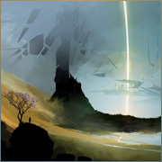
Paklis #6. Love that background (and other similar ones in this issue):
|
|
#
?
May 2, 2023 16:20
|
|
|
Wait what would even be the point of killing MJ? They just did an extremely convoluted series of events to break them up
|
|
#
?
May 2, 2023 18:29
|
|

|
CharlestheHammer posted:Wait what would even be the point of killing MJ? They just did an extremely convoluted series of events to break them up Editorial hates it when Peter is happy. That�s about it.
|
|
#
?
May 2, 2023 19:07
|
|
|
Chinston Wurchill posted:Paklis #6. Love that background (and other similar ones in this issue): gently caress yeah, this is very much my poo poo.
|
|
#
?
May 2, 2023 19:09
|
|
|
Joe Fisto posted:Editorial hates it when Peter is happy. That�s about it. It�s frustrating to see the extent that Marvel will go to keep the two characters apart while simultaneously selling a hardcover book about them getting married
|
|
#
?
May 2, 2023 19:20
|
|
|
Joe Fisto posted:Editorial hates it when Peter is happy. That�s about it. But he�s already dating black Cat! He�s already moved on. It�s stupid but it happened.
|
|
#
?
May 2, 2023 20:01
|
|
|
CharlestheHammer posted:But he’s already dating black Cat! He’s already moved on.  
|
|
#
?
May 2, 2023 20:09
|
|
|
The Bendis Daredevil run could maybe be up there with Miller and Nocenti if Maleev�s photo-traced art wasn�t threatening to drag the whole comic down with it. I�m usually not this charitable with Bendis�s comics, the writing works better here than in most of his other works. Like, what if these scenes were drawn by Miller or JRJR in their primes, or a modern top tier artist, is what I'm thinking.    EDIT: I actually think Maleev is competent and the art works well with the colors in the talkier scenes, but any scene with action or a more complicated scenario suffers. Suleman fucked around with this message at 23:59 on May 2, 2023 |
|
#
?
May 2, 2023 22:37
|
|
|
 Journey into Mystery #64 (1961) Pencils & Inks: Steve Ditko Colors: Stan Goldberg  The Champions #1 (1975) Pencils: Don Heck Inks: Mike Esposito Colors: Petra Goldberg  World of Krypton #3 (1979) Pencils: Alan Kupperberg (layouts, uncredited); Howard Chaykin Inks: Frank Chiaramonte Colors: Jerry Serpe   Firestorm, The Nuclear Man #69 (1988) Pencils: Joe Brozowski (as J. J. Birch) Inks: Sam de la Rosa Colors: Nansi Hoolahan These panels jumped out for being such a blatant rip of The Guyver, pictured below.  The purple character (Zuggernaut) already had a new design the next issue it appeared.  Firestorm #83 (1989) Pencils: Tom Grindberg Inks: Sam de la Rosa Colors: Nansi Hoolahan  Firestorm #91 (1989) Pencils & Inks: Tom Mandrake Colors: Nansi Hoolahan  Relative Heroes #1 (2000) Pencils: Yvel Guichet Inks: Aaron Sowd Colors: Rob Schwager A different vanishing point for each character!    The Marvelous Adventures of Gus Beezer with the X-Men #1 (2003) Pencils & Inks: Jason Lethcoe Colors: Hi-Fi When you can't even be bothered to fully erase your draft lines.  The Punisher #1 (2011) Pencils & Inks: Marco Checchetto Colors: Matt Hollingsworth
|
|
#
?
May 2, 2023 23:27
|
|


|
Joe Fisto posted:It may have been. Is it ok for an artist to ask for an AI to make art in their style? Interesting. Still more effort than the Greg Land method
|
|
#
?
May 3, 2023 00:02
|
|


|
Okay, it's well drawn and I get what they were going for, but maybe they should have cropped Catwoman out of that last panel:
|
|
#
?
May 3, 2023 00:38
|
|


|
batman only wants one thing
|
|
#
?
May 3, 2023 01:02
|
|
|
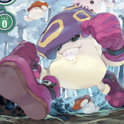
In the new throwback series Venom Lethal Protector II, artist Farid Karami gives 90's Silver Sable a realistic human shape. That's cool. 
|
|
#
?
May 3, 2023 01:11
|
|
|
very on board for thicc Silver Sable
|
|
#
?
May 3, 2023 03:42
|
|

|
Darthemed posted:
It�s early 60s Marvel, so I�m going to assume this story is about an Asian man looking for Peter Falk.
|
|
#
?
May 3, 2023 03:49
|
|
|
Flesh Forge posted:very on board for thicc Silver Sable If you see a normal sized woman and think "drat, that's thicc" then you need to stay the hell away from real women. Restraining order optional. (USER WAS PUT ON PROBATION FOR THIS POST)
|
|
#
?
May 3, 2023 09:26
|
|

|
Uh, she's fairly beefy by real world standards and that's fine  e: "restraining order" loving weird response there tbh Flesh Forge fucked around with this message at 09:36 on May 3, 2023 |
|
#
?
May 3, 2023 09:34
|
|
|
Chinston Wurchill posted:Paklis #6. Love that background (and other similar ones in this issue): It's masterful how the line weights and colouring are keeping the extremely busy and detailed background from overwhelming the foreground elements.
|
|
#
?
May 3, 2023 12:08
|
|


|
Flesh Forge posted:very on board for thicc Silver Sable It�s not just that one panel. She�s a beefcake the whole issue.
|
|
#
?
May 3, 2023 16:57
|
|
|
nice!
|
|
#
?
May 3, 2023 17:22
|
|
|
Jedit posted:If you see a normal sized woman and think "drat, that's thicc" then you need to stay the hell away from real women. Restraining order optional. What a weird loving overreaction
|
|
#
?
May 3, 2023 19:55
|
|
|
I love some of this old art a lot, especially knowing the limitations the artists faced in terms of photo reference and poo poo like that. Nowadays, you can just look up "1978 Corvette" and get 200 images to look at but back then, access to that was limited and took a lot of work to track down. I still have a categorized library of reference material I collected in the late 80's and early 90's that I one day plan to use for a collage series and even now occasionally go looking for something. But what I really wanted to post was how utterly lovely comic book writing used to be. The image is right there, showing you everything that's happening, and yet every caption and every piece of dialogue just describes what you're looking at. "Ace Carbone pulls his gun and aims at the caped crusaders!" "Batman deftly knock the gun out of the criminal's hand with his batarang" "Robin quickly swings in on his bat-rope and delivers a kick to the thug's face, knocking him out." *WHAMMO* "The criminal thugs are handcuffed and taken in by the police" It took a really really long time before the creators mastered (or even explored) the idea of using the images and the text in sync to complement each other and to begin to embrace something resembling real, believable dialogue. Which is even funnier to me since Marvel, in the 60's with Spider-Man and Fantastic Four were lauded for being more "realistic" than their competitors. And they WERE. loving Stan Lee didn't write poo poo. He looked at what Jack Kirby and Steve Ditko drew then put text in explaining exactly what happens in the god damned picture. "Look! It's Lockjaw! He's...he's getting LARGER!" Now he seems to be teleporting to another dimension!" "Hey, Spider-Man, now I have these giant robot arms powered by this nuclear battery strapped to my back! See how easily they snap your webs?"
|
|
#
?
May 4, 2023 00:10
|
|

|
It's fascinating to see how much an artist's sensibilities can change the timing sensibilities of a script; both of these examples below are from the same writer:   Teenage Mutant Ninja Turtles Adventures #5 Story: Stephen Murphy (under the pseudonym "Dean Clarrain") and Ryan Brown Script: "Dean Clarrain" Pencils: Ken Mitchroney Inks: Dave Garcia Letters: Gary Fields Colors: Barry Grossman    Teenage Mutant Ninja Turtles Adventures #7 Story: "Dean Clarrain" and Ryan Brown Script: "Dean Clarrain" Pencils: Jim Lawson Inks/Letters: Gary Fields Colors: Barry Grossman The sheer contrast of how things smoothly flow when Mitchroney is on art vs how stilted everything feels with Lawson on art.
|
|
#
?
May 4, 2023 01:05
|
|

|

|
|
#
?
May 4, 2023 01:11
|
|
|
Flesh Forge posted:very on board for thicc Scott Summers
|
|
#
?
May 4, 2023 01:35
|
|

|
If the overall art would be better I would think it was an ode to this classic 
|
|
#
?
May 4, 2023 01:47
|
|

|

|
| # ? May 27, 2024 07:53 |
|
|
BiggerBoat posted:I love some of this old art a lot, especially knowing the limitations the artists faced in terms of photo reference and poo poo like that. Nowadays, you can just look up "1978 Corvette" and get 200 images to look at but back then, access to that was limited and took a lot of work to track down. I still have a categorized library of reference material I collected in the late 80's and early 90's that I one day plan to use for a collage series and even now occasionally go looking for something. I think Lees contributions to the storytelling varied significantly from project to project, I did a read through of both early Fantastic Four and Spider-Man and though JRSR does great work on both titles, taking over for Kirby and Ditko respectively, it's really obvious the moment Jack is gone from FF that the storytelling has changed whereas in Spider-Man it's a different artist, but the storytelling stays pretty consistent, if that makes sense.
|
|
#
?
May 4, 2023 01:57
|
|