


|
Base paints are a bit thicker, while layer paints are a little thinner and slightly more transparent so they can be layered on top of a base pt. You can use either for either role but you'll have to do multiple coats or thin it down as appropriate
|
 #
?
Sep 14, 2023 17:17
#
?
Sep 14, 2023 17:17
|
|

|

|
| # ? May 29, 2024 06:47 |
|
|
There's also not a lot of value contrast, where everything's the same sort of mid tone and nothing jumps out. You're very close to an analogous color scheme, so try something like this, but maybe swap the bright annoying blue in E for a bluish metal color instead (read: base leadbelcher, lazy highlight with runefang steel, then a dillute wash with a blue shade/contrast like pylar glacier) Edit: this is from color.adobe.com and is a fantastic tool for picking out and designing color schemes Paints that will match these colors, but these are just guides and if you can you should go to a store and pick them out yourself: A = emperor's children from GW (use this to highlight B) is the closest but if you're willing to try some wild poo poo, the flourescent colors from golden are pretty hard to work with but extremely vibrant B = warlord purple from Vallejo C = nagarroth night from GW D = alien purple from Vallejo (use this to highlight C) E = magic blue from vallejo Spanish Manlove fucked around with this message at 17:21 on Sep 14, 2023 |
|
#
?
Sep 14, 2023 17:17
|
|

|
Spanish Manlove posted:There's also not a lot of value contrast, where everything's the same sort of mid tone and nothing jumps out. You're very close to an analogous color scheme, so try something like this, but maybe swap the bright annoying blue in E for a bluish metal color instead (read: base leadbelcher, lazy highlight with runefang steel, then a dillute wash with a blue shade/contrast like pylar glacier) Cool, thank you! Going to keep the advice of not making too many separate bits in mind as well. I'm 100% sure that like, all my first tries are going to be rough to start anyway
|
|
#
?
Sep 14, 2023 17:25
|
|

|
Weird Pumpkin posted:Been messing around with the template posted in the last page, and I really like the way this color scheme is coming together: Just a couple of things to point out before you dive headfirst into your first Sisters model. Sisters models don't have shoulder trim (aside from like, one finecast character and Paragon Warsuits). The edge of the pauldrons just have an upturned lip so if you try to paint that as trim you might go mad in the process since there's no physical gap to act as a guideline. The corset is actually leather but OML paints it the same colour as the armour with a rougher texture. You might not be aware of this but it's a free spot of contrast if you want to take advantage of it. I'm not sure about the white backpack exhaust. There's no white elsewhere on your colour scheme so it'll really stand out when it's not necessarily a focal point of the model. Your colour scheme is like 3 adjacent hues in the red-purple range and it's at risk of looking like a purple blob from 3 feet away. E: oops you already updated while I was phone postin
|
|
#
?
Sep 14, 2023 17:27
|
|

 I'd only have to pick up a couple paints from what I've already got as well, most of it is just stuff from the starter set
|
Another helpful guide to designing color schemes is this breakdown from Valve on how to design color palettes for DOTA characters, namely "pick one pop color and stick to it" https://help.steampowered.com/en/faqs/view/0688-7692-4D5A-1935
|
|
#
?
Sep 14, 2023 17:28
|
|
|
Eej posted:Just a couple of things to point out before you dive headfirst into your first Sisters model. Oh that is helpful, thank you! I was going off of things I saw seaching for paint schemes. I was dumb and forgot to color that spot in actually, I'd make it the same color as everything else. I couldn't remember if it was a ring or actually filled in and I didn't bother checking! I forget how small the models are yeah, something to think about before I start painting because what looks like a lot blown up on my monitor would probably translate much better to the smaller scale of a mini  Spanish Manlove posted:Another helpful guide to designing color schemes is this breakdown from Valve on how to design color palettes for DOTA characters, namely "pick one pop color and stick to it" Good info! Promise my last template idea:  Using some of the contrasting colors from the post above. I feel like this would stand out a lot more? Also just looks kinda cool and would be way more easy to read on a small model from way far away. Maybe the metal parts need to be a little brighter though so they stand out more, also this should hopefully be easier to paint as a whole then my initial idea! Gonna give it some thought and get any paints I need, then try it out once I have some stuff assembled. I'll post back when I've got a model or two painted (for both criticism/help and so y'all can see my terrible first tries lol) Weird Pumpkin fucked around with this message at 18:18 on Sep 14, 2023 |
|
#
?
Sep 14, 2023 17:41
|
|
|
Weird Pumpkin posted:I forget how small the models are yeah, something to think about before I start painting because what looks like a lot blown up on my monitor would probably translate much better to the smaller scale of a mini It's amazing to transition from pictures online which make painting feel pretty achievable and then you get the actual model in your hands and it's just so loving tiny and it has all these goddamn details and then it's really daunting.
|
|
#
?
Sep 14, 2023 18:15
|
|


|
rantmo posted:It's amazing to transition from pictures online which make painting feel pretty achievable and then you get the actual model in your hands and it's just so loving tiny and it has all these goddamn details and then it's really daunting. I'm legit worried (in a very mild sense) about painting the Exorcist I got. Just looking at it from the box it's full of a million tiny little details and I have no idea how I'm going to do any of it lmao Going to save that for the very last one I do probably
|
|
#
?
Sep 14, 2023 18:24
|
|
|
As someone who's dumb enough to paint a squad of space wolf terminators in a single day: you do it one bit at a time. It's daunting but piece by piece you just do each little greeble and pelt and purity seal and skull. Then you'll be all relieved you're finished, and notice you missed a purity seal on their ankle.
|
|
#
?
Sep 14, 2023 18:32
|
|
|
rantmo posted:It's amazing to transition from pictures online which make painting feel pretty achievable and then you get the actual model in your hands and it's just so loving tiny and it has all these goddamn details and then it's really daunting. Being very enthusiastic about painting is a good sign though. Some people absolutely hate having to do it. If it�s something you enjoy you�ll improve a lot faster, I think. The other one secret trick is to not beat yourself up bc no matter if you�re 5 or 50, no matter what natural talent you have, no matter how much your hands shake or don�t, let�s face it, the first eyes you try to paint will look like they belong in miniatures unspiration
|
|
#
?
Sep 14, 2023 18:35
|
|

|
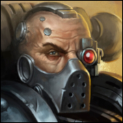
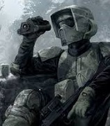
https://www.warhammer-community.com/2023/09/14/heresy-thursday-put-loyalist-weaklings-to-the-sword-with-the-traitor-champion-consul/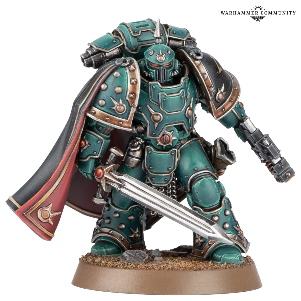 drat that would make a sick Chaos Lord... if it wasn't resin
|
|
#
?
Sep 14, 2023 19:24
|
|
|
Part of what has helped me is being more realistic/modest in my ambitions with painting; if I can get a smooth and clean application of paint, that's plenty good, anything more than that is gravy. It's worthwhile to push myself and try new things, but all I have to do is a quality base layer, a wash, and maybe a little bit of highlighting. That's all the pressure I need to put on myself so everything after that is stuff I want to try. It helps that I'm painting Grey Knights which are, broadly speaking, dead simple to paint, but even then I'm trying a glazing technique for the power weapons that I still haven't quite nailed but am looking forward to taking another crack at. Then I start in on my Blood Angels successor chapter which I'm really looking forward to getting to work on.
|
|
#
?
Sep 14, 2023 19:26
|
|
|
Eej posted:https://www.warhammer-community.com/2023/09/14/heresy-thursday-put-loyalist-weaklings-to-the-sword-with-the-traitor-champion-consul/ He'd probably look cooler with a beaky helmet I feel. Someone I follow on twitter remarked that the model looked like it was designed by an AI. Also to add to the current discussion; don't be afraid to gently caress up. Because it's really easy to get rid of the paint and just try again later.
|
|
#
?
Sep 14, 2023 19:26
|
|

|
It's a cool look, but it feels more like something a 3D sculptor would sell to avoid stepping on GW's toes.
|
|
#
?
Sep 14, 2023 19:29
|
|

|
Heresy is really knocking it out of the park with cool Marine sculpts. That dude is fuckin cool.
|
|
#
?
Sep 14, 2023 19:30
|
|
|
Eej posted:https://www.warhammer-community.com/2023/09/14/heresy-thursday-put-loyalist-weaklings-to-the-sword-with-the-traitor-champion-consul/ That would make a bad-rear end Wolf Lord too. Add on some fur and whatnot.
|
|
#
?
Sep 14, 2023 19:40
|
|
|
My favorite part of painting is seeing all the little mistakes melt away when you stand up from the table and put the modes next to each other. I know I got some gold on that marine�s leg that shouldn�t be there, but nobody else probably ever will, and he looks nice with his friends 
|
|
#
?
Sep 14, 2023 19:54
|
|


|
At tabletop distance, a textured base (with a clean rim) is almost as important as a any quality paint job. It doesn't have to be anything complicated as long as it's unified across your army. That traitor Consul has a simple surface of drybrushed sand, but a few differently coloured stones and/or tufts of grass add a huge amount of visual interest. And since the ground is pretty much by default a very dirty surface, it's almost impossible to fail since dirt is rarely a uniform perfectly colour.
|
|
#
?
Sep 14, 2023 20:40
|
|

|
In the words of the immortal St. Duncan, "Faces and bases make armies look aces."
|
|
#
?
Sep 14, 2023 20:46
|
|


|
moths posted:It's a cool look, but it feels more like something a 3D sculptor would sell to avoid stepping on GW's toes. Yeah it does. "Umbral Lord In Power Armor" vibes.
|
|
#
?
Sep 14, 2023 21:47
|
|

|
Speaking of sisters schemes, here�s one I threw together last night that I ended up liking a lot. AK Streaking Grime is my best friend.  Not the prettiest, but I like the contrast and the dirtiness of it and I can do a bunch in a hurry.
|
|
#
?
Sep 14, 2023 22:54
|
|

|
That looks cool, like an old black and white film almost.
|
|
#
?
Sep 14, 2023 23:11
|
|
|
it looks right out of a Blanche painting.
|
|
#
?
Sep 14, 2023 23:12
|
|


|
sepia tones
|
|
#
?
Sep 14, 2023 23:20
|
|
|
Yeah crank your lightsource down a bit and that'll be proper grimdark!
|
|
#
?
Sep 14, 2023 23:22
|
|


|
Eej posted:https://www.warhammer-community.com/2023/09/14/heresy-thursday-put-loyalist-weaklings-to-the-sword-with-the-traitor-champion-consul/ I�ve been eyeballing the DP Fulgrim since they showed him then remembering he�ll shatter if you look at him wrong rantmo posted:Part of what has helped me is being more realistic/modest in my ambitions with painting; if I can get a smooth and clean application of paint, that's plenty good, anything more than that is gravy. It's worthwhile to push myself and try new things, but all I have to do is a quality base layer, a wash, and maybe a little bit of highlighting. That's all the pressure I need to put on myself so everything after that is stuff I want to try. It helps that I'm painting Grey Knights which are, broadly speaking, dead simple to paint, but even then I'm trying a glazing technique for the power weapons that I still haven't quite nailed but am looking forward to taking another crack at. Then I start in on my Blood Angels successor chapter which I'm really looking forward to getting to work on. I�m doing a BA successor too. Kinda settled on white with red as the main colours, good accents like I did in school. But I can�t quite decide on how to combo the red white. The OGs were white except for the shoulder pads and constantly got mistaken for White Scars. After a couple years painting napoleonics tho I feel comfortable tackling fancy pads so I�m thinking of quartering them or doing checkerboards or something. If anybody less bad at colours has ideas for what would look cool I�m all ears Edgar Allen Ho fucked around with this message at 00:16 on Sep 15, 2023 |
|
#
?
Sep 14, 2023 23:59
|
|
|
Edgar Allen Ho posted:I�ve been eyeballing the DP Fulgrim since they showed him then remembering he�ll shatter if you look at him wrong That�s funny, my white scar successors get mistaken as blood angels all the time because they use a lot of red and gold.
|
|
#
?
Sep 15, 2023 02:19
|
|

|
moths posted:It's a cool look, but it feels more like something a 3D sculptor would sell to avoid stepping on GW's toes. I really like the mix of corinthian and great helm with a spike on top, I think that's my favorite marine helmet now. Great for a lot of two tone color schemes to have it inset like that too.
|
|
#
?
Sep 15, 2023 02:23
|
|

|
Edgar Allen Ho posted:I�m doing a BA successor too. Kinda settled on white with red as the main colours, good accents like I did in school. But I can�t quite decide on how to combo the red white. The OGs were white except for the shoulder pads and constantly got mistaken for White Scars. After a couple years painting napoleonics tho I feel comfortable tackling fancy pads so I�m thinking of quartering them or doing checkerboards or something. If anybody less bad at colours has ideas for what would look cool I�m all ears I'm sticking mostly to the standard BA scheme (the idea is that they're a Second Founding chapter that split off with great reluctance and moved to a system fairly close to Baal, mostly to justify using the Epic Heroes) but with a gold left forearm and black right forearm, maybe also the hands if it's not distinctive enough. I'm also going to do something different with the pauldrons, probably gold with black trim but I'm going to have to play with them more. I also want to have all the weapon casings in a really dark green for something different.
|
|
#
?
Sep 15, 2023 04:34
|
|
|
Sharkopath posted:I really like the mix of corinthian and great helm with a spike on top, I think that's my favorite marine helmet now. Great for a lot of two tone color schemes to have it inset like that too. The top spike kinda owns and I might have to give a few of my characters one
|
|
#
?
Sep 15, 2023 05:54
|
|
|
Eej posted:https://www.warhammer-community.com/2023/09/14/heresy-thursday-put-loyalist-weaklings-to-the-sword-with-the-traitor-champion-consul/ someone at GW loves this design with ultraheavy power armor with a cape that is basically a tablecloth. it's genuinely excellent and feels like a look into what 30K could be like if the armor marks were pushed hard enough visually to feel like different pieces of equipment rather than cosmetic variations also, drawing weapon across the body with offhand swung back Always Works
|
|
#
?
Sep 15, 2023 07:14
|
|
|
Captain Magic posted:Speaking of sisters schemes, here�s one I threw together last night that I ended up liking a lot. AK Streaking Grime is my best friend. I really like the grimy look. To me it's not really grimdark, as classic 40k grimdark is still clean and majestic (like that sweet space marine above). This Sister looks like she's realised that war is about having a bad time while walking around in the dirt.
|
|
#
?
Sep 15, 2023 08:43
|
|

|
Athas posted:I really like the grimy look. To me it's not really *grimdark*, as classic 40k grimdark is still clean and majestic (like that sweet space marine above). This Sister looks like she's realised that war is about having a bad time while walking around in the dirt. Grimdark is the name of that painting style though; using streaking grimes, enamel washes, and oil paints to get the vibe of early GW art and not necessarily the minis.
|
|
#
?
Sep 15, 2023 10:45
|
|


|
Grimdark is actually an ethos.
|
|
#
?
Sep 15, 2023 11:31
|
|
|
Grimdark is the friends we massacred along the way
|
|
#
?
Sep 15, 2023 11:40
|
|

|
rules Q: Grey Knights Nemesis Dreadknight can charge after advancing or falling back. Does this mean you can deliberately fallback and re-charge for fights first and tank shock, if you have the CP to spare? Any drawback besides the CP cost, positioning issues, and needing to survive to do so? coelomate fucked around with this message at 12:47 on Sep 15, 2023 |
|
#
?
Sep 15, 2023 11:59
|
|
|
coelomate posted:rules Q: Grey Knights Nemesis Dreadknight can charge after advancing or falling back. Yes, that's the entire point of that ability.
|
|
#
?
Sep 15, 2023 12:30
|
|
|
I know Death Guard was one of if not the worst team before they got buffed a bit, but what would a 2000 pt team look like in 10th?
|
|
#
?
Sep 15, 2023 18:38
|
|

|
E2M2 posted:I know Death Guard was one of if not the worst team before they got buffed a bit, but what would a 2000 pt team look like in 10th? Grimy.
|
|
#
?
Sep 15, 2023 18:46
|
|
|

|
| # ? May 29, 2024 06:47 |
|
|
Captain Magic posted:Speaking of sisters schemes, here�s one I threw together last night that I ended up liking a lot. AK Streaking Grime is my best friend. Really appreciate all the comments on this one! I think I�ll try the scheme some more on the rest of the army.
|
|
#
?
Sep 15, 2023 18:49
|
|