|
 Tales to Astonish #13 (1960) Pencils: Jack Kirby Inks: Dick Ayers Colors: Stan Goldberg  Tales to Astonish #13 (1960) Pencils/Inks: Steve Ditko Colors: Stan Goldberg  Tales to Astonish #14 (1960) Pencils/Inks: Steve Ditko Colors: Stan Goldberg  House of Secrets #54 (1962) Pencils/Inks: Ruben Moreira Colors: ?  Haunted #7 (1972) Pencils/Inks: Steve Ditko Colors: ?  Ghostly Tales #103 (1973) Pencils/Inks: Steve Ditko Colors: ?  Fantastic Four #144 (1974) Pencils: Rich Buckler Inks: Joe Sinnott Colors: George Roussos  Ghost Manor #67 (1983) Pencils/Inks: Steve Ditko Colors: ?   Ghost Manor #67 (1983) Pencils/Inks: Enrique Nieto Colors: ?  Ghost Manor #69 (1983) Pencils/Inks: Pete Morisi Colors: ?      Ghost Manor #71 (1983) Pencils/Inks: Steve Ditko Colors: ?
|
 #
?
Jan 2, 2024 00:27
#
?
Jan 2, 2024 00:27
|
|


|

|
| # ? May 13, 2024 07:54 |
|
|
Darthemed posted:
SKA BLAM sounds like a battle of the bands where there are far too many trumpets and suspenders.
|
|
#
?
Jan 2, 2024 00:35
|
|


|
Darthemed posted:New Year's lettering batch, ahoy. A selection of perfect gang-tags
|
|
#
?
Jan 2, 2024 08:39
|
|


Frank Miller's "Holy Terror" got mentioned in another thread, so it checked it out, and it has some of the worst art I have ever seen in my life. I can't even tell what's going on half the time.    
|
|
|
#
?
Jan 3, 2024 20:49
|
|
|
neat detail of both lettering style matching and the moment being referenced seen reflected (and thus so is the SFX) Transformers #2 Writer/Line Art: Daniel Warren Johnson Colors: Mike Spicer Letters: Rus Wooton (though the SFX lettering was done by Johnson)  Duke #1 Writer: Joshua Williamson Line Art: Tom Reilly Colors: Jordie Bellaire Letters: Rus Wooton (though I think this specific SFX lettering might be Reilly)
|
|
#
?
Jan 3, 2024 22:16
|
|

|
Oh wow that's a great detail
|
|
#
?
Jan 3, 2024 22:43
|
|


|
SimonChris posted:Frank Miller's "Holy Terror" got mentioned in another thread, so it checked it out, and it has some of the worst art I have ever seen in my life. I can't even tell what's going on half the time.
|
|
#
?
Jan 4, 2024 00:45
|
|
|
SimonChris posted:Frank Miller's "Holy Terror" got mentioned in another thread, so it checked it out, and it has some of the worst art I have ever seen in my life. I can't even tell what's going on half the time. Whatever you do don't check out DK2. It's somehow even worse. Miller is the anti Liefeld too in both these books. It's like he figured out how to draw the soles of those boots (whatever they're called) and he puts them into EVERY...loving panel. I don't know if Miller just got lazy, drunk, contemptible with the medium itself or all three because the original DK1, SIn City, Ronin and his work on Daredevil are objectively great, even if you don't care for his style, as some don't. But, like you said, you can't even tell what's happening on these pages, which is the first rule of comic book art and is not the case at all in his best work. Quite the opposite in fact. Frank's storytelling, framing, use of light, shadow and contrast and the suggestion of motion and action were pretty top tier and borderline revolutionary when he was on top of his game. I honestly don't know what the gently caress happened with him. You can't even really chalk it up to being "experimental" either because plenty of artists experiment pretty heavily but their poo poo's not straight up UGLY most of the time. I'm an artist myself and like to try out new poo poo but I'll keep working with it until it's polished or presentable at least, even if I'm not always successful. In DK3, Adam Kubert kind of aped Miller's style from DK1 and was much MUCH more successful with it, for no other reason than you could tell he took some CARE with the actual work. This poo poo isn't even good from a thumbnail layout standpoint.
|
|
#
?
Jan 4, 2024 01:09
|
|

|
DK2 does have some great work, even if parts of it are better in the conceptualization than the execution. His intentions are there in the first few pages, with how scratchy and coarse the old hero The Atom is compared to the comparatively sparse lining of Catgirl. Notably, when he appears, Plastic Man shares the clean lining, suiting his immortality, while other heroes who are introduced with the consumptive cragginess get cleaner and more polished as the battle inspires and rejuvenates them, all as Bats gets more and more battered.  The final results do get overwhelmed by 'computer possiblities!' at times, though the decade and a year between it and Batman: Digital Justice are thankfully evident, but I feel like there's certainly more artistic strengths and considerations on show in DK2 than there are weaknesses and indifference.   I might be pushing back on this more because I remember hearing a few people discussing the art in DK2 and saying it looked like Miller had gone through a stroke. I didn't have the opportunity to respond to that at the time, so it's been sitting in the back of my mind for years, especially because I've never been able to shake how impressed college-aged me was at seeing this page pulled off in a climactic story moment, and then flipping back to the cover of the TPB. Not quite an Ozymandias moment, but enough to clinch that Miller went into it with a plan and beats in mind.  
|
|
#
?
Jan 4, 2024 02:53
|
|
|
Well...Ok. I don't see anything worth looking at or reading in any of those panels/pages.
|
|
#
?
Jan 4, 2024 03:23
|
|
|
we startin 2024 with a Frank Miller Guy? lmao
|
|
#
?
Jan 4, 2024 03:38
|
|

|
BiggerBoat posted:
Alcoholism, is my guess. Has he improved materially since he got on the wagon?
|
|
#
?
Jan 4, 2024 12:16
|
|
|
Senior Woodchuck posted:Alcoholism, is my guess. Has he improved materially since he got on the wagon? Not anything that I've seen, no.  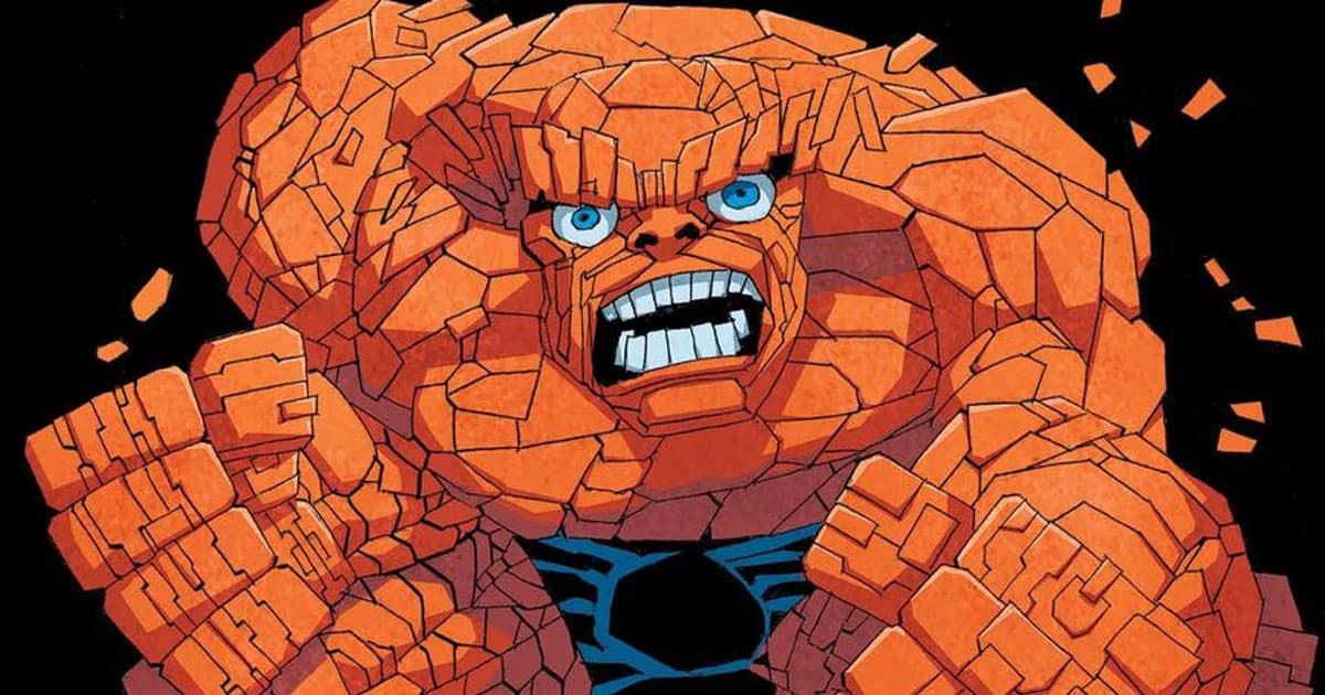 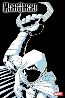 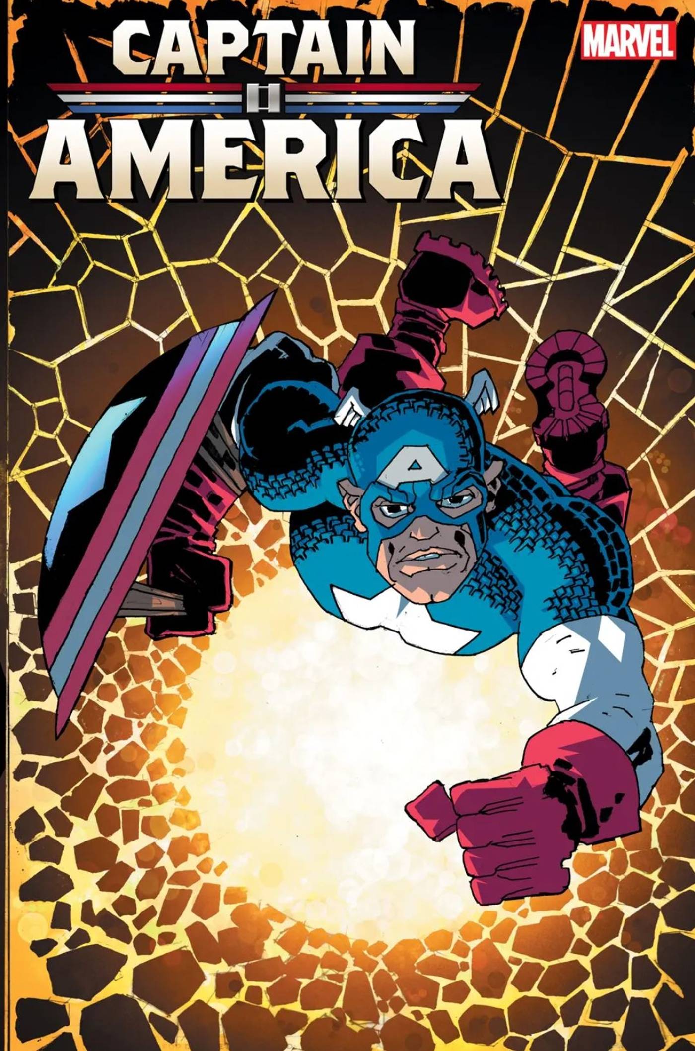
|
|
#
?
Jan 4, 2024 14:21
|
|
|
Didn't know it was possible for an artist's brainchildren to have Fetal Alcohol Syndrome but I guess it makes sense
|
|
#
?
Jan 5, 2024 16:23
|
|
|
Can't spell fascist without FAS
|
|
#
?
Jan 5, 2024 16:27
|
|
|
BiggerBoat posted:Not anything that I've seen, no. The Thing, Moon Knight, and Cap are fine if in a generic Miller pose.
|
|
#
?
Jan 5, 2024 18:57
|
|

|
Mr Hootington posted:The Thing, Moon Knight, and Cap are fine if in a generic Miller pose. thats barely panel-quality, not special-guest-artist-cover quality
|
|
#
?
Jan 5, 2024 19:03
|
|

|
Mr Hootington posted:The Thing, Moon Knight, and Cap are fine if in a generic Miller pose. They look like someone tried to transfer Miller's style to Saturday morning cartoons and it's not working at all.
|
|
#
?
Jan 5, 2024 19:03
|
|

|
DK II started well but there is a midway point where the artwork just became so freaking block like that it was hard to even figure out what was going on in the panels. Just weird shapes instead of people. I read somewhere (probably on these forums) that while he was writing DK II 9/11 happened and it pretty much break his brain which is why the first half of DK II seems more traditional for Miller, both story wise and artwise, and the second half done after 9/11 is a lot angrier, both story wise and art wise.
|
|
#
?
Jan 6, 2024 01:40
|
|

|
Digamma-F-Wau posted:neat detail of both lettering style matching and the moment being referenced seen reflected (and thus so is the SFX) That's good.
|
|
#
?
Jan 6, 2024 12:49
|
|

|
fyi if you like Terry Moore's technique, these weekly videos he posts are about 5-10% promo for his books and otherwise generally some insightful show and tell: https://twitter.com/TerryMooreArt/status/1743786833127919865
|
|
#
?
Jan 7, 2024 01:24
|
|

|
https://twitter.com/wolverinepooled/status/1745077928746975480?s=46
|
|
#
?
Jan 10, 2024 20:25
|
|
|
a copy of the frank cho spider-woman cover that is so impressively bad that it ceases to be horny and is just poo poo
|
|
#
?
Jan 10, 2024 20:38
|
|

|
I was just talking about the Milo Manara Spider-Woman cover and maybe I�m too manga brained but I don�t see why it was so controversial. It�s horny but I wouldn�t call it tasteless
|
|
#
?
Jan 10, 2024 20:49
|
|
|
That poor person's spine 
|
|
#
?
Jan 10, 2024 22:06
|
|
|
I assume its a parody. Just look at it. It is so over the top (even for Campbell) that I figure he knows what he is doing and is just taking the piss here
|
|
#
?
Jan 10, 2024 22:40
|
|
|
The tweet was taken down, probably because it isn't by J. Scott Campbell, it's by Anton Tarelov:
|
|
#
?
Jan 11, 2024 14:41
|
|
|
Her kneecaps are perfectly square.
|
|
#
?
Jan 11, 2024 15:38
|
|
|
whered she get oxford converse
|
|
#
?
Jan 11, 2024 15:48
|
|
|
I don't have my ruler handy but I think her index finger is as long as her face.
|
|
#
?
Jan 11, 2024 15:55
|
|
|
Her right hand is really loving with me
|
|
#
?
Jan 11, 2024 16:06
|
|
|
Well, if it isn't my old friend Mrs. McGwen, With a hand for a leg and a leg for her han'
|
|
#
?
Jan 11, 2024 16:37
|
|
|
oh god my body hurts all over looking at that edit what is the nose situation there
|
|
#
?
Jan 13, 2024 08:46
|
|
|
Aaaaaah!
|
|
#
?
Jan 13, 2024 13:42
|
|
|
Does this count as posting Liefeld? Rob, my dude, he's not even the worst Spidey artist named John Romita
|
|
#
?
Jan 24, 2024 02:57
|
|

|
The Skybound Dracula series just wrapped up, and the art (by Martin Simmonds) stayed strong throughout. 
|
|
#
?
Feb 3, 2024 00:41
|
|
|
I never tire of Herbie. 
|
|
#
?
Feb 5, 2024 10:14
|
|

|
This is pretty unrealistic. I saw a documentary that clearly presented the fact that vampires can't eat pizza: https://www.youtube.com/watch?v=d47zpGcp2nA
|
|
#
?
Feb 5, 2024 18:35
|
|

|
 Keen Detective Funnies #7 (1939) Letters: ?  Keen Detective Funnies #7 (1939) Pencils/Inks: Harry Francis Campbell Colors: ?  Tales to Astonish #15 (1961) Pencils/Inks: Don Heck Colors: Stan Goldberg Letters: Ray Holloway(?)  Tales to Astonish #15 (1961) Pencils/Inks: Steve Ditko Colors: Stan Goldberg Letters: Artie Simek  Tales to Astonish #16 (1961) Pencils/Inks: Don Heck Colors: Stan Goldberg Letters: Ray Holloway(?)  Tales to Astonish #16 (1961) Pencils/Inks: Steve Ditko Colors: Stan Goldberg Letters: Artie Simek  Tales to Astonish #17 (1961) Pencils/Inks: Steve Ditko Colors: Stan Goldberg Letters: Artie Simek  Tales to Astonish #17 (1961) Pencils/Inks: Don Heck Colors: Stan Goldberg  Ghost Manor #77 (1984) Pencils/Inks: Pat Boyette (signed) Colors: ?  Hellstorm: Prince of Lies #4 (1993) Pencils: Michael Bair Inks: Peter Gross Colors: Ariane Lenshoek Not too hot on the actual character, but I love the work on the background.  Blade: The Vampire-Hunter #4 (1994) Pencils: Douglas Wheatley Inks: Steve Moncuse Colors: Tom Ziuko
|
|
#
?
Feb 5, 2024 20:54
|
|
|

|
| # ? May 13, 2024 07:54 |
|
|
Holy god damned poo poo. https://x.com/VanguardComic/status/1755695862666178729?s=20 Greg Land would look at this and be like "what a goddamned hack."
|
|
#
?
Feb 9, 2024 08:07
|
|