


|
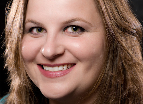
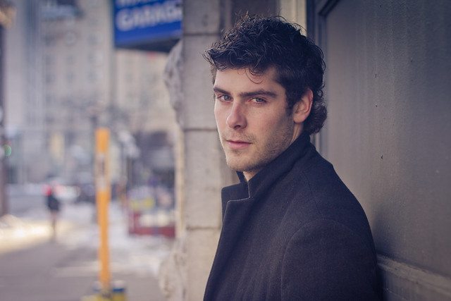
Interrupting Moss posted:Musician portrait thingy. It's a bit cliche, but I think we ended up with something nice. Only thing I don't like is that little shadow created by her ear. I should have pulled that light around. What I like most is the shallow depth of field (even though this type of portrait reminds me of a high school yearbook photo (a very nicely shot high school yearbook photo)) My friend, standing on the top floor of a parking lot. I was 'freelensing' it. I like the effect. 
|
 #
¿
Sep 9, 2010 04:25
#
¿
Sep 9, 2010 04:25
|
|


|

|
| # ¿ May 20, 2024 23:31 |
|
|
AtomicManiac posted:I've never worked with a MUA, what makes them Good/bad, and what do you look for? Well freelensing is this basically: http://lukeroberts.us/2009/12/freelensing/ As for the sharpness comment, this was one of three tries with an 85mm lens and for some reason (maybe I'm imagining this) it was easier to nail the focus than with the 50mm.
|
|
#
¿
Sep 9, 2010 22:39
|
|
|
Glass Knuckles posted:I believe its where you detach the lens from the camera partly, and maneuver it with your hand. Haha yea. I like the shallow dof it creates (0 aperture after all) as well as the fact that you can make pseudo tilt shift effects too.
|
|
#
¿
Sep 9, 2010 22:52
|
|
|
Paragon8 posted:These are from a test I'm a fan of blue tones. --  Untitled  Untitled
|
|
#
¿
Oct 27, 2010 00:16
|
|


|
HPL posted:The second one is a little overdone subject-wise but I'm digging the first one. Neat pose and lighting and it looks like she's getting abducted by aliens or something. Kudos for paying enough attention to make sure shadows from her hands didn't get on her face or the rest of her. I know, haha, the garage shoot is a pretty cliche theme. I was hoping I'd get some natural light in but we arrived too late.
|
|
#
¿
Oct 27, 2010 01:25
|
|
|
bung posted:My wife wanted some headshots for her facebook profile and for her corporate profile. I don't think the editing is too intrusive but I don't like how her forehead is cut off
|
|
#
¿
Aug 11, 2011 17:33
|
|
|
Just some random shots. I need new friends so I have more people to shoot.    
|
|
#
¿
Aug 31, 2011 20:52
|
|
|
xenilk posted:Thanks for making me stress about my upcoming shoot with a 1 year old! ha ha What I did for my nephew (who I've shot from birth up until now as a 2.5 yr old) is either calling his name, or working with him - I go where he goes, follow him around and basically get great shots of him doing what babies do best, which is wander around. Now if you're talking about a staged shoot in front of a picked out place, then just be prepared to take 100's of shots hoping a few are keepers. PS. the mothers of babies will like all kinds of photos, even ones that look a bit off to a photographer's eyes.
|
|
#
¿
Oct 10, 2011 05:08
|
|
|
Some people that I shot a while back and I just got around to processing them.     
|
|
#
¿
Feb 26, 2012 19:18
|
|
|
Bioshuffle posted:Santa, those shots are fantastic! Did you have to lower the camera to waist level to avoid the "dwarf leg" effect? Thanks. Not really because I was far away, using the 85mm. In some cases I was taller than the person so I just half crouched to get them right in the frame.
|
|
#
¿
Feb 26, 2012 20:56
|
|
|
Gazmachine posted:This is my favourite. I just ordered the 85mm and seeing these has made me even more excited, and let me tell you, I was already really frigging excited. Woop! That's awesome, which one are you getting? I have the f1.8 and I love using it, it's by far my favourite our of my lenses.
|
|
#
¿
Feb 27, 2012 01:32
|
|
|
xenilk posted:Oh my god, those are _great_ Thank you! I don't think I'm at mannequin level yet though haha. Where has he been lately anyway?
|
|
#
¿
Feb 28, 2012 01:30
|
|
|
Falco posted:
Thanks. The more I look at them the more I wish I had framed all the people the same way, not too far not too close. Oh well.
|
|
#
¿
Feb 28, 2012 02:16
|
|
|
Bioshuffle posted:For the newbies (like myself) could you possibly talk us through what goes on when you meet them? Do you pose them? Do you move them to a better location? Does it all depend on the circumstance and location? Give us the insider scoop! I was just walking around the streets and I was lucky because I had my gf with me. So when I approached the people they weren't freaked out or anything. I went up to them and just asked if I could take their photo. Most said yes. I didn't pose them but if they were standing at a weird place I'd tell them to move a little bit to where looks better. I took 2-3 shots said thanks and moved on.
|
|
#
¿
Feb 28, 2012 02:33
|
|
|
xenilk posted:Few portraits from last week that I finally had time to go over: sw1gger posted:still feelin' brooke shaden-y Both of these have very nice processing done on them.
|
|
#
¿
Mar 5, 2012 18:16
|
|

|
xenilk posted:Finalized the set I did with Alex-Sandrine I've been liking your post processing work lately. However, I want to say that you have too many different styles for one set (I looked through the flickr set. BW shots are nicely edited). I prefer the second photo's tones, can you apply those tones to the other images in the set? CarrotFlowers posted:I don't know where else to put this one. This feels like the best fit. While I like the processing, I think it's on the edge of being a bit too much - what sets me off is her skin tones, they don't seem too smooth (because of the contrast of the rest of the scene perhaps?). Maybe mask out her face and hand only and apply less processing on those parts. bobmarleysghost fucked around with this message at 02:54 on Mar 15, 2012 |
|
#
¿
Mar 15, 2012 02:49
|
|
")


|
CarrotFlowers posted:What part specifically of her skin doesn't look smooth? I did have her skin masked off for most of the processing, but I still wanted her to look like she wasn't composited in, so I did some curves and dodging/burning to her as well, just took out the texture and the super harsh curves. Is it that shadow on her cheek? I can see that part maybe, but I don't understand what looks off about her hand? There is also a weird bone or something coming out of her neck. I want to keep it fairly contrasty, because the whole scene is supposed to look dark, but I don't want it to look blotchy or something either. Ah, I see what you mean (I clicked to see the original size). I guess "doesn't look smooth" wasn't the right way of saying "contrast" :S Now that I see the 100% image I can tell the skin is in fact not 'not smooth'. Her hand looks purple however on closer inspection, I'm assuming it was cold out so there is not much you can do there without it looking off. It looked weird when I saw the image you posted at that size, but the 100% clears it up.
|
|
#
¿
Mar 15, 2012 04:08
|
|
|
CarrotFlowers posted:Ah yeah, thanks for the clarification Ha, wow she is pretty dedicated then! I like the second shot (on flickr)
|
|
#
¿
Mar 15, 2012 23:44
|
|
|
I went out biking with my brother, came back with some nice photos. Here we were crossing a field to get to a bike path on the other side.  
|
|
#
¿
Apr 14, 2012 03:38
|
|
|
RangerScum posted:I can't believe I still haven't gotten my new camera in the mail. I'm running out of old photos to edit! I don't know whether or not you wanted c&c, but I had to say this about this photo - her neck with all those shadows makes her look really really old. The whole area looks "rough" to me; blotchy in a way. However, it's nothing that PS can't fix.
|
|
#
¿
Apr 24, 2012 16:59
|
|

|
RangerScum posted:I'll always take c&c without any complaints. Though the only shadows on her neck are on the right side from her chin, so I'm not sure which part you're talking about. The wrinkle lines in her skin? Also the skin might look blotchy if viewing a small version of the photo, if you look at the full-size you'll see that the makeup artist put on some gold glitter stuff. I am not sure how sold I am on how good it looks, but ah well. Ah, I looked at your original and noticed the glitter. It was sloppily applied to her neck (unless that was the intention, in which case it was not obvious), which added to the blotchy feel that I was talking about. By shadows I meant the different shadows around her collar bones. Also, like every normal person, she has lines around her nose and under her eye. I hope you don't mind, I took your photo and edited the following: - removed the eye and nose lines for a smoother cheek area - smoothed out her neck by removing the messy glitter lines and neck lines - slightly lightened her collar bone shadows as to not be too pronounced It's a quick edit, and I could have spent more time around her eye lines, but I wanted to show you what I was talking about. 
|
|
#
¿
Apr 24, 2012 17:41
|
|
|
Bottom Liner posted:I had a great engagement session yesterday. They were a really awesome couple that looked great together, can't ask for more than that. They look like they're repelling each other.
|
|
#
¿
May 3, 2012 05:47
|
|

|
whereismyshoe posted:that picture made me reconsider whether or not i should suck it up and save for a little while longer to get a 5dII. stunningly crisp If you think that upgrading the body will get you crisper results then you are in desperate need to stop reading the gear threads here and elsewhere, where they push mega pixels and AF to not only consumers but apparently hobbyists too. There are at least 2 posters from this forum where I noticed they upgraded to newer bodies and spent 2-3 thousand dollars and yet their photos are still wholly underwhelming. Point of my little rant is: invest in optics not in bodies. A quality lens will give you crisp results.
|
|
#
¿
May 22, 2012 15:41
|
|
|
True, but lets say he's coming from a 450/550 series body (I have no idea what he is using) and wants to upgrade to 5D2. That will give him higher resolution photos but taken in the same style. So unless his style changes, the new camera will not produce better photos. Or crisper for that matter. Lots of people on flickr or 500px use the old rebel bodies and their photos are great because of the idea/processing behind them FIRST and the quality of the medium second. I agree with you that objectively he will get better photos with a better camera - in terms of image resolution and grain control, but not necessarily crispness.
|
|
#
¿
May 23, 2012 06:35
|
|
|
Exactly. You can clearly tell he used a curves layer on the water to bring up blue in the shadows, and he left the girl completely masked out with no blue in the shadows. Edit: he's actually kind of sloppy with a few images. The water near the horizon has been left out with no blue in the shadows, so it's kind of inconsistent.  He takes good photos, and using very good looking models doesn't hurt. bobmarleysghost fucked around with this message at 00:22 on Jun 28, 2012 |
|
#
¿
Jun 28, 2012 00:17
|
|
|
Cyberbob posted:I actually went back to the RAW drawing board and started again on processing this lot. Sorry, but I think that the post processing is pretty bad - it's too yellow/green. Here is a quick edit. I'm sure the sky looked better before processing. Your edit / Warm edit / Cool edit   
|
|
#
¿
Jul 26, 2012 23:29
|
|
|
You can always, you know, retouch it.
|
|
#
¿
Aug 3, 2012 03:08
|
|
|
thetzar posted:This is something I did today. My boss needed a head-torsoshot with a quickness, and huddled over my shoulder as we went through a few dozen options. He selected this one, though he wasn't entirely pleased with his face. Nice! Pretty sharp, and nice composition and pose. I don't think I'd like the colour version better. But show us if you'd like.
|
|
#
¿
Aug 4, 2012 05:59
|
|

|
Your work is always great, but I always wanted to ask you why you leave the edges of the photos after developing?
|
|
#
¿
Aug 8, 2012 03:54
|
|
|
Ah, I see. I thought that you left it to create a dream-like feel to it. (wow that sounded cliche but I mean it)
|
|
#
¿
Aug 8, 2012 06:48
|
|
|
8th-samurai posted:Nope, Bronica just shot their ads with Hasselblads. Oh snap. I might cut some V's into my Bro's back now...
|
|
#
¿
Aug 8, 2012 17:03
|
|
|
If you have his model release, just post the photo.
|
|
#
¿
Aug 10, 2012 04:34
|
|
|
evil_bunnY posted:Was the goal to make him look like he got his eye coloration from Melange addiction? Oh snap, da spice must flow!
|
|
#
¿
Aug 13, 2012 23:52
|
|
|
the posted:How do I take a picture like this? Press that red buttan there  But in all seriousness, do this: - get a model - sit them in front of a dark background, far away from said background - light them with a window/softbox placed in front of them - take a photo with low aperture - change to BW, add contrast, make sure BG has no detail in it - don't forget to make your model do something interesting
|
|
#
¿
Aug 14, 2012 03:29
|
|
|
I haven't posted here in a while. The following are from a shoot I did over the weekend. I like the shots, but at the same time I feel underwhelmed with them. Maybe someone here will notice?    
|
|
#
¿
Sep 5, 2012 04:10
|
|
|
aliencowboy posted:Overall your subject either feels detached or has rigid, unnatural posing. Processing looks good. I know what you guys are saying about the posing. She told me she's not good at posing and I admit that I suck at posing other people too. I actually did shoot the fourth one while exposing for the light streak, and she is more isolated in the light. I'll edit it and post it up, it was purely a coin toss between the two. I need to get a wider lens for environmental shots, these were shot with an 85 on full frame. I have some full body shots but I'm meh on the background, I'll see what I can do with them. QPZIL posted:Yeah, I think all of those shots would be wonderful if they were of a model with a little more charisma or... well, any semblance of facial expression. This was our first time shooting together (she's my gf's friend so I know her but never shot her), next time we go for a shoot I'll discuss the posing with her/facial expression with her. Elite Taco posted:I like this, but I think it's because it's kinda weird. I'll take it! TheAngryDrunk posted:Not quite a portrait, but I really like this one. Looks like a video game. It does seem a bit isometric, and her pose is like a robot's! Thanks for the comments guys! She likes the photos, but I think I'll have to schedule another shoot to improve on things. PS. I can't wait for the MF shots though! Just need to process them.
|
|
#
¿
Sep 5, 2012 05:09
|
|
|
Reichstag posted:I just solved the mystery of why you were underwhelmed. Ha, we will see on Friday evil_bunnY posted:This is baller. In the others she just looks bored for no reason? Was it what you guys were going for and why? The theme was a loose interpretation of "girl walking in the city, daydreaming of the forest". The photos in the woods didn't come out as good as I had hoped, but I will revisit them in a few days, may be they'll look alright then. Here is the re-done photo, which is now actually two photos stitched together. Why - because the exposed-for-the-ray-of-light photos do not include the speed bump and surrounding area AS WELL as the girl being in the right place, which I liked in the original. I like the wider view, however that STOP HERE sign is bugging me and I was not able to successfully clone it out. 
bobmarleysghost fucked around with this message at 03:01 on Sep 6, 2012 |
|
#
¿
Sep 6, 2012 02:58
|
|
|
Ric posted:The first one you posted is far better, with her head against the ramp and her shadow within that of the stop sign. evil_bunnY posted:Yeah I like the tension in the first one better. What I did like more in the first photo is that her head is against a one colour background, she is pretty well distinguished. In the second, she seems a bit cramped. However, I like the light and shadow play more in the second shot. KingColliwog posted:Where can we see the first one, lurked a few pages of his flickr and couldn't find it Here is the original  nonanone posted:I like the new one better. The flow feels better to me, looking at it. I think I will keep the new one for now.
|
|
#
¿
Sep 8, 2012 03:05
|
|
|
I like he feel/processing on all of them. The second one looks good to me, by looking at the photo I can easily make up a back story to the photo, so I'm guessing that's job well done on your theme.
|
|
#
¿
Sep 9, 2012 16:17
|
|
|

|
| # ¿ May 20, 2024 23:31 |
|
|
sw1gger posted:Money. All of 'em. Well done sir. The second shot is pretty good! The subject is a little bit too much to the left for my liking but I'm being picky. I like the balanced lighting, the processing is at the limit of being 'over the line'. Good stuff. RangerScum posted:I've been out of it for a while but a couple recent shoots are helping me to get back into a shooting mindset again. These two are my favourites, I just wish (as was already stated) that the clarity slider wasn't pushed all the way to the right. The lighting is great though - I like the overexposed look.
|
|
#
¿
Oct 12, 2012 15:52
|
|


