|
I HATE CARS posted:Okay, done: http://bettr.superpositionkitty.com/ I can't seem to get it to work with the name in the URL if the Flickr name has a space in it. Am I doing it wrong or is it a bug?
|
|
|
|

|
| # ? Apr 26, 2024 12:34 |
|
Tziko posted:I can't seem to get it to work with the name in the URL if the Flickr name has a space in it. Am I doing it wrong or is it a bug? What browser? And what happens if you replace the space with %20 ? EDIT: Sorry for derailing this thread Brad, I didn't think people would be that interested in it. Would you prefer I made a new thread for it? EDIT: 4, think i fixed it, see Flickr thread. VVV Done. I HATE CARS fucked around with this message at 19:25 on May 26, 2010 |
|
|
|
I HATE CARS posted:What browser? And what happens if you replace the space with %20 ? you should take this to the flickr thread. maybe the OP will update with it because its baller.
|
|
|
|
AIIAZNSK8ER posted:you should take this to the flickr thread. maybe the OP will update with it because its baller. yeah, just make a thing for me to copy and paste and I'll put it in the OP of the flickr thread.
|
|
|
|
I HATE CARS posted:What browser? And what happens if you replace the space with %20 ? Ah, it was due to Safari (Mac) automatically replacing the space in the URL with a %20. It works with Chrome, however. Could you make it so that it converts %20 to spaces in the API call so that it works with all browsers?
|
|
|
|
If you could put some basic user info in the first frame (or wherever you like really that'd be great (mostly looking for favorites), but I recognize that's not the intent of the thing, so welp 
|
|
|
|
I HATE CARS posted:Okay, done: http://bettr.superpositionkitty.com/ This is awesome. You are awesome. Of course I missed the fact that you had made a link to Harry Kaufmann's flickr and went searching through the thread to find his flickr account, only to forget your URL, go back, check your post and realized I'd wasted 10 minutes.
|
|
|
|
I've always enjoyed this guys work: http://nhmcelroy.com/home.html 
|
|
|
|
Spedman posted:I've always enjoyed this guys work: This is very cool. It reminds me of Into The Wild. Thank you.
|
|
|
|
http://www.behance.net/garmonique I think this guy does well what a lot of artsy hipsters attempt to do... photograph mundane outdoor stuff in a gritty, lifeless sort of way... And make them interesting. With film, of course. 
grayscale fucked around with this message at 17:02 on Jun 1, 2010 |
|
|
|
Greybone posted:http://www.vg.no/nyheter/utrolige-historier/artikkel.php?artid=10007099 has a fantastic  Actually a close up crop  
|
|
|
|
http://www.dayswithmyfather.com/ This set really made me tear up, the photos are fantastic, the story that goes with it is heartbreaking. A similar story is going on in my own family at the moment, as it would be for many others. To navigate just move your mouse to the bottom of the image until it moves, then click.
|
|
|
|
I HATE CARS posted:(look at the first two lamposts)
|
|
|
|
Regression posted:Does anyone mind extrapolating on why that image is good? I'm not really that experienced a photographer; is lining lamp posts up against buildings that great? The picture is mainly about lines- the verticals of the buildings, the winding road, the telephone lines. The first 2 lamp posts lining up with the building edge create a harmony that helps draw my eye in, as do the other lines. The photographer has created a photo that I want to explore, yet my eyes keep getting 'trapped' towards the center with the tiny people and the tallest building. The image has a very pleasing geometry to it, one that was carefully planed by the photographer and not just a happy accident.
|
|
|
|
^^^^^^ Thanks. I guess it is a personal thing: my eyes do not get drawn by any lines, they don't settle anywhere. I don't feel any real harmony or balance. And the colors add nothing to me. I'll make up for adding to the discussion-instead-of-photos in this thread by posting a couple photos later.
|
|
|
|
Regression posted:Does anyone mind extrapolating on why that image is good? I'm not really that experienced a photographer; is lining lamp posts up against buildings that great? I think it was kind of talked about in the art thread, and this is advice I've heard a couple times from all over, but you have to look at a ton of images. Look at stuff from all time periods across all subject matter. After some study you start to just kind of appreciate it differently.
|
|
|
|
Haha you don't need all that much history behind you to understand that image. I offer learning about photography as a piece of advice to build a worthwhile personal aesthetic but it is by no means necessary in order to give a superficial formal analysis of an image. Regarding that image in particular (http://www.flickr.com/photos/harry_kaufmann/4410725001/sizes/l/) the attractiveness is 90% compositional which is something people naturally understand ("Good" composition is a construct built around what most people find visually appealing). To do a quick analysis of this you could examine the disparate elements and then group them together to form a compositional thumbnail in your mind. For example note the buildings on the left hand side they are not all one building but several individual ones yet when you look at the photo they convey a sense of oneness, this is partly because they are objects of similar function and style but also because they were photographed such that they are braced at top and bottom leaving contiguous lines running across from the left to center-right, there are also no breaks between the buildings. This composition is intensified by other aspects of the photo, the light poles running along the road create lines leading to the same place that the lines from the buildings run (at points the light posts align with the lines visible in the buildings). On the right hand side there are more buildings and some electrical wires and the lines in the buildings line up perfectly with the wires. Down the bottom centre of the frame there is a physical path that leads to where all these lines converge and turn a corner. All these elements come together and support each other to create a really compositionally tight image. In a less abstract discussion of the photos you can see a well maintained path carving a path through a complex run down tenements. A subjective analysis might see the photo as an image of two landscapes that have, for the necessity of a functional(?) city, to exist superimposed upon each other and as a discussion of the dialogue (or lack thereof) between them.
|
|
|
|
I just think it's pretty.
|
|
|
|
And that's why
|
|
|
|
Yet if you look at other photos in his pool, this compositional skill you praise muchly is not evident, is not there. Has disapparated and I do wonder if perhaps, you are conjecturing things about a photo like your english teacher conjectured about a poet laureate who, like this photographer, had no other loftier ambition than to jerk off in his sock, so to speak. It's a matter of opinion. And it's fantastic that this fellow managed to find some straight poles in China, and super fantastic he is using a 4x5 camera (really) but the photo, while being nice, and very straight, is just okay to me because when I look at it, that's all there is, there's no subtext. It's just as much of a snapshot as you can get with a 4x5 camera.
|
|
|
|
Helmacron posted:Yet if you look at other photos in his pool, this compositional skill you praise muchly is not evident, is not there. Has disapparated and I do wonder if perhaps, you are conjecturing things about a photo like your english teacher conjectured about a poet laureate who, like this photographer, had no other loftier ambition than to jerk off in his sock, so to speak. Um no I'm talking about the photo not the photographer edit: :p
|
|
|
|
Twenties Superstar posted:Why are you still posting?
|
|
|
|
Z posted:Why are you still posting? Sometimes I am honestly not sure
|
|
|
|
Helmacron posted:Yet if you look at other photos in his pool, this compositional skill you praise muchly is not evident, is not there. Has disapparated and I do wonder if perhaps, you are conjecturing things about a photo like your english teacher conjectured about a poet laureate who, like this photographer, had no other loftier ambition than to jerk off in his sock, so to speak. Well, informed opinion, though. Is it possible the guy just pulled the trigger and caught this image by accident? Sure. It's also very, very unlikely. Not every image in his stream is as strong, but wouldn't that be fantastic? A flickr stream is not a portfolio, necessarily, with only the best of the best of a photographers shots. His isle of the dead shot is one of my favorite recent photographs, and he has several similarly strong.
|
|
|
|
Twenties Superstar posted:Let me tell you what's up.
|
|
|
|
Twenties Superstar posted:Um no I'm talking about the photo not the photographer Look, mostly we agree that it is a good photo. Some people can't see it and some people like it but can't see why. I offered, without any real knowledge of the photographer, his equipment, technique, or even really the setting that the photo captures, an analysis of some of the compositional elements in the image. I wasn't trying to pontificate on the merits of any particular style or technique my goal was to maybe help explain why, to some people, the image looks like everything just fits together. Maybe the guy who took it got lucky (successful field photographers are all, I believe, lucky to an extent) and he doesn't understand why or even if the photo is good but that discussion wasn't a part of why I made that post.
|
|
|
|
Helmacron posted:Yet if you look at other photos in his pool, this compositional skill you praise muchly is not evident, is not there. Maybe not as strong in the other images, but you can tell what he's trying to do even if the images are not as successful as that one. Also Twenties Superstar posted a pretty detailed explanation of what he thinks, if you disagree that's fine but it would be great if you could say why in a reasonable way beyond "it's all opinion and I think it sucks". AIIAZNSK8ER posted:I think it was kind of talked about in the art thread, and this is advice I've heard a couple times from all over, but you have to look at a ton of images. Look at stuff from all time periods across all subject matter. After some study you start to just kind of appreciate it differently. I think visual literacy is the same as anything else, the more images you are exposed to and the more constructively you think about them, the better your ability to read (and talk about) photographs becomes.
|
|
|
|
Here's some Sandy Skoglund:   
|
|
|
|
I'm eagerly awaiting the "selective color.. OH NOES!" responses. I can sort of see the association between places, people and animals, except for the second one. Why are there fish swimming through the bedroom?
|
|
|
|
brad industry posted:Here's some Sandy Skoglund: With the exception of the fish picture, I find them all disquieting in way I don't like. Make them go away.
|
|
|
|
Cross_ posted:I'm eagerly awaiting the "selective color.. OH NOES!" responses. That one is called "Revenge of the Goldfish" I think. I think artists that start out in other mediums and end up becoming photographers by documenting their installations/work are really interesting. Here is Thomas Demand (former Dusseldorf student), who builds these sets entirely out of paper:    
|
|
|
|
Cross_ posted:I'm eagerly awaiting the "selective color.. OH NOES!" responses. Well - Why are there foxes jumping around the tables in a restaurant? What's with the gray fox? I wonder why she used two different animals in the last one?
|
|
|
|
Cross_ posted:I'm eagerly awaiting the "selective color.. OH NOES!" responses. The quality of the lighting looks like everything might actually BE that color. There's nothing in those shots you couldn't do by painting a lot of props and setting up the scene -- it would just be a lot easier to do in Photoshop. I hope it's the former. [e] the two with the foxes and squirrels look more fake than the ones with the fish and cats.
|
|
|
|
She builds those scenes, it takes her months. I believe they are shot on 8x10. If you ever get the chance to see them in person, do it - her older work is all dye prints and the color is amazing.
|
|
|
|
Twenties Superstar posted:Regarding that image in particular (http://www.flickr.com/photos/harry_kaufmann/4410725001/sizes/l/) the attractiveness is 90% compositional which is something people naturally understand ("Good" composition is a construct built around what most people find visually appealing). To do a quick analysis of this you could examine the disparate elements and then group them together to form a compositional thumbnail in your mind. For example note the buildings on the left hand side they are not all one building but several individual ones yet when you look at the photo they convey a sense of oneness, this is partly because they are objects of similar function and style but also because they were photographed such that they are braced at top and bottom leaving contiguous lines running across from the left to center-right, there are also no breaks between the buildings. This composition is intensified by other aspects of the photo, the light poles running along the road create lines leading to the same place that the lines from the buildings run (at points the light posts align with the lines visible in the buildings). On the right hand side there are more buildings and some electrical wires and the lines in the buildings line up perfectly with the wires. Down the bottom centre of the frame there is a physical path that leads to where all these lines converge and turn a corner. All these elements come together and support each other to create a really compositionally tight image. But all the lines do not converge. The buildings in the centre background point more horizontally than the other lines. Also, the winding of the road is barely noticable, as is the turning of the corner. Thus, the road does not lead my eye anywhere, where ideally it should lead me around the photo. In addition, the photo is taken from a standing position, which adds to the point-and-shoot feel. The colors in my opinion could use some more contrast, at least on my screen. Finally, the buildings in the centre background are distractingly brighter than the buildings to the right and left - the sun is shining brighter on them. Together with the above point, this means poor exposure? I promised some content in return. I might have the following from the art thread, which I haven't read in a while:  (Stephen Shore) And the following because it is an iconic photo from an other photographer - and awesome. 
Regression fucked around with this message at 23:07 on Jun 2, 2010 |
|
|
|
Cross_ posted:Why are there fish swimming through the bedroom? http://www.answers.com/topic/cold-fish
|
|
|
|
Regression posted:Thanks, I appreciate this. You're right, all the lines do not converge but there are a lot of lines in the photo and the most prominent ones, i.e. the ones that are informed by the most prominent features of the image, do and those lines in turn inform the way the image and the many minor lines in it are viewed in relation to one another. Here's a crappy drawing trying to explain what I mean:  Where the road winds out of view is where all of the major and most of minor lines in the photo converge. If you are following any line in the image it is likely going to end here. Here I'll note that I read the lines as moving toward to the centre of the frame probably because of the function of looking down a path. You say that the lines "should" lead your eyes around the photo and not just end but I disagree. Lines are functional and aren't just artefacts to lure into you looking at other parts of the image so you can see it all, sometimes they are going to point at specific things and that could be meaningful. Here's a good example of different types of lines in a painting from 14th century (to show how lines are used in situations of careful and totally controlled composition as well as how they have been used this way for a long time):  Follow the lines of the sitting group and you'll notice that it is just going around in circles, similar in manner to how you described an image might be "ideally", so that you see the image of Christ repeatedly and the faces of his bereaved followers. But note the rocky outcrop in the background which leads straight to the face of Christ. If you aren't paying close attention you might even miss it but it is there to draw your eye straight to the figure and terminate there. How this relates back to the photo under discussion has to do with how lines need not give you necessarily something to look at but something to think about. We've already discussed how the composition of the photo may not be by intent of the photographer but under an isolated analysis all lines converging on a point that is, in the image, obscured from view may result in curiosity as to what is around the bend or, in my case, I get a sense of satisfaction that the photo so neatly completes itself. The former being an analysis predicated on the photo being open form where my view of it is conducive to more closed form. The photo is taken from a stand-and-shoot position but if it was taken from any other position then likely a lot of the interesting compositional elements wouldn't line up so neatly. The appearance of extreme order in a seemingly chaotic "snapshot" is part of what makes contemporary topographics so interesting to me. Regarding colour and exposure my feelings are that it gives the image a natural appearance which is desirable to me given the analysis of order in chaotic nature mentioned above. I'm curious to see if you can try and explain why you like this image:  given you're rejection of images taken from a stand-and-shoot position Twenties Superstar fucked around with this message at 23:41 on Jun 2, 2010 |
|
|
|
This thread just got way better.
|
|
|
|
Hey Twenties Superstar you have always been my favourite CC/Dorkroom poster. Just sayin'.
|
|
|
|

|
| # ? Apr 26, 2024 12:34 |
|
I HATE CARS posted:Hey Twenties Superstar you have always been my favourite CC/Dorkroom poster. Just sayin'. I was going to say that. The number of times Brad or Twenties Superstar post a detailed critique of the merits of an image just to be shot down with 'that's just hipster art BS' or 'i disagree just because for no reason' really makes me wonder why they keep doing it.
|
|
|


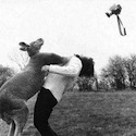
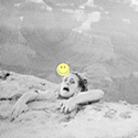

 bullfighting picture, though it's more about the subject matter than the photography?
