

|
This guy makes me want to get a medium format camera http://www.flickr.com/photos/magnifik1/   I'm just a sucker for urban shots.
|
 #
¿
Nov 23, 2009 21:25
#
¿
Nov 23, 2009 21:25
|
|


|

|
| # ¿ May 4, 2024 22:40 |
|
|
Pompous Rhombus posted:Wow, his work is fantastic. 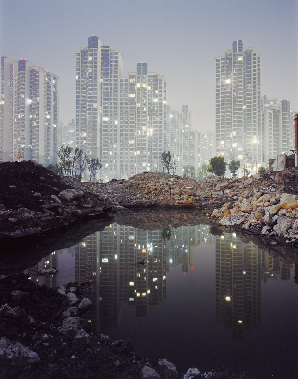 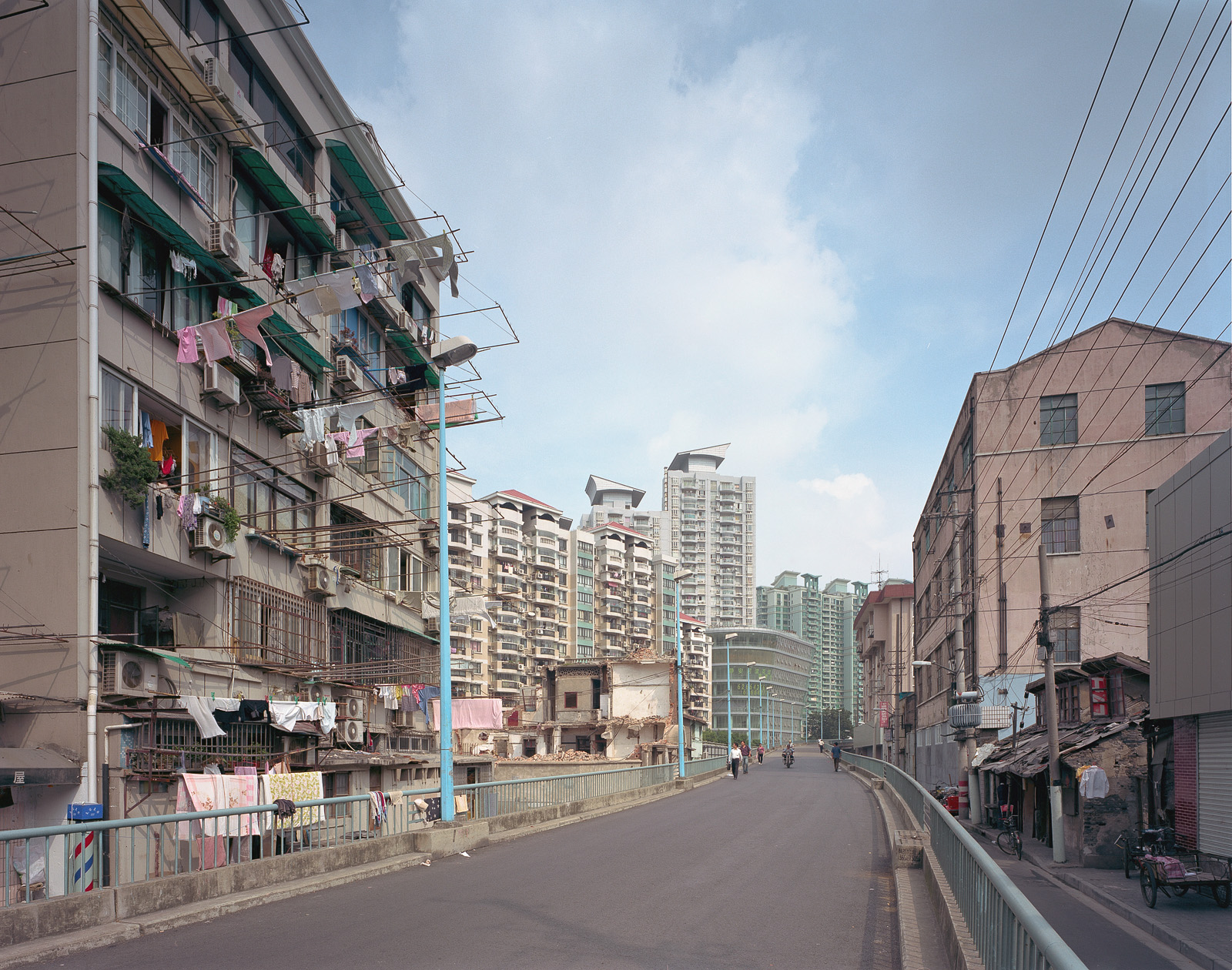
|
|
#
¿
May 16, 2010 08:06
|
|
|
fronkpies posted:I could be wrong, but the last one looks digital with heavy editing. You're right, he shoots with a 5D.
|
|
#
¿
May 20, 2010 13:49
|
|
|
Bojanglesworth posted:Every time I come to this thread I see this photo and I'm sorry, but it just looks like a half rear end point and shoot photo. The other photo is great, but this one, not so much. To my eye, it looks nothing like a point and shoot- the tonality, the sharpness, his post processing, the subject - no p&s can achieve this quality.
|
|
#
¿
May 21, 2010 04:36
|
|
|
I stumbled across Antony Crook. I really like his photos and style.   LENS FLARE 
|
|
#
¿
Sep 16, 2010 01:18
|
|
|
I long for the day I A) travel to a place/location like this B) realize the potential and take the shot http://www.christopherandersonphoto.com/#/BOOK%20PROJECTS/CAPITOLIO/9
|
|
#
¿
Oct 31, 2010 19:21
|
|
|
 From Katie Weisberger
|
|
#
¿
Oct 27, 2011 00:30
|
|
|
I'm sure some of you have seen these, but for those who haven't:  http://www.alexeytitarenko.com/city17.html
|
|
#
¿
Nov 4, 2011 16:01
|
|
|
That's pretty simple but very effective. I always wondered how fine art photographers get that fine art look to their photos, they havea very recognizable desaturated look to them.
|
|
#
¿
Dec 19, 2011 14:48
|
|
|
Herein I correct my previous statement to "a lot" instead of all.
|
|
#
¿
Dec 20, 2011 23:44
|
|
|
TomR posted:They still show more restraint than people who push the sliders right and make awful over saturated crap. I think the difference is they take photos of highly saturated colours, but not crank the saturation on the photo after, necessarily. Yes, that is a good way of putting it. Reichstag posted:Half the photos in the link you quoted are high contrast and full of saturated color, so I'm a little confused about what you mean. I know what you mean, they are saturated. It's just that a lot of the fine art that I've seen has less saturated colours, clear colours but less saturated I mean. I have previously seen 3 of the 4 links you posted as well, so I do know that there is a lot of saturated fine art photos. Like dukeku said as well, the de/saturation alone does not equal fine art. But the palette that is in the trees photo is what I imagine when I hear fine art.
|
|
#
¿
Dec 21, 2011 01:40
|
|
|
In other news, these are pretty good you guys http://www.retronaut.co/2011/02/shackletons-antarctica-in-colour-1915/
|
|
#
¿
Dec 22, 2011 02:12
|
|
|
I've seen his photographs all over the internet but I never knew who he is. Now I can finally put a name to these images. Awesome stuff. His portraits are awesome and his landscapes are equally awesome.      Nadav Kander http://www.wefolk.com/photography/3-nadav-kander/categories bobmarleysghost fucked around with this message at 01:45 on Jan 13, 2012 |
|
#
¿
Jan 13, 2012 01:32
|
|
|
The first photo is amazing! http://lightbox.time.com/2012/01/17/happy-birthday-muhammad-ali-70-iconic-images-for-70-years/ Click for full screen, it's even better. 
|
|
#
¿
Jan 18, 2012 00:29
|
|
|
From Time's Lightbox http://lightbox.time.com/2012/03/14/happy-birthday-lightbox-a-year-of-great-photography/#4 Pretty epic photo from 1988.
|
|
#
¿
Mar 15, 2012 13:54
|
|
|
Some black and white work by Devin Yalkin http://devinyalkinphotography.com/acoustic-movements/acoustic-movements/     
|
|
#
¿
Apr 3, 2012 02:37
|
|
|
So this guy takes pretty amazing photos.     
|
|
#
¿
Apr 27, 2012 02:02
|
|
|
Bottom Liner posted:Really creative double exposure work These are not double exposures. They're reflections on a window. I remember reading about the photographer and I'm pretty sure he said they were reflections.
|
|
#
¿
May 2, 2012 00:06
|
|


|
Bottom Liner posted:Wow, that's crazy. I assumed it was done in post as well, but that's genius. Hmm, now that I'm looking at the whole set, some do look like they are double exposures - these ones in particular:   and some others as well. May be I was confused as to which photographer said that. Hmm... unless he was carrying a piece of glass with him and held it between the subjects.
|
|
#
¿
May 2, 2012 05:18
|
|
|
Jessica Eaton "Canadian photographer Jessica Eaton uses her camera to create color invisible to the naked eye. She gives bright hues to gray forms in her series Cubes for Albers and LeWitt, and that work was recently awarded the photography prize at the 2012 Hy�res International Festival of Fashion and Photography" "Eaton applies filters in those three colors to her camera and takes multiple exposures, a process that turns the gray form seen here into the vibrant ones seen above. �The color itself is mixed inside the camera,� she says."    
|
|
#
¿
May 17, 2012 02:33
|
|
|
I've been following this guy for quite a while now (rss not fb etc), and man does he know black and white! Colour too. http://severinkoller.at/blog/?p=309      
|
|
#
¿
Jul 19, 2012 03:41
|
|
|
http://lightbox.time.com/2012/07/27/changing-landscapes-naoya-hatakeyama-natural-stories/quote:All of his work is looking at landscapes in transition. It draws on the tradition of the sublime, so even when the work is peaceful there�s always this quality of on-the-verge-of-change,� Sutcliffe says. �Even if the photographs are sort of peaceful and idyllic there is this sense of this other, more interesting system at work. 
|
|
#
¿
Aug 1, 2012 01:28
|
|
|
That's an awesome radio station, it would make a great FPS map.
|
|
#
¿
Aug 24, 2012 02:57
|
|
|
Yuanling Wang - http://wangyuanling.com/    The complete series. Great work. http://wangyuanling.com/shi-ba-ti/ 
bobmarleysghost fucked around with this message at 06:35 on Sep 22, 2012 |
|
#
¿
Sep 22, 2012 06:14
|
|
|
http://www.samaharris.com/ 
|
|
#
¿
Jan 4, 2013 05:10
|
|
|
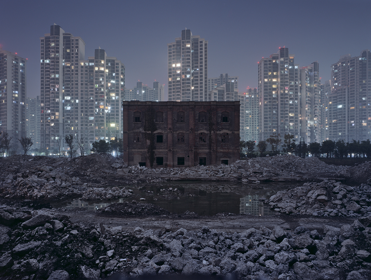
http://www.chenjiagang.com/enindex.aspx 
|
|
#
¿
Jan 17, 2013 18:34
|
|
|
 http://www.newyorker.com/online/blogs/photobooth/2013/01/slide-show-of-the-smartest-animals-on-earth.html
|
|
#
¿
Feb 2, 2013 06:56
|
|
|
I really like his high contrast processing  
|
|
#
¿
Feb 4, 2013 18:21
|
|
|
 http://www.30characters.com/tag/d-c-stuelpner
|
|
#
¿
Feb 7, 2013 16:43
|
|
|
These are amazing.
|
|
#
¿
Feb 18, 2013 03:08
|
|


|
Just get a macro lens, use a back light, add real/digital dust. -- Here's an interesting interview with Saul Leiter quote:On Self-Importance quote:On the Present Day    
|
|
#
¿
Feb 20, 2013 06:47
|
|
|
Fragrag posted:Frederik Buyckx, who's studying his Masters at my school*, got an honorable mention in this year's World Press Photo. On one hand, it makes me proud to be studying in the same institution as him. On the other, it makes me wonder whether I'll be even as good. These are pretty great. Except for the editing of her hair in this one  
|
|
#
¿
Feb 21, 2013 23:58
|
|
|
Zachary Norman posted:Each image was constructed using only two anamorphic sheets of (flat) inkjet paper, a roll of green seamless paper, a set of lights and a camera. The apparent three-dimensionality of each form is an illusion achieved through anamorphism and multiple strobes flashes (exposures) all executed �in-camera�. The colors of the forms are the result of middle mixtures achieved through multiple exposures. The colors were determined by a strict formula- the color spectrum was quantified, using the hexadecimal format, and then divided by the number of faces of a given Platonic Solid, each face was then assigned a fraction of the color spectrum. For example, an octahedron has eight sides so the spectrum was divided into eight equal fractions and each face of the octahedron was assigned one of these colors. http://www.zacharydeannorman.com/solids.html    
|
|
#
¿
Feb 24, 2013 21:32
|
|
|
John Lennon's glasses after he was shot.  Shot by Yoko.
|
|
#
¿
Feb 27, 2013 16:56
|
|
|
http://www.reframingphotography.com/content/duane-michals
|
|
#
¿
Mar 3, 2013 21:56
|
|
|
I saw that earlier today, really awesome.
|
|
#
¿
Mar 13, 2013 04:33
|
|
|
 Thomas Prior http://thomasprior.tumblr.com/post/45188995629/scorched-earth-urban-sprawl-last-week-in-mexico
|
|
#
¿
Mar 13, 2013 18:04
|
|
|
Thomas Kellner - http://www.tkellner.com/thomas-kellner/thomas-kellner/the-artist/   
|
|
#
¿
Mar 14, 2013 18:28
|
|
|
These are great. I spent a lot of time looking at each one, they really draw you in. His "less than one" is just as good, I recommend you guys take a look if you haven't. bobmarleysghost fucked around with this message at 01:51 on Apr 12, 2013 |
|
#
¿
Apr 12, 2013 01:38
|
|
|

|
| # ¿ May 4, 2024 22:40 |
|
|
Roger Ballen - Asylum of the birds http://www.rogerballen.com/image-gallery   
|
|
#
¿
Apr 27, 2013 06:15
|
|