


|
You may have done this already somewhere else, but could you post a before and after shot? It might help with opinions regarding the post processing.
|
 #
¿
Jan 27, 2012 07:17
#
¿
Jan 27, 2012 07:17
|
|


|

|
| # ¿ May 1, 2024 06:11 |
|
|
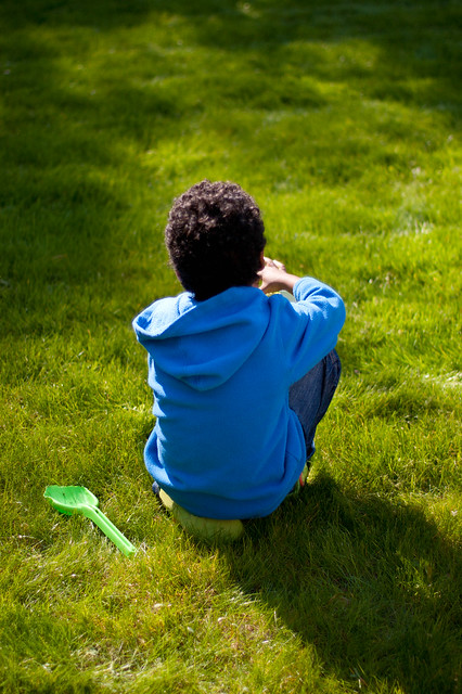
I think the post is quite good. You're taking average, sort of meh pictures of animals and turning them into some of the most talked about photos in the dork room. The fact that they look studio lit makes them look fake (who can get a tiger to pose for a studio production?) and I think that's what makes them remarkable. Additionally, when they come in groups or when I consider the many many shots with similar post you've produced over the last year or whatever, I think they all go together really well and that adds to the awesomeness of the whole thing. I've heard it said a half dozen times but all of your shots together in a photo book would be spectacular. e:  _MG_0181 by spf3million, on Flickr spf3million fucked around with this message at 17:41 on Jan 27, 2012 |
|
#
¿
Jan 27, 2012 16:00
|
|
|
Dradien posted:Now, last time I posted here was with a picture that was not color corrected, kind of crappy with a nasty shadow on it, too narrow focus, etc etc.
|
|
#
¿
Jan 29, 2012 07:40
|
|

|
Chidona posted:
Chidona posted:
Chidona posted:
Cacator posted:
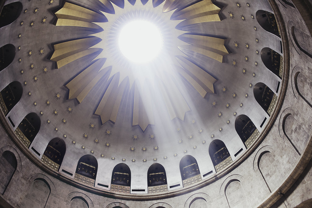
dukeku posted:dukeku posted:VomitOnLino posted:Visited the Church of the Holy Sepulchre in Jersualem (supposedly where Jesus was crucified and was resurrected). 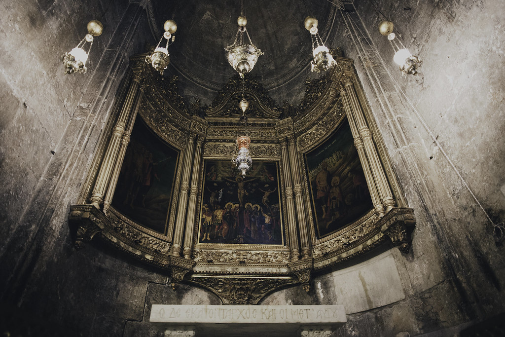 _MG_2202-150 by spf3million, on Flickr What's left of the J-man's tomb. 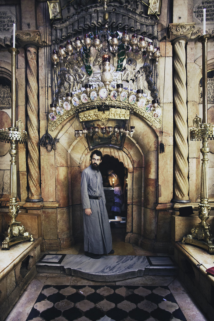 _MG_2215-153 by spf3million, on Flickr
|
|
#
¿
May 12, 2012 17:45
|
|

|
torgeaux posted:
guidoanselmi posted: doctor 7 posted:These are both loving stellar. I honestly don't know what to say other than drat fine work. Composition works, exposure is spot on, colour looks a bit dulled (I don't know if you did anything in regards to it) but it looks just right for the photos. Really well done. HookShot posted:
 _MG_2229-151 by spf3million, on Flickr I spent a ton of time editing out a thing in the middle of the room. Could you tell if I hadn't said anything?  _MG_2229 by spf3million, on Flickr
|
|
#
¿
May 13, 2012 17:45
|
|

|
Turd Nelson posted:Thanks for the feedback everyone! I went ahead and removed the bench at the bottom (which I hadn't noticed until it was mentioned). Something I'm working on for the photo contest.  _MG_2363-161-162 by spf3million, on Flickr
|
|
#
¿
May 19, 2012 07:16
|
|
|
Wafflecopper posted:
|
|
#
¿
Jun 11, 2012 17:45
|
|
|
HookShot posted:
|
|
#
¿
Jun 14, 2012 13:41
|
|
|
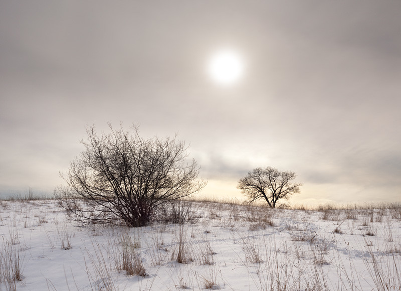
Not sure what this is (airplane trails?) but I like it. Not a big fan of the tree tops though.
|
|
#
¿
Jun 17, 2012 04:16
|
|

|
bakahentai posted:And the one shot from the trip that I really wanted to turn out, but I'm just not sure how to make it work:
|
|
#
¿
Jun 29, 2012 19:38
|
|
|
RazalasSol posted:
rio posted:
Deadreak posted:
e: saw your comment later, oh well. Dalax posted:
Whitezombi posted:The second. Shooting straight lines is difficult. An image like this has to be 100% perfect. Every line must be perfectly straight. Every shape equal. You must have symmetry. As it is it does not work. phootnote posted:
Awkward Davies posted:Sometimes I want to give critique like "You took a picture of something boring. Why did you do that?". The snow on the bottom right isn't interesting at all. The trees and mysterious light on the bottom left is very interesting. Try re-framing to get more of the mysterious trees and less of the boring snow with a million footprints. Shampoo posted:In my playing with Lightroom, I decided to bite the bullet and import most of my old photos and see if I could re-process them into something nicer. App13 posted:
Santa is strapped posted:I was out shooting with a friend and had some nice light show up (10mins later it was gone). Whitezombi posted:
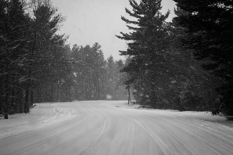
What's going on with that bridge/dam in the background? I want to see more of that. I actually kind of like the 3rd although it seems a little noisy for some reason. It would be worlds better if the sky were more interesting. As it is now, it is just blah gray. When they sky looks like this, I find it best to try to eliminate the sky from the composition altogether. These two are completely baller. Really love how you can see the movement in the falling snow. The 1st could possibly use a little exposure bump since there aren't really any pure whites unlike the 2nd where there are definitely blacks and whites. Druckman posted:
xenilk posted:
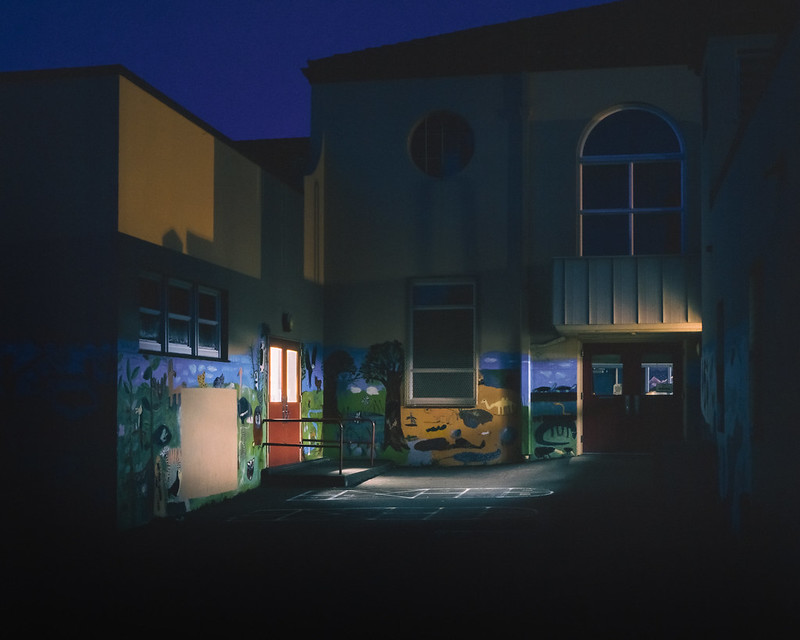
I can't decide which version of this I like best. Is either one worth the effort to clone out all of those drat scratches on the right wall? 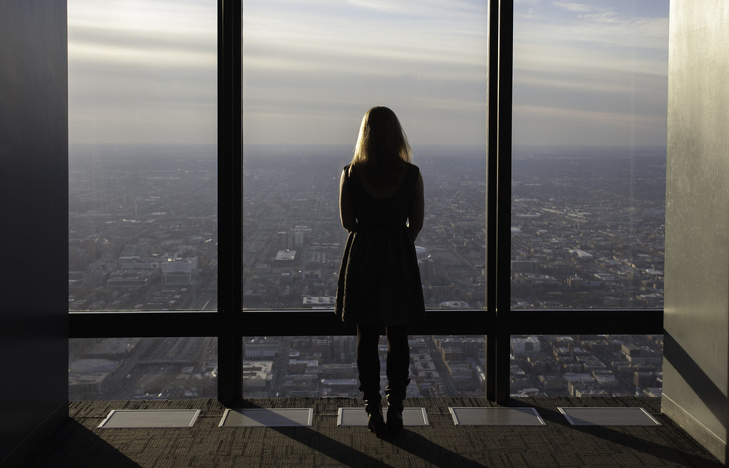 _MG_5121 by spf3million, on Flickr 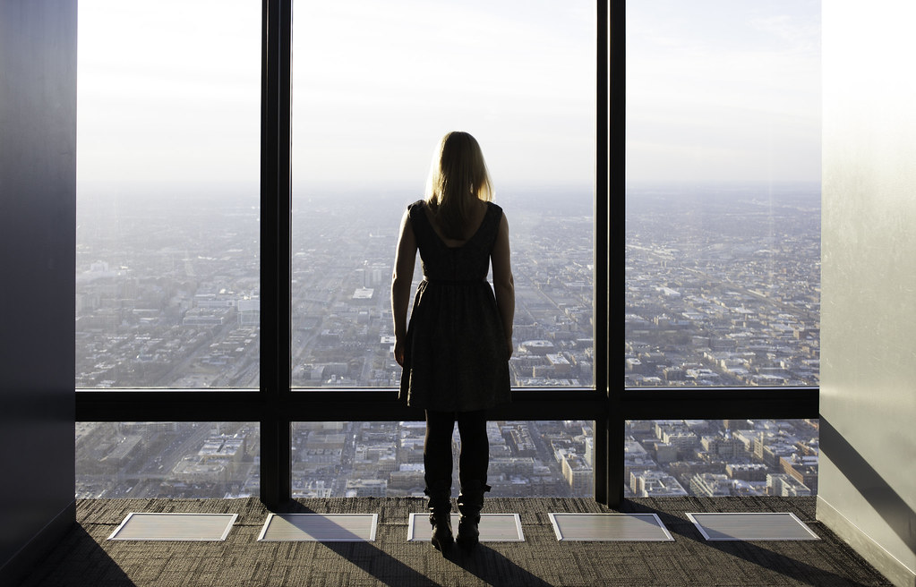 _MG_5120 by spf3million, on Flickr
|
|
#
¿
Jan 30, 2013 17:14
|
|


|
I like the way the shadows fall and the framing provided by the dark and light walls on either side. I prefer the pose in the 1st but like the exposure of the 2nd more. Maybe a vertical would be better though, decisions decisions. e: Primo Itch posted:Maybe somewhere in the middle? I think that bumping up a little bit the exposure in the first one should do the trick. I also like the model pose in it better than the 2nd, where she feels a little bit stiff.
|
|
#
¿
Jan 30, 2013 17:28
|
|
|

|
| # ¿ May 1, 2024 06:11 |
|
|
For good star trails you are probably best off with 15 or 30 second exposures continuously. If you are using an intervelometer (which you basically have to for star trails), you'll set the wait time between photos to be the smallest possible, that will minimized the gaps.
|
|
#
¿
Mar 12, 2013 10:18
|
|