


|
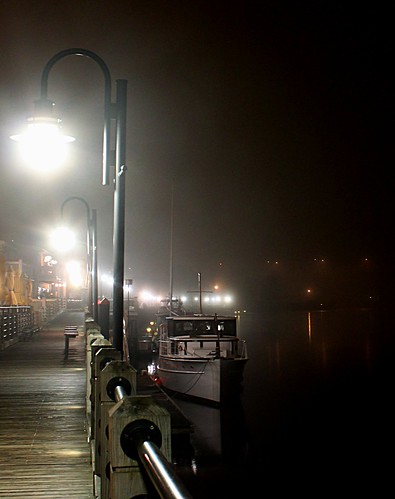
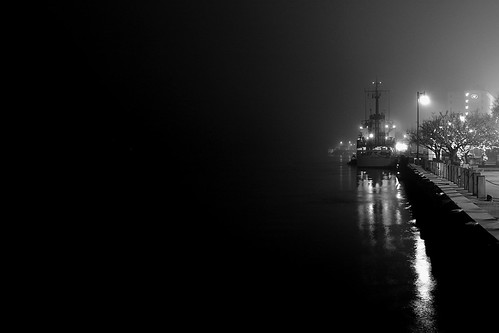
bandaid posted:This is my first post here in a long time, but here goes.. The first one I'm not crazy about. Boat seems to be smack in the middle of the frame and not that interesting. The second on the other hand I am really a fan of. Despite what many say about the negative space I think it works perfectly in this image and wouldn't change a thing. Spent some time on a cold beach yesterday for this shot. I don't often shoot beaches so I didn't have any great ideas for a foreground. I thought about staging a log or something but there was nothing interesting nearby. My original composition I liked a lot better, but once I got home I noticed I had way more salt spray on my filter than I thought, and in this comp that was much less noticeable. 
|
 #
¿
Jan 30, 2012 18:44
#
¿
Jan 30, 2012 18:44
|
|

|

|
| # ¿ May 1, 2024 02:38 |
|
|
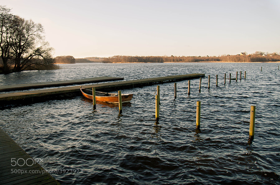
Dread Head posted:I really like this photo but there are a few things that bother me. While I absolutely love the rocks that are isolated by the sand (I want a shot like this now!) the rocks in the lower right feel awkward and cut off. I am also not sure if I like the piece of land on the right. I am not sure if you included this on purpose or if that was the only way to really frame the rest of your photo. I share your feeling about the rocks in the lower right. I was already at 10mm and couldn't really get the comp I wanted from there. Like I mentioned earlier this wasn't my composition of choice, I had set up in a spot I really liked and was sure that was the shot I would go with, I just stopped at this spot on my way back to the trail and took a few extra for good measure, and thank goodness I did because the original shots had so much salt spray visible on them they were unusable as it obstructed the darker foreground. The salt in this image was mostly above the horizon and much harder to see. The rock formation on the right had a bad lens flare on it which I'm finding this Sigma 10-20 does a lot of. I had to clean it up in post and would have rather cut that segment out altogether. On top of all that I didn't get my focus dead on either, I'm blaming this all on the fact that this wasn't the intended shot, but I was pleased enough with the overall image that I couldn't bring myself to scrap the whole shoot. I like the above shot, it's different than your usual stuff and I know how hard it can be to find interesting shots that aren't water or rocks. I think I would prefer if it was taken portrait though, maybe with mostly white filling the frame. In this framing the green is just a bit too dominant.
|
|
#
¿
Feb 1, 2012 14:15
|
|
|
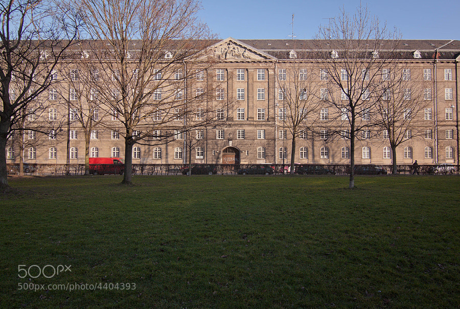
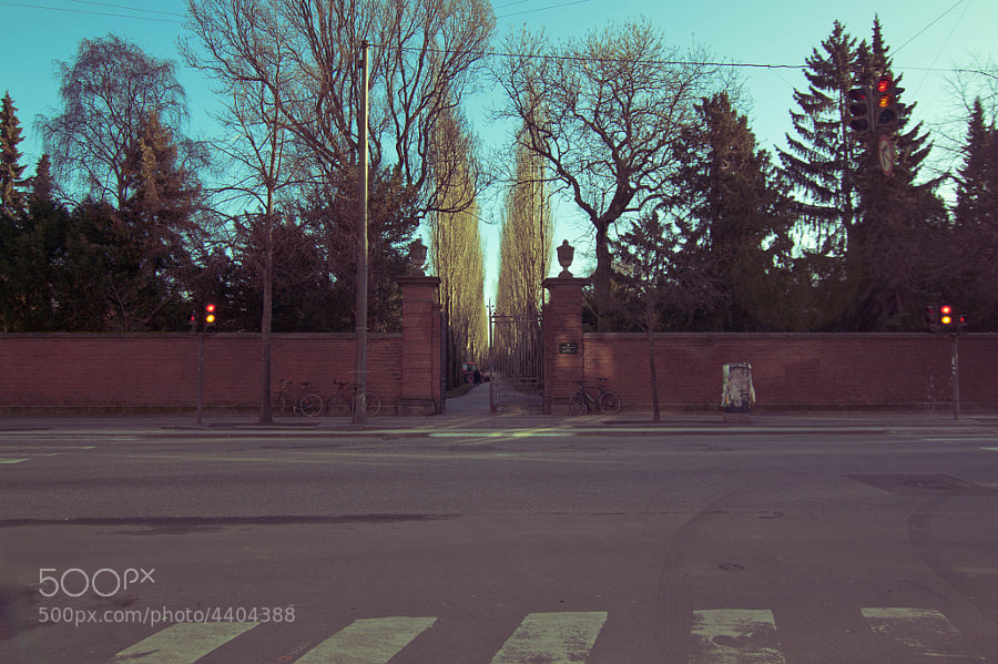
Cockwhore posted:Here are three photos of mine, I've posted before but never got any critique on. I find the first two very uninteresting. The grass is underexposed, the trees tops are cut off and the composition is just a bit off. I think you had a good idea, and if you shot more or less equal sky/building/grass, while framing the trees right, and properly exposing it, it would be a neat photo. That's a lot of ifs though. The third I like much more than the first, the composition is good and the subject is interesting, but the sky is blown out and the tree is so underexposed it's distracting. The location is great though, if you shot there a bit closer to dawn or dusk and avoided that hard light. 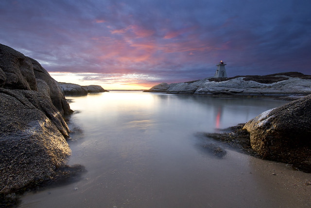 Self critique: I think the shot is fairly strong overall but the glaring problem is the lighthouse is too close to center. I did think of this when composing but it was this or have way too much dark rock in the foreground, and I'm starting learn that imposing dark rocks have done a lot of harm to my photos in the past so I'm avoiding them at all costs. Critique would be welcome.
|
|
#
¿
Feb 4, 2012 14:40
|
|
|
Bottom Liner posted:
Really like this photo. I don't have much to say that would improve it because the feel is spot on, the only complaint is maybe that it's a bit underexposed. Bottom Liner posted:I tried layering lighting with a long exposure. I wish I had gotten the back trees more to really add that extra depth. Oh well, the owl is cool. The fill flash is really jarring and kind of washes out what would otherwise be a cool scene. I see what you were going for and see the possibility, just not sure how you would accomplish it with a softer foreground light and still exposed enough to see the detail. 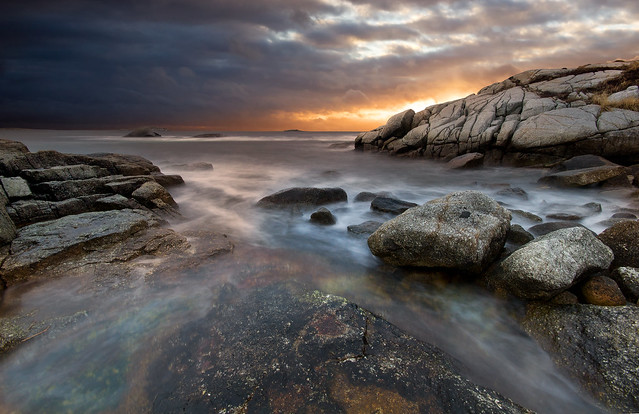 Been to this spot about 10 times now and something is always wrong, tide, light, wind. Everything lined up finally this time, hoping I don't have to go back there any more.
|
|
#
¿
Feb 19, 2012 14:21
|
|


|
Tamgerine posted:I like their expressions and the color temperature a lot, I think it suits the mood you're going for. I'm not sure if I like the pipes in it though. It's a little distracting but provides a little bit of asymmetry. I think I'd prefer the shot without the pipes. I think the lighting on their face is good, it's dramatic without hiding their eye on the opposite side of the face. Have you considered converting some of these to B&W? I know it seems to be overdone in wedding and engagement shooting but the colour from their clothes (the third shot in particular) is really distracting and in your face. The second one isn't doing much for me, because together they just look like a single mass. Any silhouettes when working with a plus size subject aren't going be flattering.  day 40 by David Childers, on Flickr This is just stellar.
|
|
#
¿
Feb 20, 2012 15:13
|
|


|
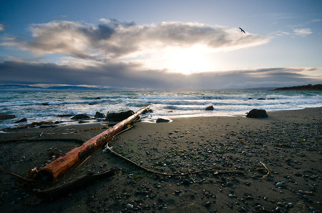
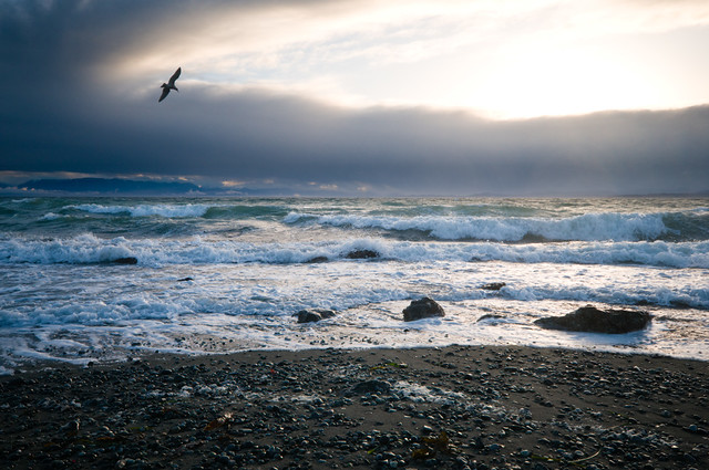
Dread Head posted:I think the first is a bit heavy on the contrast. The shot directly into the sun and the lost shadows are hard on the eyes. I do like the leading line of the log but its leading me into the harsh light at the center of the image. The second I like quite a bit more. It suffers from some of the same issues but the seagull really makes it. I feel like it focuses more on the rough seas and the ocean rather than the foreground, and the bird soaring gives the impression that there is wind to go with that surf. Maybe crop the second one a bit and lose some of the foreground? 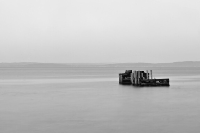 I'm trying to take less photos that are loaded with too much stuff going on. It's hard because I really like colourful, detail-oriented seascapes and landscapes but I'm getting a lot of criticism about only shooting one thing. It was overcast today and with the low fog everything looked very flat so I tried to just go with the whole "flat" theme. Used a 10s exposure to try and lighten the water a bit to make the transition to the sky a bit smoother. I'm unsure about the tones as I don't do B/W conversions often, any recommendations are very welcome. Also holy jesus I don't know what happened to my camera but I had to clone out about 300 bits of sensor dust on this one. Maybe they were always there but I hadn't shot anything this plain to see them.
|
|
#
¿
Mar 5, 2012 00:41
|
|
|
Ferris Bueller posted:
I think you had the right idea focusing close and tight on these ice formations. They are very interesting and deserve to be the focal point of the image. The problem is the composition just doesn't feel quite right. I've run into things like this a lot where I'll find something really interesting for a focal point, but the landscape itself is full of dull winter colours (dark rocks, sparse brush, snow patches) and I usually fail to make anything of it. Looks like you were in a similar situation here, but you did a better job than I usually end up doing. That being said it still has some of the same pitfalls. After a brief departure I'm going back to abusing gravy water. 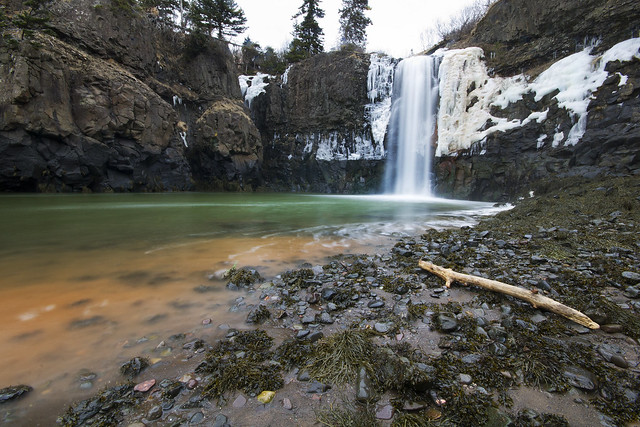  The waterfall photo was a real pain to get. That area is in the Bay of Fundy which has the highest tides in the world. When scouting it on google maps I saw several hundred feet of beach from where the waterfall hits the ground to the ocean. Turns out the satellite image was taken at low tide and when I arrived, the spot I was standing for this shot was under about 8' of water. You can actually see the high tide line where the snow stops at the base of the falls. That's where the water was when I arrived, this is just an hour later. By the time I packed up my gear from this shot and started heading out, that basin in the shot was mud and the falls were mostly splashing down on solid ground. Really crazy tides.
|
|
#
¿
Mar 12, 2012 14:00
|
|

|
blackmanjew posted:Hope this isn't creepy or off base, but I had two of your pictures printed to hang up in my room. Those turned out great, awesome photos too. 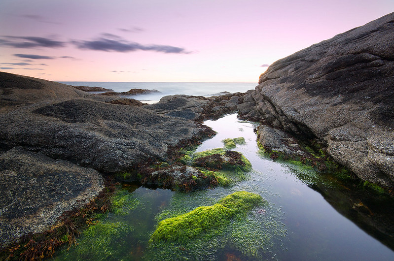  whaam fucked around with this message at 00:11 on Oct 16, 2012 |
|
#
¿
Oct 15, 2012 15:46
|
|

|
Pukestain Pal posted:This is a beautiful photo. The editing on it works perfectly. You should be really proud of it. I wouldn't change anything about it. Seconding that, really stands out. Got a new body and can't stop shooting, sorry for spamming PAD.   (USER WAS PUT ON PROBATION FOR THIS POST)
|
|
#
¿
Oct 19, 2012 02:23
|
|
|
Mathturbator posted:I have no idea why I love this picture so much... But I do! I have to say I love it too, something about the scale of where she is, reminds me of the scene in 127 hours when the guy is finally escaping his dire situation and here is this girl just whimsically strolling around a similar scene. Pukestain Pal posted:Photo I took in Maine this summer that I'm pretty proud of. It was taken during the blue hour just after sunset. Wow Maine and Nova Scotia look a lot alike. I like the composition here and as much as I hate to suggest a "gimmick crop" I think a really tight and wide crop just above and below the treeline and its reflection would be great. Its funny I think the shot wouldn't be nearly as strong without that warm light coming from the house, it really makes me feel cozy just looking at it and I'm imagining what it would be like to live there instead of just an arbitrary house shot.  (Side apology to dorkroom, got probated last week for not critiquing in this thread, been away from the forum for a long time and got confused about the SAD/PAD changes, should have read OP) whaam fucked around with this message at 00:14 on Nov 4, 2012 |
|
#
¿
Nov 3, 2012 15:45
|
|


|
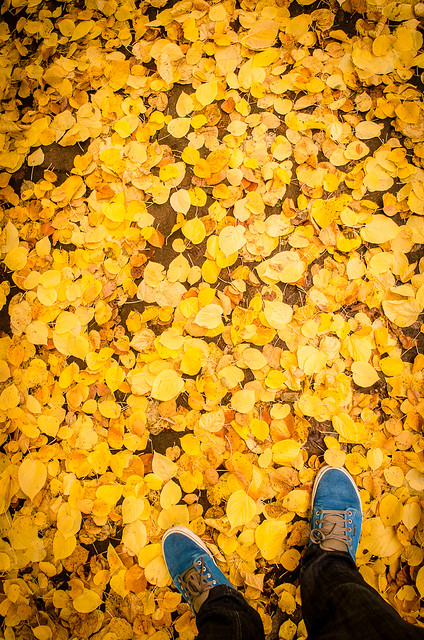
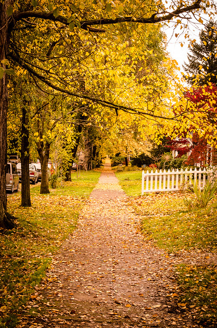
kahm posted:
The first one I really like, the colour contrast really pops and its simple enough to just be a really cool image. The second I think isn't as good. A wide angle would make it worse in my opinion, and I think that shots like this (long path or road under fall trees) are better served when they are showcasing symmetry which this one is not thanks to the trees only being on one side. If anything I think moving further up to get that white fence out of the frame and using a longer lens would actually be better, make it a big more tunnel-vision and focus on the seemingly endless sidewalk. phootnote posted:
Two things that jump out at me for improving here is the exposure for one, the only thing exposed properly is the leaves high in the distant trees, the sky is blown out and the foreground is underexposed. Two exposures probably isn't necessary but if you shot it RAW and exposed for the foreground you could end up pretty balanced in post I think. The other is that shots like this that focus on a road moving toward the horizon often do better with a lower perspective, especially if they are enclosed and "tunnel-like" as this one is. Really great composition on this one though as far as positioning the road and it leading me into the distance. 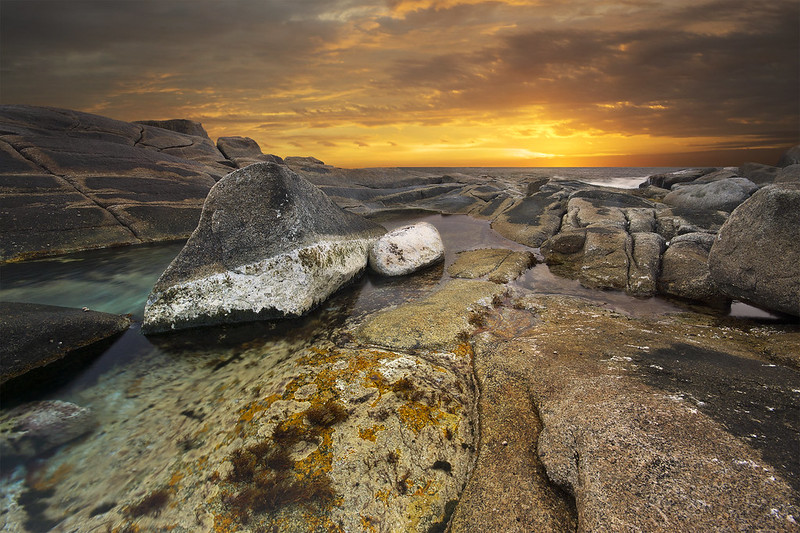 I went shooting here intending to get a telephoto landscape of the local lighthouse tourist trap, but when looking for a good vantage point I stumbled on this very strange tidal pool. Lots of colours you don't usually see around here thanks to the moss, kelp, barnacles and god knows what else. Believe it or not the saturation is almost straight from RAW, I think maybe a +15 cyan or something for the blues in the bottom left. CPL for the pool reflections and a grad ND which ended up butchering the rocks which I didn't see in the viewfinder at the time, luckily I took some shots without it as well. In particular I feel like it lost some of its contrast on jpeg conversion, maybe I'm converting wrong, but I don't want to just slide contrast up and break the knob off, is it a bit flat or have I been staring at it too long? whaam fucked around with this message at 20:09 on Nov 6, 2012 |
|
#
¿
Nov 6, 2012 17:01
|
|

|
Leviathor posted:Great location. The abrupt change in foreground/background lightness is jarring (the sky and everything else). The light falloff on the foreground through the ocean and including that one rock on the right hand side needs a bit of reality introduced to it. Yeah you are right. Burnt it down a bit to make it a bit smoother of a transition. Also warmed it up a bit. whaam fucked around with this message at 20:09 on Nov 6, 2012 |
|
#
¿
Nov 6, 2012 17:51
|
|
|
LibbyCr posted:The third is has nice parallel lines with the trees being similarly shaped to the buildings. Its a bit soft but there isn't much you can do about that now, looks like you missed focus by a bit. I like the photo though, and think its just slightly tilted but I could be wrong. I wouldn't crop it any differently though I like the symmetry of the poles. 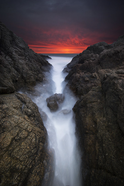 Too dark? Sometimes when I look at it I feel its too dark, others it looks just right, different monitors and all that. I tried pushing the exposure in the foreground a bit but it looked unnatural.
|
|
#
¿
Mar 1, 2013 14:23
|
|
|
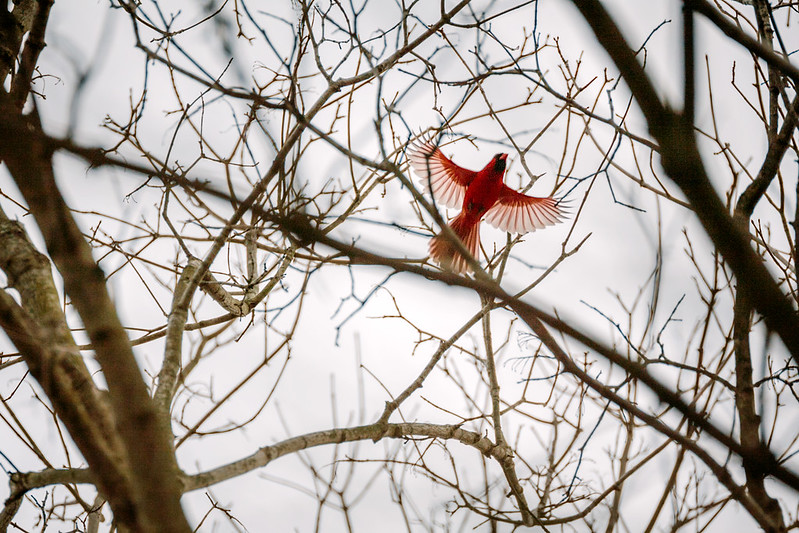
rio posted:I don't know if it is just an illusion caused by some of the different vertical lines, that the building itself is crooked and that is what you are presenting as a point of interest or what but as someone who constantly trying to keep conscious of not leaning photos I can't *not* see it as just an off level photo. If the building itself is crooked and you are playing it against the lines in the road, more context would help by showing some of the surroundings. I see a crooked building starting to show in the left of the frame that could help maybe, possibly able to help portray crookedness not as a mistake but something interesting in the image (not sure what is actually over there of course) and that tattered canadian flag looks like it could provide some sort of interest too if it was more part of the scene. As it is, though, you are just presenting this building that is honestly not all that interesting to me. I get the idea of the cat one, and its pretty neat but I just don't like it as a photo. I can't get past the clutter even though that was the intent of the photo. Good job nailing focus though. The other two are much better. Love the car shot, looks like something out of a Stephen King movie. The cardinal's composition doesn't feel right but I'm not sure you could have done anything different judging by the cluttered overhead.  The idea was to capture that the old run-down lighthouse had been replaced by the new bridge that spans the ocean to the island in the distance. You used to only be able to get there by ferry and boat but since the bridge's construction, many of the old lighthouses on the shore have gone to ruin. The birds were a lucky coincidence and they were flying away from the bridge in the RAW but I flipped them so they look like they are also abandoning the lighthouse.
|
|
#
¿
Mar 11, 2014 22:44
|
|

|
polyfractal posted:I really like this photo, it has a ominous, dreamy atmosphere. But I feel that I like it for reasons unrelated to your stated intentions. If your intentions were to contrast the lighthouse to the bridge, the bridge is not a strong enough visual element. I didn't notice until my eyes had lingered on the photo for a while. It's nice composition, receding into the distance, but not a major component of the image. I'm actually really really far from the bridge. I wish I could get it to show better, I agree, but it just wasn't possible. The bright cloud is a bit extra bright thanks to post processing, maybe a mistake on my part. Shellman posted:I don't like the vignette on this one. It's too strong, and I think that the cool tones of the shot would look better without it. I liked that the birds led my eye to the lighthouse, but I'm not sure how I feel about knowing that you flipped 'em around to make that happen. The perspective of the bridge tapering off into the distance is nice, too. The vignette does appear strong especially in thumbnail form. I think its more due to the darkened clouds in the top corners than the vignette itself. I considered not using it and now you have me thinking I should have followed through with that. As for the birds, things rarely just happen like that, capturing birds randomly flying in a landscape. I flipped them so I could crop the image tighter and remove some of the boring foreground bush, also them flying away towards the bridge seemed right. I don't think its an ethics violation or anything since its just a landscape, but to each their own.
|
|
#
¿
Mar 12, 2014 01:23
|
|
|
Wafflecopper posted:
There's something about the contrast between the rock and the pale blue sky that is making this feel washed out to me. Not sure if that makes any sense but that's just how I'm seeing it. It's perfectly exposed but things feel a bit too bright, maybe just the time of day and the harsh light. The reflection turned out great, and it looks really great as a pocket of blue in all that rock, the light and sky is just throwing me.  Something about this photo feels off to me. I was pleased with the result when I was shooting then got back and didn't like it nearly as much looking at it on the screen. It's barely been touched in post but I can't see what would help it out. The only thing I can think that is dragging it down is the composition seems weak? This was at 70mm so I couldn't really move around and frame it very well, the only thing I can think to help would be to crop out some of the water in the foreground. In the viewfinder I thought it would work as a very simple 3-layer image with oranges on top, browns in the middle and blue on the bottom, but I think that isn't working since the island doesn't span the whole middle and the "blues" got pretty orange from the reflection.
|
|
#
¿
May 23, 2014 20:31
|
|

|
|
| # ¿ May 1, 2024 02:38 |
|
|
Neowyrm posted:This is strongly reminiscent of PC game "Dear Esther" for me. Was this taken in the Hebrides? Not Scotland but Nova Scotia (new scotland). Very similar landscapes here.
|
|
#
¿
May 23, 2014 20:57
|
|